


Be Awesome in ggplot2: A Practical Guide to be Highly Effective - R software and data visualization
Basics
ggplot2 is a powerful and a flexible R package, implemented by Hadley Wickham, for producing elegant graphics. The gg in ggplot2 means Grammar of Graphics, a graphic concept which describes plots by using a “grammar”.
According to ggplot2 concept, a plot can be divided into different fundamental parts : Plot = data + Aesthetics + Geometry.
The principal components of every plot can be defined as follow:
- data is a data frame
- Aesthetics is used to indicate x and y variables. It can also be used to control the color, the size or the shape of points, the height of bars, etc…..
- Geometry corresponds to the type of graphics (histogram, box plot, line plot, density plot, dot plot, ….)
Two main functions, for creating plots, are available in ggplot2 package : a qplot() and ggplot() functions.
- qplot() is a quick plot function which is easy to use for simple plots.
- The ggplot() function is more flexible and robust than qplot for building a plot piece by piece.
The generated plot can be kept as a variable and then printed at any time using the function print().
After creating plots, two other important functions are:
- last_plot(), which returns the last plot to be modified
- ggsave(“plot.png”, width = 5, height = 5), which saves the last plot in the current working directory.
This document describes how to create and customize different types of graphs using ggplot2. Many examples of code and graphics are provided.
Related Book:
GGPlot2 Essentials for Great Data Visualization in R
Types of graphs for data visualization
The type of plots, to be created, depends on the format of your data. The ggplot2 package provides methods for visualizing the following data structures:
- One variable - x: continuous or discrete
- Two variables - x & y: continuous and/or discrete
- Continuous bivariate distribution - x & y (both continuous)
- Continuous function
- Error bar
- Maps
- Three variables
In the current document we’ll provide the essential ggplot2 functions for drawing each of these seven data formats.
How this document is organized?
- Basics
- Types of graphs for data visualization
- How this document is organized?
- Install and load ggplot2 package
- Data format and preparation
- qplot(): Quick plot with ggplot2
- ggplot(): build plots piece by piece
- One variable: Continuous
- One variable: Discrete
- Two variables: Continuous X, Continuous Y
- Two variables: Continuous bivariate distribution
- Two variables: Continuous function
- Two variables: Discrete X, Continuous Y
- Two variables: Discrete X, Discrete Y
- Two variables: Visualizing error
- Two variables: Maps
- Three variables
- Other types of graphs
- Graphical primitives: polygon, path, ribbon, segment, rectangle
- Graphical parameters
- Main title, axis labels and legend title
- Legend position and appearance
- Change colors automatically and manually
- Point shapes, colors and size
- Add text annotations to a graph
- Line types
- Themes and background colors
- Axis limits: Minimum and Maximum values
- Axis transformations: log and sqrt scales
- Axis ticks: customize tick marks and labels, reorder and select items
- Add straight lines to a plot: horizontal, vertical and regression lines
- Rotate a plot: flip and reverse
- Faceting: split a plot into a matrix of panels
- Position adjustements
- Coordinate systems
- Extensions to ggplot2: R packages and functions
- Ressources to improve your ggplot2 skills
- Acknoweledgment
- Infos
Install and load ggplot2 package
Use the R code below:
# Installation
install.packages('ggplot2')
# Loading
library(ggplot2)
Data format and preparation
The data should be a data.frame (columns are variables and rows are observations).
The data set mtcars is used in the examples below:
# Load the data
data(mtcars)
df <- mtcars[, c("mpg", "cyl", "wt")]
# Convert cyl to a factor variable
df$cyl <- as.factor(df$cyl)
head(df)
## mpg cyl wt
## Mazda RX4 21.0 6 2.620
## Mazda RX4 Wag 21.0 6 2.875
## Datsun 710 22.8 4 2.320
## Hornet 4 Drive 21.4 6 3.215
## Hornet Sportabout 18.7 8 3.440
## Valiant 18.1 6 3.460mtcars : Motor Trend Car Road Tests.
Description: The data comprises fuel consumption and 10 aspects of automobile design and performance for 32 automobiles (1973 - 74 models).
Format: A data frame with 32 observations on 3 variables.
- [, 1] mpg Miles/(US) gallon
- [, 2] cyl Number of cylinders
- [, 3] wt Weight (lb/1000)
qplot(): Quick plot with ggplot2
The qplot() function is very similar to the standard R plot() function. It can be used to create quickly and easily different types of graphs: scatter plots, box plots, violin plots, histogram and density plots.
A simplified format of qplot() is :
qplot(x, y = NULL, data, geom="auto")- x, y : x and y values, respectively. The argument y is optional depending on the type of graphs to be created.
- data : data frame to use (optional).
- geom : Character vector specifying geom to use. Defaults to “point” if x and y are specified, and “histogram” if only x is specified.
Other arguments such as main, xlab and ylab can be also used to add main title and axis labels to the plot.
Read more about qplot(): Quick plot with ggplot2.
Scatter plots
The R code below creates basic scatter plots using the argument geom = “point”. It’s also possible to combine different geoms (e.g.: geom = c(“point”, “smooth”)).
# Basic scatter plot
qplot(x = mpg, y = wt, data = df, geom = "point")
# Scatter plot with smoothed line
qplot(mpg, wt, data = df,
      geom = c("point", "smooth"))
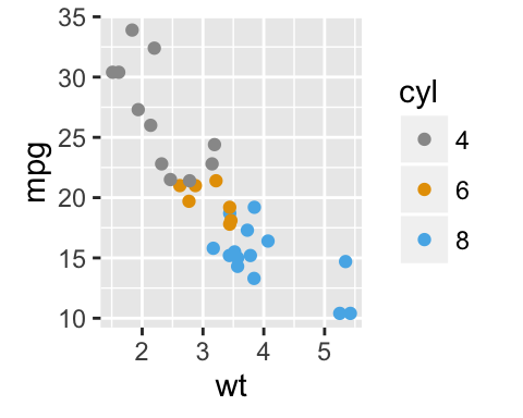
The following R code will change the color and the shape of points by groups. The column cyl will be used as grouping variable. In other words, the color and the shape of points will be changed by the levels of cyl.
qplot(mpg, wt, data = df, colour = cyl, shape = cyl)
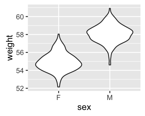
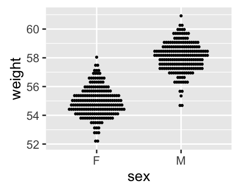
Box plot, violin plot and dot plot
The R code below generates some data containing the weights by sex (M for male; F for female):
set.seed(1234)
wdata = data.frame(
        sex = factor(rep(c("F", "M"), each=200)),
        weight = c(rnorm(200, 55), rnorm(200, 58)))
head(wdata)
## sex weight
## 1 F 53.79293
## 2 F 55.27743
## 3 F 56.08444
## 4 F 52.65430
## 5 F 55.42912
## 6 F 55.50606# Basic box plot from data frame
qplot(sex, weight, data = wdata,
geom= "boxplot", fill = sex)
# Violin plot
qplot(sex, weight, data = wdata, geom = "violin")
# Dot plot
qplot(sex, weight, data = wdata, geom = "dotplot",
stackdir = "center", binaxis = "y", dotsize = 0.5)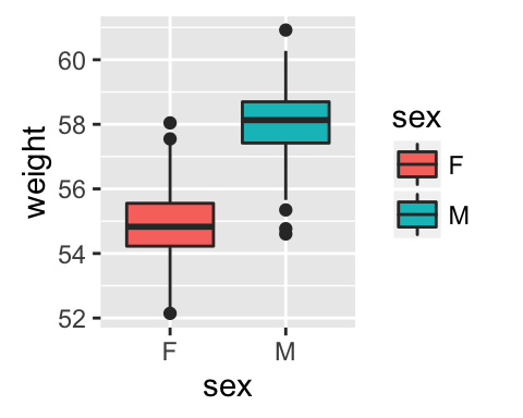
Histogram and density plots
The histogram and density plots are used to display the distribution of data.
# Histogram  plot
# Change histogram fill color by group (sex)
qplot(weight, data = wdata, geom = "histogram",
      fill = sex)
# Density plot
# Change density plot line color by group (sex)
# change line type
qplot(weight, data = wdata, geom = "density",
    color = sex, linetype = sex)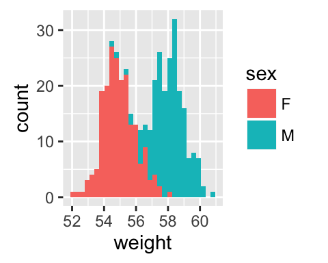

ggplot(): build plots piece by piece
As mentioned above, there are two main functions in ggplot2 package for generating graphics:
- The quick and easy-to-use function: qplot()
- The more powerful and flexible function to build plots piece by piece: ggplot()
This section describes briefly how to use the function ggplot(). Recall that, the concept of ggplot divides a plot into three different fundamental parts: plot = data + Aesthetics + geometry.
- data: a data frame.
- Aesthetics: used to specify x and y variables, color, size, shape, ….
- Geometry: the type of plots (histogram, boxplot, line, density, dotplot, bar, …)
To demonstrate how the function ggplot() works, we’ll draw a scatter plot. The function aes() is used to specify aesthetics. An alternative option is the function aes_string() which generates mappings from a string. aes_string() is particularly useful when writing functions that create plots because you can use strings to define the aesthetic mappings, rather than having to use substitute to generate a call to aes()
# Basic scatter plot
ggplot(data = mtcars, aes(x = wt, y = mpg)) +
  geom_point()
# Change the point size, and shape
ggplot(mtcars, aes(x = wt, y = mpg)) +
  geom_point(size = 2, shape = 23)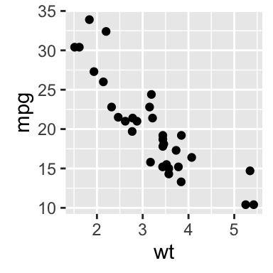
The function aes_string() can be used as follow:
ggplot(mtcars, aes_string(x = "wt", y = "mpg")) +
  geom_point(size = 2, shape = 23)
Note that, some plots visualize a transformation of the original data set. In this case, an alternative way to build a layer is to use stat_*() functions.
In the following example, the function geom_density() does the same as the function stat_density():
# Use geometry function
ggplot(wdata, aes(x = weight)) + geom_density()
# OR use stat function
ggplot(wdata, aes(x = weight)) + stat_density()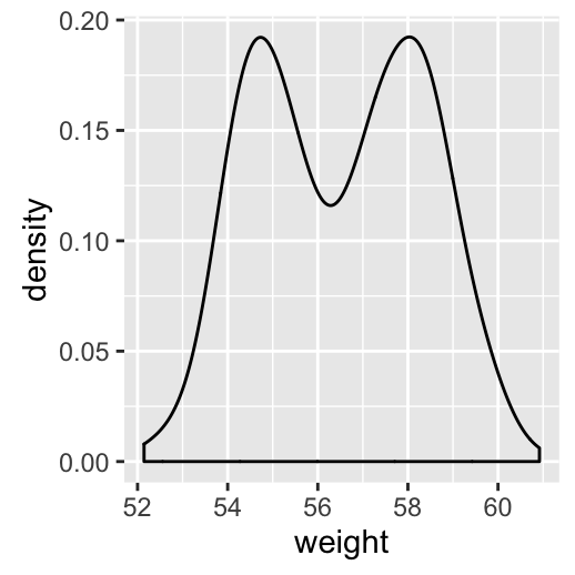
For each plot type, we’ll provide the geom_*() function and the corresponding stat_*() function (if available).
One variable: Continuous
We’ll use weight data (wdata), generated in the previous sections.
head(wdata)## sex weight
## 1 F 53.79293
## 2 F 55.27743
## 3 F 56.08444
## 4 F 52.65430
## 5 F 55.42912
## 6 F 55.50606The following R code computes the mean value by sex:
library(plyr)
mu <- ddply(wdata, "sex", summarise, grp.mean=mean(weight))
head(mu)
## sex grp.mean
## 1 F 54.94224
## 2 M 58.07325We start by creating a plot, named a, that we’ll finish in the next section by adding a layer.
a <- ggplot(wdata, aes(x = weight))Possible layers are:
- For one continuous variable:
- geom_area() for area plot
- geom_density() for density plot
- geom_dotplot() for dot plot
- geom_freqpoly() for frequency polygon
- geom_histogram() for histogram plot
- stat_ecdf() for empirical cumulative density function
- stat_qq() for quantile - quantile plot
- For one discrete variable:
- geom_bar() for bar plot
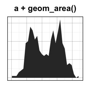
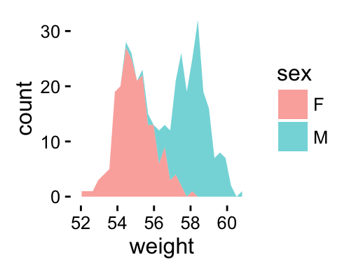
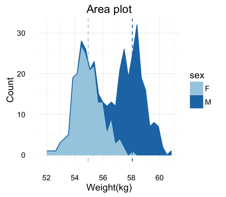
geom_area(): Create an area plot
# Basic plot
a + geom_area(stat = "bin")
# change fill colors by sex
a + geom_area(aes(fill = sex), stat ="bin", alpha=0.6) +
  theme_classic()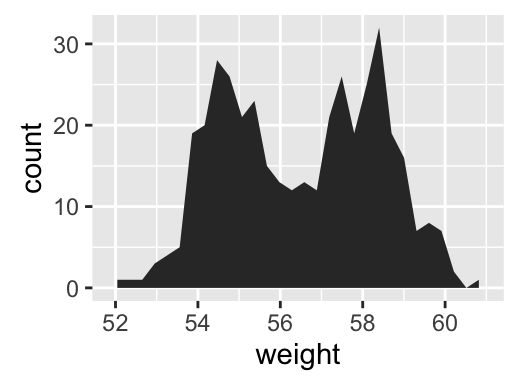
Note that, by default y axis corresponds to the count of weight values. If you want to change the plot in order to have the density on y axis, the R code would be as follow.
a + geom_area(aes(y = ..density..), stat ="bin")To customize the plot, the following arguments can be used: alpha, color, fill, linetype, size. Learn more here: ggplot2 area plot.
- Key function: geom_area()
- Alternative function: stat_bin()
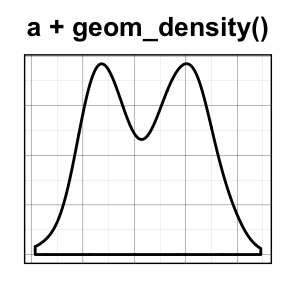
a + stat_bin(geom = "area")geom_density(): Create a smooth density estimate
We’ll use the following functions:
- geom_density() to create a density plot
- geom_vline() to add a vertical lines corresponding to group mean values
- scale_color_manual() to change the color manually by groups
# Basic plot
a + geom_density()
# change line colors by sex
a + geom_density(aes(color = sex))
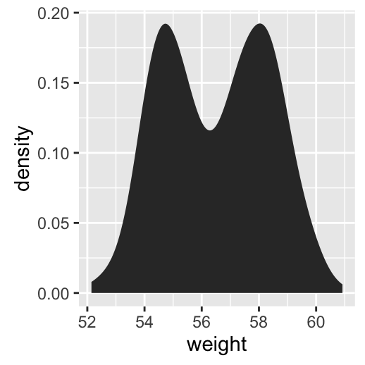
# Change fill color by sex
# Use semi-transparent fill: alpha = 0.4
a + geom_density(aes(fill = sex), alpha=0.4)
# Add mean line and Change color manually
a + geom_density(aes(color = sex)) +
geom_vline(data=mu, aes(xintercept=grp.mean, color=sex),
linetype="dashed") +
scale_color_manual(values=c("#999999", "#E69F00"))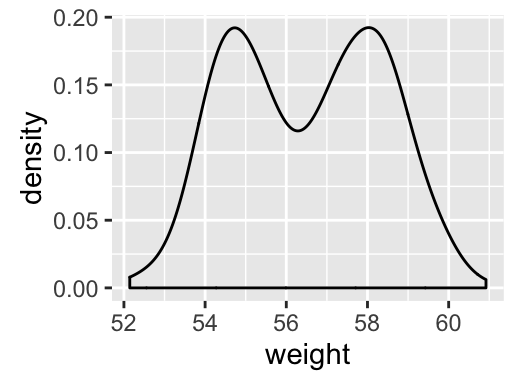

To customize the plot, the following arguments can be used: alpha, color, fill, linetype, size. Learn more here: ggplot2 density plot.
![]()
- Key function: geom_density()
- Alternative function: stat_density()
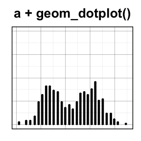
a + stat_density()geom_dotplot(): Dot plot
In a dot plot, dots are stacked with each dot representing one observation.
# Basic plot
a + geom_dotplot()
# change fill and color by sex
a + geom_dotplot(aes(fill = sex))
# Change fill color manually
a + geom_dotplot(aes(fill = sex)) +
  scale_fill_manual(values=c("#999999", "#E69F00"))
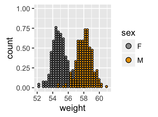
To customize the plot, the following arguments can be used: alpha, color, fill and dotsize. Learn more here: ggplot2 dot plot.
![]()
- Key functions: geom_dotplot()
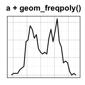
geom_freqpoly(): Frequency polygon
# Basic plot
a + geom_freqpoly()
# change y axis to density value
# and change theme
a + geom_freqpoly(aes(y = ..density..)) +
  theme_minimal()
# change color and linetype by sex
a + geom_freqpoly(aes(color = sex, linetype = sex)) +
  theme_minimal()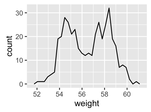
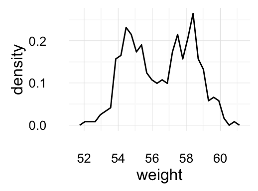
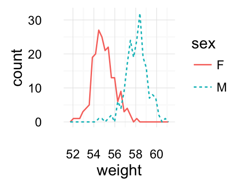
To customize the plot, the following arguments can be used: alpha, color, linetype and size.
- Key function: geom_freqpoly()
- Alternative function: stat_bin()
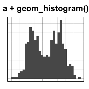
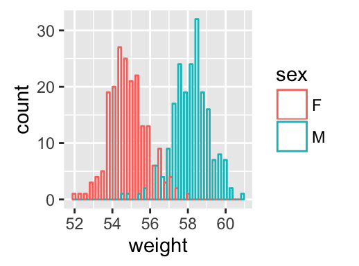
geom_histogram(): Histogram
# Basic plot
a + geom_histogram()
# change line colors by sex
a + geom_histogram(aes(color = sex), fill = "white",
position = "dodge") 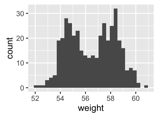
If you want to change the plot in order to have the density on y axis, the R code would be as follow.
a + geom_histogram(aes(y = ..density..))To customize the plot, the following arguments can be used: alpha, color, fill, linetype and size. Learn more here: ggplot2 histogram plot.
![]()
- Key functions: geom_histogram()
- Position adjustments: “identity” (or position_identity()), “stack” (or position_stack()), “dodge” ( or position_dodge()). Default value is “stack”
- Alternative function: stat_bin()
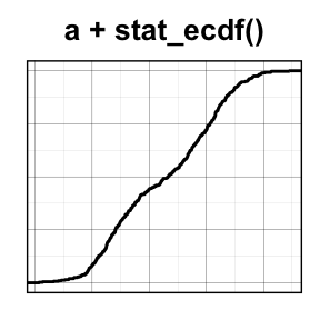
a + stat_bin(geom = "histogram")stat_ecdf(): Empirical Cumulative Density Function
a + stat_ecdf()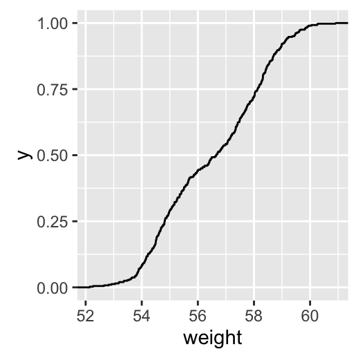
To customize the plot, the following arguments can be used: alpha, color, linetype and size. Learn more here: ggplot2 ECDF.
- Key function: stat_ecdf()
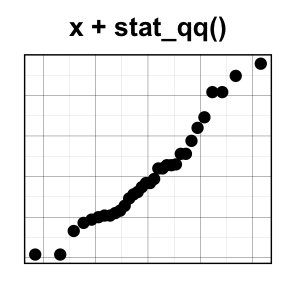
stat_qq(): quantile - quantile plot
ggplot(mtcars, aes(sample=mpg)) + stat_qq()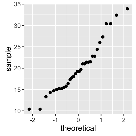
To customize the plot, the following arguments can be used: alpha, color, shape and size. Learn more here: ggplot2 quantile - quantile plot.
- Key function: stat_qq()
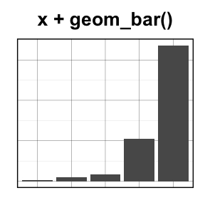
One variable: Discrete
The function geom_bar() can be used to visualize one discrete variable. In this case, the count of each level is plotted. We’ll use the mpg data set [in ggplot2 package]. The R code is as follow:
data(mpg)
b <- ggplot(mpg, aes(fl))
# Basic plot
b + geom_bar()
# Change fill color
b + geom_bar(fill = "steelblue", color ="steelblue") +
  theme_minimal()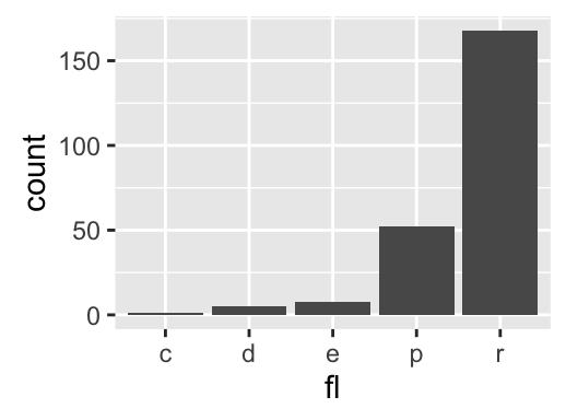
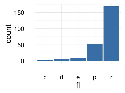
To customize the plot, the following arguments can be used: alpha, color, fill, linetype and size. Learn more here: ggplot2 bar plot.
![]()
- Key function: geom_bar()
- Alternative function: stat_count()
b + stat_count()Two variables: Continuous X, Continuous Y
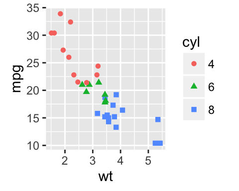
We’ll use the mtcars data set. The variable cyl is used as grouping variable.
data(mtcars)
mtcars$cyl <- as.factor(mtcars$cyl)
head(mtcars[, c("wt", "mpg", "cyl")])
## wt mpg cyl
## Mazda RX4 2.620 21.0 6
## Mazda RX4 Wag 2.875 21.0 6
## Datsun 710 2.320 22.8 4
## Hornet 4 Drive 3.215 21.4 6
## Hornet Sportabout 3.440 18.7 8
## Valiant 3.460 18.1 6We start by creating a plot, named b, that we’ll finish in the next section by adding a layer.
b <- ggplot(mtcars, aes(x = wt, y = mpg))Possible layers include:
- geom_point() for scatter plot
- geom_smooth() for adding smoothed line such as regression line
- geom_quantile() for adding quantile lines
- geom_rug() for adding a marginal rug
- geom_jitter() for avoiding overplotting
- geom_text() for adding textual annotations
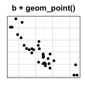

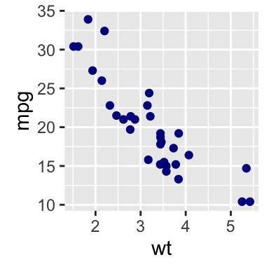
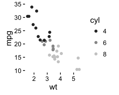
geom_point(): Scatter plot
# Basic plot
b + geom_point()
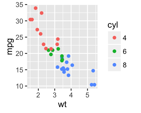
# change the color and the point
# by the levels of cyl variable
b + geom_point(aes(color = cyl, shape = cyl))
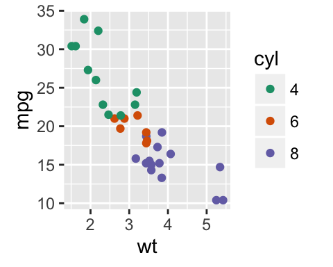
# Change color manually
b + geom_point(aes(color = cyl, shape = cyl)) +
scale_color_manual(values = c("#999999", "#E69F00", "#56B4E9"))+
theme_minimal()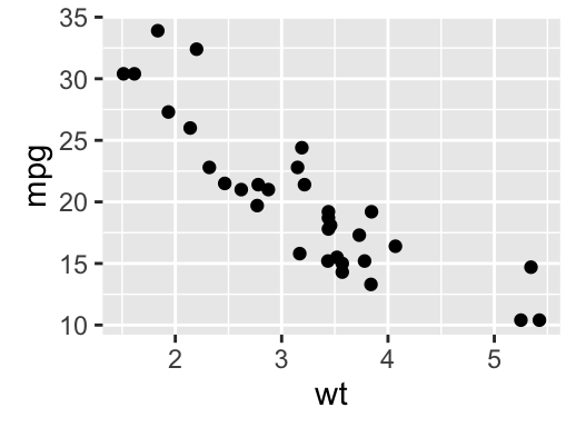

To customize the plot, the following arguments can be used: alpha, color, fill, shape and size. Learn more here: ggplot2 scatter plot.
![]()
- key function: geom_point()
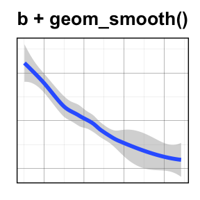
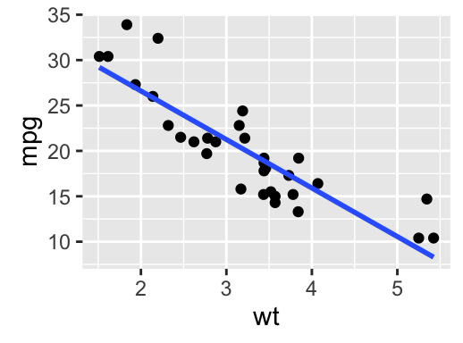
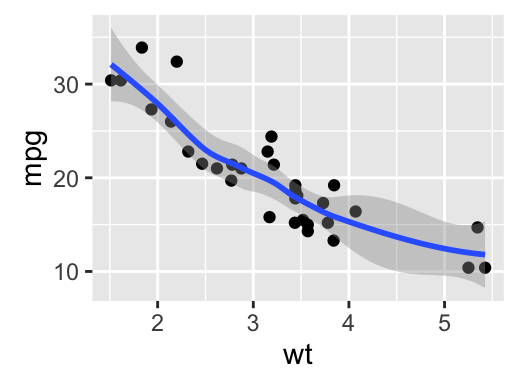
geom_smooth(): Add regression line or smoothed conditional mean
To add a regression line on a scatter plot, the function geom_smooth() is used in combination with the argument method = lm. lm stands for linear model.
# Regression line only
b + geom_smooth(method = lm)
# Point + regression line
# Remove the confidence interval
b + geom_point() +
geom_smooth(method = lm, se = FALSE)
# loess method: local regression fitting
b + geom_point() + geom_smooth()
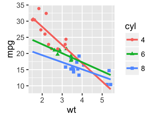
# Change color and shape by groups (cyl)
b + geom_point(aes(color=cyl, shape=cyl)) +
geom_smooth(aes(color=cyl, shape=cyl),
method=lm, se=FALSE, fullrange=TRUE)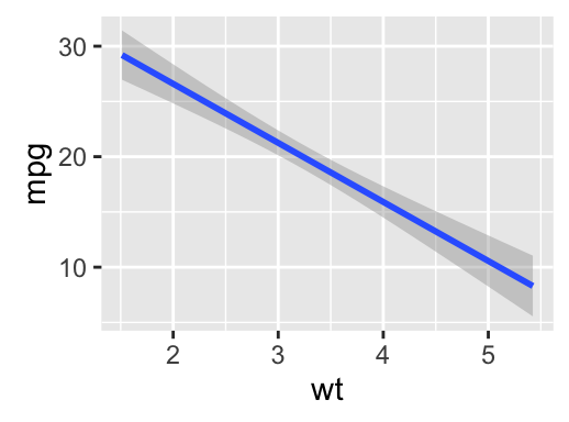
To customize the plot, the following arguments can be used: alpha, color, fill, shape , linetype and size. Learn more here: ggplot2 scatter plot
- key function: geom_smooth()
- Alternative function: stat_smooth()
b + stat_smooth(method = "lm")geom_quantile(): Add quantile lines from a quantile regression
Quantile lines can be used as a continuous analogue of a geom_boxplot().
We’ll use the mpg data set [in ggplot2].
The function geom_quantile() can be used for adding quantile lines:
ggplot(mpg, aes(cty, hwy)) +
  geom_point() + geom_quantile() +
  theme_minimal()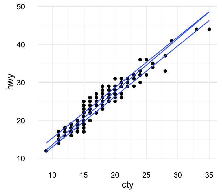
An alternative to geom_quantile() is the function stat_quantile():
ggplot(mpg, aes(cty, hwy)) +
  geom_point() + stat_quantile(quantiles = c(0.25, 0.5, 0.75))
To customize the plot, the following arguments can be used: alpha, color, linetype and size. Learn more here: Continuous quantiles
- Key function: geom_quantile()
- Alternative function: stat_quantile()
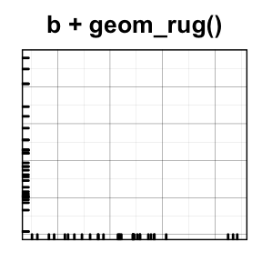
geom_rug(): Add marginal rug to scatter plots
We’ll use faithful data set.
# Add marginal rugs using faithful data
ggplot(faithful, aes(x=eruptions, y=waiting)) +
  geom_point() + geom_rug()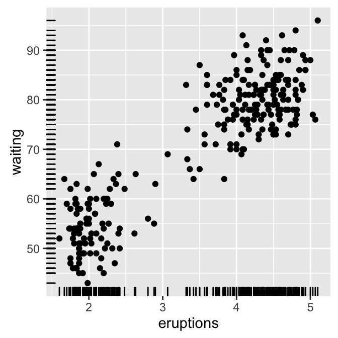
To customize the plot, the following arguments can be used: alpha, color, linetype and size. Learn more here: ggplot2 scatter plot
- key function: geom_rug()
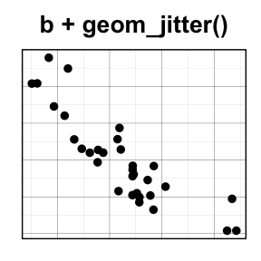
geom_jitter(): Jitter points to reduce overplotting
The function geom_jitter() is a convenient default for geom_point(position = ‘jitter’). The mpg data set [in ggplot2] is used in the following examples.
p <- ggplot(mpg, aes(displ, hwy))
# Default scatter plot
p + geom_point()
# Use jitter to reduce overplotting
p + geom_jitter(
    position = position_jitter(width = 0.5, height = 0.5))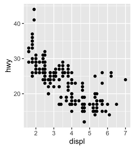
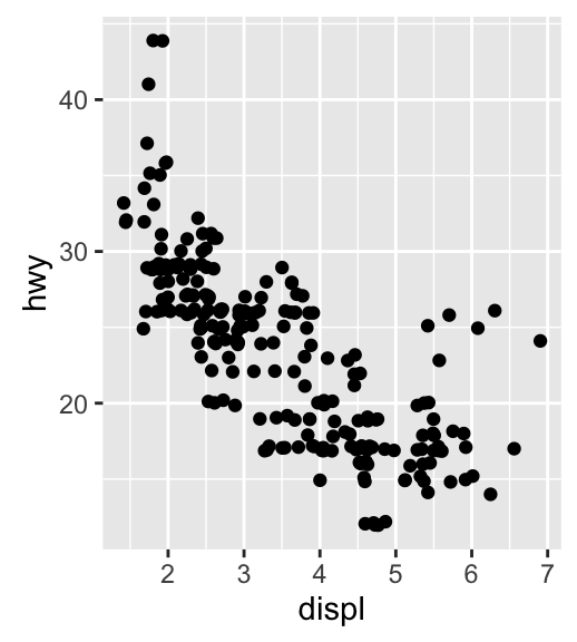
To adjust the extent of jittering, the function position_jitter() with the arguments width and height are used:
- width: degree of jitter in x direction.
- height: degree of jitter in y direction.
To customize the plot, the following arguments can be used: alpha, color, fill, shape and size. Learn more here: ggplot2 jitter
- Key functions: geom_jitter(), position_jitter()
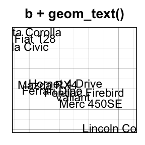
geom_text(): Textual annotations
The argument label is used to specify a vector of labels for point annotations.
b + geom_text(aes(label = rownames(mtcars)))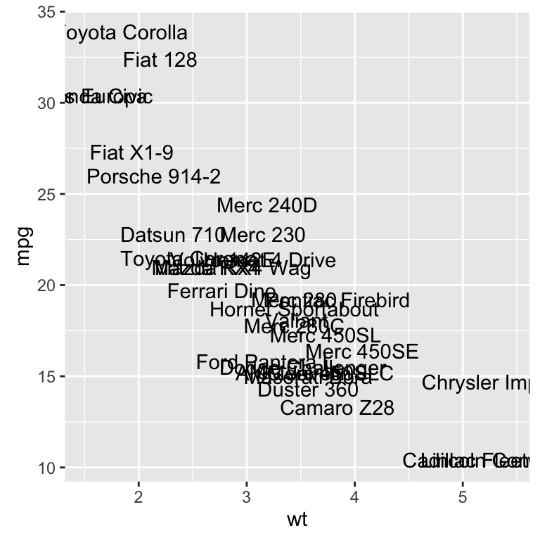
To customize the plot, the following arguments can be used: label, alpha, angle, color, family, fontface, hjust, lineheight, size, and vjust. Learn more here: ggplot2 add textual annotations
![]()
- key function: geom_text(), annotation_custom()
Two variables: Continuous bivariate distribution
We start by using the diamonds data set [in ggplot2].
data(diamonds)
head(diamonds[, c("carat", "price")])
## carat price
## 1 0.23 326
## 2 0.21 326
## 3 0.23 327
## 4 0.29 334
## 5 0.31 335
## 6 0.24 336We start by creating a plot, named c, that we’ll finish in the next section by adding a layer.
c <- ggplot(diamonds, aes(carat, price))Possible layers include:
- geom_bin2d() for adding a heatmap of 2d bin counts. Rectangular bining.
- geom_hex() for adding hexagon bining. The R package hexbin is required for this functionality
- geom_density_2d() for adding contours from a 2d density estimate
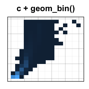
geom_bin2d(): Add heatmap of 2d bin counts
The function geom_bin2d() produces a scatter plot with rectangular bins. The number of observations is counted in each bins and displayed as a heatmap.
# Default plot
c + geom_bin2d()
# Change the number of bins
c + geom_bin2d(bins = 15)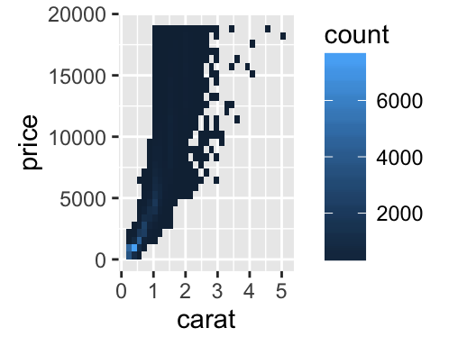
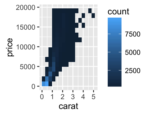
To customize the plot, the following arguments can be used: xmax, xmin, ymax, ymin, alpha, color, fill, linetype and size. Learn more here: ggplot2 Scatter plots with rectangular bins
- Key functions: geom_bin2d()
- Alternative functions: stat_bin_2d(), stat_summary_2d()
c + stat_bin_2d()
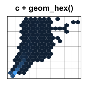
c + stat_summary_2d(aes(z = depth))geom_hex(): Add hexagon bining
The function geom_hex() produces a scatter plot with hexagon bining. The hexbin R package is required for hexagon bining. If you don’t have it, use the R code below to install it:
install.packages("hexbin")The function geom_hex() can be used as follow:
require(hexbin)
# Default plot
c + geom_hex()
# Change the number of bins
c + geom_hex(bins = 10)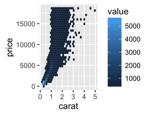
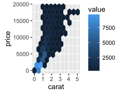
To customize the plot, the following arguments can be used: alpha, color, fill and size. Learn more here: ggplot2 Scatter plots with rectangular bins
- Key function: geom_hex()
- Alternative functions: stat_bin_hex(), stat_summary_hex()
c + stat_bin_hex()
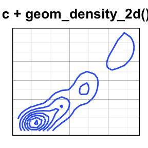
c + stat_summary_hex(aes(z = depth))geom_density_2d(): Add contours from a 2d density estimate
The functions geom_density_2d() or stat_density_2d() can be used to add 2d density estimate to a scatter plot.
faithful data set is used in this section, and we first start by creating a scatter plot (**sp*) as follow:
# Scatter plot
sp <- ggplot(faithful, aes(x=eruptions, y=waiting))
# Default plot
sp + geom_density_2d()
# Add points
sp + geom_point() + geom_density_2d()
# Use stat_density_2d with geom = "polygon"
sp + geom_point() +
stat_density_2d(aes(fill = ..level..), geom="polygon")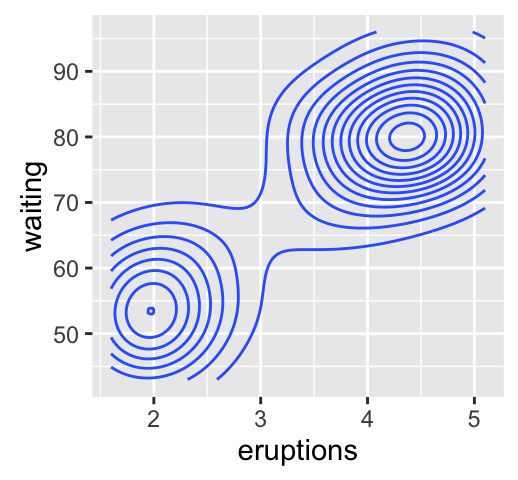
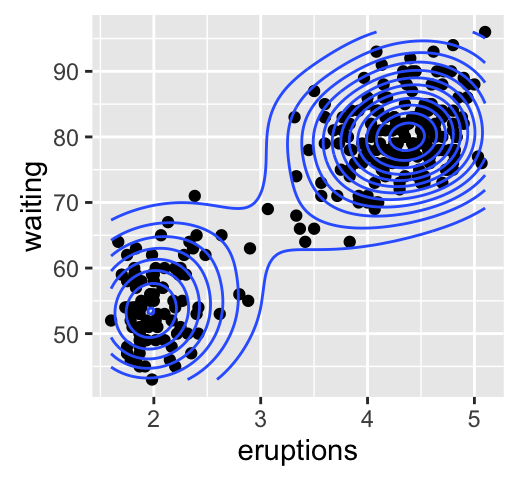
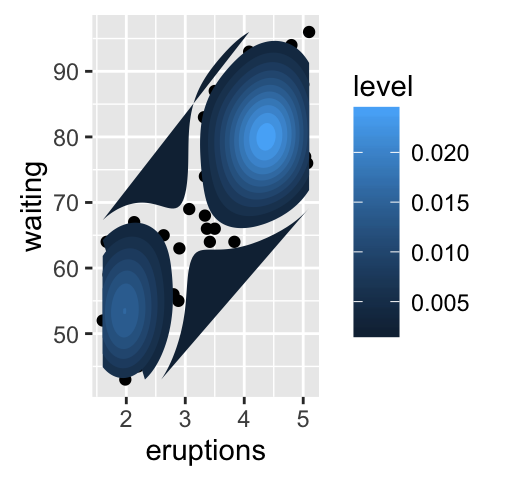
To customize the plot, the following arguments can be used: alpha, color, linetype and size. Learn more here: ggplot2 Scatter plots with the 2d density estimation
- Key function: geom_density_2d()
- Alternative functions: stat_density_2d()
sp + stat_density_2d()- See also: stat_contour(), geom_contour()
Two variables: Continuous function
In this section, we’ll see how to connect observations by line. The economics data set [in ggplot2] is used.
data(economics)
head(economics)
## date pce pop psavert uempmed unemploy
## 1 1967-07-01 507.4 198712 12.5 4.5 2944
## 2 1967-08-01 510.5 198911 12.5 4.7 2945
## 3 1967-09-01 516.3 199113 11.7 4.6 2958
## 4 1967-10-01 512.9 199311 12.5 4.9 3143
## 5 1967-11-01 518.1 199498 12.5 4.7 3066
## 6 1967-12-01 525.8 199657 12.1 4.8 3018We start by creating a plot, named d, that we’ll finish in the next section by adding a layer.
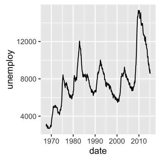
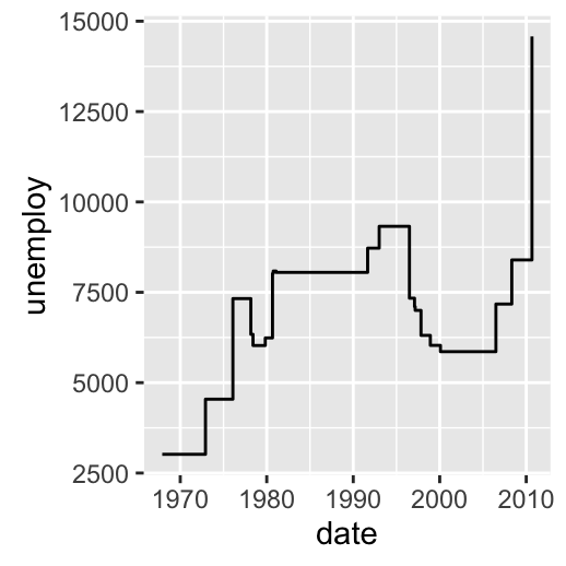
d <- ggplot(economics, aes(x = date, y = unemploy))Possible layers include:
- geom_area() for area plot
- geom_line() for line plot connecting observations, ordered by x
- geom_step() for connecting observations by stairs
# Area plot
d + geom_area()
# Line plot: connecting observations, ordered by x
d + geom_line()
# Connecting observations by stairs
# a subset of economics data set is used
set.seed(1234)
ss <- economics[sample(1:nrow(economics), 20), ]
ggplot(ss, aes(x = date, y = unemploy)) +
  geom_step()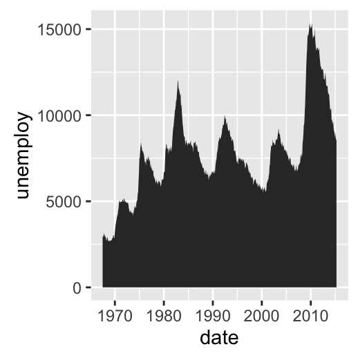
To customize the plot, the following arguments can be used: alpha, color, linetype, size and fill (for geom_area only). Learn more here: ggplot2 line plot.
![]()
- Key functions: geom_area(), geom_line(), geom_step()
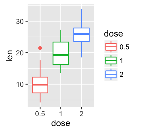
Two variables: Discrete X, Continuous Y
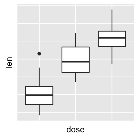
The ToothGrowth data set we’ll be used to plot the continuous variable len (for tooth length) by the discrete variable dose. The following R code converts the variable dose from a numeric to a discrete factor variable.
data("ToothGrowth")
ToothGrowth$dose <- as.factor(ToothGrowth$dose)
head(ToothGrowth)
## len supp dose
## 1 4.2 VC 0.5
## 2 11.5 VC 0.5
## 3 7.3 VC 0.5
## 4 5.8 VC 0.5
## 5 6.4 VC 0.5
## 6 10.0 VC 0.5We start by creating a plot, named e, that we’ll finish in the next section by adding a layer.
e <- ggplot(ToothGrowth, aes(x = dose, y = len))Possible layers include:
- geom_boxplot() for box plot
- geom_violin() for violin plot
- geom_dotplot() for dot plot
- geom_jitter() for stripchart
- geom_line() for line plot
- geom_bar() for bar plot
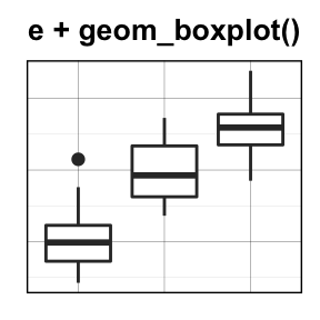
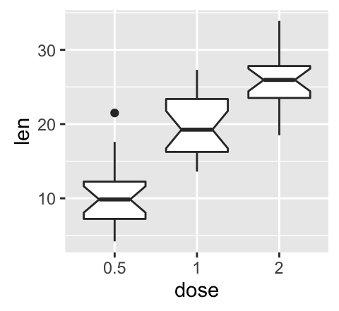
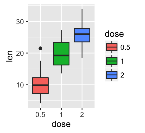
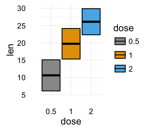
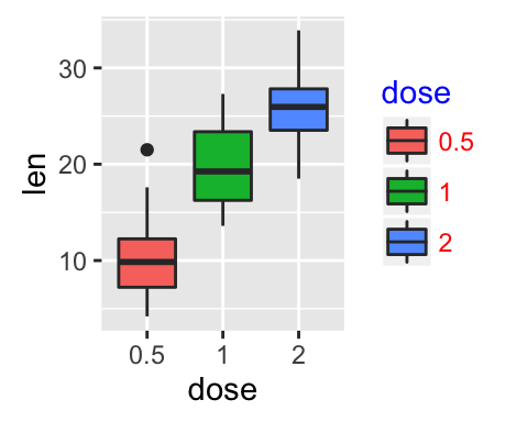
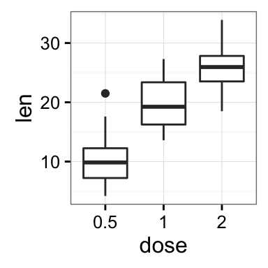
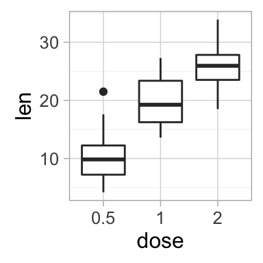
geom_boxplot(): Box and whiskers plot
# Default plot
e + geom_boxplot()
# Notched box plot
e + geom_boxplot(notch = TRUE)
# Color by group (dose)
e + geom_boxplot(aes(color = dose))
# Change fill color by group (dose)
e + geom_boxplot(aes(fill = dose))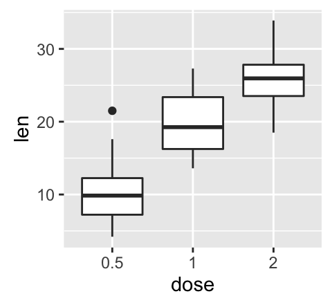
# Box plot with multiple groups
ggplot(ToothGrowth, aes(x=dose, y=len, fill=supp)) +
  geom_boxplot()
To customize the plot, the following arguments can be used: alpha, color, linetype, shape, size and fill. Learn more here: ggplot2 box plot.
![]()
- Key function: geom_boxplot()
- Alternative functions: stat_boxplot()
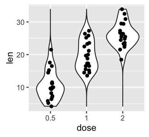
e + stat_boxplot(coeff = 1.5)geom_violin(): Violin plot
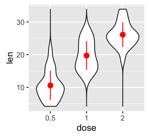
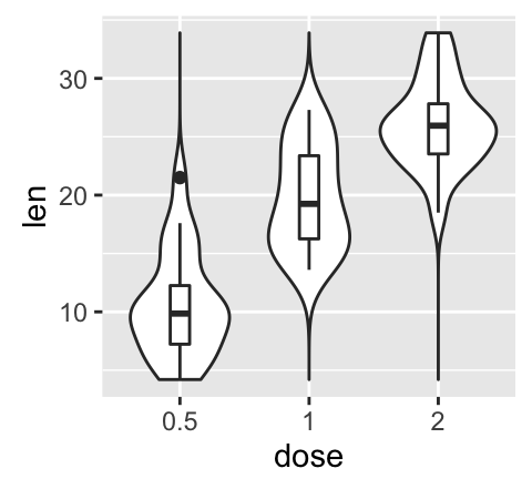
Violin plots are similar to box plots, except that they also show the kernel probability density of the data at different values.
# Default plot
e + geom_violin(trim = FALSE)
# violin plot with mean points (+/- SD)
e + geom_violin(trim = FALSE) +
  stat_summary(fun.data="mean_sdl",  fun.args = list(mult=1),
               geom="pointrange", color = "red")
# Combine with box plot
e + geom_violin(trim = FALSE) +
  geom_boxplot(width = 0.2)
# Color by group (dose)
e + geom_violin(aes(color = dose), trim = FALSE)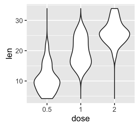
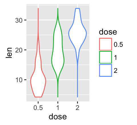
To customize the plot, the following arguments can be used: alpha, color, linetype, size and fill. Learn more here: ggplot2 violin plot.
![]()
- Key functions: geom_violin()
- Alternative functions: stat_ydensity()
e + stat_ydensity(trim = FALSE)geom_dotplot(): Dot plot
# Default plot
e + geom_dotplot(binaxis = "y", stackdir = "center")
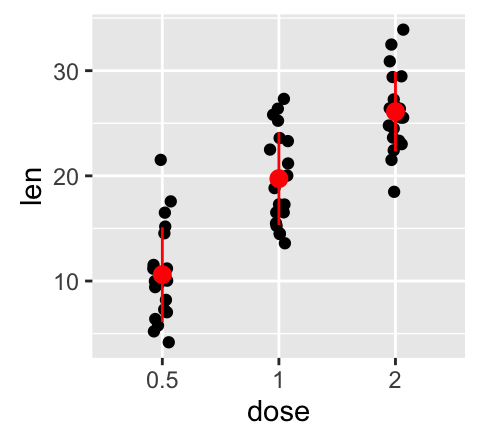
# Dot plot with mean points (+/- SD)
e + geom_dotplot(binaxis = "y", stackdir = "center") +
stat_summary(fun.data="mean_sdl", fun.args = list(mult=1),
geom="pointrange", color = "red")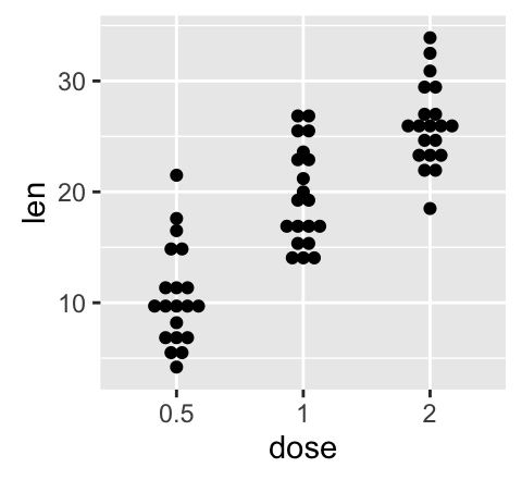

# Combine with box plot
e + geom_boxplot() +
  geom_dotplot(binaxis = "y", stackdir = "center")
# Add violin plot
e + geom_violin(trim = FALSE) +
  geom_dotplot(binaxis='y', stackdir='center')

# Color and fill by group (dose)
e + geom_dotplot(aes(color = dose, fill = dose),
                 binaxis = "y", stackdir = "center")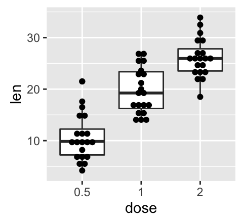
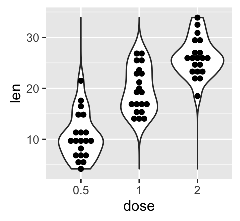
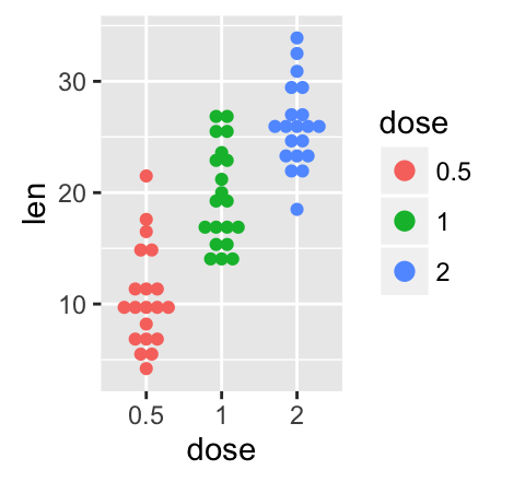
To customize the plot, the following arguments can be used: alpha, color, dotsize and fill. Learn more here: ggplot2 dot plot.
![]()
- Key functions: geom_dotplot(), stat_summary()
geom_jitter(): Strip charts
Stripcharts are also known as one dimensional scatter plots. These plots are suitable compared to box plots when sample sizes are small.
# Default plot
e + geom_jitter(position=position_jitter(0.2))
# Strip charts with mean points (+/- SD)
e + geom_jitter(position=position_jitter(0.2)) +
  stat_summary(fun.data="mean_sdl",  fun.args = list(mult=1),
               geom="pointrange", color = "red")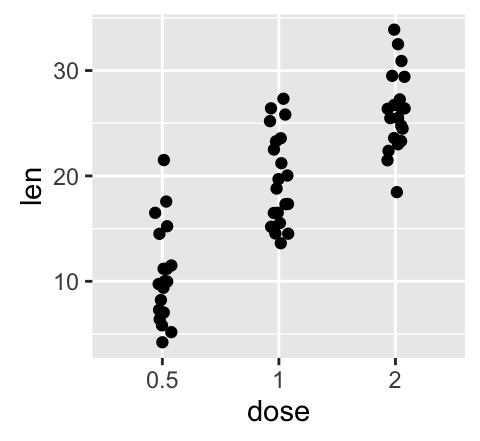
# Combine with box plot
e + geom_jitter(position=position_jitter(0.2)) +
  geom_dotplot(binaxis = "y", stackdir = "center")
# Add violin plot
e + geom_violin(trim = FALSE) +
  geom_jitter(position=position_jitter(0.2))

# Change color and shape by group (dose)
e +  geom_jitter(aes(color = dose, shape = dose),
                 position=position_jitter(0.2))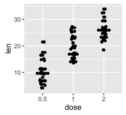

To customize the plot, the following arguments can be used: alpha, color, shape, size and fill. Learn more here: ggplot2 strip charts.
![]()
- Key functions: geom_jitter(), stat_summary()
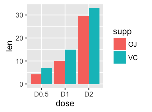
geom_line(): Line plot
Data derived from ToothGrowth data sets are used.
df <- data.frame(supp=rep(c("VC", "OJ"), each=3),
                dose=rep(c("D0.5", "D1", "D2"),2),
                len=c(6.8, 15, 33, 4.2, 10, 29.5))
head(df)
## supp dose len
## 1 VC D0.5 6.8
## 2 VC D1 15.0
## 3 VC D2 33.0
## 4 OJ D0.5 4.2
## 5 OJ D1 10.0
## 6 OJ D2 29.5In the graphs below, line types and point shapes are controlled automatically by the levels of the variable supp :
# Change line types by groups (supp)
ggplot(df, aes(x=dose, y=len, group=supp)) +
  geom_line(aes(linetype=supp))+
  geom_point()
# Change line types, point shapes and colors
ggplot(df, aes(x=dose, y=len, group=supp)) +
  geom_line(aes(linetype=supp, color = supp))+
  geom_point(aes(shape=supp, color = supp))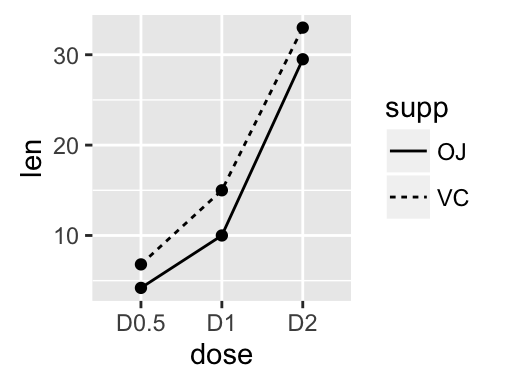
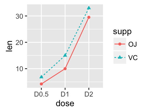
To customize the plot, the following arguments can be used: alpha, color, linetype and size. Learn more here: ggplot2 line plot.
![]()
- Key functions: geom_line(), geom_step()
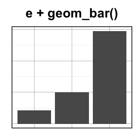
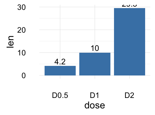
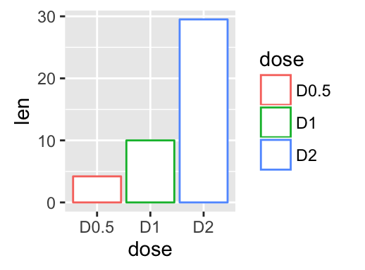
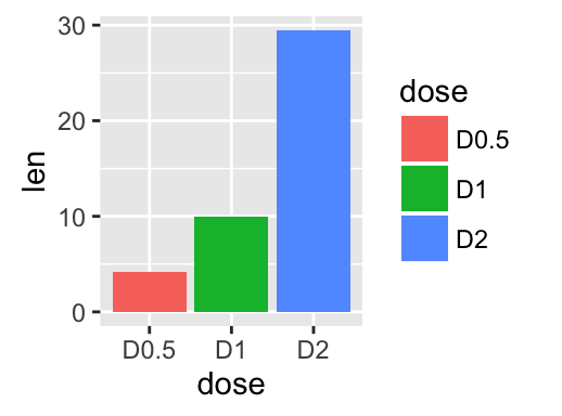
geom_bar(): Bar plot
Data derived from ToothGrowth data sets are used.
df <- data.frame(dose=c("D0.5", "D1", "D2"),
                len=c(4.2, 10, 29.5))
head(df)
## dose len
## 1 D0.5 4.2
## 2 D1 10.0
## 3 D2 29.5df2 <- data.frame(supp=rep(c("VC", "OJ"), each=3),
dose=rep(c("D0.5", "D1", "D2"),2),
len=c(6.8, 15, 33, 4.2, 10, 29.5))
head(df2)## supp dose len
## 1 VC D0.5 6.8
## 2 VC D1 15.0
## 3 VC D2 33.0
## 4 OJ D0.5 4.2
## 5 OJ D1 10.0
## 6 OJ D2 29.5We start by creating a simple bar plot (named f) using the df data set:
f <- ggplot(df, aes(x = dose, y = len))# Basic bar plot
f + geom_bar(stat = "identity")
# Change fill color and add labels
f + geom_bar(stat="identity", fill="steelblue")+
geom_text(aes(label=len), vjust=-0.3, size=3.5)+
theme_minimal()
# Change bar plot line colors by groups
f + geom_bar(aes(color = dose),
stat="identity", fill="white")
# Change bar plot fill colors by groups
f + geom_bar(aes(fill = dose), stat="identity")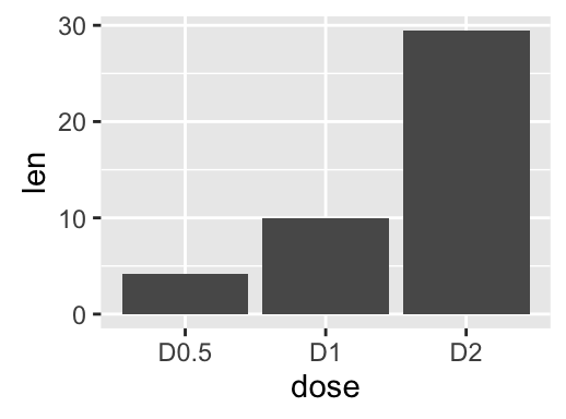
Bar plot with multiple groups:
g <- ggplot(data=df2, aes(x=dose, y=len, fill=supp))
# Stacked bar plot
g + geom_bar(stat = "identity")
# Use position=position_dodge()
g + geom_bar(stat="identity", position=position_dodge())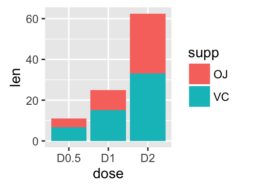
To customize the plot, the following arguments can be used: alpha, color, fill, linetype and size. Learn more here: ggplot2 bar plot.
![]()
- Key function: geom_bar()
- Alternative function: stat_identity()
g + stat_identity(geom = "bar")
g + stat_identity(geom = "bar", position = "dodge")
Two variables: Discrete X, Discrete Y
The diamonds data set [in ggplot2] we’ll be used to plot the discrete variable color (for diamond colors) by the discrete variable cut (for diamond cut types). The plot is created using the function geom_jitter().
ggplot(diamonds, aes(cut, color)) +
  geom_jitter(aes(color = cut), size = 0.5)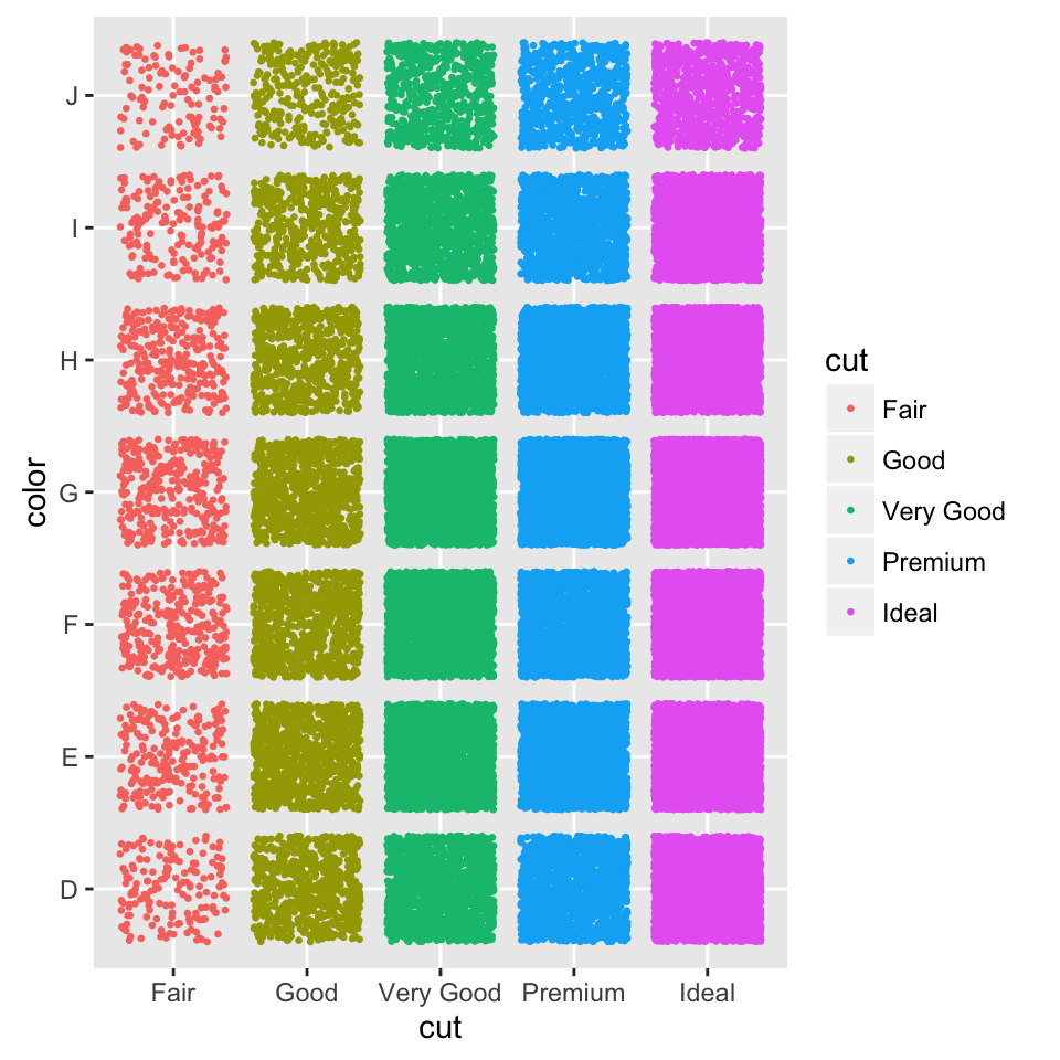
To customize the plot, the following arguments can be used: alpha, color, fill, shape and size.
- Key function: geom_jitter()
Two variables: Visualizing error
The ToothGrowth data set we’ll be used. We start by creating a data set named df which holds ToothGrowth data.
# ToothGrowth data set
df <- ToothGrowth
df$dose <- as.factor(df$dose)
head(df)
## len supp dose
## 1 4.2 VC 0.5
## 2 11.5 VC 0.5
## 3 7.3 VC 0.5
## 4 5.8 VC 0.5
## 5 6.4 VC 0.5
## 6 10.0 VC 0.5The helper function below (data_summary()) will be used to calculate the mean and the standard deviation (used as error), for the variable of interest, in each group. The plyr package is required.
# Calculate the mean and the SD in each group
#+++++++++++++++++++++++++
# data : a data frame
# varname : the name of the variable to be summariezed
# grps : column names to be used as grouping variables
data_summary <- function(data, varname, grps){
  require(plyr)
  summary_func <- function(x, col){
    c(mean = mean(x[[col]], na.rm=TRUE),
      sd = sd(x[[col]], na.rm=TRUE))
  }
  data_sum<-ddply(data, grps, .fun=summary_func, varname)
  data_sum <- rename(data_sum, c("mean" = varname))
 return(data_sum)
}
Using the function data_summary(), the following R code creates a data set named df2 which holds the mean and the SD of tooth length (len) by groups (dose).
df2 <- data_summary(df, varname="len", grps= "dose")
# Convert dose to a factor variable
df2$dose=as.factor(df2$dose)
head(df2)
## dose len sd
## 1 0.5 10.605 4.499763
## 2 1 19.735 4.415436
## 3 2 26.100 3.774150We start by creating a plot, named f, that we’ll finish in the next section by adding a layer.
f <- ggplot(df2, aes(x = dose, y = len,
                     ymin = len-sd, ymax = len+sd))
Possible layers include:
- geom_crossbar() for hollow bar with middle indicated by horizontal line
- geom_errorbar() for error bars
- geom_errorbarh() for horizontal error bars
- geom_linerange() for drawing an interval represented by a vertical line
- geom_pointrange() for creating an interval represented by a vertical line, with a point in the middle.

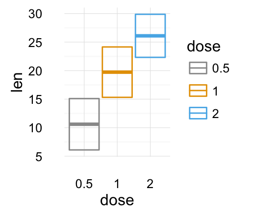
geom_crossbar(): Hollow bar with middle indicated by horizontal line
We’ll use the data set named df2, which holds the mean and the SD of tooth length (len) by groups (dose).
# Default plot
f + geom_crossbar()
# color by groups
f + geom_crossbar(aes(color = dose))
# Change color manually
f + geom_crossbar(aes(color = dose)) +
  scale_color_manual(values = c("#999999", "#E69F00", "#56B4E9"))+
  theme_minimal()
# fill by groups and change color manually
f + geom_crossbar(aes(fill = dose)) +
  scale_fill_manual(values = c("#999999", "#E69F00", "#56B4E9"))+
  theme_minimal()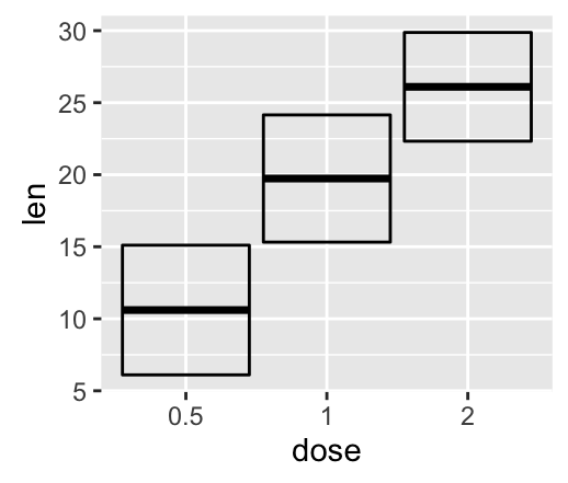
Cross bar with multiple groups: Using the function data_summary(), we start by creating a data set named df3 which holds the mean and the SD of tooth length (len) by 2 groups (supp and dose).
df3 <- data_summary(df, varname="len", grps= c("supp", "dose"))
head(df3)
## supp dose len sd
## 1 OJ 0.5 13.23 4.459709
## 2 OJ 1 22.70 3.910953
## 3 OJ 2 26.06 2.655058
## 4 VC 0.5 7.98 2.746634
## 5 VC 1 16.77 2.515309
## 6 VC 2 26.14 4.797731The data set df3 is used to create cross bars with multiple groups. For this end, the variable len is plotted by dose and the color is changed by the levels of the factor supp.
f <- ggplot(df3, aes(x = dose, y = len,
                     ymin = len-sd, ymax = len+sd))
# Default plot
f + geom_crossbar(aes(color = supp))
# Use position_dodge() to avoid overlap
f + geom_crossbar(aes(color = supp),
                  position = position_dodge(1))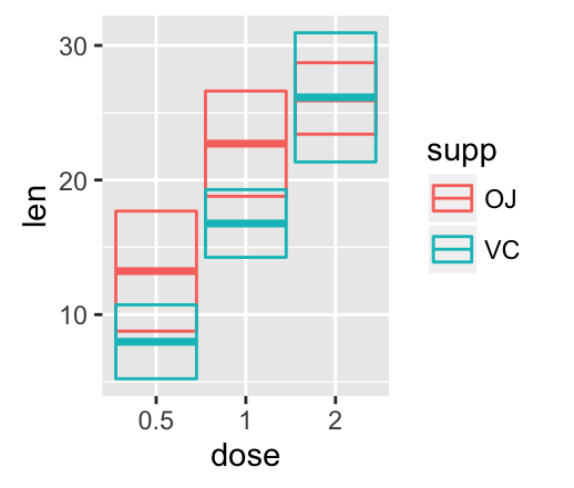
A simple alternative to geom_crossbar() is to use the function stat_summary() as follow. In this case, the mean and the SD can be computed automatically.
f <- ggplot(df, aes(x = dose, y = len, color = supp))
# Use geom_crossbar()
f + stat_summary(fun.data="mean_sdl", fun.args = list(mult=1),
                 geom="crossbar", width = 0.6,
                 position = position_dodge(0.8))
To customize the plot, the following arguments can be used: alpha, color, fill, linetype and size. Learn more here: ggplot2 error bars.
- Key functions: geom_crossbar(), stat_summary()
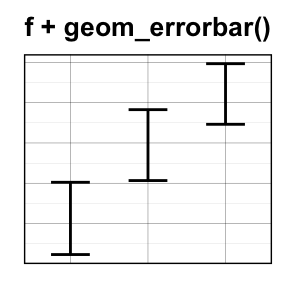
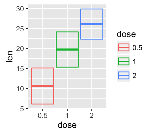
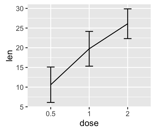
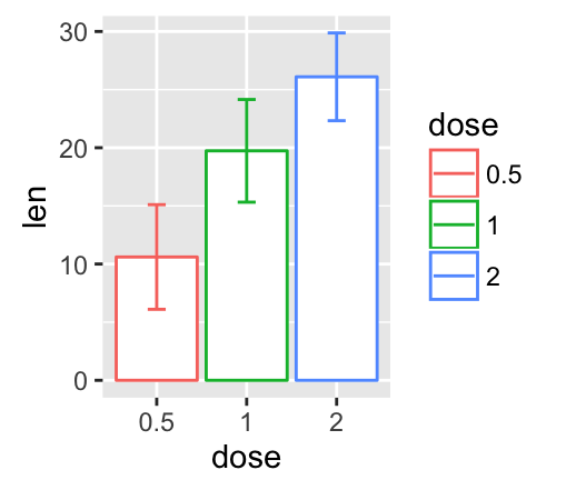
geom_errorbar(): Error bars
We’ll use the data set named df2, which holds the mean and the SD of tooth length (len) by groups (dose).
We start by creating a plot, named f, that we’ll finish next by adding a layer.
f <- ggplot(df2, aes(x = dose, y = len,
                     ymin = len-sd, ymax = len+sd))
# Error bars colored by groups
f + geom_errorbar(aes(color = dose), width = 0.2)
# Combine with line plot
f + geom_line(aes(group = 1)) +
geom_errorbar(width = 0.2)
# Combine with bar plot, color by groups
f + geom_bar(aes(color = dose), stat = "identity", fill ="white") +
geom_errorbar(aes(color = dose), width = 0.2)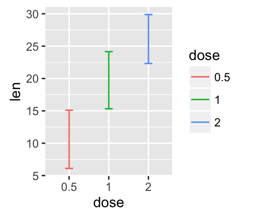
Error bars with multiple groups:
The data set df3 is used to create cross bars with multiple groups. For this end, the variable len is plotted by dose and the color is changed by the levels of the factor supp.
f <- ggplot(df3, aes(x = dose, y = len,
                     ymin = len-sd, ymax = len+sd))
# Default plot
f + geom_bar(aes(fill = supp), stat = "identity",
             position = "dodge") +
  geom_errorbar(aes(color = supp),  position = "dodge")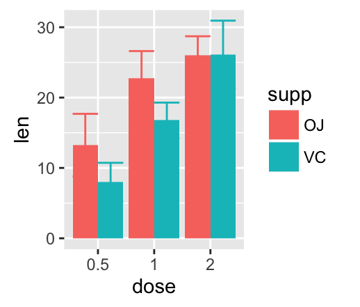
To customize the plot, the following arguments can be used: alpha, color, linetype, size and width.
Learn more here:
![]()
![]()
- Key functions: geom_errorbar(), stat_summary()
geom_errorbarh(): Horizontal error bars
We’ll use the data set named df2, which holds the mean and the SD of tooth length (len) by groups (dose):
df2 <- data_summary(ToothGrowth, varname="len", grps = "dose")
head(df2)
## dose len sd
## 1 0.5 10.605 4.499763
## 2 1 19.735 4.415436
## 3 2 26.100 3.774150We start by creating a plot, named f, that we’ll finish next by adding a layer.
f <- ggplot(df2, aes(x = len, y = dose ,
                     xmin=len-sd, xmax=len+sd))
The arguments xmin and xmax are used for horizontal error bars.
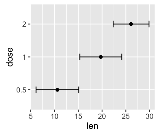
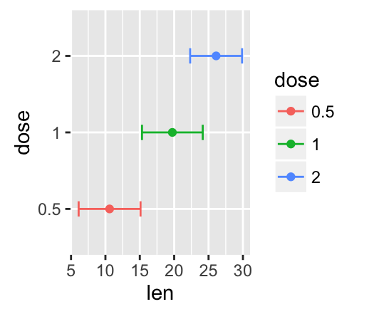
To customize the plot, the following arguments can be used: alpha, color, linetype, size and height.
- Key functions: geom_errorbarh()
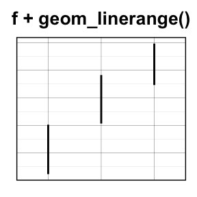
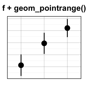
geom_linerange() and geom_pointrange(): An interval represented by a vertical line
- geom_linerange(): Add an interval represented by a vertical line
- geom_pointrange(): Add an interval represented by a vertical line with a point in the middle
We’ll use the data set df2.
f <- ggplot(df2, aes(x = dose, y = len,
                     ymin=len-sd, ymax=len+sd))
# Line range
f + geom_linerange()
# Point range
f + geom_pointrange()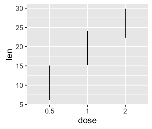
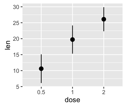
To customize the plot, the following arguments can be used: alpha, color, linetype, size, shape and fill (for geom_pointrange()).
Combine geom_dotplot and error bars
It’s also possible to combine geom_dotplot() and error bars. We’ll use the ToothGrowth data set. You don’t need to compute the mean and SD. This can be done automatically by using the function stat_summary() in combination with the argument fun.data = “mean_sdl”.
We start by creating a dot plot, named g, that we’ll finish in the next section by adding error bar layers.
g <- ggplot(df, aes(x=dose, y=len)) +
  geom_dotplot(binaxis='y', stackdir='center')
# use geom_crossbar()
g + stat_summary(fun.data="mean_sdl", fun.args = list(mult=1),
geom="crossbar", width=0.5)
# Use geom_errorbar()
g + stat_summary(fun.data=mean_sdl, fun.args = list(mult=1),
geom="errorbar", color="red", width=0.2) +
stat_summary(fun.y=mean, geom="point", color="red")
# Use geom_pointrange()
g + stat_summary(fun.data=mean_sdl, fun.args = list(mult=1),
geom="pointrange", color="red")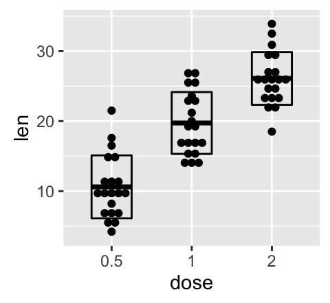

To customize the plot, the following arguments can be used: alpha, color, fill, linetype and size. Learn more here: ggplot2 error bars.
- Key functions: geom_errorbarh(), geom_errorbar(), geom_linerange(), geom_pointrange(), geom_crossbar(), stat_summary()
Two variables: Maps
The function geom_map() can be used to create a map with ggplot2. The R package map is required. It contains geographical information useful for drawing easily maps in ggplot2.
Install map package (if you don’t have it):
install.packages("map")In the following R code, we’ll create USA map and USArrests crime data to shade each region.
# Prepare the data
crimes <- data.frame(state = tolower(rownames(USArrests)),
                     USArrests)
library(reshape2) # for melt
crimesm <- melt(crimes, id = 1)
# Get map data
require(maps)
map_data <- map_data("state")
# Plot the map with Murder data
ggplot(crimes, aes(map_id = state)) +
  geom_map(aes(fill = Murder), map = map_data) +
  expand_limits(x = map_data$long, y = map_data$lat)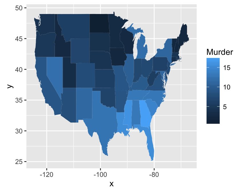
To customize the plot, the following arguments can be used: alpha, color, fill, linetype and size. Learn more here: ggplot2 map.
Key function: geom_map()
Three variables
The mtcars data set we’ll be used. We first compute a correlation matrix, which will be visualized using specific ggplot2 functions.
Prepare the data:
df <- mtcars[, c(1,3,4,5,6,7)]
# Correlation matrix
cormat <- round(cor(df),2)
# Melt the correlation matrix
require(reshape2)
cormat <- melt(cormat)
head(cormat)
## Var1 Var2 value
## 1 mpg mpg 1.00
## 2 disp mpg -0.85
## 3 hp mpg -0.78
## 4 drat mpg 0.68
## 5 wt mpg -0.87
## 6 qsec mpg 0.42We start by creating a plot, named g, that we’ll finish in the next section by adding a layer.
g <- ggplot(cormat, aes(x = Var1, y = Var2))Possible layers include:
- geom_tile(): Tile plane with rectangles (similar to levelplot and image)
- geom_raster(): High-performance rectangular tiling. This is a special case of geom_tile where all tiles are the same size.
We’ll use the function geom_tile() to visualize a correlation matrix.
Compute and visualize correlation matrix:
# 1. Compute correlation
cormat <- round(cor(df),2)
# 2. Reorder the correlation matrix by
# Hierarchical clustering
hc <- hclust(as.dist(1-cormat)/2)
cormat.ord <- cormat[hc$order, hc$order]
# 3. Get the upper triangle
cormat.ord[lower.tri(cormat.ord)]<- NA
# 4. Melt the correlation matrix
require(reshape2)
melted_cormat <- melt(cormat.ord, na.rm = TRUE)
# Create the heatmap
ggplot(melted_cormat, aes(Var2, Var1, fill = value))+
  geom_tile(color = "white")+
  scale_fill_gradient2(low = "blue", high = "red", mid = "white",
   midpoint = 0, limit = c(-1,1), space = "Lab",
   name="Pearson\nCorrelation") + # Change gradient color
  theme_minimal()+ # minimal theme
 theme(axis.text.x = element_text(angle = 45, vjust = 1,
                                  size = 12, hjust = 1))+
 coord_fixed()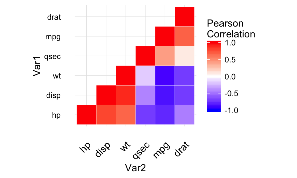
To customize the plot, the following arguments can be used: alpha, color, fill, linetype and size. Learn more here: ggplot2 correlation matrix heatmap.
- Key functions: geom_tile(), geom_raster()
Graphical primitives: polygon, path, ribbon, segment, rectangle
This section describes how to add graphical elements to a plot. The functions below we’ll be used:
- geom_polygon(): Add polygon, a filled path
- geom_path(): Connect observations in original order
- geom_ribbon(): Add ribbons, y range with continuous x values.
- geom_segment(): Add a single line segments
- geom_curve(): Add curves
- geom_rect(): Add a 2d rectangles.
- The R code below draws France map using geom_polygon():
require(maps)
france = map_data('world', region = 'France')
ggplot(france, aes(x = long, y = lat, group = group)) +
  geom_polygon(fill = 'white', colour = 'black')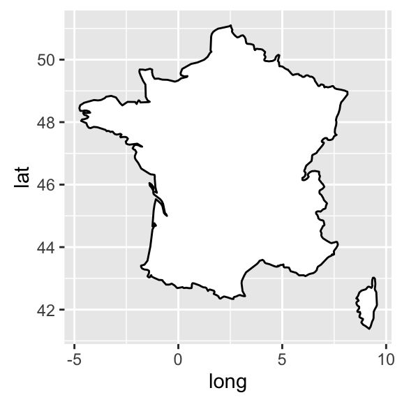
To customize the plot, the following arguments can be used: alpha, color, fill, linetype and size.
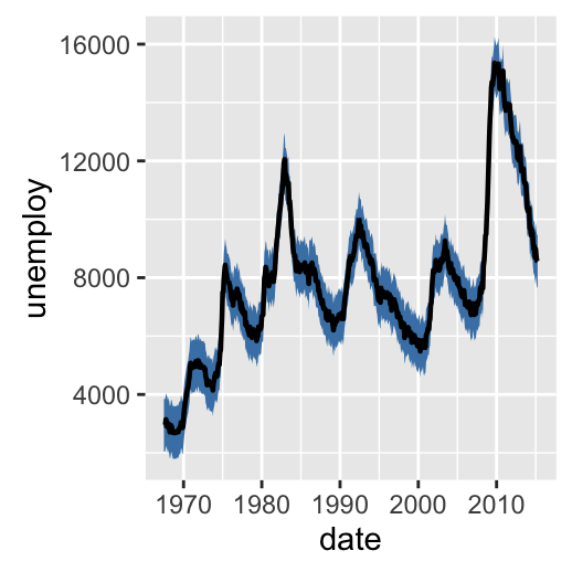
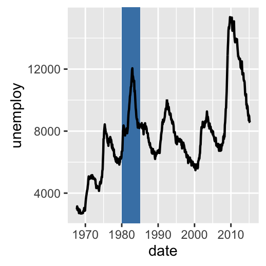
- The following R code uses econimics data [in ggplot2] and produces path, ribbon and rectangles.
h <- ggplot(economics, aes(date, unemploy))
# Path
h + geom_path()
# Ribbon
h + geom_ribbon(aes(ymin = unemploy-900, ymax = unemploy+900),
                fill = "steelblue") +
  geom_path(size = 0.8)
# Rectangle
h + geom_rect(aes(xmin = as.Date('1980-01-01'), ymin = -Inf,
                 xmax = as.Date('1985-01-01'), ymax = Inf),
             fill = "steelblue") +
geom_path(size = 0.8) 
To customize the plot, the following arguments can be used: alpha, color, fill (for ribbon only), linetype and size.
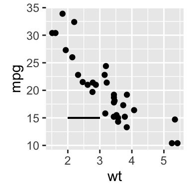
- Add line segments between points (x1, y1) and (x2, y2):
# Create a scatter plot
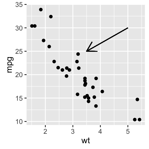
i <- ggplot(mtcars, aes(wt, mpg)) + geom_point()
# Add segment
i + geom_segment(aes(x = 2, y = 15, xend = 3, yend = 15))
# Add arrow
require(grid)
i + geom_segment(aes(x = 5, y = 30, xend = 3.5, yend = 25),
arrow = arrow(length = unit(0.5, "cm")))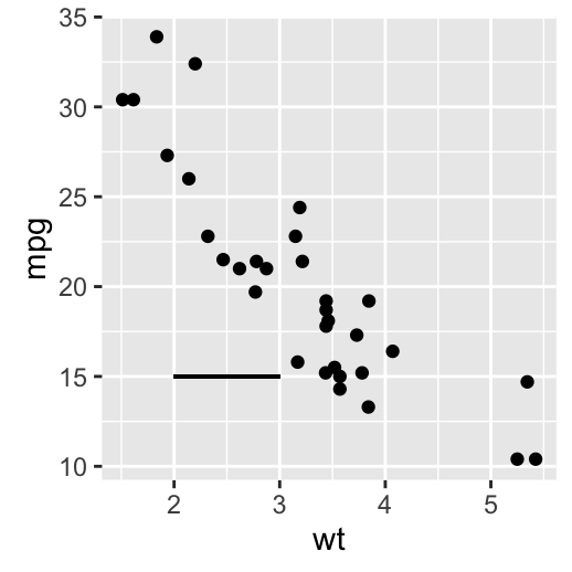
To customize the plot, the following arguments can be used: alpha, color, linetype and size. Learn more here: ggplot2 add line segment.
- Add curves between points (x1, y1) and (x2, y2):
i + geom_curve(aes(x = 2, y = 15, xend = 3, yend = 15))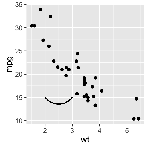
- Key functions: geom_path(), geom_ribbon(), geom_rect(), geom_segment()
Graphical parameters
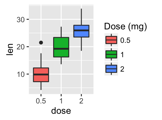
Main title, axis labels and legend title
We start by creating a box plot using the data set ToothGrowth:
# Convert the variable dose from numeric to factor variable
ToothGrowth$dose <- as.factor(ToothGrowth$dose)
p <- ggplot(ToothGrowth, aes(x=dose, y=len)) + geom_boxplot()
The function below can be used for changing titles and labels:
- p + ggtitle(“New main title”): Adds a main title above the plot
- p + xlab(“New X axis label”): Changes the X axis label
- p + ylab(“New Y axis label”): Changes the Y axis label
- p + labs(title = “New main title”, x = “New X axis label”, y = “New Y axis label”): Changes main title and axis labels
The function labs() can be also used to change the legend title.
- Change main title and axis labels
# Default plot
print(p)
# Change title and axis labels
p <- p +labs(title="Plot of length \n by dose",
        x ="Dose (mg)", y = "Teeth length")
p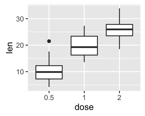
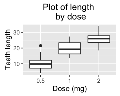
Note that, \n is used to split long title into multiple lines.
- Change the appearance of labels:
To change the appearance(color, size and face ) of labels, the functions theme() and element_text() can be used.
The function element_blank() hides the labels.
# Change the appearance of labels
p + theme(
plot.title = element_text(color="red", size=14, face="bold.italic"),
axis.title.x = element_text(color="blue", size=14, face="bold"),
axis.title.y = element_text(color="#993333", size=14, face="bold")
)
# Hide labels
p + theme(plot.title = element_blank(),
          axis.title.x = element_blank(),
          axis.title.y = element_blank())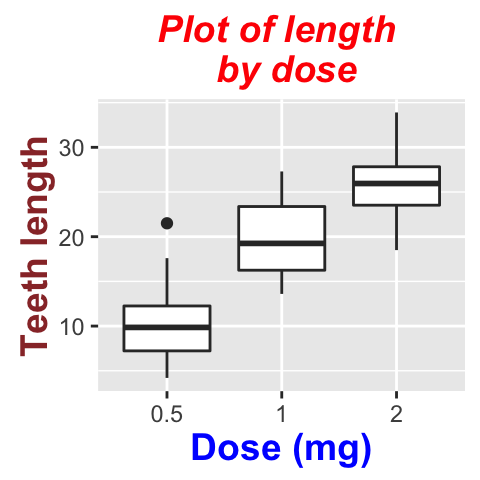
- Change legend titles: Scale functions (fill, color, size, shape, …) are used to update legend titles.
# Default plot
p <- ggplot(ToothGrowth, aes(x=dose, y=len, fill=dose))+
  geom_boxplot()
p
# Modify legend titles
p + labs(fill = "Dose (mg)")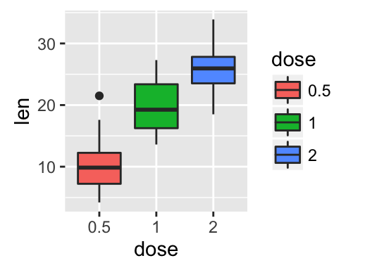
Learn more here: ggplot2 title: main, axis and legend titles.
Legend position and appearance
- Create a box plot
# Convert the variable dose from numeric to factor variable
ToothGrowth$dose <- as.factor(ToothGrowth$dose)
p <- ggplot(ToothGrowth, aes(x=dose, y=len, fill=dose))+
geom_boxplot()- Change legend position and appearance
# Change legend position: "left","top", "right", "bottom", "none"
p + theme(legend.position="top")
# Remove legends
p + theme(legend.position = "none")
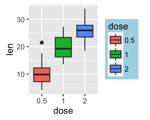
# Change the appearance of legend title and labels
p + theme(legend.title = element_text(colour="blue"),
legend.text = element_text(colour="red"))
# Change legend box background color
p + theme(legend.background = element_rect(fill="lightblue"))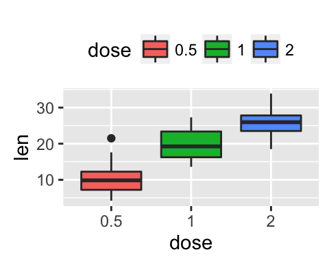
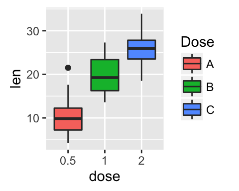
- Customize legends using scale functions
- Change the order of legend items: scale_x_discrete()
- Set legend title and labels: scale_fill_discrete()
# Change the order of legend items
p + scale_x_discrete(limits=c("2", "0.5", "1"))
# Set legend title and labels
p + scale_fill_discrete(name = "Dose", labels = c("A", "B", "C"))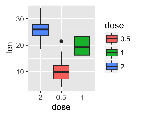
Learn more here: ggplot2 legend position and appearance.
Change colors automatically and manually
ToothGrowth and mtcars data sets are used in the examples below.
# Convert dose and cyl columns from numeric to factor variables
ToothGrowth$dose <- as.factor(ToothGrowth$dose)
mtcars$cyl <- as.factor(mtcars$cyl)
We start by creating some plots which will be finished hereafter:
# Box plot
bp <- ggplot(ToothGrowth, aes(x=dose, y=len))
# Scatter plot
sp <- ggplot(mtcars, aes(x=wt, y=mpg))- Draw plots: change fill and outline colors
# box plot
bp + geom_boxplot(fill='steelblue', color="red")
# scatter plot
sp + geom_point(color='darkblue')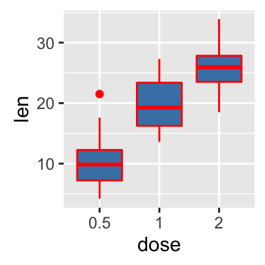
- Change color by groups using the levels of dose variable
# Box plot
bp <- bp + geom_boxplot(aes(fill = dose))
bp
# Scatter plot
sp <- sp + geom_point(aes(color = cyl))
sp
- Change colors manually:
- scale_fill_manual() for box plot, bar plot, violin plot, etc
- scale_color_manual() for lines and points
# Box plot
bp + scale_fill_manual(values=c("#999999", "#E69F00", "#56B4E9"))
# Scatter plot
sp + scale_color_manual(values=c("#999999", "#E69F00", "#56B4E9"))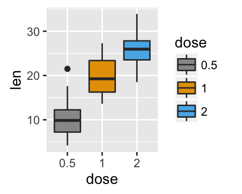
- Use RColorBrewer palettes: (Read more about RColorBrewer: color in R)
- scale_fill_brewer() for box plot, bar plot, violin plot, etc
- scale_color_brewer() for lines and points
# Box plot
bp + scale_fill_brewer(palette="Dark2")
# Scatter plot
sp + scale_color_brewer(palette="Dark2")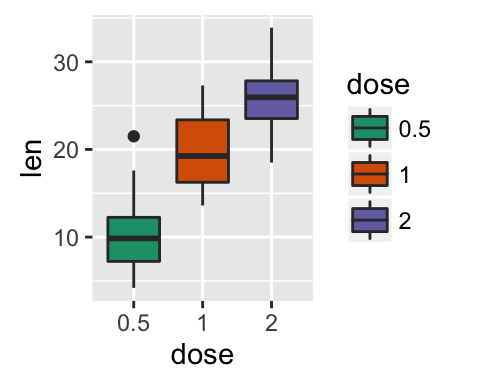
Available color palettes in the RColorBrewer package:
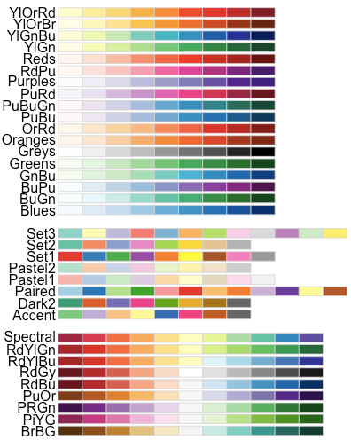
RColorBrewer palettes
- Use gray colors:
- scale_fill_grey() for box plot, bar plot, violin plot, etc
- scale_colour_grey() for points, lines, etc
# Box plot
bp + scale_fill_grey() + theme_classic()
# Scatter plot
sp + scale_color_grey() + theme_classic()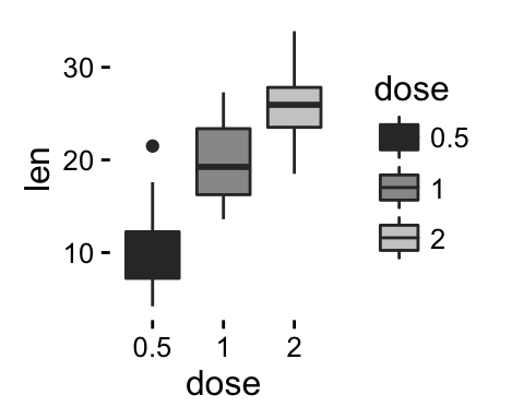
- Gradient or continuous colors:
Plots can be colored according to the values of a continuous variable using the functions :
- scale_color_gradient(), scale_fill_gradient() for sequential gradients between two colors
- scale_color_gradient2(), scale_fill_gradient2() for diverging gradients
- scale_color_gradientn(), scale_fill_gradientn() for gradient between n colors
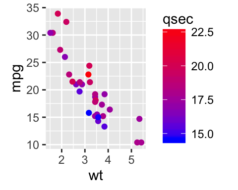
Gradient colors for scatter plots: The graphs are colored using the qsec continuous variable :
# Color by qsec values
sp2<-ggplot(mtcars, aes(x=wt, y=mpg)) +
  geom_point(aes(color = qsec))
sp2
# Change the low and high colors
# Sequential color scheme
sp2+scale_color_gradient(low="blue", high="red")
# Diverging color scheme
mid<-mean(mtcars$qsec)
sp2+scale_color_gradient2(midpoint=mid, low="blue", mid="white",
                          high="red", space = "Lab" )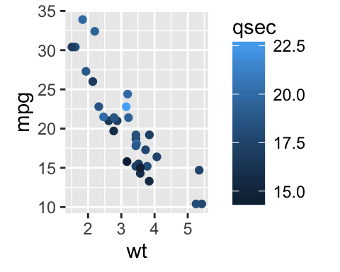
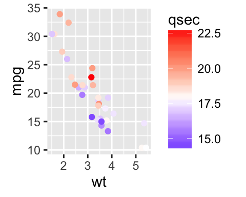
Learn more here: ggplot2 colors.
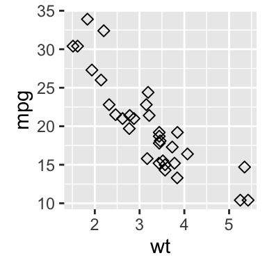
Point shapes, colors and size
The different points shapes commonly used in R are shown in the image below:
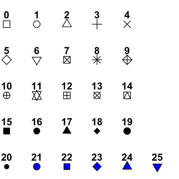
mtcars data is used in the following examples.
# Convert cyl as factor variable
mtcars$cyl <- as.factor(mtcars$cyl)
Create a scatter plot and change point shapes, colors and size:
# Basic scatter plot
ggplot(mtcars, aes(x=wt, y=mpg)) +
  geom_point(shape = 18, color = "steelblue", size = 4)
# Change point shapes and colors by groups
ggplot(mtcars, aes(x=wt, y=mpg)) +
  geom_point(aes(shape = cyl, color = cyl))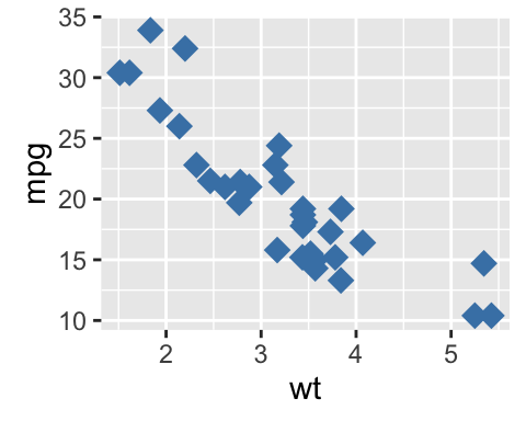
It’s also possible to manually change the appearance of points:
- scale_shape_manual() : to change point shapes
- scale_color_manual() : to change point colors
- scale_size_manual() : to change the size of points
# Change colors and shapes manually
ggplot(mtcars, aes(x=wt, y=mpg, group=cyl)) +
  geom_point(aes(shape=cyl, color=cyl), size=2)+
  scale_shape_manual(values=c(3, 16, 17))+
  scale_color_manual(values=c('#999999','#E69F00', '#56B4E9'))+
  theme(legend.position="top")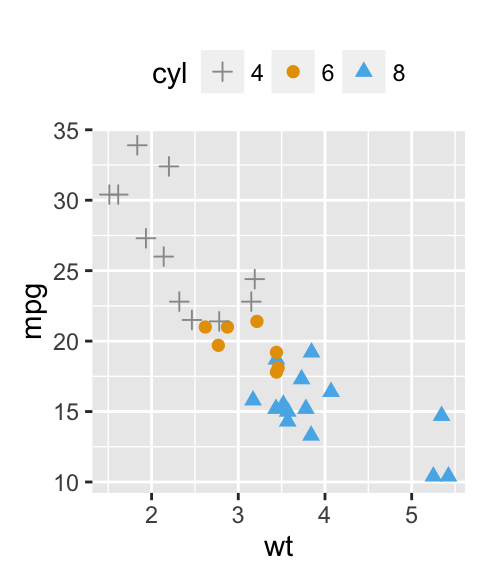
Learn more here: ggplot2 point shapes, colors and size.
Add text annotations to a graph
There are three important functions for adding texts to a plot:
- geom_text(): Textual annotations
- annotate(): Textual annotations
- annotation_custom(): Static annotations that are the same in every panel. These annotations are not affected by the plot scales.
A subset of mtcars data is used:
set.seed(1234)
df <- mtcars[sample(1:nrow(mtcars), 10), ]
df$cyl <- as.factor(df$cyl)
Scatter plots with textual annotations:
# Scatter plot
sp <- ggplot(df, aes(x=wt, y=mpg))+ geom_point()
# Add text, change colors by groups
sp + geom_text(aes(label = rownames(df), color = cyl),
size = 3, vjust = -1)
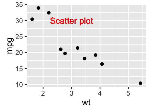
# Add text at a particular coordinate
sp + geom_text(x = 3, y = 30, label = "Scatter plot",
color="red")
Learn more here: ggplot2 text: Add text annotations to a graph.
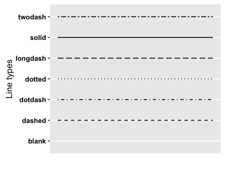
Line types
The different line types available in R software are : “blank”, “solid”, “dashed”, “dotted”, “dotdash”, “longdash”, “twodash”.
Note that, line types can be also specified using numbers : 0, 1, 2, 3, 4, 5, 6. 0 is for “blank”, 1 is for “solid”, 2 is for “dashed”, ….
A graph of the different line types is shown below :
- Basic line plot
# Create some data
df <- data.frame(time=c("breakfeast", "Lunch", "Dinner"),
                bill=c(10, 30, 15))
head(df)
## time bill
## 1 breakfeast 10
## 2 Lunch 30
## 3 Dinner 15# Basic line plot with points
# Change the line type
ggplot(data=df, aes(x=time, y=bill, group=1)) +
geom_line(linetype = "dashed")+
geom_point()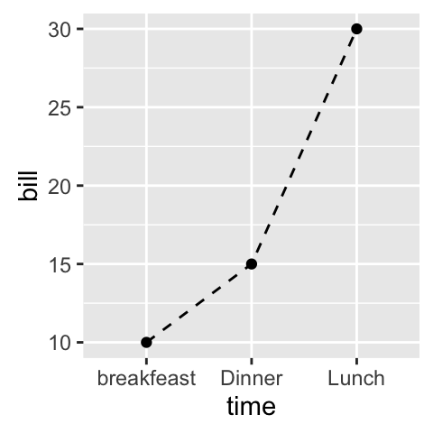
- Line plots with multiple groups
# Create some data
df2 <- data.frame(sex = rep(c("Female", "Male"), each=3),
                  time=c("breakfeast", "Lunch", "Dinner"),
                  bill=c(10, 30, 15, 13, 40, 17) )
head(df2)
## sex time bill
## 1 Female breakfeast 10
## 2 Female Lunch 30
## 3 Female Dinner 15
## 4 Male breakfeast 13
## 5 Male Lunch 40
## 6 Male Dinner 17# Line plot with multiple groups
# Change line types and colors by groups (sex)
ggplot(df2, aes(x=time, y=bill, group=sex)) +
geom_line(aes(linetype = sex, color = sex))+
geom_point(aes(color=sex))+
theme(legend.position="top")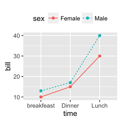
The functions below can be used to change the appearance of line types manually:
- scale_linetype_manual() : to change line types
- scale_color_manual() : to change line colors
- scale_size_manual() : to change the size of lines
# Change line types, colors and sizes
ggplot(df2, aes(x=time, y=bill, group=sex)) +
  geom_line(aes(linetype=sex, color=sex, size=sex))+
  geom_point()+
  scale_linetype_manual(values=c("twodash", "dotted"))+
  scale_color_manual(values=c('#999999','#E69F00'))+
  scale_size_manual(values=c(1, 1.5))+
  theme(legend.position="top")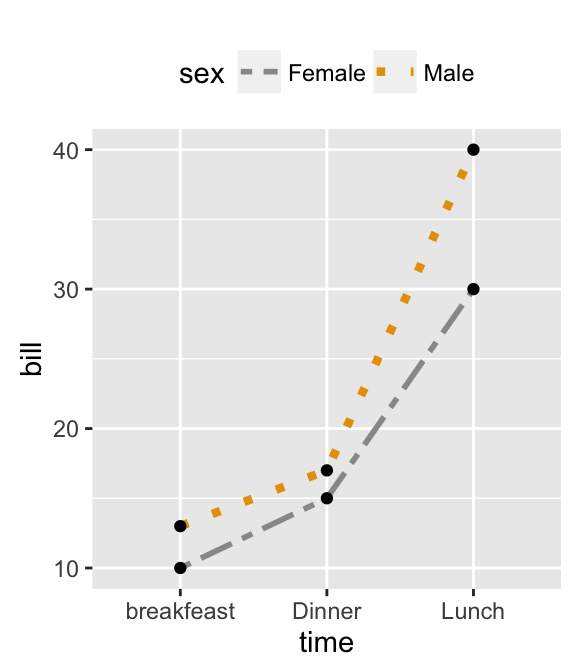
Learn more here: ggplot2 line types.
Themes and background colors
ToothGrowth data is used :
# Convert the column dose from numeric to factor variable
ToothGrowth$dose <- as.factor(ToothGrowth$dose)- Create a box plot
p <- ggplot(ToothGrowth, aes(x=dose, y=len)) +
geom_boxplot()- Change plot themes
Several functions are available in ggplot2 package for changing quickly the theme of plots :
- theme_gray(): gray background color and white grid lines
- theme_bw() : white background and gray grid lines
p + theme_gray(base_size = 14)
p + theme_bw()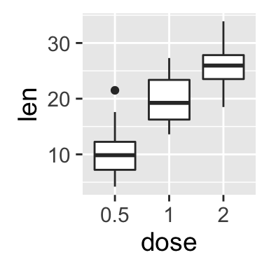
ggplot2 background color, theme_gray and theme_bw, R programming
- theme_linedraw : black lines around the plot
- theme_light : light gray lines and axis (more attention towards the data)
p + theme_linedraw()
p + theme_light()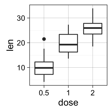
ggplot2 background color, theme_linedraw and theme_light, R programming
- theme_minimal: no background annotations
- theme_classic : theme with axis lines and no grid lines
p + theme_minimal()
p + theme_classic()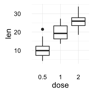

ggplot2 background color, theme_minimal and theme_classic, R programming
Learn more here: ggplot2 themes and background colors.
Axis limits: Minimum and Maximum values
Create a plot:
p <- ggplot(cars, aes(x = speed, y = dist)) + geom_point()Different functions are available for setting axis limits:
- Without clipping (preferred):
- p + coord_cartesian(xlim = c(5, 20), ylim = (0, 50)): Cartesian coordinates. The Cartesian coordinate system is the most common type of coordinate system. It will zoom the plot (like you’re looking at it with a magnifying glass), without clipping the data.
- With clipping the data (removes unseen data points): Observations not in this range will be dropped completely and not passed to any other layers.
- p + xlim(5, 20) + ylim(0, 50)
- p + scale_x_continuous(limits = c(5, 20)) + scale_y_continuous(limits = c(0, 50))
- Expand the plot limits with data: This function is a thin wrapper around geom_blank() that makes it easy to add data to a plot.
- p + expand_limits(x = 0, y = 0): set the intercept of x and y axes at (0,0)
- p + expand_limits(x = c(5, 50), y = c(0, 150))
# Default plot
print(p)
# Change axis limits using coord_cartesian()
p + coord_cartesian(xlim =c(5, 20), ylim = c(0, 50))
# Use xlim() and ylim()
p + xlim(5, 20) + ylim(0, 50)
# Expand limits
p + expand_limits(x = c(5, 50), y = c(0, 150))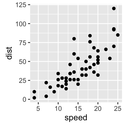
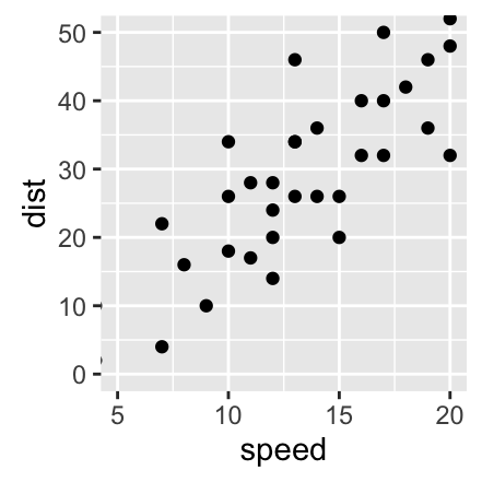

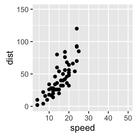
Learn more here: ggplot2 axis limits.
Note that, date axis limits can be set using the functions scale_x_date() and scale_y_date(). Read more here: ggplot2 date axis.
Axis transformations: log and sqrt scales
- Create a scatter plot:
p <- ggplot(cars, aes(x = speed, y = dist)) + geom_point()- ggplot2 functions for continuous axis transformations:
p + scale_x_log10(), p + scale_y_log10() : Plot x and y on log10 scale, respectively.
p + scale_x_sqrt(), p + scale_y_sqrt() : Plot x and y on square root scale, respectively.
p + scale_x_reverse(), p + scale_y_reverse() : Reverse direction of axes
p + coord_trans(x =“log10”, y=“log10”) : transformed cartesian coordinate system. Possible values for x and y are “log2”, “log10”, “sqrt”, …
- p + scale_x_continuous(trans=‘log2’), p + scale_y_continuous(trans=‘log2’) : another allowed value for the argument trans is ‘log10’
- The R code below uses the function scale_xx_continuous() to transform axis scales:
# Default scatter plot
print(p)
# Log transformation using scale_xx()
# possible values for trans : 'log2', 'log10','sqrt'
p + scale_x_continuous(trans='log2') +
  scale_y_continuous(trans='log2')
# Format axis tick mark labels
require(scales)
p + scale_y_continuous(trans = log2_trans(),
    breaks = trans_breaks("log2", function(x) 2^x),
    labels = trans_format("log2", math_format(2^.x)))
# Reverse coordinates
p + scale_y_reverse() ![]()
![]()
![]()
![]()
Learn more here: ggplot2 axis limits.
Axis ticks: customize tick marks and labels, reorder and select items
- Functions for changing the style of axis tick mark labels:
- element_text(face, color, size, angle): change text style
- element_blank(): Hide text
- Create a box plot:
p <- ggplot(ToothGrowth, aes(x=dose, y=len)) + geom_boxplot()
# print(p)- Change the style and the orientation angle of axis tick labels
# Change the style of axis tick labels
# face can be "plain", "italic", "bold" or "bold.italic"
p + theme(axis.text.x = element_text(face="bold", color="#993333",
                           size=14, angle=45),
          axis.text.y = element_text(face="bold", color="blue",
                           size=14, angle=45))
# Remove axis ticks and tick mark labels
p + theme(
  axis.text.x = element_blank(), # Remove x axis tick labels
  axis.text.y = element_blank(), # Remove y axis tick labels
  axis.ticks = element_blank()) # Remove ticks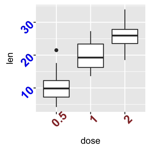
- Customize continuous and discrete axes:
- Discrete axes
- scale_x_discrete(name, breaks, labels, limits): for X axis
- scale_y_discrete(name, breaks, labels, limits): for y axis
- Continuous axes
- scale_x_continuous(name, breaks, labels, limits, trans): for X axis
- scale_y_continuous(name, breaks, labels, limits, trans): for y axis
Briefly, the meaning of the arguments are as follow:
- name : x or y axis labels
- breaks : vector specifying which breaks to display
- labels : labels of axis tick marks
- limits : vector indicating the data range
scale_xx() functions can be used to change the following x or y axis parameters :
- axis titles
- axis limits (data range to display)
- choose where tick marks appear
- manually label tick marks
4.1. Discrete axes:
# Change x axis label and the order of items
p + scale_x_discrete(name ="Dose (mg)",
                    limits=c("2","1","0.5"))
# Change tick mark labels
p + scale_x_discrete(breaks=c("0.5","1","2"),
        labels=c("Dose 0.5", "Dose 1", "Dose 2"))
# Choose which items to display
p + scale_x_discrete(limits=c("0.5", "2"))
4.2. Continuous axes:
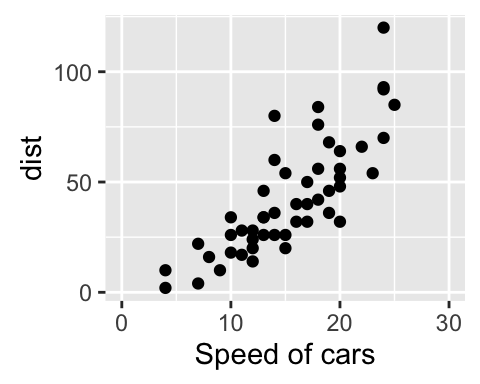
# Default scatter plot
# +++++++++++++++++
sp <- ggplot(cars, aes(x = speed, y = dist)) + geom_point()
sp
# Customize the plot
#+++++++++++++++++++++
# 1. Change x and y axis labels, and limits
sp <- sp + scale_x_continuous(name="Speed of cars", limits=c(0, 30)) +
  scale_y_continuous(name="Stopping distance", limits=c(0, 150))
# 2. Set tick marks on y axis: a tick mark is shown on every 50
sp + scale_y_continuous(breaks=seq(0, 150, 50))
# Format the labels
# +++++++++++++++++
require(scales)
sp + scale_y_continuous(labels = percent) # labels as percents
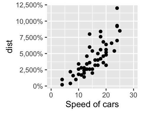
Learn more here: ggplot2 Axis ticks: tick marks and labels.
Add straight lines to a plot: horizontal, vertical and regression lines
The R function below can be used :
- geom_hline(yintercept, linetype, color, size): for horizontal lines
- geom_vline(xintercept, linetype, color, size): for vertical lines
- geom_abline(intercept, slope, linetype, color, size): for regression lines
- geom_segment() to add segments
- Create a simple scatter plot
# Simple scatter plot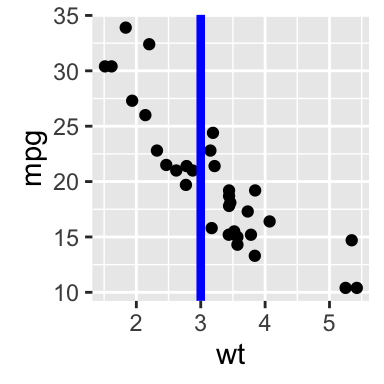
sp <- ggplot(data=mtcars, aes(x=wt, y=mpg)) + geom_point()- Add straight lines
# Add horizontal line at y = 2O; change line type and color
sp + geom_hline(yintercept=20, linetype="dashed", color = "red")
# Add vertical line at x = 3; change line type, color and size
sp + geom_vline(xintercept = 3, color = "blue", size=1.5)
# Add regression line
sp + geom_abline(intercept = 37, slope = -5, color="blue")+
  ggtitle("y = -5X + 37")
# Add horizontal line segment
sp + geom_segment(aes(x = 2, y = 15, xend = 3, yend = 15))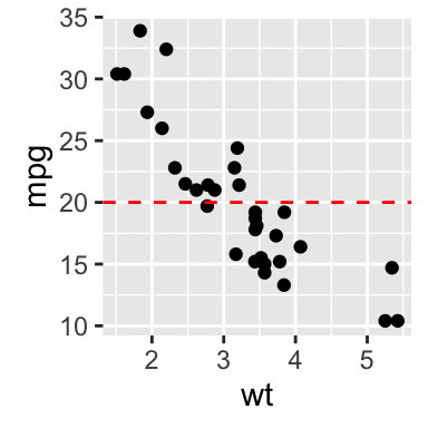
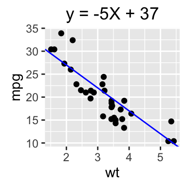
Learn more here: ggplot2 add straight lines to a plot.
Rotate a plot: flip and reverse
- coord_flip(): Create horizontal plots
- scale_x_reverse(), scale_y_reverse(): Reverse the axes
set.seed(1234)
# Basic histogram
hp <- qplot(x=rnorm(200), geom="histogram")
hp
# Horizontal histogram
hp + coord_flip()
# Y axis reversed
hp + scale_y_reverse()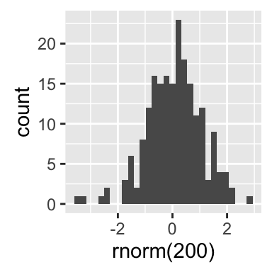
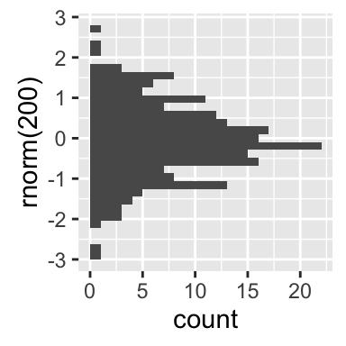

Learn more here: ggplot2 rotate a graph.
Faceting: split a plot into a matrix of panels
Facets divide a plot into subplots based on the values of one or more categorical variables.
There are two main functions for faceting :
- facet_grid()
- facet_wrap()
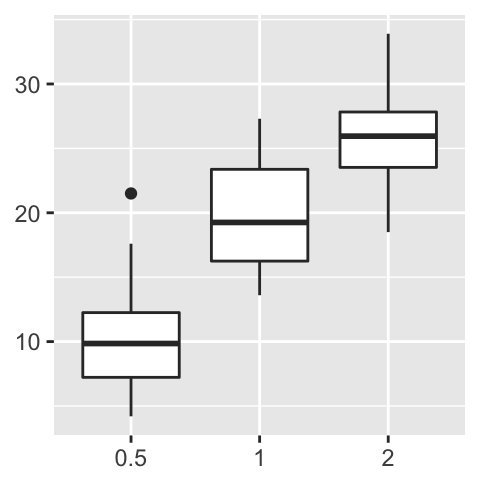
Create a box plot filled by groups:
p <- ggplot(ToothGrowth, aes(x=dose, y=len, group=dose)) +
  geom_boxplot(aes(fill=dose))
p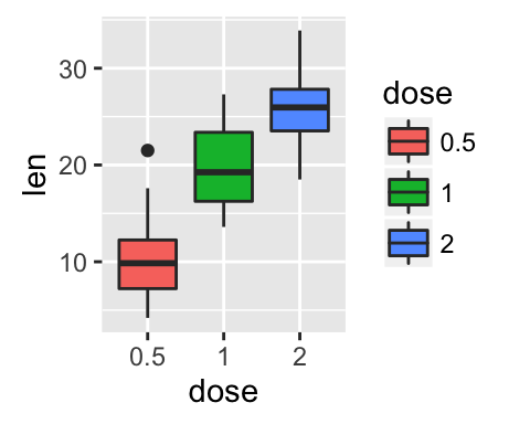
The following functions can be used for facets:
p + facet_grid(supp ~ .): Facet in vertical direction based on the levels of supp variable.
p + facet_grid(. ~ supp): Facet in horizontal direction based on the levels of supp variable.
p + facet_grid(dose ~ supp): Facet in horizontal and vertical directions based on two variables: dose and supp.
- p + facet_wrap(~ fl): Place facet side by side into a rectangular layout
- Facet with one discrete variable: Split by the levels of the group “supp”
# Split in vertical direction
p + facet_grid(supp ~ .)
# Split in horizontal direction
p + facet_grid(. ~ supp)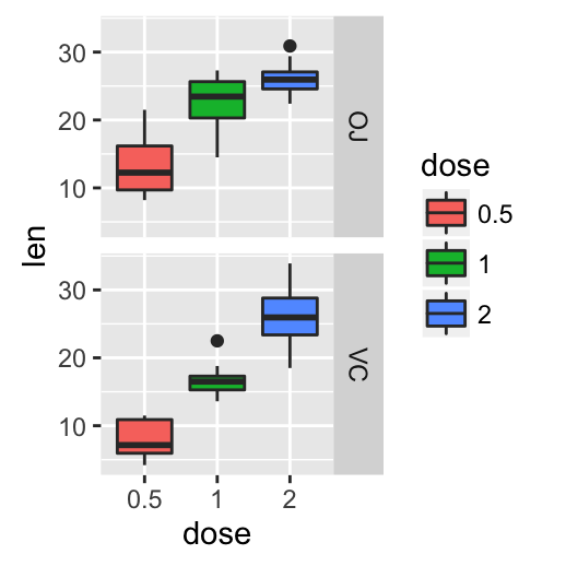
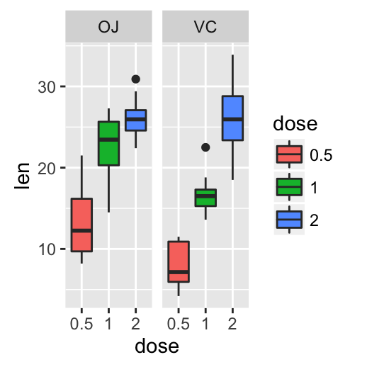
- Facet with two discrete variables: Split by the levels of the groups “dose” and “supp”
# Facet by two variables: dose and supp.
# Rows are dose and columns are supp
p + facet_grid(dose ~ supp)
# Facet by two variables: reverse the order of the 2 variables
# Rows are supp and columns are dose
p + facet_grid(supp ~ dose)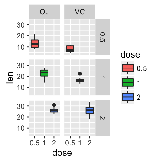
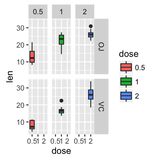
By default, all the panels have the same scales (scales=“fixed”). They can be made independent, by setting scales to free, free_x, or free_y.
p + facet_grid(dose ~ supp, scales='free')Learn more here: ggplot2 facet : split a plot into a matrix of panels.
Position adjustements
Position adjustments determine how to arrange geoms. The argument position is used to adjust geom positions:
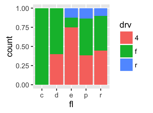
p <- ggplot(mpg, aes(fl, fill = drv))
# Arrange elements side by side
p + geom_bar(position = "dodge")
# Stack objects on top of one another,
# and normalize to have equal height
p + geom_bar(position = "fill")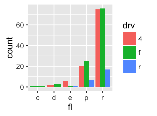
# Stack elements on top of one another
p + geom_bar(position = "stack")
# Add random noise to X and Y position
# of each element to avoid overplotting
ggplot(mpg, aes(cty, hwy)) +
  geom_point(position = "jitter")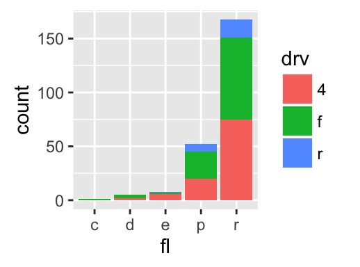
Note that, each of these position adjustments can be done using a function with manual width and height argument.
- position_dodge(width, height)
- position_fill(width, height)
- position_stack(width, height)
- position_jitter(width, height)
p + geom_bar(position = position_dodge(width = 1))
Learn more here: ggplot2 bar plots.
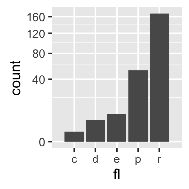
Coordinate systems
p <- ggplot(mpg, aes(fl)) + geom_bar()The coordinate systems in ggplot2 are:
p + coord_cartesian(xlim = NULL, ylim = NULL): Cartesian coordinate system (default). It’s the most familiar and common, type of coordinate system.
p + coord_fixed(ratio = 1, xlim = NULL, ylim = NULL): Cartesian coordinates with fixed relationship between x and y scales. The ratio represents the number of units on the y-axis equivalent to one unit on the x-axis. The default, ratio = 1, ensures that one unit on the x-axis is the same length as one unit on the y-axis.
p + coord_flip(…): Flipped cartesian coordinates. Useful for creating horizontal plot by rotating.
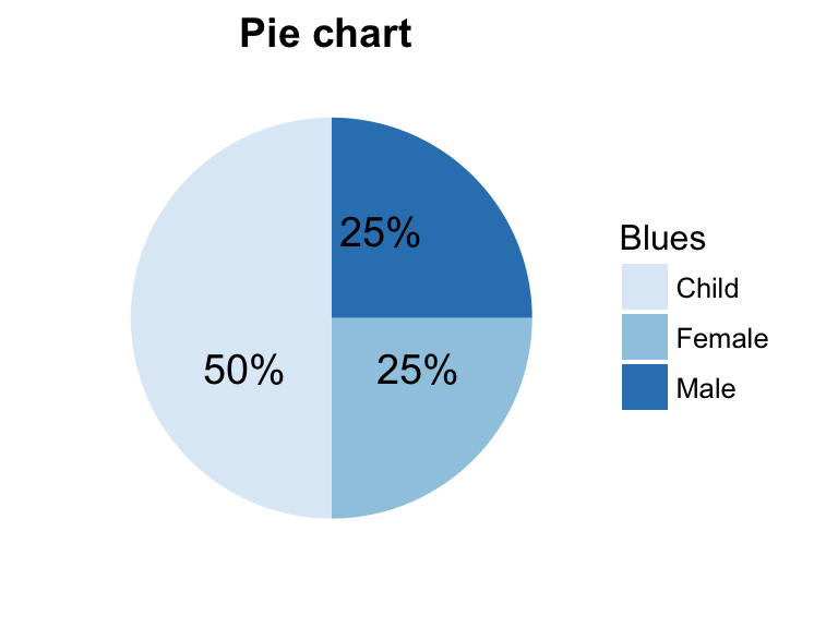
p + coord_polar(theta = “x”, start = 0, direction = 1): Polar coordinates. The polar coordinate system is most commonly used for pie charts, which are a stacked bar chart in polar coordinates.
p + coord_trans(x, y, limx, limy): Transformed cartesian coordinate system.
- coord_map(): Map projections. Provides the full range of map projections available in the mapproj package.
- Arguments for coord_cartesian(), coord_fixed() and coord_flip()
- xlim: limits for the x axis
- ylim: limits for the y axis
- ratio: aspect ratio, expressed as y/x
- …: Other arguments passed onto coord_cartesian
- Arguments for coord_polar()
- theta: variable to map angle to (x or y)
- start: offset of starting point from 12 o’clock in radians
- direction: 1, clockwise; -1, anticlockwise
- Arguments for coord_trans()
- x, y: transformers for x and y axes
- limx, limy: limits for x and y axes.
p + coord_cartesian(ylim = c(0, 200))
p + coord_fixed(ratio = 1/50)
p + coord_flip()
p + coord_polar(theta = "x", direction = 1)
p + coord_trans(y = "sqrt")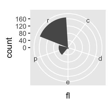
Extensions to ggplot2: R packages and functions
factoextra: factoextra : Extract and Visualize the outputs of a multivariate analysis. factoextra provides some easy-to-use functions to extract and visualize the output of PCA (Principal Component Analysis), CA (Correspondence Analysis) and MCA (Multiple Correspondence Analysis) functions from several packages (FactoMineR, stats, ade4 and MASS). It contains also many functions for simplifying clustering analysis workflows. Ggplot2 plotting system is used.
easyggplot2: Perform and customize easily a plot with ggplot2. The idea behind ggplot2 is seductively simple but the detail is, yes, difficult. To customize a plot, the syntax is sometimes a tiny bit opaque and this raises the level of difficulty. easyGgplot2 package (which depends on ggplot2) to make and customize quickly plots including box plot, dot plot, strip chart, violin plot, histogram, density plot, scatter plot, bar plot, line plot, etc, …
ggplot2 - Easy way to mix multiple graphs on the same page: The R package gridExtra and cowplot are used.
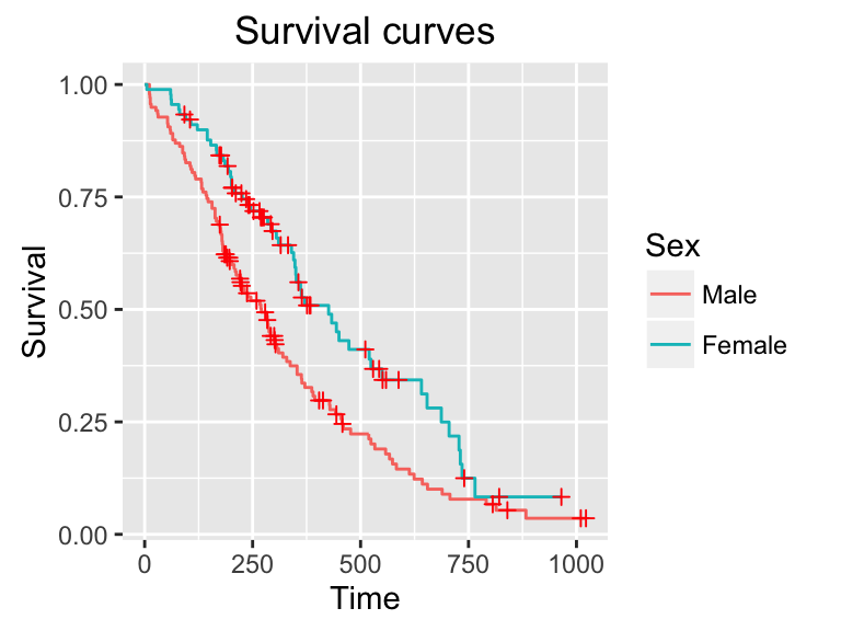
ggfortify: Define fortify and autoplot functions to allow ggplot2 to handle some popular R packages. These include plotting 1) Matrix; 2) Linear Model and Generalized Linear Model; 3) Time Series; 4) PCA/Clustering; 5) Survival Curve; 6) Probability distribution
GGally: GGally extends ggplot2 by providing several functions including pairwise correlation matrix, scatterplot plot matrix, parallel coordinates plot, survival plot and several functions to plot networks.
ggRandomForests: Graphical analysis of random forests with the randomForestSRC and ggplot2 packages.
ggdendro: Create dendrograms and tree diagrams using ggplot2
ggmcmc: Tools for Analyzing MCMC Simulations from Bayesian Inference
Ressources to improve your ggplot2 skills
Blog posts
Acknoweledgment
- Thanks to Hadley Wickham for ggplot2 package: ggplot2 online documentation
- Thanks to RStudio for ggplot2 cheatseet)
Infos
This analysis was performed using R (ver. 3.2.4) and ggplot2 (ver 2.1.0).
Show me some love with the like buttons below... Thank you and please don't forget to share and comment below!!
Montrez-moi un peu d'amour avec les like ci-dessous ... Merci et n'oubliez pas, s'il vous plaît, de partager et de commenter ci-dessous!
Recommended for You!


Recommended for you
This section contains the best data science and self-development resources to help you on your path.
Books - Data Science
Our Books
- Practical Guide to Cluster Analysis in R by A. Kassambara (Datanovia)
- Practical Guide To Principal Component Methods in R by A. Kassambara (Datanovia)
- Machine Learning Essentials: Practical Guide in R by A. Kassambara (Datanovia)
- R Graphics Essentials for Great Data Visualization by A. Kassambara (Datanovia)
- GGPlot2 Essentials for Great Data Visualization in R by A. Kassambara (Datanovia)
- Network Analysis and Visualization in R by A. Kassambara (Datanovia)
- Practical Statistics in R for Comparing Groups: Numerical Variables by A. Kassambara (Datanovia)
- Inter-Rater Reliability Essentials: Practical Guide in R by A. Kassambara (Datanovia)
Others
- R for Data Science: Import, Tidy, Transform, Visualize, and Model Data by Hadley Wickham & Garrett Grolemund
- Hands-On Machine Learning with Scikit-Learn, Keras, and TensorFlow: Concepts, Tools, and Techniques to Build Intelligent Systems by Aurelien Géron
- Practical Statistics for Data Scientists: 50 Essential Concepts by Peter Bruce & Andrew Bruce
- Hands-On Programming with R: Write Your Own Functions And Simulations by Garrett Grolemund & Hadley Wickham
- An Introduction to Statistical Learning: with Applications in R by Gareth James et al.
- Deep Learning with R by François Chollet & J.J. Allaire
- Deep Learning with Python by François Chollet
Click to follow us on Facebook :
Comment this article by clicking on "Discussion" button (top-right position of this page)