


ggplot2 scatter plots : Quick start guide - R software and data visualization
- Prepare the data
- Basic scatter plots
- Label points in the scatter plot
- Scatter plots with multiple groups
- Add marginal rugs to a scatter plot
- Scatter plots with the 2d density estimation
- Scatter plots with ellipses
- Scatter plots with rectangular bins
- Scatter plot with marginal density distribution plot
- Customized scatter plots
- Infos
This article describes how create a scatter plot using R software and ggplot2 package. The function geom_point() is used.
![]()
Related Book:
GGPlot2 Essentials for Great Data Visualization in R
Prepare the data
mtcars data sets are used in the examples below.
# Convert cyl column from a numeric to a factor variable
mtcars$cyl <- as.factor(mtcars$cyl)
head(mtcars)
## mpg cyl disp hp drat wt qsec vs am gear carb
## Mazda RX4 21.0 6 160 110 3.90 2.620 16.46 0 1 4 4
## Mazda RX4 Wag 21.0 6 160 110 3.90 2.875 17.02 0 1 4 4
## Datsun 710 22.8 4 108 93 3.85 2.320 18.61 1 1 4 1
## Hornet 4 Drive 21.4 6 258 110 3.08 3.215 19.44 1 0 3 1
## Hornet Sportabout 18.7 8 360 175 3.15 3.440 17.02 0 0 3 2
## Valiant 18.1 6 225 105 2.76 3.460 20.22 1 0 3 1Basic scatter plots
Simple scatter plots are created using the R code below. The color, the size and the shape of points can be changed using the function geom_point() as follow :
geom_point(size, color, shape)library(ggplot2)
# Basic scatter plot
ggplot(mtcars, aes(x=wt, y=mpg)) + geom_point()
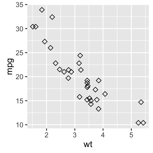
# Change the point size, and shape
ggplot(mtcars, aes(x=wt, y=mpg)) +
geom_point(size=2, shape=23)
Note that, the size of the points can be controlled by the values of a continuous variable as in the example below.
# Change the point size
ggplot(mtcars, aes(x=wt, y=mpg)) +
  geom_point(aes(size=qsec))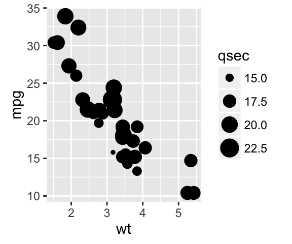
Read more on point shapes : ggplot2 point shapes
Label points in the scatter plot
The function geom_text() can be used :
ggplot(mtcars, aes(x=wt, y=mpg)) +
  geom_point() +
  geom_text(label=rownames(mtcars))
Read more on text annotations : ggplot2 - add texts to a plot
Add regression lines
The functions below can be used to add regression lines to a scatter plot :
- geom_smooth() and stat_smooth()
- geom_abline()
geom_abline() has been already described at this link : ggplot2 add straight lines to a plot.
Only the function geom_smooth() is covered in this section.
A simplified format is :
geom_smooth(method="auto", se=TRUE, fullrange=FALSE, level=0.95)- method : smoothing method to be used. Possible values are lm, glm, gam, loess, rlm.
- method = “loess”: This is the default value for small number of observations. It computes a smooth local regression. You can read more about loess using the R code ?loess.
- method =“lm”: It fits a linear model. Note that, it’s also possible to indicate the formula as formula = y ~ poly(x, 3) to specify a degree 3 polynomial.
- se : logical value. If TRUE, confidence interval is displayed around smooth.
- fullrange : logical value. If TRUE, the fit spans the full range of the plot
- level : level of confidence interval to use. Default value is 0.95
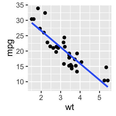
# Add the regression line
ggplot(mtcars, aes(x=wt, y=mpg)) +
geom_point()+
geom_smooth(method=lm)
# Remove the confidence interval
ggplot(mtcars, aes(x=wt, y=mpg)) +
geom_point()+
geom_smooth(method=lm, se=FALSE)
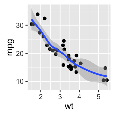
# Loess method
ggplot(mtcars, aes(x=wt, y=mpg)) +
geom_point()+
geom_smooth()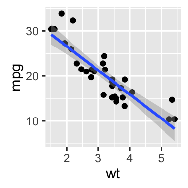
Change the appearance of points and lines
This section describes how to change :
- the color and the shape of points
- the line type and color of the regression line
- the fill color of the confidence interval
# Change the point colors and shapes
# Change the line type and color
ggplot(mtcars, aes(x=wt, y=mpg)) +
  geom_point(shape=18, color="blue")+
  geom_smooth(method=lm, se=FALSE, linetype="dashed",
             color="darkred")
# Change the confidence interval fill color
ggplot(mtcars, aes(x=wt, y=mpg)) +
  geom_point(shape=18, color="blue")+
  geom_smooth(method=lm,  linetype="dashed",
             color="darkred", fill="blue")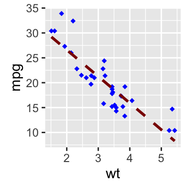
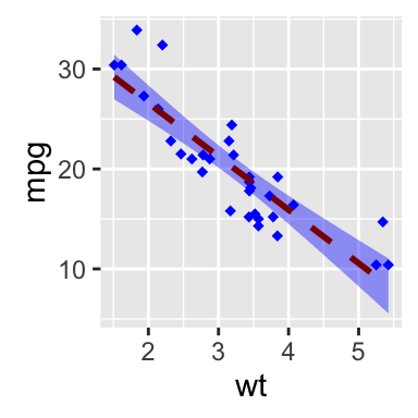
Note that a transparent color is used, by default, for the confidence band. This can be changed by using the argument alpha : geom_smooth(fill=“blue”, alpha=1)
Read more on point shapes : ggplot2 point shapes
Read more on line types : ggplot2 line types
Scatter plots with multiple groups
This section describes how to change point colors and shapes automatically and manually.
Change the point color/shape/size automatically
In the R code below, point shapes, colors and sizes are controlled by the levels of the factor variable cyl :
# Change point shapes by the levels of cyl
ggplot(mtcars, aes(x=wt, y=mpg, shape=cyl)) +
geom_point()
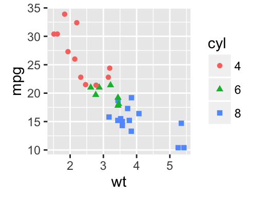
# Change point shapes and colors
ggplot(mtcars, aes(x=wt, y=mpg, shape=cyl, color=cyl)) +
geom_point()
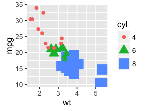
# Change point shapes, colors and sizes
ggplot(mtcars, aes(x=wt, y=mpg, shape=cyl, color=cyl, size=cyl)) +
geom_point()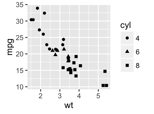
Add regression lines
Regression lines can be added as follow :
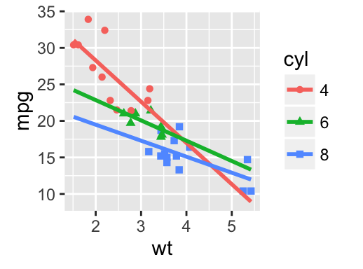
# Add regression lines
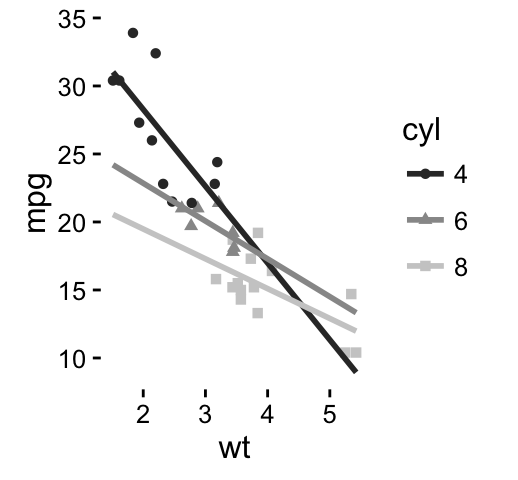
ggplot(mtcars, aes(x=wt, y=mpg, color=cyl, shape=cyl)) +
geom_point() +
geom_smooth(method=lm)
# Remove confidence intervals
# Extend the regression lines
ggplot(mtcars, aes(x=wt, y=mpg, color=cyl, shape=cyl)) +
geom_point() +
geom_smooth(method=lm, se=FALSE, fullrange=TRUE)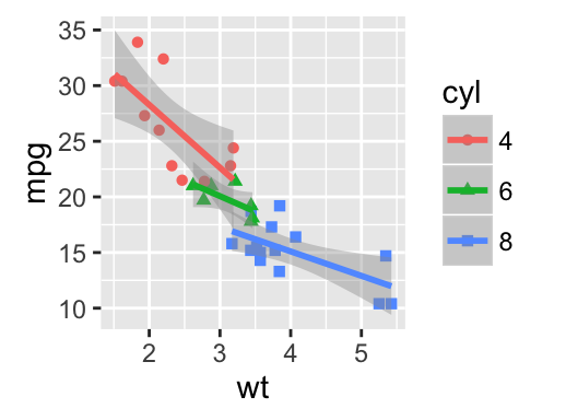
Note that, you can also change the line type of the regression lines by using the aesthetic linetype = cyl.
The fill color of confidence bands can be changed as follow :
ggplot(mtcars, aes(x=wt, y=mpg, color=cyl, shape=cyl)) +
  geom_point() +
  geom_smooth(method=lm, aes(fill=cyl))
Change the point color/shape/size manually
The functions below are used :
- scale_shape_manual() for point shapes
- scale_color_manual() for point colors
- scale_size_manual() for point sizes
# Change point shapes and colors manually
ggplot(mtcars, aes(x=wt, y=mpg, color=cyl, shape=cyl)) +
geom_point() +
geom_smooth(method=lm, se=FALSE, fullrange=TRUE)+
scale_shape_manual(values=c(3, 16, 17))+
scale_color_manual(values=c('#999999','#E69F00', '#56B4E9'))+
theme(legend.position="top")
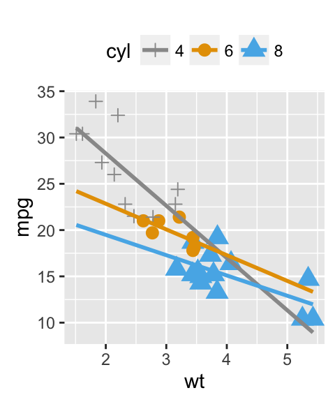
# Change the point sizes manually
ggplot(mtcars, aes(x=wt, y=mpg, color=cyl, shape=cyl))+
geom_point(aes(size=cyl)) +
geom_smooth(method=lm, se=FALSE, fullrange=TRUE)+
scale_shape_manual(values=c(3, 16, 17))+
scale_color_manual(values=c('#999999','#E69F00', '#56B4E9'))+
scale_size_manual(values=c(2,3,4))+
theme(legend.position="top")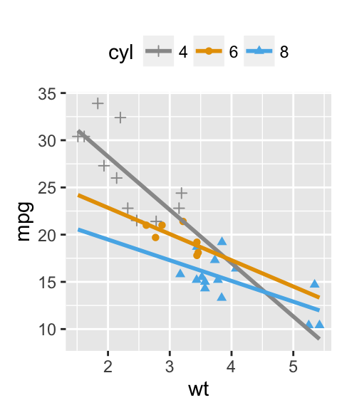
It is also possible to change manually point and line colors using the functions :
- scale_color_brewer() : to use color palettes from RColorBrewer package
- scale_color_grey() : to use grey color palettes
p <- ggplot(mtcars, aes(x=wt, y=mpg, color=cyl, shape=cyl)) +
  geom_point() +
  geom_smooth(method=lm, se=FALSE, fullrange=TRUE)+
  theme_classic()
# Use brewer color palettes
p+scale_color_brewer(palette="Dark2")
# Use grey scale
p + scale_color_grey()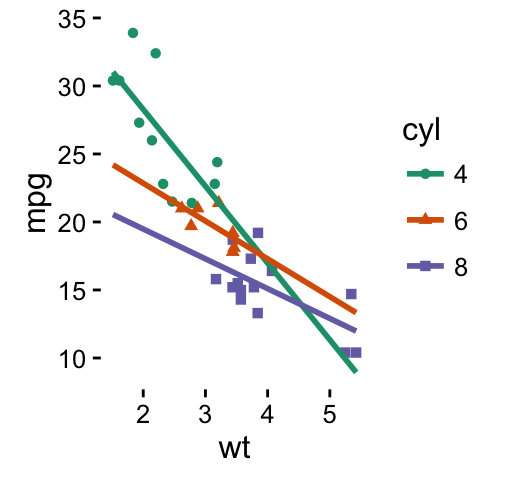
Read more on ggplot2 colors here : ggplot2 colors
Add marginal rugs to a scatter plot
The function geom_rug() can be used :
geom_rug(sides ="bl")sides : a string that controls which sides of the plot the rugs appear on. Allowed value is a string containing any of “trbl”, for top, right, bottom, and left.
# Add marginal rugs
ggplot(mtcars, aes(x=wt, y=mpg)) +
geom_point() + geom_rug()
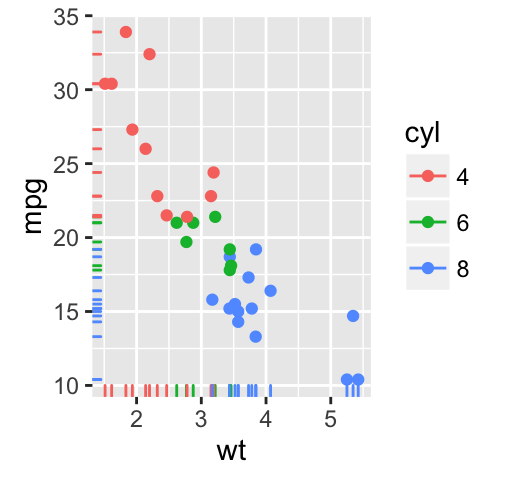
# Change colors
ggplot(mtcars, aes(x=wt, y=mpg, color=cyl)) +
geom_point() + geom_rug()
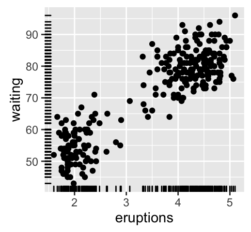
# Add marginal rugs using faithful data
ggplot(faithful, aes(x=eruptions, y=waiting)) +
geom_point() + geom_rug()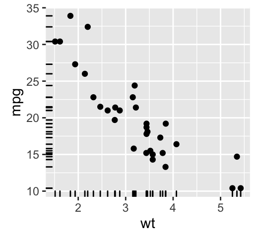
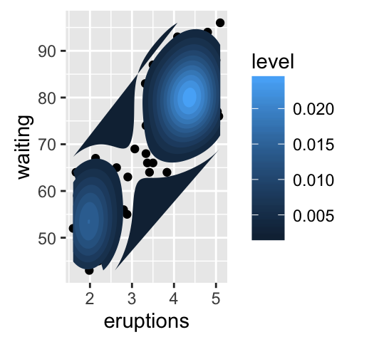
Scatter plots with the 2d density estimation
The functions geom_density_2d() or stat_density_2d() can be used :
# Scatter plot with the 2d density estimation
sp <- ggplot(faithful, aes(x=eruptions, y=waiting)) +
  geom_point()
sp + geom_density_2d()
# Gradient color
sp + stat_density_2d(aes(fill = ..level..), geom="polygon")
# Change the gradient color
sp + stat_density_2d(aes(fill = ..level..), geom="polygon")+
  scale_fill_gradient(low="blue", high="red")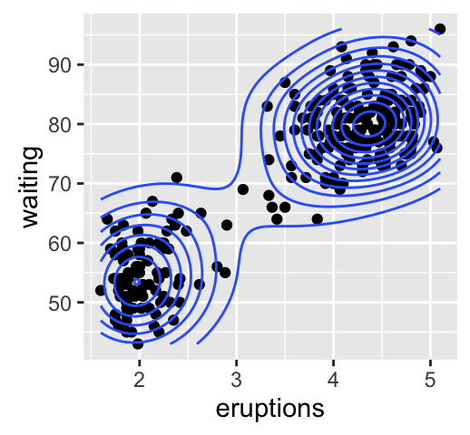
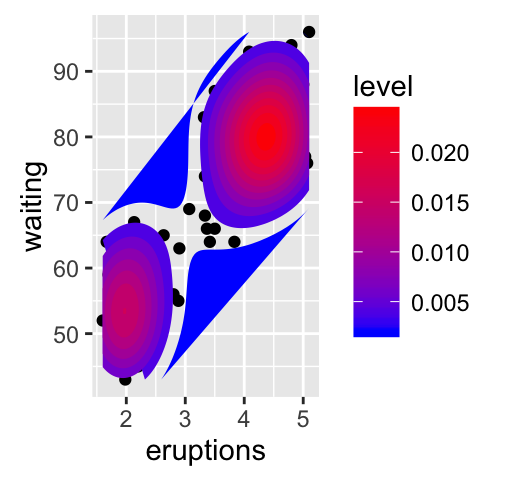
Read more on ggplot2 colors here : ggplot2 colors
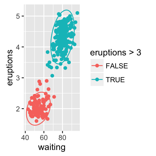
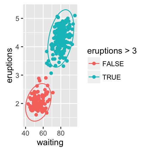
Scatter plots with ellipses
The function stat_ellipse() can be used as follow:
# One ellipse arround all points
ggplot(faithful, aes(waiting, eruptions))+
  geom_point()+
  stat_ellipse()
# Ellipse by groups
p <- ggplot(faithful, aes(waiting, eruptions, color = eruptions > 3))+
  geom_point()
p + stat_ellipse()
# Change the type of ellipses: possible values are "t", "norm", "euclid"
p + stat_ellipse(type = "norm")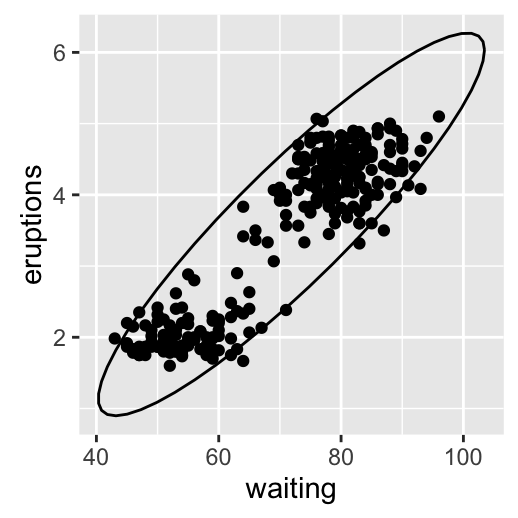
Scatter plots with rectangular bins
The number of observations is counted in each bins and displayed using any of the functions below :
- geom_bin2d() for adding a heatmap of 2d bin counts
- stat_bin_2d() for counting the number of observation in rectangular bins
- stat_summary_2d() to apply function for 2D rectangular bins
The simplified formats of these functions are :
plot + geom_bin2d(...)
plot+stat_bin_2d(geom=NULL, bins=30)
plot + stat_summary_2d(geom = NULL, bins = 30, fun = mean)- geom : geometrical object to display the data
- bins : Number of bins in both vertical and horizontal directions. The default value is 30
- fun : function for summary
The data sets diamonds from ggplot2 package is used :
head(diamonds)## carat cut color clarity depth table price x y z
## 1 0.23 Ideal E SI2 61.5 55 326 3.95 3.98 2.43
## 2 0.21 Premium E SI1 59.8 61 326 3.89 3.84 2.31
## 3 0.23 Good E VS1 56.9 65 327 4.05 4.07 2.31
## 4 0.29 Premium I VS2 62.4 58 334 4.20 4.23 2.63
## 5 0.31 Good J SI2 63.3 58 335 4.34 4.35 2.75
## 6 0.24 Very Good J VVS2 62.8 57 336 3.94 3.96 2.48# Plot
p <- ggplot(diamonds, aes(carat, price))
p + geom_bin2d()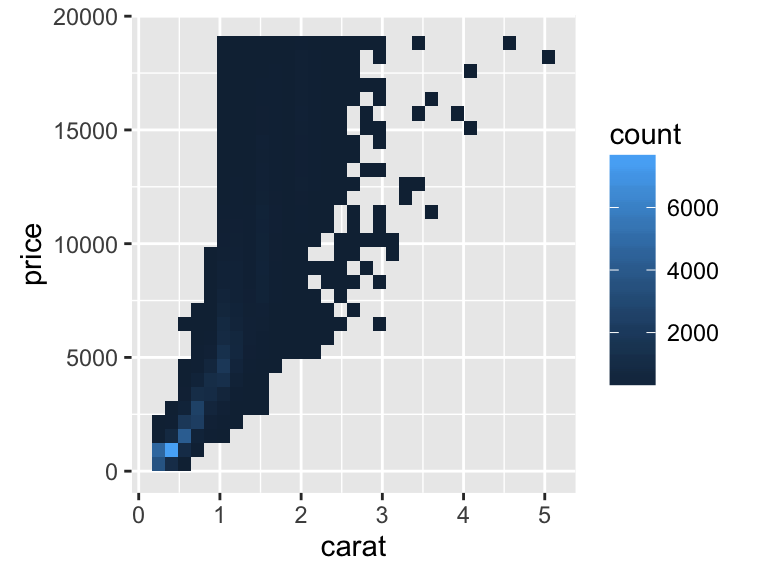
Change the number of bins :
# Change the number of bins
p + geom_bin2d(bins=10)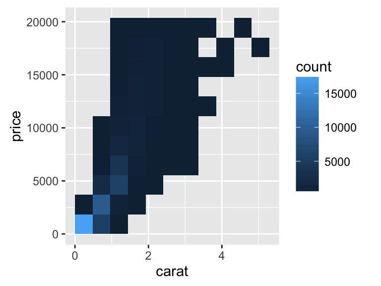
Or specify the width of bins :
# Or specify the width of bins
p + geom_bin2d(binwidth=c(1, 1000))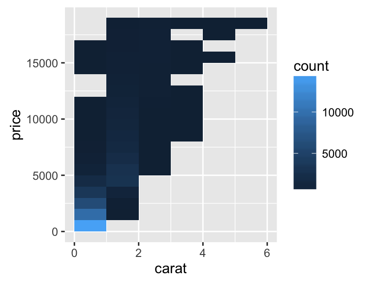
Scatter plot with marginal density distribution plot
Step 1/3. Create some data :
set.seed(1234)
x <- c(rnorm(500, mean = -1), rnorm(500, mean = 1.5))
y <- c(rnorm(500, mean = 1), rnorm(500, mean = 1.7))
group <- as.factor(rep(c(1,2), each=500))
df <- data.frame(x, y, group)
head(df)
## x y group
## 1 -2.20706575 -0.2053334 1
## 2 -0.72257076 1.3014667 1
## 3 0.08444118 -0.5391452 1
## 4 -3.34569770 1.6353707 1
## 5 -0.57087531 1.7029518 1
## 6 -0.49394411 -0.9058829 1Step 2/3. Create the plots :
# scatter plot of x and y variables
# color by groups
scatterPlot <- ggplot(df,aes(x, y, color=group)) +
geom_point() +
scale_color_manual(values = c('#999999','#E69F00')) +
theme(legend.position=c(0,1), legend.justification=c(0,1))
scatterPlot
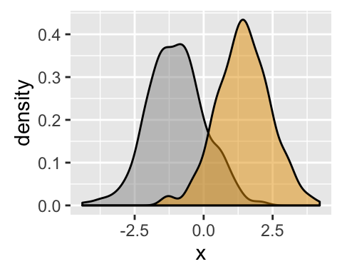
# Marginal density plot of x (top panel)
xdensity <- ggplot(df, aes(x, fill=group)) +
geom_density(alpha=.5) +
scale_fill_manual(values = c('#999999','#E69F00')) +
theme(legend.position = "none")
xdensity
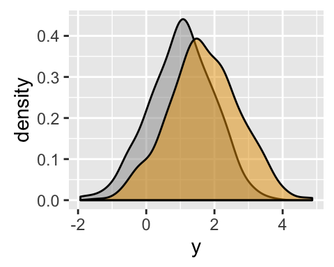
# Marginal density plot of y (right panel)
ydensity <- ggplot(df, aes(y, fill=group)) +
geom_density(alpha=.5) +
scale_fill_manual(values = c('#999999','#E69F00')) +
theme(legend.position = "none")
ydensity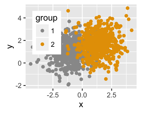
Create a blank placeholder plot :
blankPlot <- ggplot()+geom_blank(aes(1,1))+
  theme(plot.background = element_blank(),
   panel.grid.major = element_blank(),
   panel.grid.minor = element_blank(),
   panel.border = element_blank(),
   panel.background = element_blank(),
   axis.title.x = element_blank(),
   axis.title.y = element_blank(),
   axis.text.x = element_blank(),
   axis.text.y = element_blank(),
   axis.ticks = element_blank()
     )
Step 3/3. Put the plots together:
To put multiple plots on the same page, the package gridExtra can be used. Install the package as follow :
install.packages("gridExtra")Arrange ggplot2 with adapted height and width for each row and column :
library("gridExtra")
grid.arrange(xdensity, blankPlot, scatterPlot, ydensity,
        ncol=2, nrow=2, widths=c(4, 1.4), heights=c(1.4, 4))
Read more on how to arrange multiple ggplots in one page : ggplot2 - Easy way to mix multiple graphs on the same page
Customized scatter plots
# Basic scatter plot
ggplot(mtcars, aes(x=wt, y=mpg)) +
geom_point()+
geom_smooth(method=lm, color="black")+
labs(title="Miles per gallon \n according to the weight",
x="Weight (lb/1000)", y = "Miles/(US) gallon")+
theme_classic()
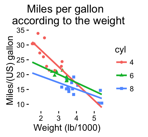
# Change color/shape by groups
# Remove confidence bands
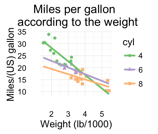
p <- ggplot(mtcars, aes(x=wt, y=mpg, color=cyl, shape=cyl)) +
geom_point()+
geom_smooth(method=lm, se=FALSE, fullrange=TRUE)+
labs(title="Miles per gallon \n according to the weight",
x="Weight (lb/1000)", y = "Miles/(US) gallon")
p + theme_classic() 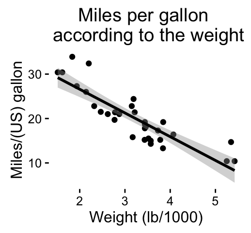
Change colors manually :
# Continuous colors
p + scale_color_brewer(palette="Paired") + theme_classic()
# Discrete colors
p + scale_color_brewer(palette="Dark2") + theme_minimal()
# Gradient colors
p + scale_color_brewer(palette="Accent") + theme_minimal()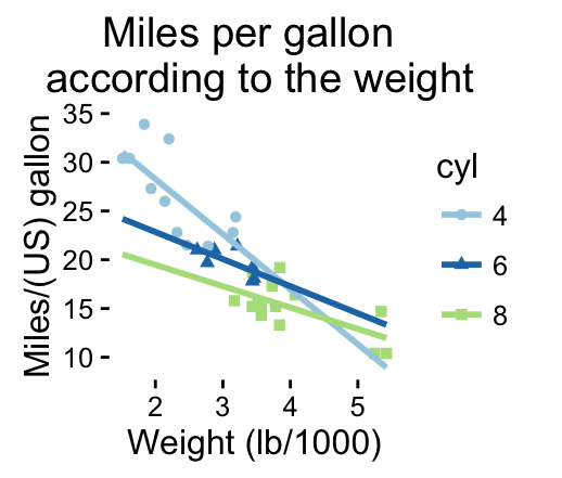
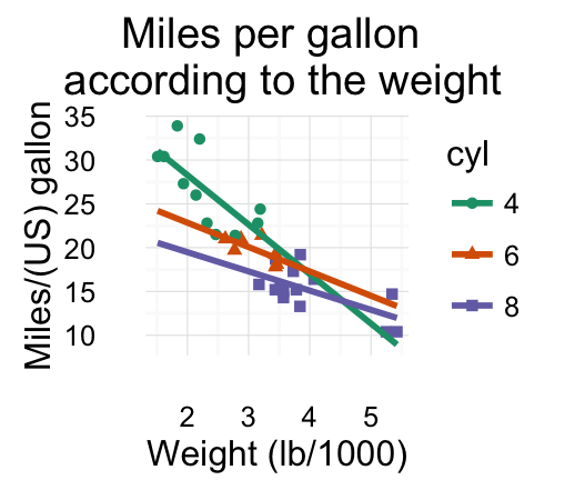
Read more on ggplot2 colors here : ggplot2 colors
Infos
This analysis has been performed using R software (ver. 3.2.4) and ggplot2 (ver. 2.1.0)
Show me some love with the like buttons below... Thank you and please don't forget to share and comment below!!
Montrez-moi un peu d'amour avec les like ci-dessous ... Merci et n'oubliez pas, s'il vous plaît, de partager et de commenter ci-dessous!
Recommended for You!


Recommended for you
This section contains the best data science and self-development resources to help you on your path.
Books - Data Science
Our Books
- Practical Guide to Cluster Analysis in R by A. Kassambara (Datanovia)
- Practical Guide To Principal Component Methods in R by A. Kassambara (Datanovia)
- Machine Learning Essentials: Practical Guide in R by A. Kassambara (Datanovia)
- R Graphics Essentials for Great Data Visualization by A. Kassambara (Datanovia)
- GGPlot2 Essentials for Great Data Visualization in R by A. Kassambara (Datanovia)
- Network Analysis and Visualization in R by A. Kassambara (Datanovia)
- Practical Statistics in R for Comparing Groups: Numerical Variables by A. Kassambara (Datanovia)
- Inter-Rater Reliability Essentials: Practical Guide in R by A. Kassambara (Datanovia)
Others
- R for Data Science: Import, Tidy, Transform, Visualize, and Model Data by Hadley Wickham & Garrett Grolemund
- Hands-On Machine Learning with Scikit-Learn, Keras, and TensorFlow: Concepts, Tools, and Techniques to Build Intelligent Systems by Aurelien Géron
- Practical Statistics for Data Scientists: 50 Essential Concepts by Peter Bruce & Andrew Bruce
- Hands-On Programming with R: Write Your Own Functions And Simulations by Garrett Grolemund & Hadley Wickham
- An Introduction to Statistical Learning: with Applications in R by Gareth James et al.
- Deep Learning with R by François Chollet & J.J. Allaire
- Deep Learning with Python by François Chollet
Click to follow us on Facebook :
Comment this article by clicking on "Discussion" button (top-right position of this page)