


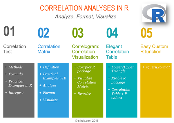
Correlation Analyses in R
Previously, we described the essentials of R programming and provided quick start guides for importing data into R. Additionally, we described how to compute descriptive or summary statistics using R software.
How this chapter is organized?
Correlation Test Between Two Variables in R
Brief outline:
- What is correlation test?
- Methods for correlation analyses
- Correlation formula
- Pearson correlation formula
- Spearman correlation formula
- Kendall correlation formula
- Compute correlation in R
- R functions
- Import your data into R
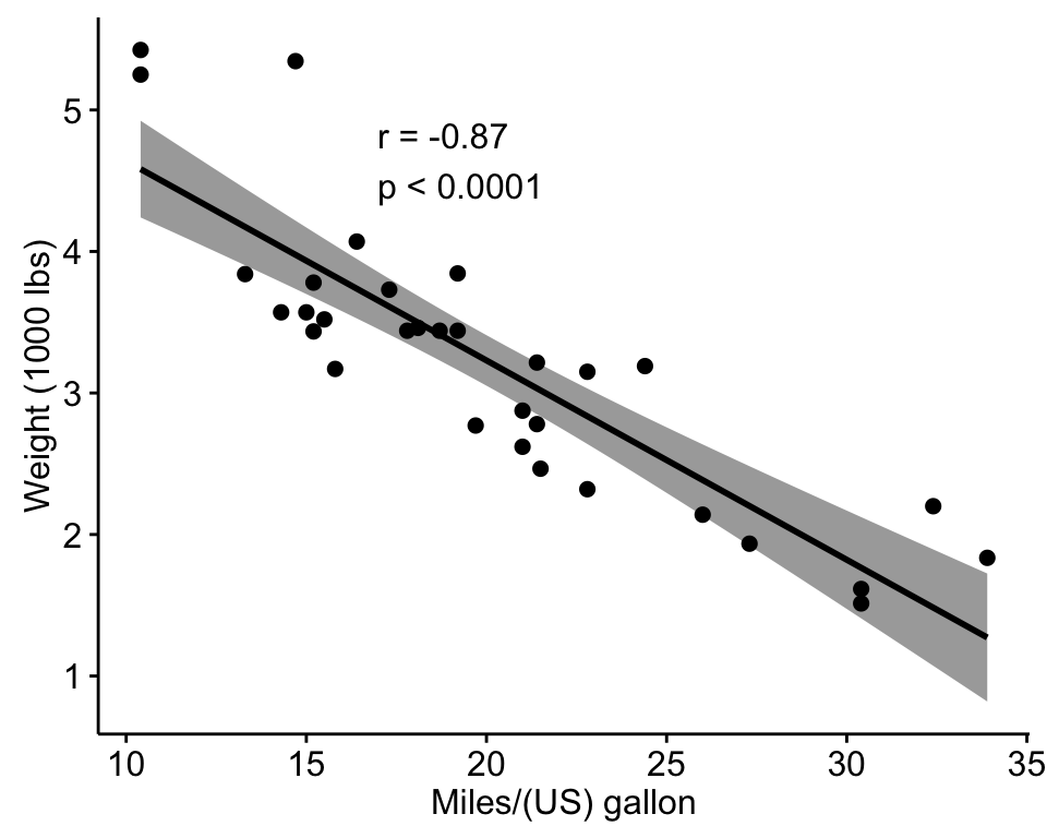
- Visualize your data using scatter plots
- Preliminary test to check the test assumptions
- Pearson correlation test
- Kendall rank correlation test
- Spearman rank correlation coefficient
- Interpret correlation coefficient
Read more: —> Correlation Test Between Two Variables in R.
Correlation Matrix: Analyze, Format and Visualize
Correlation matrix is used to analyze the correlation between multiple variables at the same time.
Brief outline:
- What is correlation matrix?
- Compute correlation matrix in R
- R functions
- Compute correlation matrix
- Correlation matrix with significance levels (p-value)
- A simple function to format the correlation matrix
- Visualize correlation matrix
- Use symnum() function: Symbolic number coding
- Use corrplot() function: Draw a correlogram
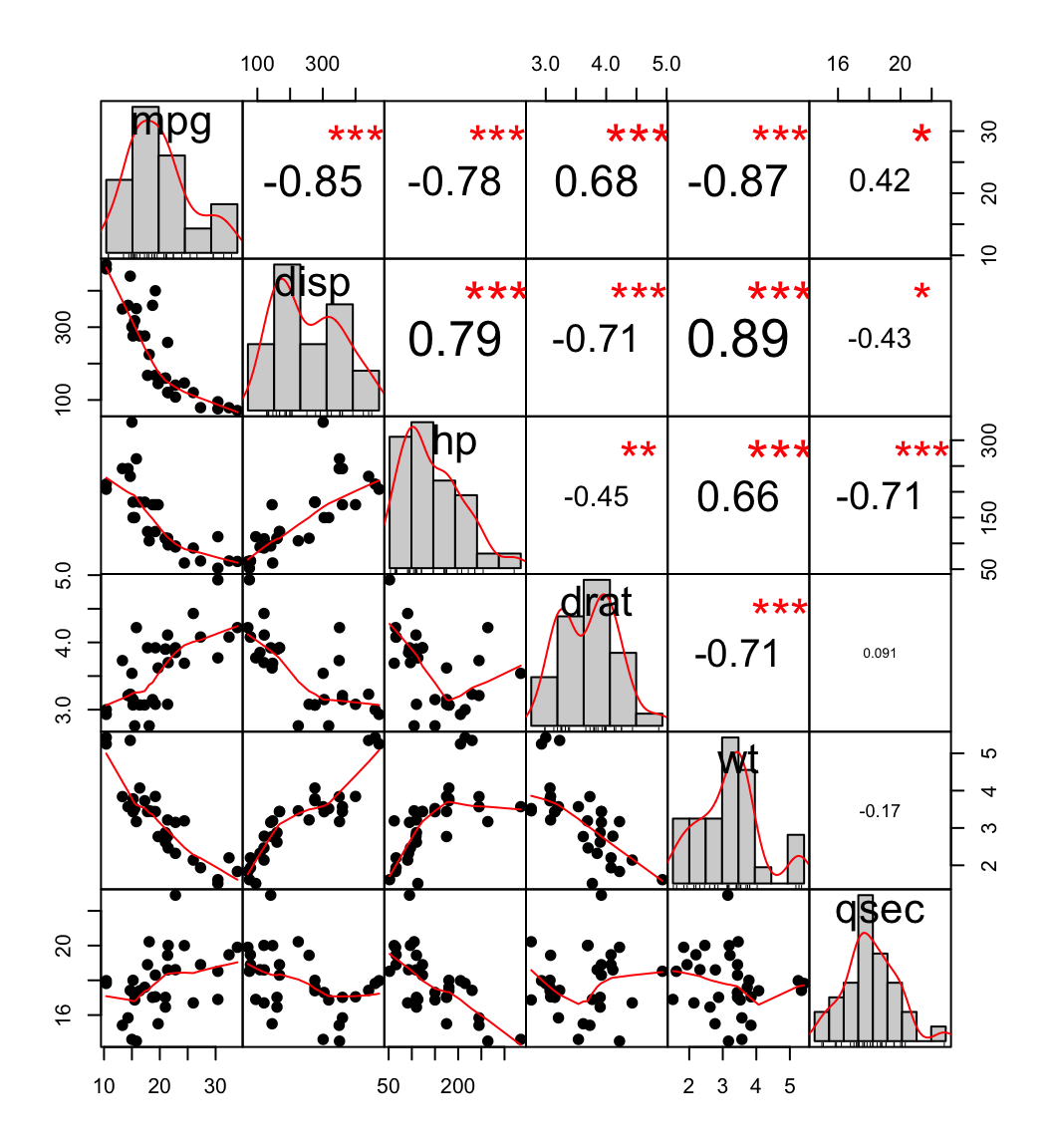
- Use chart.Correlation(): Draw scatter plots
- Use heatmap()
scatter plot, chart
Read more: —> Correlation Matrix: Analyze, Format and Visualize.
Visualize Correlation Matrix using Correlogram
Correlogram is a graph of correlation matrix. Useful to highlight the most correlated variables in a data table. In this plot, correlation coefficients are colored according to the value. Correlation matrix can be also reordered according to the degree of association between variables.
Brief outline:
- Install R corrplot package
- Data for correlation analysis
- Computing correlation matrix
- Correlogram : Visualizing the correlation matrix
- Visualization methods
- Types of correlogram layout
- Reordering the correlation matrix
- Changing the color of the correlogram
- Changing the color and the rotation of text labels
- Combining correlogram with the significance test
- Customize the correlogram
library(corrplot)
library(RColorBrewer)
M <-cor(mtcars)
corrplot(M, type="upper", order="hclust",
         col=brewer.pal(n=8, name="RdYlBu"))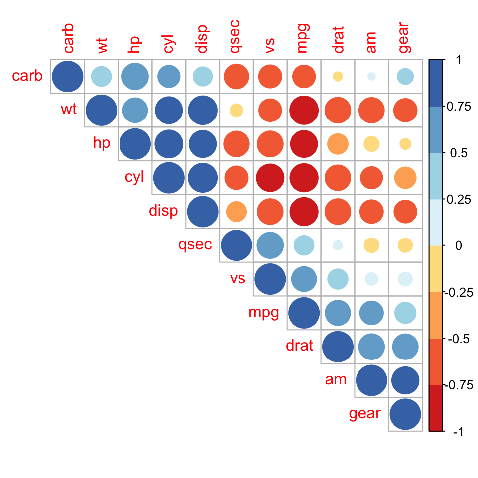
Read more: —> Visualize Correlation Matrix using Correlogram.
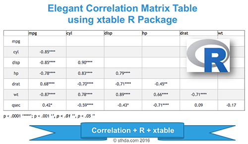
Elegant Correlation Table using xtable R Package
The aim of this article is to show you how to get the lower and the upper triangular part of a correlation matrix. We will use also xtable R package to display a nice correlation table.
Brief outline:
- Correlation matrix analysis
- Lower and upper triangular part of a correlation matrix
- Use xtable R package to display nice correlation table in html format
- Combine matrix of correlation coefficients and significance levels
Read more: —> Elegant correlation table using xtable R package.
Correlation Matrix : An R Function to Do All You Need
The goal of this article is to provide you a custom R function, named rquery.cormat(), for calculating and visualizing easily a correlation matrix in a single line R code.
Brief outline:
- Computing the correlation matrix using rquery.cormat()
- Upper triangle of the correlation matrix
- Full correlation matrix
- Change the colors of the correlogram
- Draw a heatmap
- Format the correlation table
- Description of rquery.cormat() function
source("https://www.sthda.com/upload/rquery_cormat.r")
mydata <- mtcars[, c(1,3,4,5,6,7)]
require("corrplot")
rquery.cormat(mydata)
$r
hp disp wt qsec mpg drat
hp 1
disp 0.79 1
wt 0.66 0.89 1
qsec -0.71 -0.43 -0.17 1
mpg -0.78 -0.85 -0.87 0.42 1
drat -0.45 -0.71 -0.71 0.091 0.68 1
$p
hp disp wt qsec mpg drat
hp 0
disp 7.1e-08 0
wt 4.1e-05 1.2e-11 0
qsec 5.8e-06 0.013 0.34 0
mpg 1.8e-07 9.4e-10 1.3e-10 0.017 0
drat 0.01 5.3e-06 4.8e-06 0.62 1.8e-05 0
$sym
hp disp wt qsec mpg drat
hp 1
disp , 1
wt , + 1
qsec , . 1
mpg , + + . 1
drat . , , , 1
attr(,"legend")
[1] 0 ' ' 0.3 '.' 0.6 ',' 0.8 '+' 0.9 '*' 0.95 'B' 1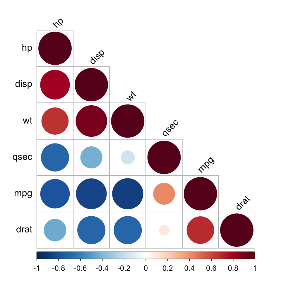
Read more: —> Correlation Matrix : An R Function to Do All You Need.
See also
Infos
This analysis has been performed using R statistical software (ver. 3.2.4).
Show me some love with the like buttons below... Thank you and please don't forget to share and comment below!!
Montrez-moi un peu d'amour avec les like ci-dessous ... Merci et n'oubliez pas, s'il vous plaît, de partager et de commenter ci-dessous!
Recommended for You!


Recommended for you
This section contains the best data science and self-development resources to help you on your path.
Books - Data Science
Our Books
- Practical Guide to Cluster Analysis in R by A. Kassambara (Datanovia)
- Practical Guide To Principal Component Methods in R by A. Kassambara (Datanovia)
- Machine Learning Essentials: Practical Guide in R by A. Kassambara (Datanovia)
- R Graphics Essentials for Great Data Visualization by A. Kassambara (Datanovia)
- GGPlot2 Essentials for Great Data Visualization in R by A. Kassambara (Datanovia)
- Network Analysis and Visualization in R by A. Kassambara (Datanovia)
- Practical Statistics in R for Comparing Groups: Numerical Variables by A. Kassambara (Datanovia)
- Inter-Rater Reliability Essentials: Practical Guide in R by A. Kassambara (Datanovia)
Others
- R for Data Science: Import, Tidy, Transform, Visualize, and Model Data by Hadley Wickham & Garrett Grolemund
- Hands-On Machine Learning with Scikit-Learn, Keras, and TensorFlow: Concepts, Tools, and Techniques to Build Intelligent Systems by Aurelien Géron
- Practical Statistics for Data Scientists: 50 Essential Concepts by Peter Bruce & Andrew Bruce
- Hands-On Programming with R: Write Your Own Functions And Simulations by Garrett Grolemund & Hadley Wickham
- An Introduction to Statistical Learning: with Applications in R by Gareth James et al.
- Deep Learning with R by François Chollet & J.J. Allaire
- Deep Learning with Python by François Chollet
Click to follow us on Facebook :
Comment this article by clicking on "Discussion" button (top-right position of this page)
Articles contained by this category :
Correlation coefficient
Correlation coefficient calculator
Correlation coefficient calculator : the top 3 you should know
correlation formula
Correlation matrix : A quick start guide to analyze, format and visualize a correlation matrix using R software
Correlation matrix : An R function to do all you need
Correlation matrix : Formatting and visualization
Correlation matrix : How to make a heatmap ?
Correlation Test Between Two Variables in R
Elegant correlation table using xtable R package
Visualize correlation matrix using correlogram
Visualize correlation matrix using symnum function