ggplot2 area plot : Quick start guide - R software and data visualization
This R tutorial describes how to create an area plot using R software and ggplot2 package. We’ll see also, how to color under density curve using geom_area.
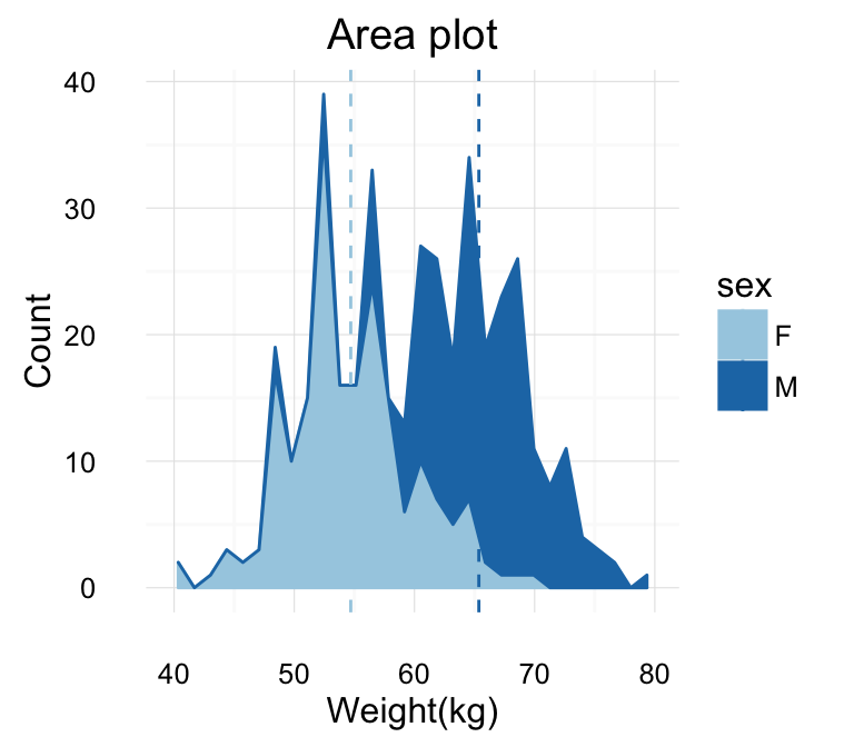
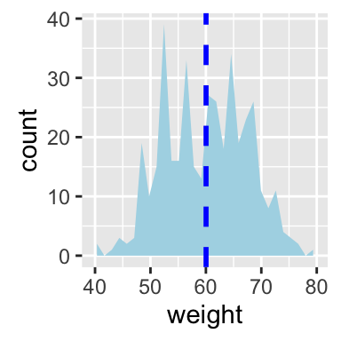
The function geom_area() is used. You can also add a line for the mean using the function geom_vline.
ggplot2 geom_area - R software and data visualization
Prepare the data
This data will be used for the examples below :
set.seed(1234)
df <- data.frame(
  sex=factor(rep(c("F", "M"), each=200)),
  weight=round(c(rnorm(200, mean=55, sd=5),
                 rnorm(200, mean=65, sd=5)))
  )
head(df)
## sex weight
## 1 F 49
## 2 F 56
## 3 F 60
## 4 F 43
## 5 F 57
## 6 F 58Basic area plots
library(ggplot2)
p <- ggplot(df, aes(x=weight))
# Basic area plot
p + geom_area(stat = "bin")
# y axis as density value
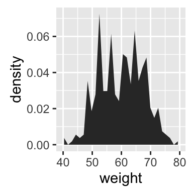
p + geom_area(aes(y = ..density..), stat = "bin")
# Add mean line
p + geom_area(stat = "bin", fill = "lightblue")+
  geom_vline(aes(xintercept=mean(weight)),
            color="blue", linetype="dashed", size=1)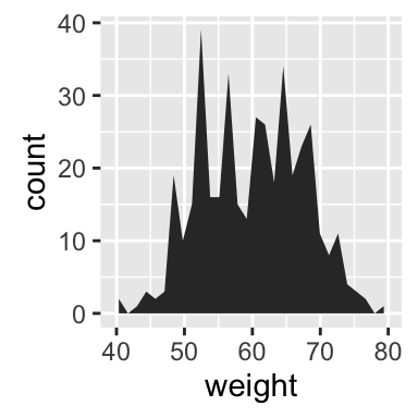
ggplot2 geom_area - R software and data visualization
Change line types and colors
# Change line color and fill color
p + geom_area(stat ="bin", color="darkblue",
              fill="lightblue")
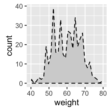
# Change line type
p + geom_area(stat = "bin", color= "black",
              fill="lightgrey", linetype="dashed")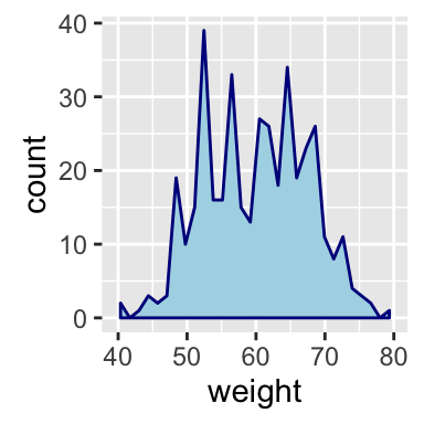
ggplot2 geom_area - R software and data visualization
Read more on ggplot2 line types : ggplot2 line types
Change colors by groups
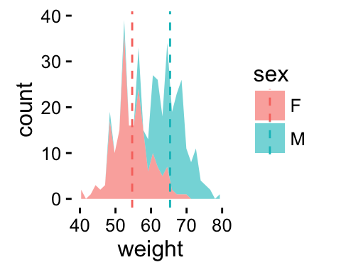
Calculate the mean of each group :
library(plyr)
mu <- ddply(df, "sex", summarise, grp.mean=mean(weight))
head(mu)
## sex grp.mean
## 1 F 54.70
## 2 M 65.36Change fill colors
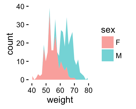
Area plot fill colors can be automatically controlled by the levels of sex :
# Change area plot fill colors by groups
ggplot(df, aes(x=weight, fill=sex)) +
  geom_area(stat ="bin")
# Use semi-transparent fill
p<-ggplot(df, aes(x=weight, fill=sex)) +
  geom_area(stat ="bin", alpha=0.6) +
  theme_classic()
p
# Add mean lines
p+geom_vline(data=mu, aes(xintercept=grp.mean, color=sex),
             linetype="dashed")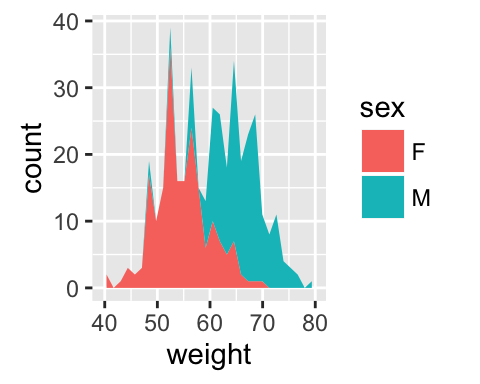
ggplot2 geom_area - R software and data visualization
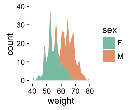
It is also possible to change manually the area plot fill colors using the functions :
- scale_fill_manual() : to use custom colors
- scale_fill_brewer() : to use color palettes from RColorBrewer package
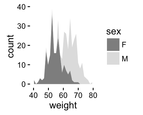
- scale_fill_grey() : to use grey color palettes
# Use custom color palettes
p+scale_fill_manual(values=c("#999999", "#E69F00"))
# use brewer color palettes
p+scale_fill_brewer(palette="Dark2")
# Use grey scale
p + scale_fill_grey()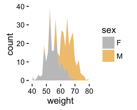
ggplot2 geom_area - R software and data visualization
Read more on ggplot2 colors here : ggplot2 colors
Change the legend position
p + theme(legend.position="top")
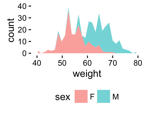
p + theme(legend.position="bottom")
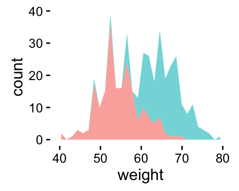
p + theme(legend.position="none") # Remove legend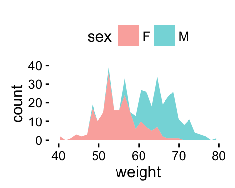
ggplot2 geom_area - R software and data visualization
The allowed values for the arguments legend.position are : “left”,“top”, “right”, “bottom”.
Read more on ggplot legends : ggplot2 legends
Use facets
Split the plot in multiple panels :
p<-ggplot(df, aes(x=weight))+
  geom_area(stat ="bin")+facet_grid(sex ~ .)
p
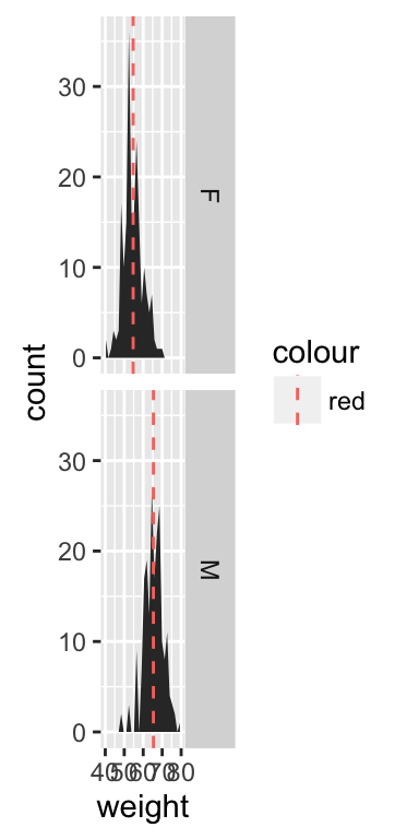
# Add mean lines
p+geom_vline(data=mu, aes(xintercept=grp.mean, color="red"),
             linetype="dashed")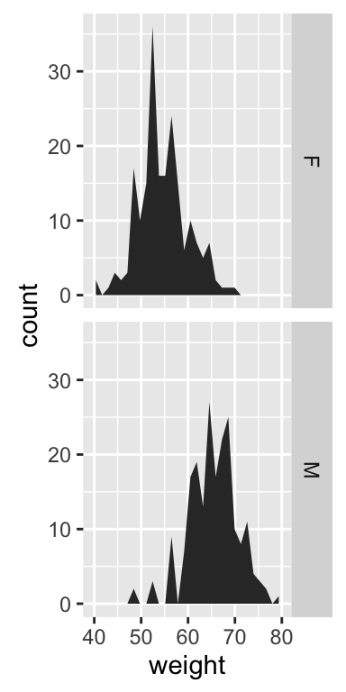
ggplot2 geom_area - R software and data visualization
Read more on facets : ggplot2 facets
Contrasting bar plot and area plot
An area plot is the continuous analog of a stacked bar chart. In the following example, we’ll use diamonds data set [in ggplot2 package]:
# Load the data
data("diamonds")
p <- ggplot(diamonds, aes(x = price, fill = cut))
head(diamonds)
## carat cut color clarity depth table price x y z
## 1 0.23 Ideal E SI2 61.5 55 326 3.95 3.98 2.43
## 2 0.21 Premium E SI1 59.8 61 326 3.89 3.84 2.31
## 3 0.23 Good E VS1 56.9 65 327 4.05 4.07 2.31
## 4 0.29 Premium I VS2 62.4 58 334 4.20 4.23 2.63
## 5 0.31 Good J SI2 63.3 58 335 4.34 4.35 2.75
## 6 0.24 Very Good J VVS2 62.8 57 336 3.94 3.96 2.48# Bar plot
p + geom_bar(stat = "bin")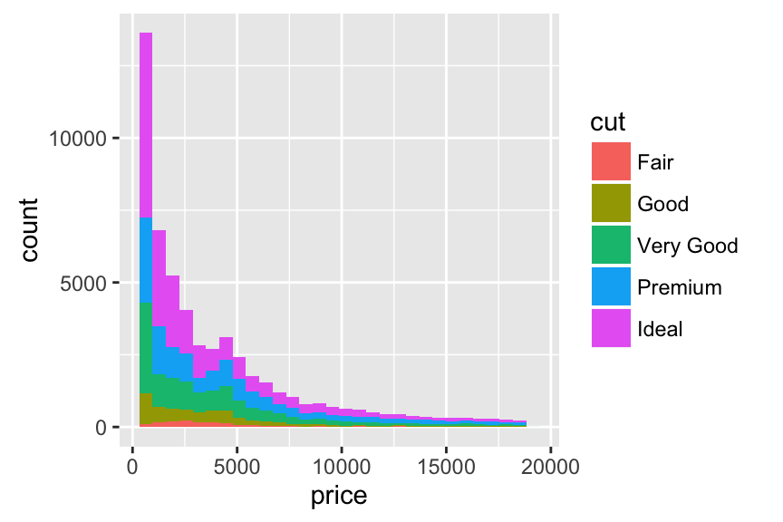
ggplot2 geom_area - R software and data visualization
# Area plot
p + geom_area(stat = "bin") +
scale_fill_brewer(palette="Dark2") 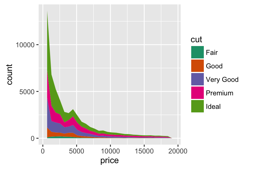
ggplot2 geom_area - R software and data visualization
Coloring under density curve using geom_area
dat <- with(density(df$weight), data.frame(x, y))
ggplot(data = dat, mapping = aes(x = x, y = y)) +
    geom_line()+
    geom_area(mapping = aes(x = ifelse(x>65 & x< 70 , x, 0)), fill = "red") +
    xlim(30, 80)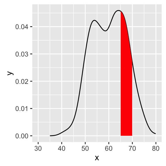
ggplot2 geom_area - R software and data visualization
Infos
This analysis has been performed using R software (ver. 3.2.4) and ggplot2 (ver. 2.1.0)
Show me some love with the like buttons below... Thank you and please don't forget to share and comment below!!
Montrez-moi un peu d'amour avec les like ci-dessous ... Merci et n'oubliez pas, s'il vous plaît, de partager et de commenter ci-dessous!
Recommended for You!
Recommended for you
This section contains the best data science and self-development resources to help you on your path.
Books - Data Science
Our Books
- Practical Guide to Cluster Analysis in R by A. Kassambara (Datanovia)
- Practical Guide To Principal Component Methods in R by A. Kassambara (Datanovia)
- Machine Learning Essentials: Practical Guide in R by A. Kassambara (Datanovia)
- R Graphics Essentials for Great Data Visualization by A. Kassambara (Datanovia)
- GGPlot2 Essentials for Great Data Visualization in R by A. Kassambara (Datanovia)
- Network Analysis and Visualization in R by A. Kassambara (Datanovia)
- Practical Statistics in R for Comparing Groups: Numerical Variables by A. Kassambara (Datanovia)
- Inter-Rater Reliability Essentials: Practical Guide in R by A. Kassambara (Datanovia)
Others
- R for Data Science: Import, Tidy, Transform, Visualize, and Model Data by Hadley Wickham & Garrett Grolemund
- Hands-On Machine Learning with Scikit-Learn, Keras, and TensorFlow: Concepts, Tools, and Techniques to Build Intelligent Systems by Aurelien Géron
- Practical Statistics for Data Scientists: 50 Essential Concepts by Peter Bruce & Andrew Bruce
- Hands-On Programming with R: Write Your Own Functions And Simulations by Garrett Grolemund & Hadley Wickham
- An Introduction to Statistical Learning: with Applications in R by Gareth James et al.
- Deep Learning with R by François Chollet & J.J. Allaire
- Deep Learning with Python by François Chollet
Click to follow us on Facebook :
Comment this article by clicking on "Discussion" button (top-right position of this page)


