


Descriptive Statistics and Graphics
- Import your data into R
- Check your data
- R functions for computing descriptive statistics
- Descriptive statistics for a single group
- Descriptive statistics by groups
- Frequency tables
- Infos
Descriptive statistics
Import your data into R
Prepare your data as specified here: Best practices for preparing your data set for R
Save your data in an external .txt tab or .csv files
Import your data into R as follow:
# If .txt tab file, use this
my_data <- read.delim(file.choose())
# Or, if .csv file, use this
my_data <- read.csv(file.choose())
Here, we’ll use the built-in R data set named iris.
# Store the data in the variable my_data
my_data <- iris
Check your data
You can inspect your data using the functions head() and tails(), which will display the first and the last part of the data, respectively.
# Print the first 6 rows
head(my_data, 6)
Sepal.Length Sepal.Width Petal.Length Petal.Width Species
1 5.1 3.5 1.4 0.2 setosa
2 4.9 3.0 1.4 0.2 setosa
3 4.7 3.2 1.3 0.2 setosa
4 4.6 3.1 1.5 0.2 setosa
5 5.0 3.6 1.4 0.2 setosa
6 5.4 3.9 1.7 0.4 setosaR functions for computing descriptive statistics
Some R functions for computing descriptive statistics:
| Description | R function |
|---|---|
| Mean | mean() |
| Standard deviation | sd() |
| Variance | var() |
| Minimum | min() |
| Maximum | maximum() |
| Median | median() |
| Range of values (minimum and maximum) | range() |
| Sample quantiles | quantile() |
| Generic function | summary() |
| Interquartile range | IQR() |
The function mfv(), for most frequent value, [in modeest package] can be used to find the statistical mode of a numeric vector.
Descriptive statistics for a single group
Measure of central tendency: mean, median, mode
Roughly speaking, the central tendency measures the “average” or the “middle” of your data. The most commonly used measures include:
- the mean: the average value. It’s sensitive to outliers.
- the median: the middle value. It’s a robust alternative to mean.
- and the mode: the most frequent value
In R,
- The function mean() and median() can be used to compute the mean and the median, respectively;
- The function mfv() [in the modeest R package] can be used to compute the mode of a variable.
The R code below computes the mean, median and the mode of the variable Sepal.Length [in my_data data set]:
# Compute the mean value
mean(my_data$Sepal.Length)
[1] 5.843333# Compute the median value
median(my_data$Sepal.Length)[1] 5.8# Compute the mode
# install.packages("modeest")
require(modeest)
mfv(my_data$Sepal.Length)[1] 5Measure of variablity
Measures of variability gives how “spread out” the data are.
Range: minimum & maximum
- Range corresponds to biggest value minus the smallest value. It gives you the full spread of the data.
# Compute the minimum value
min(my_data$Sepal.Length)
[1] 4.3# Compute the maximum value
max(my_data$Sepal.Length)[1] 7.9# Range
range(my_data$Sepal.Length)[1] 4.3 7.9Interquartile range
Recall that, quartiles divide the data into 4 parts. Note that, the interquartile range (IQR) - corresponding to the difference between the first and third quartiles - is sometimes used as a robust alternative to the standard deviation.
- R function:
quantile(x, probs = seq(0, 1, 0.25))- x: numeric vector whose sample quantiles are wanted.
- probs: numeric vector of probabilities with values in [0,1].
- Example:
quantile(my_data$Sepal.Length) 0% 25% 50% 75% 100%
4.3 5.1 5.8 6.4 7.9 By default, the function returns the minimum, the maximum and three quartiles (the 0.25, 0.50 and 0.75 quartiles).
To compute deciles (0.1, 0.2, 0.3, …., 0.9), use this:
quantile(my_data$Sepal.Length, seq(0, 1, 0.1))To compute the interquartile range, type this:
IQR(my_data$Sepal.Length)[1] 1.3Variance and standard deviation
The variance represents the average squared deviation from the mean. The standard deviation is the square root of the variance. It measures the average deviation of the values, in the data, from the mean value.
# Compute the variance
var(my_data$Sepal.Length)
# Compute the standard deviation =
# square root of th variance
sd(my_data$Sepal.Length)
Median absolute deviation
The median absolute deviation (MAD) measures the deviation of the values, in the data, from the median value.
# Compute the median
median(my_data$Sepal.Length)
# Compute the median absolute deviation
mad(my_data$Sepal.Length)
Which measure to use?
- Range. It’s not often used because it’s very sensitive to outliers.
- Interquartile range. It’s pretty robust to outliers. It’s used a lot in combination with the median.
- Variance. It’s completely uninterpretable because it doesn’t use the same units as the data. It’s almost never used except as a mathematical tool
- Standard deviation. This is the square root of the variance. It’s expressed in the same units as the data. The standard deviation is often used in the situation where the mean is the measure of central tendency.
- Median absolute deviation. It’s a robust way to estimate the standard deviation, for data with outliers. It’s not used very often.
In summary, the IQR and the standard deviation are the two most common measures used to report the variability of the data.
Computing an overall summary of a variable and an entire data frame
summary() function
The function summary() can be used to display several statistic summaries of either one variable or an entire data frame.
- Summary of a single variable. Five values are returned: the mean, median, 25th and 75th quartiles, min and max in one single line call:
summary(my_data$Sepal.Length) Min. 1st Qu. Median Mean 3rd Qu. Max.
4.300 5.100 5.800 5.843 6.400 7.900 - Summary of a data frame. In this case, the function summary() is automatically applied to each column. The format of the result depends on the type of the data contained in the column. For example:
- If the column is a numeric variable, mean, median, min, max and quartiles are returned.
- If the column is a factor variable, the number of observations in each group is returned.
summary(my_data, digits = 1) Sepal.Length Sepal.Width Petal.Length Petal.Width Species
Min. :4 Min. :2 Min. :1 Min. :0.1 setosa :50
1st Qu.:5 1st Qu.:3 1st Qu.:2 1st Qu.:0.3 versicolor:50
Median :6 Median :3 Median :4 Median :1.3 virginica :50
Mean :6 Mean :3 Mean :4 Mean :1.2
3rd Qu.:6 3rd Qu.:3 3rd Qu.:5 3rd Qu.:1.8
Max. :8 Max. :4 Max. :7 Max. :2.5 sapply() function
It’s also possible to use the function sapply() to apply a particular function over a list or vector. For instance, we can use it, to compute for each column in a data frame, the mean, sd, var, min, quantile, …
# Compute the mean of each column
sapply(my_data[, -5], mean)
Sepal.Length Sepal.Width Petal.Length Petal.Width
5.843333 3.057333 3.758000 1.199333 # Compute quartiles
sapply(my_data[, -5], quantile) Sepal.Length Sepal.Width Petal.Length Petal.Width
0% 4.3 2.0 1.00 0.1
25% 5.1 2.8 1.60 0.3
50% 5.8 3.0 4.35 1.3
75% 6.4 3.3 5.10 1.8
100% 7.9 4.4 6.90 2.5stat.desc() function
The function stat.desc() [in pastecs package], provides other useful statistics including:
- the median
- the mean
- the standard error on the mean (SE.mean)
- the confidence interval of the mean (CI.mean) at the p level (default is 0.95)
- the variance (var)
- the standard deviation (std.dev)
and the variation coefficient (coef.var) defined as the standard deviation divided by the mean
Install pastecs package
install.packages("pastecs")- Use the function stat.desc() to compute descriptive statistics
# Compute descriptive statistics
library(pastecs)
res <- stat.desc(my_data[, -5])
round(res, 2)
Sepal.Length Sepal.Width Petal.Length Petal.Width
nbr.val 150.00 150.00 150.00 150.00
nbr.null 0.00 0.00 0.00 0.00
nbr.na 0.00 0.00 0.00 0.00
min 4.30 2.00 1.00 0.10
max 7.90 4.40 6.90 2.50
range 3.60 2.40 5.90 2.40
sum 876.50 458.60 563.70 179.90
median 5.80 3.00 4.35 1.30
mean 5.84 3.06 3.76 1.20
SE.mean 0.07 0.04 0.14 0.06
CI.mean.0.95 0.13 0.07 0.28 0.12
var 0.69 0.19 3.12 0.58
std.dev 0.83 0.44 1.77 0.76
coef.var 0.14 0.14 0.47 0.64Case of missing values
Note that, when the data contains missing values, some R functions will return errors or NA even if just a single value is missing.
For example, the mean() function will return NA if even only one value is missing in a vector. This can be avoided using the argument na.rm = TRUE, which tells to the function to remove any NAs before calculations. An example using the mean function is as follow:
mean(my_data$Sepal.Length, na.rm = TRUE)Graphical display of distributions
The R package ggpubr will be used to create graphs.
Installation and loading ggpubr
- Install the latest version from GitHub as follow:
# Install
if(!require(devtools)) install.packages("devtools")
devtools::install_github("kassambara/ggpubr")- Or, install from CRAN as follow:
install.packages("ggpubr")- Load ggpubr as follow:
library(ggpubr)Box plots
ggboxplot(my_data, y = "Sepal.Length", width = 0.5)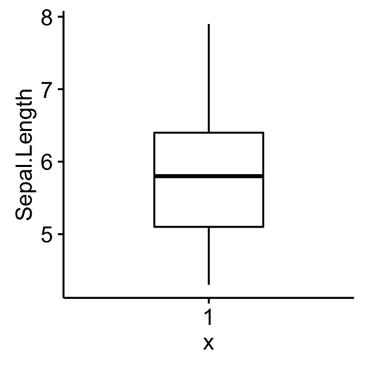
Histogram
Histogram plot of Sepal.Length with mean line (dashed line).
gghistogram(my_data, x = "Sepal.Length", bins = 9,
             add = "mean")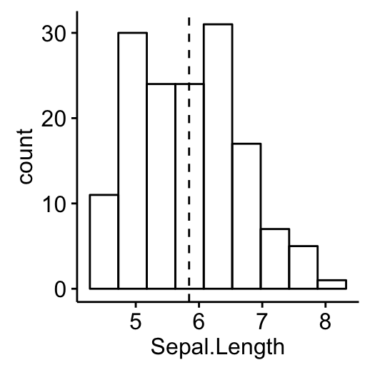
Empirical cumulative distribution function (ECDF)
ggecdf(my_data, x = "Sepal.Length")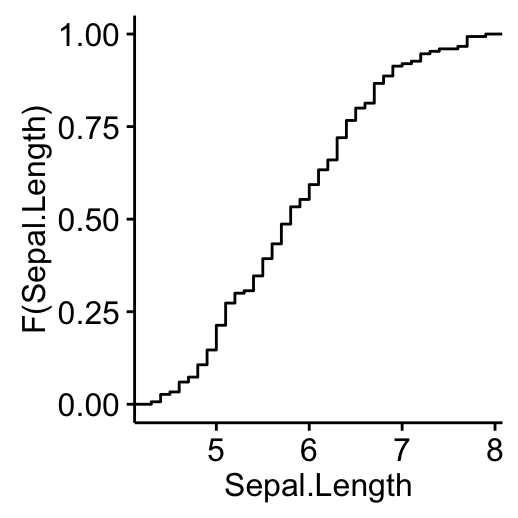
Q-Q plots
ggqqplot(my_data, x = "Sepal.Length")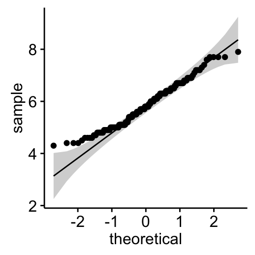
Descriptive statistics by groups
To compute summary statistics by groups, the functions group_by() and summarise() [in dplyr package] can be used.
- We want to group the data by Species and then:
- compute the number of element in each group. R function: n()
- compute the mean. R function mean()
- and the standard deviation. R function sd()
The function %>% is used to chaine operations.
- Install ddplyr as follow:
install.packages("dplyr")- Descriptive statistics by groups:
library(dplyr)
group_by(my_data, Species) %>%
summarise(
  count = n(),
  mean = mean(Sepal.Length, na.rm = TRUE),
  sd = sd(Sepal.Length, na.rm = TRUE)
  )
Source: local data frame [3 x 4]
Species count mean sd
(fctr) (int) (dbl) (dbl)
1 setosa 50 5.006 0.3524897
2 versicolor 50 5.936 0.5161711
3 virginica 50 6.588 0.6358796- Graphics for grouped data:
library("ggpubr")
# Box plot colored by groups: Species
ggboxplot(my_data, x = "Species", y = "Sepal.Length",
          color = "Species",
          palette = c("#00AFBB", "#E7B800", "#FC4E07"))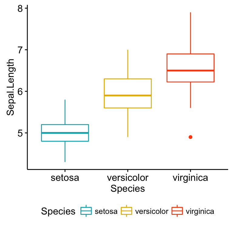
# Stripchart colored by groups: Species
ggstripchart(my_data, x = "Species", y = "Sepal.Length",
          color = "Species",
          palette = c("#00AFBB", "#E7B800", "#FC4E07"),
          add = "mean_sd")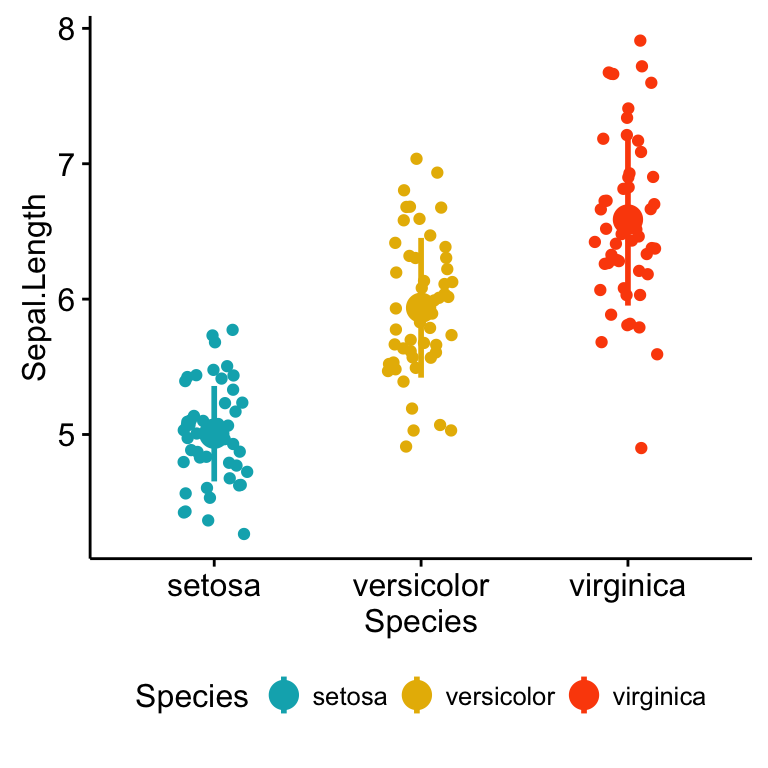
Note that, when the number of observations per groups is small, it’s recommended to use strip chart compared to box plots.
Frequency tables
A frequency table (or contingency table) is used to describe categorical variables. It contains the counts at each combination of factor levels.
R function to generate tables: table()
Create some data
Distribution of hair and eye color by sex of 592 students:
# Hair/eye color data
df <- as.data.frame(HairEyeColor)
hair_eye_col <- df[rep(row.names(df), df$Freq), 1:3]
rownames(hair_eye_col) <- 1:nrow(hair_eye_col)
head(hair_eye_col)
Hair Eye Sex
1 Black Brown Male
2 Black Brown Male
3 Black Brown Male
4 Black Brown Male
5 Black Brown Male
6 Black Brown Male# hair/eye variables
Hair <- hair_eye_col$Hair
Eye <- hair_eye_col$EyeSimple frequency distribution: one categorical variable
- Table of counts
# Frequency distribution of hair color
table(Hair)
Hair
Black Brown Red Blond
108 286 71 127 # Frequency distribution of eye color
table(Eye)Eye
Brown Blue Hazel Green
220 215 93 64 - Graphics: to create the graphics, we start by converting the table as a data frame.
# Compute table and convert as data frame
df <- as.data.frame(table(Hair))
df
Hair Freq
1 Black 108
2 Brown 286
3 Red 71
4 Blond 127# Visualize using bar plot
library(ggpubr)
ggbarplot(df, x = "Hair", y = "Freq")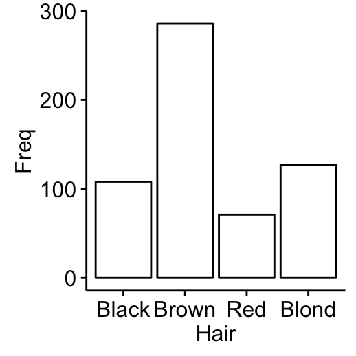
Two-way contingency table: Two categorical variables
tbl2 <- table(Hair , Eye)
tbl2
Eye
Hair Brown Blue Hazel Green
Black 68 20 15 5
Brown 119 84 54 29
Red 26 17 14 14
Blond 7 94 10 16It’s also possible to use the function xtabs(), which will create cross tabulation of data frames with a formula interface.
xtabs(~ Hair + Eye, data = hair_eye_col)- Graphics: to create the graphics, we start by converting the table as a data frame.
df <- as.data.frame(tbl2)
head(df)
Hair Eye Freq
1 Black Brown 68
2 Brown Brown 119
3 Red Brown 26
4 Blond Brown 7
5 Black Blue 20
6 Brown Blue 84# Visualize using bar plot
library(ggpubr)
ggbarplot(df, x = "Hair", y = "Freq",
color = "Eye",
palette = c("brown", "blue", "gold", "green"))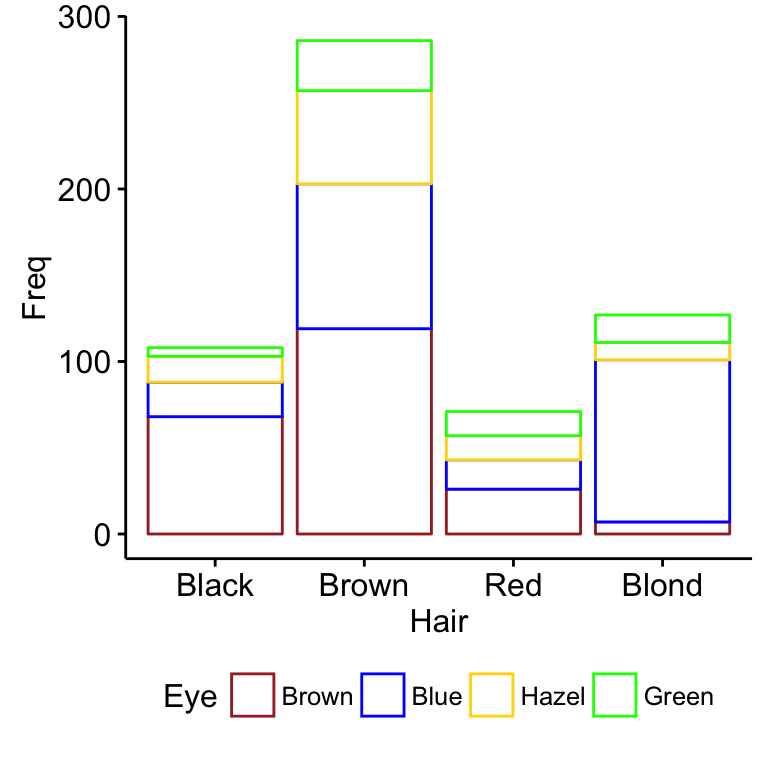
# position dodge
ggbarplot(df, x = "Hair", y = "Freq",
          color = "Eye", position = position_dodge(),
          palette = c("brown", "blue", "gold", "green"))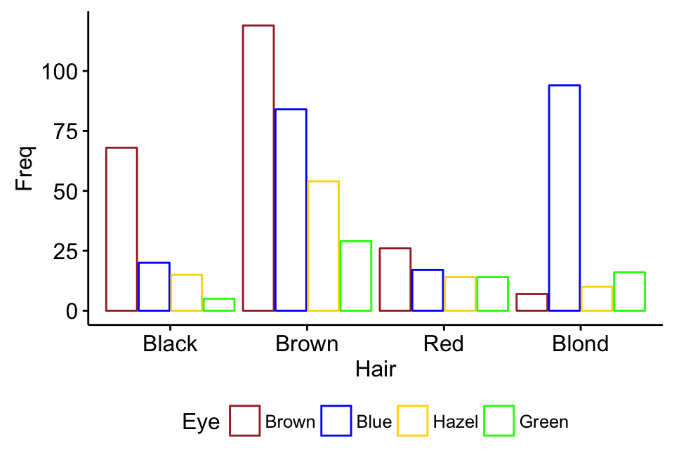
Multiway tables: More than two categorical variables
- Hair and Eye color distributions by sex using xtabs():
xtabs(~Hair + Eye + Sex, data = hair_eye_col), , Sex = Male
Eye
Hair Brown Blue Hazel Green
Black 32 11 10 3
Brown 53 50 25 15
Red 10 10 7 7
Blond 3 30 5 8
, , Sex = Female
Eye
Hair Brown Blue Hazel Green
Black 36 9 5 2
Brown 66 34 29 14
Red 16 7 7 7
Blond 4 64 5 8- You can also use the function ftable() [for flat contingency tables]. It returns a nice output compared to xtabs() when you have more than two variables:
ftable(Sex + Hair ~ Eye, data = hair_eye_col) Sex Male Female
Hair Black Brown Red Blond Black Brown Red Blond
Eye
Brown 32 53 10 3 36 66 16 4
Blue 11 50 10 30 9 34 7 64
Hazel 10 25 7 5 5 29 7 5
Green 3 15 7 8 2 14 7 8Compute table margins and relative frequency
Table margins correspond to the sums of counts along rows or columns of the table. Relative frequencies express table entries as proportions of table margins (i.e., row or column totals).
The function margin.table() and prop.table() can be used to compute table margins and relative frequencies, respectively.
- Format of the functions:
margin.table(x, margin = NULL)
prop.table(x, margin = NULL)- x: table
- margin: index number (1 for rows and 2 for columns)
- compute table margins:
Hair <- hair_eye_col$Hair
Eye <- hair_eye_col$Eye
# Hair/Eye color table
he.tbl <- table(Hair, Eye)
he.tbl
Eye
Hair Brown Blue Hazel Green
Black 68 20 15 5
Brown 119 84 54 29
Red 26 17 14 14
Blond 7 94 10 16# Margin of rows
margin.table(he.tbl, 1)Hair
Black Brown Red Blond
108 286 71 127 # Margin of columns
margin.table(he.tbl, 2)Eye
Brown Blue Hazel Green
220 215 93 64 - Compute relative frequencies:
# Frequencies relative to row total
prop.table(he.tbl, 1)
Eye
Hair Brown Blue Hazel Green
Black 0.62962963 0.18518519 0.13888889 0.04629630
Brown 0.41608392 0.29370629 0.18881119 0.10139860
Red 0.36619718 0.23943662 0.19718310 0.19718310
Blond 0.05511811 0.74015748 0.07874016 0.12598425# Table of percentages
round(prop.table(he.tbl, 1), 2)*100 Eye
Hair Brown Blue Hazel Green
Black 63 19 14 5
Brown 42 29 19 10
Red 37 24 20 20
Blond 6 74 8 13To express the frequencies relative to the grand total, use this:
he.tbl/sum(he.tbl)Infos
This analysis has been performed using R software (ver. 3.2.4).
Show me some love with the like buttons below... Thank you and please don't forget to share and comment below!!
Montrez-moi un peu d'amour avec les like ci-dessous ... Merci et n'oubliez pas, s'il vous plaît, de partager et de commenter ci-dessous!
Recommended for You!


Recommended for you
This section contains the best data science and self-development resources to help you on your path.
Books - Data Science
Our Books
- Practical Guide to Cluster Analysis in R by A. Kassambara (Datanovia)
- Practical Guide To Principal Component Methods in R by A. Kassambara (Datanovia)
- Machine Learning Essentials: Practical Guide in R by A. Kassambara (Datanovia)
- R Graphics Essentials for Great Data Visualization by A. Kassambara (Datanovia)
- GGPlot2 Essentials for Great Data Visualization in R by A. Kassambara (Datanovia)
- Network Analysis and Visualization in R by A. Kassambara (Datanovia)
- Practical Statistics in R for Comparing Groups: Numerical Variables by A. Kassambara (Datanovia)
- Inter-Rater Reliability Essentials: Practical Guide in R by A. Kassambara (Datanovia)
Others
- R for Data Science: Import, Tidy, Transform, Visualize, and Model Data by Hadley Wickham & Garrett Grolemund
- Hands-On Machine Learning with Scikit-Learn, Keras, and TensorFlow: Concepts, Tools, and Techniques to Build Intelligent Systems by Aurelien Géron
- Practical Statistics for Data Scientists: 50 Essential Concepts by Peter Bruce & Andrew Bruce
- Hands-On Programming with R: Write Your Own Functions And Simulations by Garrett Grolemund & Hadley Wickham
- An Introduction to Statistical Learning: with Applications in R by Gareth James et al.
- Deep Learning with R by François Chollet & J.J. Allaire
- Deep Learning with Python by François Chollet
Click to follow us on Facebook :
Comment this article by clicking on "Discussion" button (top-right position of this page)