ggplot2 facet : split a plot into a matrix of panels
The facet approach partitions a plot into a matrix of panels. Each panel shows a different subset of the data. This R tutorial describes how to split a graph using ggplot2 package.
There are two main functions for faceting :
- facet_grid()
- facet_wrap()
Data
ToothGrowth data is used in the following examples.
# Convert dose from numeric to factor variables
ToothGrowth$dose <- as.factor(ToothGrowth$dose)
df <- ToothGrowth
head(df)
## len supp dose
## 1 4.2 VC 0.5
## 2 11.5 VC 0.5
## 3 7.3 VC 0.5
## 4 5.8 VC 0.5
## 5 6.4 VC 0.5
## 6 10.0 VC 0.5Make sure that the variable dose is converted as a factor using the above R script.
Basic box plot
Create a basic box plot filled by groups :
library(ggplot2)
bp <- ggplot(df, aes(x=dose, y=len, group=dose)) +
  geom_boxplot(aes(fill=dose))
bp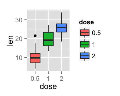
Facet with one variable
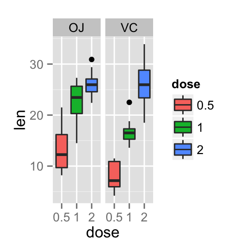
The graph is partitioned in multiple panels by levels of the group “supp”:
# Split in vertical direction
bp + facet_grid(supp ~ .)
# Split in horizontal direction
bp + facet_grid(. ~ supp)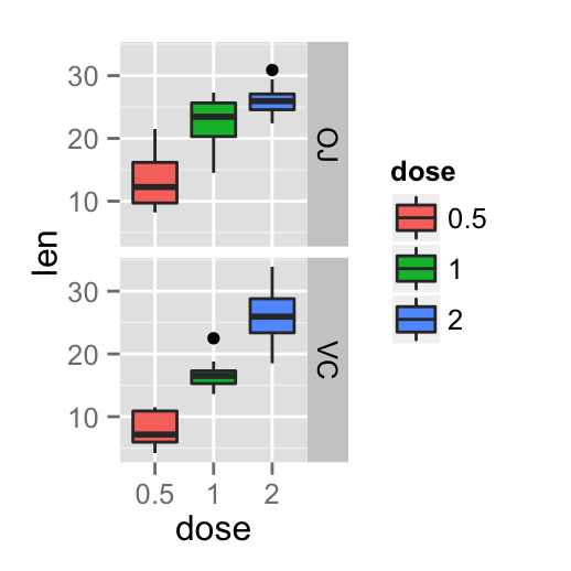
Facet with two variables
The graph is partitioned by the levels of the groups “dose” and “supp” :
# Facet by two variables: dose and supp.
# Rows are dose and columns are supp
bp + facet_grid(dose ~ supp)
# Facet by two variables: reverse the order of the 2 variables
# Rows are supp and columns are dose
bp + facet_grid(supp ~ dose)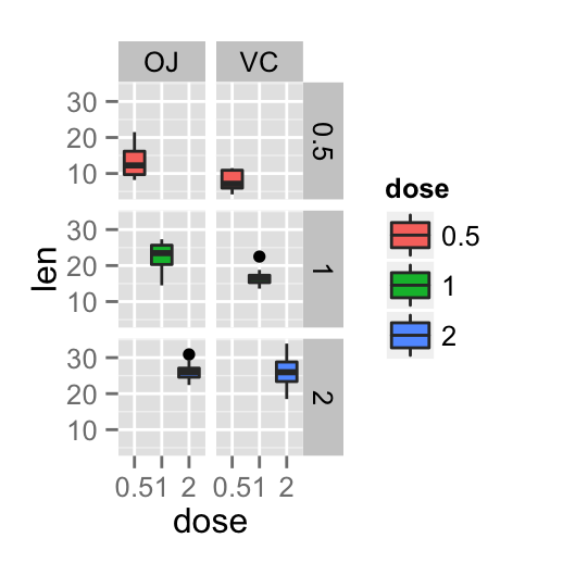
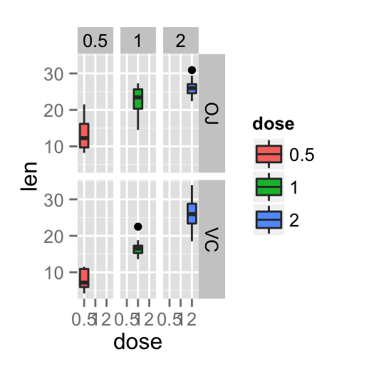
Note that, you can use the argument margins to add additional facets which contain all the data for each of the possible values of the faceting variables
bp + facet_grid(dose ~ supp, margins=TRUE)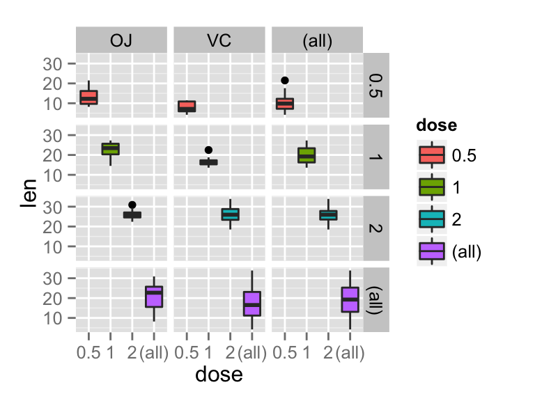
Facet scales
By default, all the panels have the same scales (scales="fixed"). They can be made independent, by setting scales to free, free_x, or free_y.
bp + facet_grid(dose ~ supp, scales='free')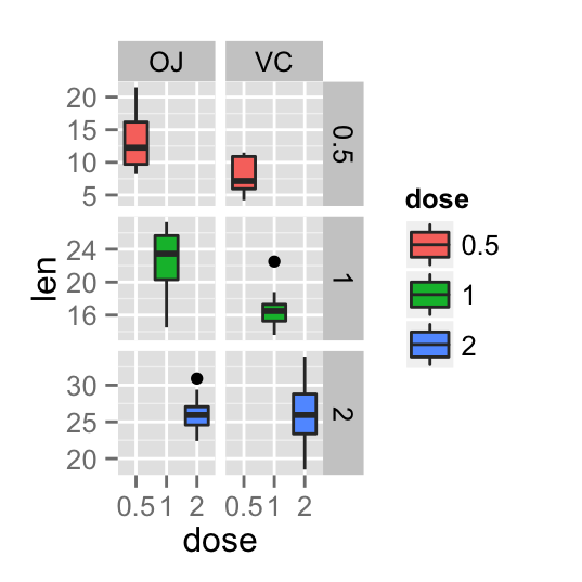
As you can see in the above plot, y axis have different scales in the different panels.
Facet labels
The argument labeller can be used to control the labels of the panels :
bp + facet_grid(dose ~ supp, labeller=label_both)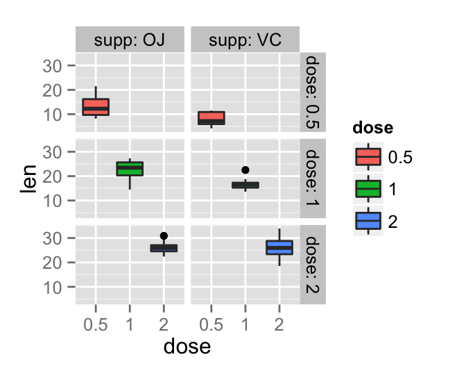
The appearance of facet labels can be modified as follow :
# Change facet text font. Possible values for the font style:
  #'plain', 'italic', 'bold', 'bold.italic'.
bp + facet_grid(dose ~ supp)+
    theme(strip.text.x = element_text(size=12, color="red",
                                      face="bold.italic"),
          strip.text.y = element_text(size=12, color="red",
                                      face="bold.italic"))
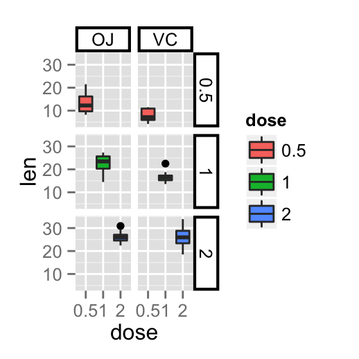
# Change the apperance of the rectangle around facet label
bp + facet_grid(dose ~ supp)+
 theme(strip.background = element_rect(colour="black", fill="white",
                                       size=1.5, linetype="solid"))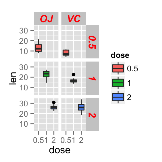
facet_wrap
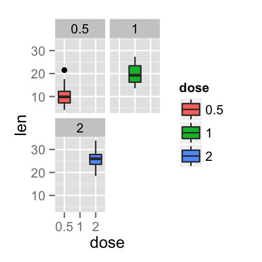
Facets can be placed side by side using the function facet_wrap() as follow :
bp + facet_wrap(~ dose)
bp + facet_wrap(~ dose, ncol=2)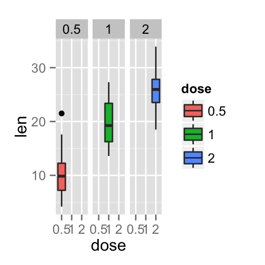
Infos
This analysis has been performed using R software (ver. 3.1.2) and ggplot2 (ver. 1.0.0)
Show me some love with the like buttons below... Thank you and please don't forget to share and comment below!!
Montrez-moi un peu d'amour avec les like ci-dessous ... Merci et n'oubliez pas, s'il vous plaît, de partager et de commenter ci-dessous!
Recommended for You!
Recommended for you
This section contains the best data science and self-development resources to help you on your path.
Books - Data Science
Our Books
- Practical Guide to Cluster Analysis in R by A. Kassambara (Datanovia)
- Practical Guide To Principal Component Methods in R by A. Kassambara (Datanovia)
- Machine Learning Essentials: Practical Guide in R by A. Kassambara (Datanovia)
- R Graphics Essentials for Great Data Visualization by A. Kassambara (Datanovia)
- GGPlot2 Essentials for Great Data Visualization in R by A. Kassambara (Datanovia)
- Network Analysis and Visualization in R by A. Kassambara (Datanovia)
- Practical Statistics in R for Comparing Groups: Numerical Variables by A. Kassambara (Datanovia)
- Inter-Rater Reliability Essentials: Practical Guide in R by A. Kassambara (Datanovia)
Others
- R for Data Science: Import, Tidy, Transform, Visualize, and Model Data by Hadley Wickham & Garrett Grolemund
- Hands-On Machine Learning with Scikit-Learn, Keras, and TensorFlow: Concepts, Tools, and Techniques to Build Intelligent Systems by Aurelien Géron
- Practical Statistics for Data Scientists: 50 Essential Concepts by Peter Bruce & Andrew Bruce
- Hands-On Programming with R: Write Your Own Functions And Simulations by Garrett Grolemund & Hadley Wickham
- An Introduction to Statistical Learning: with Applications in R by Gareth James et al.
- Deep Learning with R by François Chollet & J.J. Allaire
- Deep Learning with Python by François Chollet
Click to follow us on Facebook :
Comment this article by clicking on "Discussion" button (top-right position of this page)


