


R Base Graphs
Previously, we described the essentials of R programming and provided quick start guides for importing data into R.
This chapter contains articles describring how to visualize data using R base graphs.
How this chapter is organized?
Creating and saving graphs
- Creating graphs
- Saving graphs
- File formats for exporting plots
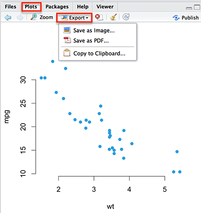
create and save plots
Read more: —> Creating and Saving Graphs in R.
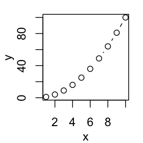
Scatter plots
- R base scatter plot: plot()
- Enhanced scatter plots: car::scatterplot()
- 3D scatter plots
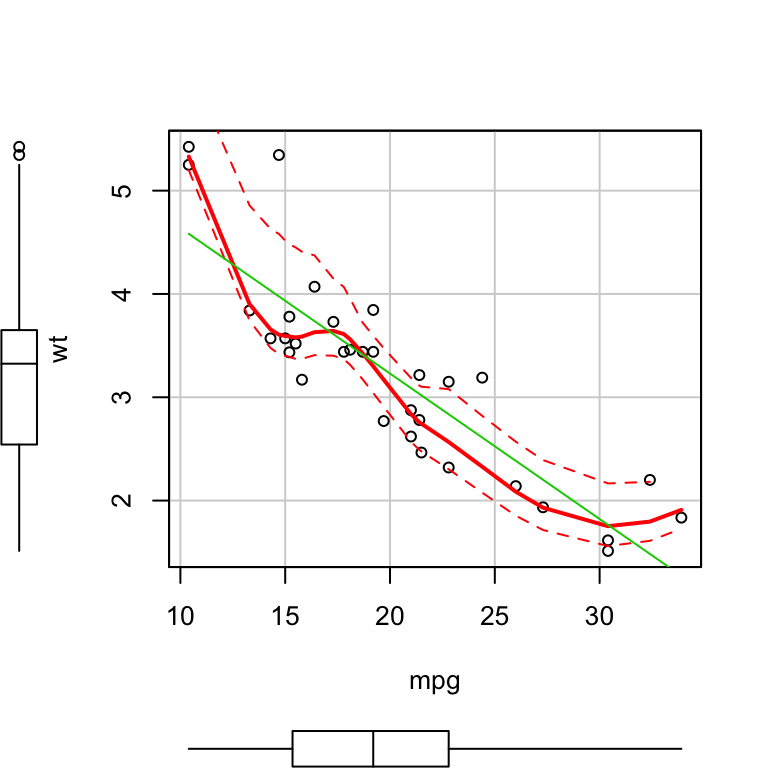
Read more: —> Scatter Plots.
Scatter plot matrices
- R base scatter plot matrices: pairs()
- Use the R package psych
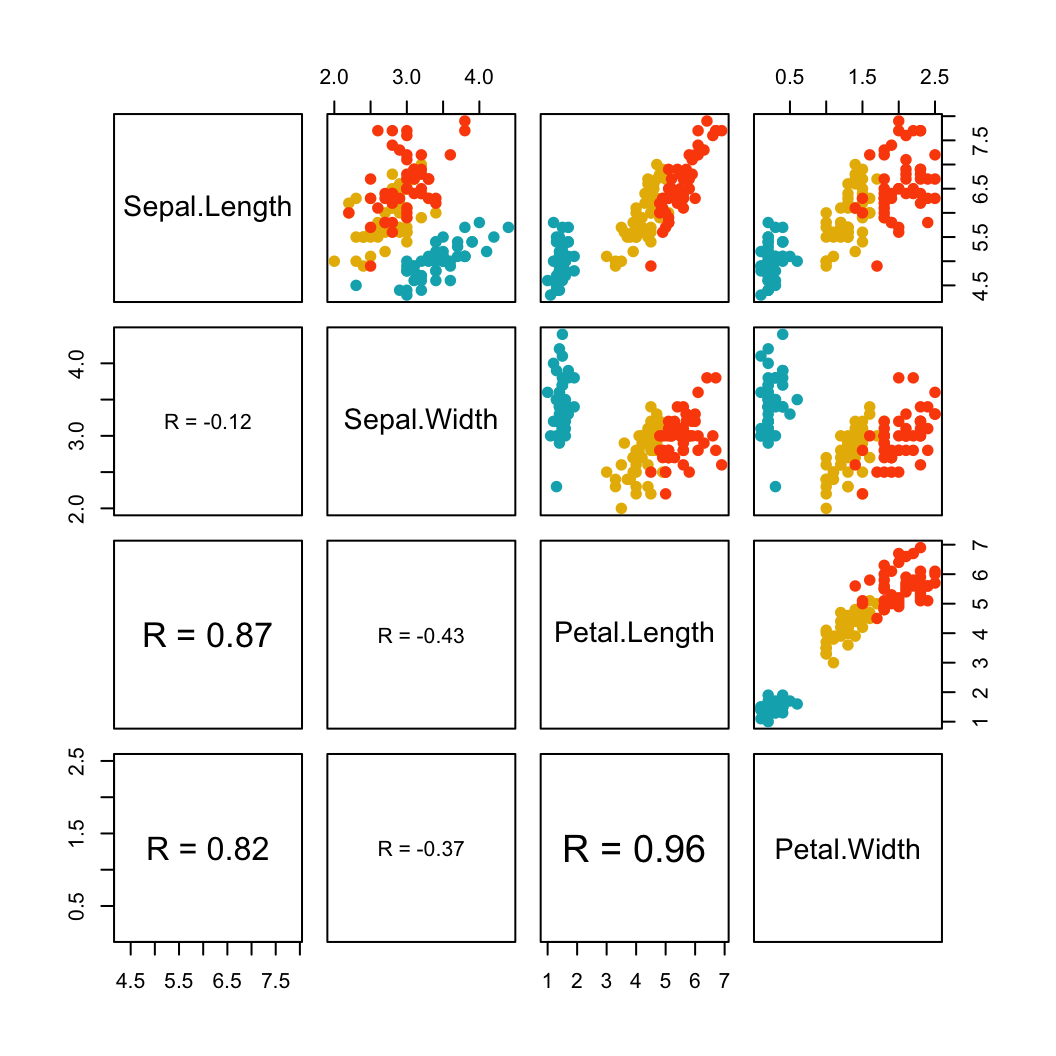
Read more —> Scatter Plot Matrices.
Box plots
- R base box plots: boxplot()
- Box plot with the number of observations: gplots::boxplot2()
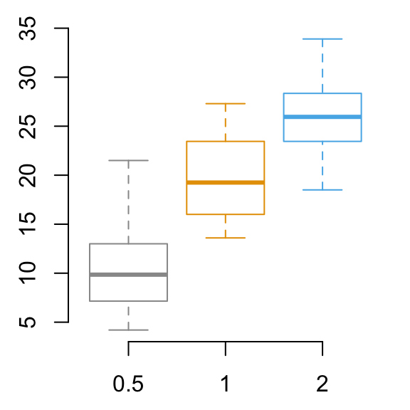
Read more —> Box Plots.
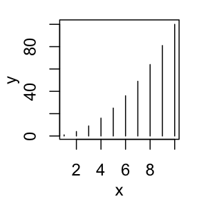
Bar plots
- Basic bar plots
- Change group names
- Change color
- Change main title and axis labels
- Stacked bar plots
- Grouped bar plots
Read more —> Bar Plots.
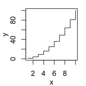
Line plots
- R base functions: plot() and lines()
- Basic line plots
- Plots with multiple lines
Read more —> Line Plots.
Pie charts
- Create basic pie charts: pie()
- Create 3D pie charts: plotix::pie3D()
Read more —> Pie Charts.
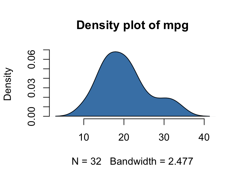
Histogram and density plots
- Create histogram plots: hist()
- Create density plots: density()
## [1] 48.96467 56.38715 60.42221 43.27151 57.14562 57.53028
Read more —> Histogram and Density Plots.
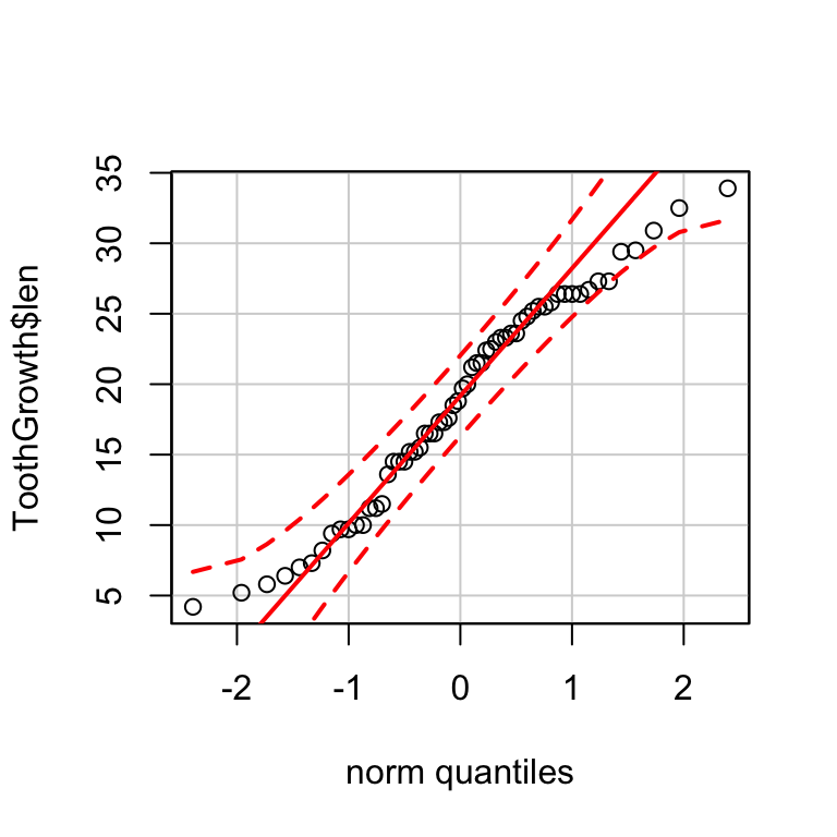
QQ-plots: Quantile-Quantile plots
Use qqPlot() [in car package]:
Read more —> QQ-plots: Quantile-Quantile plots.
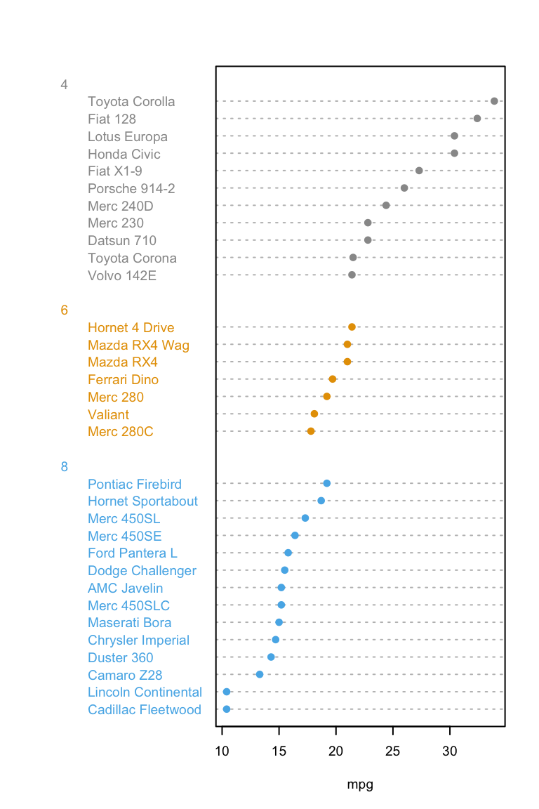
Dot charts
- R base function: dotchart()
- Dot chart of one numeric vector
- Dot chart of a matrix
Read more —> Dot charts.
R base graphical parameters
- Add and customize titles
- Add legends
- Add texts
- Add straight lines
- Add an axis to a plot
- Change axis scale : minimum, maximum and log scale
- Customize tick mark labels
- Change plotting symbols
- Change line types
- Change colors
Read more —> R base graphical Parameters.
See also
Infos
This analysis has been performed using R statistical software (ver. 3.2.4).
Enjoyed this article? I’d be very grateful if you’d help it spread by emailing it to a friend, or sharing it on Twitter, Facebook or Linked In.
Show me some love with the like buttons below... Thank you and please don't forget to share and comment below!!
Show me some love with the like buttons below... Thank you and please don't forget to share and comment below!!
Avez vous aimé cet article? Je vous serais très reconnaissant si vous aidiez à sa diffusion en l'envoyant par courriel à un ami ou en le partageant sur Twitter, Facebook ou Linked In.
Montrez-moi un peu d'amour avec les like ci-dessous ... Merci et n'oubliez pas, s'il vous plaît, de partager et de commenter ci-dessous!
Montrez-moi un peu d'amour avec les like ci-dessous ... Merci et n'oubliez pas, s'il vous plaît, de partager et de commenter ci-dessous!
Recommended for You!


Recommended for you
This section contains the best data science and self-development resources to help you on your path.
Books - Data Science
Our Books
- Practical Guide to Cluster Analysis in R by A. Kassambara (Datanovia)
- Practical Guide To Principal Component Methods in R by A. Kassambara (Datanovia)
- Machine Learning Essentials: Practical Guide in R by A. Kassambara (Datanovia)
- R Graphics Essentials for Great Data Visualization by A. Kassambara (Datanovia)
- GGPlot2 Essentials for Great Data Visualization in R by A. Kassambara (Datanovia)
- Network Analysis and Visualization in R by A. Kassambara (Datanovia)
- Practical Statistics in R for Comparing Groups: Numerical Variables by A. Kassambara (Datanovia)
- Inter-Rater Reliability Essentials: Practical Guide in R by A. Kassambara (Datanovia)
Others
- R for Data Science: Import, Tidy, Transform, Visualize, and Model Data by Hadley Wickham & Garrett Grolemund
- Hands-On Machine Learning with Scikit-Learn, Keras, and TensorFlow: Concepts, Tools, and Techniques to Build Intelligent Systems by Aurelien Géron
- Practical Statistics for Data Scientists: 50 Essential Concepts by Peter Bruce & Andrew Bruce
- Hands-On Programming with R: Write Your Own Functions And Simulations by Garrett Grolemund & Hadley Wickham
- An Introduction to Statistical Learning: with Applications in R by Gareth James et al.
- Deep Learning with R by François Chollet & J.J. Allaire
- Deep Learning with Python by François Chollet
Get involved :
Click to follow us on Facebook :
Comment this article by clicking on "Discussion" button (top-right position of this page)
Click to follow us on Facebook :
Comment this article by clicking on "Discussion" button (top-right position of this page)
Categories contained by this category :
Graphical parameters
Articles contained by this category :
Bar Plots - R Base Graphs
Box Plots - R Base Graphs
Creating and Saving Graphs - R Base Graphs
Dot Charts - R Base Graphs
Generic plot types in R software
Histogram and Density Plots - R Base Graphs
Line Plots - R Base Graphs
Pie Charts - R Base Graphs
Plot Group Means and Confidence Intervals - R Base Graphs
QQ-plots: Quantile-Quantile plots - R Base Graphs
Scatter Plot Matrices - R Base Graphs
Scatter Plots - R Base Graphs
Strip charts: 1-D scatter plots - R Base Graphs