


ggplot2 axis scales and transformations
This R tutorial describes how to modify x and y axis limits (minimum and maximum values) using ggplot2 package. Axis transformations (log scale, sqrt, …) and date axis are also covered in this article.
Related Book:
GGPlot2 Essentials for Great Data Visualization in R
Prepare the data
ToothGrowth data is used in the following examples :
# Convert dose column dose from a numeric to a factor variable
ToothGrowth$dose <- as.factor(ToothGrowth$dose)
head(ToothGrowth)
## len supp dose
## 1 4.2 VC 0.5
## 2 11.5 VC 0.5
## 3 7.3 VC 0.5
## 4 5.8 VC 0.5
## 5 6.4 VC 0.5
## 6 10.0 VC 0.5Make sure that dose column is converted as a factor using the above R script.
Example of plots
library(ggplot2)
# Box plot
bp <- ggplot(ToothGrowth, aes(x=dose, y=len)) + geom_boxplot()
bp
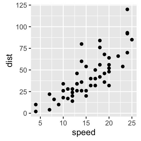
# scatter plot
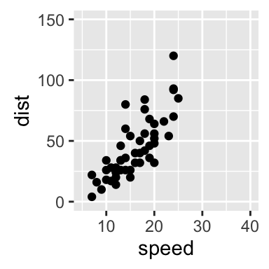
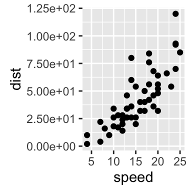
sp<-ggplot(cars, aes(x = speed, y = dist)) + geom_point()
sp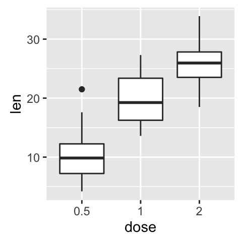
Change x and y axis limits
There are different functions to set axis limits :
- xlim() and ylim()
- expand_limits()
- scale_x_continuous() and scale_y_continuous()
Use xlim() and ylim() functions
To change the range of a continuous axis, the functions xlim() and ylim() can be used as follow :
# x axis limits
sp + xlim(min, max)
# y axis limits
sp + ylim(min, max)
min and max are the minimum and the maximum values of each axis.
# Box plot : change y axis range
bp + ylim(0,50)
# scatter plots : change x and y limits
sp + xlim(5, 40)+ylim(0, 150)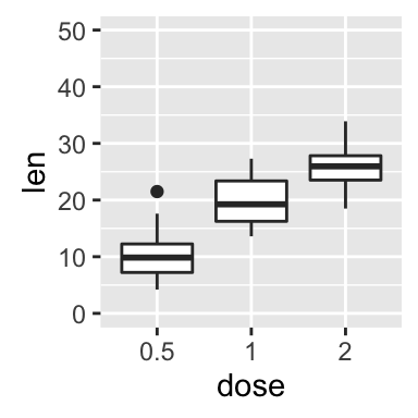
Use expand_limts() function
Note that, the function expand_limits() can be used to :
- quickly set the intercept of x and y axes at (0,0)
- change the limits of x and y axes
# set the intercept of x and y axis at (0,0)
sp + expand_limits(x=0, y=0)
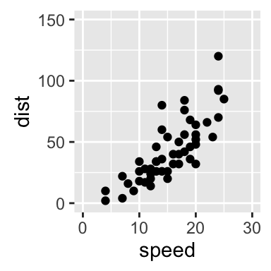
# change the axis limits
sp + expand_limits(x=c(0,30), y=c(0, 150))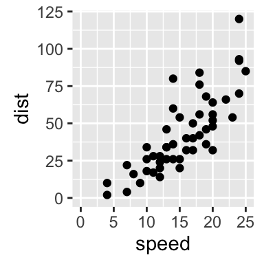
Use scale_xx() functions
It is also possible to use the functions scale_x_continuous() and scale_y_continuous() to change x and y axis limits, respectively.
The simplified formats of the functions are :
scale_x_continuous(name, breaks, labels, limits, trans)
scale_y_continuous(name, breaks, labels, limits, trans)- name : x or y axis labels
- breaks : to control the breaks in the guide (axis ticks, grid lines, …). Among the possible values, there are :
- NULL : hide all breaks
- waiver() : the default break computation
- a character or numeric vector specifying the breaks to display
- labels : labels of axis tick marks. Allowed values are :
- NULL for no labels
- waiver() for the default labels
- character vector to be used for break labels
- limits : a numeric vector specifying x or y axis limits (min, max)
- trans for axis transformations. Possible values are “log2”, “log10”, …
The functions scale_x_continuous() and scale_y_continuous() can be used as follow :
# Change x and y axis labels, and limits
sp + scale_x_continuous(name="Speed of cars", limits=c(0, 30)) +
  scale_y_continuous(name="Stopping distance", limits=c(0, 150))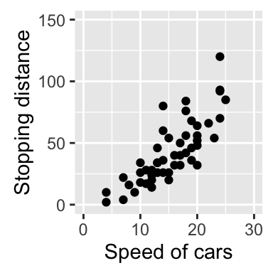
Axis transformations
Log and sqrt transformations
Built in functions for axis transformations are :
- scale_x_log10(), scale_y_log10() : for log10 transformation
- scale_x_sqrt(), scale_y_sqrt() : for sqrt transformation
- scale_x_reverse(), scale_y_reverse() : to reverse coordinates
- coord_trans(x =“log10”, y=“log10”) : possible values for x and y are “log2”, “log10”, “sqrt”, …
- scale_x_continuous(trans=‘log2’), scale_y_continuous(trans=‘log2’) : another allowed value for the argument trans is ‘log10’
These functions can be used as follow :
# Default scatter plot
sp <- ggplot(cars, aes(x = speed, y = dist)) + geom_point()
sp
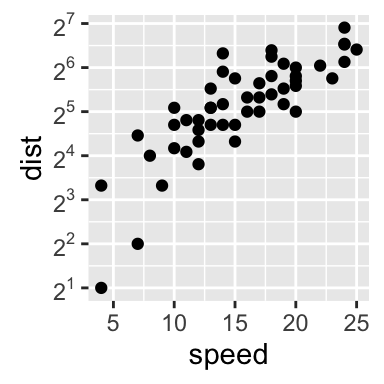
# Log transformation using scale_xx()
# possible values for trans : 'log2', 'log10','sqrt'
sp + scale_x_continuous(trans='log2') +
scale_y_continuous(trans='log2')
# Sqrt transformation
sp + scale_y_sqrt()
# Reverse coordinates
sp + scale_y_reverse() ![]()
![]()
![]()
![]()
The function coord_trans() can be used also for the axis transformation
# Possible values for x and y : "log2", "log10", "sqrt", ...
sp + coord_trans(x="log2", y="log2")![]()
Format axis tick mark labels
Axis tick marks can be set to show exponents. The scales package is required to access break formatting functions.
# Log2 scaling of the y axis (with visually-equal spacing)
library(scales)
sp + scale_y_continuous(trans = log2_trans())
# show exponents
sp + scale_y_continuous(trans = log2_trans(),
    breaks = trans_breaks("log2", function(x) 2^x),
    labels = trans_format("log2", math_format(2^.x)))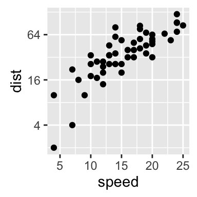
Note that many transformation functions are available using the scales package : log10_trans(), sqrt_trans(), etc. Use help(trans_new) for a full list.
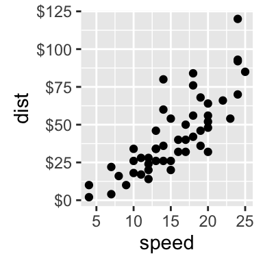
Format axis tick mark labels :
library(scales)
# Percent
sp + scale_y_continuous(labels = percent)
# dollar
sp + scale_y_continuous(labels = dollar)
# scientific
sp + scale_y_continuous(labels = scientific)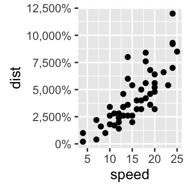
Display log tick marks
It is possible to add log tick marks using the function annotation_logticks().
Note that, these tick marks make sense only for base 10
The Animals data sets, from the package MASS, are used :
library(MASS)
head(Animals)
## body brain
## Mountain beaver 1.35 8.1
## Cow 465.00 423.0
## Grey wolf 36.33 119.5
## Goat 27.66 115.0
## Guinea pig 1.04 5.5
## Dipliodocus 11700.00 50.0The function annotation_logticks() can be used as follow :
library(MASS) # to access Animals data sets
library(scales) # to access break formatting functions
# x and y axis are transformed and formatted
p2 <- ggplot(Animals, aes(x = body, y = brain)) + geom_point() +
     scale_x_log10(breaks = trans_breaks("log10", function(x) 10^x),
              labels = trans_format("log10", math_format(10^.x))) +
     scale_y_log10(breaks = trans_breaks("log10", function(x) 10^x),
              labels = trans_format("log10", math_format(10^.x))) +
     theme_bw()
# log-log plot without log tick marks
p2
# Show log tick marks
p2 + annotation_logticks() 

Note that, default log ticks are on bottom and left.
To specify the sides of the log ticks :
# Log ticks on left and right
p2 + annotation_logticks(sides="lr")
# All sides
p2+annotation_logticks(sides="trbl")
Allowed values for the argument sides are :
- t : for top
- r : for right
- b : for bottom
- l : for left
- the combination of t, r, b and l
Format date axes
The functions scale_x_date() and scale_y_date() are used.
Example of data
Create some time serie data
df <- data.frame(
  date = seq(Sys.Date(), len=100, by="1 day")[sample(100, 50)],
  price = runif(50)
)
df <- df[order(df$date), ]
head(df)
## date price
## 33 2016-09-21 0.07245190
## 3 2016-09-23 0.51772443
## 23 2016-09-25 0.05758921
## 43 2016-09-26 0.99389551
## 45 2016-09-27 0.94858770
## 29 2016-09-28 0.82420890Plot with dates
# Plot with date
dp <- ggplot(data=df, aes(x=date, y=price)) + geom_line()
dp
Format axis tick mark labels
Load the package scales to access break formatting functions.
library(scales)
# Format : month/day
dp + scale_x_date(labels = date_format("%m/%d")) +
theme(axis.text.x = element_text(angle=45))
# Format : Week
dp + scale_x_date(labels = date_format("%W"))
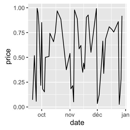
# Months only
dp + scale_x_date(breaks = date_breaks("months"),
labels = date_format("%b"))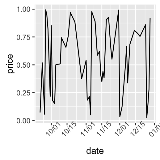

Note that, since ggplot2 v2.0.0, date and datetime scales now have date_breaks, date_minor_breaks and date_labels arguments so that you never need to use the long scales::date_breaks() or scales::date_format().
Date axis limits
US economic time series data sets (from ggplot2 package) are used :
head(economics)## date pce pop psavert uempmed unemploy
## 1 1967-07-01 507.4 198712 12.5 4.5 2944
## 2 1967-08-01 510.5 198911 12.5 4.7 2945
## 3 1967-09-01 516.3 199113 11.7 4.6 2958
## 4 1967-10-01 512.9 199311 12.5 4.9 3143
## 5 1967-11-01 518.1 199498 12.5 4.7 3066
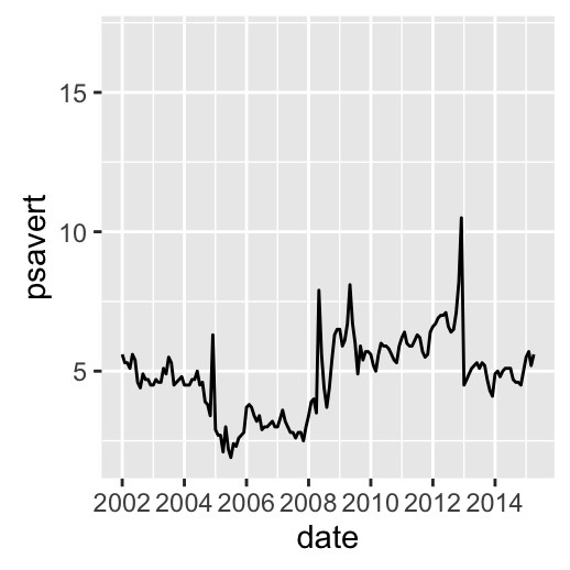
## 6 1967-12-01 525.8 199657 12.1 4.8 3018Create the plot of psavert by date :
- date : Month of data collection
- psavert : personal savings rate
# Plot with dates
dp <- ggplot(data=economics, aes(x=date, y=psavert)) + geom_line()
dp
# Axis limits c(min, max)
min <- as.Date("2002-1-1")
max <- max(economics$date)
dp+ scale_x_date(limits = c(min, max))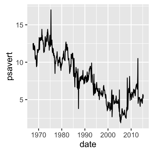
Go further
See also the function scale_x_datetime() and scale_y_datetime() to plot a data containing date and time.
Infos
This analysis has been performed using R software (ver. 3.2.4) and ggplot2 (ver. )
Show me some love with the like buttons below... Thank you and please don't forget to share and comment below!!
Montrez-moi un peu d'amour avec les like ci-dessous ... Merci et n'oubliez pas, s'il vous plaît, de partager et de commenter ci-dessous!
Recommended for You!


Recommended for you
This section contains the best data science and self-development resources to help you on your path.
Books - Data Science
Our Books
- Practical Guide to Cluster Analysis in R by A. Kassambara (Datanovia)
- Practical Guide To Principal Component Methods in R by A. Kassambara (Datanovia)
- Machine Learning Essentials: Practical Guide in R by A. Kassambara (Datanovia)
- R Graphics Essentials for Great Data Visualization by A. Kassambara (Datanovia)
- GGPlot2 Essentials for Great Data Visualization in R by A. Kassambara (Datanovia)
- Network Analysis and Visualization in R by A. Kassambara (Datanovia)
- Practical Statistics in R for Comparing Groups: Numerical Variables by A. Kassambara (Datanovia)
- Inter-Rater Reliability Essentials: Practical Guide in R by A. Kassambara (Datanovia)
Others
- R for Data Science: Import, Tidy, Transform, Visualize, and Model Data by Hadley Wickham & Garrett Grolemund
- Hands-On Machine Learning with Scikit-Learn, Keras, and TensorFlow: Concepts, Tools, and Techniques to Build Intelligent Systems by Aurelien Géron
- Practical Statistics for Data Scientists: 50 Essential Concepts by Peter Bruce & Andrew Bruce
- Hands-On Programming with R: Write Your Own Functions And Simulations by Garrett Grolemund & Hadley Wickham
- An Introduction to Statistical Learning: with Applications in R by Gareth James et al.
- Deep Learning with R by François Chollet & J.J. Allaire
- Deep Learning with Python by François Chollet
Click to follow us on Facebook :
Comment this article by clicking on "Discussion" button (top-right position of this page)