ggplot2 line plot : Quick start guide - R software and data visualization
This R tutorial describes how to create line plots using R software and ggplot2 package.
In a line graph, observations are ordered by x value and connected.
The functions geom_line(), geom_step(), or geom_path() can be used.
x value (for x axis) can be :
- date : for a time series data
- texts
- discrete numeric values
- continuous numeric values
Related Book:
GGPlot2 Essentials for Great Data Visualization in R
Basic line plots
Data
Data derived from ToothGrowth data sets are used. ToothGrowth describes the effect of Vitamin C on tooth growth in Guinea pigs.
df <- data.frame(dose=c("D0.5", "D1", "D2"),
                len=c(4.2, 10, 29.5))
head(df)
## dose len
## 1 D0.5 4.2
## 2 D1 10.0
## 3 D2 29.5- len : Tooth length
- dose : Dose in milligrams (0.5, 1, 2)
Create line plots with points
library(ggplot2)
# Basic line plot with points
ggplot(data=df, aes(x=dose, y=len, group=1)) +
  geom_line()+
  geom_point()
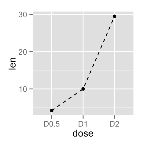
# Change the line type
ggplot(data=df, aes(x=dose, y=len, group=1)) +
  geom_line(linetype = "dashed")+
  geom_point()
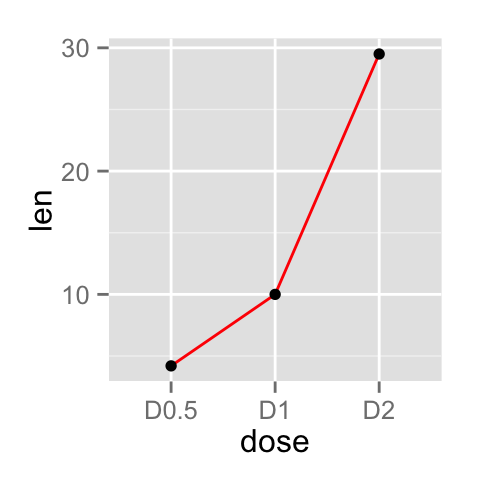
# Change the color
ggplot(data=df, aes(x=dose, y=len, group=1)) +
  geom_line(color="red")+
  geom_point()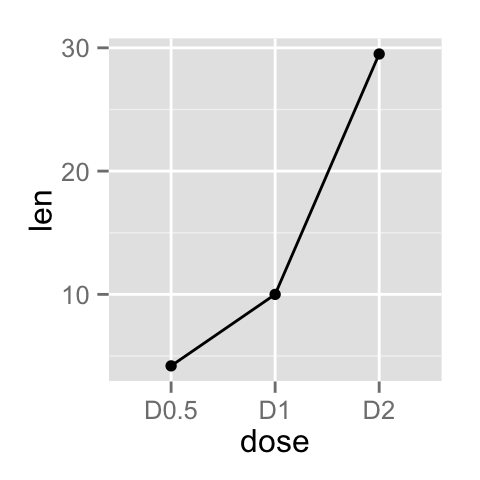
Read more on line types : ggplot2 line types
You can add an arrow to the line using the grid package :
library(grid)
# Add an arrow
ggplot(data=df, aes(x=dose, y=len, group=1)) +
  geom_line(arrow = arrow())+
  geom_point()
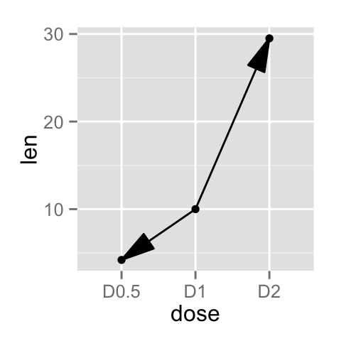
# Add a closed arrow to the end of the line
myarrow=arrow(angle = 15, ends = "both", type = "closed")
ggplot(data=df, aes(x=dose, y=len, group=1)) +
  geom_line(arrow=myarrow)+
  geom_point()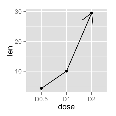
Observations can be also connected using the functions geom_step() or geom_path() :
ggplot(data=df, aes(x=dose, y=len, group=1)) +
  geom_step()+
  geom_point()
ggplot(data=df, aes(x=dose, y=len, group=1)) +
  geom_path()+
  geom_point()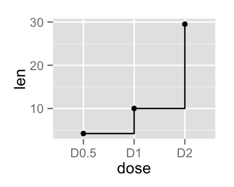
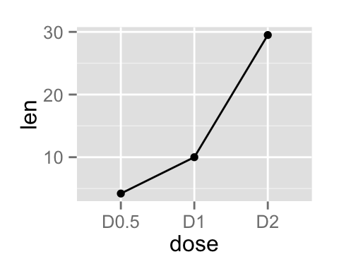
- geom_line : Connecting observations, ordered by x value
- geom_path() : Observations are connected in original order
- geom_step : Connecting observations by stairs
Line plot with multiple groups
Data
Data derived from ToothGrowth data sets are used. ToothGrowth describes the effect of Vitamin C on tooth growth in Guinea pigs. Three dose levels of Vitamin C (0.5, 1, and 2 mg) with each of two delivery methods [orange juice (OJ) or ascorbic acid (VC)] are used :
df2 <- data.frame(supp=rep(c("VC", "OJ"), each=3),
                dose=rep(c("D0.5", "D1", "D2"),2),
                len=c(6.8, 15, 33, 4.2, 10, 29.5))
head(df2)
## supp dose len
## 1 VC D0.5 6.8
## 2 VC D1 15.0
## 3 VC D2 33.0
## 4 OJ D0.5 4.2
## 5 OJ D1 10.0
## 6 OJ D2 29.5- len : Tooth length
- dose : Dose in milligrams (0.5, 1, 2)
- supp : Supplement type (VC or OJ)
Create line plots
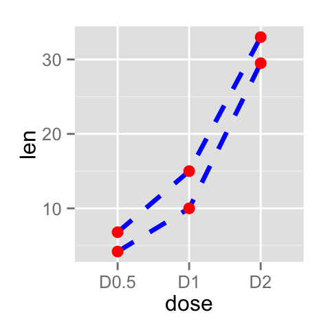
In the graphs below, line types, colors and sizes are the same for the two groups :
# Line plot with multiple groups
ggplot(data=df2, aes(x=dose, y=len, group=supp)) +
  geom_line()+
  geom_point()
# Change line types
ggplot(data=df2, aes(x=dose, y=len, group=supp)) +
  geom_line(linetype="dashed", color="blue", size=1.2)+
  geom_point(color="red", size=3)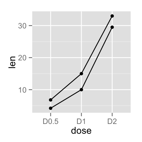
Change line types by groups
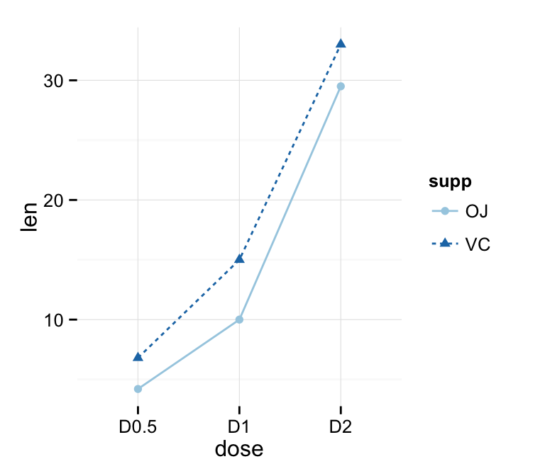
In the graphs below, line types and point shapes are controlled automatically by the levels of the variable supp :
# Change line types by groups (supp)
ggplot(df2, aes(x=dose, y=len, group=supp)) +
  geom_line(aes(linetype=supp))+
  geom_point()
# Change line types and point shapes
ggplot(df2, aes(x=dose, y=len, group=supp)) +
  geom_line(aes(linetype=supp))+
  geom_point(aes(shape=supp))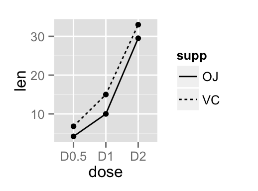
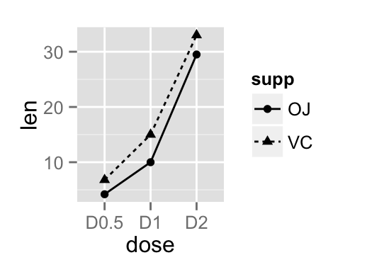
It is also possible to change manually the line types using the function scale_linetype_manual().
# Set line types manually
ggplot(df2, aes(x=dose, y=len, group=supp)) +
  geom_line(aes(linetype=supp))+
  geom_point()+
  scale_linetype_manual(values=c("twodash", "dotted"))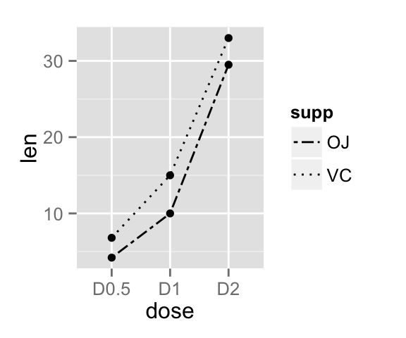
You can read more on line types here : ggplot2 line types
If you want to change also point shapes, read this article : ggplot2 point shapes
Change line colors by groups
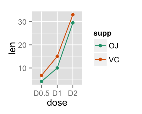
Line colors are controlled automatically by the levels of the variable supp :
p<-ggplot(df2, aes(x=dose, y=len, group=supp)) +
  geom_line(aes(color=supp))+
  geom_point(aes(color=supp))
p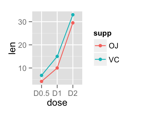
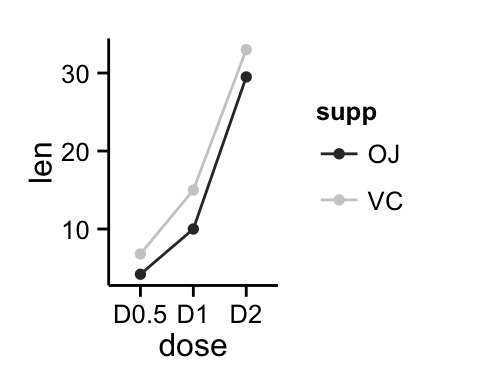
It is also possible to change manually line colors using the functions :
- scale_color_manual() : to use custom colors
- scale_color_brewer() : to use color palettes from RColorBrewer package
- scale_color_grey() : to use grey color palettes
# Use custom color palettes
p+scale_color_manual(values=c("#999999", "#E69F00", "#56B4E9"))
# Use brewer color palettes
p+scale_color_brewer(palette="Dark2")
# Use grey scale
p + scale_color_grey() + theme_classic()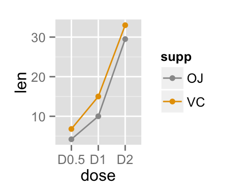
Read more on ggplot2 colors here : ggplot2 colors
Change the legend position
p <- p + scale_color_brewer(palette="Paired")+
  theme_minimal()
p + theme(legend.position="top")
p + theme(legend.position="bottom")
# Remove legend
p + theme(legend.position="none")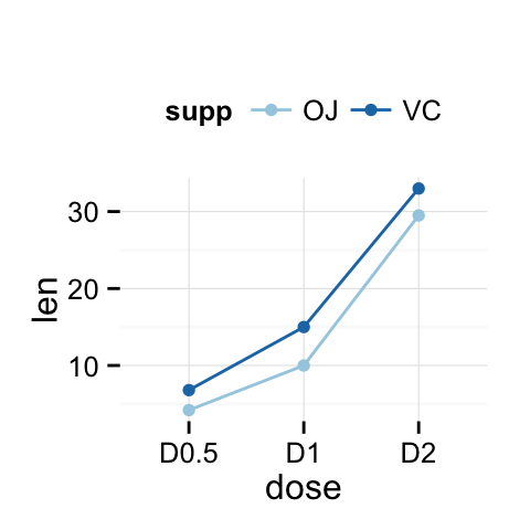
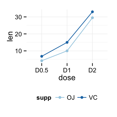
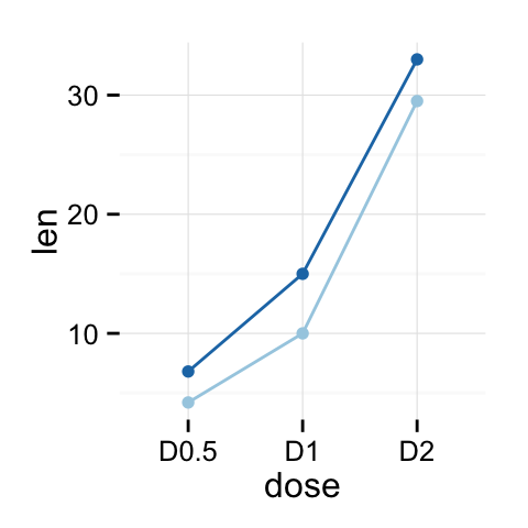
The allowed values for the arguments legend.position are : “left”,“top”, “right”, “bottom”.
Read more on ggplot legend : ggplot2 legend
Line plot with a numeric x-axis
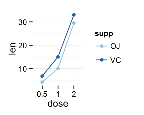
If the variable on x-axis is numeric, it can be useful to treat it as a continuous or a factor variable depending on what you want to do :
# Create some data
df2 <- data.frame(supp=rep(c("VC", "OJ"), each=3),
                dose=rep(c("0.5", "1", "2"),2),
                len=c(6.8, 15, 33, 4.2, 10, 29.5))
head(df2)
## supp dose len
## 1 VC 0.5 6.8
## 2 VC 1 15.0
## 3 VC 2 33.0
## 4 OJ 0.5 4.2
## 5 OJ 1 10.0
## 6 OJ 2 29.5# x axis treated as continuous variable
df2$dose <- as.numeric(as.vector(df2$dose))
ggplot(data=df2, aes(x=dose, y=len, group=supp, color=supp)) +
geom_line() + geom_point()+
scale_color_brewer(palette="Paired")+
theme_minimal()
# Axis treated as discrete variable
df2$dose<-as.factor(df2$dose)
ggplot(data=df2, aes(x=dose, y=len, group=supp, color=supp)) +
geom_line() + geom_point()+
scale_color_brewer(palette="Paired")+
theme_minimal()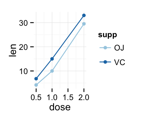
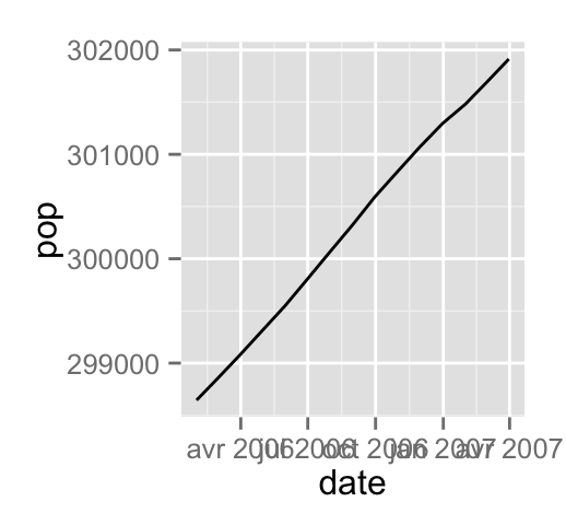
Line plot with dates on x-axis
economics time series data sets are used :
head(economics)## date pce pop psavert uempmed unemploy
## 1 1967-06-30 507.8 198712 9.8 4.5 2944
## 2 1967-07-31 510.9 198911 9.8 4.7 2945
## 3 1967-08-31 516.7 199113 9.0 4.6 2958
## 4 1967-09-30 513.3 199311 9.8 4.9 3143
## 5 1967-10-31 518.5 199498 9.7 4.7 3066
## 6 1967-11-30 526.2 199657 9.4 4.8 3018Plots :
# Basic line plot
ggplot(data=economics, aes(x=date, y=pop))+
  geom_line()
# Plot a subset of the data
ggplot(data=subset(economics, date > as.Date("2006-1-1")),
       aes(x=date, y=pop))+geom_line()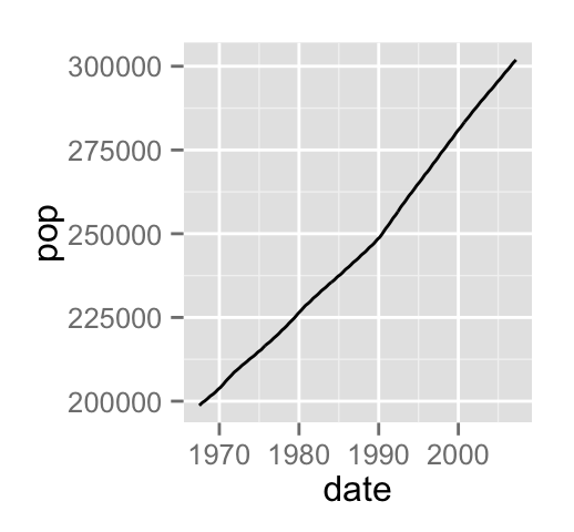
Change line size :
# Change line size
ggplot(data=economics, aes(x=date, y=pop, size=unemploy/pop))+
  geom_line()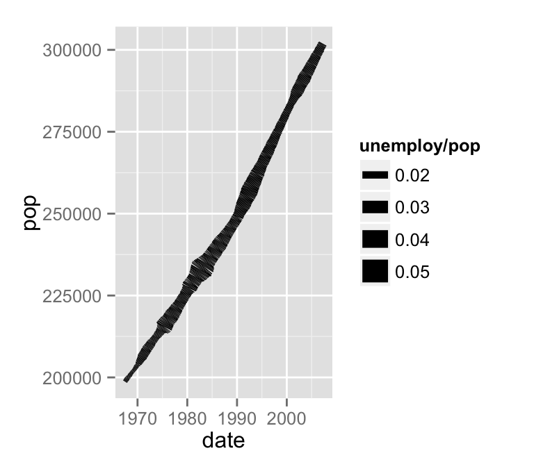
Line graph with error bars
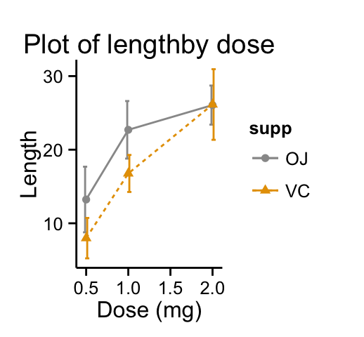
The function below will be used to calculate the mean and the standard deviation, for the variable of interest, in each group :
#+++++++++++++++++++++++++
# Function to calculate the mean and the standard deviation
  # for each group
#+++++++++++++++++++++++++
# data : a data frame
# varname : the name of a column containing the variable
  #to be summariezed
# groupnames : vector of column names to be used as
  # grouping variables
data_summary <- function(data, varname, groupnames){
  require(plyr)
  summary_func <- function(x, col){
    c(mean = mean(x[[col]], na.rm=TRUE),
      sd = sd(x[[col]], na.rm=TRUE))
  }
  data_sum<-ddply(data, groupnames, .fun=summary_func,
                  varname)
  data_sum <- rename(data_sum, c("mean" = varname))
 return(data_sum)
}
Summarize the data :
df3 <- data_summary(ToothGrowth, varname="len",
                    groupnames=c("supp", "dose"))
head(df3)
## supp dose len sd
## 1 OJ 0.5 13.23 4.459709
## 2 OJ 1.0 22.70 3.910953
## 3 OJ 2.0 26.06 2.655058
## 4 VC 0.5 7.98 2.746634
## 5 VC 1.0 16.77 2.515309
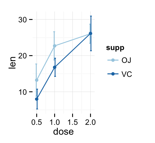
## 6 VC 2.0 26.14 4.797731The function geom_errorbar() can be used to produce a line graph with error bars :
# Standard deviation of the mean
ggplot(df3, aes(x=dose, y=len, group=supp, color=supp)) +
    geom_errorbar(aes(ymin=len-sd, ymax=len+sd), width=.1) +
    geom_line() + geom_point()+
   scale_color_brewer(palette="Paired")+theme_minimal()
# Use position_dodge to move overlapped errorbars horizontally
ggplot(df3, aes(x=dose, y=len, group=supp, color=supp)) +
    geom_errorbar(aes(ymin=len-sd, ymax=len+sd), width=.1,
    position=position_dodge(0.05)) +
    geom_line() + geom_point()+
   scale_color_brewer(palette="Paired")+theme_minimal()
Customized line graphs
# Simple line plot
# Change point shapes and line types by groups
ggplot(df3, aes(x=dose, y=len, group = supp, shape=supp, linetype=supp))+
    geom_errorbar(aes(ymin=len-sd, ymax=len+sd), width=.1,
    position=position_dodge(0.05)) +
    geom_line() +
    geom_point()+
    labs(title="Plot of lengthby dose",x="Dose (mg)", y = "Length")+
    theme_classic()
# Change color by groups
# Add error bars
p <- ggplot(df3, aes(x=dose, y=len, group = supp, color=supp))+
    geom_errorbar(aes(ymin=len-sd, ymax=len+sd), width=.1,
    position=position_dodge(0.05)) +
    geom_line(aes(linetype=supp)) +
    geom_point(aes(shape=supp))+
    labs(title="Plot of lengthby dose",x="Dose (mg)", y = "Length")+
    theme_classic()
p + theme_classic() + scale_color_manual(values=c('#999999','#E69F00'))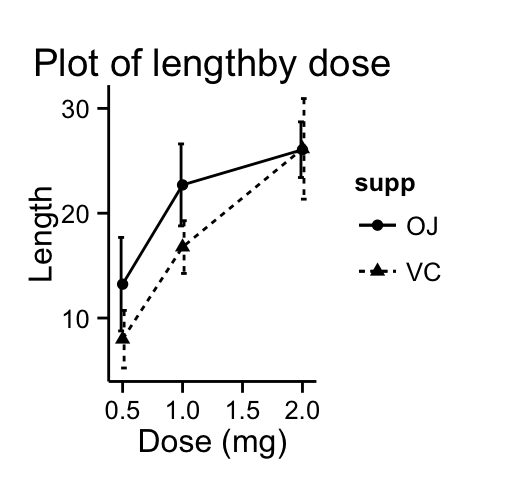
Change colors manually :
p + scale_color_brewer(palette="Paired") + theme_minimal()
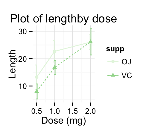
# Greens
p + scale_color_brewer(palette="Greens") + theme_minimal()
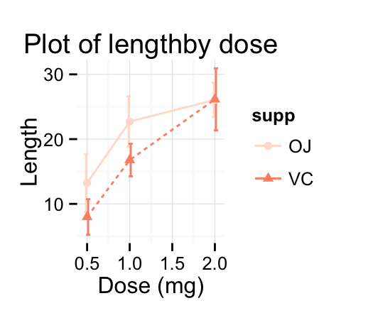
# Reds
p + scale_color_brewer(palette="Reds") + theme_minimal()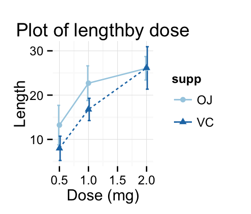
Infos
This analysis has been performed using R software (ver. 3.1.2) and ggplot2 (ver. 1.0.0)
Show me some love with the like buttons below... Thank you and please don't forget to share and comment below!!
Montrez-moi un peu d'amour avec les like ci-dessous ... Merci et n'oubliez pas, s'il vous plaît, de partager et de commenter ci-dessous!
Recommended for You!
Recommended for you
This section contains the best data science and self-development resources to help you on your path.
Books - Data Science
Our Books
- Practical Guide to Cluster Analysis in R by A. Kassambara (Datanovia)
- Practical Guide To Principal Component Methods in R by A. Kassambara (Datanovia)
- Machine Learning Essentials: Practical Guide in R by A. Kassambara (Datanovia)
- R Graphics Essentials for Great Data Visualization by A. Kassambara (Datanovia)
- GGPlot2 Essentials for Great Data Visualization in R by A. Kassambara (Datanovia)
- Network Analysis and Visualization in R by A. Kassambara (Datanovia)
- Practical Statistics in R for Comparing Groups: Numerical Variables by A. Kassambara (Datanovia)
- Inter-Rater Reliability Essentials: Practical Guide in R by A. Kassambara (Datanovia)
Others
- R for Data Science: Import, Tidy, Transform, Visualize, and Model Data by Hadley Wickham & Garrett Grolemund
- Hands-On Machine Learning with Scikit-Learn, Keras, and TensorFlow: Concepts, Tools, and Techniques to Build Intelligent Systems by Aurelien Géron
- Practical Statistics for Data Scientists: 50 Essential Concepts by Peter Bruce & Andrew Bruce
- Hands-On Programming with R: Write Your Own Functions And Simulations by Garrett Grolemund & Hadley Wickham
- An Introduction to Statistical Learning: with Applications in R by Gareth James et al.
- Deep Learning with R by François Chollet & J.J. Allaire
- Deep Learning with Python by François Chollet
Click to follow us on Facebook :
Comment this article by clicking on "Discussion" button (top-right position of this page)


