ggplot2 axis ticks : A guide to customize tick marks and labels
The goal of this tutorial is to describe how to customize axis tick marks and labels in R software using ggplot2 package.
Related Book:
GGPlot2 Essentials for Great Data Visualization in R
Data
ToothGrowth data is used in the examples hereafter.
# Convert dose column from numeric to factor variable
ToothGrowth$dose <- as.factor(ToothGrowth$dose)
head(ToothGrowth)
## len supp dose
## 1 4.2 VC 0.5
## 2 11.5 VC 0.5
## 3 7.3 VC 0.5
## 4 5.8 VC 0.5
## 5 6.4 VC 0.5
## 6 10.0 VC 0.5Make sure that dose column are converted as a factor using the above R script.
Example of plots
library(ggplot2)
p <- ggplot(ToothGrowth, aes(x=dose, y=len)) + geom_boxplot()
p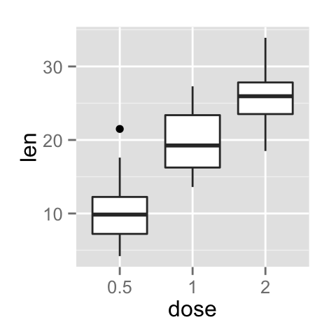
Change the appearance of the axis tick mark labels
The color, the font size and the font face of axis tick mark labels can be changed using the functions theme() and element_text() as follow :
# x axis tick mark labels
p + theme(axis.text.x= element_text(family, face, colour, size))
# y axis tick mark labels
p + theme(axis.text.y = element_text(family, face, colour, size))
The following arguments can be used for the function element_text() to change the appearance of the text :
- family : font family
- face : font face. Possible values are “plain”, “italic”, “bold” and “bold.italic”
- colour : text color
- size : text size in pts
- angle : angle (in [0, 360])
# Change the appearance and the orientation angle
# of axis tick labels
p + theme(axis.text.x = element_text(face="bold", color="#993333",
                           size=14, angle=45),
          axis.text.y = element_text(face="bold", color="#993333",
                           size=14, angle=45))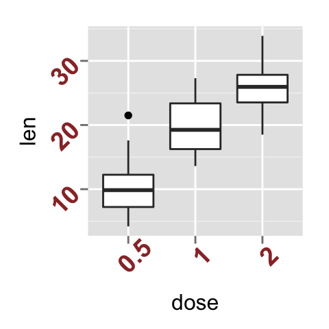
Hide x and y axis tick mark labels
axis ticks and tick mark labels can be removed using the function element_blank() as follow :
# Hide x an y axis tick mark labels
p + theme(
  axis.text.x = element_blank(),
  axis.text.y = element_blank())
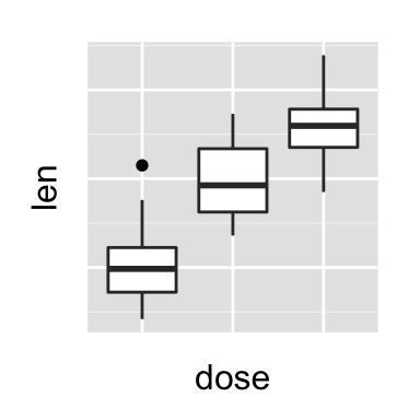
# Remove axis ticks and tick mark labels
p + theme(
  axis.text.x = element_blank(),
  axis.text.y = element_blank(),
  axis.ticks = element_blank())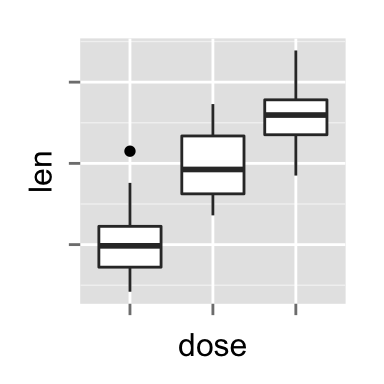
Change axis lines
Axis lines can be changed using the function element_line() as follow :
p + theme(axis.line = element_line(colour, size, linetype,
                                   lineend, color))
The arguments of element_line() are :
- colour, color : line color
- size : line size
- linetype : line type. Line type can be specified using either text (“blank”, “solid”, “dashed”, “dotted”, “dotdash”, “longdash”, “twodash”) or number (0, 1, 2, 3, 4, 5, 6). Note that linetype = “solid” is identical to linetype=1. The available line types in R are described in this post : Line type in R software
- lineend : line end. Allowed values for line end are : “round”, “butt” or “square”
# Change the line type and color of axis lines
p + theme( axis.line = element_line(colour = "darkblue",
                      size = 1, linetype = "solid"))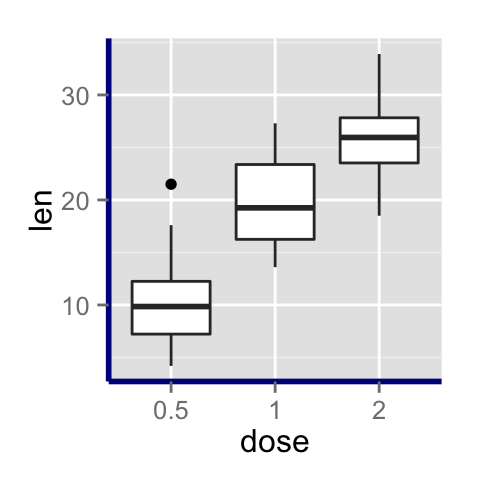
Set axis ticks for discrete and continuous axes
x or y axis can be discrete or continuous. In each of these two cases, the functions to be used for setting axis ticks are different.
Customize a discrete axis
The functions scale_x_discrete() and scale_y_discrete() are used to customize discrete x and y axis, respectively.
It is possible to use these functions to change the following x or y axis parameters :
- axis titles
- axis limits (data range to display)
- choose where tick marks appear
- manually label tick marks
The simplified formats of scale_x_discrete() and scale_y_discrete() are :
scale_x_discrete(name, breaks, labels, limits)
scale_y_discrete(name, breaks, labels, limits)- name : x or y axis labels
- breaks : control the breaks in the guide (axis ticks, grid lines, …). Among the possible values, there are :
- NULL : hide all breaks
- waiver() : the default break computation
- a character or numeric vector specifying which breaks to display
- labels : labels of axis tick marks. Allowed values are :
- NULL for no labels
- waiver() for the default labels
- character vector to be used for break labels
- limits : a character vector indicating the data range
Note that, in the examples below, we’ll use only the functions scale_x_discrete() and xlim() to customize x axis tick marks. The same kind of examples can be applied to a discrete y axis using the functions scale_y_discrete() and ylim().
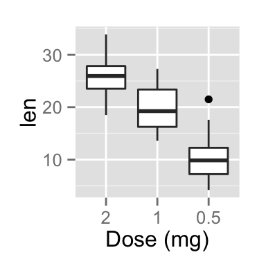
Change the order of items
The argument limits is used to change the order of the items :
# default plot
p
# Change the order of items
# Change the x axis name
p + scale_x_discrete(name ="Dose (mg)",
                    limits=c("2","1","0.5"))
Change tick mark labels
The name of tick mark texts can be changed as follow :
# Solution 1
p + scale_x_discrete(breaks=c("0.5","1","2"),
        labels=c("Dose 0.5", "Dose 1", "Dose 2"))
# Solution 2 : same plot as solution 1
p + scale_x_discrete(labels=c("0.5" = "Dose 0.5", "1" = "Dose 1",
                              "2" = "Dose 2"))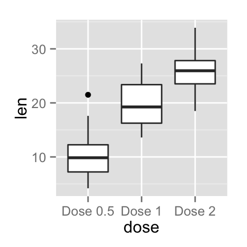

Choose which items to display
The R code below shows the box plot for the first item (dose = 0.5) and the last item (dose = 2) :
# Solution 1
p + scale_x_discrete(limits=c("0.5", "2"))
# Solution 2 : same result as solution 1
p + xlim("0.5", "2")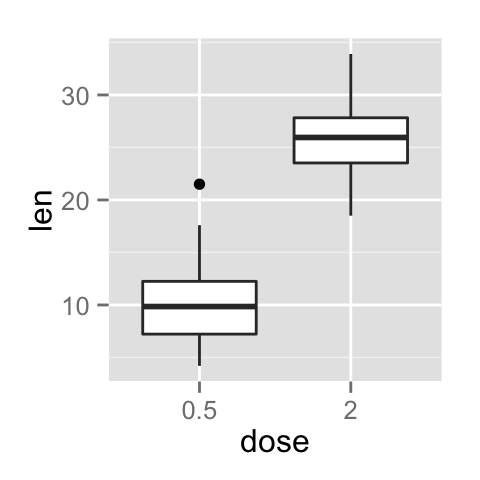

Customize a continuous axis
The functions scale_x_continuous() and scale_y_continuous() are used to customize continuous x and y axis, respectively.
Using these two functions, the following x or y axis parameters can be modified :
- axis titles
- axis limits (set the minimum and the maximum)
- choose where tick marks appear
- manually label tick marks
The simplified formats of scale_x_continuous() and scale_y_continuous() are :
scale_x_continuous(name, breaks, labels, limits, trans)
scale_y_continuous(name, breaks, labels, limits, trans)- name : x or y axis labels
- breaks : control the breaks in the guide (axis ticks, grid lines, …). Among the possible values, there are :
- NULL : hide all breaks
- waiver() : the default break computation
- a character or numeric vector specifying the breaks to display
- labels : labels of axis tick marks. Allowed values are :
- NULL for no labels
- waiver() for the default labels
- character vector to be used for break labels
- limits : a numeric vector specifying x or y axis limits (min, max)
- trans for axis transformations. Possible values are “log2”, “log10”, “sqrt”, etc
These functions can be used as follow :
# scatter plot
sp<-ggplot(cars, aes(x = speed, y = dist)) + geom_point()
sp
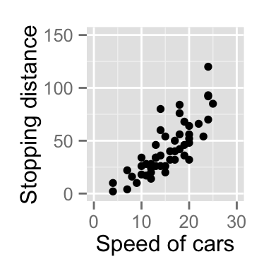
# Change x and y axis labels, and limits
sp + scale_x_continuous(name="Speed of cars", limits=c(0, 30)) +
  scale_y_continuous(name="Stopping distance", limits=c(0, 150))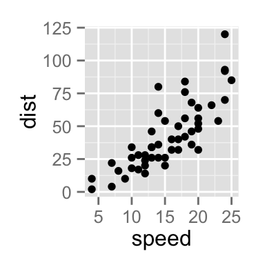
Set the position of tick marks
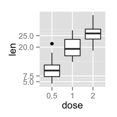
The R code below set the position of tick marks on the y axis of the box plot. The function scale_y_continuous() and the argument breaks are used to choose where the tick marks appear :
# Set tick marks on y axis
# a tick mark is shown on every 5
p + scale_y_continuous(breaks=seq(0,40,5))
# Tick marks can be spaced randomly
p + scale_y_continuous(breaks=c(5,7.5, 20, 25))

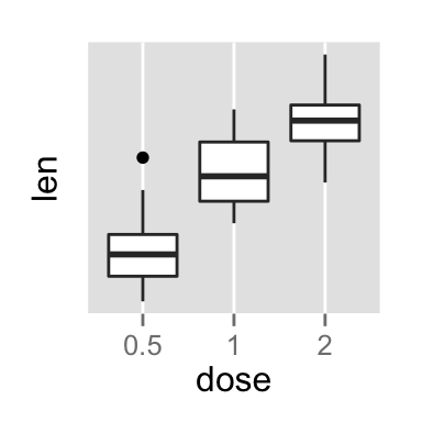
# Remove tick mark labels and gridlines
p + scale_y_continuous(breaks=NULL)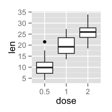
Format the text of tick mark labels
Tick mark labels can be formatted to be viewed as percents, dollars or scientific notation. The package scales is required.
library(scales)
# Format labels as percents
p + scale_y_continuous(labels = percent)
# Format labels as scientific
p + scale_y_continuous(labels = scientific)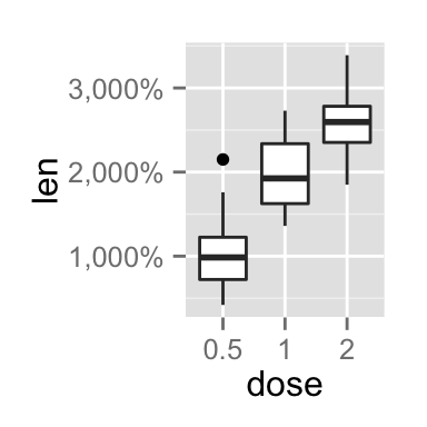
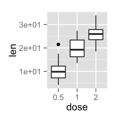
Possible values for labels are comma, percent, dollar and scientific. For more examples, read the documentation of the package scales : ?scales::trans_new
Infos
This analysis has been performed using R software (ver. 3.1.2) and ggplot2 (ver. )
Show me some love with the like buttons below... Thank you and please don't forget to share and comment below!!
Montrez-moi un peu d'amour avec les like ci-dessous ... Merci et n'oubliez pas, s'il vous plaît, de partager et de commenter ci-dessous!
Recommended for You!
Recommended for you
This section contains the best data science and self-development resources to help you on your path.
Books - Data Science
Our Books
- Practical Guide to Cluster Analysis in R by A. Kassambara (Datanovia)
- Practical Guide To Principal Component Methods in R by A. Kassambara (Datanovia)
- Machine Learning Essentials: Practical Guide in R by A. Kassambara (Datanovia)
- R Graphics Essentials for Great Data Visualization by A. Kassambara (Datanovia)
- GGPlot2 Essentials for Great Data Visualization in R by A. Kassambara (Datanovia)
- Network Analysis and Visualization in R by A. Kassambara (Datanovia)
- Practical Statistics in R for Comparing Groups: Numerical Variables by A. Kassambara (Datanovia)
- Inter-Rater Reliability Essentials: Practical Guide in R by A. Kassambara (Datanovia)
Others
- R for Data Science: Import, Tidy, Transform, Visualize, and Model Data by Hadley Wickham & Garrett Grolemund
- Hands-On Machine Learning with Scikit-Learn, Keras, and TensorFlow: Concepts, Tools, and Techniques to Build Intelligent Systems by Aurelien Géron
- Practical Statistics for Data Scientists: 50 Essential Concepts by Peter Bruce & Andrew Bruce
- Hands-On Programming with R: Write Your Own Functions And Simulations by Garrett Grolemund & Hadley Wickham
- An Introduction to Statistical Learning: with Applications in R by Gareth James et al.
- Deep Learning with R by François Chollet & J.J. Allaire
- Deep Learning with Python by François Chollet
Click to follow us on Facebook :
Comment this article by clicking on "Discussion" button (top-right position of this page)


