ggplot2 violin plot : Quick start guide - R software and data visualization
This R tutorial describes how to create a violin plot using R software and ggplot2 package.
violin plots are similar to box plots, except that they also show the kernel probability density of the data at different values. Typically, violin plots will include a marker for the median of the data and a box indicating the interquartile range, as in standard box plots.
The function geom_violin() is used to produce a violin plot.
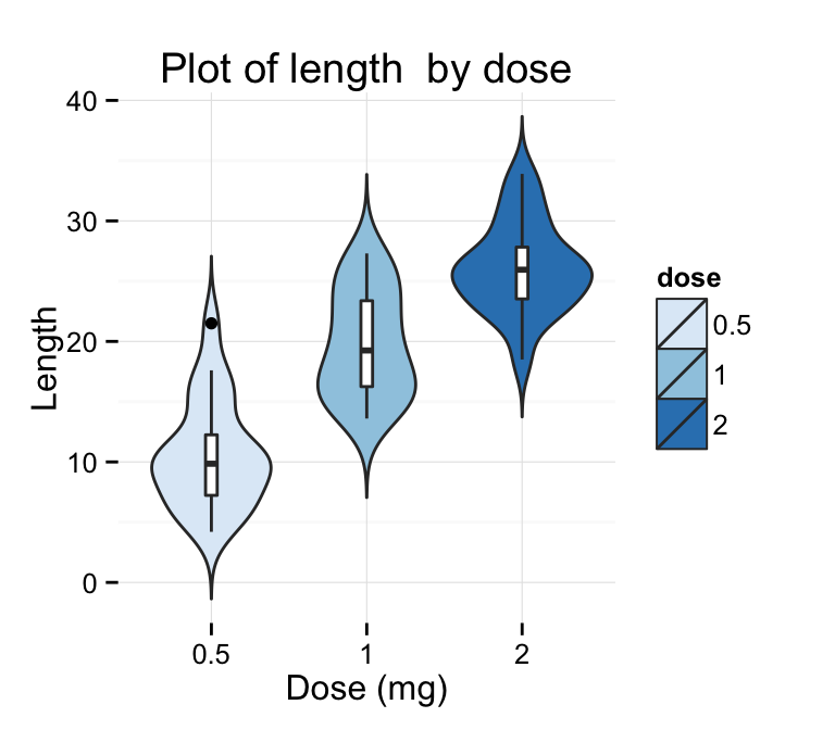
Prepare the data
ToothGrowth data sets are used :
# Convert the variable dose from a numeric to a factor variable
ToothGrowth$dose <- as.factor(ToothGrowth$dose)
head(ToothGrowth)
## len supp dose
## 1 4.2 VC 0.5
## 2 11.5 VC 0.5
## 3 7.3 VC 0.5
## 4 5.8 VC 0.5
## 5 6.4 VC 0.5
## 6 10.0 VC 0.5Make sure that the variable dose is converted as a factor variable using the above R script.
Basic violin plots
library(ggplot2)
# Basic violin plot
p <- ggplot(ToothGrowth, aes(x=dose, y=len)) +
  geom_violin()
p
# Rotate the violin plot
p + coord_flip()
# Set trim argument to FALSE
ggplot(ToothGrowth, aes(x=dose, y=len)) +
  geom_violin(trim=FALSE)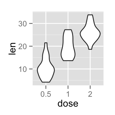
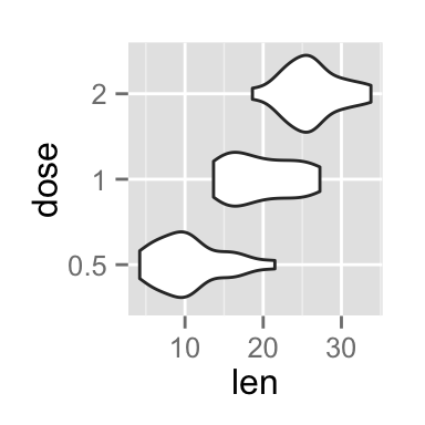
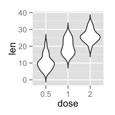
Note that by default trim = TRUE. In this case, the tails of the violins are trimmed. If FALSE, don’t trim the tails
Choose which items to display :
p + scale_x_discrete(limits=c("0.5", "2"))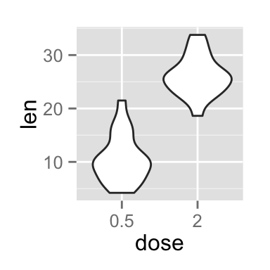
Add summary statistics on a violin plot
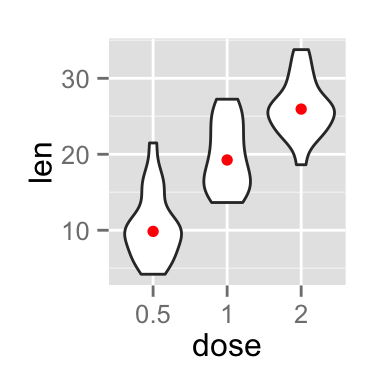
The function stat_summary() can be used to add mean/median points and more on a violin plot.
Add mean and median points
# violin plot with mean points
p + stat_summary(fun.y=mean, geom="point", shape=23, size=2)
# violin plot with median points
p + stat_summary(fun.y=median, geom="point", size=2, color="red")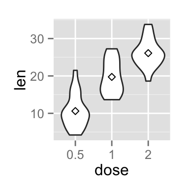
Add median and quartile
A solution is to use the function geom_boxplot :
p + geom_boxplot(width=0.1)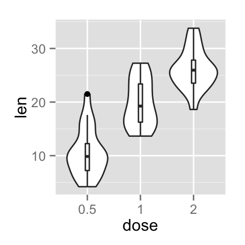
Add mean and standard deviation
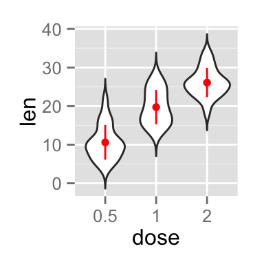
The function mean_sdl is used. mean_sdl computes the mean plus or minus a constant times the standard deviation.
In the R code below, the constant is specified using the argument mult (mult = 1). By default mult = 2.
The mean +/- SD can be added as a crossbar or a pointrange :
p <- ggplot(ToothGrowth, aes(x=dose, y=len)) +
    geom_violin(trim=FALSE)
p + stat_summary(fun.data="mean_sdl", mult=1,
                 geom="crossbar", width=0.2 )
p + stat_summary(fun.data=mean_sdl, mult=1,
                 geom="pointrange", color="red")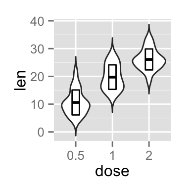
Note that, you can also define a custom function to produce summary statistics as follow :
# Function to produce summary statistics (mean and +/- sd)
data_summary <- function(x) {
   m <- mean(x)
   ymin <- m-sd(x)
   ymax <- m+sd(x)
   return(c(y=m,ymin=ymin,ymax=ymax))
}
Use a custom summary function :
p + stat_summary(fun.data=data_summary)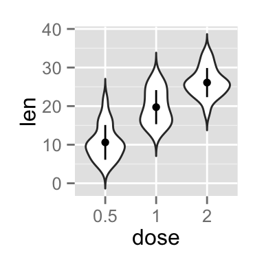
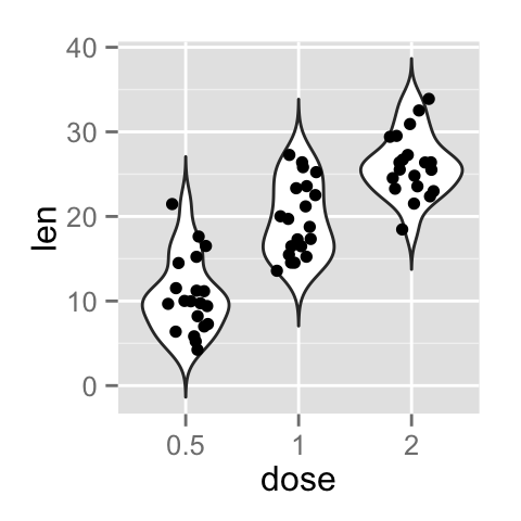
Violin plot with dots
Dots (or points) can be added to a violin plot using the functions geom_dotplot() or geom_jitter() :
# violin plot with dot plot
p + geom_dotplot(binaxis='y', stackdir='center', dotsize=1)
# violin plot with jittered points
# 0.2 : degree of jitter in x direction
p + geom_jitter(shape=16, position=position_jitter(0.2))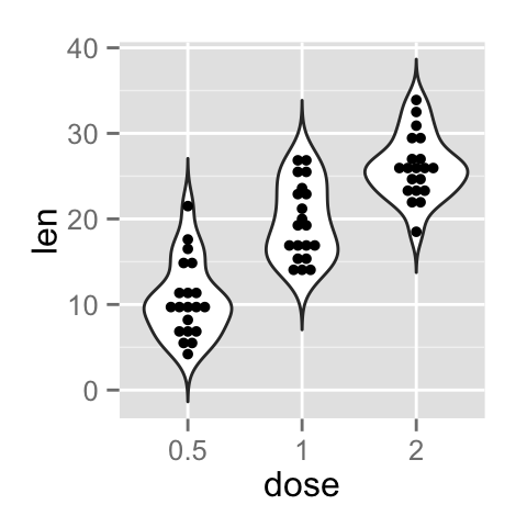
Change violin plot colors by groups
Change violin plot line colors
Violin plot line colors can be automatically controlled by the levels of dose :
# Change violin plot line colors by groups
p<-ggplot(ToothGrowth, aes(x=dose, y=len, color=dose)) +
  geom_violin(trim=FALSE)
p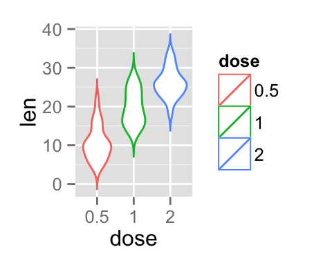
It is also possible to change manually violin plot line colors using the functions :
- scale_color_manual() : to use custom colors
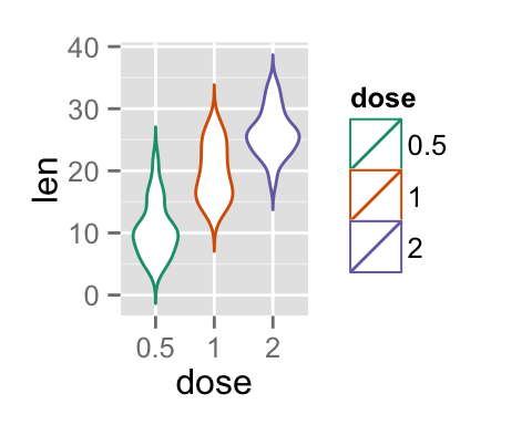
- scale_color_brewer() : to use color palettes from RColorBrewer package
- scale_color_grey() : to use grey color palettes
# Use custom color palettes
p+scale_color_manual(values=c("#999999", "#E69F00", "#56B4E9"))
# Use brewer color palettes
p+scale_color_brewer(palette="Dark2")
# Use grey scale
p + scale_color_grey() + theme_classic()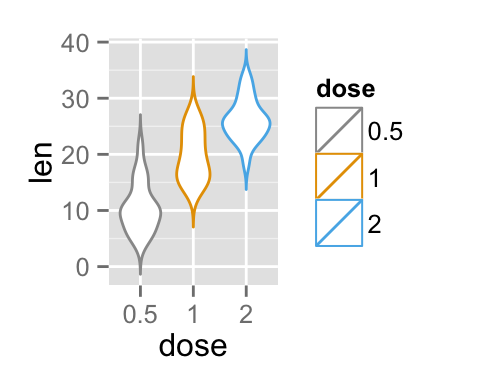
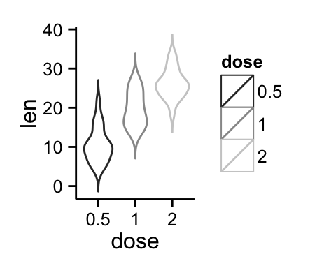
Read more on ggplot2 colors here : ggplot2 colors
Change violin plot fill colors
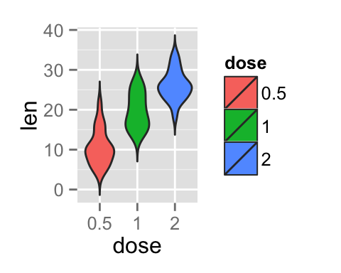
In the R code below, the fill colors of the violin plot are automatically controlled by the levels of dose :
# Use single color
ggplot(ToothGrowth, aes(x=dose, y=len)) +
  geom_violin(trim=FALSE, fill='#A4A4A4', color="darkred")+
  geom_boxplot(width=0.1) + theme_minimal()
# Change violin plot colors by groups
p<-ggplot(ToothGrowth, aes(x=dose, y=len, fill=dose)) +
  geom_violin(trim=FALSE)
p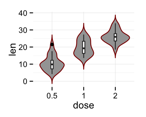
It is also possible to change manually violin plot colors using the functions :
- scale_fill_manual() : to use custom colors
- scale_fill_brewer() : to use color palettes from RColorBrewer package
- scale_fill_grey() : to use grey color palettes
# Use custom color palettes
p+scale_fill_manual(values=c("#999999", "#E69F00", "#56B4E9"))
# Use brewer color palettes
p+scale_fill_brewer(palette="Dark2")
# Use grey scale
p + scale_fill_grey() + theme_classic()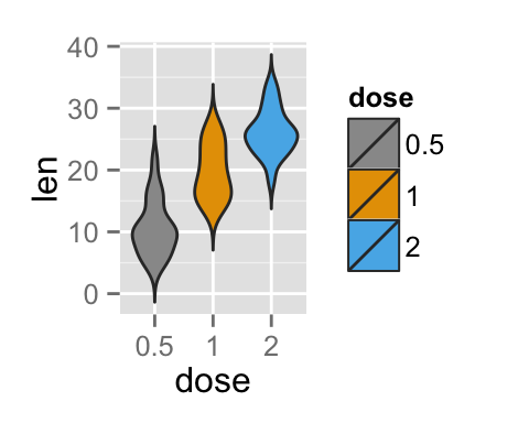
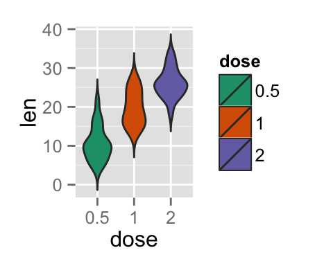
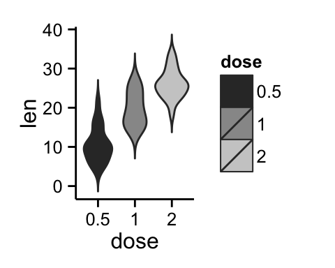
Read more on ggplot2 colors here : ggplot2 colors
Change the legend position
p + theme(legend.position="top")
p + theme(legend.position="bottom")
p + theme(legend.position="none") # Remove legend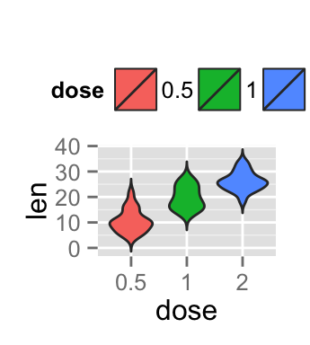
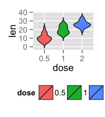
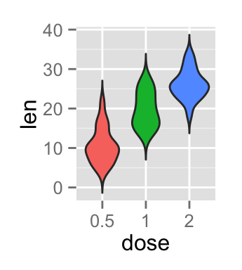
The allowed values for the arguments legend.position are : “left”,“top”, “right”, “bottom”.
Read more on ggplot legends : ggplot2 legend
Change the order of items in the legend
The function scale_x_discrete can be used to change the order of items to “2”, “0.5”, “1” :
p + scale_x_discrete(limits=c("2", "0.5", "1"))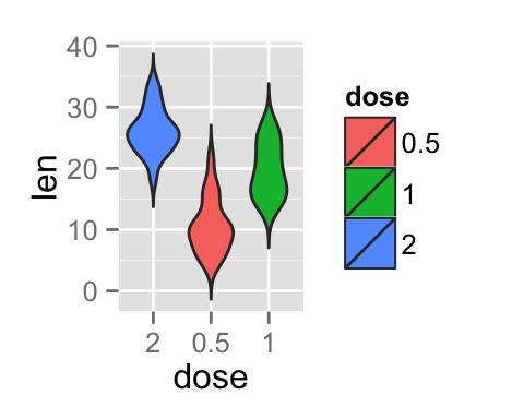
Violin plot with multiple groups
# Change violin plot colors by groups
ggplot(ToothGrowth, aes(x=dose, y=len, fill=supp)) +
  geom_violin()
# Change the position
p<-ggplot(ToothGrowth, aes(x=dose, y=len, fill=supp)) +
  geom_violin(position=position_dodge(1))
p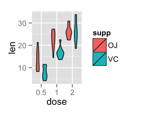

Change violin plot colors and add dots :
# Add dots
p + geom_dotplot(binaxis='y', stackdir='center',
                 position=position_dodge(1))
# Change colors
p+scale_fill_manual(values=c("#999999", "#E69F00", "#56B4E9"))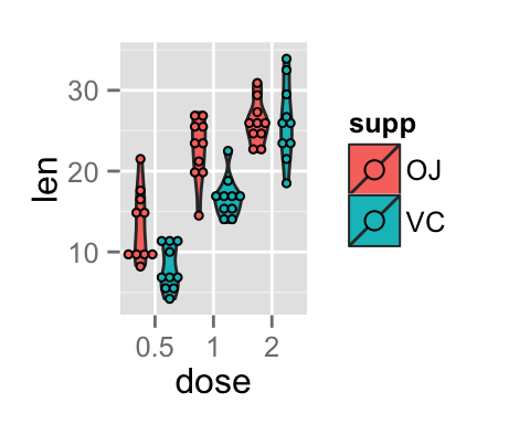
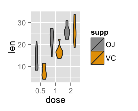
Customized violin plots
# Basic violin plot
ggplot(ToothGrowth, aes(x=dose, y=len)) +
  geom_violin(trim=FALSE, fill="gray")+
  labs(title="Plot of length  by dose",x="Dose (mg)", y = "Length")+
  geom_boxplot(width=0.1)+
  theme_classic()
# Change color by groups
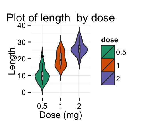
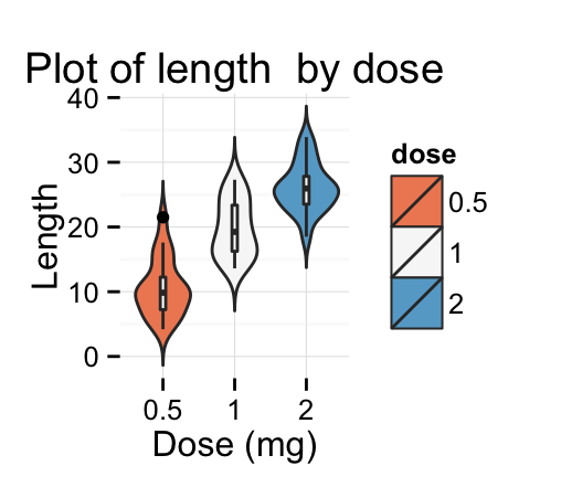
dp <- ggplot(ToothGrowth, aes(x=dose, y=len, fill=dose)) +
  geom_violin(trim=FALSE)+
  geom_boxplot(width=0.1, fill="white")+
  labs(title="Plot of length  by dose",x="Dose (mg)", y = "Length")
dp + theme_classic()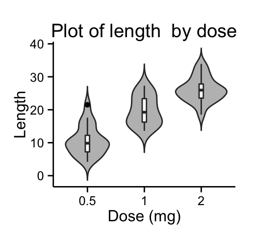
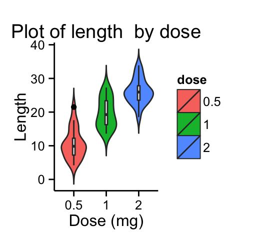
Change fill colors manually :
# Continusous colors
dp + scale_fill_brewer(palette="Blues") + theme_classic()
# Discrete colors
dp + scale_fill_brewer(palette="Dark2") + theme_minimal()
# Gradient colors
dp + scale_fill_brewer(palette="RdBu") + theme_minimal()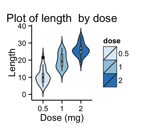
Read more on ggplot2 colors here : ggplot2 colors
Infos
This analysis has been performed using R software (ver. 3.1.2) and ggplot2 (ver. 1.0.0)
Show me some love with the like buttons below... Thank you and please don't forget to share and comment below!!
Montrez-moi un peu d'amour avec les like ci-dessous ... Merci et n'oubliez pas, s'il vous plaît, de partager et de commenter ci-dessous!
Recommended for You!
Recommended for you
This section contains the best data science and self-development resources to help you on your path.
Books - Data Science
Our Books
- Practical Guide to Cluster Analysis in R by A. Kassambara (Datanovia)
- Practical Guide To Principal Component Methods in R by A. Kassambara (Datanovia)
- Machine Learning Essentials: Practical Guide in R by A. Kassambara (Datanovia)
- R Graphics Essentials for Great Data Visualization by A. Kassambara (Datanovia)
- GGPlot2 Essentials for Great Data Visualization in R by A. Kassambara (Datanovia)
- Network Analysis and Visualization in R by A. Kassambara (Datanovia)
- Practical Statistics in R for Comparing Groups: Numerical Variables by A. Kassambara (Datanovia)
- Inter-Rater Reliability Essentials: Practical Guide in R by A. Kassambara (Datanovia)
Others
- R for Data Science: Import, Tidy, Transform, Visualize, and Model Data by Hadley Wickham & Garrett Grolemund
- Hands-On Machine Learning with Scikit-Learn, Keras, and TensorFlow: Concepts, Tools, and Techniques to Build Intelligent Systems by Aurelien Géron
- Practical Statistics for Data Scientists: 50 Essential Concepts by Peter Bruce & Andrew Bruce
- Hands-On Programming with R: Write Your Own Functions And Simulations by Garrett Grolemund & Hadley Wickham
- An Introduction to Statistical Learning: with Applications in R by Gareth James et al.
- Deep Learning with R by François Chollet & J.J. Allaire
- Deep Learning with Python by François Chollet
Click to follow us on Facebook :
Comment this article by clicking on "Discussion" button (top-right position of this page)


