


ggplot2 colors : How to change colors automatically and manually?
The goal of this article is to describe how to change the color of a graph generated using R software and ggplot2 package. A color can be specified either by name (e.g.: “red”) or by hexadecimal code (e.g. : “#FF1234”). The different color systems available in R are described at this link : colors in R.
In this R tutorial, you will learn how to :
- change colors by groups (automatically and manually)
- use RColorBrewer and Wes Anderson color palettes
- use gradient colors
![]()
Related Book:
GGPlot2 Essentials for Great Data Visualization in R
Prepare the data
ToothGrowth and mtcars data sets are used in the examples below.
# Convert dose and cyl columns from numeric to factor variables
ToothGrowth$dose <- as.factor(ToothGrowth$dose)
mtcars$cyl <- as.factor(mtcars$cyl)
head(ToothGrowth)
## len supp dose
## 1 4.2 VC 0.5
## 2 11.5 VC 0.5
## 3 7.3 VC 0.5
## 4 5.8 VC 0.5
## 5 6.4 VC 0.5
## 6 10.0 VC 0.5head(mtcars)## mpg cyl disp hp drat wt qsec vs am gear carb
## Mazda RX4 21.0 6 160 110 3.90 2.620 16.46 0 1 4 4
## Mazda RX4 Wag 21.0 6 160 110 3.90 2.875 17.02 0 1 4 4
## Datsun 710 22.8 4 108 93 3.85 2.320 18.61 1 1 4 1
## Hornet 4 Drive 21.4 6 258 110 3.08 3.215 19.44 1 0 3 1
## Hornet Sportabout 18.7 8 360 175 3.15 3.440 17.02 0 0 3 2
## Valiant 18.1 6 225 105 2.76 3.460 20.22 1 0 3 1Make sure that the columns dose and cyl are converted as factor variables using the R script above.
Simple plots
library(ggplot2)
# Box plot
ggplot(ToothGrowth, aes(x=dose, y=len)) +geom_boxplot()
# scatter plot
ggplot(mtcars, aes(x=wt, y=mpg)) + geom_point()

Use a single color
# box plot
ggplot(ToothGrowth, aes(x=dose, y=len)) +
  geom_boxplot(fill='#A4A4A4', color="darkred")
# scatter plot
ggplot(mtcars, aes(x=wt, y=mpg)) +
  geom_point(color='darkblue')

Change colors by groups
Default colors
The following R code changes the color of the graph by the levels of dose :
# Box plot
bp<-ggplot(ToothGrowth, aes(x=dose, y=len, fill=dose)) +
  geom_boxplot()
bp
# Scatter plot
sp<-ggplot(mtcars, aes(x=wt, y=mpg, color=cyl)) + geom_point()
sp

The lightness (l) and the chroma (c, intensity of color) of the default (hue) colors can be modified using the functions scale_hue as follow :
# Box plot
bp + scale_fill_hue(l=40, c=35)
# Scatter plot
sp + scale_color_hue(l=40, c=35)

Note that, the default values for l and c are : l = 65, c = 100.
Change colors manually
A custom color palettes can be specified using the functions :
- scale_fill_manual() for box plot, bar plot, violin plot, etc
- scale_color_manual() for lines and points
# Box plot
bp + scale_fill_manual(values=c("#999999", "#E69F00", "#56B4E9"))
# Scatter plot
sp + scale_color_manual(values=c("#999999", "#E69F00", "#56B4E9"))

Note that, the argument breaks can be used to control the appearance of the legend. This holds true also for the other scale_xx() functions.
# Box plot
bp + scale_fill_manual(breaks = c("2", "1", "0.5"),
                       values=c("red", "blue", "green"))
# Scatter plot
sp + scale_color_manual(breaks = c("8", "6", "4"),
                        values=c("red", "blue", "green"))

The built-in color names and a color code chart are described here : color in R.
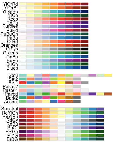
Use RColorBrewer palettes
The color palettes available in the RColorBrewer package are described here : color in R.
# Box plot
bp + scale_fill_brewer(palette="Dark2")
# Scatter plot
sp + scale_color_brewer(palette="Dark2")

The available color palettes in the RColorBrewer package are :
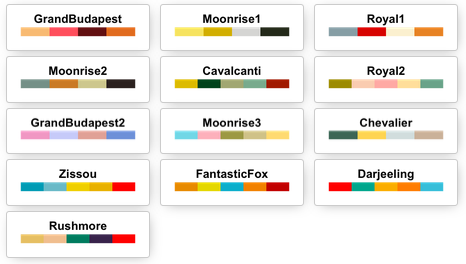
Use Wes Anderson color palettes
Install and load the color palettes as follow :
# Install
install.packages("wesanderson")
# Load
library(wesanderson)
The available color palettes are :
library(wesanderson)
# Box plot
bp+scale_fill_manual(values=wes_palette(n=3, name="GrandBudapest"))
# Scatter plot
sp+scale_color_manual(values=wes_palette(n=3, name="GrandBudapest"))

Use gray colors
The functions to use are :
- scale_colour_grey() for points, lines, etc
- scale_fill_grey() for box plot, bar plot, violin plot, etc
# Box plot
bp + scale_fill_grey() + theme_classic()
# Scatter plot
sp + scale_color_grey() + theme_classic()

Change the gray value at the low and the high ends of the palette :
# Box plot
bp + scale_fill_grey(start=0.8, end=0.2) + theme_classic()
# Scatter plot
sp + scale_color_grey(start=0.8, end=0.2) + theme_classic()

Note that, the default value for the arguments start and end are : start = 0.2, end = 0.8
Continuous colors
The graph can be colored according to the values of a continuous variable using the functions :
- scale_color_gradient(), scale_fill_gradient() for sequential gradients between two colors
- scale_color_gradient2(), scale_fill_gradient2() for diverging gradients
- scale_color_gradientn(), scale_fill_gradientn() for gradient between n colors
Gradient colors for scatter plots
The graphs are colored using the qsec continuous variable :
# Color by qsec values
sp2<-ggplot(mtcars, aes(x=wt, y=mpg, color=qsec)) + geom_point()
sp2
# Change the low and high colors
# Sequential color scheme
sp2+scale_color_gradient(low="blue", high="red")
# Diverging color scheme
mid<-mean(mtcars$qsec)
sp2+scale_color_gradient2(midpoint=mid, low="blue", mid="white",
                     high="red", space ="Lab" )


Gradient colors for histogram plots
set.seed(1234)
x <- rnorm(200)
# Histogram
hp<-qplot(x =x, fill=..count.., geom="histogram")
hp
# Sequential color scheme
hp+scale_fill_gradient(low="blue", high="red")

Note that, the functions scale_color_continuous() and scale_fill_continuous() can be used also to set gradient colors.
Gradient between n colors
# Scatter plot
# Color points by the mpg variable
sp3<-ggplot(mtcars, aes(x=wt, y=mpg, color=mpg)) + geom_point()
sp3
# Gradient between n colors
sp3+scale_color_gradientn(colours = rainbow(5))

Infos
This analysis has been performed using R software (ver. 3.1.2) and ggplot2 (ver. 1.0.0)
Show me some love with the like buttons below... Thank you and please don't forget to share and comment below!!
Montrez-moi un peu d'amour avec les like ci-dessous ... Merci et n'oubliez pas, s'il vous plaît, de partager et de commenter ci-dessous!
Recommended for You!


Recommended for you
This section contains the best data science and self-development resources to help you on your path.
Books - Data Science
Our Books
- Practical Guide to Cluster Analysis in R by A. Kassambara (Datanovia)
- Practical Guide To Principal Component Methods in R by A. Kassambara (Datanovia)
- Machine Learning Essentials: Practical Guide in R by A. Kassambara (Datanovia)
- R Graphics Essentials for Great Data Visualization by A. Kassambara (Datanovia)
- GGPlot2 Essentials for Great Data Visualization in R by A. Kassambara (Datanovia)
- Network Analysis and Visualization in R by A. Kassambara (Datanovia)
- Practical Statistics in R for Comparing Groups: Numerical Variables by A. Kassambara (Datanovia)
- Inter-Rater Reliability Essentials: Practical Guide in R by A. Kassambara (Datanovia)
Others
- R for Data Science: Import, Tidy, Transform, Visualize, and Model Data by Hadley Wickham & Garrett Grolemund
- Hands-On Machine Learning with Scikit-Learn, Keras, and TensorFlow: Concepts, Tools, and Techniques to Build Intelligent Systems by Aurelien Géron
- Practical Statistics for Data Scientists: 50 Essential Concepts by Peter Bruce & Andrew Bruce
- Hands-On Programming with R: Write Your Own Functions And Simulations by Garrett Grolemund & Hadley Wickham
- An Introduction to Statistical Learning: with Applications in R by Gareth James et al.
- Deep Learning with R by François Chollet & J.J. Allaire
- Deep Learning with Python by François Chollet
Click to follow us on Facebook :
Comment this article by clicking on "Discussion" button (top-right position of this page)