


ggplot2 themes and background colors : The 3 elements
This R tutorial describes how to change the look of a plot theme (background color, panel background color and grid lines) using R software and ggplot2 package. You’ll also learn how to use the base themes of ggplot2 and to create your own theme.
![]()
Related Book:
GGPlot2 Essentials for Great Data Visualization in R
Prepare the data
ToothGrowth data is used :
# Convert the column dose from numeric to factor variable
ToothGrowth$dose <- as.factor(ToothGrowth$dose)
head(ToothGrowth)
## len supp dose
## 1 4.2 VC 0.5
## 2 11.5 VC 0.5
## 3 7.3 VC 0.5
## 4 5.8 VC 0.5
## 5 6.4 VC 0.5
## 6 10.0 VC 0.5Make sure that the variable dose is converted as a factor using the above R script.
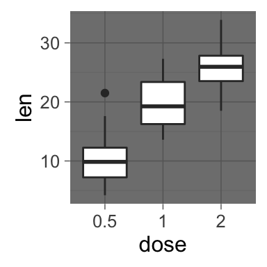
Example of plot
library(ggplot2)
p <- ggplot(ToothGrowth, aes(x=dose, y=len)) + geom_boxplot()
p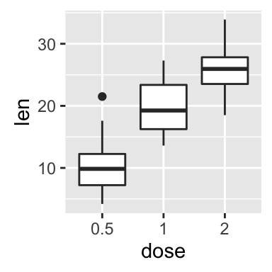
Quick functions to change plot themes
Several functions are available in ggplot2 package for changing quickly the theme of plots :
- theme_gray : gray background color and white grid lines
- theme_bw : white background and gray grid lines
p + theme_gray(base_size = 14)
p + theme_bw()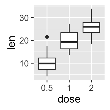
ggplot2 background color, theme_gray and theme_bw, R programming
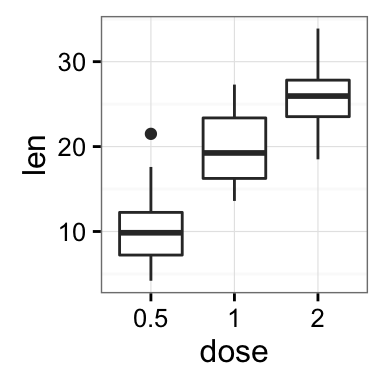
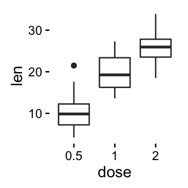
- theme_linedraw : black lines around the plot
- theme_light : light gray lines and axis (more attention towards the data)
p + theme_linedraw()
p + theme_light()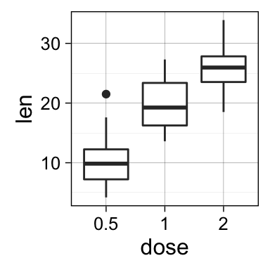

ggplot2 background color, theme_linedraw and theme_light, R programming
- theme_minimal: no background annotations
- theme_classic : theme with axis lines and no grid lines
p + theme_minimal()
p + theme_classic()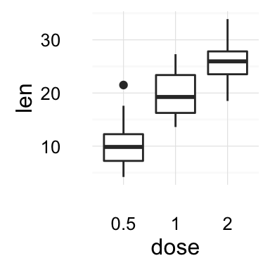
ggplot2 background color, theme_minimal and theme_classic, R programming
- theme_void: Empty theme, useful for plots with non-standard coordinates or for drawings
- theme_dark(): Dark background designed to make colours pop out
p + theme_void()
p + theme_dark()
ggplot2 background color, theme_void and theme_dark, R programming
The functions theme_xx() can take the two arguments below :
- base_size : base font size (to change the size of all plot text elements)
- base_family : base font family
The size of all the plot text elements can be easily changed at once :
# Example 1
theme_set(theme_gray(base_size = 20))
ggplot(ToothGrowth, aes(x=dose, y=len)) + geom_boxplot()
# Example 2
ggplot(ToothGrowth, aes(x=dose, y=len)) + geom_boxplot()+
  theme_classic(base_size = 25)
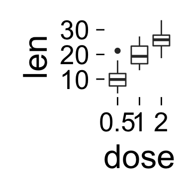
ggplot2 background color, font size, R programming
Note that, the function theme_set() changes the theme for the entire session.
Customize the appearance of the plot background
The function theme() is used to control non-data parts of the graph including :
- Line elements : axis lines, minor and major grid lines, plot panel border, axis ticks background color, etc.
- Text elements : plot title, axis titles, legend title and text, axis tick mark labels, etc.
- Rectangle elements : plot background, panel background, legend background, etc.
There is a specific function to modify each of these three elements :
- element_line() to modify the line elements of the theme
- element_text() to modify the text elements
- element_rect() to change the appearance of the rectangle elements
Note that, each of the theme elements can be removed using the function element_blank()
Change the colors of the plot panel background and the grid lines
- The functions theme() and element_rect() are used for changing the plot panel background color :
p + theme(panel.background = element_rect(fill, colour, size,
linetype, color))- fill : the fill color for the rectangle
- colour, color : border color
- size : border size
- The appearance of grid lines can be changed using the function element_line() as follow :
# change major and minor grid lines
p + theme(
  panel.grid.major = element_line(colour, size, linetype,
                                   lineend, color),
  panel.grid.minor = element_line(colour, size, linetype,
                                   lineend, color)
)- colour, color : line color
- size : line size
- linetype : line type. Line type can be specified using either text (“blank”, “solid”, “dashed”, “dotted”, “dotdash”, “longdash”, “twodash”) or number (0, 1, 2, 3, 4, 5, 6). Note that linetype = “solid” is identical to linetype=1. The available line types in R are described here : Line types in R software
- lineend : line end. Possible values for line end are : “round”, “butt” or “square”
The R code below illustrates how to modify the appearance of the plot panel background and grid lines :
# Change the colors of plot panel background to lightblue
# and the color of grid lines to white
p + theme(
  panel.background = element_rect(fill = "lightblue",
                                colour = "lightblue",
                                size = 0.5, linetype = "solid"),
  panel.grid.major = element_line(size = 0.5, linetype = 'solid',
                                colour = "white"),
  panel.grid.minor = element_line(size = 0.25, linetype = 'solid',
                                colour = "white")
  )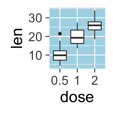
ggplot2 background color, grid lines, R programming
Remove plot panel borders and grid lines
It is possible to hide plot panel borders and grid lines with the function element_blank() as follow :
# Remove panel borders and grid lines
p + theme(panel.border = element_blank(),
          panel.grid.major = element_blank(),
          panel.grid.minor = element_blank())
# Hide panel borders and grid lines
# But change axis line
p + theme(panel.border = element_blank(),
          panel.grid.major = element_blank(),
          panel.grid.minor = element_blank(),
          axis.line = element_line(size = 0.5, linetype = "solid",
                                   colour = "black"))
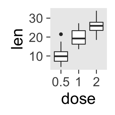
ggplot2 background color, remove plot panel border, remove grid lines, R programming
Change the plot background color (not the panel)
p + theme(plot.background = element_rect(fill = "darkblue"))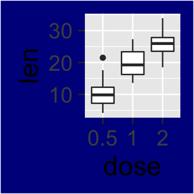
ggplot2 background color, R programming
Use a custom theme
You can change the entire appearance of a plot by using a custom theme. Jeffrey Arnold has implemented the library ggthemes containing several custom themes.
To use these themes install and load ggthemes package as follow :
install.packages("ggthemes") # Install
library(ggthemes) # Load
ggthemes package provides many custom themes and scales for ggplot.
theme_tufte : a minimalist theme
# scatter plot
ggplot(mtcars, aes(wt, mpg)) +
  geom_point() + geom_rangeframe() +
  theme_tufte()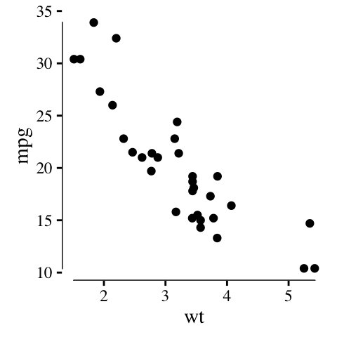
ggplot2 theme_tufte, R statistical software
theme_economist : theme based on the plots in the economist magazine
p <- ggplot(iris, aes(Sepal.Length, Sepal.Width, colour = Species))+
  geom_point()
# Use economist color scales
p + theme_economist() +
  scale_color_economist()+
  ggtitle("Iris data sets")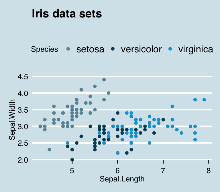
ggplot2 theme_economist, R statistical software
Note that, the function scale_fill_economist() are also available.
theme_stata: theme based on Stata graph schemes.
p + theme_stata() + scale_color_stata() +
  ggtitle("Iris data")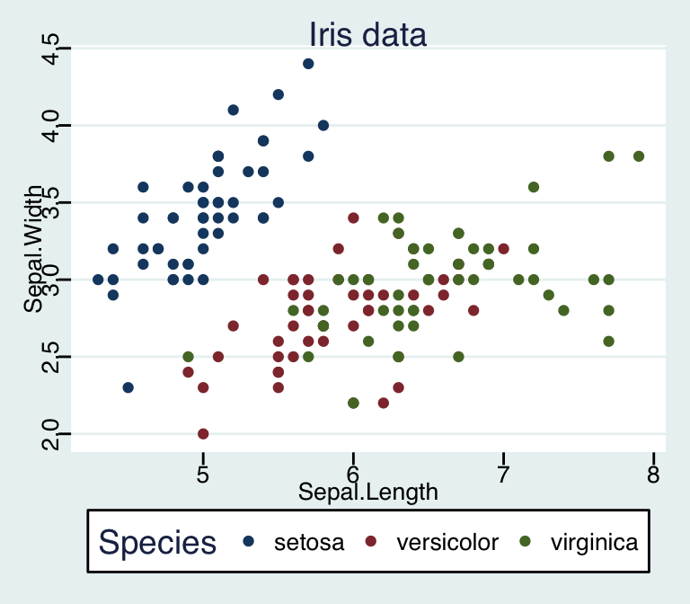
ggplot2 theme_stata, R statistical software
The stata theme color scales can be used as follow :
scale_fill_stata(scheme = "s2color", ...)
scale_color_stata(scheme = "s2color", ...)
The allowed values for the argument scheme are one of “s2color”, “s1rcolor”, “s1color”, or “mono”.
theme_wsj: theme based on plots in the Wall Street Journal
p + theme_wsj()+ scale_colour_wsj("colors6")+
  ggtitle("Iris data")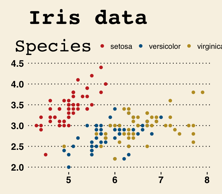
ggplot2 theme_wsj, R statistical software
The Wall Street Journal color and fill scales are :
scale_color_wsj(palette = "colors6", ...)
scale_fill_wsj(palette = "colors6", ...)
The color palette to use can be one of “rgby”, “red_green”, “black_green”, “dem_rep”, “colors6”.
theme_calc : theme based on LibreOffice Calc
These themes are based on the defaults in Google Docs and LibreOffice Calc, respectively.
p + theme_calc()+ scale_colour_calc()+
  ggtitle("Iris data")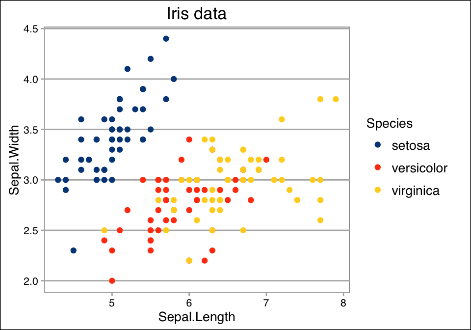
ggplot2 theme_calc, R statistical software
theme_hc : theme based on Highcharts JS
p + theme_hc()+ scale_colour_hc()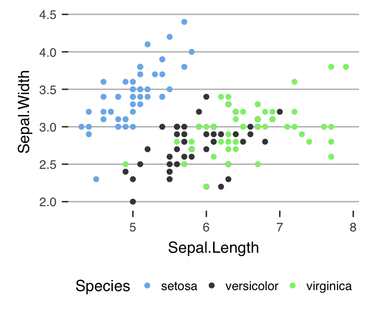
ggplot2 theme_hc, R statistical software
Create a custom theme
- You can change the theme for the current R session using the function theme_set() as follow :
theme_set(theme_gray(base_size = 20))- You can extract and modify the R code of theme_gray :
theme_gray
function (base_size = 11, base_family = "")
{
 half_line <- base_size/2
theme(
  line = element_line(colour = "black", size = 0.5,
                      linetype = 1, lineend = "butt"),
  rect = element_rect(fill = "white", colour = "black",
                      size = 0.5, linetype = 1),
  text = element_text(family = base_family, face = "plain",
                      colour = "black", size = base_size,
                      lineheight = 0.9,  hjust = 0.5,
                      vjust = 0.5, angle = 0,
                      margin = margin(), debug = FALSE),

  axis.line = element_blank(),
  axis.text = element_text(size = rel(0.8), colour = "grey30"),
  axis.text.x = element_text(margin = margin(t = 0.8*half_line/2),
                             vjust = 1),
  axis.text.y = element_text(margin = margin(r = 0.8*half_line/2),
                             hjust = 1),
  axis.ticks = element_line(colour = "grey20"),
  axis.ticks.length = unit(half_line/2, "pt"),
  axis.title.x = element_text(margin = margin(t = 0.8 * half_line,
                                          b = 0.8 * half_line/2)),
  axis.title.y = element_text(angle = 90,
                              margin = margin(r = 0.8 * half_line,
                                          l = 0.8 * half_line/2)),

  legend.background = element_rect(colour = NA),
  legend.margin = unit(0.2, "cm"),
  legend.key = element_rect(fill = "grey95", colour = "white"),
  legend.key.size = unit(1.2, "lines"),
  legend.key.height = NULL,
  legend.key.width = NULL,
  legend.text = element_text(size = rel(0.8)),
  legend.text.align = NULL,
  legend.title = element_text(hjust = 0),
  legend.title.align = NULL,
  legend.position = "right",
  legend.direction = NULL,
  legend.justification = "center",
  legend.box = NULL,

  panel.background = element_rect(fill = "grey92", colour = NA),
  panel.border = element_blank(),
  panel.grid.major = element_line(colour = "white"),
  panel.grid.minor = element_line(colour = "white", size = 0.25),
  panel.margin = unit(half_line, "pt"), panel.margin.x = NULL,
  panel.margin.y = NULL, panel.ontop = FALSE,

  strip.background = element_rect(fill = "grey85", colour = NA),
  strip.text = element_text(colour = "grey10", size = rel(0.8)),
  strip.text.x = element_text(margin = margin(t = half_line,
                                              b = half_line)),
  strip.text.y = element_text(angle = -90,
                              margin = margin(l = half_line,
                                              r = half_line)),
  strip.switch.pad.grid = unit(0.1, "cm"),
  strip.switch.pad.wrap = unit(0.1, "cm"),

  plot.background = element_rect(colour = "white"),
  plot.title = element_text(size = rel(1.2),
                            margin = margin(b = half_line * 1.2)),
  plot.margin = margin(half_line, half_line, half_line, half_line),
  complete = TRUE)
}
Note that, the function rel() modifies the size relative to the base size
Infos
This analysis has been performed using R software (ver. 3.2.4) and ggplot2 (ver. 2.1.0)
Show me some love with the like buttons below... Thank you and please don't forget to share and comment below!!
Montrez-moi un peu d'amour avec les like ci-dessous ... Merci et n'oubliez pas, s'il vous plaît, de partager et de commenter ci-dessous!
Recommended for You!


Recommended for you
This section contains the best data science and self-development resources to help you on your path.
Books - Data Science
Our Books
- Practical Guide to Cluster Analysis in R by A. Kassambara (Datanovia)
- Practical Guide To Principal Component Methods in R by A. Kassambara (Datanovia)
- Machine Learning Essentials: Practical Guide in R by A. Kassambara (Datanovia)
- R Graphics Essentials for Great Data Visualization by A. Kassambara (Datanovia)
- GGPlot2 Essentials for Great Data Visualization in R by A. Kassambara (Datanovia)
- Network Analysis and Visualization in R by A. Kassambara (Datanovia)
- Practical Statistics in R for Comparing Groups: Numerical Variables by A. Kassambara (Datanovia)
- Inter-Rater Reliability Essentials: Practical Guide in R by A. Kassambara (Datanovia)
Others
- R for Data Science: Import, Tidy, Transform, Visualize, and Model Data by Hadley Wickham & Garrett Grolemund
- Hands-On Machine Learning with Scikit-Learn, Keras, and TensorFlow: Concepts, Tools, and Techniques to Build Intelligent Systems by Aurelien Géron
- Practical Statistics for Data Scientists: 50 Essential Concepts by Peter Bruce & Andrew Bruce
- Hands-On Programming with R: Write Your Own Functions And Simulations by Garrett Grolemund & Hadley Wickham
- An Introduction to Statistical Learning: with Applications in R by Gareth James et al.
- Deep Learning with R by François Chollet & J.J. Allaire
- Deep Learning with Python by François Chollet
Click to follow us on Facebook :
Comment this article by clicking on "Discussion" button (top-right position of this page)