


Graphical parameters
This article provides a quick start guide to change and customize R graphical parameters, including:
- adding titles, legends, texts, axis and straight lines
- changing axis scales, plotting symbols, line types and colors
For each of these graphical parameters, you will learn the simplified format of the R functions to use and some examples.
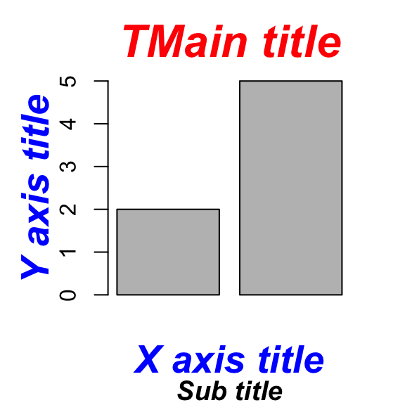
Add and customize titles
How this chapter is organized?
- Change main title and axis labels
- title colors
- The font style for titles
- Change the font size
- Use the title() function
- Customize the titles using par() function.
Read more —> Add titles to a plot in R software.
Plot titles can be specified either directly to the plotting functions during the plot creation or by using the title() function (to add titles on an existing plot).
# Add titles
barplot(c(2,5), main="Main title",
xlab="X axis title",
ylab="Y axis title",
sub="Sub-title",
col.main="red", col.lab="blue", col.sub="black")
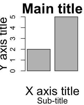
# Increase the size of titles
barplot(c(2,5), main="Main title",
xlab="X axis title",
ylab="Y axis title",
sub="Sub-title",
cex.main=2, cex.lab=1.7, cex.sub=1.2)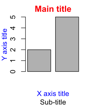
Read more —> Add titles to a plot in R software.
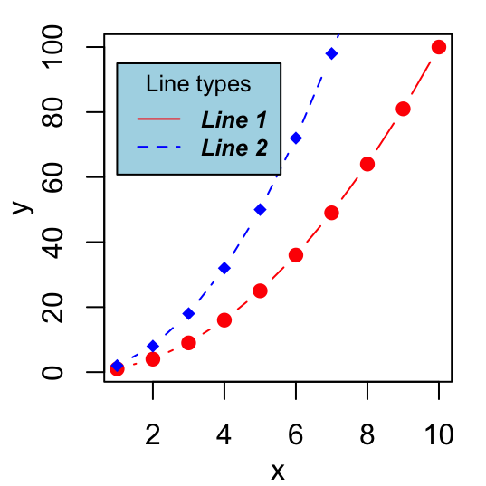
Add legends
How this chapter is organized?
- R legend function
- Title, text font and background color of the legend box
- Border of the legend box
- Specify legend position by keywords
Read more —> Add legends to plots
The legend() function can be used. A simplified format is :
legend(x, y=NULL, legend, col)- x and y : the co-ordinates to be used for the legend. Keywords can also be used for x : “bottomright”, “bottom”, “bottomleft”, “left”, “topleft”, “top”, “topright”, “right” and “center”.
- legend : the text of the legend
- col : colors of lines and points beside the text for legends
# Generate some data
x<-1:10; y1=x*x; y2=2*y1
# First line plot
plot(x, y1, type="b", pch=19, col="red", xlab="x", ylab="y")
# Add a second line
lines(x, y2, pch=18, col="blue", type="b", lty=2)
# Add legends
legend("topleft", legend=c("Line 1", "Line 2"),
       col=c("red", "blue"), lty=1:2, cex=0.8)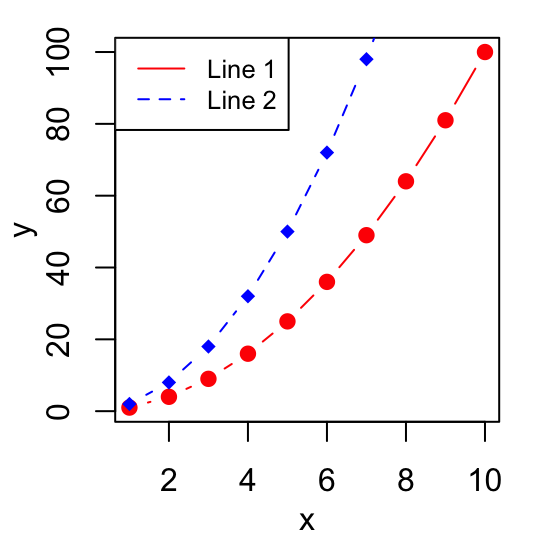
Read more —> Add legends to plots
Add texts
How this chapter is organized?
- Add texts within the graph
- Add text in the margins of the graph
- Add mathematical annotation to a plot
Read more —> Add text to a plot
To add a text to a plot in R, the text() function [to draw a text inside the plotting area] and mtext()[to put a text in one of the four margins of the plot] function can be used.
A simplified format for text() is :
text(x, y, labels)- x and y are the coordinates of the texts
- labels : vector of texts to be drawn
plot(cars[1:10,], pch=19)
text(cars[1:10,],  row.names(cars[1:10,]),
cex=0.65, pos=1,col="red") 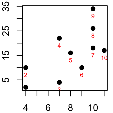
Read more —> Add text to a plot
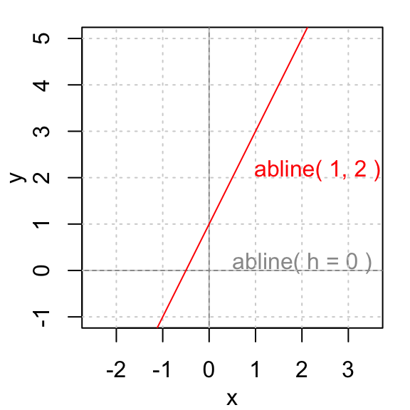
Add straight lines
How this chapter is organized?
- Add a vertical line
- Add an horizontal line
- Add regression line
Read more —> abline R function : An easy way to add straight lines to a plot using R software
The R function abline() can be used to add straight lines (vertical, horizontal or regression lines) to a graph.
A simplified format is :
abline(a=NULL, b=NULL, h=NULL, v=NULL, ...)- a, b : single values specifying the intercept and the slope of the line
- h : the y-value(s) for horizontal line(s)
- v : the x-value(s) for vertical line(s)
# Add horizontal and vertical lines
#++++++++++++++++++++++++++++++++++
plot(cars, pch=19)
abline(v=15, col="blue") # Add vertical line
# Add horizontal line, change line color, size and type
abline(h=60, col="red", lty=2, lwd=3)
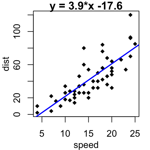
# Fit regression line
#++++++++++++++++++++++++++++++++++
require(stats)
reg<-lm(dist ~ speed, data = cars)
coeff=coefficients(reg)
# equation of the regression line :
eq = paste0("y = ", round(coeff[2],1), "*x ", round(coeff[1],1))
plot(cars, main=eq, pch=18)
abline(reg, col="blue", lwd=2)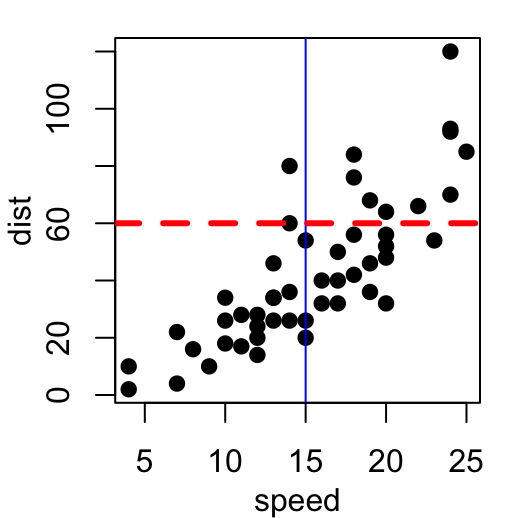
Read more —> abline R function : An easy way to add straight lines to a plot using R software
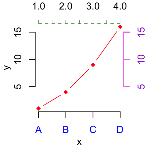
Add an axis to a plot
axis() function can be used.
A simplified format is :
axis(side, at=NULL, labels=TRUE)- side : the side of the graph the axis is to be drawn on; Possible values are 1(below), 2(left), 3(above) and 4(right).
- at: the points at which tick-marks are to be drawn.
- labels: vector of texts for the labels of tick-marks.
x<-1:4; y=x*x
plot(x, y, pch=18, col="red", type="b",
     frame=FALSE, xaxt="n") # Remove x axis
axis(1, 1:4, LETTERS[1:4], col.axis="blue")
axis(3, col = "darkgreen", lty = 2, lwd = 0.5)
axis(4, col = "violet", col.axis = "dark violet", lwd = 2)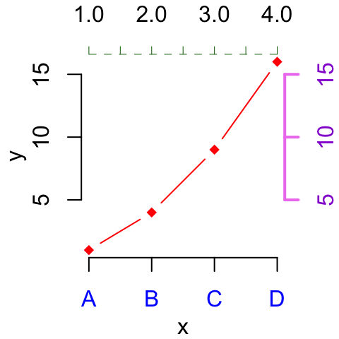
Read more —> Add an axis to a plot with R software.
Change axis scale : minimum, maximum and log scale
xlim and ylim arguments can be used to change the limits for x and y axis. Format : xlim = c(min, max); ylim = c(min, max).
log transformation can be performed using the parameters : log=“x”, log=“y” or log=“xy”.
x<-1:10; y=x*x
plot(x, y) # Simple graph
plot(x, y, xlim=c(1,15), ylim=c(1,150))# Enlarge the scale
plot(x, y, log="y")# Log scale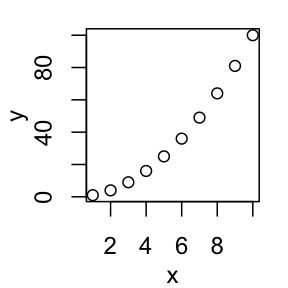
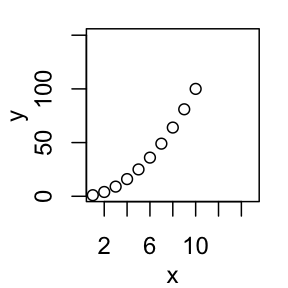
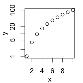
Read more —> Axis scale in R software : minimum, maximum and log scale.
Customize tick mark labels
- Color, font style and font size of tick mark labels :
- Orientation of tick mark labels
- Hide tick marks
- Change the string rotation of tick mark labels
- Use the par() function
x<-1:10; y<-x*x
# Simple graph
plot(x, y)
# Custom plot : blue text, italic-bold, magnification
plot(x,y, col.axis="blue", font.axis=4, cex.axis=1.5)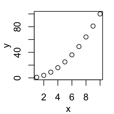
Read more —> Customize tick mark labels.
Change plotting symbols
The following points symbols can be used in R :
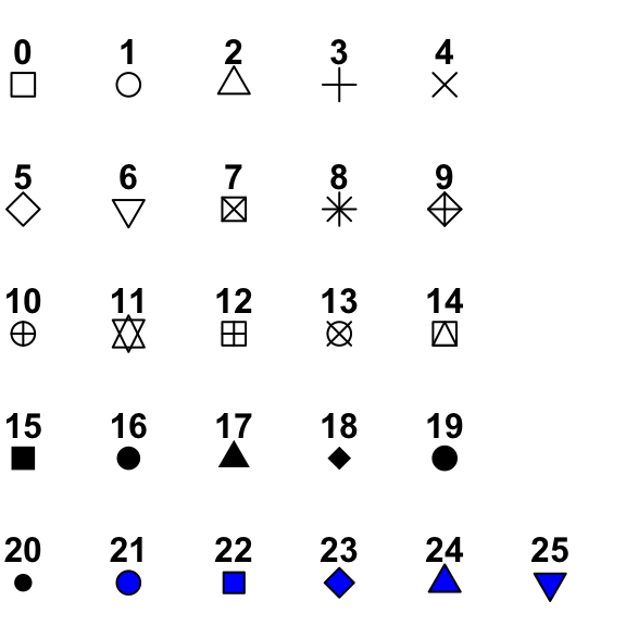
Point symbols can be changed using the argument pch.
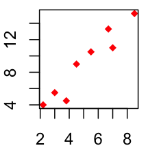
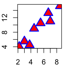
x<-c(2.2, 3, 3.8, 4.5, 7, 8.5, 6.7, 5.5)
y<-c(4, 5.5, 4.5, 9, 11, 15.2, 13.3, 10.5)
# Change plotting symbol using pch
plot(x, y, pch = 19, col="blue")
plot(x, y, pch = 18, col="red")
plot(x, y, pch = 24, cex=2, col="blue", bg="red", lwd=2)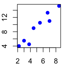
Read more —> R plot pch symbols : The different point shapes available in R.
Change line types
The following line types are available in R :
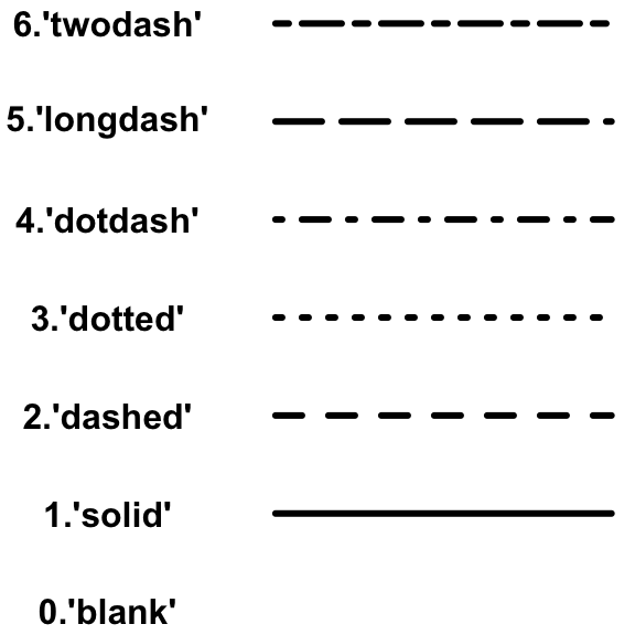
Line types can be changed using the graphical parameter lty.
x=1:10; y=x*x
plot(x, y, type="l") # Solid line (by default)
plot(x, y, type="l", lty="dashed")# Use dashed line type
plot(x, y, type="l", lty="dashed", lwd=3)# Change line width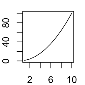
Read more —> Line types in R : lty.
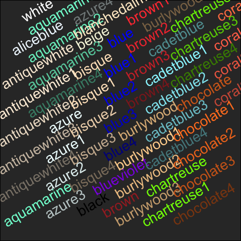
Change colors
- Built-in color names in R
- Specifying colors by hexadecimal code
- Using RColorBrewer palettes
- Use Wes Anderson color palettes
- Create a vector of n contiguous colors
Colors can be specified by names (e.g col=red) or with hexadecimal code (e.gcol = “#FFCC00”).
# use color names
barplot(c(2,5), col=c("blue", "red"))
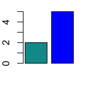
# use hexadecimal color code
barplot(c(2,5), col=c("#009999", "#0000FF"))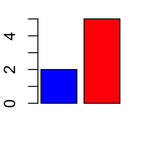
Hexadecimal color charts :
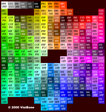 (Source: http://www.visibone.com)
RColorBrewer package can also be used to create a nice looking color palettes. Read our article : Colors in R.
Read more —> Colors in R.
Related articles
Click on the following articles to read more.
Plotting symbols in R
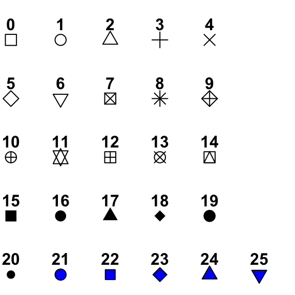 Different plotting symbols are available in R. The graphical argument used to specify point shapes is pch.
Line types in R
 The argument lty can be used to specify the line type. To change line width, the argument lwd can be used.
Colors in R
 Colors can be specified either by name (e.g col = “red”) or as a hexadecimal code (such as col = “#FFCC00”). You can also use other color systems such as ones taken from the RColorBrewer package.
Add titles to a plot
 Plot titles can be specified either directly to the plotting functions during the plot creation or by using the title() function (to add titles on an existing plot).
Add legends to plots
 To add legends to plots in R, the R legend() function can be used.
Add texts to a plot
 To add a text to a plot in R, the text() and mtext() R functions can be used.
Add straight lines
 The R function abline() can be used to add vertical, horizontal or regression lines to a graph.
Add an axis to a plot
 axis() function can be used to add a secondary axis to a plot.
Change axis scale in R
 The goal of this article is to show you how to set x and y axis limites by specifying the minimum and the maximum values of each axis. We’ll also see how to set the log scale.
Infos
This analysis has been performed using R statistical software (ver. 3.2.4).
Show me some love with the like buttons below... Thank you and please don't forget to share and comment below!!
Montrez-moi un peu d'amour avec les like ci-dessous ... Merci et n'oubliez pas, s'il vous plaît, de partager et de commenter ci-dessous!
Recommended for You!


Recommended for you
This section contains the best data science and self-development resources to help you on your path.
Books - Data Science
Our Books
- Practical Guide to Cluster Analysis in R by A. Kassambara (Datanovia)
- Practical Guide To Principal Component Methods in R by A. Kassambara (Datanovia)
- Machine Learning Essentials: Practical Guide in R by A. Kassambara (Datanovia)
- R Graphics Essentials for Great Data Visualization by A. Kassambara (Datanovia)
- GGPlot2 Essentials for Great Data Visualization in R by A. Kassambara (Datanovia)
- Network Analysis and Visualization in R by A. Kassambara (Datanovia)
- Practical Statistics in R for Comparing Groups: Numerical Variables by A. Kassambara (Datanovia)
- Inter-Rater Reliability Essentials: Practical Guide in R by A. Kassambara (Datanovia)
Others
- R for Data Science: Import, Tidy, Transform, Visualize, and Model Data by Hadley Wickham & Garrett Grolemund
- Hands-On Machine Learning with Scikit-Learn, Keras, and TensorFlow: Concepts, Tools, and Techniques to Build Intelligent Systems by Aurelien Géron
- Practical Statistics for Data Scientists: 50 Essential Concepts by Peter Bruce & Andrew Bruce
- Hands-On Programming with R: Write Your Own Functions And Simulations by Garrett Grolemund & Hadley Wickham
- An Introduction to Statistical Learning: with Applications in R by Gareth James et al.
- Deep Learning with R by François Chollet & J.J. Allaire
- Deep Learning with Python by François Chollet
Click to follow us on Facebook :
Comment this article by clicking on "Discussion" button (top-right position of this page)
Articles contained by this category :
abline R function : An easy way to add straight lines to a plot using R software
Add an axis to a plot with R software
Add custom tick mark labels to a plot in R software
Add legends to plots in R software : the easiest way!
Add text to a plot in R software
Add titles to a plot in R software
Axis scale in R software : minimum, maximum and log scale
Colors in R
Line types in R : lty
R plot pch symbols : The different point shapes available in R