Add custom tick mark labels to a plot in R software
In this article you will learn how to customize tick marks using R statistical software : changing the interval between tick marks; color and the font size for tick mark labels (texts); rotation of tick mark labels.
Color, font style and font size of tick mark labels :
For this end, the following argument can be used :
- col.axis : the color to be used for tick mark labels
- font.axis : an integer specifying the font style; possible values are :
- 1: normal text
- 2: bold
- 3: italic
- 4: bold and italic
- 5 : symbol font
- cex.axis : the size for tick mark labels; default value is 1.
x<-1:10; y<-x*x
# Simple graph
plot(x, y)
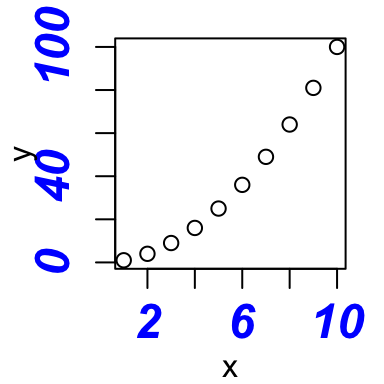
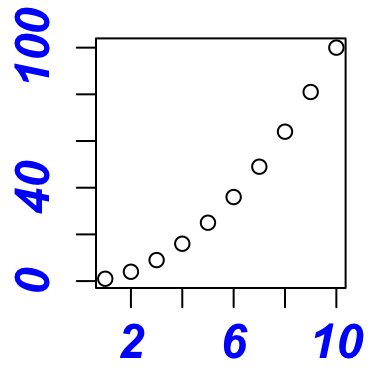
# Custom plot : blue text, italic-bold, magnification
plot(x,y, col.axis="blue", font.axis=4, cex.axis=1.5)

Orientation of tick mark labels
To change the style of the tick mark labels, las argument can be used. The possible values are :
- 0: the labels are parallel to the axis (default)
- 1: always horizontal
- 2 : always perpendicular to the axis
- 3 : always vertical
plot(x, y, las=0) # parallel
plot(x, y, las=1) # horizontal
plot(x, y, las=2) # perpendicular


Hide tick marks
To hide or to show tick mark labels, the following graphical parameters can be used :
- xaxt : a character specifying the x axis type; possible values are either “s” (for showing the axis) or “n” ( for hiding the axis)
- yaxt : a character specifying the y axis type; possible values are either “s” (for showing the axis) or “n” ( for hiding the axis)
These two arguments are very useful to take the control of the rotation angle for tick mark labels. Changing the rotation angle is not something easy in R but we’ll see how to do it in the next section.
# Hide x and y axis
plot(x, y, xaxt="n", yaxt="n")
Change the string rotation of tick mark labels
The following steps can be used :
- Hide x and y axis
- Add tick marks using the axis() R function
- Add tick mark labels using the text() function
The argument srt can be used to modify the text rotation in degrees.
# Suppress the axis
plot(x, y, xaxt="n", yaxt="n")
# Changing x axis
xtick<-seq(0, 10, by=5)
axis(side=1, at=xtick, labels = FALSE)
text(x=xtick,  par("usr")[3],
     labels = xtick, srt = 45, pos = 1, xpd = TRUE)
# Changing y axis
ytick<-seq(0, 100, by=50)
axis(side=2, at=ytick, labels = FALSE)
text(par("usr")[1], ytick,
     labels = ytick, srt = 45, pos = 2, xpd = TRUE)
Use the par() function
The par() function can be used to permanently apply the changes to all of the graphs that will be created in the current session.
par(col.axis="blue", font.axis=4, cex.axis=1.5)
plot(x,y)
Infos
This analysis has been performed using R statistical software (ver. 3.1.0).
Show me some love with the like buttons below... Thank you and please don't forget to share and comment below!!
Montrez-moi un peu d'amour avec les like ci-dessous ... Merci et n'oubliez pas, s'il vous plaît, de partager et de commenter ci-dessous!
Recommended for You!
Recommended for you
This section contains the best data science and self-development resources to help you on your path.
Books - Data Science
Our Books
- Practical Guide to Cluster Analysis in R by A. Kassambara (Datanovia)
- Practical Guide To Principal Component Methods in R by A. Kassambara (Datanovia)
- Machine Learning Essentials: Practical Guide in R by A. Kassambara (Datanovia)
- R Graphics Essentials for Great Data Visualization by A. Kassambara (Datanovia)
- GGPlot2 Essentials for Great Data Visualization in R by A. Kassambara (Datanovia)
- Network Analysis and Visualization in R by A. Kassambara (Datanovia)
- Practical Statistics in R for Comparing Groups: Numerical Variables by A. Kassambara (Datanovia)
- Inter-Rater Reliability Essentials: Practical Guide in R by A. Kassambara (Datanovia)
Others
- R for Data Science: Import, Tidy, Transform, Visualize, and Model Data by Hadley Wickham & Garrett Grolemund
- Hands-On Machine Learning with Scikit-Learn, Keras, and TensorFlow: Concepts, Tools, and Techniques to Build Intelligent Systems by Aurelien Géron
- Practical Statistics for Data Scientists: 50 Essential Concepts by Peter Bruce & Andrew Bruce
- Hands-On Programming with R: Write Your Own Functions And Simulations by Garrett Grolemund & Hadley Wickham
- An Introduction to Statistical Learning: with Applications in R by Gareth James et al.
- Deep Learning with R by François Chollet & J.J. Allaire
- Deep Learning with Python by François Chollet
Click to follow us on Facebook :
Comment this article by clicking on "Discussion" button (top-right position of this page)


