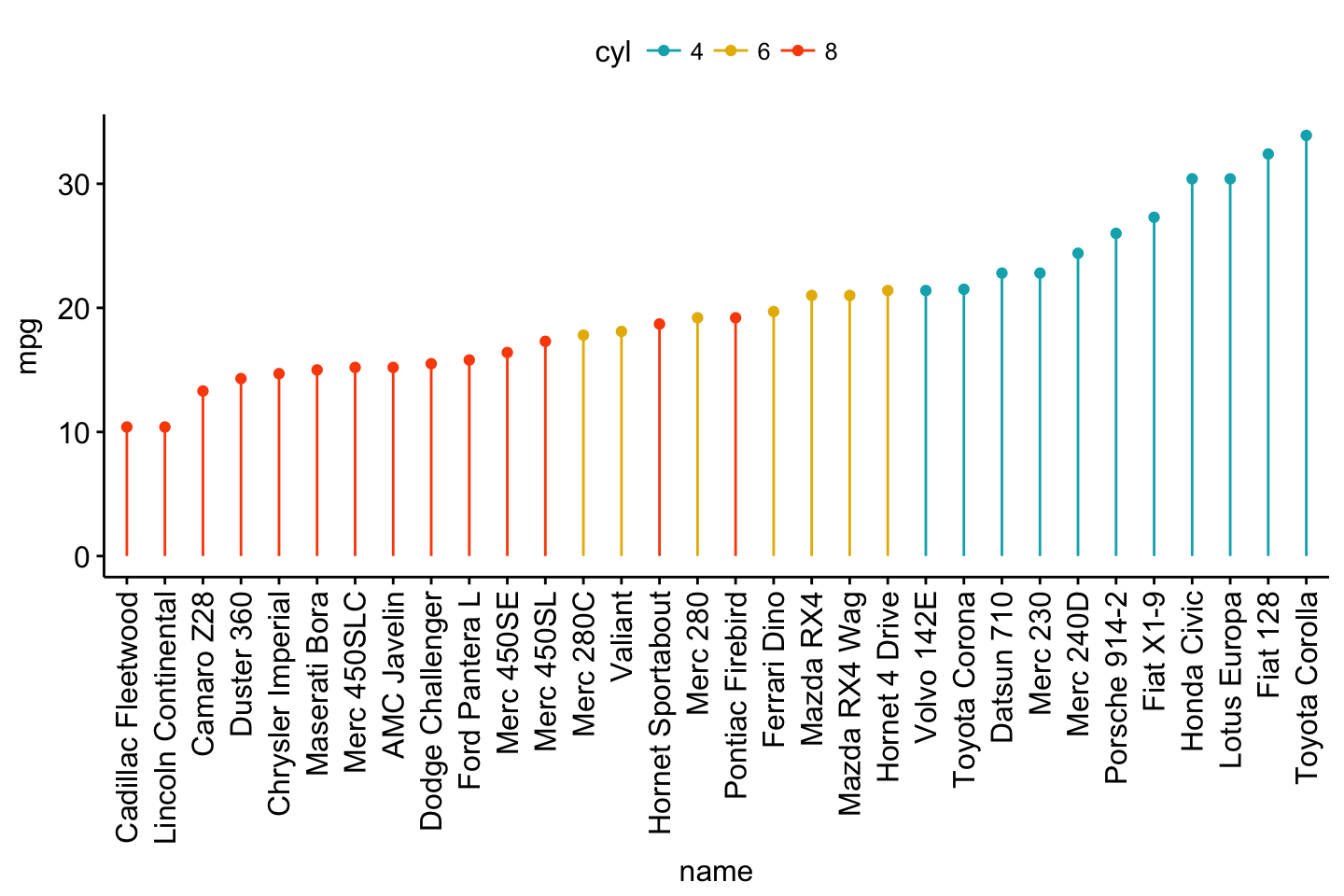
Lollipop chart
Lollipop chart is an alternative to bar plots, when you have a large set of values to visualize.
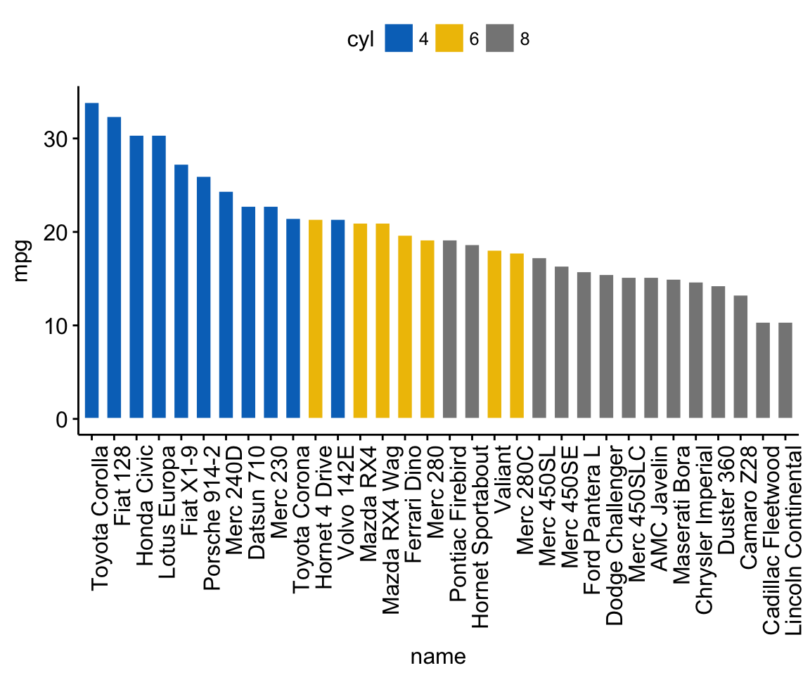
Lollipop chart colored by the grouping variable “cyl”:
ggdotchart(dfm, x = "name", y = "mpg",
           color = "cyl",                                # Color by groups
           palette = c("#00AFBB", "#E7B800", "#FC4E07"), # Custom color palette
           sorting = "ascending",                        # Sort value in descending order
           add = "segments",                             # Add segments from y = 0 to dots
           ggtheme = theme_pubr()                        # ggplot2 theme
           )
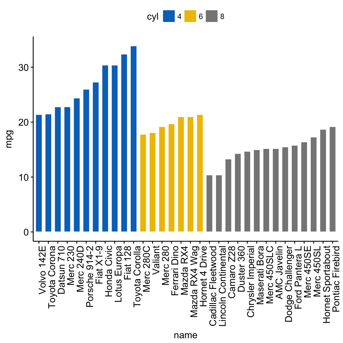
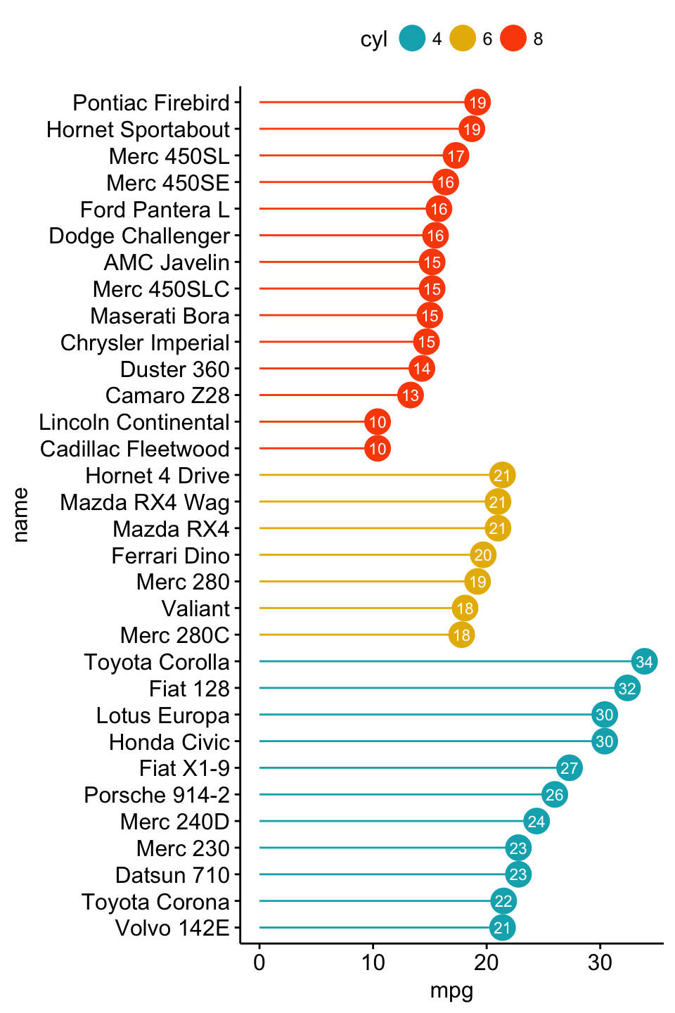
- Sort in descending order. sorting = “descending”.
- Rotate the plot vertically, using rotate = TRUE.
- Sort the mpg value inside each group by using group = “cyl”.
- Set dot.size to 6.
- Add mpg values as label. label = “mpg” or label = round(dfm$mpg).
ggdotchart(dfm, x = "name", y = "mpg",
           color = "cyl",                                # Color by groups
           palette = c("#00AFBB", "#E7B800", "#FC4E07"), # Custom color palette
           sorting = "descending",                       # Sort value in descending order
           add = "segments",                             # Add segments from y = 0 to dots
           rotate = TRUE,                                # Rotate vertically
           group = "cyl",                                # Order by groups
           dot.size = 6,                                 # Large dot size
           label = round(dfm$mpg),                        # Add mpg values as dot labels
           font.label = list(color = "white", size = 9,
                             vjust = 0.5),               # Adjust label parameters
           ggtheme = theme_pubr()                        # ggplot2 theme
           )
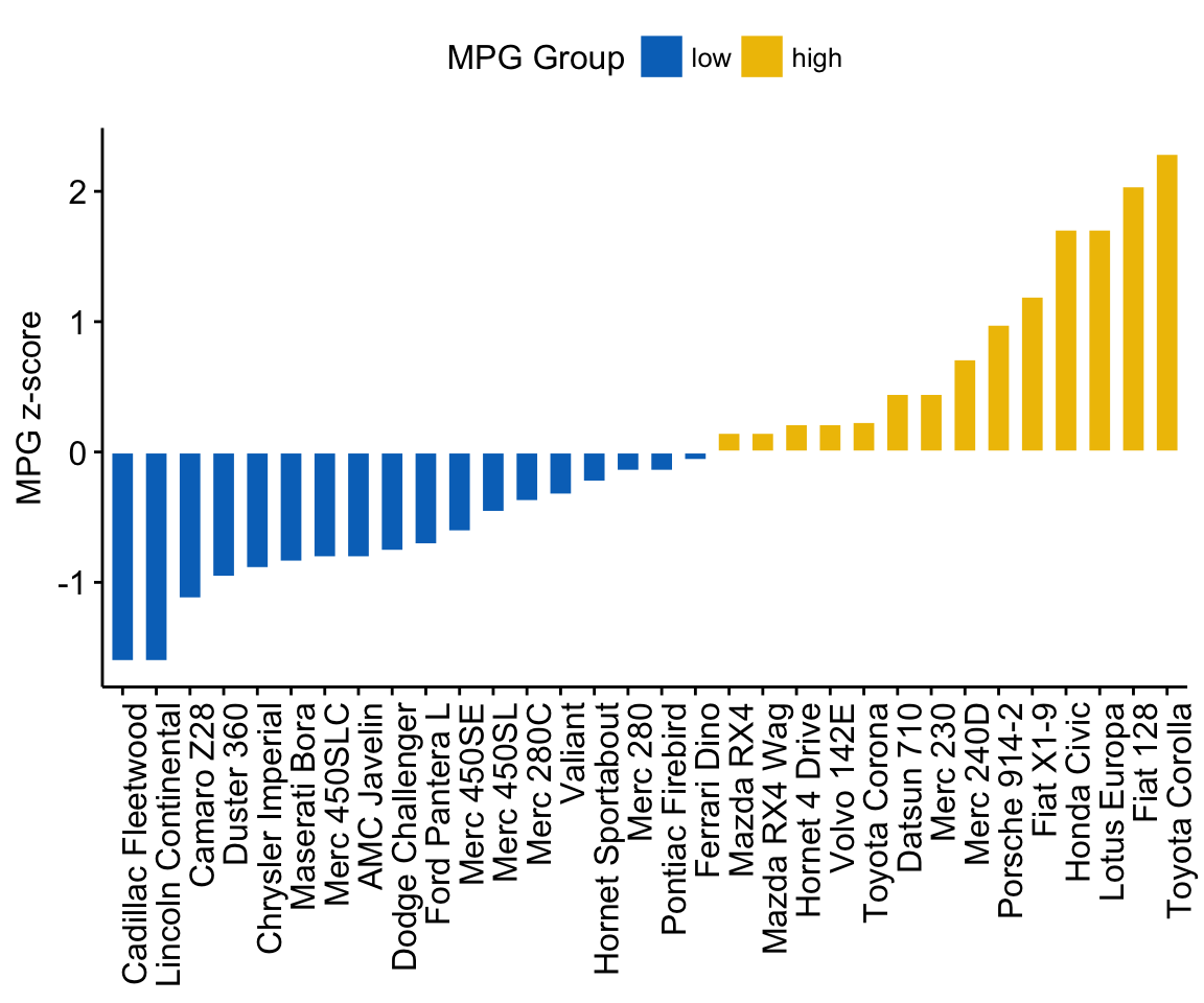
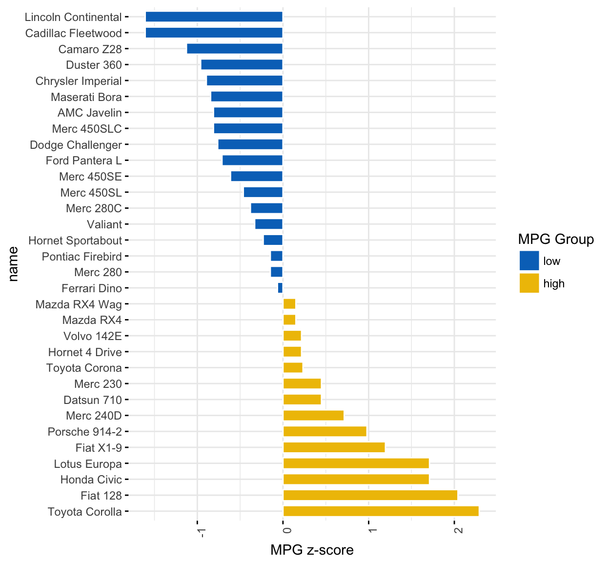
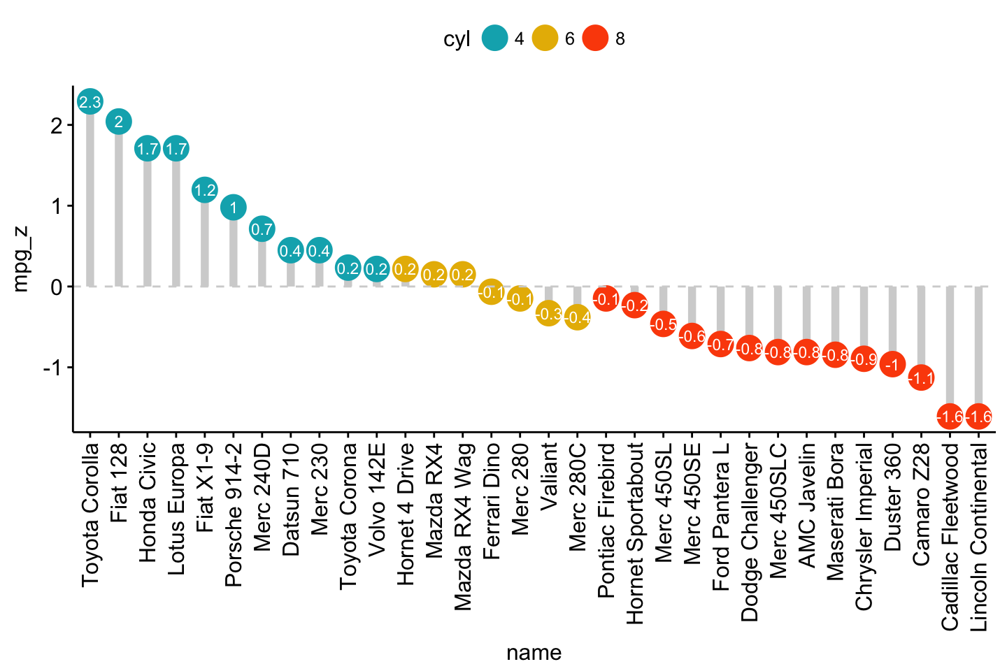
Deviation graph:
- Use y = “mpg_z”
- Change segment color and size: add.params = list(color = “lightgray”, size = 2)
ggdotchart(dfm, x = "name", y = "mpg_z",
           color = "cyl",                                # Color by groups
           palette = c("#00AFBB", "#E7B800", "#FC4E07"), # Custom color palette
           sorting = "descending",                       # Sort value in descending order
           add = "segments",                             # Add segments from y = 0 to dots
           add.params = list(color = "lightgray", size = 2), # Change segment color and size
           group = "cyl",                                # Order by groups
           dot.size = 6,                                 # Large dot size
           label = round(dfm$mpg_z,1),                        # Add mpg values as dot labels
           font.label = list(color = "white", size = 9,
                             vjust = 0.5),               # Adjust label parameters
           ggtheme = theme_pubr()                        # ggplot2 theme
           )+
  geom_hline(yintercept = 0, linetype = 2, color = "lightgray")
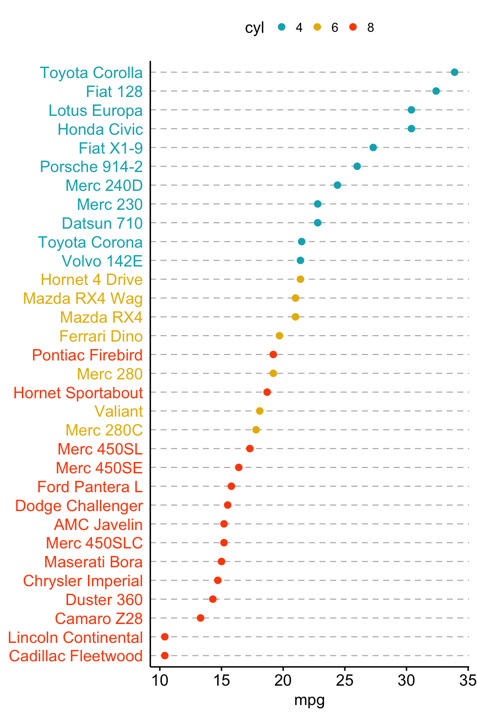
Cleveland’s dot plot
Color y text by groups. Use y.text.col = TRUE.
ggdotchart(dfm, x = "name", y = "mpg",
           color = "cyl",                                # Color by groups
           palette = c("#00AFBB", "#E7B800", "#FC4E07"), # Custom color palette
           sorting = "descending",                       # Sort value in descending order
           rotate = TRUE,                                # Rotate vertically
           dot.size = 2,                                 # Large dot size
           y.text.col = TRUE,                            # Color y text by groups
           ggtheme = theme_pubr()                        # ggplot2 theme
           )+
  theme_cleveland()                                      # Add dashed grids