Plot Means/Medians and Error Bars
In this article, we’ll describe how to plot easily means or medians with error bars. We’ll use ggplot2 based helper functions available in the ggpubr R package.
![]()
Contents:
Prerequisites
Required R package
You need to install the R package ggpubr, to easily create ggplot2-based publication ready plots.
We recommend to install the latest developmental version from GitHub as follow:
if(!require(devtools)) install.packages("devtools")
devtools::install_github("kassambara/ggpubr")
If the installation from Github failed, then try to install from CRAN as follow:
install.packages("ggpubr")Load ggpubr:
library(ggpubr)Demo data sets
Data: ToothGrowth and mtcars data sets.
# ToothGrowth
data("ToothGrowth")
head(ToothGrowth)
## len supp dose
## 1 4.2 VC 0.5
## 2 11.5 VC 0.5
## 3 7.3 VC 0.5
## 4 5.8 VC 0.5
## 5 6.4 VC 0.5
## 6 10.0 VC 0.5# mtcars
data("mtcars")
head(mtcars[, c("wt", "mpg", "cyl")])## wt mpg cyl
## Mazda RX4 2.62 21.0 6
## Mazda RX4 Wag 2.88 21.0 6
## Datsun 710 2.32 22.8 4
## Hornet 4 Drive 3.21 21.4 6
## Hornet Sportabout 3.44 18.7 8
## Valiant 3.46 18.1 6Error plots
R function: ggerrorplot() [in ggpubr].
Simplified format:
ggerrorplot(data, x, y, desc_stat = "mean_se")- data: a data frame
- x, y: x and y variables for plotting
- desc_stat: descriptive statistics to be used for visualizing errors. Default value is “mean_se”. Allowed values are one of , “mean”, “mean_se”, “mean_sd”, “mean_ci”, “mean_range”, “median”, “median_iqr”, “median_mad”, “median_range”
For example, the following R code uses the ToothGrowth data set and plots y = “len” by x = “dose”.
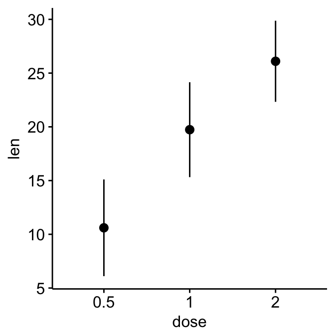
# Mean +/- standard deviation
ggerrorplot(ToothGrowth, x = "dose", y = "len",
desc_stat = "mean_sd")
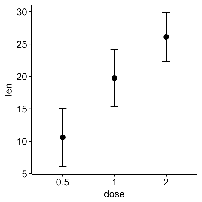
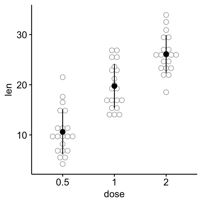
# Change error plot type and add mean points
ggerrorplot(ToothGrowth, x = "dose", y = "len",
desc_stat = "mean_sd",
error.plot = "errorbar", # Change error plot type
add = "mean" # Add mean points
)
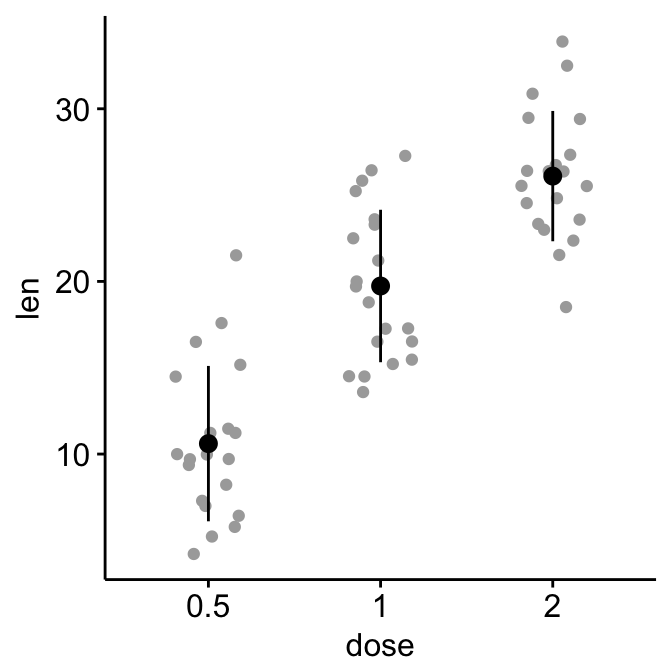
It’s also possible to add jitter points (representing individual points), dot plots and violin plots:
# Add jittered points
ggerrorplot(ToothGrowth, x = "dose", y = "len",
desc_stat = "mean_sd", color = "black",
add = "jitter", add.params = list(color = "darkgray")
)
# Add dot plots
ggerrorplot(ToothGrowth, x = "dose", y = "len",
desc_stat = "mean_sd", color = "black",
add = "dotplot", add.params = list(color = "darkgray")
)
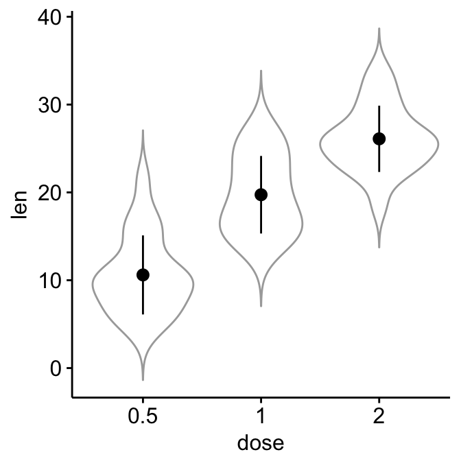
# Add violin plots
ggerrorplot(ToothGrowth, x = "dose", y = "len",
desc_stat = "mean_sd", color = "black",
add = "violin", add.params = list(color = "darkgray")
)
To add p-values comparing means, use this:
# Specify the comparisons you want
my_comparisons <- list( c("0.5", "1"), c("1", "2"), c("0.5", "2") )
ggerrorplot(ToothGrowth, x = "dose", y = "len",
            desc_stat = "mean_sd", color = "black",
            add = "violin", add.params = list(color = "darkgray"))+
  stat_compare_means(comparisons = my_comparisons)+ # Add pairwise comparisons p-value
  stat_compare_means(label.y = 50)                  # Add global p-value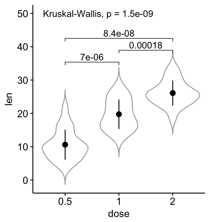
Read more at : Add P-values and Significance Levels to ggplots.
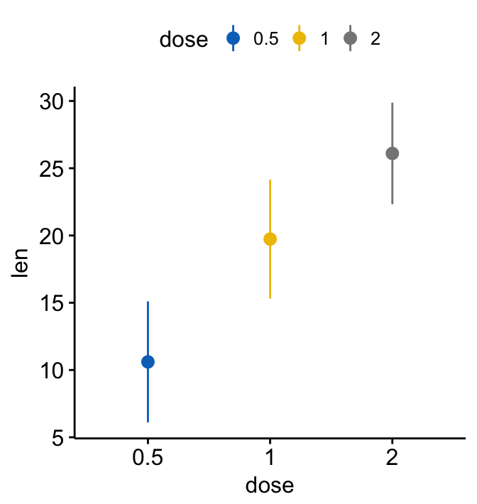
Color by a grouping variable:
# Color by "dose" (same variable used on x-axis)
ggerrorplot(ToothGrowth, x = "dose", y = "len",
desc_stat = "mean_sd",
color = "dose", palette = "jco")
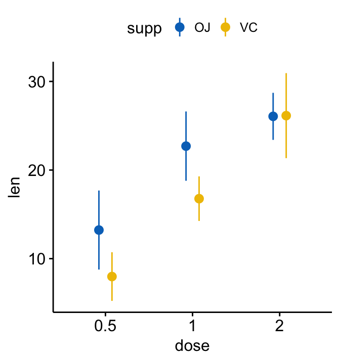
# Color by another grouping variable "supp"
ggerrorplot(ToothGrowth, x = "dose", y = "len",
desc_stat = "mean_sd",
color = "supp", palette = "jco",
position = position_dodge(0.3) # Adjust the space between bars
)
Line plots
You can create a line plot of mean +/- error using the function ggline()[in ggpubr]. The format is as follow:
# Basic line plots of means +/- se with jittered points
ggline(ToothGrowth, x = "dose", y = "len",
       add = c("mean_se", "jitter"))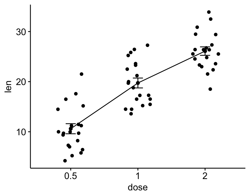
Color by groups:
ggline(ToothGrowth, x = "dose", y = "len",
       add = c("mean_se", "jitter"),
       color = "supp", palette = "jco")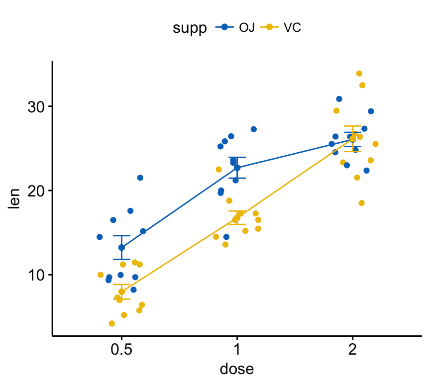
Bar plots
R function ggbarplot()[in ggpubr]. The format is as follow:
# Basic bar plots of means +/- se with jittered points
ggbarplot(ToothGrowth, x = "dose", y = "len",
       add = c("mean_se", "jitter"))
Color by groups:
ggbarplot(ToothGrowth, x = "dose", y = "len",
          add = c("mean_se", "jitter"),
          color = "supp", palette = "jco",
          position = position_dodge(0.8))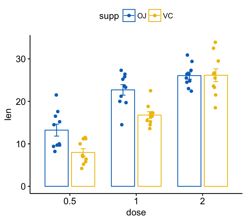
Add labels
In this section we’ll plot group means with individual information.
Data: mtcars.
# Prepare the data set
# Use row names as individual names
df <- as.data.frame(mtcars[, c("am", "hp")])
df$name <- rownames(df)
head(df)
## am hp name
## Mazda RX4 1 110 Mazda RX4
## Mazda RX4 Wag 1 110 Mazda RX4 Wag
## Datsun 710 1 93 Datsun 710
## Hornet 4 Drive 0 110 Hornet 4 Drive
## Hornet Sportabout 0 175 Hornet Sportabout
## Valiant 0 105 ValiantCreate a bar plot with individual labels.
set.seed(123)
# Bar plot of mean +/- se, add individual points
ggbarplot(df, x = "am", y = "hp",
          add = c("mean_se", "point"),
          color = "am", fill = "am", alpha = 0.5,
          palette = "jco")+
   ggrepel::geom_text_repel(aes(label = name))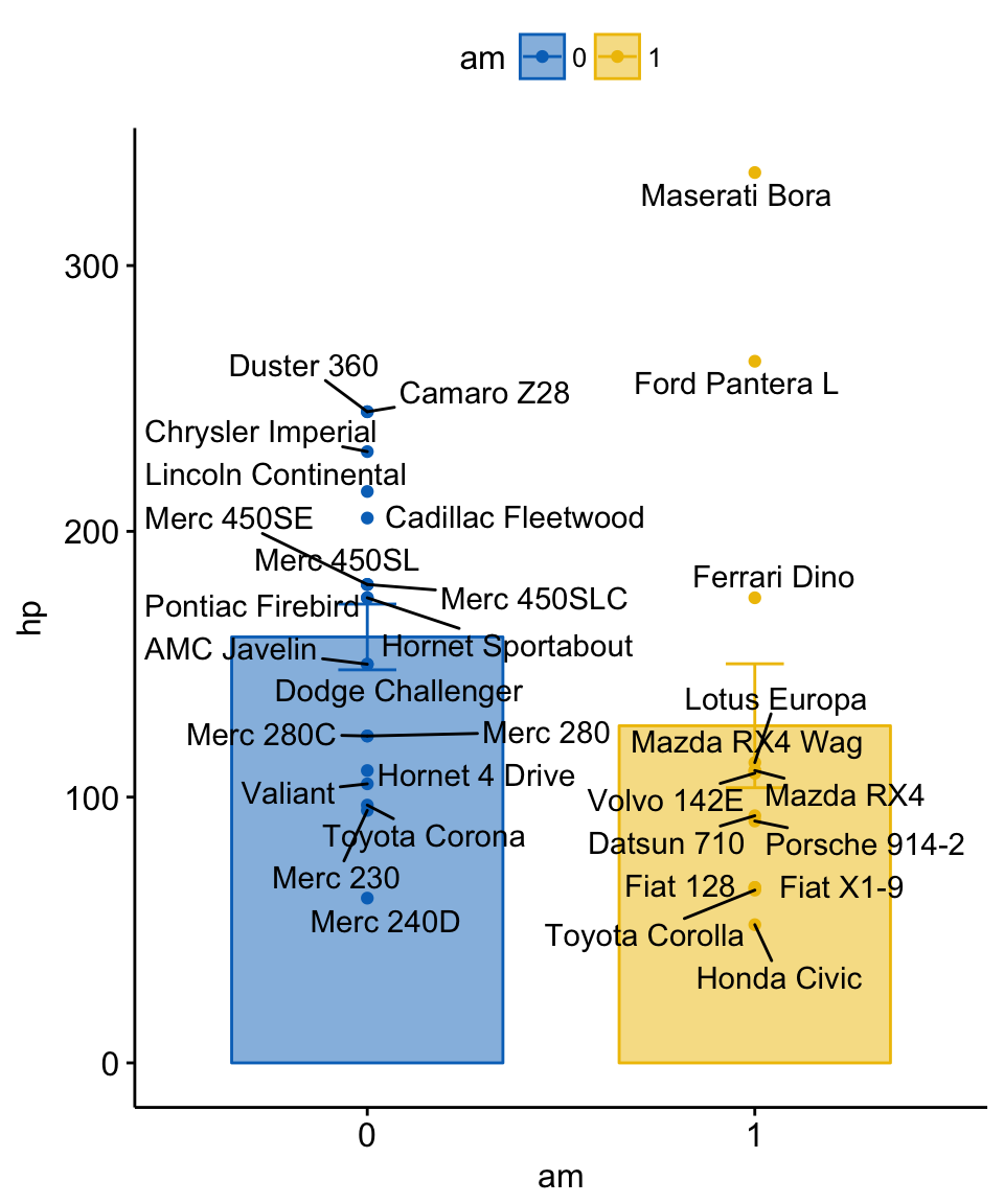
Application to gene expression data
In our previous article - Facilitating Exploratory Data Visualization: Application to TCGA Genomic Data - we described how to visualize gene expression data using box plots, violin plots, dot plots and stripcharts. We also demonstrated how to combine the plot of multiples variables (genes) in the same plot.
Here we provide some R code to visualize the mean expression profile of one or multiple genes. We’ll use the gene expression data set described in our previous tutorial: Facilitating Exploratory Data Visualization: Application to TCGA Genomic Data.
expr <- read.delim("https://raw.githubusercontent.com/kassambara/data/master/expr_tcga.txt",
                   stringsAsFactors = FALSE)
The data set contains the mRNA expression for five genes of interest - GATA3, PTEN, XBP1, ESR1 and MUC1 - from 3 different data sets:
- Breast invasive carcinoma (BRCA),
- Ovarian serous cystadenocarcinoma (OV) and
- Lung squamous cell carcinoma (LUSC)
The R code below displays the mean expression of three genes - “GATA3”, “PTEN” and “XBP1”.
ggline(expr, x = "dataset",
      y = c("GATA3", "PTEN", "XBP1"),
      combine = TRUE,
      ylab = "Expression",
      add = "mean_sd")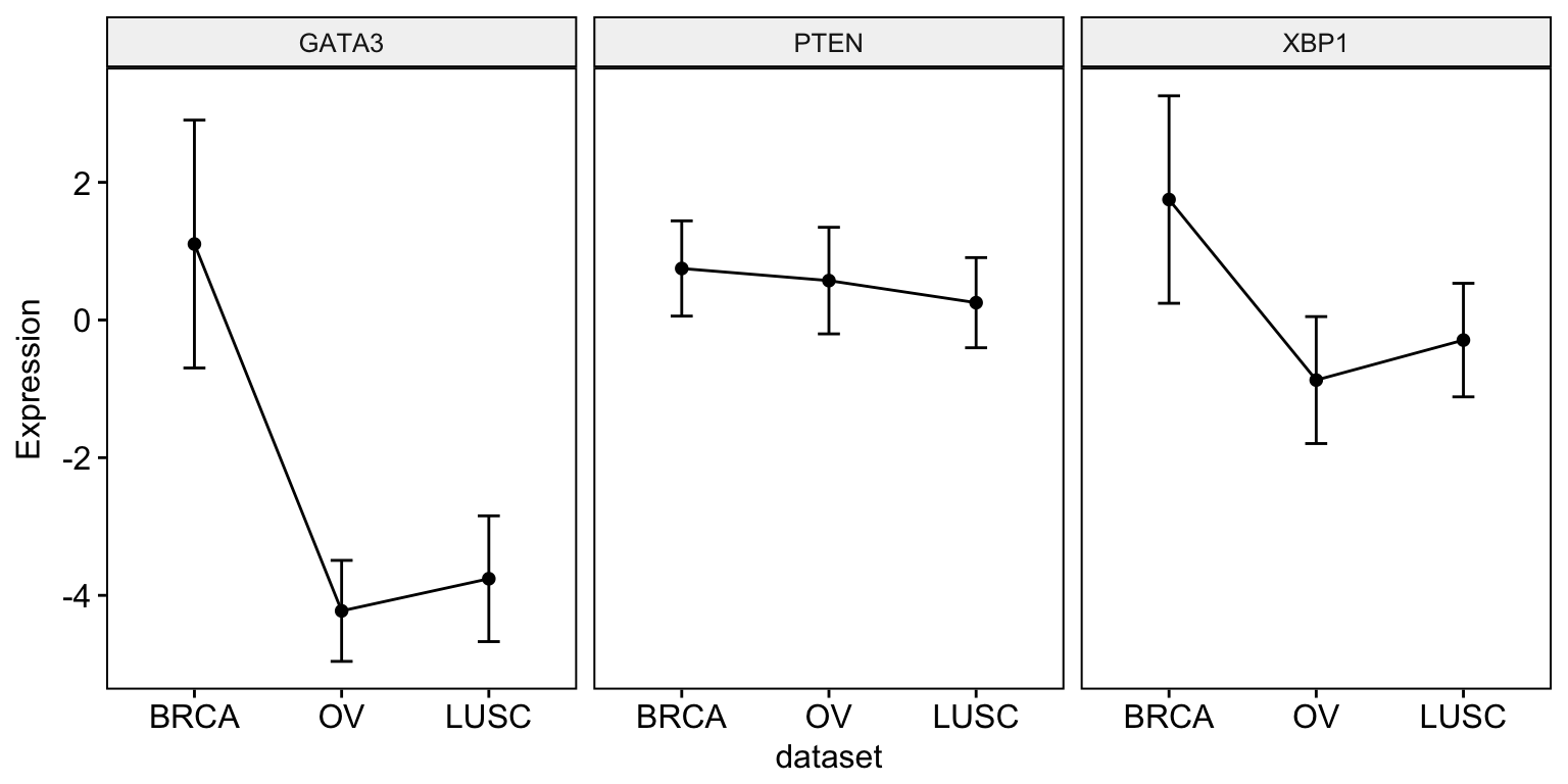
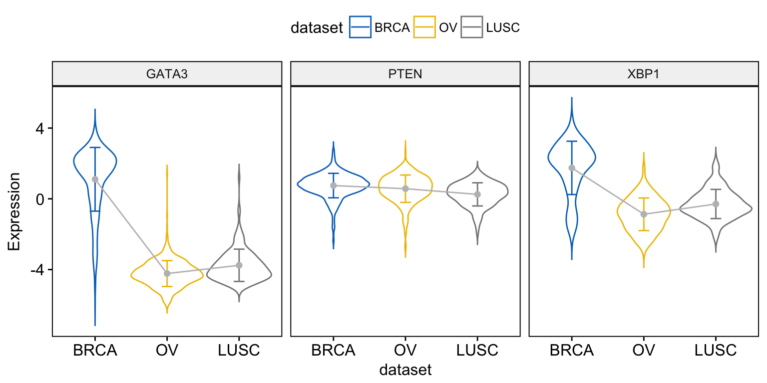
You can also add other geometries on the mean plot such as jitter points, dotplot or violin. To add a violin plot, type this:
ggline(expr, x = "dataset",
      y = c("GATA3", "PTEN", "XBP1"),
      combine = TRUE,
      ylab = "Expression",
      color = "gray",                                     # Line color
      add = c("mean_sd", "violin"),
      add.params = list(color = "dataset"),
      palette = "jco"
      )
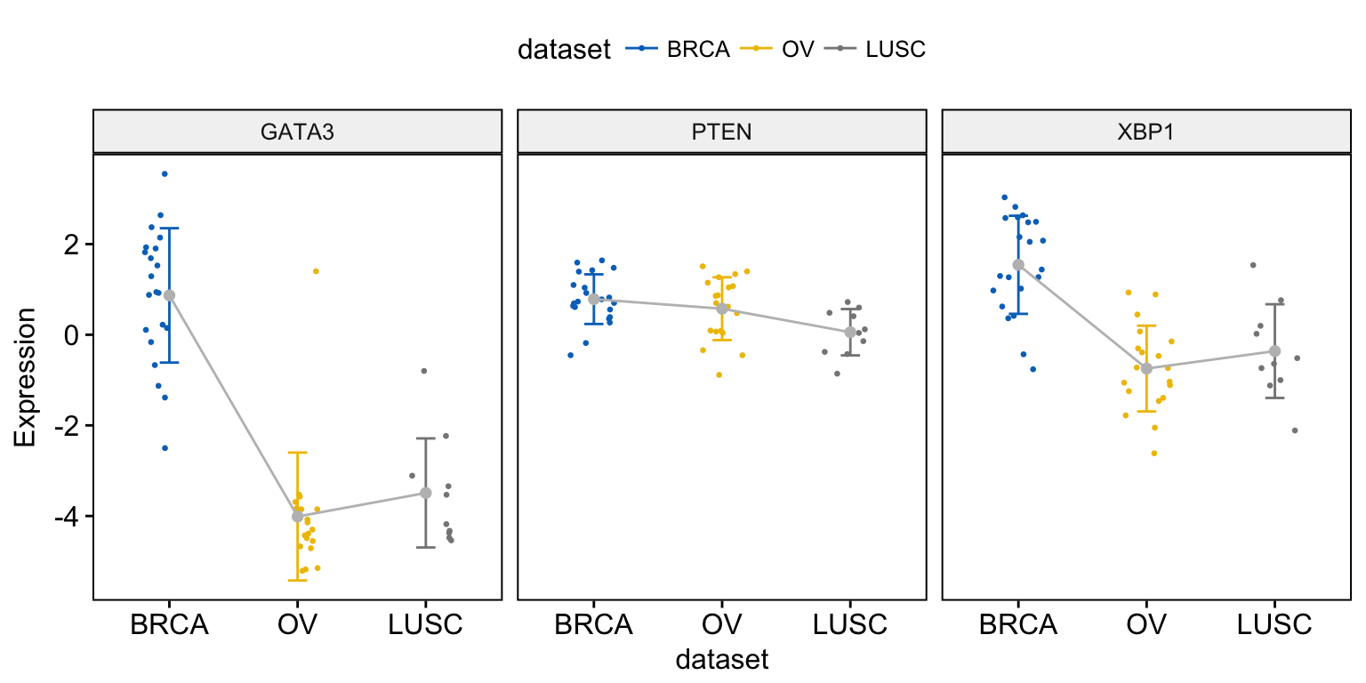
To add jitter points, we’ll use a small subset of data for readability:
# Subset 50 random rows
set.seed(123)
random_rows <- sample(1:nrow(expr), 50)
expr2 <- expr[random_rows, ]
# Visualize
ggline(expr2, x = "dataset",
      y = c("GATA3", "PTEN", "XBP1"),
      combine = TRUE,
      ylab = "Expression",
      color = "gray",
      add = c("mean_sd", "jitter"),
      add.params = list(color = "dataset", size = 0.5),
      palette = "jco"
      )
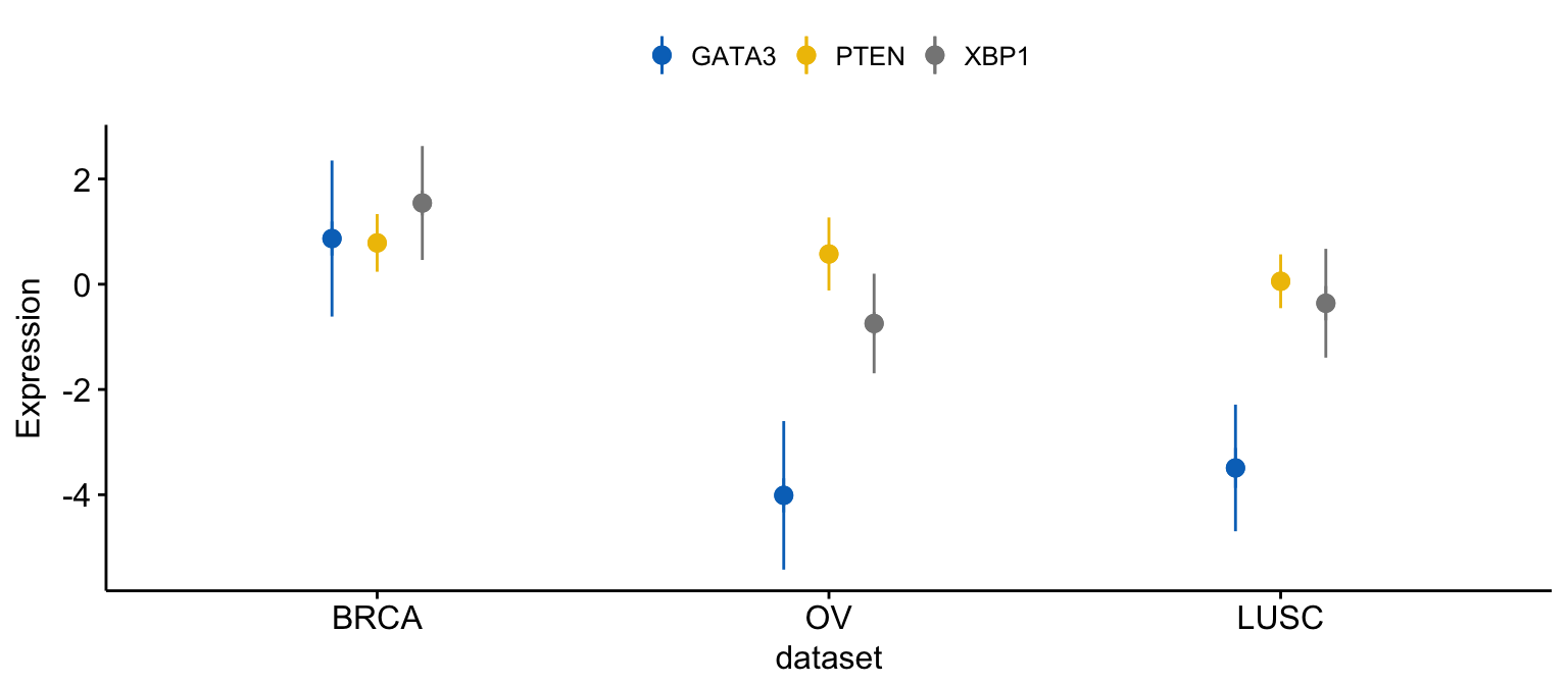
As previously shown, you can merge the three plots as follow:
# Merge the three plot
ggline(expr2, x = "dataset",
      y = c("GATA3", "PTEN", "XBP1"),
      merge = TRUE,
      ylab = "Expression",
      add = "mean_sd",
      palette = "jco")
# Add  jitter
ggline(expr2, x = "dataset",
      y = c("GATA3", "PTEN", "XBP1"),
      merge = TRUE,
      ylab = "Expression",
      add = c("mean_sd", "jitter"),              # Add jitter points
      palette = "jco")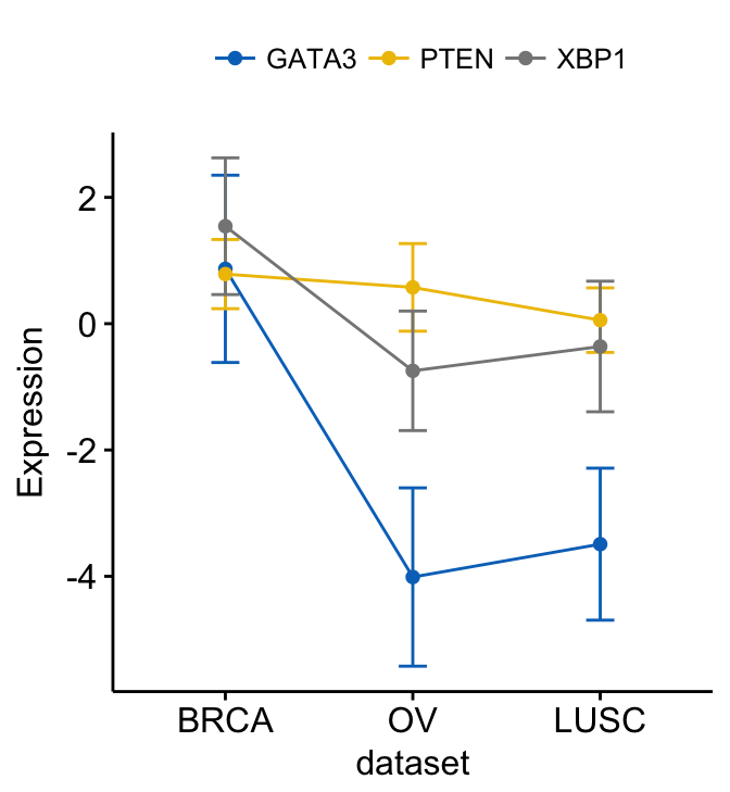

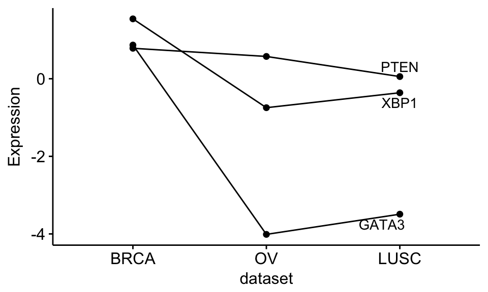
Show line labels:
ggline(expr2, x = "dataset",
      y = c("GATA3", "PTEN", "XBP1"),
      merge = TRUE,
      ylab = "Expression",
      add = "mean",
      show.line.label = TRUE,
      repel = TRUE,
      legend = "none",
      palette = rep("black", 3)   # Black color for each line
      )
Let’s plot a complex plot with point labels:
# Add  jitter
ggline(expr2, x = "dataset",
      y = c("GATA3", "PTEN", "XBP1"),
      merge = TRUE,
      ylab = "Expression",
      add = c("mean_se", "jitter"),              # Add mean_se and jitter points
      add.params = list(size = 0.7),             # Add point size
      label = "bcr_patient_barcode",             # Add point labels
      label.select = list(top.up = 2),           # show only labels for the top 2 points
      font.label = list(color = ".y."),          # Color labels by .y., here gene names
      repel = TRUE,                              # Use repel to avoid labels overplotting
      palette = "jco")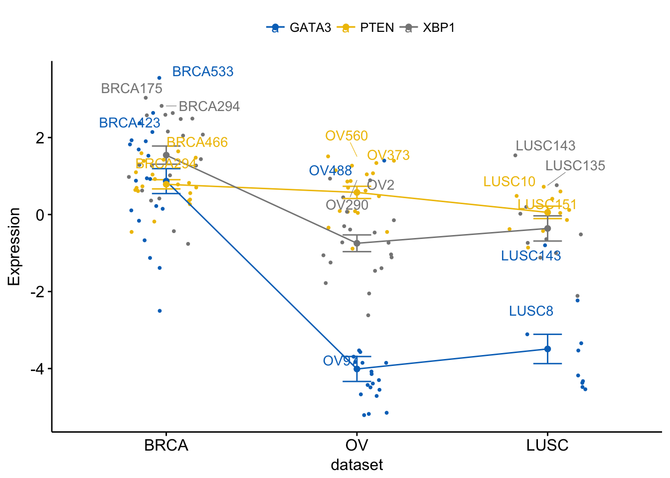
Plot a bar plot of means:
# Create bar plots
ggbarplot(expr2, x = "dataset",
      y = c("GATA3", "PTEN", "XBP1"),
      combine = TRUE,
      ylab = "Expression",
      add = "mean_se")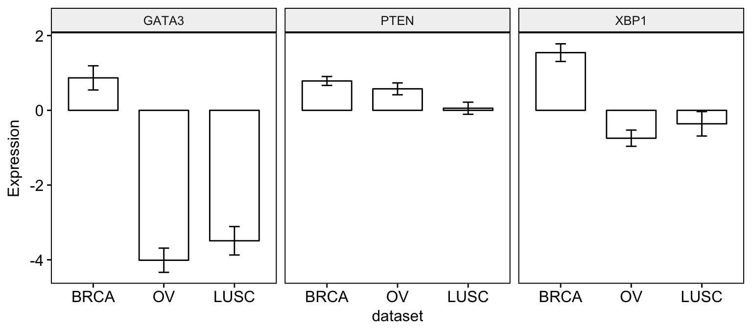
# Merge bar plots
ggbarplot(expr2, x = "dataset",
      y = c("GATA3", "PTEN", "XBP1"),
      merge = TRUE,
      ylab = "Expression",
      add = "mean_se", palette = "jco")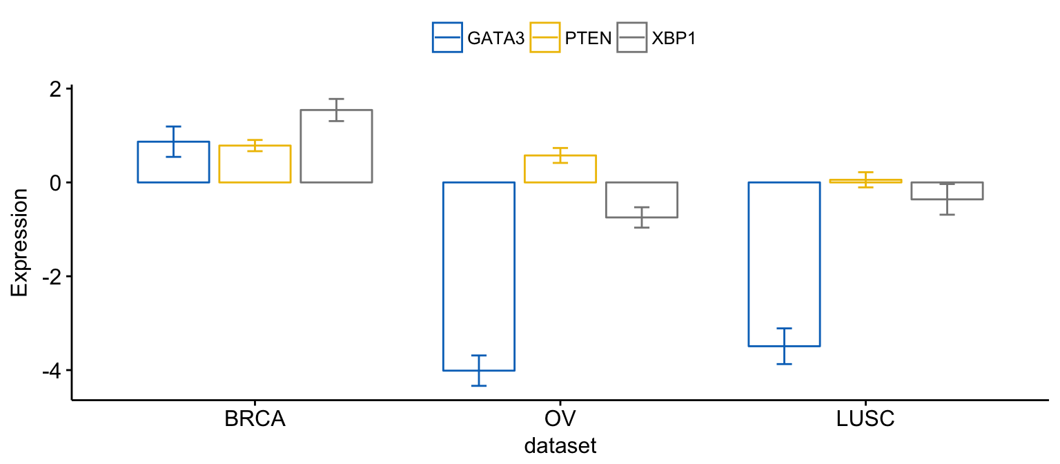
Error plots:
# Create error plots
ggerrorplot(expr2, x = "dataset",
      y = c("GATA3", "PTEN", "XBP1"),
      combine = TRUE,
      ylab = "Expression",
      add = "mean_sd")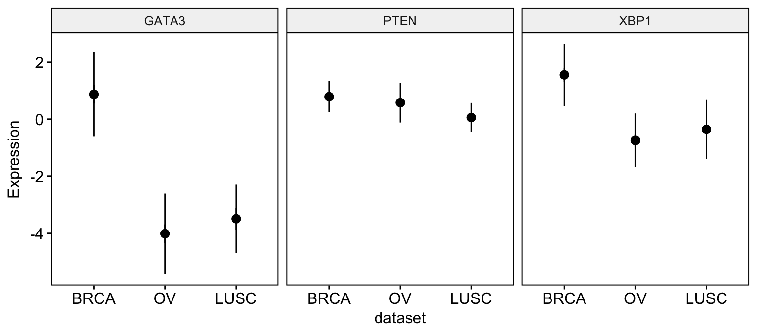
# Merge error plots
ggerrorplot(expr2, x = "dataset",
      y = c("GATA3", "PTEN", "XBP1"),
      merge = TRUE,
      ylab = "Expression",
      add = "mean_sd", palette = "jco",
      position = position_dodge(0.3)
      )