Facilitating Exploratory Data Visualization: Application to TCGA Genomic Data
In genomic fields, it’s very common to explore the gene expression profile of one or a list of genes involved in a pathway of interest. Here, we present some helper functions in the ggpubr R package to facilitate exploratory data analysis (EDA) for life scientists.
![]()
Standard graphical techniques used in EDA, include:
- Box plot
- Violin plot
- Stripchart
- Dot plot
- Histogram and density plots
- ECDF plot
- Q-Q plot
All these plots can be created using the ggplot2 R package, which is highly flexible.
However, to customize a ggplot, the syntax might appear opaque for a beginner and this raises the level of difficulty for researchers with no advanced R programming skills.
Here, we present the ggpubr package, a wrapper around ggplot2, which provides some easy-to-use functions for creating ‘ggplot2’- based publication ready plots. We’ll use the ggpubr functions to visualize gene expression profile from TCGA genomic data sets.
Contents:
Prerequisites
ggpubr package
Required R package: ggpubr.
- Install from CRAN as follow:
install.packages("ggpubr")- Or, install the latest developmental version from GitHub as follow:
if(!require(devtools)) install.packages("devtools")
devtools::install_github("kassambara/ggpubr")- Load ggpubr:
library(ggpubr)TCGA data
The Cancer Genome Atlas (TCGA) data is a publicly available data containing clinical and genomic data across 33 cancer types. These data include gene expression, CNV profiling, SNP genotyping, DNA methylation, miRNA profiling, exome sequencing, and other types of data.
The RTCGA R package, by Marcin Marcin Kosinski et al., provides a convenient solution to access to clinical and genomic data available in TCGA. Each of the data packages is a separate package, and must be installed (once) individually.
The following R code installs the core RTCGA package as well as the clinical and mRNA gene expression data packages.
# Load the bioconductor installer.
source("https://bioconductor.org/biocLite.R")
# Install the main RTCGA package
biocLite("RTCGA")
# Install the clinical and mRNA gene expression data packages
biocLite("RTCGA.clinical")
biocLite("RTCGA.mRNA")
To see the type of data available for each cancer type, use this:
library(RTCGA)
infoTCGA()
## # A tibble: 38 x 13
## Cohort BCR Clinical CN LowP Methylation mRNA mRNASeq miR
## *
## 1 ACC 92 92 90 0 80 0 79 0
## 2 BLCA 412 412 410 112 412 0 408 0
## 3 BRCA 1098 1097 1089 19 1097 526 1093 0
## 4 CESC 307 307 295 50 307 0 304 0
## 5 CHOL 51 45 36 0 36 0 36 0
## 6 COAD 460 458 451 69 457 153 457 0
## # ... with 32 more rows, and 4 more variables: miRSeq , RPPA ,
## # MAF , rawMAF More information about the disease names can be found at: http://gdac.broadinstitute.org/
Gene expression data
The R function expressionsTCGA() [in RTCGA package] can be used to easily extract the expression values of genes of interest in one or multiple cancer types.
In the following R code, we start by extracting the mRNA expression for five genes of interest - GATA3, PTEN, XBP1, ESR1 and MUC1 - from 3 different data sets:
- Breast invasive carcinoma (BRCA),
- Ovarian serous cystadenocarcinoma (OV) and
- Lung squamous cell carcinoma (LUSC)
library(RTCGA)
library(RTCGA.mRNA)
expr <- expressionsTCGA(BRCA.mRNA, OV.mRNA, LUSC.mRNA,
                        extract.cols = c("GATA3", "PTEN", "XBP1","ESR1", "MUC1"))
expr
## # A tibble: 1,305 x 7
## bcr_patient_barcode dataset GATA3 PTEN XBP1 ESR1 MUC1
##
## 1 TCGA-A1-A0SD-01A-11R-A115-07 BRCA.mRNA 2.87 1.361 2.98 3.084 1.65
## 2 TCGA-A1-A0SE-01A-11R-A084-07 BRCA.mRNA 2.17 0.428 2.55 2.386 3.08
## 3 TCGA-A1-A0SH-01A-11R-A084-07 BRCA.mRNA 1.32 1.306 3.02 0.791 2.99
## 4 TCGA-A1-A0SJ-01A-11R-A084-07 BRCA.mRNA 1.84 0.810 3.13 2.495 -1.92
## 5 TCGA-A1-A0SK-01A-12R-A084-07 BRCA.mRNA -6.03 0.251 -1.45 -4.861 -1.17
## 6 TCGA-A1-A0SM-01A-11R-A084-07 BRCA.mRNA 1.80 1.311 4.04 2.797 3.53
## # ... with 1,299 more rows To display the number of sample in each data set, type this:
nb_samples <- table(expr$dataset)
nb_samples
##
## BRCA.mRNA LUSC.mRNA OV.mRNA
## 590 154 561We can simplify data set names by removing the “mRNA” tag. This can be done using the R base function gsub().
expr$dataset <- gsub(pattern = ".mRNA", replacement = "", expr$dataset)Let’s simplify also the patients’ barcode column. The following R code will change the barcodes into BRCA1, BRCA2, …, OV1, OV2, …., etc
expr$bcr_patient_barcode <- paste0(expr$dataset, c(1:590, 1:561, 1:154))
expr
## # A tibble: 1,305 x 7
## bcr_patient_barcode dataset GATA3 PTEN XBP1 ESR1 MUC1
##
## 1 BRCA1 BRCA 2.87 1.361 2.98 3.084 1.65
## 2 BRCA2 BRCA 2.17 0.428 2.55 2.386 3.08
## 3 BRCA3 BRCA 1.32 1.306 3.02 0.791 2.99
## 4 BRCA4 BRCA 1.84 0.810 3.13 2.495 -1.92
## 5 BRCA5 BRCA -6.03 0.251 -1.45 -4.861 -1.17
## 6 BRCA6 BRCA 1.80 1.311 4.04 2.797 3.53
## # ... with 1,299 more rows The above (expr) dataset has been saved at https://raw.githubusercontent.com/kassambara/data/master/expr_tcga.txt. This data is required to practice the R code provided in this tutotial.
If you experience some issues in installing the RTCGA packages, You can simply load the data as follow:
expr <- read.delim("https://raw.githubusercontent.com/kassambara/data/master/expr_tcga.txt",
                   stringsAsFactors = FALSE)
Box plots
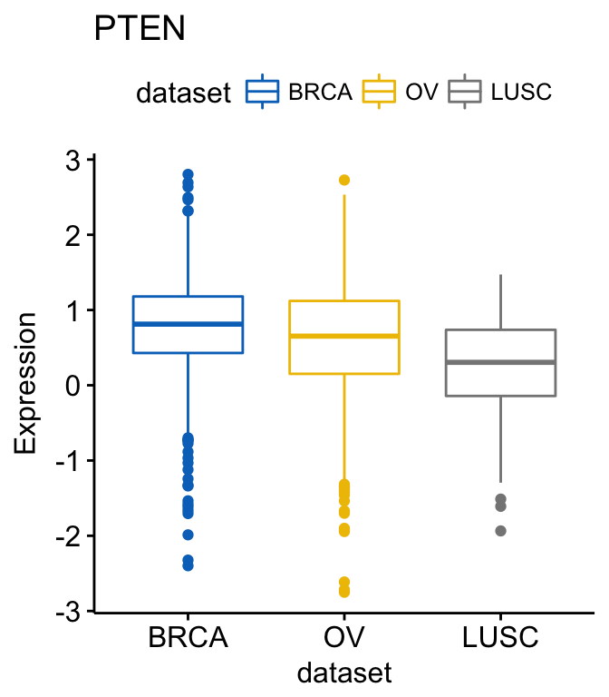
Create a box plot of a gene expression profile, colored by groups (here data set/cancer type):
library(ggpubr)
# GATA3
ggboxplot(expr, x = "dataset", y = "GATA3",
          title = "GATA3", ylab = "Expression",
          color = "dataset", palette = "jco")
# PTEN
ggboxplot(expr, x = "dataset", y = "PTEN",
          title = "PTEN", ylab = "Expression",
          color = "dataset", palette = "jco")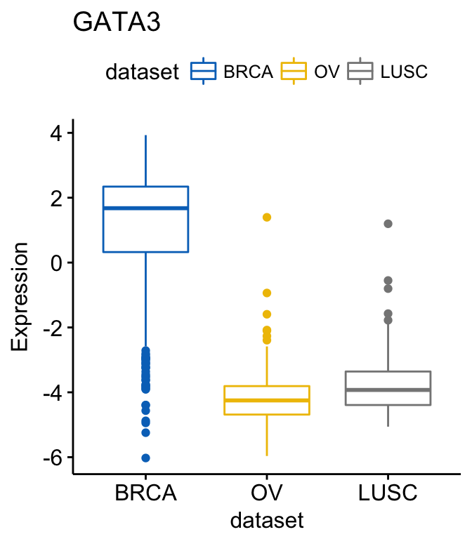
Note that, the argument palette is used to change color palettes. Allowed values include:
- “grey” for grey color palettes;
- brewer palettes e.g. “RdBu”, “Blues”, …;. To view all, type this in R: RColorBrewer::display.brewer.all() or click here to see all brewer palettes;
- or custom color palettes e.g. c(“blue”, “red”) or c(“#00AFBB”, “#E7B800”);
- and scientific journal palettes from the ggsci R package, e.g.: “npg”, “aaas”, “lancet”, “jco”, “ucscgb”, “uchicago”, “simpsons” and “rickandmorty”.
Instead of repeating the same R code for each gene, you can create a list of plots at once, as follow:
# Create a  list of plots
p <- ggboxplot(expr, x = "dataset",
               y = c("GATA3", "PTEN", "XBP1"),
               title = c("GATA3", "PTEN", "XBP1"),
               ylab = "Expression",
               color = "dataset", palette = "jco")
# View GATA3
p$GATA3
# View PTEN
p$PTEN
# View XBP1
p$XBP1
Note that, when the argument y contains multiple variables (here multiple gene names), then the arguments title, xlab and ylab can be also a character vector of same length as y.
To add p-values and significance levels to the boxplots, read our previous article: Add P-values and Significance Levels to ggplots. Briefly, you can do this:
my_comparisons <- list(c("BRCA", "OV"), c("OV", "LUSC"))
ggboxplot(expr, x = "dataset", y = "GATA3",
          title = "GATA3", ylab = "Expression",
          color = "dataset", palette = "jco")+
  stat_compare_means(comparisons = my_comparisons)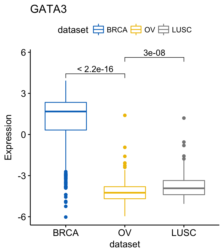
For each of the genes, you can compare the different groups as follow:
compare_means(c(GATA3, PTEN, XBP1) ~ dataset, data = expr)## # A tibble: 9 x 8
## .y. group1 group2 p p.adj p.format p.signif method
##
## 1 GATA3 BRCA OV 1.11e-177 3.34e-177 < 2e-16 **** Wilcoxon
## 2 GATA3 BRCA LUSC 6.68e-73 1.34e-72 < 2e-16 **** Wilcoxon
## 3 GATA3 OV LUSC 2.97e-08 2.97e-08 3.0e-08 **** Wilcoxon
## 4 PTEN BRCA OV 6.79e-05 6.79e-05 6.8e-05 **** Wilcoxon
## 5 PTEN BRCA LUSC 1.04e-16 3.13e-16 < 2e-16 **** Wilcoxon
## 6 PTEN OV LUSC 1.28e-07 2.56e-07 1.3e-07 **** Wilcoxon
## # ... with 3 more rows If you want to select items (here cancer types) to display or to remove a particular item from the plot, use the argument select or remove, as follow:
# Select BRCA and OV cancer types
ggboxplot(expr, x = "dataset", y = "GATA3",
title = "GATA3", ylab = "Expression",
color = "dataset", palette = "jco",
select = c("BRCA", "OV"))
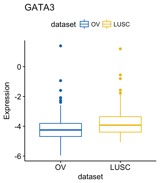
# or remove BRCA
ggboxplot(expr, x = "dataset", y = "GATA3",
title = "GATA3", ylab = "Expression",
color = "dataset", palette = "jco",
remove = "BRCA")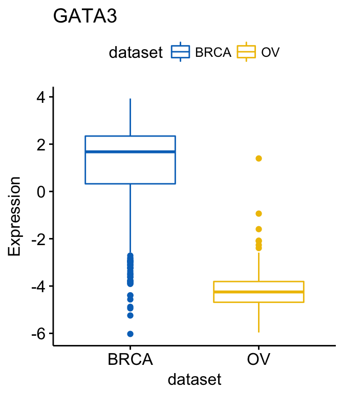
To change the order of the data sets on x axis, use the argument order. For example order = c(“LUSC”, “OV”, “BRCA”):
# Order data sets
ggboxplot(expr, x = "dataset", y = "GATA3",
          title = "GATA3", ylab = "Expression",
          color = "dataset", palette = "jco",
          order = c("LUSC", "OV", "BRCA"))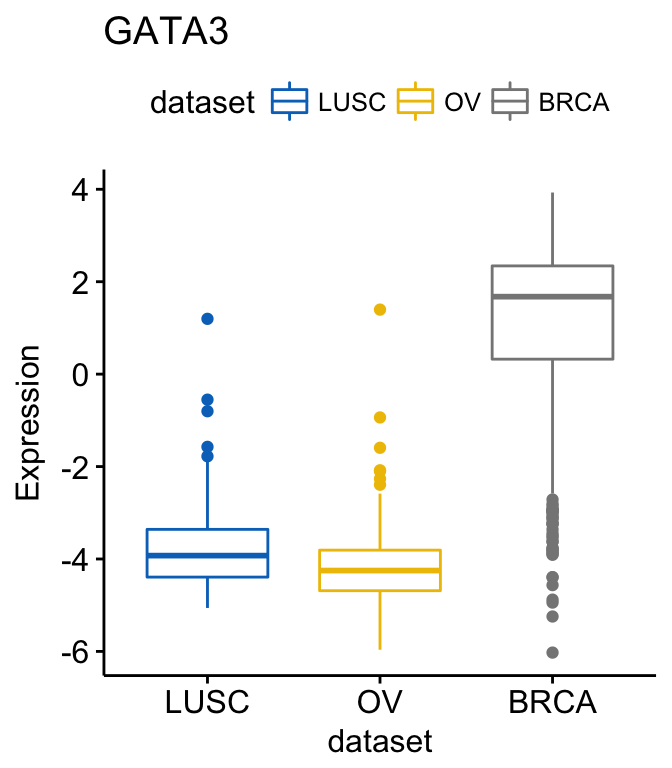
To create horizontal plots, use the argument rotate = TRUE:
ggboxplot(expr, x = "dataset", y = "GATA3",
          title = "GATA3", ylab = "Expression",
          color = "dataset", palette = "jco",
          rotate = TRUE)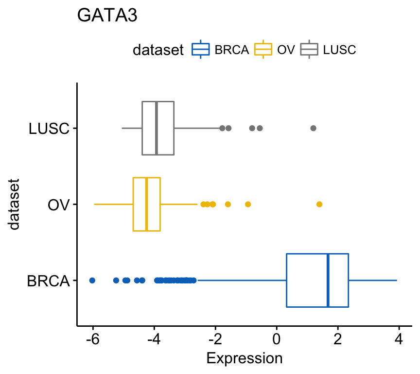
To combine the three gene expression plots into a multi-panel plot, use the argument combine = TRUE:
ggboxplot(expr, x = "dataset",
          y = c("GATA3", "PTEN", "XBP1"),
          combine = TRUE,
          ylab = "Expression",
          color = "dataset", palette = "jco")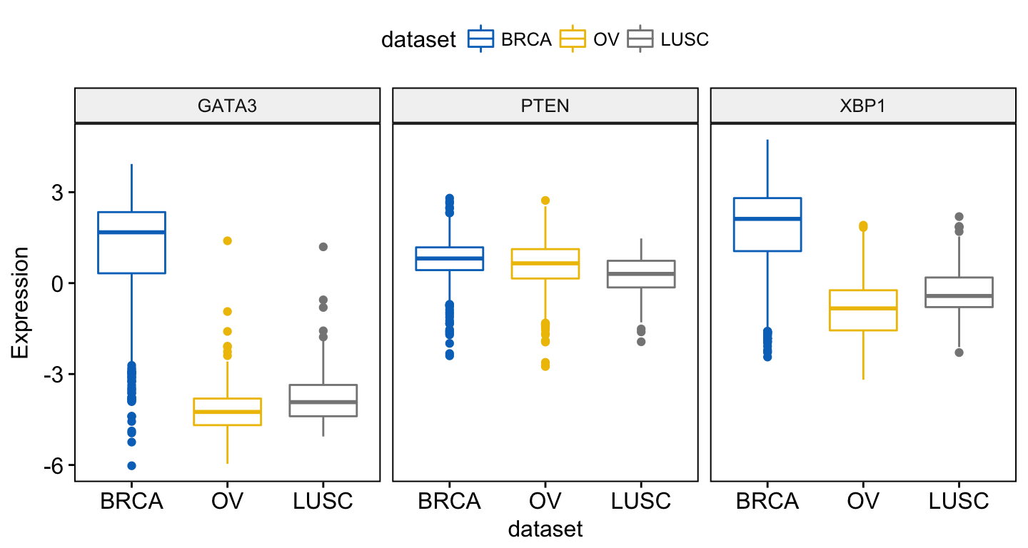
You can also merge the 3 plots using the argument merge = TRUE or merge = “asis”:
ggboxplot(expr, x = "dataset",
          y = c("GATA3", "PTEN", "XBP1"),
          merge = TRUE,
          ylab = "Expression",
          palette = "jco")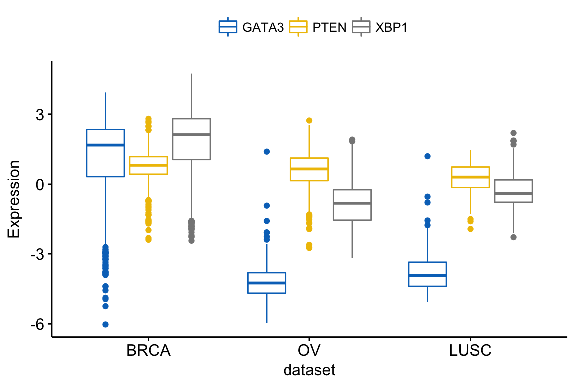
In the plot above, It’s easy to visually compare the expression level of the different genes in each cancer type.
But you might want to put genes (y variables) on x axis, in order to compare the expression level in the different cell subpopulations.
In this situation, the y variables (i.e.: genes) become x tick labels and the x variable (i.e.: dataset) becomes the grouping variable. To do this, use the argument merge = “flip”.
ggboxplot(expr, x = "dataset",
          y = c("GATA3", "PTEN", "XBP1"),
          merge = "flip",
          ylab = "Expression",
          palette = "jco")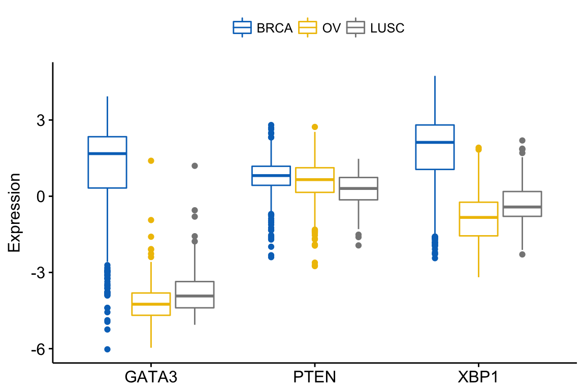
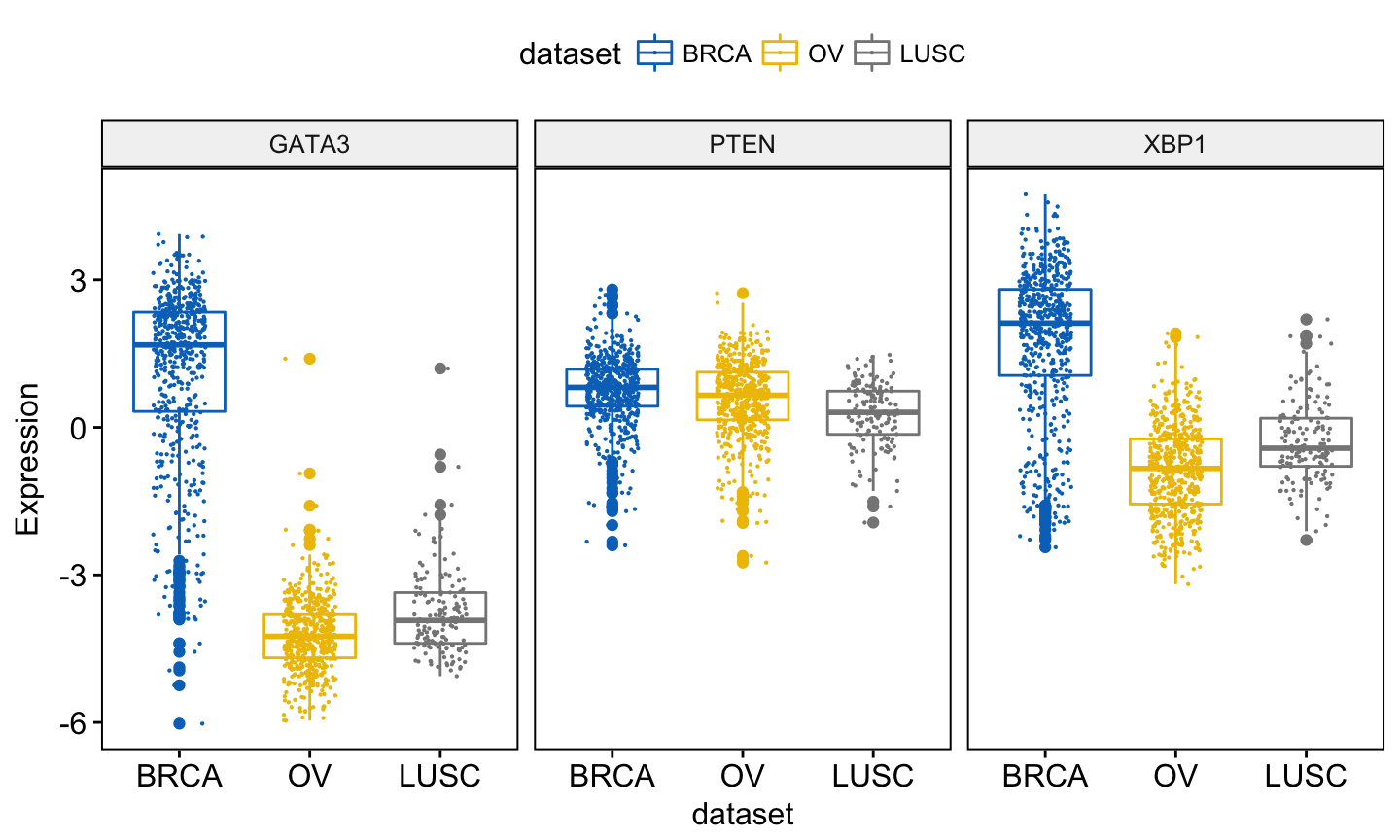
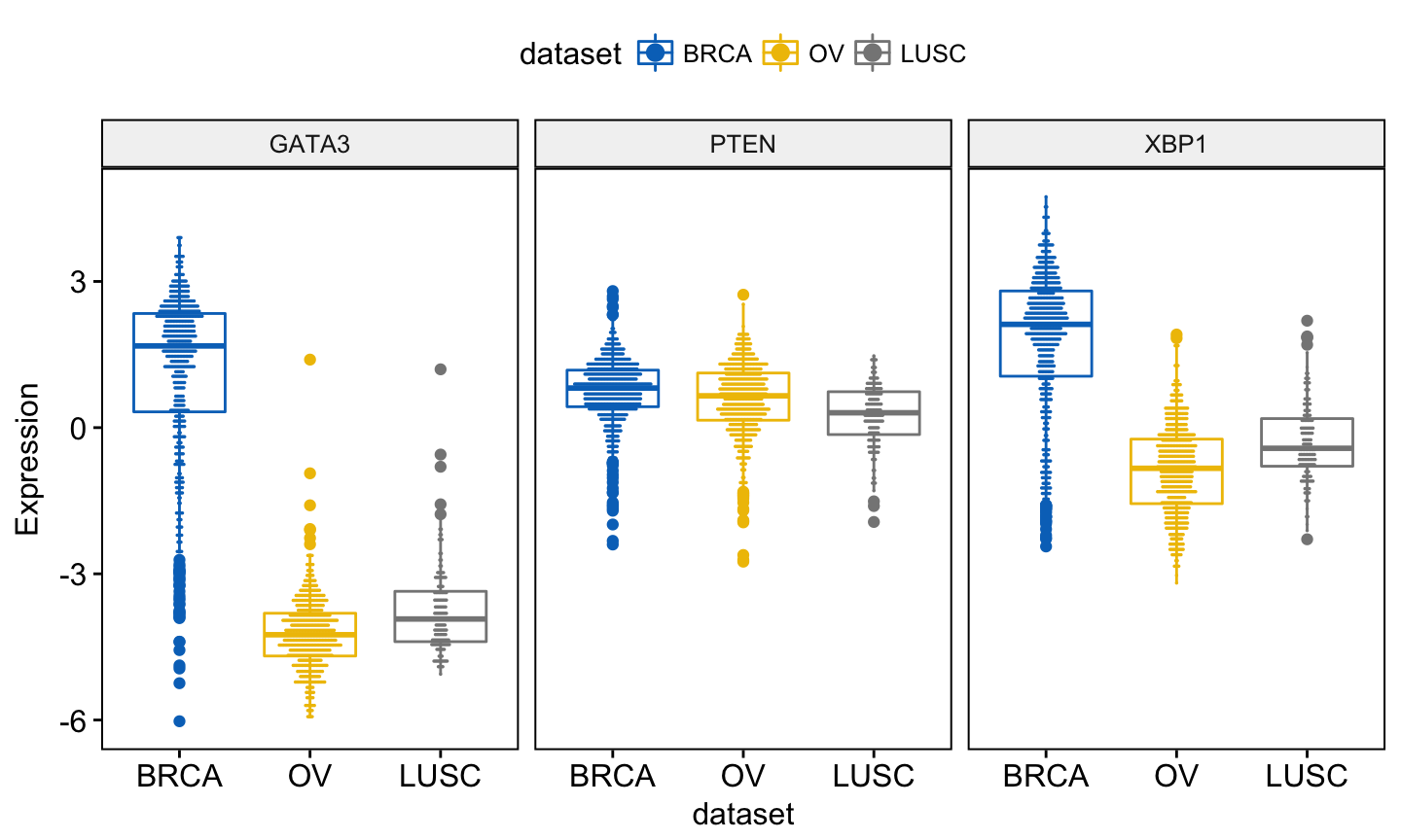
You might want to add jittered points on the boxplot. Each point correspond to individual observations. To add jittered points, use the argument add = “jitter” as follow. To customize the added elements, specify the argument add.params.
ggboxplot(expr, x = "dataset",
          y = c("GATA3", "PTEN", "XBP1"),
          combine = TRUE,
          color = "dataset", palette = "jco",
          ylab = "Expression",
          add = "jitter",                              # Add jittered points
          add.params = list(size = 0.1, jitter = 0.2)  # Point size and the amount of jittering
          )
Note that, when using ggboxplot() sensible values for the argument add are one of c(“jitter”, “dotplot”). If you decide to use add = “dotplot”, you can adjust dotsize and binwidth wen you have a strong dense dotplot. Read more about binwidth.
You can add and adjust a dotplot as follow:
ggboxplot(expr, x = "dataset",
          y = c("GATA3", "PTEN", "XBP1"),
          combine = TRUE,
          color = "dataset", palette = "jco",
          ylab = "Expression",
          add = "dotplot",                              # Add dotplot
          add.params = list(binwidth = 0.1, dotsize = 0.3)
          )
You might want to label the boxplot by showing the names of samples with the top n highest or lowest values. In this case, you can use the following arguments:
- label: the name of the column containing point labels.
- label.select: can be of two formats:
- a character vector specifying some labels to show.
- a list containing one or the combination of the following components:
- top.up and top.down: to display the labels of the top up/down points. For example, label.select = list(top.up = 10, top.down = 4).
- criteria: to filter, for example, by x and y variables values, use this: label.select = list(criteria = “`y` > 3.9 & `y` < 5 & `x` %in% c(‘BRCA’, ‘OV’)”).
For example:
ggboxplot(expr, x = "dataset",
          y = c("GATA3", "PTEN", "XBP1"),
          combine = TRUE,
          color = "dataset", palette = "jco",
          ylab = "Expression",
          add = "jitter",                               # Add jittered points
          add.params = list(size = 0.1, jitter = 0.2),  # Point size and the amount of jittering
          label = "bcr_patient_barcode",                # column containing point labels
          label.select = list(top.up = 2, top.down = 2),# Select some labels to display
          font.label = list(size = 9, face = "italic"), # label font
          repel = TRUE                                  # Avoid label text overplotting
          )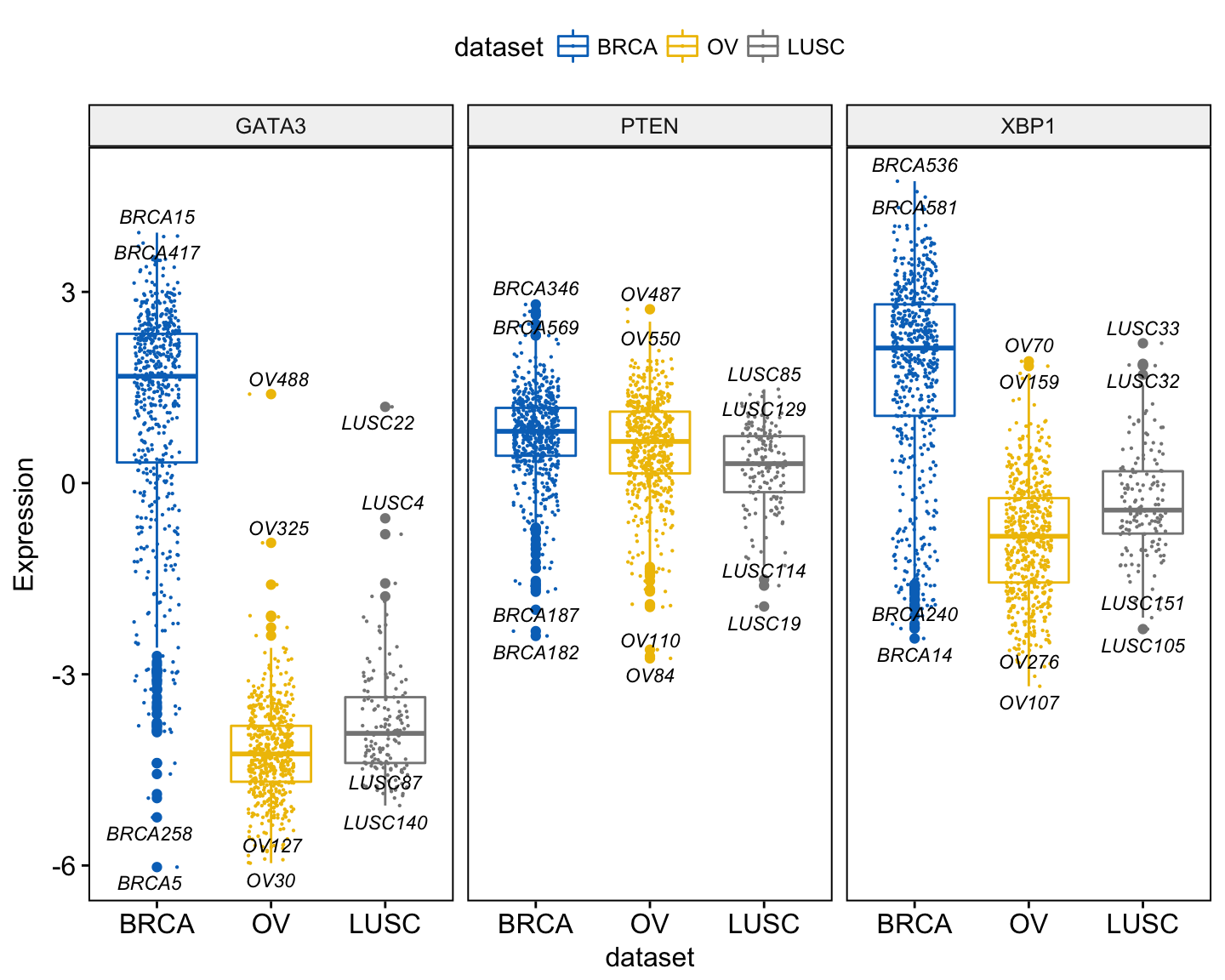
A complex criteria for labeling can be specified as follow:
label.select.criteria <- list(criteria = "`y` > 3.9 & `x` %in% c('BRCA', 'OV')")
ggboxplot(expr, x = "dataset",
          y = c("GATA3", "PTEN", "XBP1"),
          combine = TRUE,
          color = "dataset", palette = "jco",
          ylab = "Expression",
          label = "bcr_patient_barcode",              # column containing point labels
          label.select = label.select.criteria,       # Select some labels to display
          font.label = list(size = 9, face = "italic"), # label font
          repel = TRUE                                # Avoid label text overplotting
          )
Other types of plots, with the same arguments as the function ggboxplot(), are available, such as stripchart and violin plots.
Violin plots
The following R code draws violin plots with box plots inside:
ggviolin(expr, x = "dataset",
          y = c("GATA3", "PTEN", "XBP1"),
          combine = TRUE,
          color = "dataset", palette = "jco",
          ylab = "Expression",
          add = "boxplot")
Instead of adding a box plot inside the violin plot, you can add the median + interquantile range as follow:
ggviolin(expr, x = "dataset",
          y = c("GATA3", "PTEN", "XBP1"),
          combine = TRUE,
          color = "dataset", palette = "jco",
          ylab = "Expression",
          add = "median_iqr")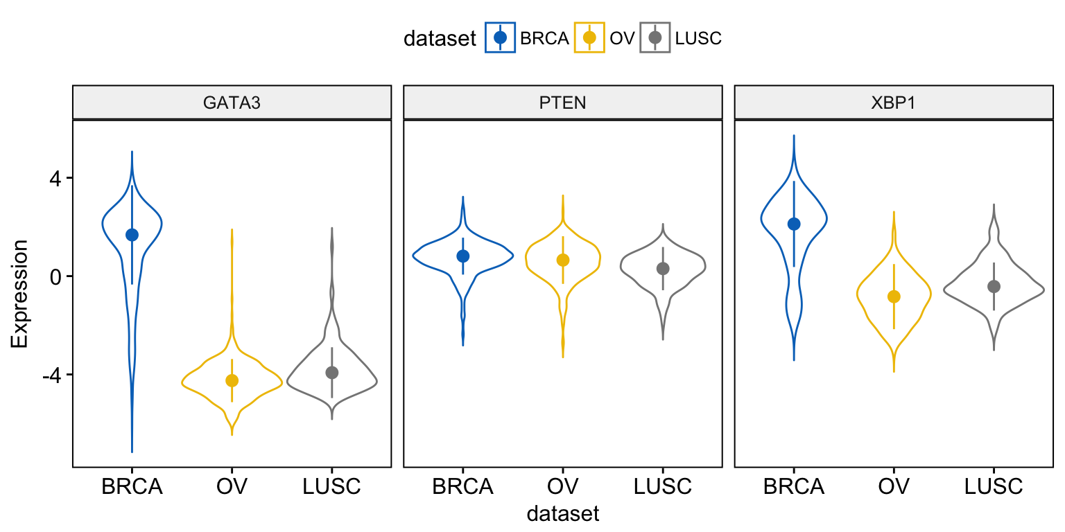
When using the function ggviolin(), sensible values for the argument add include: “mean”, “mean_se”, “mean_sd”, “mean_ci”, “mean_range”, “median”, “median_iqr”, “median_mad”, “median_range”.
You can also add “jitter” points and “dotplot” inside the violin plot as described previously in the box plot section.
Stripcharts and dot plots
To draw a stripchart, type this:
ggstripchart(expr, x = "dataset",
             y = c("GATA3", "PTEN", "XBP1"),
             combine = TRUE,
             color = "dataset", palette = "jco",
             size = 0.1, jitter = 0.2,
             ylab = "Expression",
             add = "median_iqr",
             add.params = list(color = "gray"))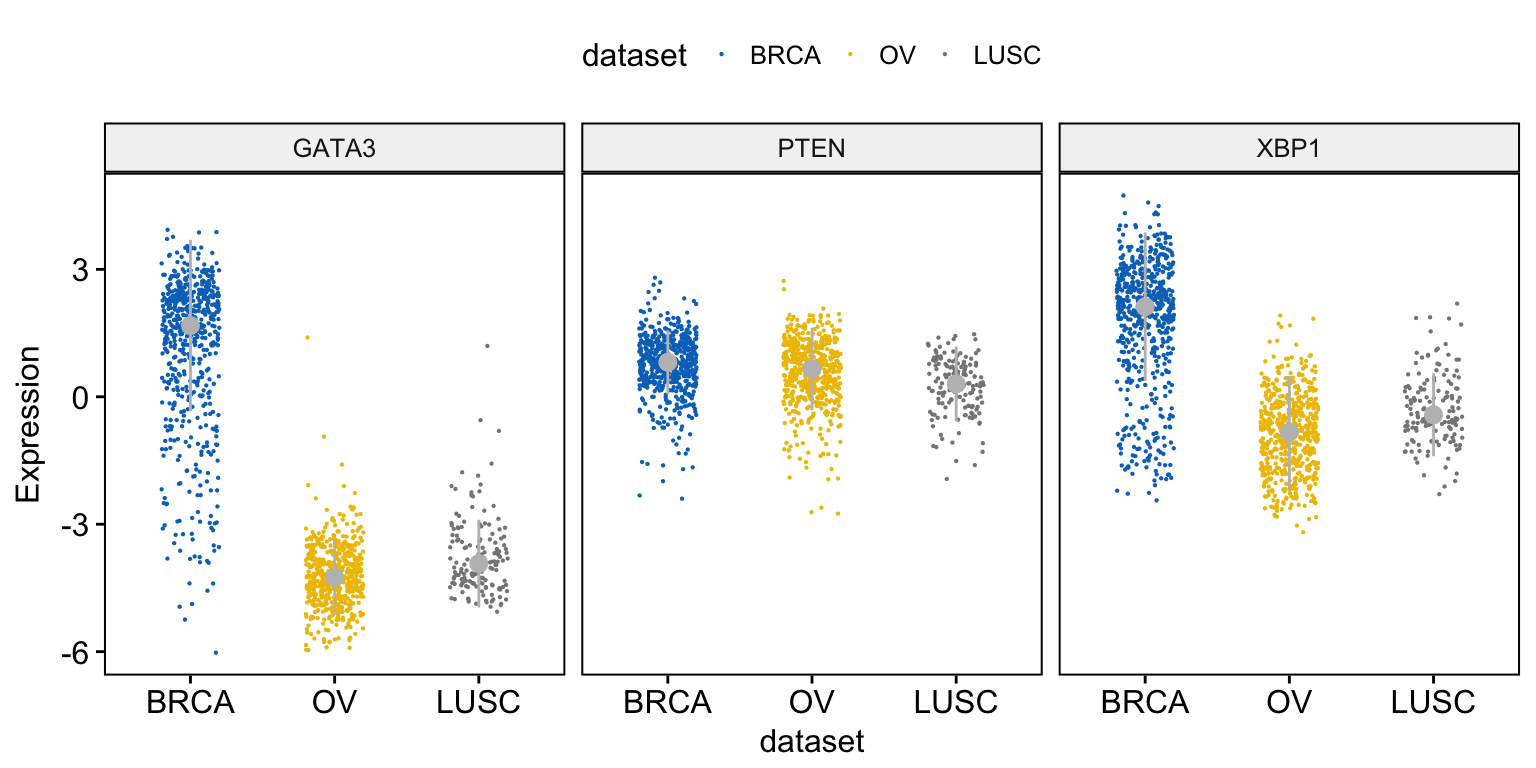
For a dot plot, use this:
ggdotplot(expr, x = "dataset",
          y = c("GATA3", "PTEN", "XBP1"),
          combine = TRUE,
          color = "dataset", palette = "jco",
          fill = "white",
          binwidth = 0.1,
          ylab = "Expression",
          add = "median_iqr",
          add.params = list(size = 0.9))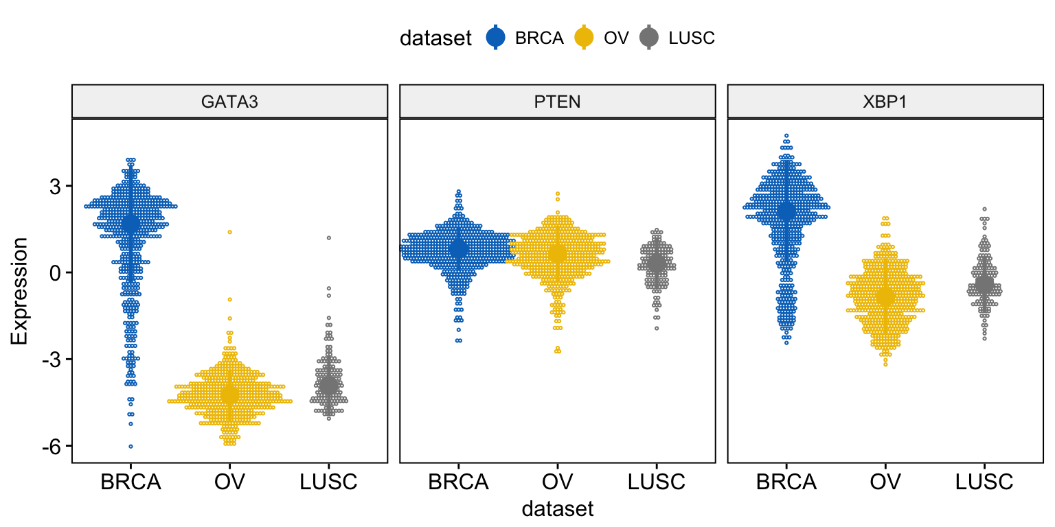
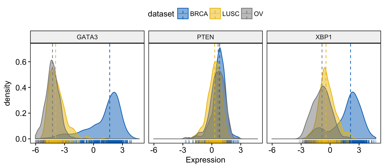
Density plots
To visualize the distribution as a density plot, use the function ggdensity() as follow:
# Basic density plot
ggdensity(expr,
       x = c("GATA3", "PTEN",  "XBP1"),
       y = "..density..",
       combine = TRUE,                  # Combine the 3 plots
       xlab = "Expression",
       add = "median",                  # Add median line.
       rug = TRUE                       # Add marginal rug
)
# Change color and fill by dataset
ggdensity(expr,
       x = c("GATA3", "PTEN",  "XBP1"),
       y = "..density..",
       combine = TRUE,                  # Combine the 3 plots
       xlab = "Expression",
       add = "median",                  # Add median line.
       rug = TRUE,                      # Add marginal rug
       color = "dataset",
       fill = "dataset",
       palette = "jco"
)
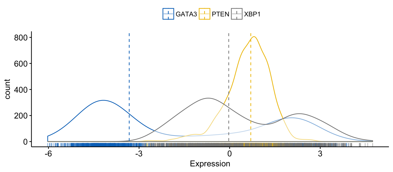
# Merge the 3 plots
# and use y = "..count.." instead of "..density.."
ggdensity(expr,
       x = c("GATA3", "PTEN",  "XBP1"),
       y = "..count..",
       merge = TRUE,                    # Merge the 3 plots
       xlab = "Expression",
       add = "median",                  # Add median line.
       rug = TRUE ,                     # Add marginal rug
       palette = "jco"                  # Change color palette
)
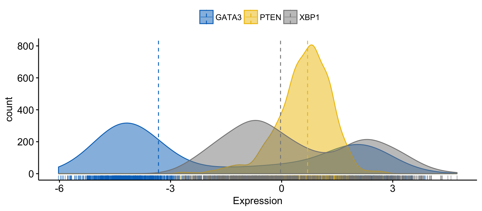
# color and fill by x variables
ggdensity(expr,
       x = c("GATA3", "PTEN",  "XBP1"),
       y = "..count..",
       color = ".x.", fill = ".x.",     # color and fill by x variables
       merge = TRUE,                    # Merge the 3 plots
       xlab = "Expression",
       add = "median",                  # Add median line.
       rug = TRUE ,                     # Add marginal rug
       palette = "jco"                  # Change color palette
)
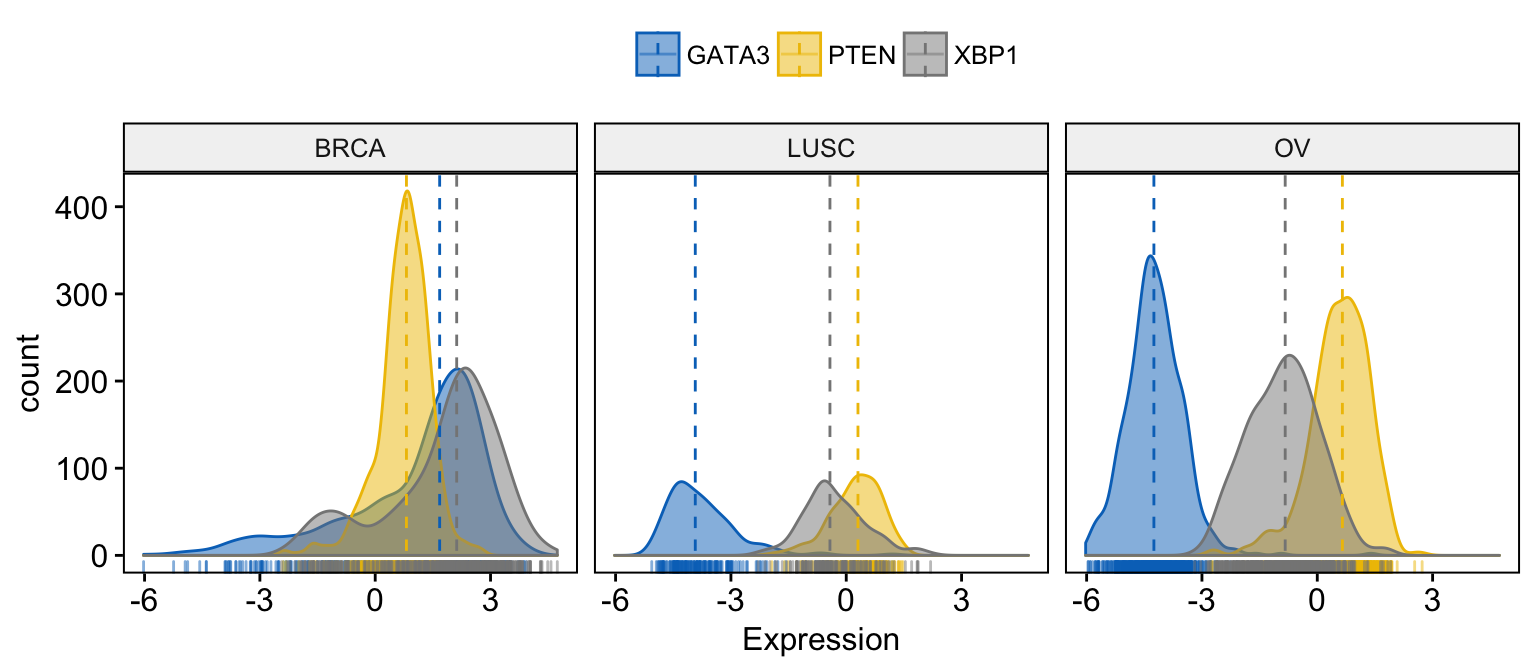
# Facet by "dataset"
ggdensity(expr,
       x = c("GATA3", "PTEN",  "XBP1"),
       y = "..count..",
       color = ".x.", fill = ".x.",
       facet.by = "dataset",            # Split by "dataset" into multi-panel
       merge = TRUE,                    # Merge the 3 plots
       xlab = "Expression",
       add = "median",                  # Add median line.
       rug = TRUE ,                     # Add marginal rug
       palette = "jco"                  # Change color palette
)
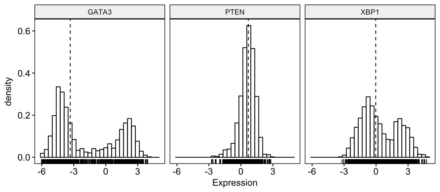
Histogram plots
To visualize the distribution as a histogram plot, use the function gghistogram() as follow:
# Basic histogram plot
gghistogram(expr,
       x = c("GATA3", "PTEN",  "XBP1"),
       y = "..density..",
       combine = TRUE,                  # Combine the 3 plots
       xlab = "Expression",
       add = "median",                  # Add median line.
       rug = TRUE                       # Add marginal rug
)
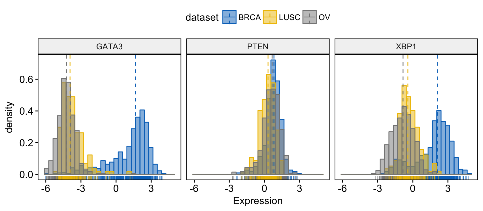
# Change color and fill by dataset
gghistogram(expr,
       x = c("GATA3", "PTEN",  "XBP1"),
       y = "..density..",
       combine = TRUE,                  # Combine the 3 plots
       xlab = "Expression",
       add = "median",                  # Add median line.
       rug = TRUE,                      # Add marginal rug
       color = "dataset",
       fill = "dataset",
       palette = "jco"
)
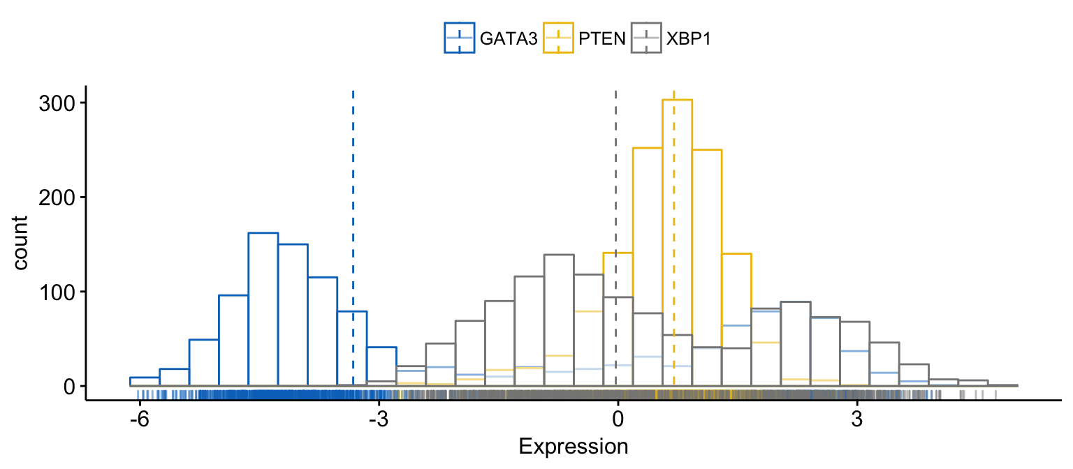
# Merge the 3 plots
# and use y = "..count.." instead of "..density.."
gghistogram(expr,
       x = c("GATA3", "PTEN",  "XBP1"),
       y = "..count..",
       merge = TRUE,                    # Merge the 3 plots
       xlab = "Expression",
       add = "median",                  # Add median line.
       rug = TRUE ,                     # Add marginal rug
       palette = "jco"                  # Change color palette
)
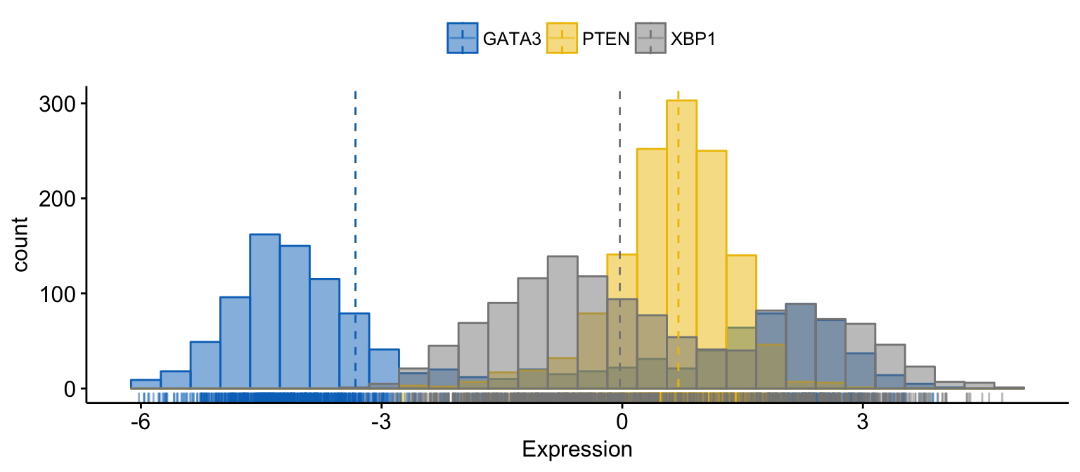
# color and fill by x variables
gghistogram(expr,
       x = c("GATA3", "PTEN",  "XBP1"),
       y = "..count..",
       color = ".x.", fill = ".x.",     # color and fill by x variables
       merge = TRUE,                    # Merge the 3 plots
       xlab = "Expression",
       add = "median",                  # Add median line.
       rug = TRUE ,                     # Add marginal rug
       palette = "jco"                  # Change color palette
)
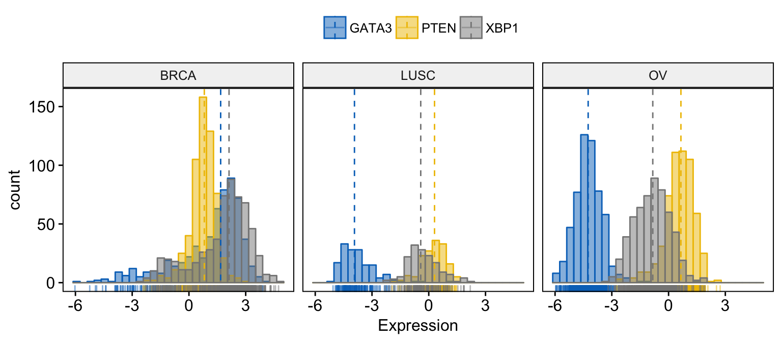
# Facet by "dataset"
gghistogram(expr,
       x = c("GATA3", "PTEN",  "XBP1"),
       y = "..count..",
       color = ".x.", fill = ".x.",
       facet.by = "dataset",            # Split by "dataset" into multi-panel
       merge = TRUE,                    # Merge the 3 plots
       xlab = "Expression",
       add = "median",                  # Add median line.
       rug = TRUE ,                     # Add marginal rug
       palette = "jco"                  # Change color palette
)
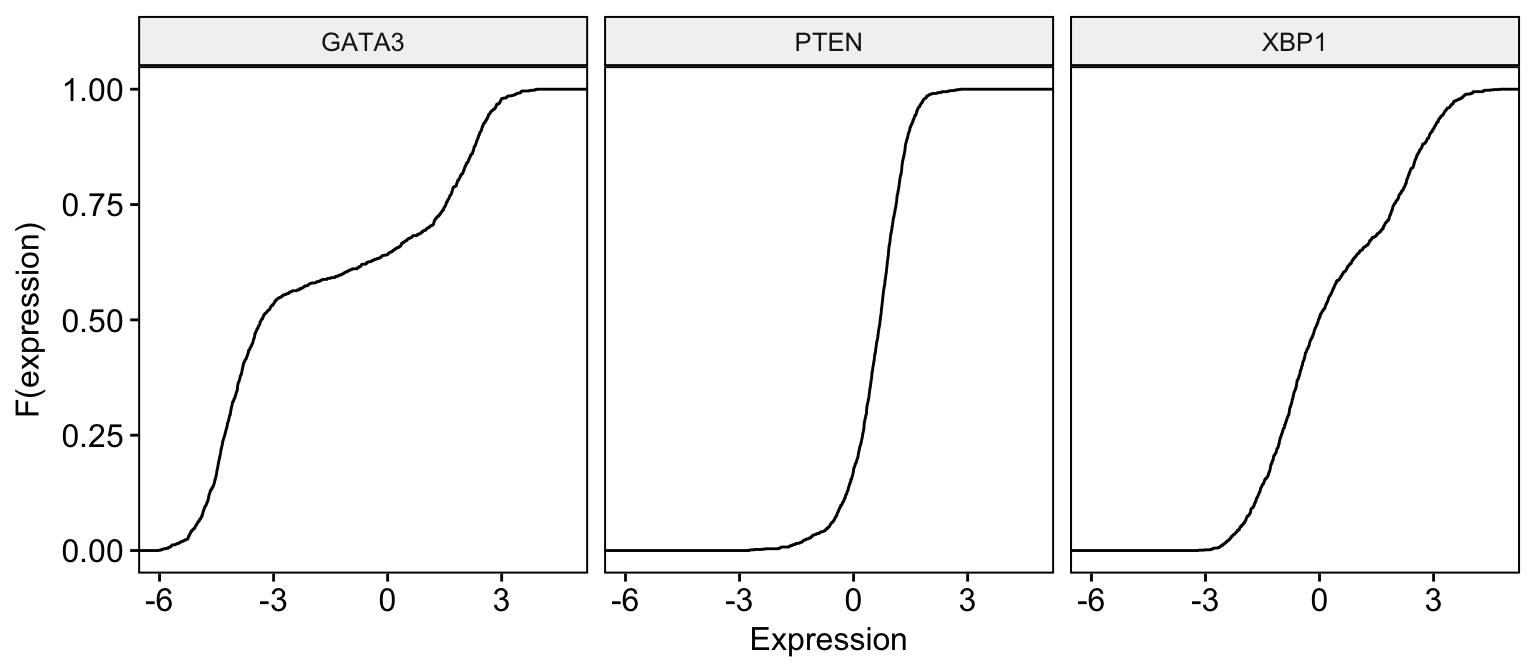
Empirical cumulative density function
# Basic ECDF plot
ggecdf(expr,
       x = c("GATA3", "PTEN",  "XBP1"),
       combine = TRUE,
       xlab = "Expression", ylab = "F(expression)"
)
# Change color  by dataset
ggecdf(expr,
       x = c("GATA3", "PTEN",  "XBP1"),
       combine = TRUE,
       xlab = "Expression", ylab = "F(expression)",
       color = "dataset", palette = "jco"
)
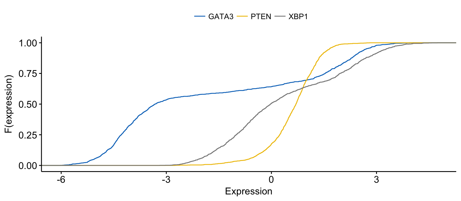
# Merge the 3 plots and color by x variables
ggecdf(expr,
       x = c("GATA3", "PTEN",  "XBP1"),
       merge = TRUE,
       xlab = "Expression", ylab = "F(expression)",
       color = ".x.", palette = "jco"
)
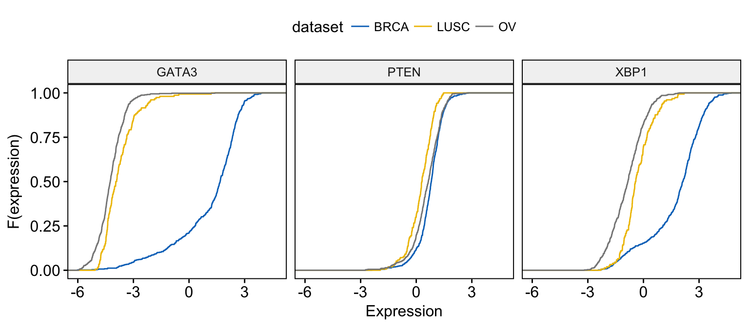
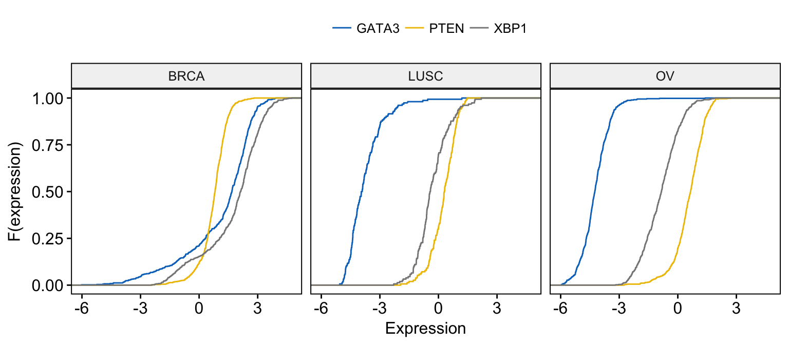
# Merge the 3 plots and color by x variables
# facet by "dataset" into multi-panel
ggecdf(expr,
       x = c("GATA3", "PTEN",  "XBP1"),
       merge = TRUE,
       xlab = "Expression", ylab = "F(expression)",
       color = ".x.", palette = "jco",
       facet.by = "dataset"
)
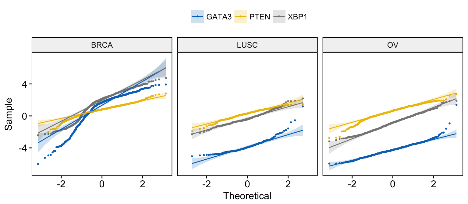
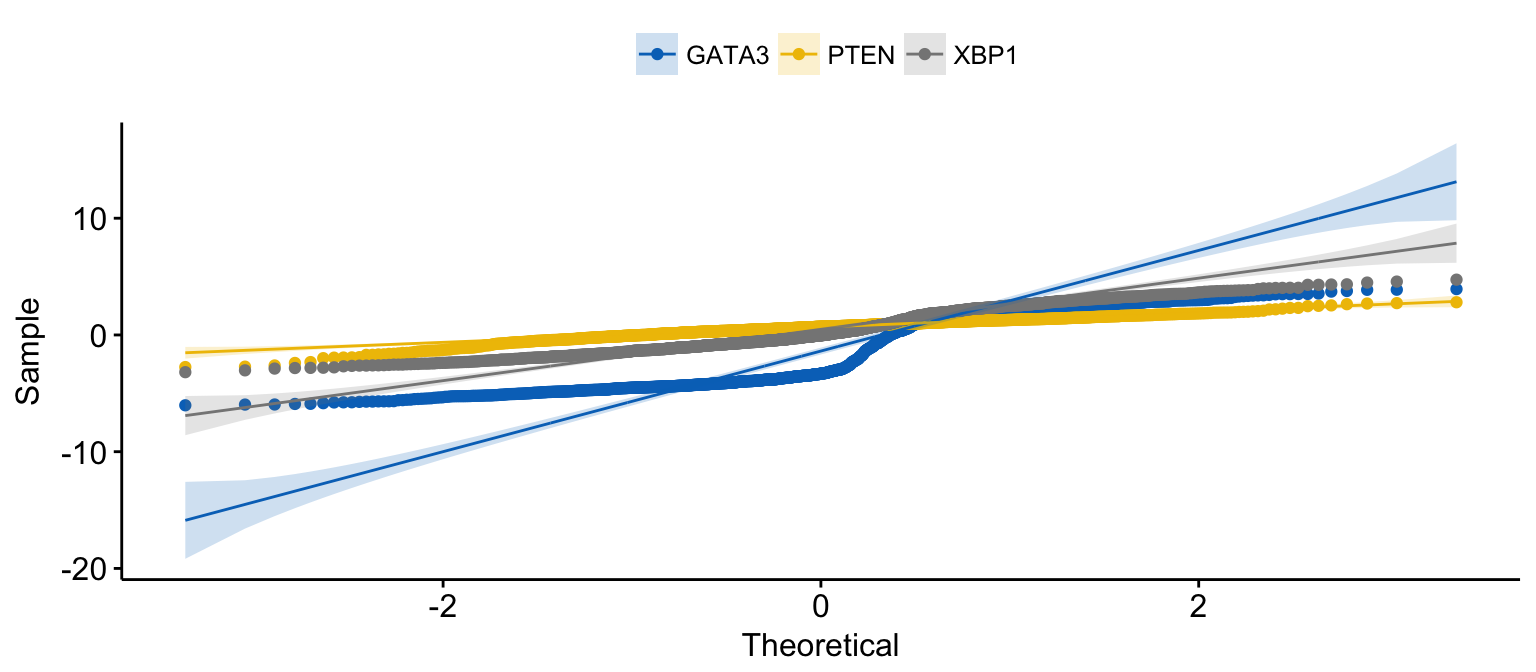
Quantile - Quantile plot
# Basic ECDF plot
ggqqplot(expr,
       x = c("GATA3", "PTEN",  "XBP1"),
       combine = TRUE, size = 0.5
)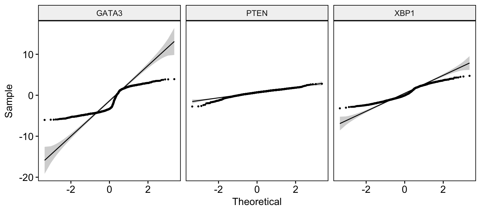
# Change color  by dataset
ggqqplot(expr,
       x = c("GATA3", "PTEN",  "XBP1"),
       combine = TRUE, color = "dataset", palette = "jco",
       size = 0.5
)
# Merge the 3 plots and color by x variables
ggqqplot(expr,
       x = c("GATA3", "PTEN",  "XBP1"),
       merge = TRUE,
       color = ".x.", palette = "jco"
)
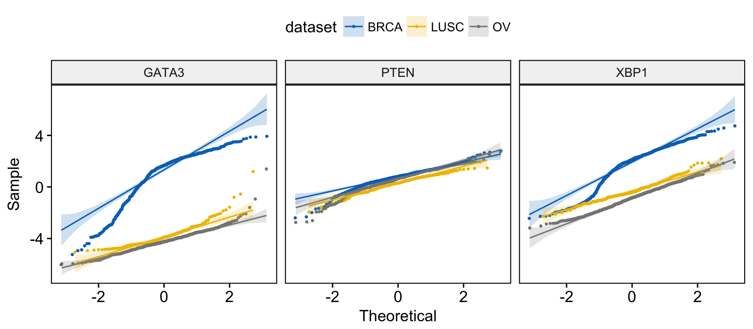
# Merge the 3 plots and color by x variables
# facet by "dataset" into multi-panel
ggqqplot(expr,
       x = c("GATA3", "PTEN",  "XBP1"),
       merge = TRUE, size = 0.5,
       color = ".x.", palette = "jco",
       facet.by = "dataset"
)