


R Basics for Data Visualization
R is a free and powerful statistical software for analyzing and visualizing data.
In this chapter, you’ll learn:
- the basics of R programming for importing and manipulating your data:
- filtering and ordering rows,
- renaming and adding columns,
- computing summary statistics
- R graphics systems and packages for data visualization:
- R traditional base plots
- Lattice plotting system that aims to improve on R base graphics
- ggplot2 package, a powerful and a flexible R package, for producing elegant graphics piece by piece.
- ggpubr package, which facilitates the creation of beautiful ggplot2-based graphs for researcher with non-advanced programming backgrounds.
- ggformula package, an extension of ggplot2, based on formula interfaces (much like the lattice interface)
Contents:

Install R and RStudio
RStudio is an integrated development environment for R that makes using R easier. R and RStudio can be installed on Windows, MAC OSX and Linux platforms.
- R can be downloaded and installed from the Comprehensive R Archive Network (CRAN) webpage (http://cran.r-project.org/)
- After installing R software, install also the RStudio software available at: http://www.rstudio.com/products/RStudio/.
- Launch RStudio and start use R inside R studio.
Install and load required R packages
An R package is a collection of functionalities that extends the capabilities of base R. To use the R code provide in this book, you should install the following R packages:
tidyversepackages, which are a collection of R packages that share the same programming philosophy. These packages include:readr: for importing data into Rdplyr: for data manipulationggplot2andggpubrfor data visualization.
ggpubrpackage, which makes it easy, for beginner, to create publication ready plots.
- Install the tidyverse package. Installing tidyverse will install automatically readr, dplyr, ggplot2 and more. Type the following code in the R console:
install.packages("tidyverse")- Install the ggpubr package.
- We recommend to install the latest developmental version of ggpubr as follow:
if(!require(devtools)) install.packages("devtools")
devtools::install_github("kassambara/ggpubr")- If the above R code fails, you can install the latest stable version on CRAN:
install.packages("ggpubr")- Load required packages. After installation, you must first load the package for using the functions in the package. The function
library()is used for this task. An alternative function isrequire(). For example, to load ggplot2 and ggpubr packages, type this:
library("ggplot2")
library("ggpubr")
Now, we can use R functions, such as ggscatter() [in the ggpubr package] for creating a scatter plot.
If you want to learn more about a given function, say ggscatter(), type this in R console: ?ggscatter.
Data format
Your data should be in rectangular format, where columns are variables and rows are observations (individuals or samples).
Column names should be compatible with R naming conventions. Avoid column with blank space and special characters. Good column names:
long_jumporlong.jump. Bad column name:long jump.Avoid beginning column names with a number. Use letter instead. Good column names:
sport_100morx100m. Bad column name:100m.Replace missing values by
NA(for not available)
For example, your data should look like this:
  manufacturer model displ year cyl      trans drv
1         audi    a4   1.8 1999   4   auto(l5)   f
2         audi    a4   1.8 1999   4 manual(m5)   f
3         audi    a4   2.0 2008   4 manual(m6)   f
4         audi    a4   2.0 2008   4   auto(av)   f
Read more at: Best Practices in Preparing Data Files for Importing into R
Import your data in R
First, save your data into txt or csv file formats and import it as follow (you will be asked to choose the file):
library("readr")
# Reads tab delimited files (.txt tab)
my_data <- read_tsv(file.choose())
# Reads comma (,) delimited files (.csv)
my_data <- read_csv(file.choose())
# Reads semicolon(;) separated files(.csv)
my_data <- read_csv2(file.choose())
Read more about how to import data into R at this link: https://www.sthda.com/english/wiki/importing-data-into-r
Demo data sets
R comes with several demo data sets for playing with R functions. The most used R demo data sets include: USArrests, iris and mtcars. To load a demo data set, use the function data() as follow. The function head() is used to inspect the data.
data("iris")   # Loading
head(iris, n = 3)  # Print the first n = 3 rows
## Sepal.Length Sepal.Width Petal.Length Petal.Width Species
## 1 5.1 3.5 1.4 0.2 setosa
## 2 4.9 3.0 1.4 0.2 setosa
## 3 4.7 3.2 1.3 0.2 setosaTo learn more about iris data sets, type this:
?irisAfter typing the above R code, you will see the description of iris data set: this iris data set gives the measurements in centimeters of the variables sepal length and width and petal length and width, respectively, for 50 flowers from each of 3 species of iris. The species are Iris setosa, versicolor, and virginica.
Data manipulation
After importing your data in R, you can easily manipulate it using the dplyr package (Wickham et al. 2017), which can be installed using the R code: install.packages("dplyr").
After loading dplyr, you can use the following R functions:
filter(): Pick rows (observations/samples) based on their values.distinct(): Remove duplicate rows.arrange(): Reorder the rows.select(): Select columns (variables) by their names.rename(): Rename columns.mutate(): Add/create new variables.summarise(): Compute statistical summaries (e.g., computing the mean or the sum)group_by(): Operate on subsets of the data set.
Note that, dplyr package allows to use the forward-pipe chaining operator (%>%) for combining multiple operations. For example, x %>% f is equivalent to f(x). Using the pipe (%>%), the output of each operation is passed to the next operation. This makes R programming easy.
We’ll show you how these functions work in the different chapters of this book.
R graphics systems
There are different graphic packages available in R for visualizing your data: 1) R base graphs, 2) Lattice Graphs (Sarkar 2016) and 3) ggplot2 (Wickham and Chang 2017).
In this section, we start by providing a quick overview of R base and lattice plots, and then we move to ggplot2 graphic system. The vast majority of plots generated in this book is based on the modern and flexible ggplot2 R package.
R base graphs
R comes with simple functions to create many types of graphs. For example:
| Plot Types | R base function |
|---|---|
| Scatter plot | plot() |
| Scatter plot matrix | pairs() |
| Box plot | boxplot() |
| Strip chart | stripchart() |
| Histogram plot | hist() |
| density plot | density() |
| Bar plot | barplot() |
| Line plot | plot() and line() |
| Pie charts | pie() |
| Dot charts | dotchart() |
| Add text to a plot | text() |
In the most cases, you can use the following arguments to customize the plot:
pch: change point shapes. Allowed values comprise number from 1 to 25.cex: change point size. Example:cex = 0.8.col: change point color. Example: col = “blue”.frame: logical value.frame = FALSEremoves the plot panel border frame.main,xlab,ylab. Specify the main title and the x/y axis labels -, respectivelylas: For a vertical x axis text, uselas = 2.
In the following R code, we’ll use the iris data set to create a:
- Scatter plot of Sepal.Length (on x-axis) and Sepal.Width (on y-axis).
- Box plot of Sepal.length (y-axis) by Species (x-axis)
# (1) Create a scatter lot
plot(
  x = iris$Sepal.Length, y = iris$Sepal.Width,
  pch = 19, cex = 0.8, frame = FALSE,
  xlab = "Sepal Length",ylab = "Sepal Width"
  )
# (2) Create a box plot
boxplot(Sepal.Length ~ Species, data = iris,
        ylab = "Sepal.Length",
        frame = FALSE, col = "lightgray")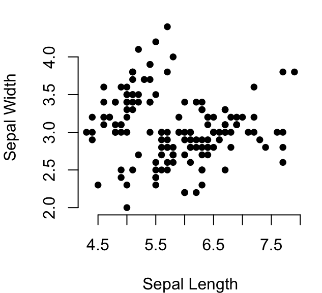

Read more examples at: R base Graphics on STHDA, https://www.sthda.com/english/wiki/r-base-graphs
Lattice graphics
The lattice R package provides a plotting system that aims to improve on R base graphs. After installing the package, whith the R command install.packages("lattice"), you can test the following functions.
- Main functions in the lattice package:
| Plot types | Lattice functions |
|---|---|
| Scatter plot | xyplot() |
| Scatter plot matrix | splom() |
| 3D scatter plot | cloud() |
| Box plot | bwplot() |
| strip plots (1-D scatter plots) | stripplot() |
| Dot plot | dotplot() |
| Bar chart | barchart() |
| Histogram | histogram() |
| Density plot | densityplot() |
| Theoretical quantile plot | qqmath() |
| Two-sample quantile plot | qq() |
| 3D contour plot of surfaces | contourplot() |
| False color level plot of surfaces | levelplot() |
| Parallel coordinates plot | parallel() |
| 3D wireframe graph | wireframe() |
The lattice package uses formula interface. For example, in lattice terminology, the formula y ~ x | group, means that we want to plot the y variable according to the x variable, splitting the plot into multiple panels by the variable group.
- Create a basic scatter plot of y by x. Syntax:
y ~ x. Change the color by groups and useauto.key = TRUEto show legends:
library("lattice")
xyplot(
  Sepal.Length ~ Petal.Length, group = Species,
  data = iris, auto.key = TRUE, pch = 19, cex = 0.5
  )
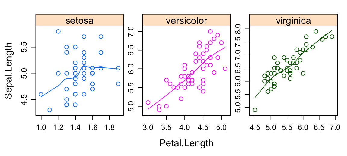
- Multiple panel plots by groups. Syntax:
y ~ x | group.
xyplot(
  Sepal.Length ~ Petal.Length | Species,
  layout = c(3, 1),               # panel with ncol = 3 and nrow = 1
  group = Species, data = iris,
  type = c("p", "smooth"),        # Show points and smoothed line
  scales = "free"                 # Make panels axis scales independent
  )
Read more examples at: Lattice Graphics on STHDA
ggplot2 graphics
GGPlot2 is a powerful and a flexible R package, implemented by Hadley Wickham, for producing elegant graphics piece by piece. The gg in ggplot2 means Grammar of Graphics, a graphic concept which describes plots by using a “grammar”. According to the ggplot2 concept, a plot can be divided into different fundamental parts: Plot = data + Aesthetics + Geometry
- data: a data frame
- aesthetics: used to indicate the x and y variables. It can be also used to control the color, the size and the shape of points, etc…..
- geometry: corresponds to the type of graphics (histogram, box plot, line plot, ….)
The ggplot2 syntax might seem opaque for beginners, but once you understand the basics, you can create and customize any kind of plots you want.
Note that, to reduce this opacity, we recently created an R package, named ggpubr (ggplot2 Based Publication Ready Plots), for making ggplot simpler for students and researchers with non-advanced programming backgrounds. We’ll present ggpubr in the next section.
After installing and loading the ggplot2 package, you can use the following key functions:
| Plot types | GGPlot2 functions |
|---|---|
| Initialize a ggplot | ggplot() |
| Scatter plot | geom_point() |
| Box plot | geom_boxplot() |
| Violin plot | geom_violin() |
| strip chart | geom_jitter() |
| Dot plot | geom_dotplot() |
| Bar chart | geom_bar() |
| Line plot | geom_line() |
| Histogram | geom_histogram() |
| Density plot | geom_density() |
| Error bars | geom_errorbar() |
| QQ plot | stat_qq() |
| ECDF plot | stat_ecdf() |
| Title and axis labels | labs() |
The main function in the ggplot2 package is ggplot(), which can be used to initialize the plotting system with data and x/y variables.
For example, the following R code takes the iris data set to initialize the ggplot and then a layer (geom_point()) is added onto the ggplot to create a scatter plot of x = Sepal.Length by y = Sepal.Width:
library(ggplot2)
ggplot(iris, aes(x = Sepal.Length, y = Sepal.Width))+
  geom_point()
# Change point size, color and shape
ggplot(iris, aes(x = Sepal.Length, y = Sepal.Width))+
  geom_point(size = 1.2, color = "steelblue", shape = 21)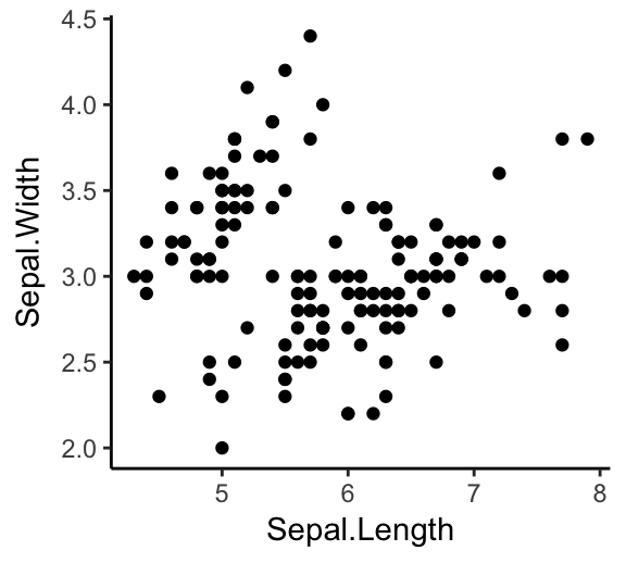

Note that, in the code above, the shape of points is specified as number. To display the different point shape available in R, type this:
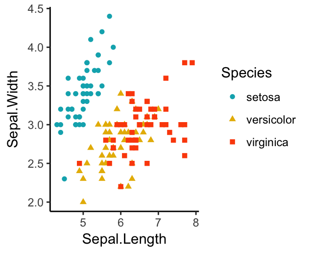
ggpubr::show_point_shapes()It’s also possible to control points shape and color by a grouping variable (here, Species). For example, in the code below, we map points color and shape to the Species grouping variable.
# Control points color by groups
ggplot(iris, aes(x = Sepal.Length, y = Sepal.Width))+
  geom_point(aes(color = Species, shape = Species))
# Change the default color manually.
# Use the scale_color_manual() function
ggplot(iris, aes(x = Sepal.Length, y = Sepal.Width))+
  geom_point(aes(color = Species, shape = Species))+
  scale_color_manual(values = c("#00AFBB", "#E7B800", "#FC4E07"))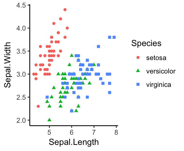
You can also split the plot into multiple panels according to a grouping variable. R function: facet_wrap(). Another interesting feature of ggplot2, is the possibility to combine multiple layers on the same plot. For example, with the following R code, we’ll:
- Add points with
geom_point(), colored by groups. - Add the fitted smoothed regression line using
geom_smooth(). By default the functiongeom_smooth()add the regression line and the confidence area. You can control the line color and confidence area fill color by groups. - Facet the plot into multiple panels by groups
- Change color and fill manually using the function
scale_color_manual()andscale_fill_manual()
ggplot(iris, aes(x = Sepal.Length, y = Sepal.Width))+
  geom_point(aes(color = Species))+
  geom_smooth(aes(color = Species, fill = Species))+
  facet_wrap(~Species, ncol = 3, nrow = 1)+
  scale_color_manual(values = c("#00AFBB", "#E7B800", "#FC4E07"))+
  scale_fill_manual(values = c("#00AFBB", "#E7B800", "#FC4E07"))
Note that, the default theme of ggplots is theme_gray() (or theme_grey()), which is theme with grey background and white grid lines. More themes are available for professional presentations or publications. These include: theme_bw(), theme_classic() and theme_minimal().
To change the theme of a given ggplot (p), use this: p + theme_classic(). To change the default theme to theme_classic() for all the future ggplots during your entire R session, type the following R code:
theme_set(
  theme_classic()
)
Now you can create ggplots with theme_classic() as default theme:
ggplot(iris, aes(x = Sepal.Length, y = Sepal.Width))+
  geom_point()
ggpubr for publication ready plots
The ggpubr R package facilitates the creation of beautiful ggplot2-based graphs for researcher with non-advanced programming backgrounds (Kassambara 2017).
For example, to create the density distribution of “Sepal.Length”, colored by groups (“Species”), type this:
library(ggpubr)
# Density plot with mean lines and marginal rug
ggdensity(iris, x = "Sepal.Length",
   add = "mean", rug = TRUE,             # Add mean line and marginal rugs
   color = "Species", fill = "Species",  # Color by groups
   palette = "jco")                      # use jco journal color palette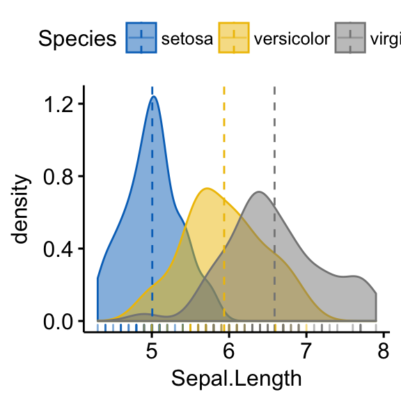
Note that the argument palette can take also a custom color palette. For example palette= c(“#00AFBB”, “#E7B800”, “#FC4E07”).
- Create a box plot with p-values comparing groups:
# Groups that we want to compare
my_comparisons <- list(
  c("setosa", "versicolor"), c("versicolor", "virginica"),
  c("setosa", "virginica")
)
# Create the box plot. Change colors by groups: Species
# Add jitter points and change the shape by groups
ggboxplot(
  iris, x = "Species", y = "Sepal.Length",
  color = "Species", palette = c("#00AFBB", "#E7B800", "#FC4E07"),
  add = "jitter"
  )+
  stat_compare_means(comparisons = my_comparisons, method = "t.test")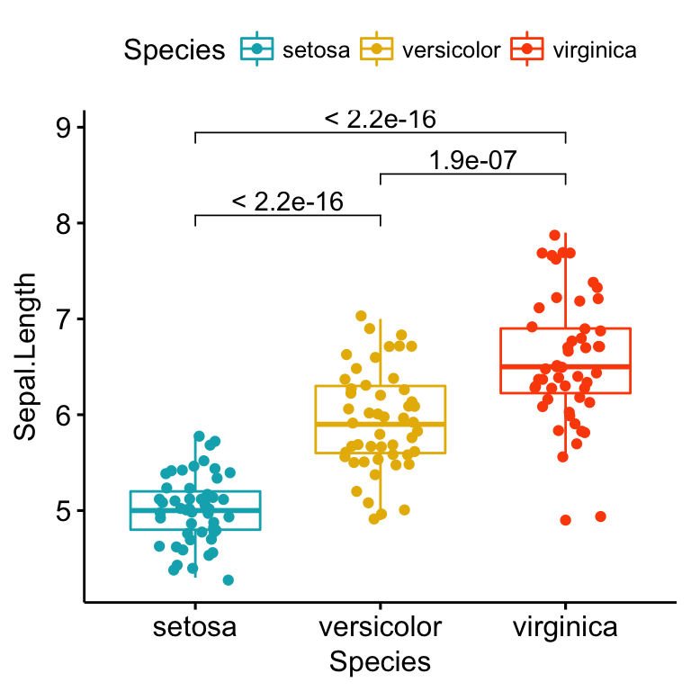
Learn more on STHDA at: ggpubr: Publication Ready Plots
Export R graphics
You can export R graphics to many file formats, including: PDF, PostScript, SVG vector files, Windows MetaFile (WMF), PNG, TIFF, JPEG, etc.
The standard procedure to save any graphics from R is as follow:
- Open a graphic device using one of the following functions:
- pdf(“r-graphics.pdf”),
- postscript(“r-graphics.ps”),
- svg(“r-graphics.svg”),
- png(“r-graphics.png”),
- tiff(“r-graphics.tiff”),
- jpeg(“r-graphics.jpg”),
- win.metafile(“r-graphics.wmf”),
- and so on.
Additional arguments indicating the width and the height (in inches) of the graphics region can be also specified in the mentioned function.
Create a plot
Close the graphic device using the function
dev.off()
For example, you can export R base plots to a pdf file as follow:
pdf("r-base-plot.pdf")
# Plot 1 --> in the first page of PDF
plot(x = iris$Sepal.Length, y = iris$Sepal.Width)
# Plot 2 ---> in the second page of the PDF
hist(iris$Sepal.Length)
dev.off()
To export ggplot2 graphs, the R code looks like this:
# Create some plots
library(ggplot2)
myplot1 <- ggplot(iris, aes(Sepal.Length, Sepal.Width)) +
  geom_point()
myplot2 <- ggplot(iris, aes(Species, Sepal.Length)) +
  geom_boxplot()
# Print plots to a pdf file
pdf("ggplot.pdf")
print(myplot1)     # Plot 1 --> in the first page of PDF
print(myplot2)     # Plot 2 ---> in the second page of the PDF
dev.off()
Note that for a ggplot, you can also use the following functions to export the graphic:
ggsave()[in ggplot2]. Makes it easy to save a ggplot. It guesses the type of graphics device from the file extension.ggexport()[in ggpubr]. Makes it easy to arrange and export multiple ggplots at once.
See also the following blog post to save high-resolution ggplots
References
Kassambara, Alboukadel. 2017. Ggpubr: ’Ggplot2’ Based Publication Ready Plots. https://www.sthda.com/english/rpkgs/ggpubr.
Sarkar, Deepayan. 2016. Lattice: Trellis Graphics for R. https://CRAN.R-project.org/package=lattice.
Wickham, Hadley, and Winston Chang. 2017. Ggplot2: Create Elegant Data Visualisations Using the Grammar of Graphics.
Wickham, Hadley, Romain Francois, Lionel Henry, and Kirill Müller. 2017. Dplyr: A Grammar of Data Manipulation. https://CRAN.R-project.org/package=dplyr.