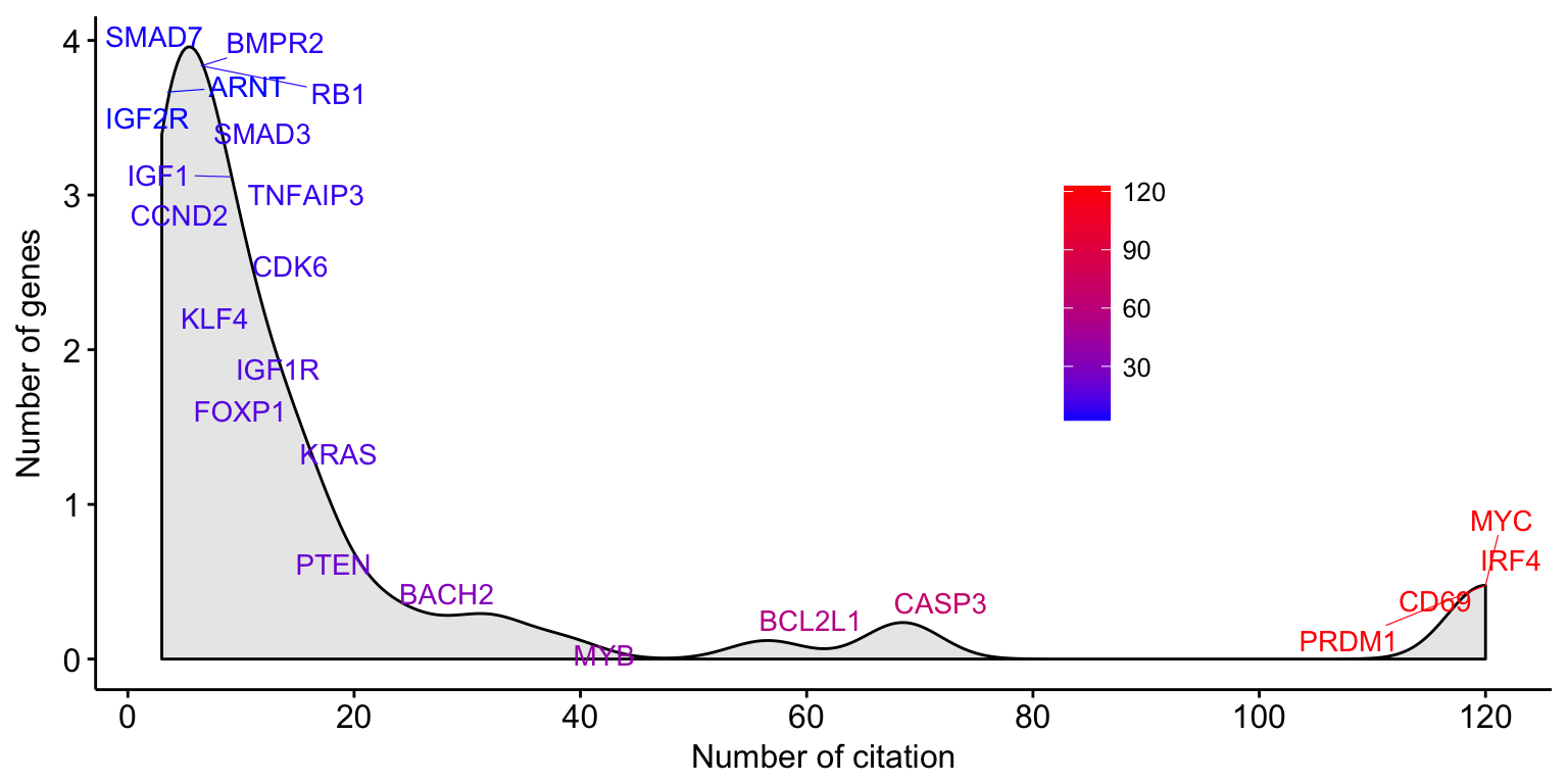
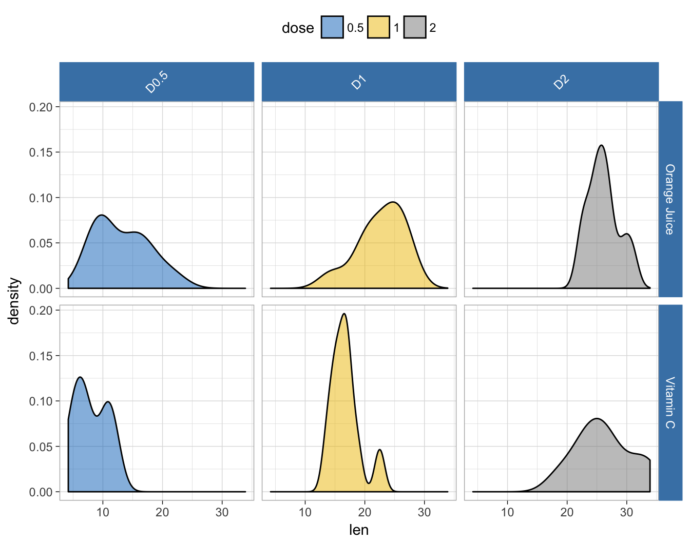
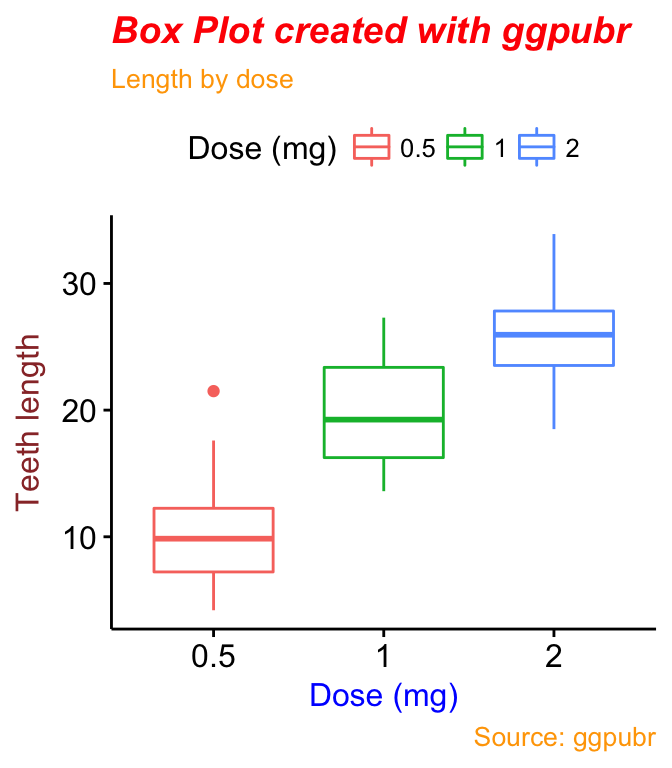
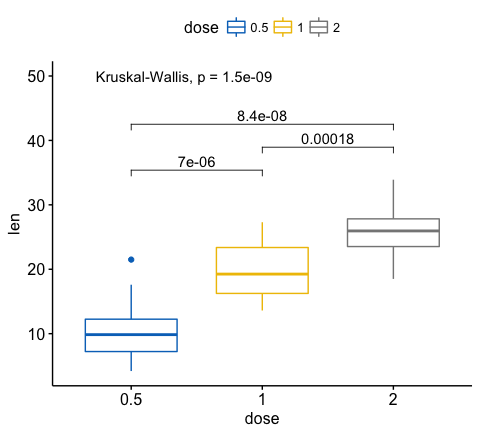
Add Text Labels to Histogram and Density Plots

The ggpubr R package facilitates the creation of beautiful ggplot2-based graphs for researcher with non-advanced programming backgrounds.
The current material starts by presenting a collection of articles for simply creating and customizing publication-ready plots using ggpubr. Next, some examples of plots created with ggpubr are shown.
ggpubr Key features:
Official online documentation: http://www.sthda.com/english/rpkgs/ggpubr.

install.packages("ggpubr")# Install
if(!require(devtools)) install.packages("devtools")
devtools::install_github("kassambara/ggpubr")library("ggpubr")library(ggpubr)
# Create some data format
# :::::::::::::::::::::::::::::::::::::::::::::::::::
set.seed(1234)
wdata = data.frame(
sex = factor(rep(c("F", "M"), each=200)),
weight = c(rnorm(200, 55), rnorm(200, 58)))
head(wdata, 4)## sex weight
## 1 F 53.8
## 2 F 55.3
## 3 F 56.1
## 4 F 52.7# Density plot with mean lines and marginal rug
# :::::::::::::::::::::::::::::::::::::::::::::::::::
# Change outline and fill colors by groups ("sex")
# Use custom palette
ggdensity(wdata, x = "weight",
add = "mean", rug = TRUE,
color = "sex", fill = "sex",
palette = c("#00AFBB", "#E7B800"))
# Histogram plot with mean lines and marginal rug
# :::::::::::::::::::::::::::::::::::::::::::::::::::
# Change outline and fill colors by groups ("sex")
# Use custom color palette
gghistogram(wdata, x = "weight",
   add = "mean", rug = TRUE,
   color = "sex", fill = "sex",
   palette = c("#00AFBB", "#E7B800"))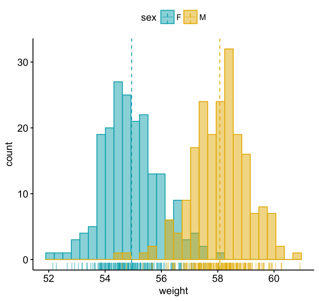
# Load data
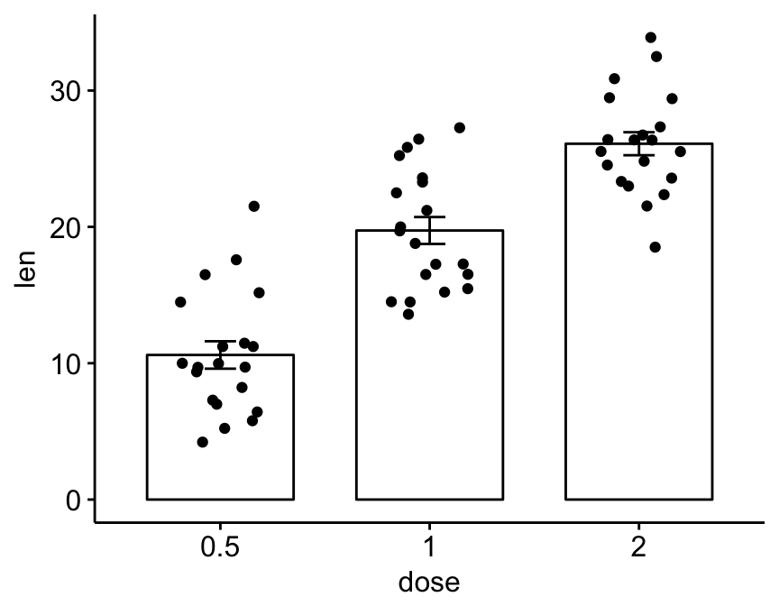
data("ToothGrowth")
df <- ToothGrowth
head(df, 4)
## len supp dose
## 1 4.2 VC 0.5
## 2 11.5 VC 0.5
## 3 7.3 VC 0.5
## 4 5.8 VC 0.5# Box plots with jittered points
# :::::::::::::::::::::::::::::::::::::::::::::::::::
# Change outline colors by groups: dose
# Use custom color palette
# Add jitter points and change the shape by groups
p <- ggboxplot(df, x = "dose", y = "len",
color = "dose", palette =c("#00AFBB", "#E7B800", "#FC4E07"),
add = "jitter", shape = "dose")
p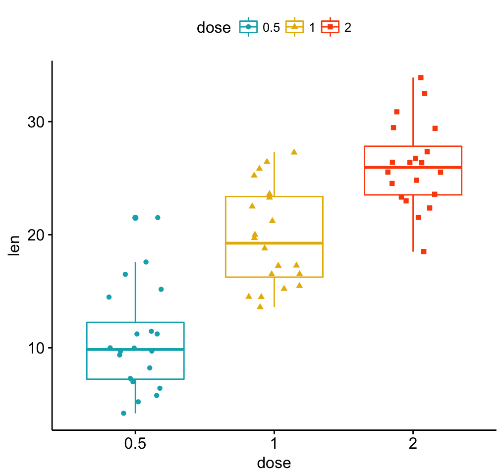
 # Add p-values comparing groups
 # Specify the comparisons you want
my_comparisons <- list( c("0.5", "1"), c("1", "2"), c("0.5", "2") )
p + stat_compare_means(comparisons = my_comparisons)+ # Add pairwise comparisons p-value
  stat_compare_means(label.y = 50)                   # Add global p-value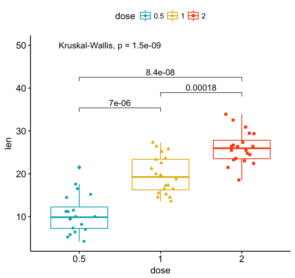
# Violin plots with box plots inside
# :::::::::::::::::::::::::::::::::::::::::::::::::::
# Change fill color by groups: dose
# add boxplot with white fill color
ggviolin(df, x = "dose", y = "len", fill = "dose",
         palette = c("#00AFBB", "#E7B800", "#FC4E07"),
         add = "boxplot", add.params = list(fill = "white"))+
  stat_compare_means(comparisons = my_comparisons, label = "p.signif")+ # Add significance levels
stat_compare_means(label.y = 50) # Add global the p-value 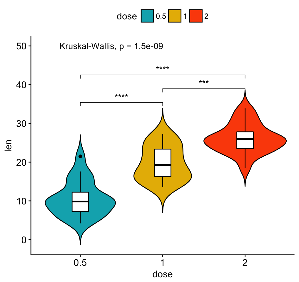
Load and prepare data:
# Load data
data("mtcars")
dfm <- mtcars
# Convert the cyl variable to a factor
dfm$cyl <- as.factor(dfm$cyl)
# Add the name colums
dfm$name <- rownames(dfm)
# Inspect the data
head(dfm[, c("name", "wt", "mpg", "cyl")])
## name wt mpg cyl
## Mazda RX4 Mazda RX4 2.62 21.0 6
## Mazda RX4 Wag Mazda RX4 Wag 2.88 21.0 6
## Datsun 710 Datsun 710 2.32 22.8 4
## Hornet 4 Drive Hornet 4 Drive 3.21 21.4 6
## Hornet Sportabout Hornet Sportabout 3.44 18.7 8
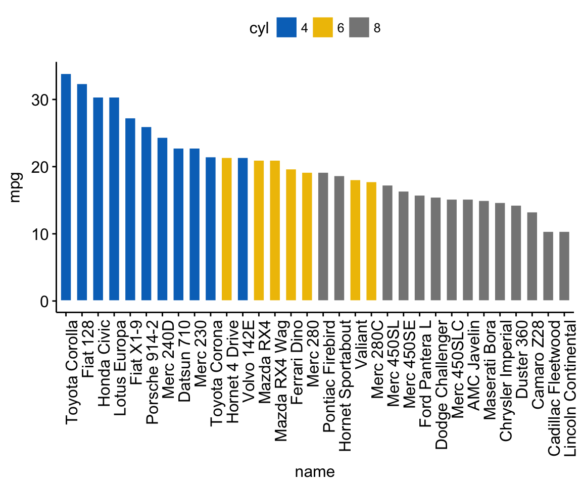
## Valiant Valiant 3.46 18.1 6Change the fill color by the grouping variable “cyl”. Sorting will be done globally, but not by groups.
ggbarplot(dfm, x = "name", y = "mpg",
          fill = "cyl",               # change fill color by cyl
          color = "white",            # Set bar border colors to white
          palette = "jco",            # jco journal color palett. see ?ggpar
          sort.val = "desc",          # Sort the value in dscending order
          sort.by.groups = FALSE,     # Don't sort inside each group
          x.text.angle = 90           # Rotate vertically x axis texts
          )
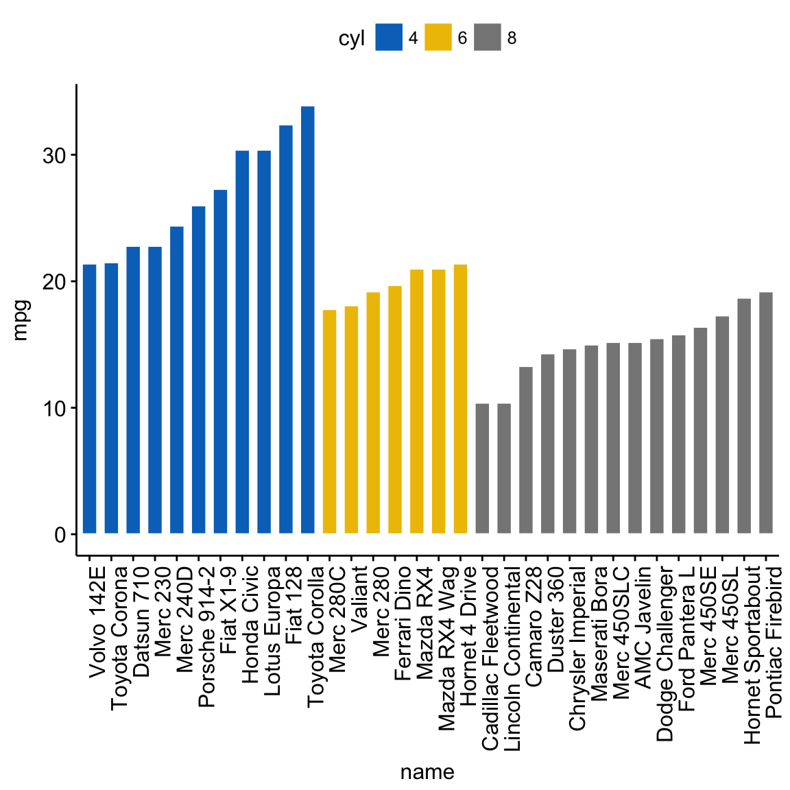
Sort bars inside each group. Use the argument sort.by.groups = TRUE.
ggbarplot(dfm, x = "name", y = "mpg",
          fill = "cyl",               # change fill color by cyl
          color = "white",            # Set bar border colors to white
          palette = "jco",            # jco journal color palett. see ?ggpar
          sort.val = "asc",           # Sort the value in dscending order
          sort.by.groups = TRUE,      # Sort inside each group
          x.text.angle = 90           # Rotate vertically x axis texts
          )
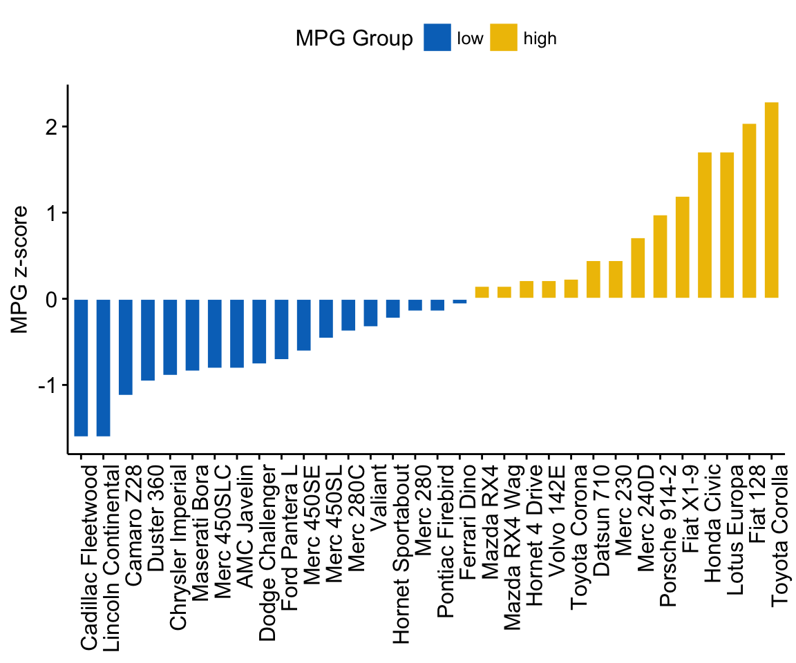
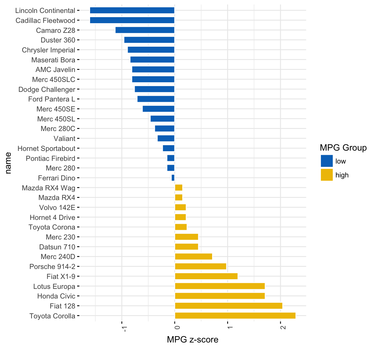
The deviation graph shows the deviation of quantitative values to a reference value. In the R code below, we’ll plot the mpg z-score from the mtcars dataset.
Calculate the z-score of the mpg data:
# Calculate the z-score of the mpg data
dfm$mpg_z <- (dfm$mpg -mean(dfm$mpg))/sd(dfm$mpg)
dfm$mpg_grp <- factor(ifelse(dfm$mpg_z < 0, "low", "high"),
                     levels = c("low", "high"))
# Inspect the data
head(dfm[, c("name", "wt", "mpg", "mpg_z", "mpg_grp", "cyl")])
## name wt mpg mpg_z mpg_grp cyl
## Mazda RX4 Mazda RX4 2.62 21.0 0.151 high 6
## Mazda RX4 Wag Mazda RX4 Wag 2.88 21.0 0.151 high 6
## Datsun 710 Datsun 710 2.32 22.8 0.450 high 4
## Hornet 4 Drive Hornet 4 Drive 3.21 21.4 0.217 high 6
## Hornet Sportabout Hornet Sportabout 3.44 18.7 -0.231 low 8
## Valiant Valiant 3.46 18.1 -0.330 low 6Create an ordered bar plot, colored according to the level of mpg:
ggbarplot(dfm, x = "name", y = "mpg_z",
          fill = "mpg_grp",           # change fill color by mpg_level
          color = "white",            # Set bar border colors to white
          palette = "jco",            # jco journal color palett. see ?ggpar
          sort.val = "asc",           # Sort the value in ascending order
          sort.by.groups = FALSE,     # Don't sort inside each group
          x.text.angle = 90,          # Rotate vertically x axis texts
          ylab = "MPG z-score",
          xlab = FALSE,
          legend.title = "MPG Group"
          )
Rotate the plot: use rotate = TRUE and sort.val = “desc”
ggbarplot(dfm, x = "name", y = "mpg_z",
          fill = "mpg_grp",           # change fill color by mpg_level
          color = "white",            # Set bar border colors to white
          palette = "jco",            # jco journal color palett. see ?ggpar
          sort.val = "desc",          # Sort the value in descending order
          sort.by.groups = FALSE,     # Don't sort inside each group
          x.text.angle = 90,          # Rotate vertically x axis texts
          ylab = "MPG z-score",
          legend.title = "MPG Group",
          rotate = TRUE,
          ggtheme = theme_minimal()
          )
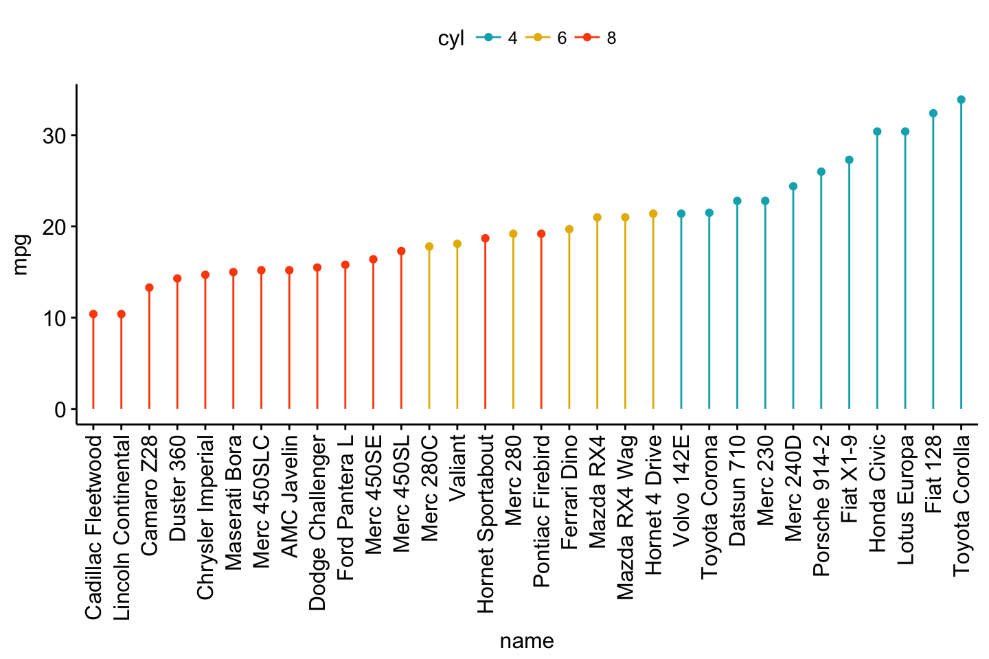
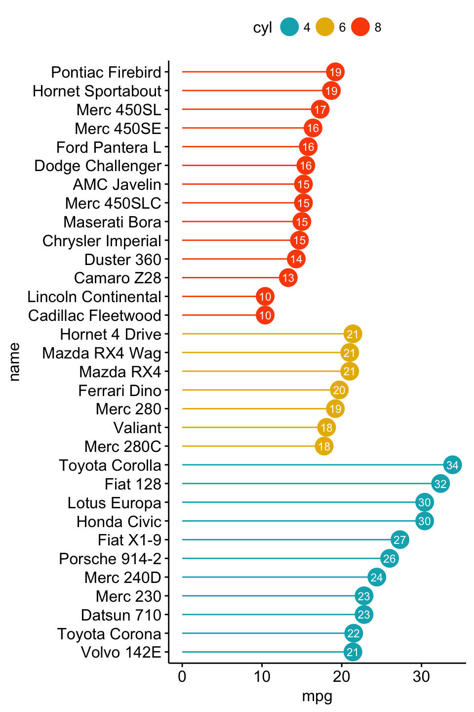
Lollipop chart is an alternative to bar plots, when you have a large set of values to visualize.
Lollipop chart colored by the grouping variable “cyl”:
ggdotchart(dfm, x = "name", y = "mpg",
           color = "cyl",                                # Color by groups
           palette = c("#00AFBB", "#E7B800", "#FC4E07"), # Custom color palette
           sorting = "ascending",                        # Sort value in descending order
           add = "segments",                             # Add segments from y = 0 to dots
           ggtheme = theme_pubr()                        # ggplot2 theme
           )
ggdotchart(dfm, x = "name", y = "mpg",
           color = "cyl",                                # Color by groups
           palette = c("#00AFBB", "#E7B800", "#FC4E07"), # Custom color palette
           sorting = "descending",                       # Sort value in descending order
           add = "segments",                             # Add segments from y = 0 to dots
           rotate = TRUE,                                # Rotate vertically
           group = "cyl",                                # Order by groups
           dot.size = 6,                                 # Large dot size
           label = round(dfm$mpg),                        # Add mpg values as dot labels
           font.label = list(color = "white", size = 9,
                             vjust = 0.5),               # Adjust label parameters
           ggtheme = theme_pubr()                        # ggplot2 theme
           )
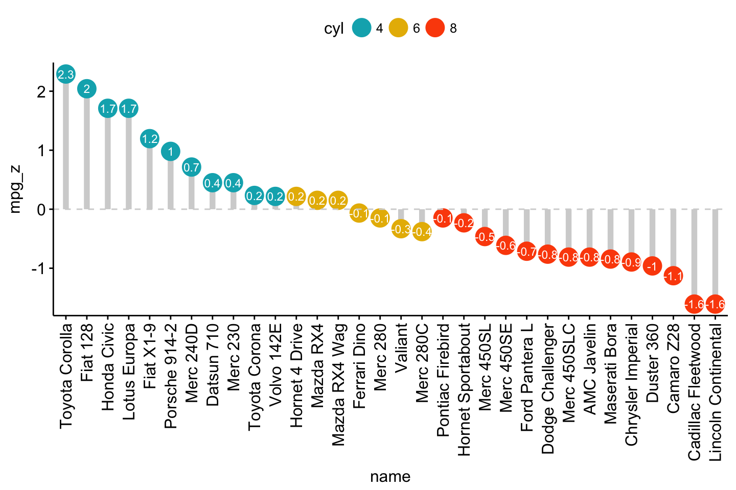
Deviation graph:
ggdotchart(dfm, x = "name", y = "mpg_z",
           color = "cyl",                                # Color by groups
           palette = c("#00AFBB", "#E7B800", "#FC4E07"), # Custom color palette
           sorting = "descending",                       # Sort value in descending order
           add = "segments",                             # Add segments from y = 0 to dots
           add.params = list(color = "lightgray", size = 2), # Change segment color and size
           group = "cyl",                                # Order by groups
           dot.size = 6,                                 # Large dot size
           label = round(dfm$mpg_z,1),                        # Add mpg values as dot labels
           font.label = list(color = "white", size = 9,
                             vjust = 0.5),               # Adjust label parameters
           ggtheme = theme_pubr()                        # ggplot2 theme
           )+
  geom_hline(yintercept = 0, linetype = 2, color = "lightgray")
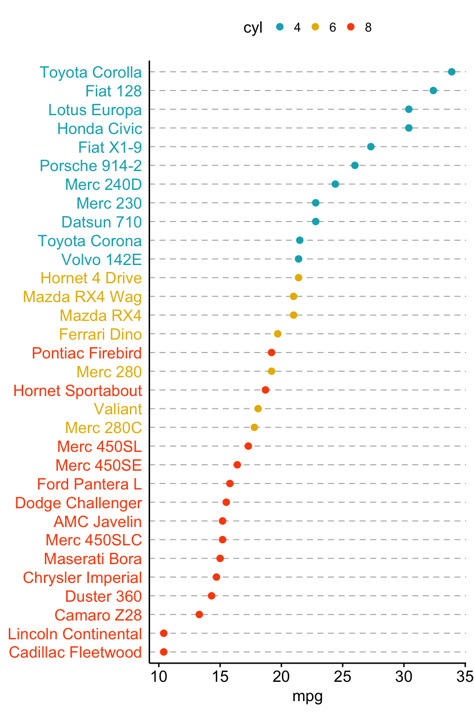
Color y text by groups. Use y.text.col = TRUE.
ggdotchart(dfm, x = "name", y = "mpg",
           color = "cyl",                                # Color by groups
           palette = c("#00AFBB", "#E7B800", "#FC4E07"), # Custom color palette
           sorting = "descending",                       # Sort value in descending order
           rotate = TRUE,                                # Rotate vertically
           dot.size = 2,                                 # Large dot size
           y.text.col = TRUE,                            # Color y text by groups
           ggtheme = theme_pubr()                        # ggplot2 theme
           )+
  theme_cleveland()                                      # Add dashed grids