


Data Visualization
Previously, we described the essentials of R programming and provided quick start guides for importing data into R.
This chapter describes how to plot data in R and make elegant data visualization.
How this chapter is organized?
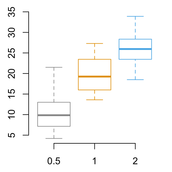
Lattice Graphs
Lattice package is a powerful and elegant data visualization system that aims to improve on base R graphs.
- xyplot(): Scatter plot
- cloud(): 3D scatter plot
- Box plot, Dot plot, Strip plot
- Density plot and Histogram
Read more: —> Lattice Graphs.
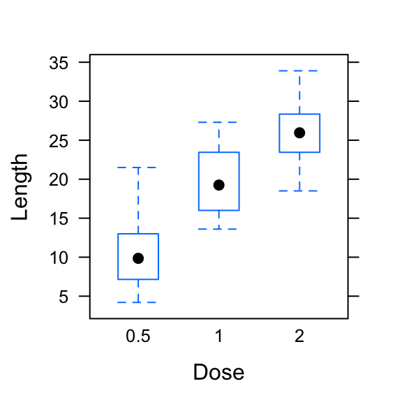
Ggplot2
ggplot2 is a powerful and a flexible R package, implemented by Hadley Wickham, for producing elegant graphics.
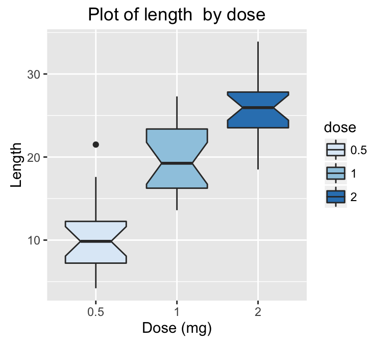
- ggplots
- ggplot2 Graphical Parameters
- Main title, axis labels and legend title
- Legend position and appearance
- Change colors automatically and manually
- Point shapes, colors and size
- Add text annotations to a graph
- Line types
- Themes and background colors
- Axis scales and transformations
- Axis ticks: customize tick marks and labels, reorder and select items
- Add straight lines to a plot: horizontal, vertical and regression lines
- Rotate a plot: flip and reverse
- Faceting: split a plot into a matrix of panels
- Cheat Sheets
Read more: —> ggplot2 essentials.
3D Graphics
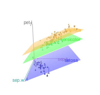
3d scatter plot rgl
- Static 3D Scatter Plots
- Interactive 3D Graphs
Read more: —> 3D Graphics.
Infos
This analysis has been performed using R statistical software (ver. 3.2.4).
Enjoyed this article? I’d be very grateful if you’d help it spread by emailing it to a friend, or sharing it on Twitter, Facebook or Linked In.
Show me some love with the like buttons below... Thank you and please don't forget to share and comment below!!
Show me some love with the like buttons below... Thank you and please don't forget to share and comment below!!
Avez vous aimé cet article? Je vous serais très reconnaissant si vous aidiez à sa diffusion en l'envoyant par courriel à un ami ou en le partageant sur Twitter, Facebook ou Linked In.
Montrez-moi un peu d'amour avec les like ci-dessous ... Merci et n'oubliez pas, s'il vous plaît, de partager et de commenter ci-dessous!
Montrez-moi un peu d'amour avec les like ci-dessous ... Merci et n'oubliez pas, s'il vous plaît, de partager et de commenter ci-dessous!
Recommended for You!


Recommended for you
This section contains the best data science and self-development resources to help you on your path.
Books - Data Science
Our Books
- Practical Guide to Cluster Analysis in R by A. Kassambara (Datanovia)
- Practical Guide To Principal Component Methods in R by A. Kassambara (Datanovia)
- Machine Learning Essentials: Practical Guide in R by A. Kassambara (Datanovia)
- R Graphics Essentials for Great Data Visualization by A. Kassambara (Datanovia)
- GGPlot2 Essentials for Great Data Visualization in R by A. Kassambara (Datanovia)
- Network Analysis and Visualization in R by A. Kassambara (Datanovia)
- Practical Statistics in R for Comparing Groups: Numerical Variables by A. Kassambara (Datanovia)
- Inter-Rater Reliability Essentials: Practical Guide in R by A. Kassambara (Datanovia)
Others
- R for Data Science: Import, Tidy, Transform, Visualize, and Model Data by Hadley Wickham & Garrett Grolemund
- Hands-On Machine Learning with Scikit-Learn, Keras, and TensorFlow: Concepts, Tools, and Techniques to Build Intelligent Systems by Aurelien Géron
- Practical Statistics for Data Scientists: 50 Essential Concepts by Peter Bruce & Andrew Bruce
- Hands-On Programming with R: Write Your Own Functions And Simulations by Garrett Grolemund & Hadley Wickham
- An Introduction to Statistical Learning: with Applications in R by Gareth James et al.
- Deep Learning with R by François Chollet & J.J. Allaire
- Deep Learning with Python by François Chollet
Get involved :
Click to follow us on Facebook :
Comment this article by clicking on "Discussion" button (top-right position of this page)
Click to follow us on Facebook :
Comment this article by clicking on "Discussion" button (top-right position of this page)
Categories contained by this category :
3D graphics
ggplot2 - Essentials
R Base Graphs
Articles contained by this category :
Lattice Graphs
The Elements of Choosing Colors for Great Data Visualization in R