


Plot Multivariate Continuous Data
When you have a bivariate data, you can easily visualize the relationship between the two variables by plotting a simple scatter plot.
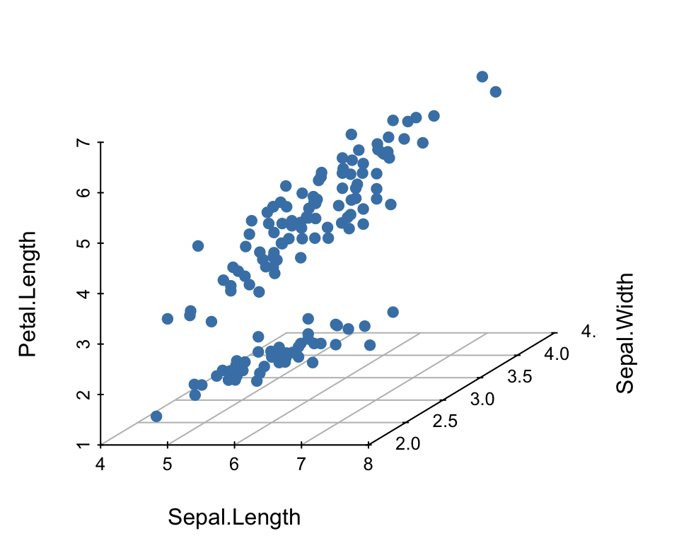
For a data set containing three continuous variables, you can create a 3d scatter plot.
For a small data set with more than three variables, it’s possible to visualize the relationship between each pairs of variables by creating a scatter plot matrix. You can also compute a correlation analysis between each pairs of variables.
For a large multivariate data set, it is more difficult to visualize their relationships. Discovering knowledge from these data requires specific statistical techniques. Multivariate analysis (MVA) refers to a set of approaches used for analyzing a data set containing multiple variables.
Among these techniques, there are:
- Cluster analysis for identifying groups of observations with similar profile according to a specific criteria.
- Principal component methods, which consist of summarizing and visualizing the most important information contained in a multivariate data set.
In this chapter we provide an overview of methods for visualizing multivariate data sets containing only continuous variables.
Contents:

Demo data set and R package
library("magrittr") # for piping %>%
head(iris, 3)
## Sepal.Length Sepal.Width Petal.Length Petal.Width Species
## 1 5.1 3.5 1.4 0.2 setosa
## 2 4.9 3.0 1.4 0.2 setosa
## 3 4.7 3.2 1.3 0.2 setosaCreate a 3d scatter plot
You can create a 3d scatter plot using the R package scatterplot3d (Ligges, Maechler, and Schnackenberg 2017), which contains a function of the same name.
Install:
install.packages("scatterplot3d")Create a basic 3d scatter plot:
library(scatterplot3d)
scatterplot3d(
  iris[,1:3], pch = 19, color = "steelblue",
   grid = TRUE, box = FALSE,
   mar = c(3, 3, 0.5, 3)
  )
- See more examples at: https://www.sthda.com/english/wiki/3d-graphics
Create a scatter plot matrix
To create a scatter plot of each possible pairs of variables, you can use the function ggpairs() [in GGally package, an extension of ggplot2](Schloerke et al. 2016) . It produces a pairwise comparison of multivariate data.
Install:
install.packages("GGally")- Create a simple scatter plot matrix. The plot contains the:
- Scatter plot and the correlation coefficient between each pair of variables
- Density distribution of each variable
library(GGally)
library(ggplot2)
ggpairs(iris[,-5])+ theme_bw()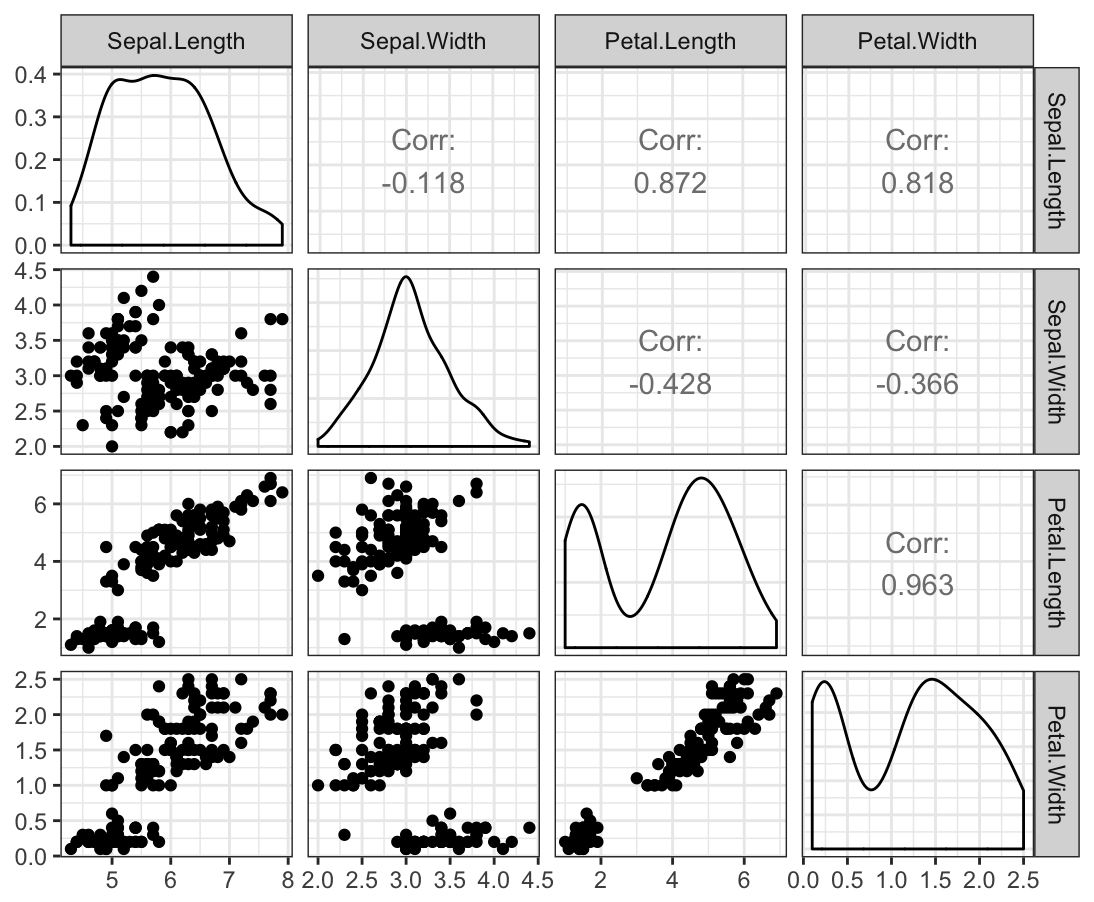
- Create a scatter plot matrix by groups. The plot contains the :
- Scatter plot and the correlation coefficient, between each pair of variables, colored by groups
- Density distribution and the box plot, of each continuous variable, colored by groups
p <- ggpairs(iris, aes(color = Species))+ theme_bw()
# Change color manually.
# Loop through each plot changing relevant scales
for(i in 1:p$nrow) {
  for(j in 1:p$ncol){
    p[i,j] <- p[i,j] +
        scale_fill_manual(values=c("#00AFBB", "#E7B800", "#FC4E07")) +
        scale_color_manual(values=c("#00AFBB", "#E7B800", "#FC4E07"))
  }
}
p
An alternative to the function ggpairs() is provided by the R base plot function chart.Correlation() [in PerformanceAnalytics packages]. It displays the correlation coefficient and the significance levels as stars.
For example, type the following R code, after installing the PerformanceAnalytics package:
# install.packages("PerformanceAnalytics")
library("PerformanceAnalytics")
my_data <- mtcars[, c(1,3,4,5,6,7)]
chart.Correlation(my_data, histogram=TRUE, pch=19)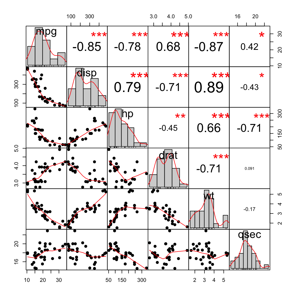
Correlation analysis
Recall that, correlation analysis is used to investigate the association between two or more variables. Read more at: Correlation analyses in R.
- Compute correlation matrix between pairs of variables using the R base function
cor() - Visualize the output. Two possibilities:
- Use the function
ggcorrplot()[in ggcorplot package]. Extension to the ggplot2 system. See more examples at: https://www.sthda.com/english/wiki/ggcorrplot-visualization-of-a-correlation-matrix-using-ggplot2. - Use the function
corrplot()[in corrplot package]. R base plotting system. See examples at: https://www.sthda.com/english/wiki/visualize-correlation-matrix-using-correlogram.
- Use the function
Here, we’ll present only the ggcorrplot package (Kassambara 2016), which can be installed as follow: install.packages("ggcorrplot").
library("ggcorrplot")
# Compute a correlation matrix
my_data <- mtcars[, c(1,3,4,5,6,7)]
corr <- round(cor(my_data), 1)
# Visualize
ggcorrplot(corr, p.mat = cor_pmat(my_data),
           hc.order = TRUE, type = "lower",
           color = c("#FC4E07", "white", "#00AFBB"),
           outline.col = "white", lab = TRUE)
In the plot above:
- Positive correlations are shown in blue and negative correlation in red
- Variables that are associated are grouped together.
- Non-significant correlation are marked by a cross (X)
Principal component analysis
Principal component analysis (PCA) is a multivariate data analysis approach that allows us to summarize and visualize the most important information contained in a multivariate data set.
PCA reduces the data into few new dimensions (or axes), which are a linear combination of the original variables. You can visualize a multivariate data by drawing a scatter plot of the first two dimensions, which contain the most important information in the data. Read more at: https://goo.gl/kabVHq
- Demo data set:
iris - Compute PCA using the R base function
prcomp() - Visualize the output using the
factoextraR package (an extension to ggplot2) (Kassambara and Mundt 2017)
library("factoextra")
my_data <- iris[, -5] # Remove the grouping variable
res.pca <- prcomp(my_data, scale = TRUE)
fviz_pca_biplot(res.pca, col.ind = iris$Species,
                palette = "jco", geom = "point")
In the plot above:
- Dimension (Dim.) 1 and 2 retained about 96% (73% + 22.9%) of the total information contained in the data set.
- Individuals with a similar profile are grouped together
- Variables that are positively correlated are on the same side of the plots. Variables that are negatively correlated are on the opposite side of the plots.
Cluster analysis
Cluster analysis is one of the important data mining methods for discovering knowledge in multidimensional data. The goal of clustering is to identify pattern or groups of similar objects within a data set of interest. Read more at: https://www.sthda.com/english/articles/25-cluster-analysis-in-r-practical-guide/.
This section describes how to compute and visualize hierarchical clustering, which output is a tree called dendrogram showing groups of similar individuals.
- Computation. R function:
hclust(). It takes a dissimilarity matrix as an input, which is calculated using the functiondist(). - Visualization:
fviz_dend()[in factoextra] - Demo data sets:
USArrests
Before cluster analysis, it’s recommended to scale (or normalize) the data, to make the variables comparable. R function: scale(), applies scaling on the column of the data (variables).
library(factoextra)
USArrests %>%
  scale() %>%                           # Scale the data
  dist() %>%                            # Compute distance matrix
  hclust(method = "ward.D2") %>%        # Hierarchical clustering
  fviz_dend(cex = 0.5, k = 4, palette = "jco") # Visualize and cut
                                              # into 4 groups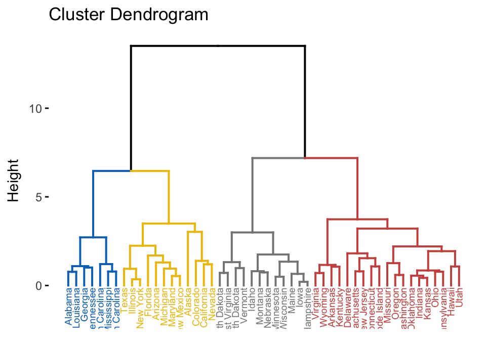
A heatmap is another way to visualize hierarchical clustering. It’s also called a false colored image, where data values are transformed to color scale. Heat maps allow us to simultaneously visualize groups of samples and features. You can easily create a pretty heatmap using the R package pheatmap.
In heatmap, generally, columns are samples and rows are variables. Therefore we start by scaling and then transpose the data before creating the heatmap.
library(pheatmap)
USArrests %>%
  scale() %>%                  # Scale variables
  t() %>%                      # Transpose
  pheatmap(cutree_cols = 4)    # Create the heatmap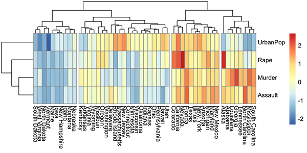
Conclusion
For a multivariate continuous data, you can perform the following analysis or visualization depending on the complexity of your data:
- 3D scatter plot : scatterplot3d() [scatterplot3d]
- Create a scatter plot matrix: ggpairs [GGally]
- Correlation matrix analysis and visualization: cor()[stats] and ggcorrplot() [ggcorrplot] for the visualization.
- Principal component analysis: prcomp() [stats] and fviz_pca() [factoextra]
- Cluster analysis: hclust() [stats] and fviz_dend() [factoextra]
References
Kassambara, Alboukadel. 2016. Ggcorrplot: Visualization of a Correlation Matrix Using ’Ggplot2’. https://www.sthda.com/english/wiki/ggcorrplot.
Kassambara, Alboukadel, and Fabian Mundt. 2017. Factoextra: Extract and Visualize the Results of Multivariate Data Analyses. https://www.sthda.com/english/rpkgs/factoextra.
Ligges, Uwe, Martin Maechler, and Sarah Schnackenberg. 2017. Scatterplot3d: 3D Scatter Plot. https://CRAN.R-project.org/package=scatterplot3d.
Schloerke, Barret, Jason Crowley, Di Cook, Francois Briatte, Moritz Marbach, Edwin Thoen, Amos Elberg, and Joseph Larmarange. 2016. GGally: Extension to ’Ggplot2’. https://CRAN.R-project.org/package=GGally.