ggcorrplot: Visualization of a correlation matrix using ggplot2
The easiest way to visualize a correlation matrix in R is to use the package corrplot.
In our previous article we also provided a quick-start guide for visualizing a correlation matrix using ggplot2.
Another solution is to use the function ggcorr() in ggally package. However, the ggally package doesn’t provide any option for reordering the correlation matrix or for displaying the significance level.
In this article, we’ll describe the R package ggcorrplot for displaying easily a correlation matrix using ‘ggplot2’.
ggcorrplot main features
It provides a solution for reordering the correlation matrix and displays the significance level on the correlogram. It includes also a function for computing a matrix of correlation p-values. It’s inspired from the package corrplot.
Installation and loading
ggcorrplot can be installed from CRAN as follow:
install.packages("ggcorrplot")Or, install the latest version from GitHub:
# Install
if(!require(devtools)) install.packages("devtools")
devtools::install_github("kassambara/ggcorrplot")
Loading:
library(ggcorrplot)Getting started
Compute a correlation matrix
The mtcars data set will be used in the following R code. The function cor_pmat() [in ggcorrplot] computes a matrix of correlation p-values.
# Compute a correlation matrix
data(mtcars)
corr <- round(cor(mtcars), 1)
head(corr[, 1:6])
## mpg cyl disp hp drat wt
## mpg 1.0 -0.9 -0.8 -0.8 0.7 -0.9
## cyl -0.9 1.0 0.9 0.8 -0.7 0.8
## disp -0.8 0.9 1.0 0.8 -0.7 0.9
## hp -0.8 0.8 0.8 1.0 -0.4 0.7
## drat 0.7 -0.7 -0.7 -0.4 1.0 -0.7
## wt -0.9 0.8 0.9 0.7 -0.7 1.0# Compute a matrix of correlation p-values
p.mat <- cor_pmat(mtcars)
head(p.mat[, 1:4])## mpg cyl disp hp
## mpg 0.000000e+00 6.112687e-10 9.380327e-10 1.787835e-07
## cyl 6.112687e-10 0.000000e+00 1.803002e-12 3.477861e-09
## disp 9.380327e-10 1.803002e-12 0.000000e+00 7.142679e-08
## hp 1.787835e-07 3.477861e-09 7.142679e-08 0.000000e+00
## drat 1.776240e-05 8.244636e-06 5.282022e-06 9.988772e-03
## wt 1.293959e-10 1.217567e-07 1.222311e-11 4.145827e-05Correlation matrix visualization
# Visualize the correlation matrix
# --------------------------------
# method = "square" (default)
ggcorrplot(corr)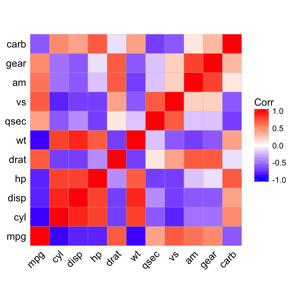
# method = "circle"
ggcorrplot(corr, method = "circle")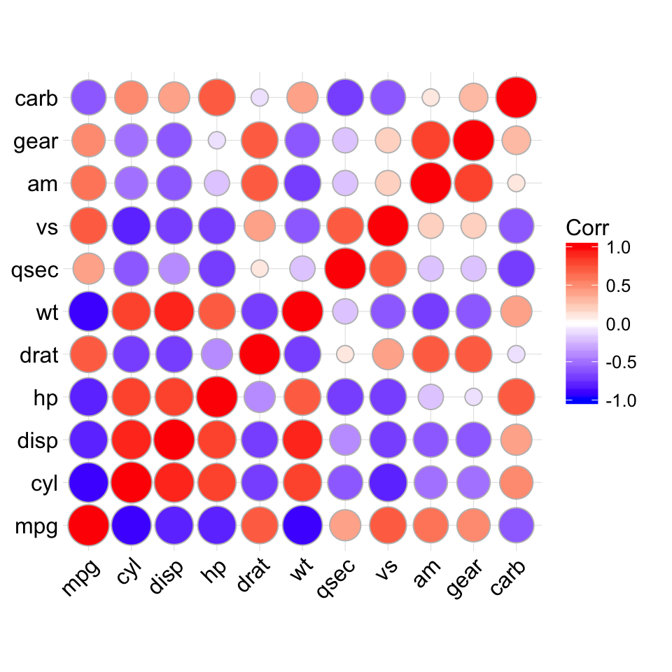
# Reordering the correlation matrix
# --------------------------------
# using hierarchical clustering
ggcorrplot(corr, hc.order = TRUE, outline.col = "white")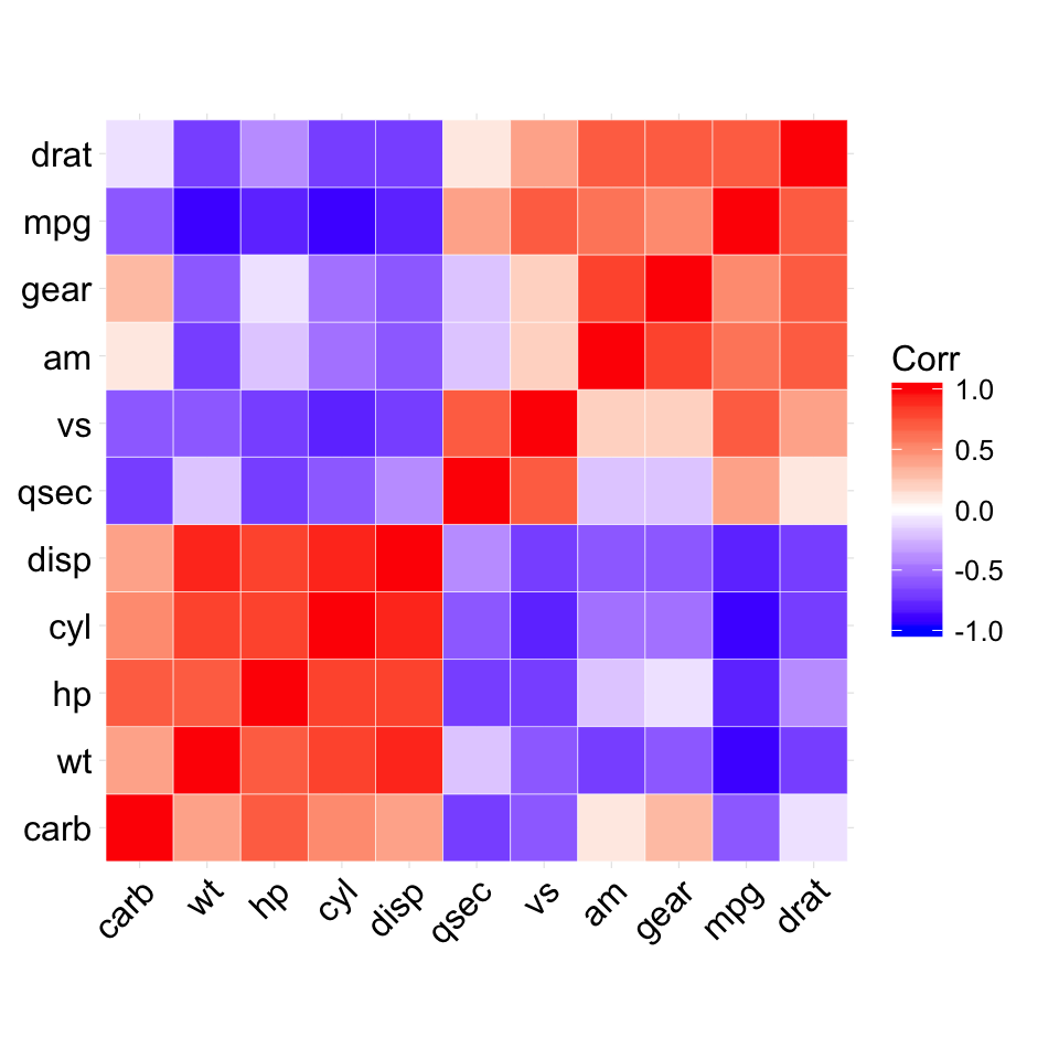
# Types of correlogram layout
# --------------------------------
# Get the lower triangle
ggcorrplot(corr, hc.order = TRUE, type = "lower",
     outline.col = "white")
# Get the upeper triangle
ggcorrplot(corr, hc.order = TRUE, type = "upper",
     outline.col = "white")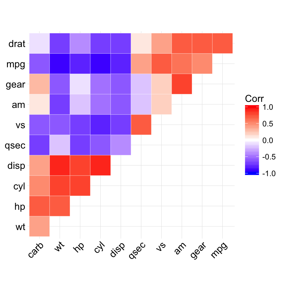
# Change colors and theme
# --------------------------------
# Argument colors
ggcorrplot(corr, hc.order = TRUE, type = "lower",
   outline.col = "white",
   ggtheme = ggplot2::theme_gray,
   colors = c("#6D9EC1", "white", "#E46726"))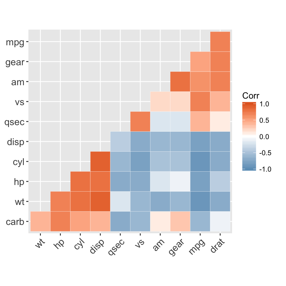
# Add correlation coefficients
# --------------------------------
# argument lab = TRUE
ggcorrplot(corr, hc.order = TRUE, type = "lower",
   lab = TRUE)
# Add correlation significance level
# --------------------------------
# Argument p.mat
# Barring the no significant coefficient
ggcorrplot(corr, hc.order = TRUE,
    type = "lower", p.mat = p.mat)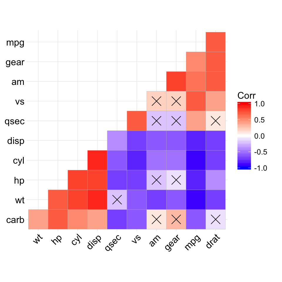
# Leave blank on no significant coefficient
ggcorrplot(corr, p.mat = p.mat, hc.order = TRUE,
    type = "lower", insig = "blank")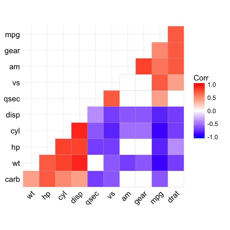
Show me some love with the like buttons below... Thank you and please don't forget to share and comment below!!
Montrez-moi un peu d'amour avec les like ci-dessous ... Merci et n'oubliez pas, s'il vous plaît, de partager et de commenter ci-dessous!
Recommended for You!
Recommended for you
This section contains the best data science and self-development resources to help you on your path.
Books - Data Science
Our Books
- Practical Guide to Cluster Analysis in R by A. Kassambara (Datanovia)
- Practical Guide To Principal Component Methods in R by A. Kassambara (Datanovia)
- Machine Learning Essentials: Practical Guide in R by A. Kassambara (Datanovia)
- R Graphics Essentials for Great Data Visualization by A. Kassambara (Datanovia)
- GGPlot2 Essentials for Great Data Visualization in R by A. Kassambara (Datanovia)
- Network Analysis and Visualization in R by A. Kassambara (Datanovia)
- Practical Statistics in R for Comparing Groups: Numerical Variables by A. Kassambara (Datanovia)
- Inter-Rater Reliability Essentials: Practical Guide in R by A. Kassambara (Datanovia)
Others
- R for Data Science: Import, Tidy, Transform, Visualize, and Model Data by Hadley Wickham & Garrett Grolemund
- Hands-On Machine Learning with Scikit-Learn, Keras, and TensorFlow: Concepts, Tools, and Techniques to Build Intelligent Systems by Aurelien Géron
- Practical Statistics for Data Scientists: 50 Essential Concepts by Peter Bruce & Andrew Bruce
- Hands-On Programming with R: Write Your Own Functions And Simulations by Garrett Grolemund & Hadley Wickham
- An Introduction to Statistical Learning: with Applications in R by Gareth James et al.
- Deep Learning with R by François Chollet & J.J. Allaire
- Deep Learning with Python by François Chollet
Click to follow us on Facebook :
Comment this article by clicking on "Discussion" button (top-right position of this page)


