Visualize correlation matrix using correlogram
- Introduction
- Install R corrplot package
- Data for correlation analysis
- Computing correlation matrix
- Correlogram : Visualizing the correlation matrix
- Conclusions
- Infos
Introduction
This article describes how to plot a correlogram in R. Correlogram is a graph of correlation matrix. It is very useful to highlight the most correlated variables in a data table. In this plot, correlation coefficients is colored according to the value. Correlation matrix can be also reordered according to the degree of association between variables. The R corrplot package is used here.
Install R corrplot package
corrplot package is required to execute the R code in this article.
install.packages("corrplot")Data for correlation analysis
The mtcars data is used to compute correlation matrix.
head(mtcars) mpg cyl disp hp drat wt qsec vs am gear carb
Mazda RX4 21.0 6 160 110 3.90 2.620 16.46 0 1 4 4
Mazda RX4 Wag 21.0 6 160 110 3.90 2.875 17.02 0 1 4 4
Datsun 710 22.8 4 108 93 3.85 2.320 18.61 1 1 4 1
Hornet 4 Drive 21.4 6 258 110 3.08 3.215 19.44 1 0 3 1
Hornet Sportabout 18.7 8 360 175 3.15 3.440 17.02 0 0 3 2
Valiant 18.1 6 225 105 2.76 3.460 20.22 1 0 3 1Computing correlation matrix
M<-cor(mtcars)
head(round(M,2))
mpg cyl disp hp drat wt qsec vs am gear carb
mpg 1.00 -0.85 -0.85 -0.78 0.68 -0.87 0.42 0.66 0.60 0.48 -0.55
cyl -0.85 1.00 0.90 0.83 -0.70 0.78 -0.59 -0.81 -0.52 -0.49 0.53
disp -0.85 0.90 1.00 0.79 -0.71 0.89 -0.43 -0.71 -0.59 -0.56 0.39
hp -0.78 0.83 0.79 1.00 -0.45 0.66 -0.71 -0.72 -0.24 -0.13 0.75
drat 0.68 -0.70 -0.71 -0.45 1.00 -0.71 0.09 0.44 0.71 0.70 -0.09
wt -0.87 0.78 0.89 0.66 -0.71 1.00 -0.17 -0.55 -0.69 -0.58 0.43Correlogram : Visualizing the correlation matrix
R corrplot function is used to plot the graph of the correlation matrix.
The simplified format of the function is :
corrplot(corr, method="circle")| Arguments | Description |
|---|---|
| corr | The correlation matrix to visualize. To visualize a general matrix, please use is.corr=FALSE. |
| method | The visualization method : “circle”, “color”, “number”, etc. |
Visualization methods
Seven different visualization methods can be used : “circle”, “square”, “ellipse”, “number”, “shade”, “color”, “pie”.
library(corrplot)
corrplot(M, method="circle")
corrplot(M, method="pie")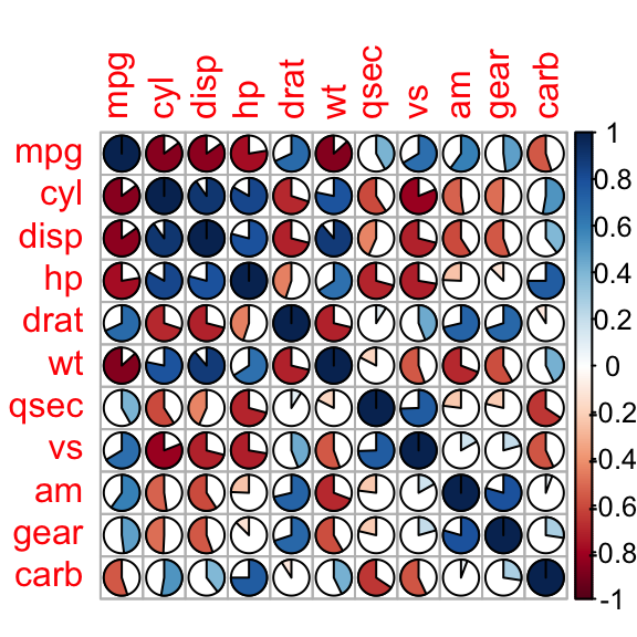
corrplot(M, method="color")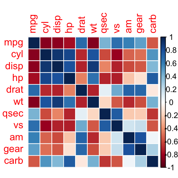
Positive correlations are displayed in blue and negative correlations in red color. Color intensity and the size of the circle are proportional to the correlation coefficients.
Display the correlation coefficient :
corrplot(M, method="number")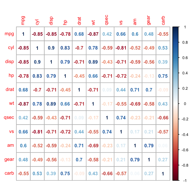
Types of correlogram layout
There are three types of layout :
- “full” (default) : display full correlation matrix
- “upper”: display upper triangular of the correlation matrix
- “lower”: display lower triangular of the correlation matrix
corrplot(M, type="upper")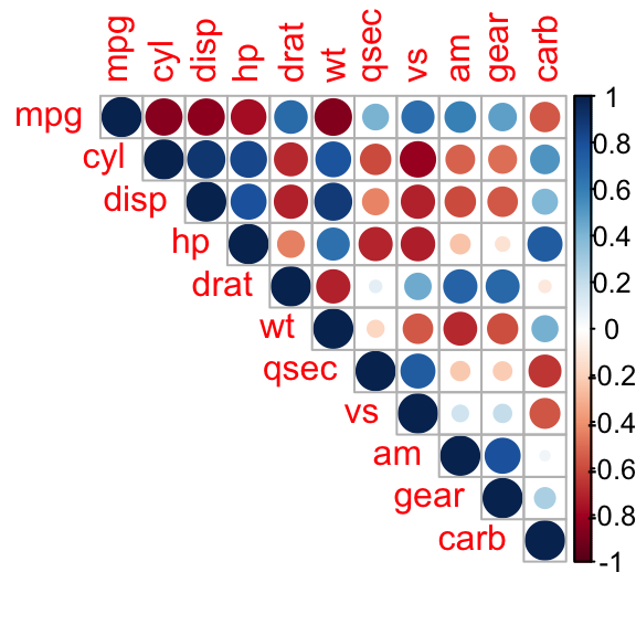
corrplot(M, type="lower")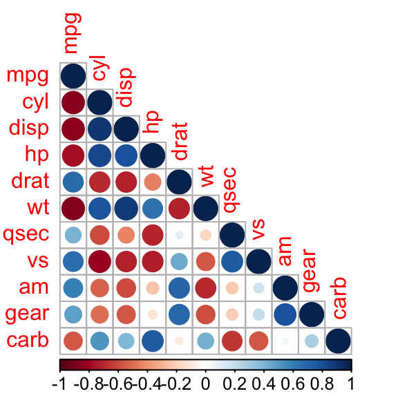
Reordering the correlation matrix
The correlation matrix can be reordered according to the correlation coefficient. This is important to identify the hidden structure and pattern in the matrix. “hclust” for hierarchical clustering order is used in the following examples.
# correlogram with hclust reordering
corrplot(M, type="upper", order="hclust")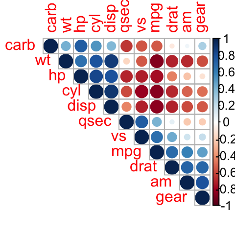
# Using different color spectrum
col<- colorRampPalette(c("red", "white", "blue"))(20)
corrplot(M, type="upper", order="hclust", col=col)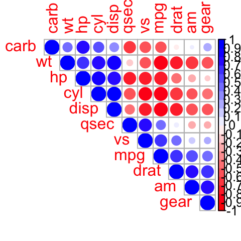
# Change background color to lightblue
corrplot(M, type="upper", order="hclust", col=c("black", "white"),
         bg="lightblue")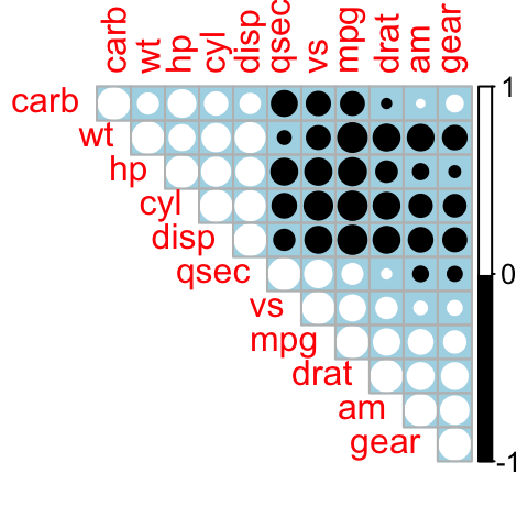
Changing the color of the correlogram
As shown in the above section, the color of the correlogram can be customized. RcolorBrewer palette of colors are used in the R script below :
library(RColorBrewer)
corrplot(M, type="upper", order="hclust",
         col=brewer.pal(n=8, name="RdBu"))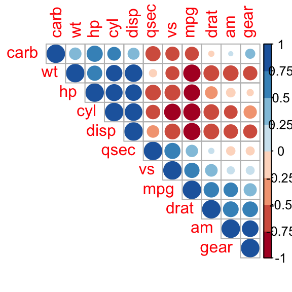
corrplot(M, type="upper", order="hclust",
         col=brewer.pal(n=8, name="RdYlBu"))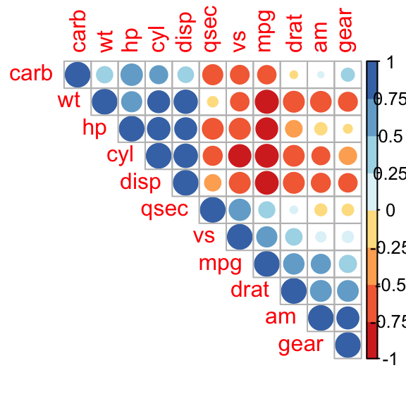
corrplot(M, type="upper", order="hclust",
         col=brewer.pal(n=8, name="PuOr"))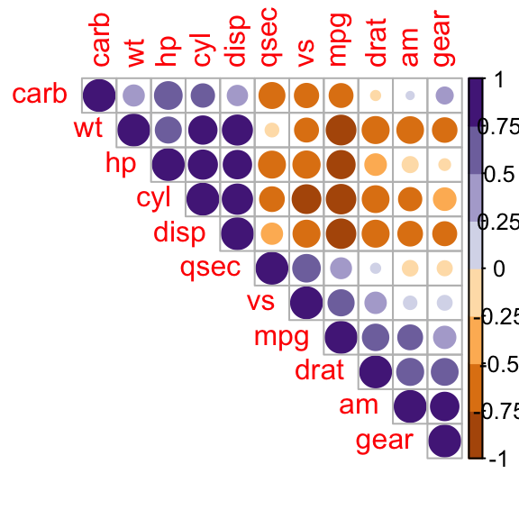
Changing the color and the rotation of text labels
tl.col (for text label color) and tl.srt (for text label string rotation) are used to change text colors and rotations.
corrplot(M, type="upper", order="hclust", tl.col="black", tl.srt=45)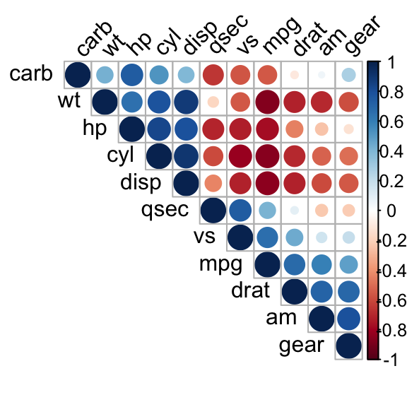
Combining correlogram with the significance test
Computing the p-value of correlations
To compute the matrix of p-value, a custom R function is used :
# mat : is a matrix of data
# ... : further arguments to pass to the native R cor.test function
cor.mtest <- function(mat, ...) {
    mat <- as.matrix(mat)
    n <- ncol(mat)
    p.mat<- matrix(NA, n, n)
    diag(p.mat) <- 0
    for (i in 1:(n - 1)) {
        for (j in (i + 1):n) {
            tmp <- cor.test(mat[, i], mat[, j], ...)
            p.mat[i, j] <- p.mat[j, i] <- tmp$p.value
        }
    }
  colnames(p.mat) <- rownames(p.mat) <- colnames(mat)
  p.mat
}
# matrix of the p-value of the correlation
p.mat <- cor.mtest(mtcars)
head(p.mat[, 1:5])
mpg cyl disp hp drat
mpg 0.000e+00 6.113e-10 9.380e-10 1.788e-07 1.776e-05
cyl 6.113e-10 0.000e+00 1.803e-12 3.478e-09 8.245e-06
disp 9.380e-10 1.803e-12 0.000e+00 7.143e-08 5.282e-06
hp 1.788e-07 3.478e-09 7.143e-08 0.000e+00 9.989e-03
drat 1.776e-05 8.245e-06 5.282e-06 9.989e-03 0.000e+00
wt 1.294e-10 1.218e-07 1.222e-11 4.146e-05 4.784e-06Add significance level to the correlogram
# Specialized the insignificant value according to the significant level
corrplot(M, type="upper", order="hclust",
         p.mat = p.mat, sig.level = 0.01)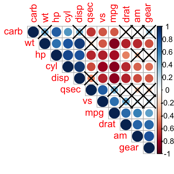
# Leave blank on no significant coefficient
corrplot(M, type="upper", order="hclust",
         p.mat = p.mat, sig.level = 0.01, insig = "blank")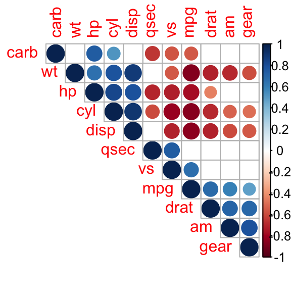
In the above figure, correlations with p-value > 0.01 are considered as insignificant. In this case the correlation coefficient values are leaved blank or crosses are added.
Customize the correlogram
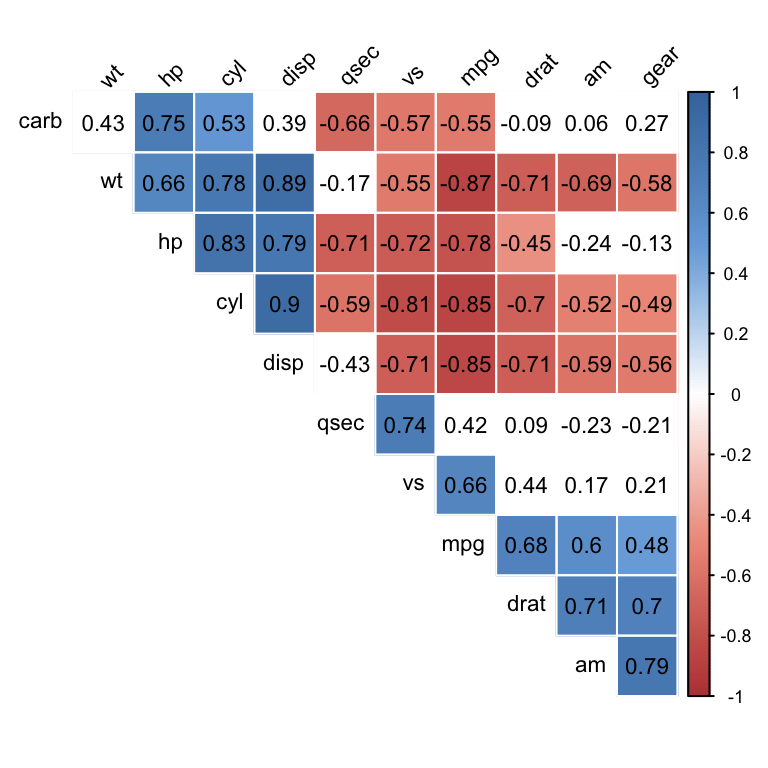
col <- colorRampPalette(c("#BB4444", "#EE9988", "#FFFFFF", "#77AADD", "#4477AA"))
corrplot(M, method="color", col=col(200),
         type="upper", order="hclust",
         addCoef.col = "black", # Add coefficient of correlation
         tl.col="black", tl.srt=45, #Text label color and rotation
         # Combine with significance
         p.mat = p.mat, sig.level = 0.01, insig = "blank",
         # hide correlation coefficient on the principal diagonal
         diag=FALSE
         )
Conclusions
Show me some love with the like buttons below... Thank you and please don't forget to share and comment below!!
Montrez-moi un peu d'amour avec les like ci-dessous ... Merci et n'oubliez pas, s'il vous plaît, de partager et de commenter ci-dessous!
Recommended for You!
Recommended for you
This section contains the best data science and self-development resources to help you on your path.
Books - Data Science
Our Books
- Practical Guide to Cluster Analysis in R by A. Kassambara (Datanovia)
- Practical Guide To Principal Component Methods in R by A. Kassambara (Datanovia)
- Machine Learning Essentials: Practical Guide in R by A. Kassambara (Datanovia)
- R Graphics Essentials for Great Data Visualization by A. Kassambara (Datanovia)
- GGPlot2 Essentials for Great Data Visualization in R by A. Kassambara (Datanovia)
- Network Analysis and Visualization in R by A. Kassambara (Datanovia)
- Practical Statistics in R for Comparing Groups: Numerical Variables by A. Kassambara (Datanovia)
- Inter-Rater Reliability Essentials: Practical Guide in R by A. Kassambara (Datanovia)
Others
- R for Data Science: Import, Tidy, Transform, Visualize, and Model Data by Hadley Wickham & Garrett Grolemund
- Hands-On Machine Learning with Scikit-Learn, Keras, and TensorFlow: Concepts, Tools, and Techniques to Build Intelligent Systems by Aurelien Géron
- Practical Statistics for Data Scientists: 50 Essential Concepts by Peter Bruce & Andrew Bruce
- Hands-On Programming with R: Write Your Own Functions And Simulations by Garrett Grolemund & Hadley Wickham
- An Introduction to Statistical Learning: with Applications in R by Gareth James et al.
- Deep Learning with R by François Chollet & J.J. Allaire
- Deep Learning with Python by François Chollet
Click to follow us on Facebook :
Comment this article by clicking on "Discussion" button (top-right position of this page)


