


FactoMineR and factoextra : Principal Component Analysis Visualization - R software and data mining
- Install and load FactoMineR package
- Install and load factoextra for visualization
- Prepare the data
- Exploratory data analysis
- Principal component analysis
- Graph of individus and variables
- Variables factor map : The correlation circle
- Graph of individuals
- Coordinates of individuals on the principal components
- Cos2 : quality of representation of individuals on the principal components
- Contribition of individuals to the princial components
- Graph of individuals using FactoMineR base graph
- Graph of individuals using factoextra
- Change the color of individuals by groups
- Principal component analysis using supplementary individuals and variables
- Dimension description
- Infos
Principal component analysis (PCA) allows us to summarize the variations (informations) in a data set described by multiple variables. Each variable could be considered as a different dimension. If you have more than 3 variables in your data sets, it could be very difficult to visualize a multi-dimensional hyperspace.
The goal of principal component analysis is to transform the initial variables into a new set of variables which explain the variation in the data. These new variables corresponds to a linear combination of the originals and are called principal components.
PCA reduces the dimensionality of multivariate data, to two or three that can be visualized graphically with minimal loss of information.
Several functions from different packages are available in R for performing PCA : prcomp and princomp (built-in R stats package), PCA (FactoMineR package), dudi.pca(ade4 package).
This R tutorial describes :
- How to perform a principal component analysis using R software and FactoMineR package
- How to visualize the output of the PCA using the R package factoextra
Install and load FactoMineR package
FactoMineR (Husson et al.) is one of the most powerful R packages and my favorite one for performing a multivariate exploratory data analysis. A rich documentation is available on the FactoMineR official website (http://factominer.free.fr/index.html) and on youtube. Many thanks to François Husson for this effort…
FactoMineR can be installed and loaded as follow :
install.packages("FactoMineR")
library("FactoMineR")
Install and load factoextra for visualization
The package factoextra has flexible methods for the classes PCA, prcomp, princomp and dudi in order to extract and visualize quickly the results of the analysis. The ggplot2 plotting system is used for the data visualization.
Install and load factoextra as follow :
library("devtools")
install_github("kassambara/factoextra")
Load it :
library("factoextra")Prepare the data
We’ll used the data sets decathlon2 from the package factoextra :
data(decathlon2)
head(decathlon2[, 1:6])
X100m Long.jump Shot.put High.jump X400m X110m.hurdle
SEBRLE 11.04 7.58 14.83 2.07 49.81 14.69
CLAY 10.76 7.40 14.26 1.86 49.37 14.05
BERNARD 11.02 7.23 14.25 1.92 48.93 14.99
YURKOV 11.34 7.09 15.19 2.10 50.42 15.31
ZSIVOCZKY 11.13 7.30 13.48 2.01 48.62 14.17
McMULLEN 10.83 7.31 13.76 2.13 49.91 14.38This data is just a subset of the decathlon data in FactoMineR package
As illustrated below, the data used here describes athletes’ performance during two sporting events (Desctar and OlympicG). It contains 27 individuals (athletes) described by 13 variables :
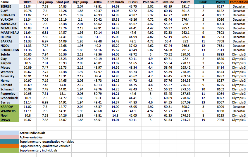
Only some of these individuals and variables will be used to perform the principal component analysis (PCA).
The coordinates of the remaining individuals and variables on the factor map will be predicted after the PCA.In PCA terminology, our data contains :
- Active individuals (in blue, rows 1:23) : Individuals that are used during the principal component analysis.
- Supplementary individuals (in green, rows 24:27) : The coordinates of these individuals will be predicted using the PCA informations and parameters obtained with active individuals/variables
- Active variables (in pink, columns 1:10) : Variables that are used for the principal component analysis.
- Supplementary variables : As supplementary individuals, the coordinates of these variables will be predicted also.
- Supplementary continuous variables : Columns 11 and 12 corresponding respectively to the rank and the points of athletes.
- Supplementary qualitative variables : Column 13 corresponding to the two athlete-tic meetings (2004 Olympic Game or 2004 Decastar). This factor variables will be used to color individuals by groups.
Extract only active individuals and variables for principal component analysis:
decathlon2.active <- decathlon2[1:23, 1:10]
head(decathlon2.active[, 1:6])
X100m Long.jump Shot.put High.jump X400m X110m.hurdle
SEBRLE 11.04 7.58 14.83 2.07 49.81 14.69
CLAY 10.76 7.40 14.26 1.86 49.37 14.05
BERNARD 11.02 7.23 14.25 1.92 48.93 14.99
YURKOV 11.34 7.09 15.19 2.10 50.42 15.31
ZSIVOCZKY 11.13 7.30 13.48 2.01 48.62 14.17
McMULLEN 10.83 7.31 13.76 2.13 49.91 14.38Exploratory data analysis
Before principal component analysis, we can perform some exploratory data analysis such as descriptive statistics, correlation matrix and scatter plot matrix.
Descriptive statistics
decathlon2.active_stats <- data.frame(
  Min = apply(decathlon2.active, 2, min), # minimum
  Q1 = apply(decathlon2.active, 2, quantile, 1/4), # First quartile
  Med = apply(decathlon2.active, 2, median), # median
  Mean = apply(decathlon2.active, 2, mean), # mean
  Q3 = apply(decathlon2.active, 2, quantile, 3/4), # Third quartile
  Max = apply(decathlon2.active, 2, max) # Maximum
  )
decathlon2.active_stats <- round(decathlon2.active_stats, 1)
head(decathlon2.active_stats)
Min Q1 Med Mean Q3 Max
X100m 10.4 10.8 11.0 11.0 11.2 11.6
Long.jump 6.8 7.2 7.3 7.3 7.5 8.0
Shot.put 12.7 14.2 14.7 14.6 15.1 16.4
High.jump 1.9 1.9 2.0 2.0 2.1 2.1
X400m 46.8 49.0 49.4 49.4 50.0 51.2
X110m.hurdle 14.0 14.2 14.4 14.5 14.9 15.7Note that, you can also use the built-in R function summary() for the descriptive statistics but I don’t like the format of the output on data frame.
Correlation matrix
The correlation between variables can be calculated as follow :
cor.mat <- round(cor(decathlon2.active),2)
head(cor.mat[, 1:6])
X100m Long.jump Shot.put High.jump X400m X110m.hurdle
X100m 1.00 -0.76 -0.45 -0.40 0.59 0.73
Long.jump -0.76 1.00 0.44 0.34 -0.51 -0.59
Shot.put -0.45 0.44 1.00 0.53 -0.31 -0.38
High.jump -0.40 0.34 0.53 1.00 -0.37 -0.25
X400m 0.59 -0.51 -0.31 -0.37 1.00 0.58
X110m.hurdle 0.73 -0.59 -0.38 -0.25 0.58 1.00Visualize the correlation matrix using a correlogram : the package corrplot is required.
# install.packages("corrplot")
library("corrplot")
corrplot(cor.mat, type="upper", order="hclust",
         tl.col="black", tl.srt=45)
Read more about visualizing correlation matrix : Correlation matrix visualization
Make a scatter plot matrix showing the correlation coefficients between variables and the significance levels : the package PerformanceAnalytics is required.
# install.packages("PerformanceAnalytics")
library("PerformanceAnalytics")
chart.Correlation(decathlon2.active[, 1:6], histogram=TRUE, pch=19)
You can read more about this plot here : Correlation matrix visualization
Principal component analysis
The function PCA() [in FactoMiner package] can be used. A simplified format is :
PCA(X, scale.unit = TRUE, ncp = 5, graph = TRUE)- X : a data frame. Rows are individuals and columns are numeric variables
- scale.unit : a logical value. If TRUE, the data are scaled to unit variance before the analysis. This standardization to the same scale avoids some variables to become dominant just because of their large measurement units.
- ncp : number of dimensions kept in the final results.
- graph : a logical value. If TRUE a graph is displayed.
In the R code below, the PCA is performed only on the active individuals/variables :
library("FactoMineR")
res.pca <- PCA(decathlon2.active, graph = FALSE)
The output of the function PCA() is a list including :
print(res.pca)**Results for the Principal Component Analysis (PCA)**
The analysis was performed on 23 individuals, described by 10 variables
*The results are available in the following objects:
name description
1 "$eig" "eigenvalues"
2 "$var" "results for the variables"
3 "$var$coord" "coord. for the variables"
4 "$var$cor" "correlations variables - dimensions"
5 "$var$cos2" "cos2 for the variables"
6 "$var$contrib" "contributions of the variables"
7 "$ind" "results for the individuals"
8 "$ind$coord" "coord. for the individuals"
9 "$ind$cos2" "cos2 for the individuals"
10 "$ind$contrib" "contributions of the individuals"
11 "$call" "summary statistics"
12 "$call$centre" "mean of the variables"
13 "$call$ecart.type" "standard error of the variables"
14 "$call$row.w" "weights for the individuals"
15 "$call$col.w" "weights for the variables" The object that is created using the function PCA() contains many informations found in many different lists and matrices. These values are described in the next section.
Variances of the principal components
The proportion of variances retained by the principal components can be extracted as follow :
eigenvalues <- res.pca$eig
head(eigenvalues[, 1:2])
eigenvalue percentage of variance
comp 1 4.1242133 41.242133
comp 2 1.8385309 18.385309
comp 3 1.2391403 12.391403
comp 4 0.8194402 8.194402
comp 5 0.7015528 7.015528
comp 6 0.4228828 4.228828Eigenvalues correspond to the amount of the variation explained by each principal component (PC). Eigenvalues are large for the first PC and small for the subsequent PCs.
- A PC with an eigenvalue > 1 indicates that the PC accounts for more variance than accounted by one of the original variables in standardized data. This is commonly used as a cutoff point to determine the number of PCs to retain.
Make a scree plot using base graphics : A scree plot is a graph of the eigenvalues/variances associated with components.
barplot(eigenvalues[, 2], names.arg=1:nrow(eigenvalues),
       main = "Variances",
       xlab = "Principal Components",
       ylab = "Percentage of variances",
       col ="steelblue")
# Add connected line segments to the plot
lines(x = 1:nrow(eigenvalues), eigenvalues[, 2],
      type="b", pch=19, col = "red")
~60% of the informations (variances) contained in the data are retained by the first two principal components.
Make the scree plot using the package factoextra :
fviz_screeplot(res.pca, ncp=10)
Graph of individus and variables
The function plot.PCA() can be used. A simplified format is :
plot.PCA(x, axes = c(1,2), choix=c("ind", "var"))- x : An object of class PCA
- axes : A numeric vector of length 2 specifying the component to plot
- choix : The graph to be plotted. Possible values are “ind” for the individuals and “var” for the variables
Variables factor map : The correlation circle
Coordinates of variables on the principal components
head(res.pca$var$coord) Dim.1 Dim.2 Dim.3 Dim.4 Dim.5
X100m -0.8506257 -0.17939806 0.3015564 0.03357320 -0.1944440
Long.jump 0.7941806 0.28085695 -0.1905465 -0.11538956 0.2331567
Shot.put 0.7339127 0.08540412 0.5175978 0.12846837 -0.2488129
High.jump 0.6100840 -0.46521415 0.3300852 0.14455012 0.4027002
X400m -0.7016034 0.29017826 0.2835329 0.43082552 0.1039085
X110m.hurdle -0.7641252 -0.02474081 0.4488873 -0.01689589 0.2242200Cos2 : quality of variables on the factor map
The quality of representation of the variables of the principal components are called the cos2.
head(res.pca$var$cos2) Dim.1 Dim.2 Dim.3 Dim.4 Dim.5
X100m 0.7235641 0.0321836641 0.09093628 0.0011271597 0.03780845
Long.jump 0.6307229 0.0788806285 0.03630798 0.0133147506 0.05436203
Shot.put 0.5386279 0.0072938636 0.26790749 0.0165041211 0.06190783
High.jump 0.3722025 0.2164242070 0.10895622 0.0208947375 0.16216747
X400m 0.4922473 0.0842034209 0.08039091 0.1856106269 0.01079698
X110m.hurdle 0.5838873 0.0006121077 0.20149984 0.0002854712 0.05027463Contributions of the variables to the principal components
Variable contributions in the determination of a given principal component are (in percentage) : (var.cos2 * 100) / (total cos2 of the component)
head(res.pca$var$contrib) Dim.1 Dim.2 Dim.3 Dim.4 Dim.5
X100m 17.544293 1.7505098 7.338659 0.13755240 5.389252
Long.jump 15.293168 4.2904162 2.930094 1.62485936 7.748815
Shot.put 13.060137 0.3967224 21.620432 2.01407269 8.824401
High.jump 9.024811 11.7715838 8.792888 2.54987951 23.115504
X400m 11.935544 4.5799296 6.487636 22.65090599 1.539012
X110m.hurdle 14.157544 0.0332933 16.261261 0.03483735 7.166193Graph of variables using FactoMineR base graph
plot(res.pca, choix = "var")
Graph of variables using factoextra
The function fviz_pca_var() is used to visualize variables :
# Default plot
fviz_pca_var(res.pca)
# Change color and theme
fviz_pca_var(res.pca, col.var="steelblue")+
  theme_minimal()
Note that, using factoextra package, the color or the transparency of variables can be automatically controlled by the value of their contributions, their cos2, their coordinates on x or y axis.
# Control variable colors using their contribution
# Possible values for the argument col.var are :
  # "cos2", "contrib", "coord", "x", "y"
fviz_pca_var(res.pca, col.var="contrib")
# Change the gradient color
fviz_pca_var(res.pca, col.var="contrib")+
scale_color_gradient2(low="blue", mid="white",
                      high="red", midpoint=55)+theme_bw()
This is helpful to highlight the most important variables in the determination of the principal components.
It’s also possible to control automatically the transparency of variables by their contributions :
# Control the transparency of variables using their contribution
# Possible values for the argument alpha.var are :
  # "cos2", "contrib", "coord", "x", "y"
fviz_pca_var(res.pca, alpha.var="contrib")+
  theme_minimal()
Read more about ggplot2 and colors here : ggplot2 colors - How to change colors automatically and manually?
Graph of individuals
Coordinates of individuals on the principal components
head(res.pca$ind$coord) Dim.1 Dim.2 Dim.3 Dim.4 Dim.5
SEBRLE 0.1955047 1.5890567 0.6424912 0.08389652 1.16829387
CLAY 0.8078795 2.4748137 -1.3873827 1.29838232 -0.82498206
BERNARD -1.3591340 1.6480950 0.2005584 -1.96409420 0.08419345
YURKOV -0.8889532 -0.4426067 2.5295843 0.71290837 0.40782264
ZSIVOCZKY -0.1081216 -2.0688377 -1.3342591 -0.10152796 -0.20145217
McMULLEN 0.1212195 -1.0139102 -0.8625170 1.34164291 1.62151286Cos2 : quality of representation of individuals on the principal components
head(res.pca$ind$cos2) Dim.1 Dim.2 Dim.3 Dim.4 Dim.5
SEBRLE 0.007530179 0.49747323 0.081325232 0.001386688 0.2689026575
CLAY 0.048701249 0.45701660 0.143628117 0.125791741 0.0507850580
BERNARD 0.197199804 0.28996555 0.004294015 0.411819183 0.0007567259
YURKOV 0.096109800 0.02382571 0.778230322 0.061812637 0.0202279796
ZSIVOCZKY 0.001574385 0.57641944 0.239754152 0.001388216 0.0054654972
McMULLEN 0.002175437 0.15219499 0.110137872 0.266486530 0.3892621478Contribition of individuals to the princial components
head(res.pca$ind$contrib) Dim.1 Dim.2 Dim.3 Dim.4 Dim.5
SEBRLE 0.04029447 5.9714533 1.4483919 0.03734589 8.45894063
CLAY 0.68805664 14.4839248 6.7537381 8.94458283 4.21794385
BERNARD 1.94740183 6.4234107 0.1411345 20.46819433 0.04393073
YURKOV 0.83308415 0.4632733 22.4517396 2.69663605 1.03075263
ZSIVOCZKY 0.01232413 10.1217143 6.2464325 0.05469230 0.25151025
McMULLEN 0.01549089 2.4310854 2.6102794 9.55055888 16.29493304Graph of individuals using FactoMineR base graph
plot(res.pca, choix = "ind")
Graph of individuals using factoextra
The function fviz_pca_ind() is used to visualize individuals :
fviz_pca_ind(res.pca)
Remove the points from the graph, use texts only :
fviz_pca_ind(res.pca, geom="text")
Note that, allowed values for the argument geom are :
- “point” to show only points (dots)
- “text” to show only labels
- c(“point”, “text”) to show both types
Control automatically the color of individuals using the cos2 values (the quality of the individuals on the factor map) :
fviz_pca_ind(res.pca, col.ind="cos2") +
scale_color_gradient2(low="blue", mid="white",
                      high="red", midpoint=0.50)
Read more about ggplot2 and colors here : ggplot2 colors - How to change colors automatically and manually?
Change the theme :
fviz_pca_ind(res.pca,  col.ind="cos2") +
scale_color_gradient2(low="blue", mid="white",
                      high="red", midpoint=0.50)+
  theme_minimal()
Read more about ggplot2 themes here : ggplot2 themes and background colors
Make a biplot of individuals and variables :
fviz_pca_biplot(res.pca, geom = "text")
Change the color of individuals by groups
We will use iris data sets in this section :
data(iris)
head(iris)
Sepal.Length Sepal.Width Petal.Length Petal.Width Species
1 5.1 3.5 1.4 0.2 setosa
2 4.9 3.0 1.4 0.2 setosa
3 4.7 3.2 1.3 0.2 setosa
4 4.6 3.1 1.5 0.2 setosa
5 5.0 3.6 1.4 0.2 setosa
6 5.4 3.9 1.7 0.4 setosa# The variable Species (index = 5) is removed
# before PCA analysis
iris.pca <- PCA(iris[,-5], graph = FALSE)Individuals factor map :
# Default plot
fviz_pca_ind(iris.pca, label="none")
Change individual colors by groups :
fviz_pca_ind(iris.pca, label="none", habillage=iris$Species)
Add ellipses of point concentrations : the argument habillage is used to specify the factor variable for coloring the observations by groups.
fviz_pca_ind(iris.pca, label="none", habillage=iris$Species,
             addEllipses=TRUE, ellipse.level=0.95)
Now, let’s :
- make a biplot of individuals and variables
- change the color of individuals by groups
- change the transparency of variable colors by their contribution values
- show only the labels for variables
fviz_pca_biplot(iris.pca,
  habillage = iris$Species, addEllipses = TRUE,
  col.var = "red", alpha.var ="cos2",
  label = "var") +
  scale_color_brewer(palette="Dark2")+
  theme_minimal()
Principal component analysis using supplementary individuals and variables
As described above, the data sets decathlon2 contain supplementary continuous variables (quanti.sup, columns 11:12), supplementary qualitative variables (quali.sup, column 13) and supplementary individuals (ind.sup, rows 24:27)
Supplementary variables and individuals are not used for the determination of the principal components. Their coordinates are predicted using only the informations provided by the performed principal component analysis on active variables/individuals.
To specify supplementary individuals and variables, the function PCA() can be used as follow :
PCA(X, scale.unit = TRUE, ncp = 5, ind.sup = NULL,
quanti.sup=NULL, quali.sup=NULL, graph=TRUE, axes = c(1,2))- X : a data frame. Rows are individuals and columns are numeric variables.
- scale.unit : a logical value. If TRUE, the data are scaled to unit variance before the analysis.
- ncp : number of dimensions kept in the final results.
- ind.sup : a numeric vector specifying the indexes of the supplementary individuals
- quanti.sup, quali.sup : a numeric vector specifying, respectively, the indexes of the quantitative and qualitative variables
- graph : a logical value. If TRUE a graph is displayed.
- axes : a vector of length 2 specifying the components to be plotted
Example of usage :
res.pca <- PCA(decathlon2, ind.sup=24:27,
               quanti.sup = 11:12, quali.sup = 13, graph=FALSE)
Visualize supplementary quantitative variables
All the results (coordinates, correlation and cos2) for the supplementary quantitative variables can be extracted as follow :
res.pca$quanti.sup$coord
Dim.1 Dim.2 Dim.3 Dim.4 Dim.5
Rank -0.7014777 -0.24519443 -0.1834294 0.05575186 -0.07382647
Points 0.9637075 0.07768262 0.1580225 -0.16623092 -0.03114711
$cor
Dim.1 Dim.2 Dim.3 Dim.4 Dim.5
Rank -0.7014777 -0.24519443 -0.1834294 0.05575186 -0.07382647
Points 0.9637075 0.07768262 0.1580225 -0.16623092 -0.03114711
$cos2
Dim.1 Dim.2 Dim.3 Dim.4 Dim.5
Rank 0.4920710 0.060120310 0.03364635 0.00310827 0.0054503477
Points 0.9287322 0.006034589 0.02497110 0.02763272 0.0009701427Variables factor map using FactoMineR base graph :
plot(res.pca, choix = "var")
Supplementary quantitative variables are shown in blue color and dashed lines.
It’s also possible to make the variables factor map using factoextra :
fviz_pca_var(res.pca)
Visualize supplementary individuals
The data sets decathlon2 contain some supplementary individuals from row 24 to 27.
# Data for the supplementary individuals
ind.sup <- decathlon2[24:27, 1:10]
ind.sup[, 1:6]
X100m Long.jump Shot.put High.jump X400m X110m.hurdle
KARPOV 11.02 7.30 14.77 2.04 48.37 14.09
WARNERS 11.11 7.60 14.31 1.98 48.68 14.23
Nool 10.80 7.53 14.26 1.88 48.81 14.80
Drews 10.87 7.38 13.07 1.88 48.51 14.01Individuals factor map using FactoMineR base graph :
plot(res.pca, choix="ind")
Supplementary individuals are shown in blue. The levels of the supplementary qualitative variable are shown in magnenta color.
The results for supplementary individuals can be extracted as follow :
res.pca$ind.sup$coord
Dim.1 Dim.2 Dim.3 Dim.4 Dim.5
KARPOV 0.7947206 0.77951227 -1.6330203 1.7242283 -0.75070396
WARNERS -0.3864645 -0.12159237 -1.7387332 -0.7063341 -0.03230011
Nool -0.5591306 1.97748871 -0.4830358 -2.2784526 -0.25461493
Drews -1.1092038 0.01741477 -3.0488182 -1.5343468 -0.32642192
$cos2
Dim.1 Dim.2 Dim.3 Dim.4 Dim.5
KARPOV 0.05104677 4.911173e-02 0.21553730 0.24028620 0.0455487744
WARNERS 0.02422707 2.398250e-03 0.49039677 0.08092862 0.0001692349
Nool 0.02897149 3.623868e-01 0.02162236 0.48108780 0.0060077529
Drews 0.09207094 2.269527e-05 0.69560547 0.17617609 0.0079736753
$dist
KARPOV WARNERS Nool Drews
3.517470 2.482899 3.284943 3.655527 Supplementary qualitative variables
The data sets decathlon2 contain a supplementary qualitative variable at columns 13 corresponding to the type of competitions.
Qualitative variable can be helpful for interpreting the data and for coloring individuals by groups.
The argument habillage is used to specify the index of the supplementary qualitative variable :
plot(res.pca, choix = "ind", habillage = 13)
It’s also possible to use factoextra :
fviz_pca_ind(res.pca, habillage = 13,
  addEllipses =TRUE, ellipse.level = 0.68) +
  scale_color_brewer(palette="Dark2") +
  theme_minimal()
Supplementary individuals are shown in blue color
The results concerning the supplementary qualitative variable are :
res.pca$quali$coord
Dim.1 Dim.2 Dim.3 Dim.4 Dim.5
Decastar -1.343451 0.1218097 -0.03789524 0.1808357 0.1343364
OlympicG 1.231497 -0.1116589 0.03473730 -0.1657661 -0.1231417
$cos2
Dim.1 Dim.2 Dim.3 Dim.4 Dim.5
Decastar 0.9051233 0.007440939 0.0007201669 0.01639956 0.009050062
OlympicG 0.9051233 0.007440939 0.0007201669 0.01639956 0.009050062
$v.test
Dim.1 Dim.2 Dim.3 Dim.4 Dim.5
Decastar -2.970766 0.4034256 -0.1528767 0.8971036 0.7202457
OlympicG 2.970766 -0.4034256 0.1528767 -0.8971036 -0.7202457
$dist
Decastar OlympicG
1.412108 1.294433
$eta2
Dim 1 Dim 2 Dim 3 Dim 4 Dim 5
Competition 0.4011568 0.00739783 0.001062332 0.03658159 0.02357972Dimension description
The function dimdesc() can be used to identify the most correlated variables with a given principal component.
A simplified format is :
dimdesc(res, axes = 1:3, proba = 0.05)- res : an object of class PCA
- axes : a numeric vector specifying the dimensions to be described
- prob : the significance level
Example of usage :
res.desc <- dimdesc(res.pca, axes = c(1,2))
# Description of dimension 1
res.desc$Dim.1
$quanti
correlation p.value
Points 0.9637075 1.605675e-13
Long.jump 0.7941806 6.059893e-06
Discus 0.7432090 4.842563e-05
Shot.put 0.7339127 6.723102e-05
High.jump 0.6100840 1.993677e-03
Javeline 0.4282266 4.149192e-02
Rank -0.7014777 1.917657e-04
X400m -0.7016034 1.910387e-04
X110m.hurdle -0.7641252 2.195812e-05
X100m -0.8506257 2.727129e-07
$quali
R2 p.value
Competition 0.4011568 0.001177378
$category
Estimate p.value
OlympicG 1.287474 0.001177378
Decastar -1.287474 0.001177378# Description of dimension 2
res.desc$Dim.2$quanti
correlation p.value
Pole.vault 0.8074511 3.205016e-06
X1500m 0.7844802 9.384747e-06
High.jump -0.4652142 2.529390e-02Infos
This analysis has been performed using R software (ver. 3.1.2) and ggplot2 (ver. )
Show me some love with the like buttons below... Thank you and please don't forget to share and comment below!!
Montrez-moi un peu d'amour avec les like ci-dessous ... Merci et n'oubliez pas, s'il vous plaît, de partager et de commenter ci-dessous!
Recommended for You!


Recommended for you
This section contains the best data science and self-development resources to help you on your path.
Books - Data Science
Our Books
- Practical Guide to Cluster Analysis in R by A. Kassambara (Datanovia)
- Practical Guide To Principal Component Methods in R by A. Kassambara (Datanovia)
- Machine Learning Essentials: Practical Guide in R by A. Kassambara (Datanovia)
- R Graphics Essentials for Great Data Visualization by A. Kassambara (Datanovia)
- GGPlot2 Essentials for Great Data Visualization in R by A. Kassambara (Datanovia)
- Network Analysis and Visualization in R by A. Kassambara (Datanovia)
- Practical Statistics in R for Comparing Groups: Numerical Variables by A. Kassambara (Datanovia)
- Inter-Rater Reliability Essentials: Practical Guide in R by A. Kassambara (Datanovia)
Others
- R for Data Science: Import, Tidy, Transform, Visualize, and Model Data by Hadley Wickham & Garrett Grolemund
- Hands-On Machine Learning with Scikit-Learn, Keras, and TensorFlow: Concepts, Tools, and Techniques to Build Intelligent Systems by Aurelien Géron
- Practical Statistics for Data Scientists: 50 Essential Concepts by Peter Bruce & Andrew Bruce
- Hands-On Programming with R: Write Your Own Functions And Simulations by Garrett Grolemund & Hadley Wickham
- An Introduction to Statistical Learning: with Applications in R by Gareth James et al.
- Deep Learning with R by François Chollet & J.J. Allaire
- Deep Learning with Python by François Chollet
Click to follow us on Facebook :
Comment this article by clicking on "Discussion" button (top-right position of this page)