Scatterplot3d: 3D graphics - R software and data visualization
- Install and load scaterplot3d
- Prepare the data
- The function scatterplot3d()
- Basic 3D scatter plots
- Change the main title and axis labels
- Change the shape and the color of points
- Change point shapes by groups
- Change point colors by groups
- Change the global appearance of the graph
- Add bars
- Modification of scatterplot3d output
- Infos
There are many packages in R (RGL, car, lattice, scatterplot3d, …) for creating 3D graphics.
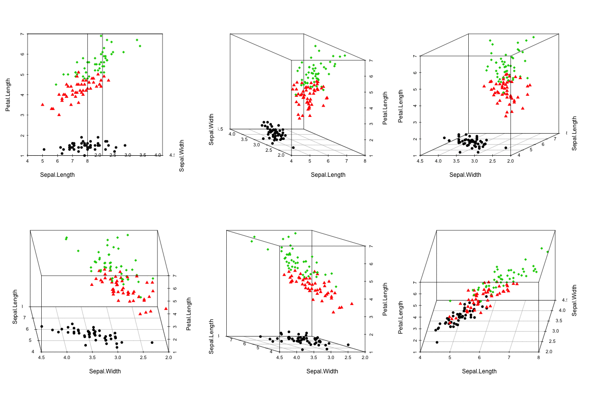
This tutorial describes how to generate a scatter pot in the 3D space using R software and the package scatterplot3d.
scaterplot3d is very simple to use and it can be easily extended by adding supplementary points or regression planes into an already generated graphic.
It can be easily installed, as it requires only an installed version of R.
Install and load scaterplot3d
install.packages("scatterplot3d") # Install
library("scatterplot3d") # load
Prepare the data
The iris data set will be used:
data(iris)
head(iris)
Sepal.Length Sepal.Width Petal.Length Petal.Width Species
1 5.1 3.5 1.4 0.2 setosa
2 4.9 3.0 1.4 0.2 setosa
3 4.7 3.2 1.3 0.2 setosa
4 4.6 3.1 1.5 0.2 setosa
5 5.0 3.6 1.4 0.2 setosa
6 5.4 3.9 1.7 0.4 setosairis data set gives the measurements of the variables sepal length and width, petal length and width, respectively, for 50 flowers from each of 3 species of iris. The species are Iris setosa, versicolor, and virginica.
The function scatterplot3d()
A simplified format is:
scatterplot3d(x, y=NULL, z=NULL)x, y, z are the coordinates of points to be plotted. The arguments y and z can be optional depending on the structure of x.
In what cases, y and z are optional variables?
- Case 1 : x is a formula of type zvar ~ xvar + yvar. xvar, yvar and zvar are used as x, y and z variables
- Case 2 : x is a matrix containing at least 3 columns corresponding to x, y and z variables, respectively
Basic 3D scatter plots
# Basic 3d graphics
scatterplot3d(iris[,1:3])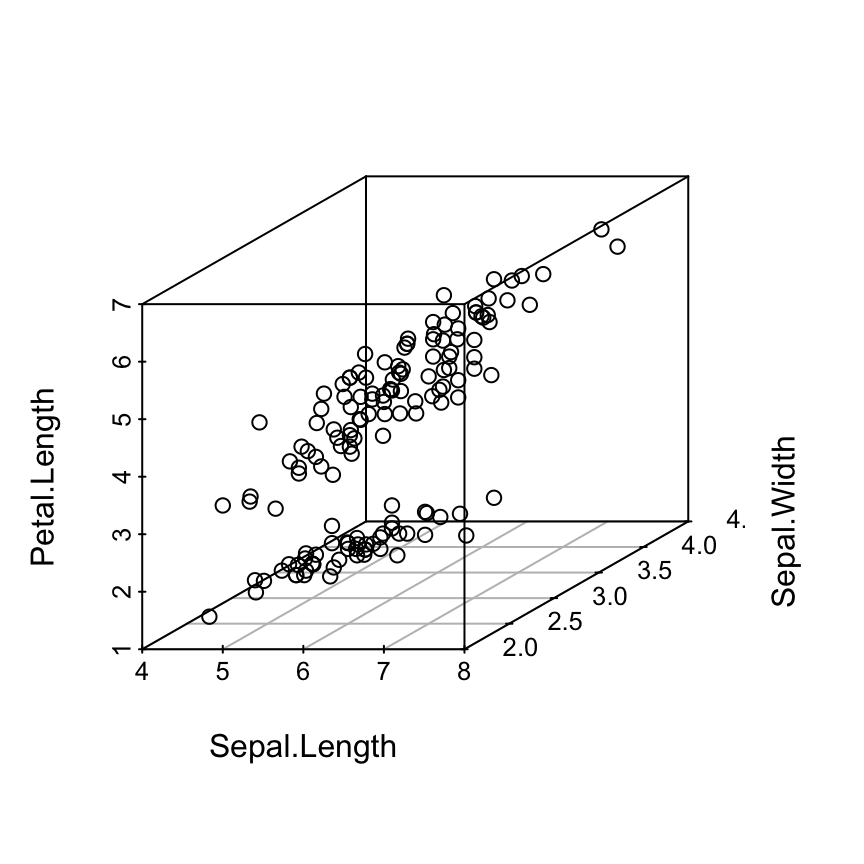
# Change the angle of point view
scatterplot3d(iris[,1:3], angle = 55)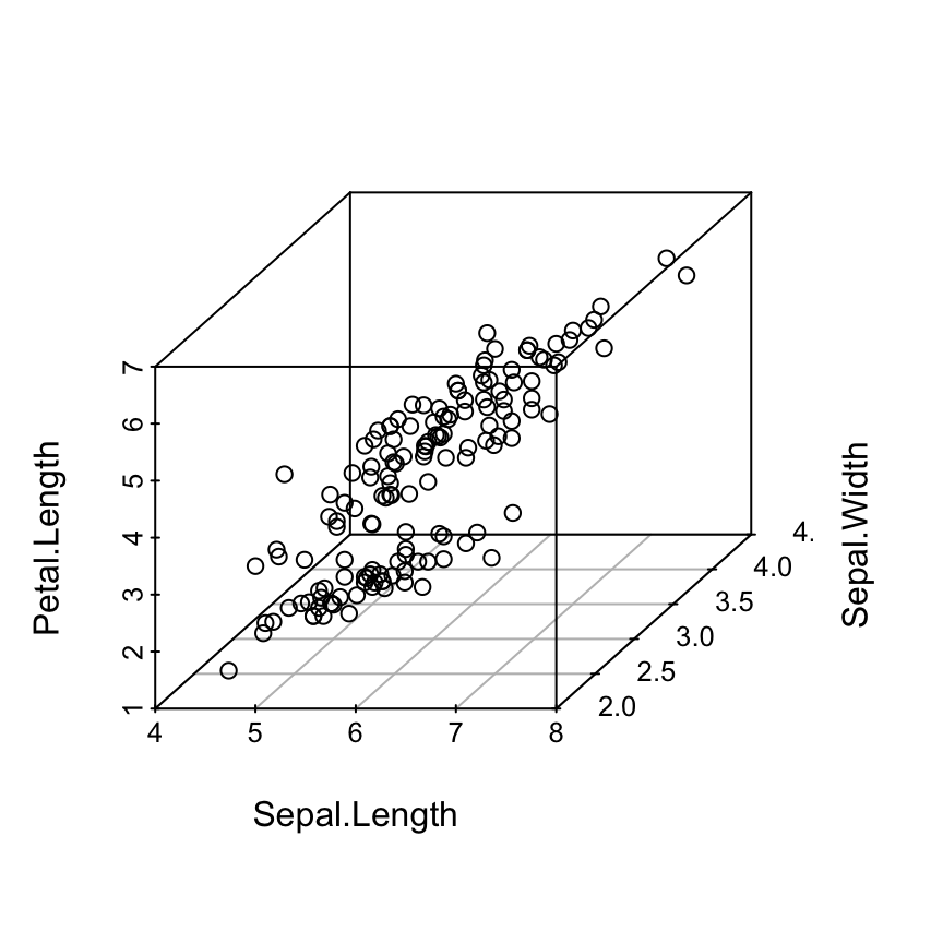
Change the main title and axis labels
scatterplot3d(iris[,1:3],
              main="3D Scatter Plot",
              xlab = "Sepal Length (cm)",
              ylab = "Sepal Width (cm)",
              zlab = "Petal Length (cm)")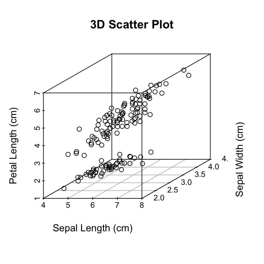
Change the shape and the color of points
The argument pch and color can be used:
scatterplot3d(iris[,1:3], pch = 16, color="steelblue")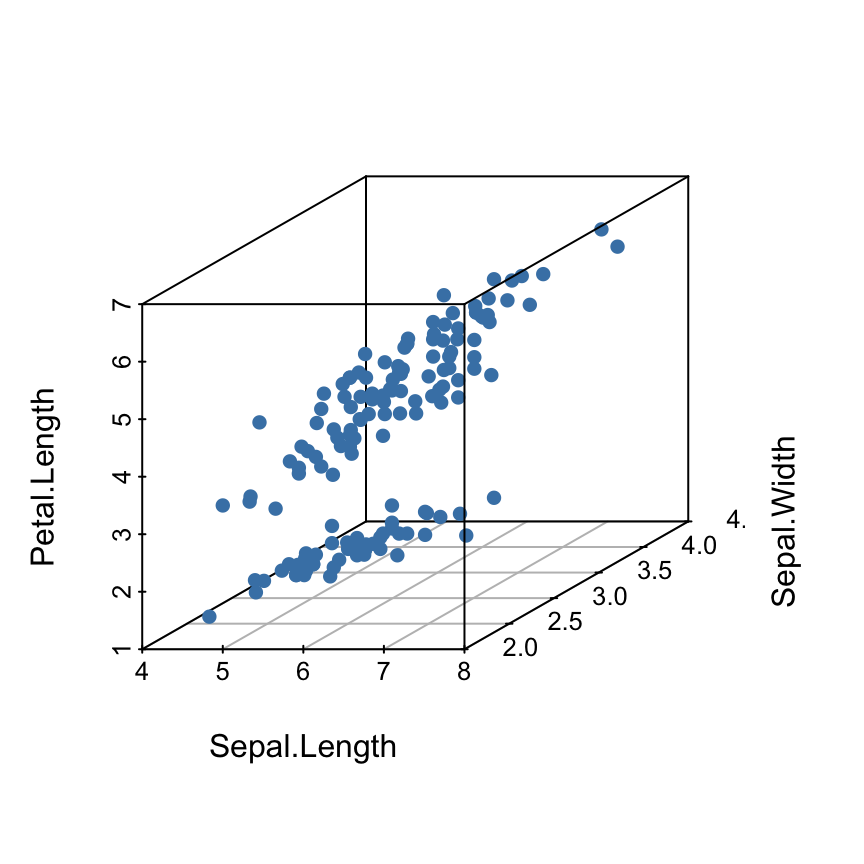
Read more on the different point shapes available in R : Point shapes in R
Change point shapes by groups
shapes = c(16, 17, 18)
shapes <- shapes[as.numeric(iris$Species)]
scatterplot3d(iris[,1:3], pch = shapes)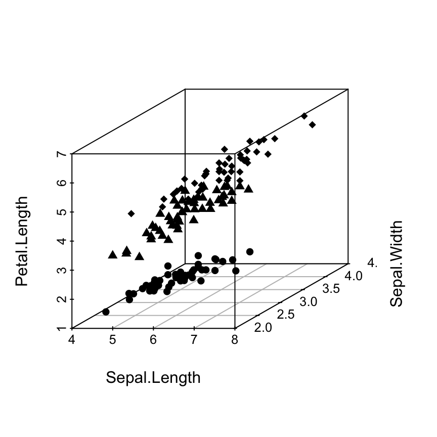
Read more on the different point shapes available in R : Point shapes in R
Change point colors by groups
colors <- c("#999999", "#E69F00", "#56B4E9")
colors <- colors[as.numeric(iris$Species)]
scatterplot3d(iris[,1:3], pch = 16, color=colors)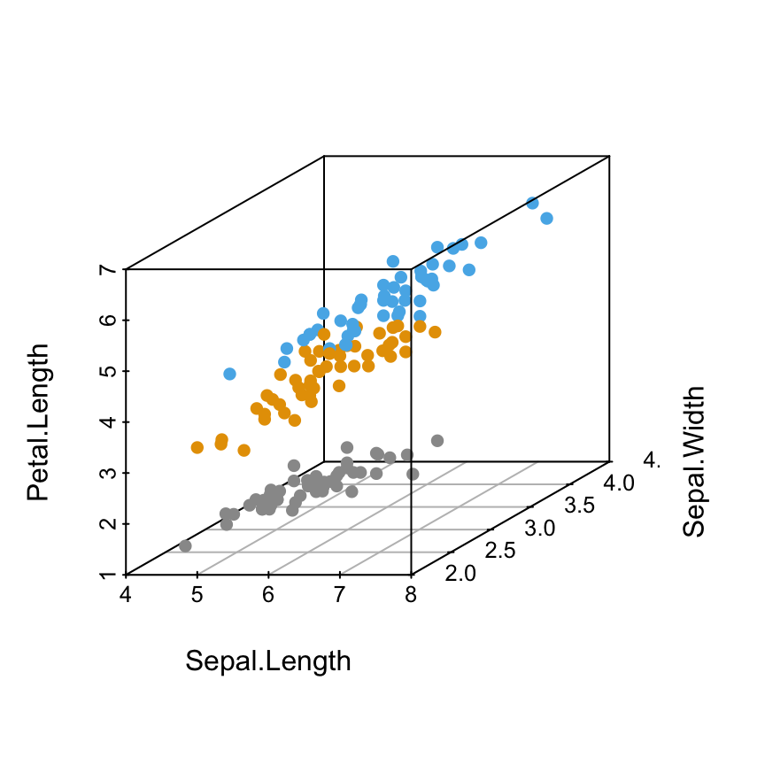
Read more about colors in R: colors in R
Change the global appearance of the graph
The arguments below can be used:
- grid: a logical value. If TRUE, a grid is drawn on the plot.
- box: a logical value. If TRUE, a box is drawn around the plot
Remove the box around the plot
scatterplot3d(iris[,1:3], pch = 16, color = colors,
              grid=TRUE, box=FALSE)
Note that, the argument grid = TRUE plots only the grid on the xy plane. In the next section, we’ll see how to add grids on the other facets of the 3D scatter plot.
Add grids on scatterplot3d
This section describes how to add xy-, xz- and yz- to scatterplot3d graphics.
We’ll use a custom function named addgrids3d(). The source code is available here : addgrids3d.r. The function is inspired from the discussion on this forum.
A simplified format of the function is:
addgrids3d(x, y=NULL, z=NULL, grid = TRUE,
col.grid = "grey", lty.grid=par("lty"))- x, y, and z are numeric vectors specifying the x, y, z coordinates of points. x can be a matrix or a data frame containing 3 columns corresponding to the x, y and z coordinates. In this case the arguments y and z are optional
- grid specifies the facet(s) of the plot on which grids should be drawn. Possible values are the combination of “xy”, “xz” or “yz”. Example: grid = c(“xy”, “yz”). The default value is TRUE to add grids only on xy facet.
- col.grid, lty.grid: the color and the line type to be used for grids
Add grids on the different factes of scatterplot3d graphics:
# 1. Source the function
source('https://www.sthda.com/sthda/RDoc/functions/addgrids3d.r')
# 2. 3D scatter plot
scatterplot3d(iris[, 1:3], pch = 16, grid=FALSE, box=FALSE)
# 3. Add grids
addgrids3d(iris[, 1:3], grid = c("xy", "xz", "yz"))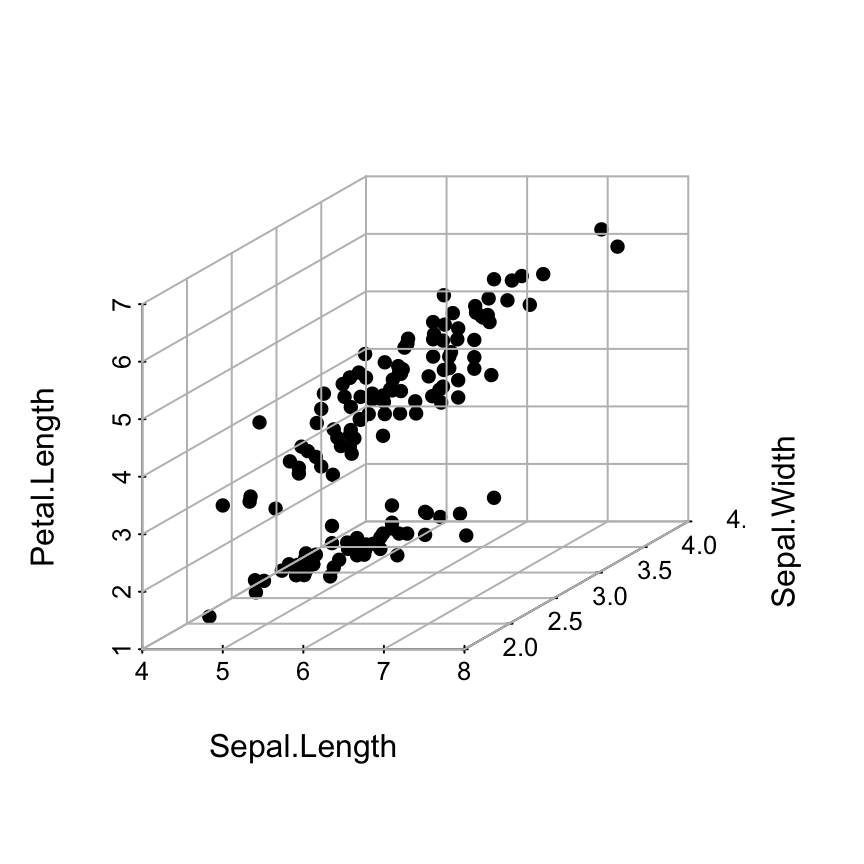
The problem on the above plot is that the grids are drawn over the points.
The R code below, we’ll put the points in the foreground using the following steps:
- An empty scatterplot3 graphic is created and the result of scatterplot3d() is assigned to s3d
- The function addgrids3d() is used to add grids
- Finally, the function s3d$points3d is used to add points on the 3D scatter plot
# 1. Source the function
source('~/hubiC/Documents/R/function/addgrids3d.r')
# 2. Empty 3D scatter plot using pch=""
s3d <- scatterplot3d(iris[, 1:3], pch = "", grid=FALSE, box=FALSE)
# 3. Add grids
addgrids3d(iris[, 1:3], grid = c("xy", "xz", "yz"))
# 4. Add points
s3d$points3d(iris[, 1:3], pch = 16)
The function points3d() is described in the next sections.
Add bars
The argument type = “h” is used. This is useful to see very clearly the x-y location of points.
scatterplot3d(iris[,1:3], pch = 16, type="h",
              color=colors)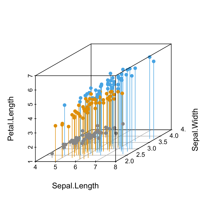
Modification of scatterplot3d output
scatterplot3d returns a list of function closures which can be used to add elements on a existing plot.
The returned functions are :
- xyz.convert(): to convert 3D coordinates to the 2D parallel projection of the existing scatterplot3d. It can be used to add arbitrary elements, such as legend, into the plot.
- points3d(): to add points or lines into the existing plot
- plane3d(): to add a plane into the existing plot
- box3d(): to add or refresh a box around the plot
Add legends
Specify the legend position using xyz.convert()
- The result of scatterplot3d() is assigned to s3d
- The function s3d$xyz.convert() is used to specify the coordinates for legends
- the function legend() is used to add legends to plots
s3d <- scatterplot3d(iris[,1:3], pch = 16, color=colors)
legend(s3d$xyz.convert(7.5, 3, 4.5), legend = levels(iris$Species),
      col =  c("#999999", "#E69F00", "#56B4E9"), pch = 16)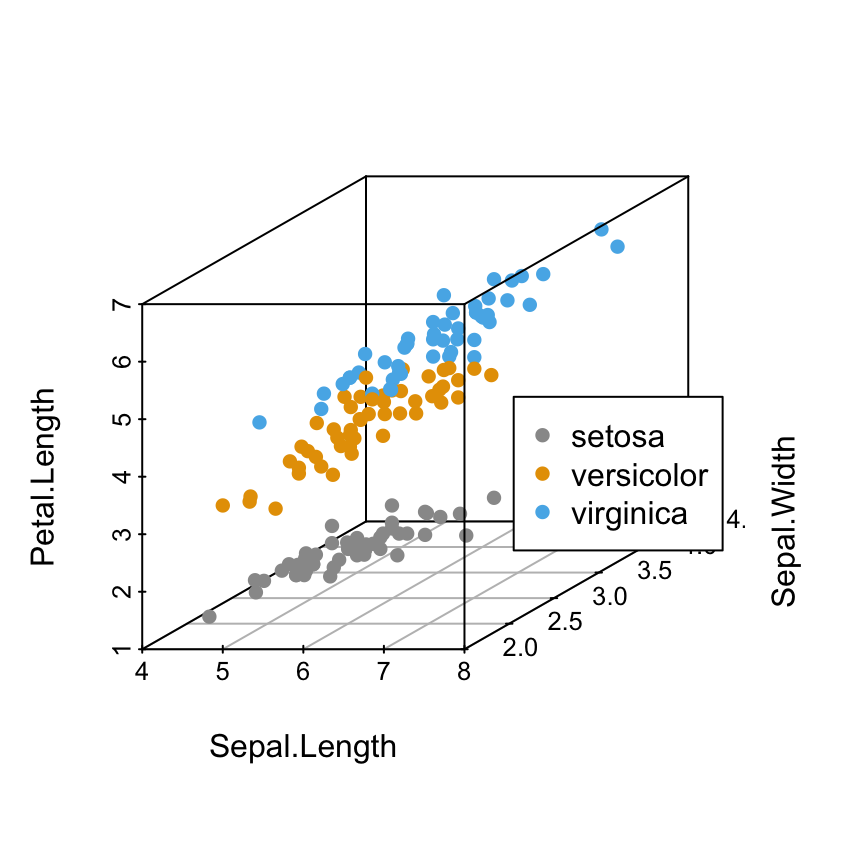
It’s also possible to specify the position of legends using the following keywords: “bottomright”, “bottom”, “bottomleft”, “left”, “topleft”, “top”, “topright”, “right” and “center”.
Read more about legend in R: legend in R.Specify the legend position using keywords
# "right" position
s3d <- scatterplot3d(iris[,1:3], pch = 16, color=colors)
legend("right", legend = levels(iris$Species),
      col =  c("#999999", "#E69F00", "#56B4E9"), pch = 16)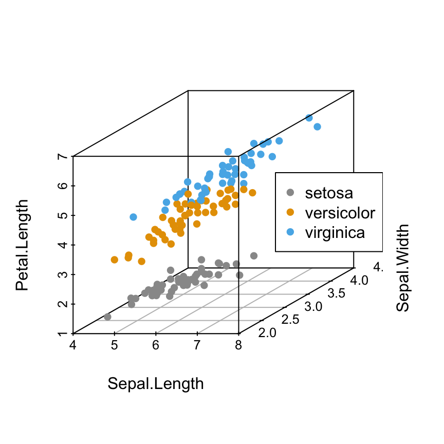
# Use the argument inset
s3d <- scatterplot3d(iris[,1:3], pch = 16, color=colors)
legend("right", legend = levels(iris$Species),
  col = c("#999999", "#E69F00", "#56B4E9"), pch = 16, inset = 0.1)
What means the argument inset in the R code above?
The argument inset is used to inset distance(s) from the margins as a fraction of the plot region when legend is positioned by keyword. ( see ?legend from R). You can play with inset argument using negative or positive values.
# "bottom" position
s3d <- scatterplot3d(iris[,1:3], pch = 16, color=colors)
legend("bottom", legend = levels(iris$Species),
      col = c("#999999", "#E69F00", "#56B4E9"), pch = 16)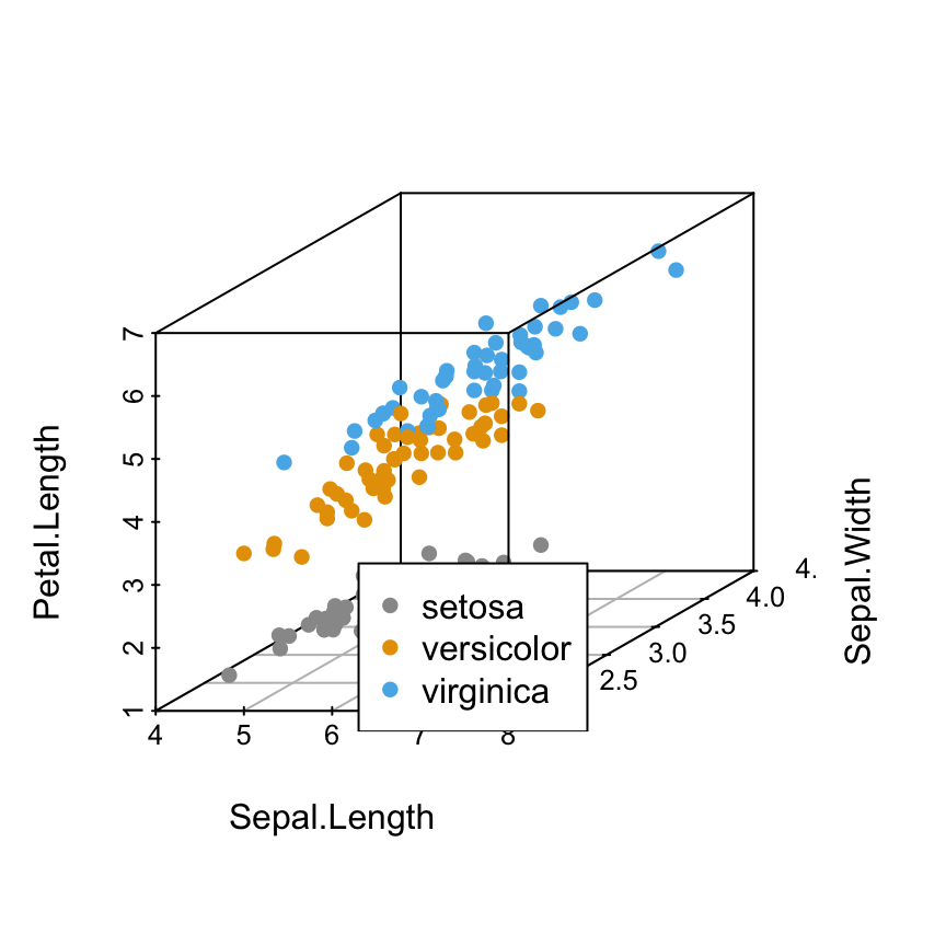
Using keywords to specify the legend position is very simple. However, sometimes, there is an overlap between some points and the legend box or between the axis and legend box.
Is there any solution to avoid this overlap?
Yes, there are several solutions using the combination of the following arguments for the function legend():
- bty = “n” : to remove the box around the legend. In this case the background color of the legend becomes transparent and the overlapping points become visible.
- bg = “transparent”: to change the background color of the legend box to transparent color (this is only possible when bty != “n”).
- inset: to modify the distance(s) between plot margins and the legend box.
- horiz: a logical value; if TRUE, set the legend horizontally rather than vertically
- xpd: a logical value; if TRUE, it enables the legend items to be drawn outside the plot.
Customize the legend position
# Custom point shapes
s3d <- scatterplot3d(iris[,1:3], pch = shapes)
legend("bottom", legend = levels(iris$Species),
       pch = c(16, 17, 18),
      inset = -0.25, xpd = TRUE, horiz = TRUE)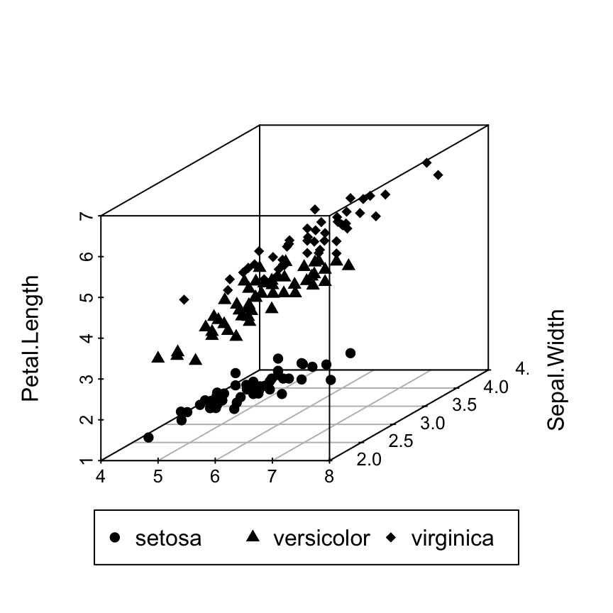
# Custom colors
s3d <- scatterplot3d(iris[,1:3], pch = 16, color=colors)
legend("bottom", legend = levels(iris$Species),
      col =  c("#999999", "#E69F00", "#56B4E9"), pch = 16,
      inset = -0.25, xpd = TRUE, horiz = TRUE)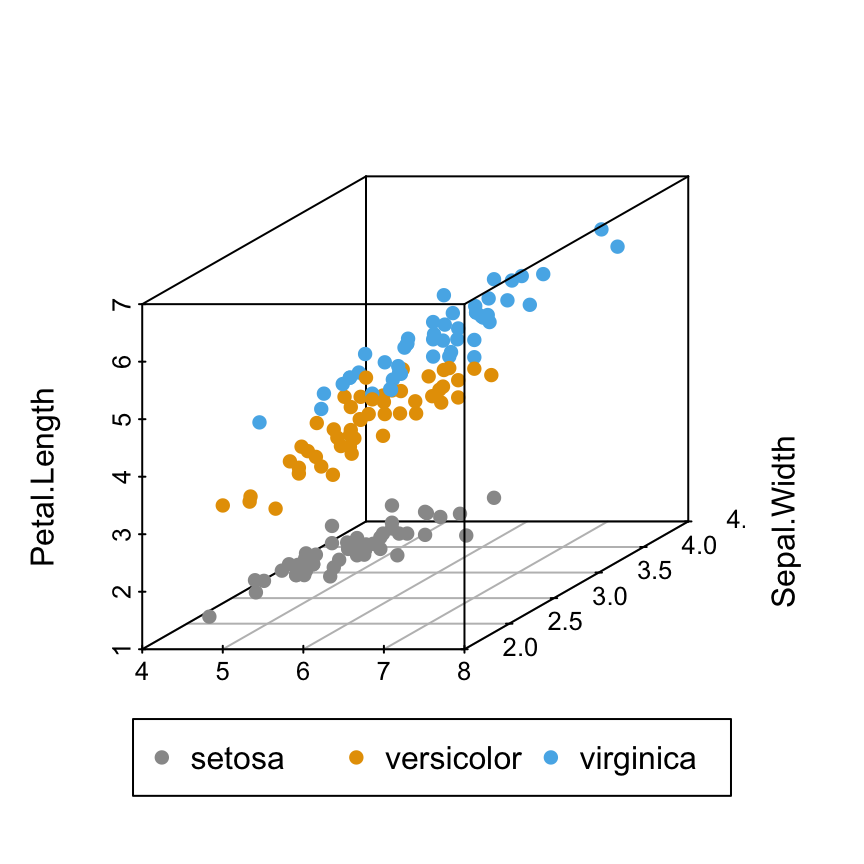
# Custom shapes/colors
s3d <- scatterplot3d(iris[,1:3], pch = shapes, color=colors)
legend("bottom", legend = levels(iris$Species),
      col =  c("#999999", "#E69F00", "#56B4E9"),
      pch = c(16, 17, 18),
      inset = -0.25, xpd = TRUE, horiz = TRUE)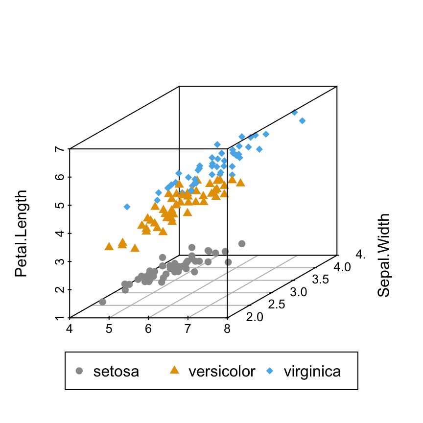
In the R code above, you can play with the arguments inset, xpd and horiz to see the effects on the appearance of the legend box.
Add point labels
The function text() is used as follow:
scatterplot3d(iris[,1:3], pch = 16, color=colors)
text(s3d$xyz.convert(iris[, 1:3]), labels = rownames(iris),
     cex= 0.7, col = "steelblue")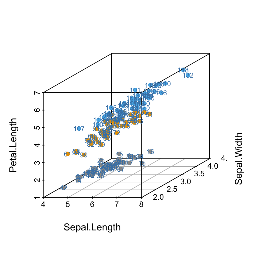
Add regression plane and supplementary points
- The result of scatterplot3d() is assigned to s3d
- A linear model is calculated as follow : lm(zvar ~ xvar + yvar). Assumption : zvar depends on xvar and yvar
- The function s3d$plane3d() is used to add the regression plane
- Supplementary points are added using the function s3d$points3d()
The data sets trees will be used:
data(trees)
head(trees)
Girth Height Volume
1 8.3 70 10.3
2 8.6 65 10.3
3 8.8 63 10.2
4 10.5 72 16.4
5 10.7 81 18.8
6 10.8 83 19.7This data set provides measurements of the girth, height and volume for black cherry trees.
3D scatter plot with the regression plane:
# 3D scatter plot
s3d <- scatterplot3d(trees, type = "h", color = "blue",
    angle=55, pch = 16)
# Add regression plane
my.lm <- lm(trees$Volume ~ trees$Girth + trees$Height)
s3d$plane3d(my.lm)
# Add supplementary points
s3d$points3d(seq(10, 20, 2), seq(85, 60, -5), seq(60, 10, -10),
    col = "red", type = "h", pch = 8)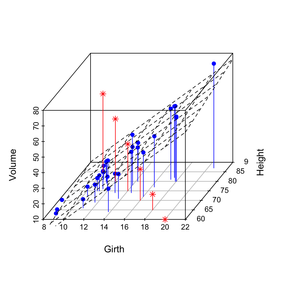
Infos
This analysis has been performed using R software (ver. 3.1.2) and scatterplot3d (ver. 0.3-35)
Show me some love with the like buttons below... Thank you and please don't forget to share and comment below!!
Montrez-moi un peu d'amour avec les like ci-dessous ... Merci et n'oubliez pas, s'il vous plaît, de partager et de commenter ci-dessous!
Recommended for You!
Recommended for you
This section contains the best data science and self-development resources to help you on your path.
Books - Data Science
Our Books
- Practical Guide to Cluster Analysis in R by A. Kassambara (Datanovia)
- Practical Guide To Principal Component Methods in R by A. Kassambara (Datanovia)
- Machine Learning Essentials: Practical Guide in R by A. Kassambara (Datanovia)
- R Graphics Essentials for Great Data Visualization by A. Kassambara (Datanovia)
- GGPlot2 Essentials for Great Data Visualization in R by A. Kassambara (Datanovia)
- Network Analysis and Visualization in R by A. Kassambara (Datanovia)
- Practical Statistics in R for Comparing Groups: Numerical Variables by A. Kassambara (Datanovia)
- Inter-Rater Reliability Essentials: Practical Guide in R by A. Kassambara (Datanovia)
Others
- R for Data Science: Import, Tidy, Transform, Visualize, and Model Data by Hadley Wickham & Garrett Grolemund
- Hands-On Machine Learning with Scikit-Learn, Keras, and TensorFlow: Concepts, Tools, and Techniques to Build Intelligent Systems by Aurelien Géron
- Practical Statistics for Data Scientists: 50 Essential Concepts by Peter Bruce & Andrew Bruce
- Hands-On Programming with R: Write Your Own Functions And Simulations by Garrett Grolemund & Hadley Wickham
- An Introduction to Statistical Learning: with Applications in R by Gareth James et al.
- Deep Learning with R by François Chollet & J.J. Allaire
- Deep Learning with Python by François Chollet
Click to follow us on Facebook :
Comment this article by clicking on "Discussion" button (top-right position of this page)


