


Impressive package for 3D and 4D graph - R software and data visualization
In my previous articles, I already described how to make 3D graphs in R using the package below:
- scatterplot3d, non interactive
- scatter3d, interactive
- rgl, interactive
To close the discussion about 3D, in this tutorial I’ll describe the impressive plot3D package and its extension plot3Drgl package.
plot3D, from Karline Soetaert, is an R package containing many functions for 2D and 3D plotting: scatter3D, points3D, lines3D,text3D, ribbon3d, hist3D, etc.
In addition to the x, y (and z) values, an additional data dimension can be represented by a color variable (argument colvar).
This “4D” plot (x, y, z, color) with a color legend is not (easily) possible using the packages mentioned above (scatterplot3d, scatter3d, rgl).
The package plot3Drgl allows to plot easily the graph generated with plot3D in openGL, as made available by package rgl. This is described at the end of the present article.
Install plot3D package
install.packages("plot3D")Load plot3D package
library("plot3D")Prepare the data
We’ll use the iris data set in the following examples :
data(iris)
head(iris)
Sepal.Length Sepal.Width Petal.Length Petal.Width Species
1 5.1 3.5 1.4 0.2 setosa
2 4.9 3.0 1.4 0.2 setosa
3 4.7 3.2 1.3 0.2 setosa
4 4.6 3.1 1.5 0.2 setosa
5 5.0 3.6 1.4 0.2 setosa
6 5.4 3.9 1.7 0.4 setosa# x, y and z coordinates
x <- sep.l <- iris$Sepal.Length
y <- pet.l <- iris$Petal.Length
z <- sep.w <- iris$Sepal.Widthiris data set gives the measurements of the variables sepal length and width and petal length and width, respectively, for 50 flowers from each of 3 species of iris. The species are Iris setosa, versicolor, and virginica.
Scatter plots
Functions for scatter plots and texts in 2D and 3D
The function below will be used:
scatter3D(x, y, z, ..., colvar = z, col = NULL, add = FALSE)
text3D(x, y, z, labels, colvar = NULL, add = FALSE)
points3D(x, y, z, ...)
lines3D(x, y, z, ...)
scatter2D(x, y, colvar = NULL, col = NULL, add = FALSE)
text2D(x, y, labels, colvar = NULL, col = NULL, add = FALSE)- x, y, z: vectors of point coordinates
- colvar: a variable used for coloring
- col: color palette used for coloring the colvar variable
- labels: the text to be written
- add: logical. If TRUE, then the points will be added to the current plot. If FALSE a new plot is started
- …: additional persp arguments including xlim, ylim, zlim, xlab, ylab, zlab, main, sub, r, d, scale, expand, box, axes, nticks, tictype.
Note that:
- points3D and lines3D are shorthand for scatter3D(…, type =“p”) and scatter3D(…, type = “l”), respectively.
- points2D and lines2D are shorthand for scatter2D(…, type = “p”) and scatter2D(…, type =“l”), respectively.
Basic scatter plot
scatter3D(x, y, z, clab = c("Sepal", "Width (cm)"))
The argument clab is used to change the title of the color legend.
By default, the points are colored automatically using the variable Z
In the R code below:
- colvar = NULL: avoids coloring by z variable
- col = “blue”: changes point colors to blue
- pch = 19: changes point shapes
- cex = 0.5: changes the size of points
scatter3D(x, y, z, colvar = NULL, col = "blue",
          pch = 19, cex = 0.5)
Change the type of the box around the plot
The argument bty is used. Allowed values are:
- “f”: full box
- “b”: default value. Only the back panels are visible
- “b2”: back panels and grid lines are visible
- “g”: grey background with white grid lines
- “bl”: black background
- “bl2”: black background with grey lines
- “u”: means that the user will specify the arguments col.axis, col.panel, lwd.panel, col.grid, lwd.grid manually
- “n”: no box will be drawn. This is the same as setting box = FALSE
# full box
scatter3D(x, y, z, bty = "f", colkey = FALSE, main ="bty= 'f'")
# back panels and grid lines are visible
scatter3D(x, y, z, bty = "b2", colkey = FALSE, main ="bty= 'b2'" )

# grey background with white grid lines
scatter3D(x, y, z, bty = "g", colkey = FALSE, main ="bty= 'g'")
# User defined
scatter3D(x, y, z, pch = 18, bty = "u", colkey = FALSE,
   main ="bty= 'u'", col.panel ="steelblue", expand =0.4,
   col.grid = "darkblue")

The argument colkey = FALSE is used to remove the legend.
Color palettes
Several color palettes are available in plot3D package:
- jet.col(n, alpha): generates the matlab-type colors. This is the default color palette used in plot3D
- jet2.col(n, alpha): similar to jet.col() but lacks the deep blue colors
- gg.col(n, alpha) and gg2.col(n, alpha) generates gg-plot-like colors
- ramp.col(col = c(“grey”, “black”), n, alpha): creates color schemes by interpolation
- alpha.col(col = “grey”, alpha): creates transparent colors
- n: Number of colors to generate. Default value is 100
- alpha: color transparency. Value in the range 0, 1. Default value is 1
- col: Colors to interpolate
# gg.col: ggplot2 like color
scatter3D(x, y, z, bty = "g", pch = 18, col = gg.col(100))
# ramp.col: custom palettes
scatter3D(x, y, z, bty = "g", pch = 18,
          col = ramp.col(c("blue", "yellow", "red")) )

Change the color by groups
The colkey is customized (see ?colkey for more details):
scatter3D(x, y, z, bty = "g", pch = 18,
          col.var = as.integer(iris$Species),
          col = c("#1B9E77", "#D95F02", "#7570B3"),
          pch = 18, ticktype = "detailed",
          colkey = list(at = c(2, 3, 4), side = 1,
          addlines = TRUE, length = 0.5, width = 0.5,
          labels = c("setosa", "versicolor", "virginica")) )
Change the position of the legend
# Bottom colkey
scatter3D(x, y, z, bty = "g",
          colkey = list(side = 1, length = 0.5))
The argument side is used to specify the colkey position: 1: for bottom, 2: for left, 3: for top, 4: for right.
3D viewing direction
The arguments theta and phi can be used to define the angles for the viewing direction. theta is the azimuthal direction and phi the co-latitude.
scatter3D(x, y, z, theta = 15, phi = 20)
scatter3D(x, y, z, phi = 0, bty ="g")
The default values for theta and phi are 40.
Titles and axis labels
scatter3D(x, y, z, pch = 18,  theta = 20, phi = 20,
          main = "Iris data", xlab = "Sepal.Length",
          ylab ="Petal.Length", zlab = "Sepal.Width")
Tick marks and labels
The arguments below can be used:
- ticktype: Possible values are
- “simple” draws just an arrow parallel to the axis to indicate direction of increase
- “detailed” draws normal ticks and labels
- nticks: the number of tick marks to draw on the axes. It has no effect if ticktype =“simple”.
 scatter3D(x, y, z, phi = 0, bty = "g",
        pch = 20, cex = 2, ticktype = "detailed")
Add points and text to an existing plot
The functions below can be used:
- scatter3D(x, y, z,…, add = TRUE): Adds points
- text3D(x, y, z, labels, …, add = TRUE): Adds texts
- Add points to an existing plot:
# Create a scatter plot
 scatter3D(x, y, z, phi = 0, bty = "g",
        pch = 20, cex = 2, ticktype = "detailed")
# Add another point (black color)
scatter3D(x = 7, y = 3, z = 3.5, add = TRUE, colkey = FALSE,
         pch = 18, cex = 3, col = "black")
- Add texts to an existing plot:
# Create a scatter plot
 scatter3D(x, y, z, phi = 0, bty = "g", pch = 20, cex = 0.5)
# Add text
text3D(x, y, z,  labels = rownames(iris),
        add = TRUE, colkey = FALSE, cex = 0.5)
Line plots
# type ="l" for lines only
 scatter3D(x, y, z, phi = 0, bty = "g", type = "l",
           ticktype = "detailed", lwd = 4)
# type ="b" for both points and lines
 scatter3D(x, y, z, phi = 0, bty = "g", type = "b",
           ticktype = "detailed", pch = 20,
           cex = c(0.5, 1, 1.5))
# type ="h" for vertical lines
scatter3D(x, y, z, phi = 0, bty = "g",  type = "h",
           ticktype = "detailed", pch = 19, cex = 0.5)
Vertical lines are useful to see clearly the x-y location of points.
Add confidence interval
The argument CI is used. It’s a list containing the parameters and values for the confidence intervals or NULL.
If CI is a list, it should contain at least the item x, y or z (latter for scatter3D).These should be 2-columned matrices, defining the left/right intervals.
Other parameters should be one of: alen = 0.01, lty = par(“lty”), lwd = par(“lwd”), col = NULL, to set the length of the arrow head, the line type and width, and the color.
If col is NULL, then the colors as specified by colvar are used.# Confidence interval
CI <- list(z = matrix(nrow = length(x),
data = rep(0.1, 2*length(x))))
head(CI$z) [,1] [,2]
[1,] 0.1 0.1
[2,] 0.1 0.1
[3,] 0.1 0.1
[4,] 0.1 0.1
[5,] 0.1 0.1
[6,] 0.1 0.1# 3D Scatter plot with CI
scatter3D(x, y, z, phi = 0, bty = "g", col = gg.col(100),
pch = 18, CI = CI)
3D fancy Scatter plot with small dots on basal plane
A helper function scatter3D_fancy() is used:
# Add small dots on basal plane and on the depth plane
scatter3D_fancy <- function(x, y, z,..., colvar = z)
  {
   panelfirst <- function(pmat) {
      XY <- trans3D(x, y, z = rep(min(z), length(z)), pmat = pmat)
      scatter2D(XY$x, XY$y, colvar = colvar, pch = ".",
              cex = 2, add = TRUE, colkey = FALSE)

      XY <- trans3D(x = rep(min(x), length(x)), y, z, pmat = pmat)
      scatter2D(XY$x, XY$y, colvar = colvar, pch = ".",
              cex = 2, add = TRUE, colkey = FALSE)
  }
  scatter3D(x, y, z, ..., colvar = colvar, panel.first=panelfirst,
    colkey = list(length = 0.5, width = 0.5, cex.clab = 0.75))
}
Fancy scatter plot:
scatter3D_fancy(x, y, z, pch = 16,
    ticktype = "detailed", theta = 15, d = 2,
    main = "Iris data",  clab = c("Petal", "Width (cm)") )
Regression plane
The mtcars data will be used:
data(mtcars)
head(mtcars[, 1:6])
mpg cyl disp hp drat wt
Mazda RX4 21.0 6 160 110 3.90 2.620
Mazda RX4 Wag 21.0 6 160 110 3.90 2.875
Datsun 710 22.8 4 108 93 3.85 2.320
Hornet 4 Drive 21.4 6 258 110 3.08 3.215
Hornet Sportabout 18.7 8 360 175 3.15 3.440
Valiant 18.1 6 225 105 2.76 3.460- Use the function lm() to compute a linear regression model: ax + by + cz + d = 0
- Use the argument surf in scatter3D() function to add a regression surface.
# x, y, z variables
x <- mtcars$wt
y <- mtcars$disp
z <- mtcars$mpg
# Compute the linear regression (z = ax + by + d)
fit <- lm(z ~ x + y)
# predict values on regular xy grid
grid.lines = 26
x.pred <- seq(min(x), max(x), length.out = grid.lines)
y.pred <- seq(min(y), max(y), length.out = grid.lines)
xy <- expand.grid( x = x.pred, y = y.pred)
z.pred <- matrix(predict(fit, newdata = xy),
                 nrow = grid.lines, ncol = grid.lines)
# fitted points for droplines to surface
fitpoints <- predict(fit)
# scatter plot with regression plane
scatter3D(x, y, z, pch = 18, cex = 2,
    theta = 20, phi = 20, ticktype = "detailed",
    xlab = "wt", ylab = "disp", zlab = "mpg",
    surf = list(x = x.pred, y = y.pred, z = z.pred,
    facets = NA, fit = fitpoints), main = "mtcars")
surf is a list specifying a (fitted) surface to be added on the scatter plot. The list should include at least x, y, z, defining the surface.
Other optional parameters can be specified in the surf argument including: colvar, col, NAcol, border, facets, lwd, resfac, clim, ltheta, lphi, shade, lighting, fit. (see ?surf3D for more details on these parameters)
Note that, by default colvar = z.
- The argument fit should give the fitted z-values, in the same order as the z-values of the scatter points, for instance produced by predict(). When present, this will produce droplines from points to the fitted surface.
Note that, the function expand.grid(), in the R code above, creates a data frame from all combinations of factors
text3D: plot 3-dimensionnal texts
The function text3D() is used as follow:
text3D(x, y, z, labels, ...)The USArrests data sets will be used in the example below:
data(USArrests)
with(USArrests, text3D(Murder, Assault, Rape,
  labels = rownames(USArrests), colvar = UrbanPop,
  col = gg.col(100), theta = 60, phi = 20,
  xlab = "Murder", ylab = "Assault", zlab = "Rape",
  main = "USA arrests", cex = 0.6,
  bty = "g", ticktype = "detailed", d = 2,
  clab = c("Urban","Pop"), adj = 0.5, font = 2))
text3D and scatter3D
# Plot texts
with(USArrests, text3D(Murder, Assault, Rape,
  labels = rownames(USArrests), colvar = UrbanPop,
  col = gg.col(100), theta = 60, phi = 20,
  xlab = "Murder", ylab = "Assault", zlab = "Rape",
  main = "USA arrests", cex = 0.6,
  bty = "g", ticktype = "detailed", d = 2,
  clab = c("Urban","Pop"), adj = 0.5, font = 2))
# Add points
 with(USArrests, scatter3D(Murder, Assault, Rape - 1,
    colvar = UrbanPop, col = gg.col(100),
    type = "h", pch = ".", add = TRUE))
# Zoom near origin: choose suitable ranges
 plotdev(xlim = c(0, 10), ylim = c(40, 150),
         zlim = c(7, 25))
Note that, in order to choose suitable ranges for zooming, you can display axis ranges as follow:
# display axis ranges
 getplist()[c("xlim","ylim","zlim")]
$xlim
[1] 0.8 17.4
$ylim
[1] 45 337
$zlim
[1] 7.3 46.03D Histogram
The function hist3D() is used:
hist3D (x, y, z, ..., colvar = z,
col = NULL, add = FALSE) - z: Matrix containing the values to be plotted
- x, y vectors with x and y values. x should be of length equal to nrow(z) and y should be equal to ncol(z)
- colvar: the variable used for coloring. If present, it should have the same dimension as z.
- col: color palette to be used for the colvar variable. By default a red-yellow-blue color scheme (?jet.col) is used
- add: Logical. If TRUE, then the surfaces will be added to the current plot. If FALSE a new plot is started.
data(VADeaths)
#  hist3D and ribbon3D with greyish background, rotated, rescaled,...
hist3D(z = VADeaths, scale = FALSE, expand = 0.01, bty = "g", phi = 20,
        col = "#0072B2", border = "black", shade = 0.2, ltheta = 90,
        space = 0.3, ticktype = "detailed", d = 2)
hist3D (x = 1:5, y = 1:4, z = VADeaths,
        bty = "g", phi = 20,  theta = -60,
        xlab = "", ylab = "", zlab = "", main = "VADeaths",
        col = "#0072B2", border = "black", shade = 0.8,
        ticktype = "detailed", space = 0.15, d = 2, cex.axis = 1e-9)
# Use text3D to label x axis
 text3D(x = 1:5, y = rep(0.5, 5), z = rep(3, 5),
       labels = rownames(VADeaths),
       add = TRUE, adj = 0)
# Use text3D to label y axis
 text3D(x = rep(1, 4),   y = 1:4, z = rep(0, 4),
       labels  = colnames(VADeaths),
       add = TRUE, adj = 1)
fancy 3D histograms
hist3D_fancy<- function(x, y, break.func = c("Sturges", "scott", "FD"), breaks = NULL,
                        colvar = NULL, col="white", clab=NULL, phi = 5, theta = 25, ...){

  # Compute the number of classes for a histogram
  break.func <- break.func [1]
  if(is.null(breaks)){
    x.breaks <- switch(break.func,
                       Sturges = nclass.Sturges(x),
                       scott = nclass.scott(x),
                       FD = nclass.FD(x))
    y.breaks <- switch(break.func,
                       Sturges = nclass.Sturges(y),
                       scott = nclass.scott(y),
                       FD = nclass.FD(y))
  } else x.breaks <- y.breaks <- breaks

  # Cut x and y variables in bins for counting
  x.bin <- seq(min(x), max(x), length.out = x.breaks)
  y.bin <- seq(min(y), max(y), length.out = y.breaks)
  xy <- table(cut(x, x.bin), cut(y, y.bin))
  z <- xy

  xmid <- 0.5*(x.bin[-1] + x.bin[-length(x.bin)])
  ymid <- 0.5*(y.bin[-1] + y.bin[-length(y.bin)])

  oldmar <- par("mar")
  par (mar = par("mar") + c(0, 0, 0, 2))
  hist3D(x = xmid, y = ymid, z = xy, ...,
    zlim = c(-max(z)/2, max(z)), zlab = "counts", bty= "g",
    phi = phi, theta = theta,
    shade = 0.2, col = col, border = "black",
    d = 1, ticktype = "detailed")

  scatter3D(x, y,
    z = rep(-max(z)/2, length.out = length(x)),
    colvar = colvar, col = gg.col(100),
    add = TRUE, pch = 18, clab = clab,
    colkey = list(length = 0.5, width = 0.5,
       dist = 0.05, cex.axis = 0.8, cex.clab = 0.8)
       )
  par(mar = oldmar)
}
hist3D_fancy(quakes$long, quakes$lat, colvar=quakes$depth,
breaks =30)
hist3D_fancy(iris$Sepal.Length, iris$Petal.Width,
             colvar=as.numeric(iris$Species))
scatter2D: 2D scatter plot
Create some data:
# x, y coordinates
set.seed(1234)
x  <- sort(rnorm(10))
y  <- runif(10)
# Variable for coloring points
col.v <- sqrt(x^2 + y^2)
Basic 2D scatter plot:
scatter2D(x, y, colvar = col.v, pch = 16, bty ="n",
          type ="b")
- type: plot types. Allowed values are:
- “b” to draw both points and line
- “h” for vertical line
- “l” for line only
- “p” for points only
- bty: box type
2D scatter plot with confidence interval:
# Confidence interval for x variable only
CI <- list()
CI$x <- matrix(nrow = length(x), data = c(rep(0.25, 2*length(x))))
scatter2D(x, y, colvar = col.v, pch = 16, bty ="n", cex = 1.5,
          CI = CI, type = "b")
# Confidence interval for both x and y variables
CI$y <- matrix (nrow = length(y), data = c(rep(0.05, 2*length(y))))
CI$col <- "black"
scatter2D(x, y, colvar = col.v, pch = 16,  bty ="n", cex = 1.5,
          CI = CI, type ="b")
CI$y[c(2,4,8,10), ] <- NA  # Some points have no CI
CI$x[c(2,4,8,10), ] <- NA  # Some points have no CI
CI$alen <- 0.02            # increase arrow head
scatter2D(x, y, colvar = col.v, pch = 16,  bty ="n", cex = 1.5,
          CI = CI, type ="b")
text2D
# Only text
with(USArrests, text2D(x = Murder, y = Assault + 5, colvar = Rape,
     xlab = "Murder", ylab = "Assault", clab = "Rape",
     main = "USA arrests", labels = rownames(USArrests), cex = 0.6,
     adj = 0.5, font = 2))
# text with point
 with(USArrests, text2D(x = Murder, y = Assault + 5, colvar = Rape,
     xlab = "Murder", ylab = "Assault", clab = "Rape",
     main = "USA arrests", labels = rownames(USArrests), cex = 0.6,
     adj = 0.5, font = 2))
 with(USArrests, scatter2D(x = Murder, y = Assault, colvar = Rape,
     pch = 16, add = TRUE, colkey = FALSE))
Other functions
It’s also possible to draw arrows, segments and rectangles in a 3D or 2D plot using the functions below:
arrows3D(x0, y0, z0, x1, y1, z1, ..., colvar = NULL,
         col = NULL, type = "triangle", add = FALSE)
segments3D(x0, y0, z0, x1, y1, z1, ..., colvar = NULL,
           col = NULL, add = "FALSE")
rect3D(x0, y0, y0, x1, y1, z1, ..., colvar = NULL,
       col = NULL, add = FALSE)
arrows2D(x0, y0, z0, x1, y1, z1, ..., colvar = NULL,
         col = NULL, type = "triangle", add = FALSE)
segments2D(x0, y0, z0, x1, y1, z1, ..., colvar = NULL,
           col = NULL, add = "FALSE")
rect2D(x0, y0, y0, x1, y1, z1, ..., colvar = NULL,
col = NULL, add = FALSE)- x0, y0, z0: coordinates of points from which to draw
- x1, y1, z1: coordinates of points to which to draw. For arrows3D and segments3D, at least one must be supplied. For rect3D exactly one must be NULL.
- colvar: The variable used for coloring.
- col: color palette to be used for coloring. Default is red-yellow-blue color scheme.
- add: Logical. If TRUE, then the arrows, segments, … will be added to the current plot. If FALSE a new plot is started.
Prepare the data: we want to plot 4 arrows starting from the point of coordinates c(x0, y0, z0) and ending at c(x1, y1, z1)
x0 <- c(0, 0, 0, 0)
y0 <- c(0, 0, 0, 0)
z0 <- c(0, 0, 0, 0)
x1 <- c(0.89, -0.46, 0.99, 0.96)
y1 <- c(0.36,  0.88, 0.02, 0.06)
z1 <- c(-0.28, 0.09, 0.05, 0.24)
cols <- c("#1B9E77", "#D95F02", "#7570B3", "#E7298A")
3D Arrows:
arrows3D(x0, y0, z0, x1, y1, z1, colvar = x1^2, col = cols,
         lwd = 2, d = 3, clab = c("Quality", "score"),
         main = "Arrows 3D", bty ="g", ticktype = "detailed")
# Add starting point of arrow
points3D(x0, y0, z0, add = TRUE, col="darkred",
          colkey = FALSE, pch = 19, cex = 1)
# Add labels to the arrows
text3D(x1, y1, z1, c("Sepal.L", "Sepal.W", "Petal.L", "Petal.W"),
colvar = x1^2, col = cols, add=TRUE, colkey = FALSE)![]()
2D arrows:
arrows2D(x0, y0,  x1, y1,  colvar = x1^2, col = cols,
         lwd = 2, clab = c("Quality", "score"),
          bty ="n", xlim = c(-1, 1), ylim = c(-1, 1))
# Add vertical and horizontal lines at c(0,0)
abline(h =0, v = 0, lty = 2)
# Add starting point of arrow
points2D(x0, y0, add = TRUE, col="darkred",
          colkey = FALSE, pch = 19, cex = 1)
# Add labels to the arrows
text2D(x1, y1, c("Sepal.L", "Sepal.W", "Petal.L", "Petal.W"),
colvar = x1^2, col = cols, add=TRUE, colkey = FALSE)![]()
Note that, segments3D() and segments2D() are very similar to arrows3D() and arrows2D() and you can play with them also.
3D rectangle: the R code below creates a rectangle with a transparent fill color (alpha = 0.5)
rect3D(x0 = 0, y0 = 0.5, z0 = 0, x1 = 1, z1 = 5,
       ylim = c(0, 1), bty = "g", facets = TRUE,
       border = "red", col ="#7570B3", alpha=0.5,
       lwd = 2, phi = 20)
In the R code above, facets = FALSE, will remove the rectangle fill color.
2D rectangle:
rect2D(x0 = runif(3), y0 = runif(3),
       x1 = runif(3), y1 = runif(3), colvar = 1:3,
       alpha = 0.4, lwd = 2, main = "rect2D")
Interactive plot
To draw an interactive 3D plot the package plot3Drgl can be used.
The package plot3Drgl allows to plot the graph generated with plot3D in openGL, as made available by package rgl.
The simplest way is to do as follow:
- Create base R-graphics using plot3D package
- Then use the function plotrgl() to draw the same figure in rgl
The package rgl allows to interactively rotate, zoom the graphs. However it’s not yet possible to plot a colorkey
# Create his3D using plot3D
hist3D_fancy(iris$Sepal.Length, iris$Petal.Width, colvar=as.numeric(iris$Species))
# Make the rgl version
library("plot3Drgl")
plotrgl()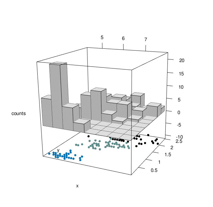
Note that, after creating the rgl plot you can use the functions below:
- croprgl(xlim, ylim, zlim, …) to modify the ranges
- cutrgl(…) to zoom in on a selected region of the plot. The current plot will be overwritten
uncutrgl(…) and uncroprgl(…) restore the original plot.
- …: any arguments for par3d, open3d or material3d in rgl package.
Infos
This analysis has been performed using R software (ver. 3.1.2) and plot3D (ver. 1.0-2)
References:
- Karline Soetaert. plot3D: Tools for plotting 3-D and 2-D data. http://cran.r-project.org/web/packages/plot3D/vignettes/plot3D.pdf
Show me some love with the like buttons below... Thank you and please don't forget to share and comment below!!
Montrez-moi un peu d'amour avec les like ci-dessous ... Merci et n'oubliez pas, s'il vous plaît, de partager et de commenter ci-dessous!
Recommended for You!


Recommended for you
This section contains the best data science and self-development resources to help you on your path.
Books - Data Science
Our Books
- Practical Guide to Cluster Analysis in R by A. Kassambara (Datanovia)
- Practical Guide To Principal Component Methods in R by A. Kassambara (Datanovia)
- Machine Learning Essentials: Practical Guide in R by A. Kassambara (Datanovia)
- R Graphics Essentials for Great Data Visualization by A. Kassambara (Datanovia)
- GGPlot2 Essentials for Great Data Visualization in R by A. Kassambara (Datanovia)
- Network Analysis and Visualization in R by A. Kassambara (Datanovia)
- Practical Statistics in R for Comparing Groups: Numerical Variables by A. Kassambara (Datanovia)
- Inter-Rater Reliability Essentials: Practical Guide in R by A. Kassambara (Datanovia)
Others
- R for Data Science: Import, Tidy, Transform, Visualize, and Model Data by Hadley Wickham & Garrett Grolemund
- Hands-On Machine Learning with Scikit-Learn, Keras, and TensorFlow: Concepts, Tools, and Techniques to Build Intelligent Systems by Aurelien Géron
- Practical Statistics for Data Scientists: 50 Essential Concepts by Peter Bruce & Andrew Bruce
- Hands-On Programming with R: Write Your Own Functions And Simulations by Garrett Grolemund & Hadley Wickham
- An Introduction to Statistical Learning: with Applications in R by Gareth James et al.
- Deep Learning with R by François Chollet & J.J. Allaire
- Deep Learning with Python by François Chollet
Click to follow us on Facebook :
Comment this article by clicking on "Discussion" button (top-right position of this page)