


Plot Two Continuous Variables: Scatter Graph and Alternatives
Scatter plots are used to display the relationship between two continuous variables x and y. In this article, we’ll start by showing how to create beautiful scatter plots in R.
We’ll use helper functions in the ggpubr R package to display automatically the correlation coefficient and the significance level on the plot.
We’ll also describe how to color points by groups and to add concentration ellipses around each group. Additionally, we’ll show how to create bubble charts, as well as, how to add marginal plots (histogram, density or box plot) to a scatter plot.
We continue by showing show some alternatives to the standard scatter plots, including rectangular binning, hexagonal binning and 2d density estimation. These plot types are useful in a situation where you have a large data set containing thousands of records.
R codes for zooming, in a scatter plot, are also provided. Finally, you’ll learn how to add fitted regression trend lines and equations to a scatter graph.
Contents:

Prerequisites
- Install cowplot package. Used to arrange multiple plots. Will be used here to create a scatter plot with marginal density plots. Install the latest developmental version as follow:
devtools::install_github("wilkelab/cowplot")- Install ggpmisc for adding the equation of a fitted regression line on a scatter plot:
install.packages("ggpmisc")- Load required packages and set ggplot themes:
- Load ggplot2 and ggpubr R packages
- Set the default theme to
theme_minimal()[in ggplot2]
library(ggplot2)
library(ggpubr)
theme_set(
  theme_minimal() +
    theme(legend.position = "top")
)- Prepare demo data sets:
Dataset: mtcars. The variable cyl is used as grouping variable.
# Load data
data("mtcars")
df <- mtcars
# Convert cyl as a grouping variable
df$cyl <- as.factor(df$cyl)
# Inspect the data
head(df[, c("wt", "mpg", "cyl", "qsec")], 4)
## wt mpg cyl qsec
## Mazda RX4 2.62 21.0 6 16.5
## Mazda RX4 Wag 2.88 21.0 6 17.0
## Datsun 710 2.32 22.8 4 18.6
## Hornet 4 Drive 3.21 21.4 6 19.4Basic scatter plots
Key functions:
geom_point(): Create scatter plots. Key arguments:color,sizeandshapeto change point color, size and shape.geom_smooth(): Add smoothed conditional means / regression line. Key arguments:color,sizeandlinetype: Change the line color, size and type.fill: Change the fill color of the confidence region.
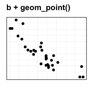
b <- ggplot(df, aes(x = wt, y = mpg))
# Scatter plot with regression line
b + geom_point()+
  geom_smooth(method = "lm")

# Add a loess smoothed fit curve
b + geom_point()+
geom_smooth(method = "loess") 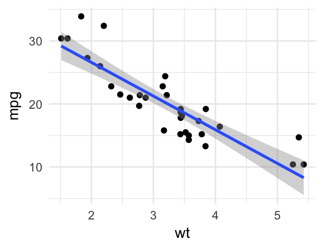
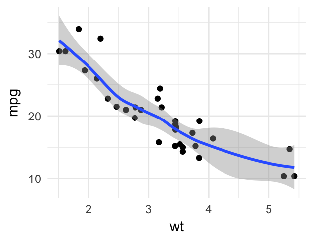
To remove the confidence region around the regression line, specify the argument se = FALSE in the function geom_smooth().
Change the point shape, by specifying the argument shape, for example:
b + geom_point(shape = 18)To see the different point shapes commonly used in R, type this:
ggpubr::show_point_shapes()
Create easily a scatter plot using ggscatter() [in ggpubr]. Use stat_cor() [ggpubr] to add the correlation coefficient and the significance level.
# Add regression line and confidence interval
# Add correlation coefficient: stat_cor()
ggscatter(df, x = "wt", y = "mpg",
          add = "reg.line", conf.int = TRUE,
          add.params = list(fill = "lightgray"),
          ggtheme = theme_minimal()
          )+
  stat_cor(method = "pearson",
label.x = 3, label.y = 30) 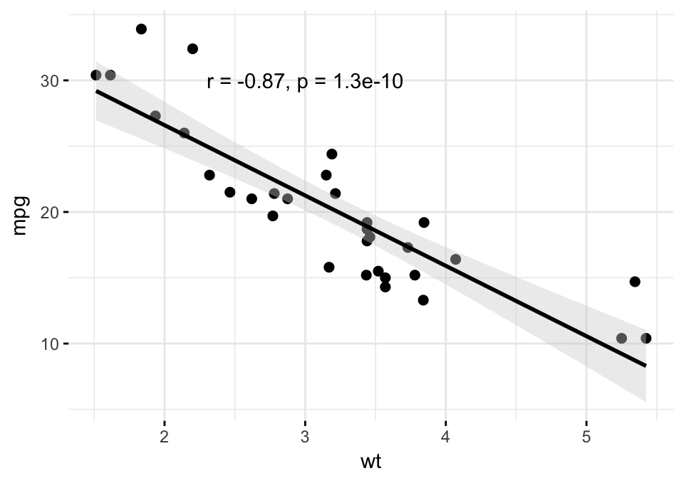
Multiple groups
- Change point colors and shapes by groups.
- Add marginal rug:
geom_rug().
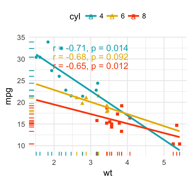
# Change color and shape by groups (cyl)
b + geom_point(aes(color = cyl, shape = cyl))+
  geom_smooth(aes(color = cyl, fill = cyl), method = "lm") +
  geom_rug(aes(color =cyl)) +
  scale_color_manual(values = c("#00AFBB", "#E7B800", "#FC4E07"))+
  scale_fill_manual(values = c("#00AFBB", "#E7B800", "#FC4E07"))
# Remove confidence region (se = FALSE)
# Extend the regression lines: fullrange = TRUE
b + geom_point(aes(color = cyl, shape = cyl)) +
  geom_rug(aes(color =cyl)) +
  geom_smooth(aes(color = cyl), method = lm,
              se = FALSE, fullrange = TRUE)+
  scale_color_manual(values = c("#00AFBB", "#E7B800", "#FC4E07"))+
  ggpubr::stat_cor(aes(color = cyl), label.x = 3)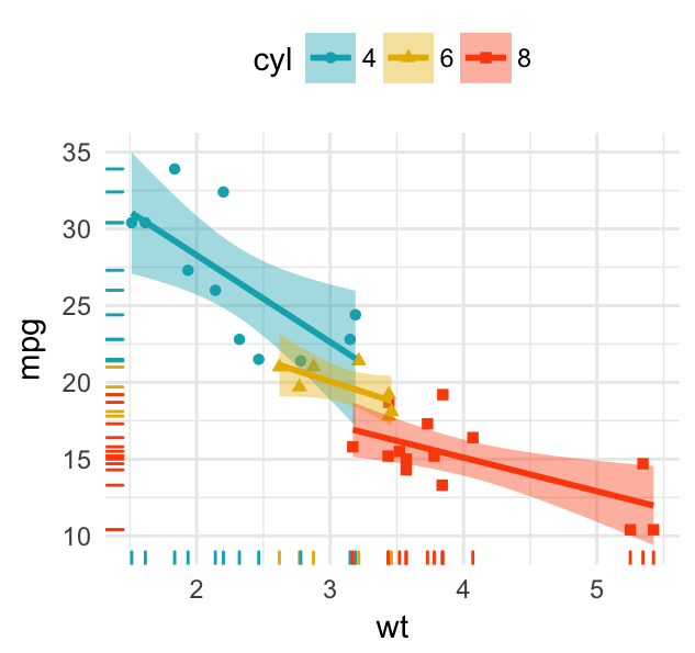
- Split the plot into multiple panels. Use the function
facet_wrap():
b + geom_point(aes(color = cyl, shape = cyl))+
  geom_smooth(aes(color = cyl, fill = cyl),
              method = "lm", fullrange = TRUE) +
  facet_wrap(~cyl) +
  scale_color_manual(values = c("#00AFBB", "#E7B800", "#FC4E07"))+
  scale_fill_manual(values = c("#00AFBB", "#E7B800", "#FC4E07")) +
  theme_bw()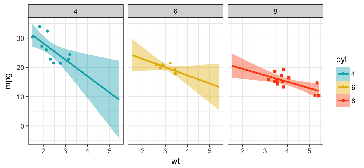
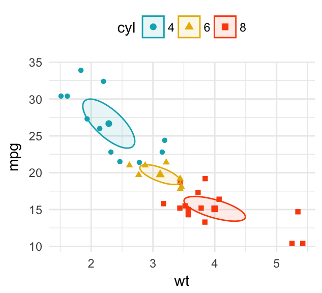
- Add concentration ellipse around groups. R function
stat_ellipse(). Key arguments:type: The type of ellipse. The default “t” assumes a multivariate t-distribution, and “norm” assumes a multivariate normal distribution. “euclid” draws a circle with the radius equal to level, representing the euclidean distance from the center.level: The confidence level at which to draw an ellipse (default is 0.95), or, if type=“euclid”, the radius of the circle to be drawn.
b + geom_point(aes(color = cyl, shape = cyl))+
  stat_ellipse(aes(color = cyl), type = "t")+
  scale_color_manual(values = c("#00AFBB", "#E7B800", "#FC4E07"))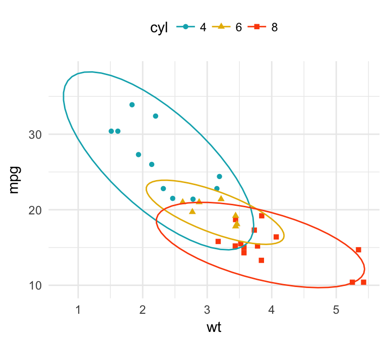
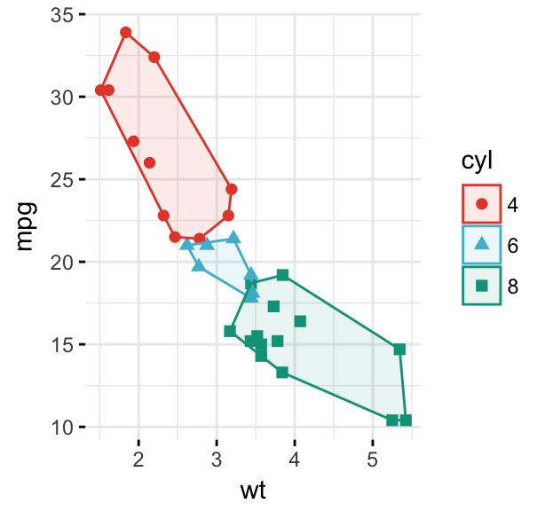
Instead of drawing the concentration ellipse, you can: i) plot a convex hull of a set of points; ii) add the mean points and the confidence ellipse of each group. Key R functions: stat_chull(), stat_conf_ellipse() and stat_mean() [in ggpubr]:
# Convex hull of groups
b + geom_point(aes(color = cyl, shape = cyl)) +
  stat_chull(aes(color = cyl, fill = cyl),
             alpha = 0.1, geom = "polygon") +
  scale_color_manual(values = c("#00AFBB", "#E7B800", "#FC4E07")) +
  scale_fill_manual(values = c("#00AFBB", "#E7B800", "#FC4E07"))
# Add mean points and confidence ellipses
b + geom_point(aes(color = cyl, shape = cyl)) +
  stat_conf_ellipse(aes(color = cyl, fill = cyl),
                    alpha = 0.1, geom = "polygon") +
  stat_mean(aes(color = cyl, shape = cyl), size = 2) +
  scale_color_manual(values = c("#00AFBB", "#E7B800", "#FC4E07")) +
scale_fill_manual(values = c("#00AFBB", "#E7B800", "#FC4E07")) 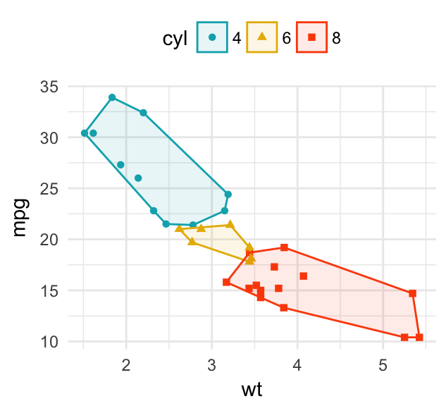
- Easy alternative using
ggpubr. See this article: Perfect Scatter Plots with Correlation and Marginal Histograms
# Add group mean points and stars
ggscatter(df, x = "wt", y = "mpg",
          color = "cyl", palette = "npg",
          shape = "cyl", ellipse = TRUE,
          mean.point = TRUE, star.plot = TRUE,
          ggtheme = theme_minimal())
# Change the ellipse type to 'convex'
ggscatter(df, x = "wt", y = "mpg",
          color = "cyl", palette = "npg",
          shape = "cyl",
          ellipse = TRUE, ellipse.type = "convex",
          ggtheme = theme_minimal())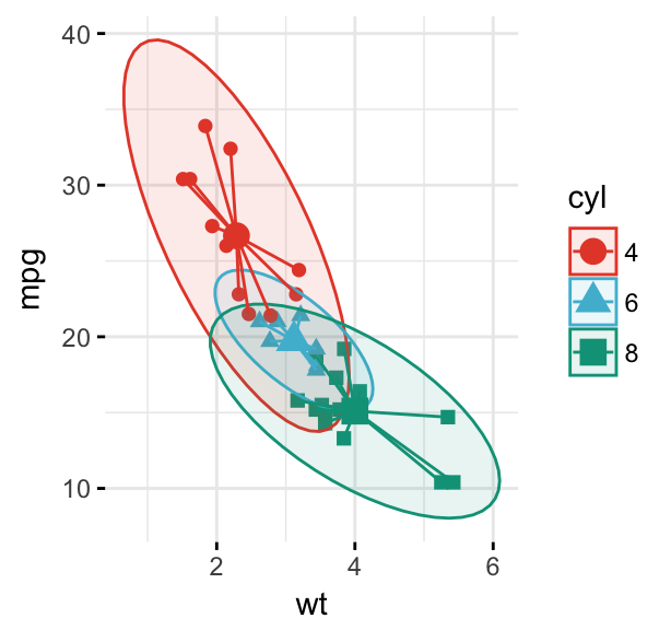
Add point text labels
Key functions:
geom_text()andgeom_label(): ggplot2 standard functions to add text to a plot.geom_text_repel()andgeom_label_repel()[in ggrepel package]. Repulsive textual annotations. Avoid text overlapping.
First install ggrepel (ìnstall.packages("ggrepel")), then type this:
library(ggrepel)
# Add text to the plot
.labs <- rownames(df)
b + geom_point(aes(color = cyl)) +
  geom_text_repel(aes(label = .labs,  color = cyl), size = 3)+
  scale_color_manual(values = c("#00AFBB", "#E7B800", "#FC4E07"))
# Draw a rectangle underneath the text, making it easier to read.
b + geom_point(aes(color = cyl)) +
  geom_label_repel(aes(label = .labs,  color = cyl), size = 3)+
  scale_color_manual(values = c("#00AFBB", "#E7B800", "#FC4E07"))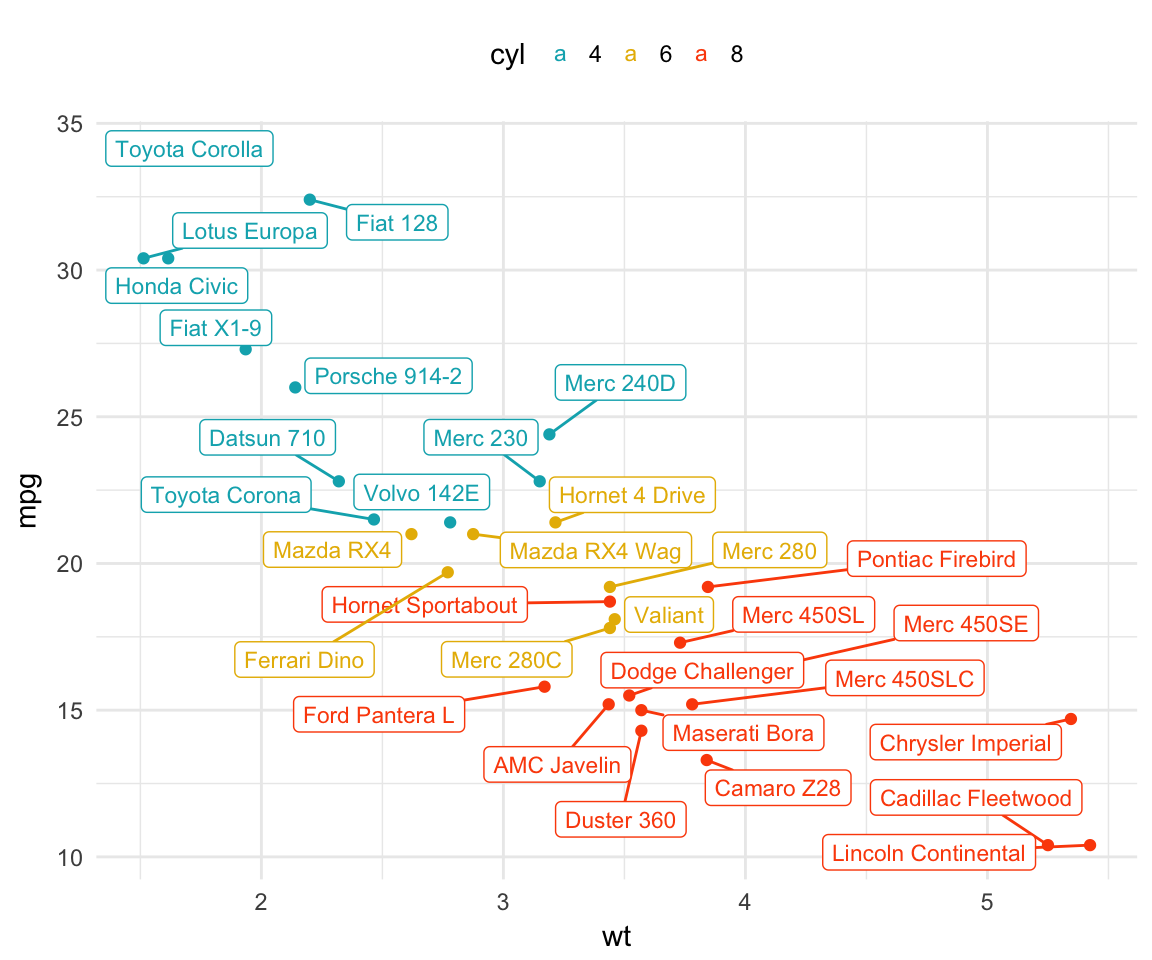
Bubble chart
In a bubble chart, points size is controlled by a continuous variable, here qsec. In the R code below, the argument alpha is used to control color transparency. alpha should be between 0 and 1.
b + geom_point(aes(color = cyl, size = qsec), alpha = 0.5) +
  scale_color_manual(values = c("#00AFBB", "#E7B800", "#FC4E07")) +
  scale_size(range = c(0.5, 12))  # Adjust the range of points size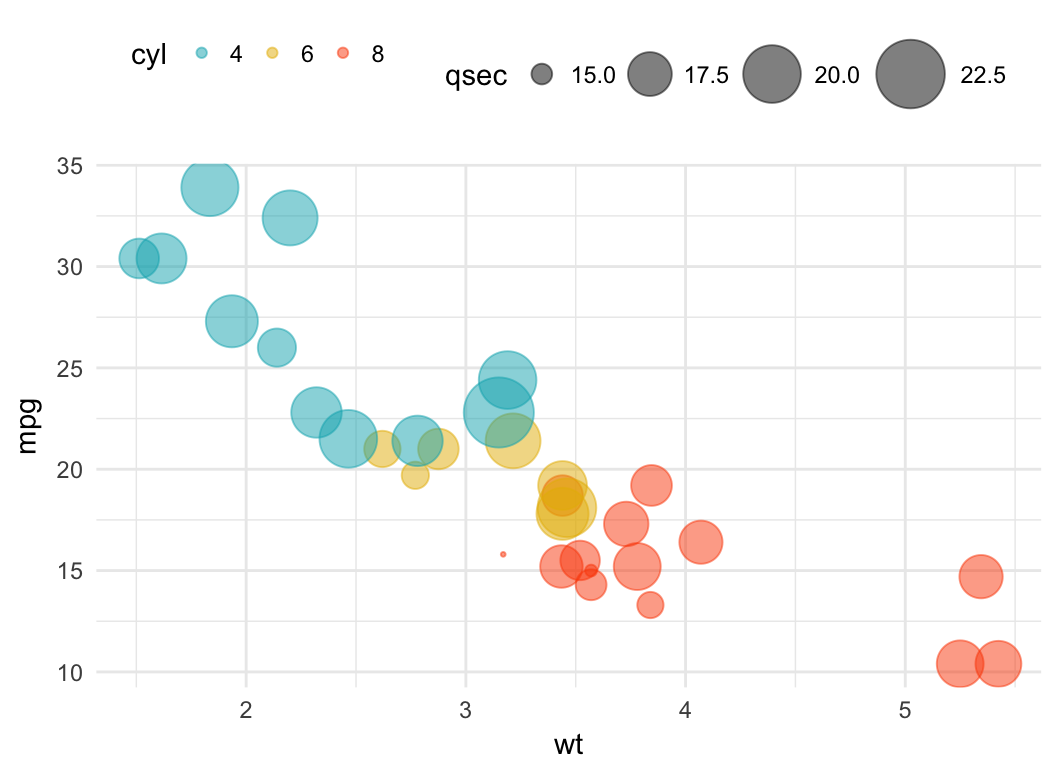
Color by a continuous variable
- Color points according to the values of the continuous variable: “mpg”.
- Change the default blue gradient color using the function
scale_color_gradientn()[in ggplot2], by specifying two or more colors.
b + geom_point(aes(color = mpg), size = 3) +
  scale_color_gradientn(colors = c("#00AFBB", "#E7B800", "#FC4E07"))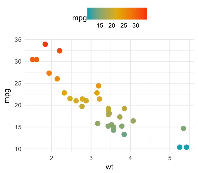
Add marginal density plots
The function ggMarginal() [in ggExtra package] (Attali 2017), can be used to easily add a marginal histogram, density or box plot to a scatter plot.
First, install the ggExtra package as follow: install.packages("ggExtra"); then type the following R code:
# Create a scatter plot
p <- ggplot(iris, aes(Sepal.Length, Sepal.Width)) +
  geom_point(aes(color = Species), size = 3, alpha = 0.6) +
  scale_color_manual(values = c("#00AFBB", "#E7B800", "#FC4E07"))
# Add density distribution as marginal plot
library("ggExtra")
ggMarginal(p, type = "density")
# Change marginal plot type
ggMarginal(p, type = "boxplot")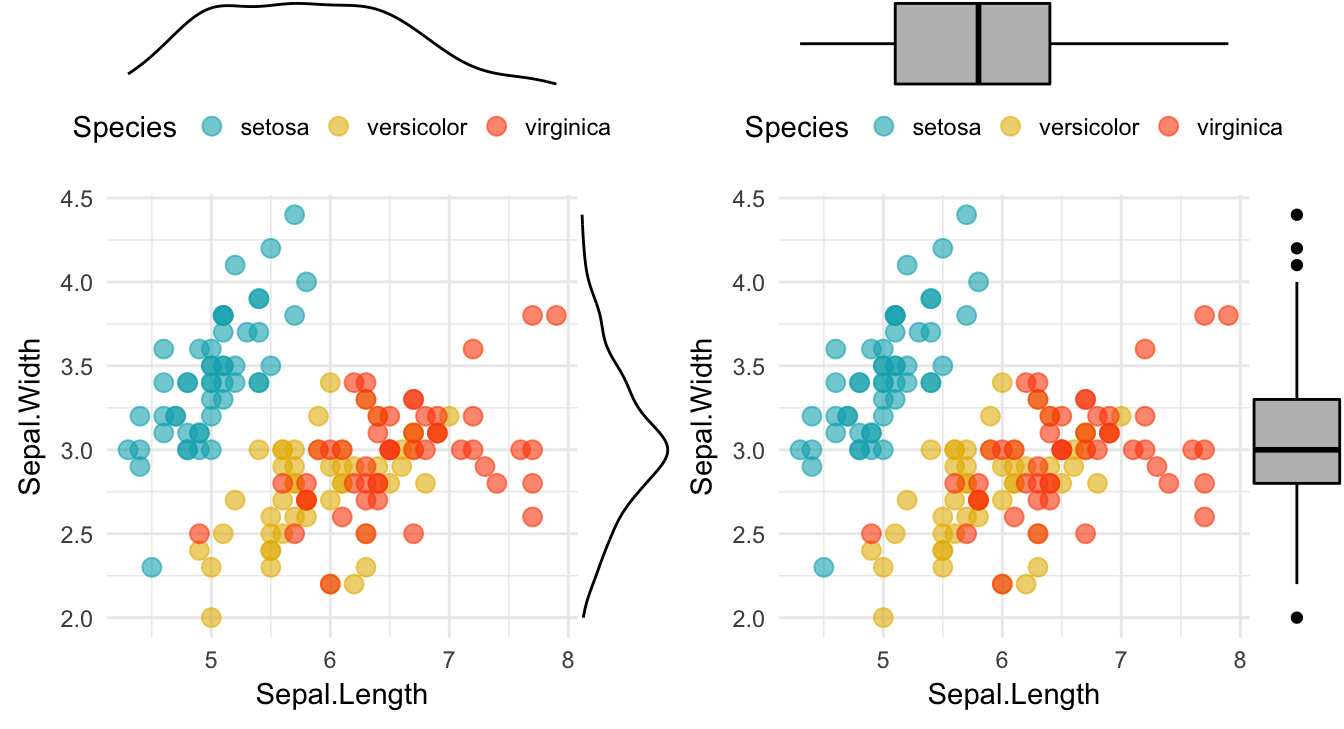
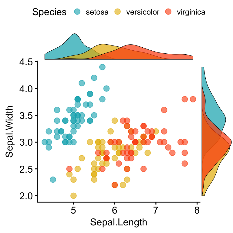
One limitation of ggExtra is that it can’t cope with multiple groups in the scatter plot and the marginal plots.
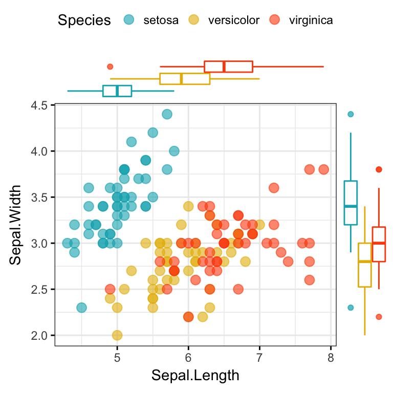
A solution is provided in the function ggscatterhist() [ggpubr]:
library(ggpubr)
# Grouped Scatter plot with marginal density plots
ggscatterhist(
  iris, x = "Sepal.Length", y = "Sepal.Width",
  color = "Species", size = 3, alpha = 0.6,
  palette = c("#00AFBB", "#E7B800", "#FC4E07"),
  margin.params = list(fill = "Species", color = "black", size = 0.2)
  )
# Use box plot as marginal plots
ggscatterhist(
  iris, x = "Sepal.Length", y = "Sepal.Width",
  color = "Species", size = 3, alpha = 0.6,
  palette = c("#00AFBB", "#E7B800", "#FC4E07"),
  margin.plot = "boxplot",
  ggtheme = theme_bw()
  )
Continuous bivariate distribution
In this section, we’ll present some alternatives to the standard scatter plots. These include:
- Rectangular binning. Rectangular heatmap of 2d bin counts
- Hexagonal binning: Hexagonal heatmap of 2d bin counts.
- 2d density estimation
- Rectangular binning:
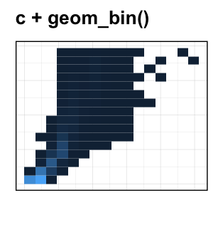
Rectangular binning is a very useful alternative to the standard scatter plot in a situation where you have a large data set containing thousands of records.
Rectangular binning helps to handle overplotting. Rather than plotting each point, which would appear highly dense, it divides the plane into rectangles, counts the number of cases in each rectangle, and then plots a heatmap of 2d bin counts. In this plot, many small hexagon are drawn with a color intensity corresponding to the number of cases in that bin.
Key function: geom_bin2d(): Creates a heatmap of 2d bin counts. Key arguments: bins, numeric vector giving number of bins in both vertical and horizontal directions. Set to 30 by default.
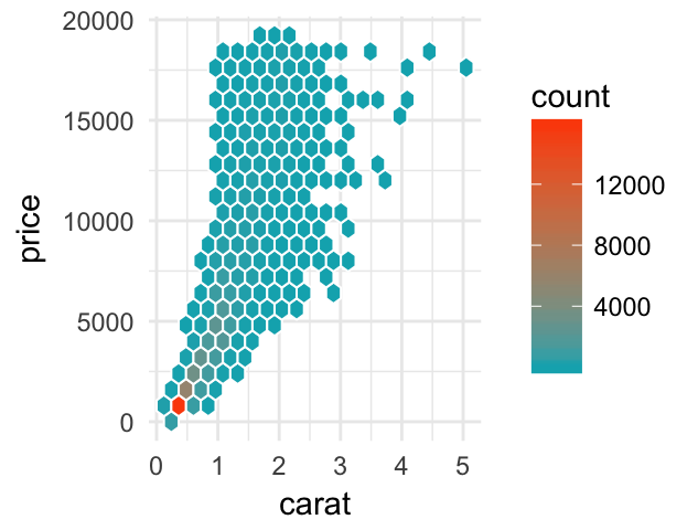
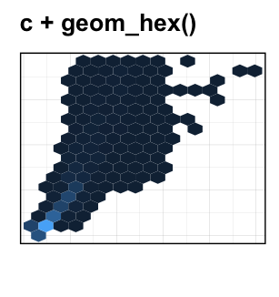
- Hexagonal binning: Similar to rectangular binning, but divides the plane into regular hexagons. Hexagon bins avoid the visual artefacts sometimes generated by the very regular alignment of `geom_bin2d().
Key function: geom_hex()
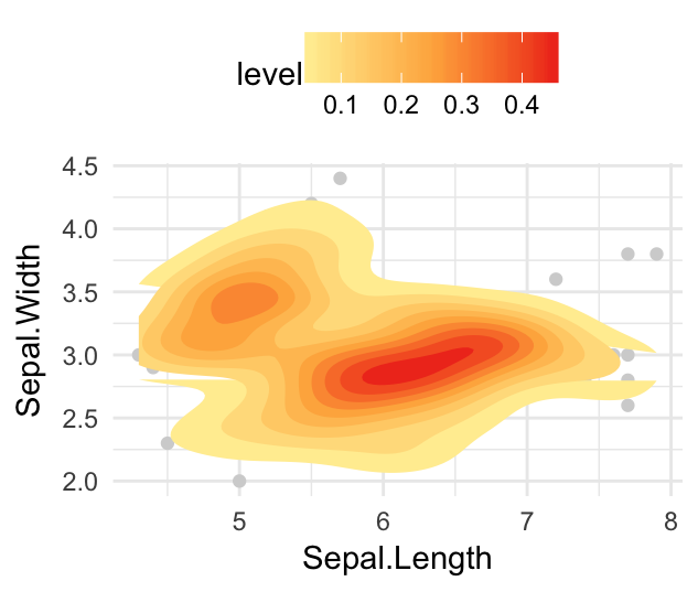
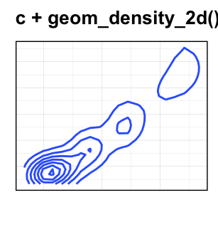
- Contours of a 2d density estimate. Perform a 2D kernel density estimation and display results as contours overlaid on the scatter plot. This can be also useful for dealing with overplotting.
Key function: geom_density_2d()
- Create a scatter plot with rectangular and hexagonal binning:
# Rectangular binning
ggplot(diamonds, aes(carat, price)) +
  geom_bin2d(bins = 20, color ="white")+
  scale_fill_gradient(low =  "#00AFBB", high = "#FC4E07")+
  theme_minimal()
# Hexagonal binning
ggplot(diamonds, aes(carat, price)) +
  geom_hex(bins = 20, color = "white")+
  scale_fill_gradient(low =  "#00AFBB", high = "#FC4E07")+
  theme_minimal()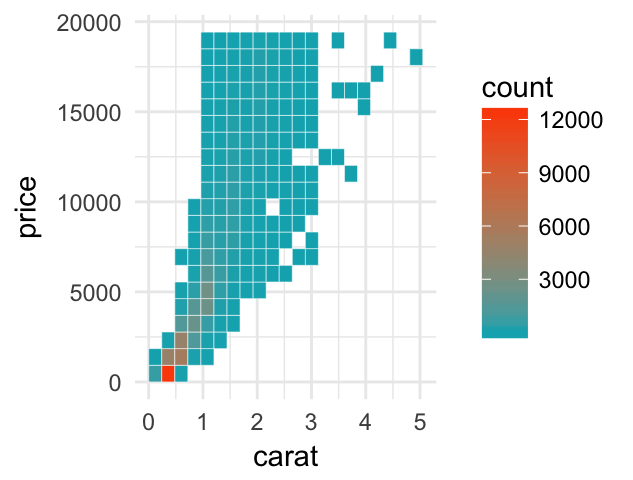
- Create a scatter plot with 2d density estimation:
# Add 2d density estimation
sp <- ggplot(iris, aes(Sepal.Length, Sepal.Width)) +
  geom_point(color = "lightgray")
sp + geom_density_2d()

# Use different geometry and change the gradient color
sp + stat_density_2d(aes(fill = ..level..), geom = "polygon") +
  scale_fill_gradientn(colors = c("#FFEDA0", "#FEB24C", "#F03B20"))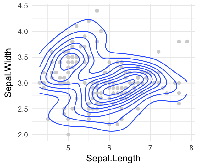
Zoom in a scatter plot
- Key function:
facet_zomm()[in ggforce] (Pedersen 2016). - Demo data set:
iris. The R code below zoom the points whereSpecies == "versicolor".
library(ggforce)
ggplot(iris, aes(Petal.Length, Petal.Width, colour = Species)) +
  geom_point() +
  ggpubr::color_palette("jco") +
  facet_zoom(x = Species == "versicolor")+
  theme_bw()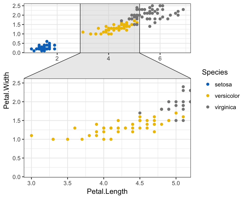
To zoom the points, where Petal.Length < 2.5, type this:
ggplot(iris, aes(Petal.Length, Petal.Width, colour = Species)) +
  geom_point() +
  ggpubr::color_palette("jco") +
  facet_zoom(x = Petal.Length < 2.5)+
  theme_bw()
Add trend lines and equations
In this section, we’ll describe how to add trend lines to a scatter plot and labels (equation, R2, BIC, AIC) for a fitted lineal model.
- Load packages and create a basic scatter plot facetted by groups:
# Load packages and set theme
library(ggpubr)
library(ggpmisc)
theme_set(
  theme_bw() +
    theme(legend.position = "top")
  )
# Scatter plot
p <- ggplot(iris, aes(Sepal.Length, Sepal.Width)) +
  geom_point(aes(color = Species), size = 3, alpha = 0.6) +
  scale_color_manual(values = c("#00AFBB", "#E7B800", "#FC4E07")) +
  scale_fill_manual(values = c("#00AFBB", "#E7B800", "#FC4E07"))+
facet_wrap(~Species)- Add regression line, correlation coefficient and equantions of the fitted line. Key functions:
stat_smooth()[ggplot2]stat_cor()[ggpubr]stat_poly_eq()[ggpmisc]
formula <- y ~ x
p +
  stat_smooth( aes(color = Species, fill = Species), method = "lm") +
  stat_cor(aes(color = Species), label.y = 4.4)+
  stat_poly_eq(
    aes(color = Species, label = ..eq.label..),
    formula = formula, label.y = 4.2, parse = TRUE)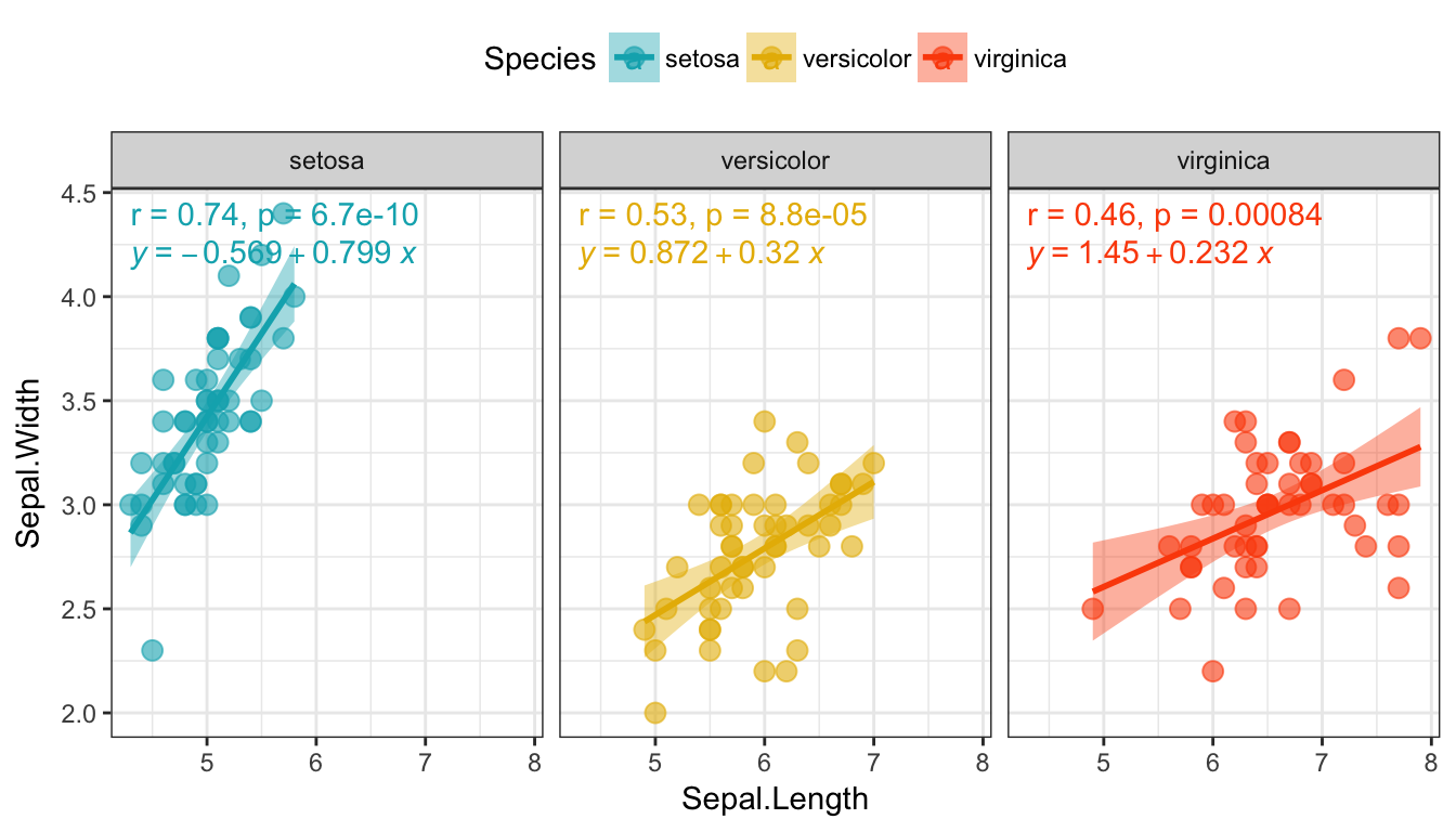
- Fit polynomial equation:
- Create some data:
set.seed(4321)
x <- 1:100
y <- (x + x^2 + x^3) + rnorm(length(x), mean = 0, sd = mean(x^3) / 4)
my.data <- data.frame(x, y, group = c("A", "B"),
y2 = y * c(0.5,2), block = c("a", "a", "b", "b"))- Fit polynomial regression line and add labels:
# Polynomial regression. Sow equation and adjusted R2
formula <- y ~ poly(x, 3, raw = TRUE)
p <- ggplot(my.data, aes(x, y2, color = group)) +
  geom_point() +
  geom_smooth(aes(fill = group), method = "lm", formula = formula) +
  stat_poly_eq(
    aes(label =  paste(..eq.label.., ..adj.rr.label.., sep = "~~~~")),
    formula = formula, parse = TRUE
    )
ggpar(p, palette = "jco")
Note that, you can also display the AIC and the BIC values using ..AIC.label.. and ..BIC.label.. in the above equation.
Other arguments (label.x, label.y) are available in the function stat_poly_eq() to adjust label positions.
For more examples, type this R code: browseVignettes(“ggpmisc”).
Conclusion
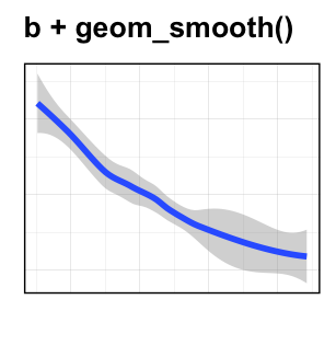
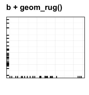
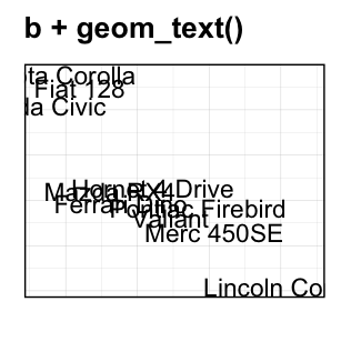
- Create a basic scatter plot:
b <- ggplot(mtcars, aes(x = wt, y = mpg))Possible layers, include:
geom_point()for scatter plotgeom_smooth()for adding smoothed line such as regression linegeom_rug()for adding a marginal ruggeom_text()for adding textual annotations
- Continuous bivariate distribution:
c <- ggplot(diamonds, aes(carat, price))Possible layers include:
geom_bin2d(): Rectangular binning.geom_hex(): Hexagonal binning.geom_density_2d(): Contours from a 2d density estimate
See also
- ggpubr: Publication Ready Plots. https://goo.gl/7uySha
- Perfect Scatter Plots with Correlation and Marginal Histograms. https://goo.gl/3o4ddg
References
Attali, Dean. 2017. GgExtra: Add Marginal Histograms to ’Ggplot2’, and More ’Ggplot2’ Enhancements. https://github.com/daattali/ggExtra.
Pedersen, Thomas Lin. 2016. Ggforce: Accelerating ’Ggplot2’. https://github.com/thomasp85/ggforce.