


FAMD - Factor Analysis of Mixed Data in R: Essentials
Factor analysis of mixed data (FAMD) is a principal component method dedicated to analyze a data set containing both quantitative and qualitative variables (Pagès 2004). It makes it possible to analyze the similarity between individuals by taking into account a mixed types of variables. Additionally, one can explore the association between all variables, both quantitative and qualitative variables.
Roughly speaking, the FAMD algorithm can be seen as a mixed between principal component analysis (PCA) (Chapter @ref(principal-component-analysis)) and multiple correspondence analysis (MCA) (Chapter @ref(multiple-correspondence-analysis)). In other words, it acts as PCA quantitative variables and as MCA for qualitative variables.
Quantitative and qualitative variables are normalized during the analysis in order to balance the influence of each set of variables.
In the current chapter, we demonstrate how to compute and visualize factor analysis of mixed data using FactoMineR (for the analysis) and factoextra (for data visualization) R packages.
Contents:
Computation
R packages
Install required packages as follow:
install.packages(c("FactoMineR", "factoextra"))Load the packages:
library("FactoMineR")
library("factoextra")
Data format
We’ll use a subset of the wine data set available in FactoMineR package:
library("FactoMineR")
data(wine)
df <- wine[,c(1,2, 16, 22, 29, 28, 30,31)]
head(df[, 1:7], 4)
## Label Soil Plante Acidity Harmony Intensity Overall.quality
## 2EL Saumur Env1 2.00 2.11 3.14 2.86 3.39
## 1CHA Saumur Env1 2.00 2.11 2.96 2.89 3.21
## 1FON Bourgueuil Env1 1.75 2.18 3.14 3.07 3.54
## 1VAU Chinon Env2 2.30 3.18 2.04 2.46 2.46To see the structure of the data, type this:
str(df)The data contains 21 rows (wines, individuals) and 8 columns (variables):
- The first two columns are factors (
categorical variables):label(Saumur, Bourgueil or Chinon) andsoil(Reference, Env1, Env2 or Env4). - The remaining columns are numeric (
continuous variables).
The goal of this study is to analyze the characteristics of the wines.
R code
The function FAMD() [FactoMiner package] can be used to compute FAMD. A simplified format is :
FAMD (base, ncp = 5, sup.var = NULL, ind.sup = NULL, graph = TRUE)base: a data frame with n rows (individuals) and p columns (variables).ncp: the number of dimensions kept in the results (by default 5)sup.var: a vector indicating the indexes of the supplementary variables.ind.sup: a vector indicating the indexes of the supplementary individuals.graph: a logical value. If TRUE a graph is displayed.
To compute FAMD, type this:
library(FactoMineR)
res.famd <- FAMD(df, graph = FALSE)
The output of the FAMD() function is a list including :
print(res.famd)## *The results are available in the following objects:
##
## name description
## 1 "$eig" "eigenvalues and inertia"
## 2 "$var" "Results for the variables"
## 3 "$ind" "results for the individuals"
## 4 "$quali.var" "Results for the qualitative variables"
## 5 "$quanti.var" "Results for the quantitative variables"Visualization and interpretation
We’ll use the following factoextra functions:
get_eigenvalue(res.famd): Extract the eigenvalues/variances retained by each dimension (axis).fviz_eig(res.famd): Visualize the eigenvalues/variances.get_famd_ind(res.famd): Extract the results for individuals.get_famd_var(res.famd): Extract the results for quantitative and qualitative variables.fviz_famd_ind(res.famd),fviz_famd_var(res.famd): Visualize the results for individuals and variables, respectively.
In the next sections, we’ll illustrate each of these functions.
To help in the interpretation of FAMD, we highly recommend to read the interpretation of principal component analysis (Chapter (???)(principal-component-analysis)) and multiple correspondence analysis (Chapter (???)(multiple-correspondence-analysis)). Many of the graphs presented here have been already described in our previous chapters.
Eigenvalues / Variances
The proportion of variances retained by the different dimensions (axes) can be extracted using the function get_eigenvalue() [factoextra package] as follow:
library("factoextra")
eig.val <- get_eigenvalue(res.famd)
head(eig.val)
## eigenvalue variance.percent cumulative.variance.percent
## Dim.1 4.832 43.92 43.9
## Dim.2 1.857 16.88 60.8
## Dim.3 1.582 14.39 75.2
## Dim.4 1.149 10.45 85.6
## Dim.5 0.652 5.93 91.6The function fviz_eig() or fviz_screeplot() [factoextra package] can be used to draw the scree plot (the percentages of inertia explained by each FAMD dimensions):
fviz_screeplot(res.famd)
Graph of variables
All variables
The function get_mfa_var() [in factoextra] is used to extract the results for variables. By default, this function returns a list containing the coordinates, the cos2 and the contribution of all variables:
var <- get_famd_var(res.famd)
var
## FAMD results for variables
## ===================================================
## Name Description
## 1 "$coord" "Coordinates"
## 2 "$cos2" "Cos2, quality of representation"
## 3 "$contrib" "Contributions"The different components can be accessed as follow:
# Coordinates of variables
head(var$coord)
# Cos2: quality of representation on the factore map
head(var$cos2)
# Contributions to the  dimensions
head(var$contrib)
The following figure shows the correlation between variables - both quantitative and qualitative variables - and the principal dimensions, as well as, the contribution of variables to the dimensions 1 and 2. The following functions [in the factoextra package] are used:
fviz_famd_var()to plot both quantitative and qualitative variablesfviz_contrib()to visualize the contribution of variables to the principal dimensions
# Plot of variables
fviz_famd_var(res.famd, repel = TRUE)
# Contribution to the first dimension
fviz_contrib(res.famd, "var", axes = 1)
# Contribution to the second dimension
fviz_contrib(res.famd, "var", axes = 2)
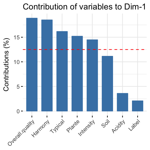
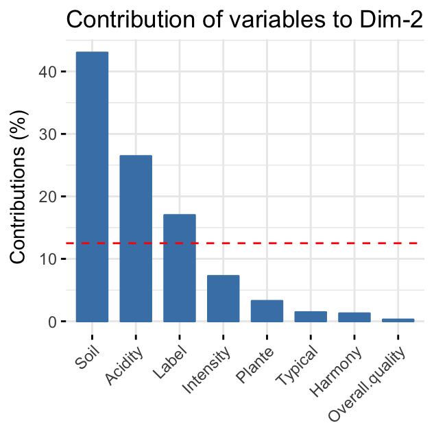
The red dashed line on the graph above indicates the expected average value, If the contributions were uniform. Read more in chapter (Chapter @ref(principal-component-analysis)).
From the plots above, it can be seen that:
-
variables that contribute the most to the first dimension are: Overall.quality and Harmony.
-
variables that contribute the most to the second dimension are: Soil and Acidity.
Quantitative variables
To extract the results for quantitative variables, type this:
quanti.var <- get_famd_var(res.famd, "quanti.var")
quanti.var
## FAMD results for quantitative variables
## ===================================================
## Name Description
## 1 "$coord" "Coordinates"
## 2 "$cos2" "Cos2, quality of representation"
## 3 "$contrib" "Contributions"In this section, we’ll describe how to visualize quantitative variables. Additionally, we’ll show how to highlight variables according to either i) their quality of representation on the factor map or ii) their contributions to the dimensions.
The R code below plots quantitative variables. We use repel = TRUE, to avoid text overlapping.
fviz_famd_var(res.famd, "quanti.var", repel = TRUE,
              col.var = "black")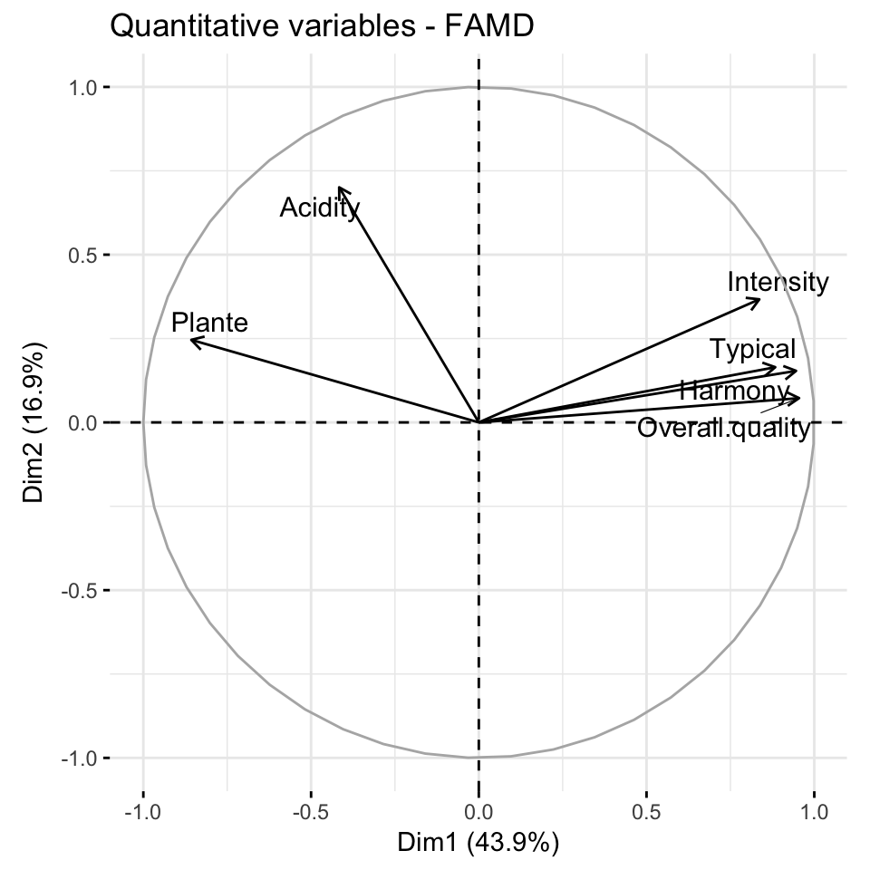
Briefly, the graph of variables (correlation circle) shows the relationship between variables, the quality of the representation of variables, as well as, the correlation between variables and the dimensions. Read more at PCA (Chapter @ref(principal-component-analysis)), MCA (Chapter @ref(multiple-correspondence-analysis)) and MFA (Chapter @ref(multiple-factor-analysis)).
The most contributing quantitative variables can be highlighted on the scatter plot using the argument col.var = "contrib". This produces a gradient colors, which can be customized using the argument gradient.cols.
fviz_famd_var(res.famd, "quanti.var", col.var = "contrib",
             gradient.cols = c("#00AFBB", "#E7B800", "#FC4E07"),
             repel = TRUE)
Similarly, you can highlight quantitative variables using their cos2 values representing the quality of representation on the factor map. If a variable is well represented by two dimensions, the sum of the cos2 is closed to one. For some of the items, more than 2 dimensions might be required to perfectly represent the data.
# Color by cos2 values: quality on the factor map
fviz_famd_var(res.famd, "quanti.var", col.var = "cos2",
             gradient.cols = c("#00AFBB", "#E7B800", "#FC4E07"),
             repel = TRUE)
Graph of qualitative variables
Like quantitative variables, the results for qualitative variables can be extracted as follow:
quali.var <- get_famd_var(res.famd, "quali.var")
quali.var
## FAMD results for qualitative variable categories
## ===================================================
## Name Description
## 1 "$coord" "Coordinates"
## 2 "$cos2" "Cos2, quality of representation"
## 3 "$contrib" "Contributions"To visualize qualitative variables, type this:
fviz_famd_var(res.famd, "quali.var", col.var = "contrib",
             gradient.cols = c("#00AFBB", "#E7B800", "#FC4E07")
             )
The plot above shows the categories of the categorical variables.
Graph of individuals
To get the results for individuals, type this:
ind <- get_famd_ind(res.famd)
ind
## FAMD results for individuals
## ===================================================
## Name Description
## 1 "$coord" "Coordinates"
## 2 "$cos2" "Cos2, quality of representation"
## 3 "$contrib" "Contributions"To plot individuals, use the function fviz_mfa_ind() [in factoextra]. By default, individuals are colored in blue. However, like variables, it’s also possible to color individuals by their cos2 and contribution values:
fviz_famd_ind(res.famd, col.ind = "cos2",
             gradient.cols = c("#00AFBB", "#E7B800", "#FC4E07"),
             repel = TRUE)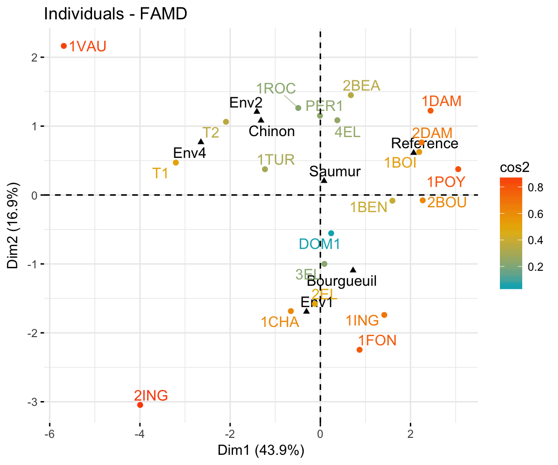
In the plot above, the qualitative variable categories are shown in black. Env1, Env2, Env3 are the categories of the soil. Saumur, Bourgueuil and Chinon are the categories of the wine Label. If you don’t want to show them on the plot, use the argument invisible = "quali.var".
Individuals with similar profiles are close to each other on the factor map. For the interpretation, read more at Chapter @ref(multiple-correspondence-analysis) (MCA) and Chapter @ref(multiple-factor-analysis) (MFA).
Note that, it’s possible to color the individuals using any of the qualitative variables in the initial data table. To do this, the argument habillage is used in the fviz_famd_ind() function. For example, if you want to color the wines according to the supplementary qualitative variable “Label”, type this:
fviz_mfa_ind(res.famd,
             habillage = "Label", # color by groups
             palette = c("#00AFBB", "#E7B800", "#FC4E07"),
             addEllipses = TRUE, ellipse.type = "confidence",
             repel = TRUE # Avoid text overlapping
) 
If you want to color individuals using multiple categorical variables at the same time, use the function fviz_ellipses() [in factoextra] as follow:
fviz_ellipses(res.famd, c("Label", "Soil"), repel = TRUE)
Alternatively, you can specify categorical variable indices:
fviz_ellipses(res.famd, 1:2, geom = "point")Summary
The factor analysis of mixed data (FAMD) makes it possible to analyze a data set, in which individuals are described by both qualitative and quantitative variables. In this article, we described how to perform and interpret FAMD using FactoMineR and factoextra R packages.
Further reading
Factor Analysis of Mixed Data Using FactoMineR (video course). https://goo.gl/64gY3R
References
Pagès, J. 2004. “Analyse Factorielle de Donnees Mixtes.” Revue Statistique Appliquee 4: 93–111.