


qplot: Quick plot with ggplot2 - R software and data visualization
The function qplot() [in ggplot2] is very similar to the basic plot() function from the R base package. It can be used to create and combine easily different types of plots. However, it remains less flexible than the function ggplot().
This chapter provides a brief introduction to qplot(), which stands for quick plot. Concerning the function ggplot(), many articles are available at the end of this web page for creating and customizing different plots using ggplot().
Data format
The data must be a data.frame (columns are variables and rows are observations).
The data set mtcars is used in the examples below:
data(mtcars)
df <- mtcars[, c("mpg", "cyl", "wt")]
head(df)
## mpg cyl wt
## Mazda RX4 21.0 6 2.620
## Mazda RX4 Wag 21.0 6 2.875
## Datsun 710 22.8 4 2.320
## Hornet 4 Drive 21.4 6 3.215
## Hornet Sportabout 18.7 8 3.440
## Valiant 18.1 6 3.460mtcars : Motor Trend Car Road Tests.
Description: The data comprises fuel consumption and 10 aspects of automobile design and performance for 32 automobiles (1973 - 74 models).
Format: A data frame with 32 observations on 3 variables.
- [, 1] mpg Miles/(US) gallon
- [, 2] cyl Number of cylinders
- [, 3] wt Weight (lb/1000)
Usage of qplot() function
A simplified format of qplot() is :
qplot(x, y=NULL, data, geom="auto",
xlim = c(NA, NA), ylim =c(NA, NA))- x : x values
- y : y values (optional)
- data : data frame to use (optional).
- geom : Character vector specifying geom to use. Defaults to “point” if x and y are specified, and “histogram” if only x is specified.
- xlim, ylim: x and y axis limits
Other arguments including main, xlab, ylab and log can be used also:
- main: Plot title
- xlab, ylab: x and y axis labels
- log: which variables to log transform. Allowed values are “x”, “y” or “xy”
Note that, the stat and position arguments to qplot() have been deprecated since ggplot2 version 2.0.0.
Scatter plots
Basic scatter plots
The plot can be created using data from either numeric vectors or a data frame:
# Use data from numeric vectors
x <- 1:10; y = x*x
# Basic plot
qplot(x,y)
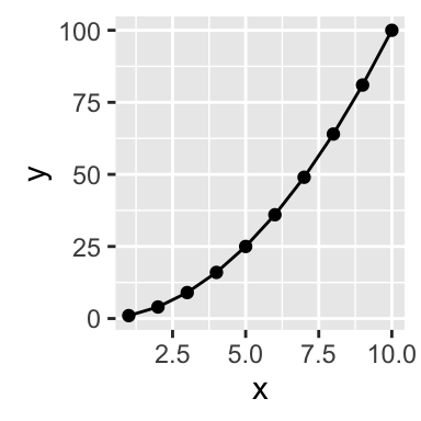
# Add line
qplot(x, y, geom=c("point", "line"))
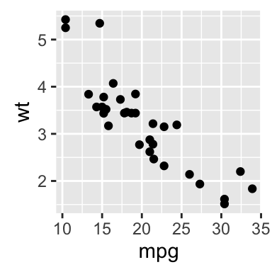
# Use data from a data frame
qplot(mpg, wt, data=mtcars)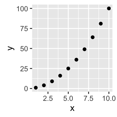
Scatter plots with smoothed line
The option smooth is used to add a smoothed line with its standard error:
# Smoothing
qplot(mpg, wt, data = mtcars, geom = c("point", "smooth"))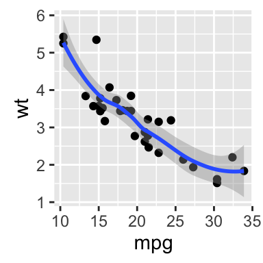
To draw a regression line, read the following article: ggplot2 scatter plot
Smoothed line by groups
The argument color is used to tell R that we want to color the points by groups:
# Linear fits by group
qplot(mpg, wt, data = mtcars, color = factor(cyl),
      geom=c("point", "smooth"))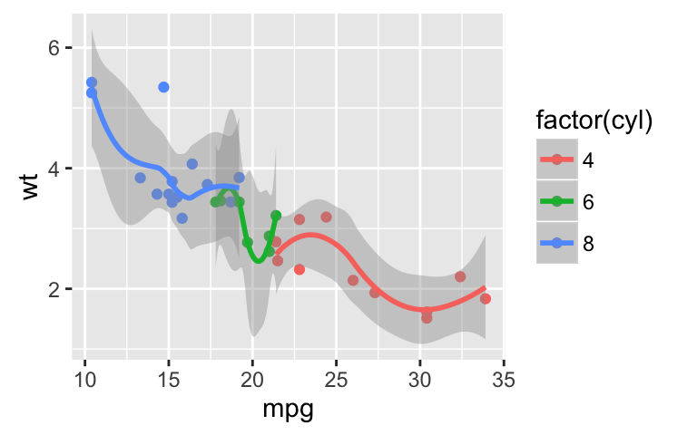
Change scatter plot colors
Points can be colored according to the values of a continuous or a discrete variable. The argument colour is used.
# Change the color by a continuous numeric variable
qplot(mpg, wt, data = mtcars, colour = cyl)
# Change the color by groups (factor)
df <- mtcars
df[,'cyl'] <- as.factor(df[,'cyl'])
qplot(mpg, wt, data = df, colour = cyl)
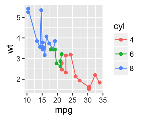
# Add lines
qplot(mpg, wt, data = df, colour = cyl,
geom=c("point", "line"))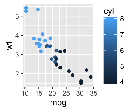
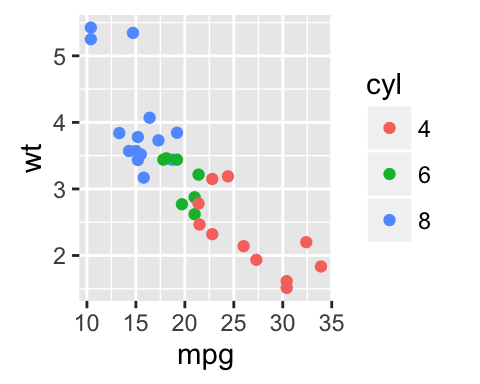
Note that you can also use the following R code to generate the second plot :
qplot(mpg, wt, data=df, colour= factor(cyl))Change the shape and the size of points
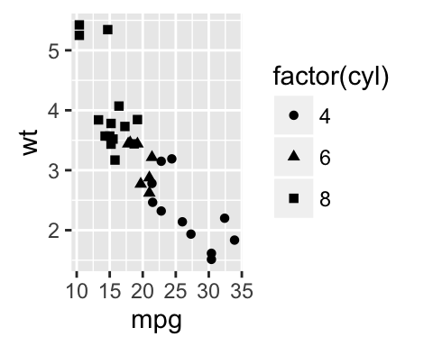
Like color, the shape and the size of points can be controlled by a continuous or discrete variable.
# Change the size of points according to
  # the values of a continuous variable
qplot(mpg, wt, data = mtcars, size = mpg)
# Change point shapes by groups
qplot(mpg, wt, data = mtcars, shape = factor(cyl))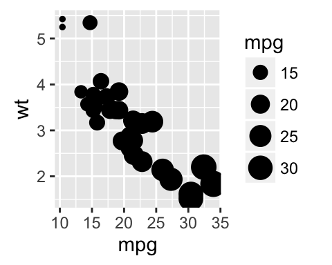
Scatter plot with texts
The argument label is used to specify the texts to be used for each points:
qplot(mpg, wt, data = mtcars, label = rownames(mtcars),
      geom=c("point", "text"),
      hjust=0, vjust=0)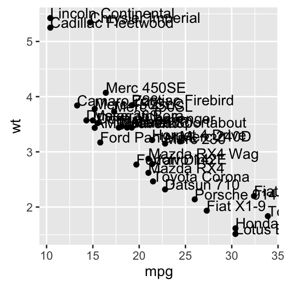
Box plot, dot plot and violin plot
PlantGrowth data set is used in the following example :
head(PlantGrowth)## weight group
## 1 4.17 ctrl
## 2 5.58 ctrl
## 3 5.18 ctrl
## 4 6.11 ctrl
## 5 4.50 ctrl
## 6 4.61 ctrl- geom = “boxplot”: draws a box plot
- geom = “dotplot”: draws a dot plot. The supplementary arguments stackdir = “center” and binaxis = “y” are required.
- geom = “violin”: draws a violin plot. The argument trim is set to FALSE
# Basic box plot from a numeric vector
x <- "1"
y <- rnorm(100)
qplot(x, y, geom="boxplot")
# Basic box plot from data frame
qplot(group, weight, data = PlantGrowth,
geom=c("boxplot"))
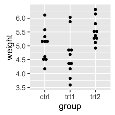
# Dot plot
qplot(group, weight, data = PlantGrowth,
geom=c("dotplot"),
stackdir = "center", binaxis = "y")
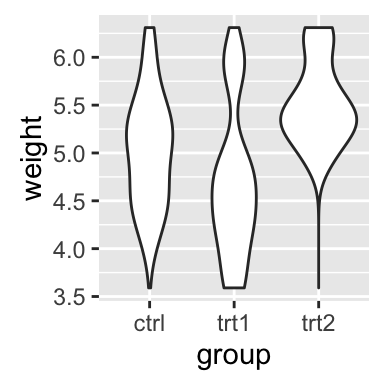
# Violin plot
qplot(group, weight, data = PlantGrowth,
geom=c("violin"), trim = FALSE)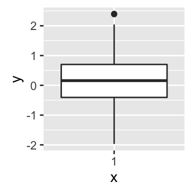

Change the color by groups:
# Box plot from a data frame
# Add jitter and change fill color by group
qplot(group, weight, data = PlantGrowth,
geom=c("boxplot", "jitter"), fill = group)
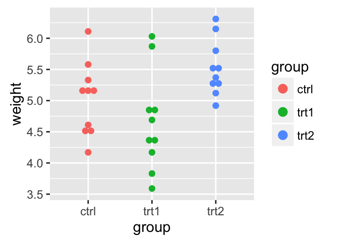
# Dot plot
qplot(group, weight, data = PlantGrowth,
geom = "dotplot", stackdir = "center", binaxis = "y",
color = group, fill = group)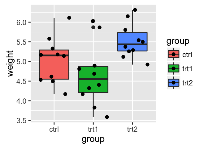
Histogram and density plots
The histogram and density plots are used to display the distribution of data.
Generate some data
The R code below generates some data containing the weights by sex (M for male; F for female):
set.seed(1234)
mydata = data.frame(
        sex = factor(rep(c("F", "M"), each=200)),
        weight = c(rnorm(200, 55), rnorm(200, 58)))
head(mydata)
## sex weight
## 1 F 53.79293
## 2 F 55.27743
## 3 F 56.08444
## 4 F 52.65430
## 5 F 55.42912
## 6 F 55.50606Histogram plot
# Basic histogram
qplot(weight, data = mydata, geom = "histogram")
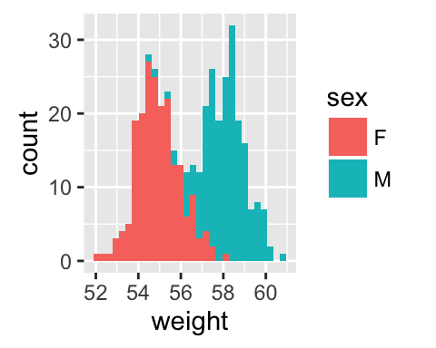
# Change histogram fill color by group (sex)
qplot(weight, data = mydata, geom = "histogram",
fill = sex)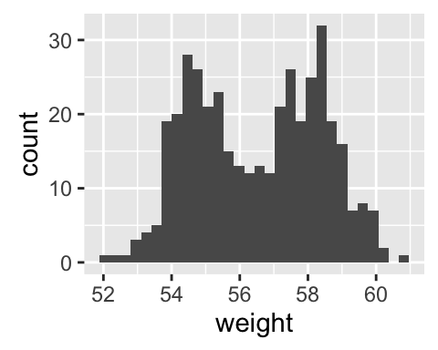
Density plot
# Basic density plot
qplot(weight, data = mydata, geom = "density")
# Change density plot line color by group (sex)
# change line type
qplot(weight, data = mydata, geom = "density",
    color = sex, linetype = sex)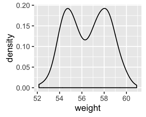

Main titles and axis labels
Titles can be added to the plot as follow:
qplot(weight, data = mydata, geom = "density",
      xlab = "Weight (kg)", ylab = "Density",
      main = "Density plot of Weight")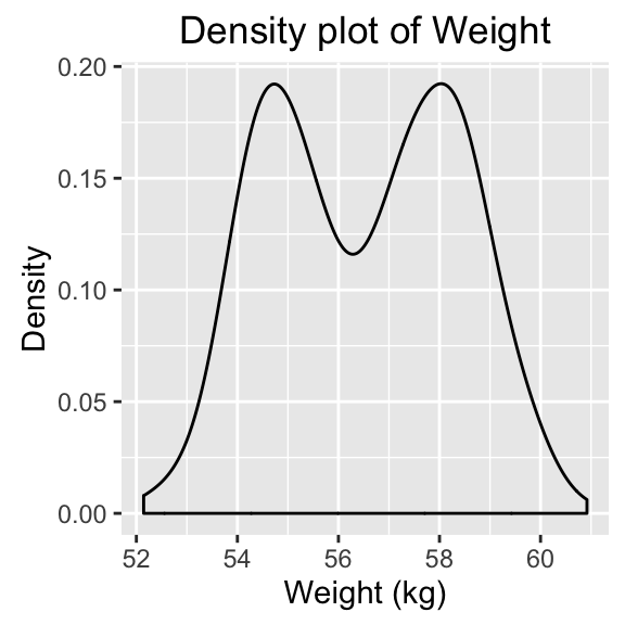
Infos
This analysis was performed using R (ver. 3.2.4) and ggplot2 (ver 2.1.0).
Show me some love with the like buttons below... Thank you and please don't forget to share and comment below!!
Montrez-moi un peu d'amour avec les like ci-dessous ... Merci et n'oubliez pas, s'il vous plaît, de partager et de commenter ci-dessous!
Recommended for You!


Recommended for you
This section contains the best data science and self-development resources to help you on your path.
Books - Data Science
Our Books
- Practical Guide to Cluster Analysis in R by A. Kassambara (Datanovia)
- Practical Guide To Principal Component Methods in R by A. Kassambara (Datanovia)
- Machine Learning Essentials: Practical Guide in R by A. Kassambara (Datanovia)
- R Graphics Essentials for Great Data Visualization by A. Kassambara (Datanovia)
- GGPlot2 Essentials for Great Data Visualization in R by A. Kassambara (Datanovia)
- Network Analysis and Visualization in R by A. Kassambara (Datanovia)
- Practical Statistics in R for Comparing Groups: Numerical Variables by A. Kassambara (Datanovia)
- Inter-Rater Reliability Essentials: Practical Guide in R by A. Kassambara (Datanovia)
Others
- R for Data Science: Import, Tidy, Transform, Visualize, and Model Data by Hadley Wickham & Garrett Grolemund
- Hands-On Machine Learning with Scikit-Learn, Keras, and TensorFlow: Concepts, Tools, and Techniques to Build Intelligent Systems by Aurelien Géron
- Practical Statistics for Data Scientists: 50 Essential Concepts by Peter Bruce & Andrew Bruce
- Hands-On Programming with R: Write Your Own Functions And Simulations by Garrett Grolemund & Hadley Wickham
- An Introduction to Statistical Learning: with Applications in R by Gareth James et al.
- Deep Learning with R by François Chollet & J.J. Allaire
- Deep Learning with Python by François Chollet
Click to follow us on Facebook :
Comment this article by clicking on "Discussion" button (top-right position of this page)