


Guide to Create Beautiful Graphics in R (Book)
File informations
Size : Unknown sizeCreation date :
Last update :
Downloads number : 0
Number of views : 21816
Category : eBooks
Author : kassambara
9 Comments
This book provides step-by-step guides to create easily beautiful graphics using ggplot2, a popular R package for data visualization.
A preview of the first 48 pages of the file is available by clicking this link: ggplot2: the elements (preview).
Download the ebook through payhip:


Order a physical copy from amazon:

How this book is organized?
This book contains 6 parts. The first part provides a quick introduction to R (chapter 1) and to ggplot2 plotting system (chapter 1).
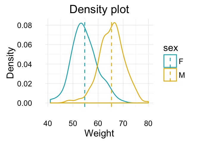
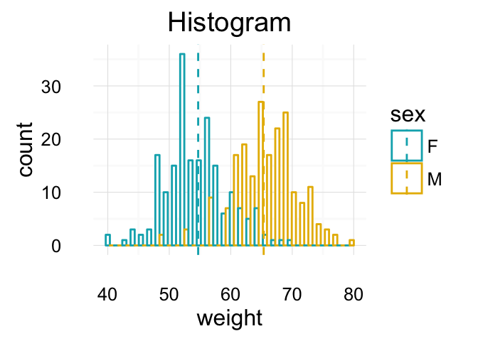
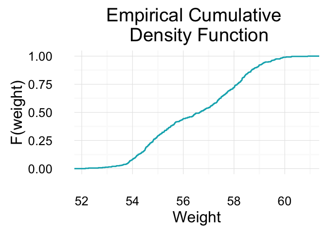
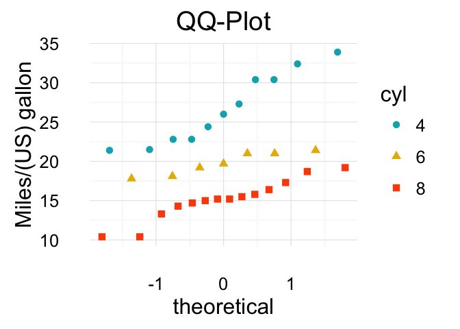
In the second part (chapter 3 - 11), we described the different graphs for visualizing one continous/discrete variable: area plots, density plots, histogram plots, frequency polygon, dot plots, ECDF and QQ plots.
ggplot2: Guide to Create Beautiful Graphics in R
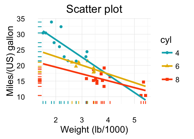
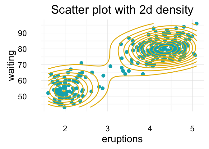
Part III provides quick-start guides for plotting two continuous/discretes variables, including :
- Scatter plots (chapter 12)
- Continuous bivariate distribution (chapter 13)
- Jitter plots of two discretes variables (chapter 14)
ggplot2: Guide to Create Beautiful Graphics in R
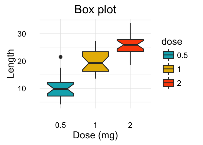
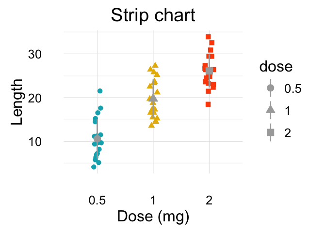
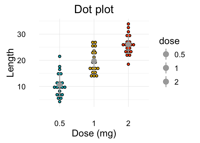
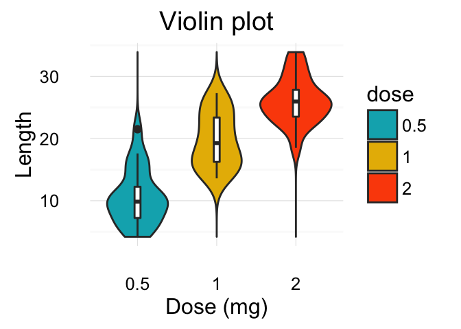
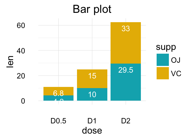
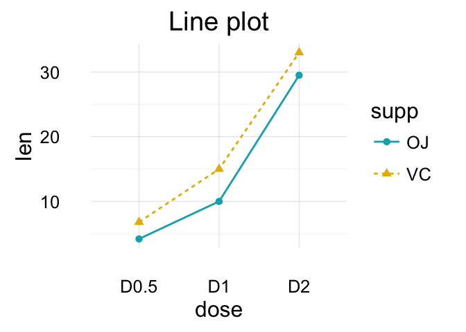
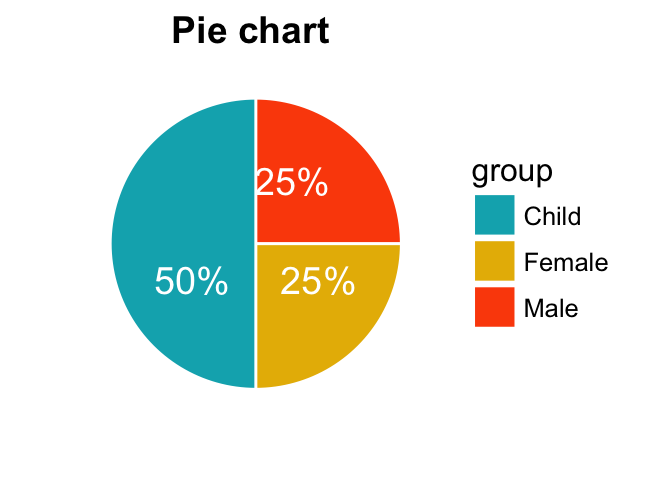
Part IV (chapter 15 - 22 ) describes how to draw and customize: box plots, violin plots, dot plots, strip charts, line plots, bar plots and pie charts.
ggplot2: Guide to Create Beautiful Graphics in R
Part V of the book covers how to change graphical parameters including:
- Main title, axis labels and legend titles (chapter 24)
- Legend position and appearance (chapter 25)
- Colors (chapter 26)
- Point shapes, colors and size (chapter 27)
- Line types (chapter 28)
- Axis limits: minimum and maximum values (chapter 29)
- Axis transformations: log and sqrt (chapter 30)
- Date axes (chapter 31)
- Axis ticks : customize tick marks and labels (chapter 32)
- Themes and background colors (chapter 33)
- Add text annotations to a graph (chapter 34)
- Add straight lines to a plot: horizontal, vertical and regression lines (chapter 35)
- Rotate a plot (chapter 36)
- Facets: split a plot into a matrix of panels (chapter 37)
- Position adjustements (chapter 38)
- Coordinate systems (chapter 39)
Part VI describes some extensions of ggplot2 including:
- Arranging multiple graphs on the same page (chapter 40)
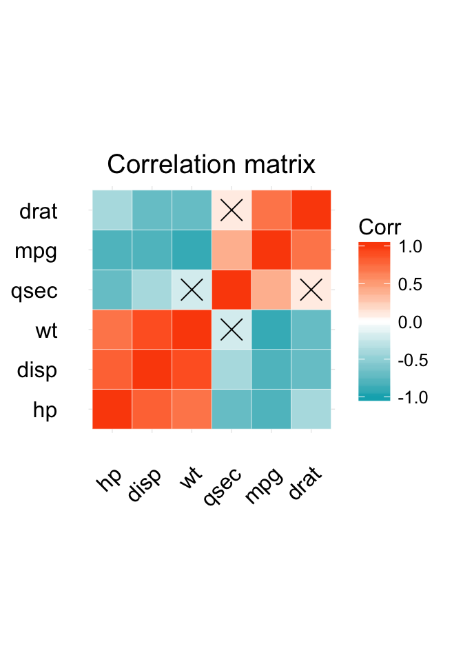
- Correlation matrix visualization (chapter 41)
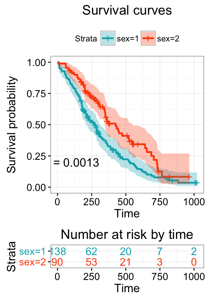
- Plotting survival curves (chapter 42)
Survival curves and correlation matrix:
ggplot2: Guide to Create Beautiful Graphics in R
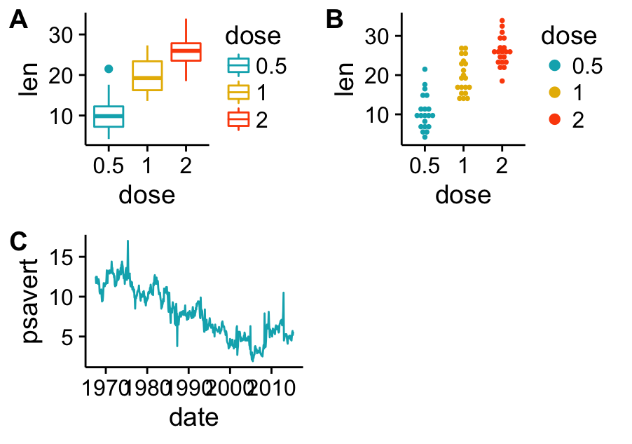
Mixing multiple plots on the same page:
ggplot2: Guide to Create Beautiful Graphics in R
Each chapter is organized as an independent quick start guide. This means that, you don’t need to read the different chapters in sequence.
For each chapter, the covered ggplot2 key functions are generally mentioned at the beginning. The used data are described and many examples of R codes and graphics are provided.
Download the ebook through payhip: