


Evaluation of Classification Model Accuracy: Essentials
After building a predictive classification model, you need to evaluate the performance of the model, that is how good the model is in predicting the outcome of new observations test data that have been not used to train the model.
In other words you need to estimate the model prediction accuracy and prediction errors using a new test data set. Because we know the actual outcome of observations in the test data set, the performance of the predictive model can be assessed by comparing the predicted outcome values against the known outcome values.
This chapter describes the commonly used metrics and methods for assessing the performance of predictive classification models, including:
- Average classification accuracy, representing the proportion of correctly classified observations.
- Confusion matrix, which is 2x2 table showing four parameters, including the number of true positives, true negatives, false negatives and false positives.
- Precision, Recall and Specificity, which are three major performance metrics describing a predictive classification model
- ROC curve, which is a graphical summary of the overall performance of the model, showing the proportion of true positives and false positives at all possible values of probability cutoff. The Area Under the Curve (AUC) summarizes the overall performance of the classifier.
We’ll provide practical examples in R to compute these above metrics, as well as, to create the ROC plot.
Contents:

Loading required R packages
tidyversefor easy data manipulation and visualizationcaretfor easy machine learning workflow
library(tidyverse)
library(caret)
Building a classification model
To keep things simple, we’ll perform a binary classification, where the outcome variable can have only two possible values: negative vs positive.
We’ll compute an example of linear discriminant analysis model using the PimaIndiansDiabetes2 [mlbench package], introduced in Chapter @ref(classification-in-r), for predicting the probability of diabetes test positivity based on clinical variables.
- Split the data into training (80%, used to build the model) and test set (20%, used to evaluate the model performance):
# Load the data
data("PimaIndiansDiabetes2", package = "mlbench")
pima.data <- na.omit(PimaIndiansDiabetes2)
# Inspect the data
sample_n(pima.data, 3)
# Split the data into training and test set
set.seed(123)
training.samples <- pima.data$diabetes %>%
  createDataPartition(p = 0.8, list = FALSE)
train.data  <- pima.data[training.samples, ]
test.data <- pima.data[-training.samples, ]- Fit the LDA model on the training set and make predictions on the test data:
library(MASS)
# Fit LDA
fit <- lda(diabetes ~., data = train.data)
# Make predictions on the test data
predictions <- predict(fit, test.data)
prediction.probabilities <- predictions$posterior[,2]
predicted.classes <- predictions$class
observed.classes <- test.data$diabetes
Overall classification accuracy
The overall classification accuracy rate corresponds to the proportion of observations that have been correctly classified. Determining the raw classification accuracy is the first step in assessing the performance of a model.
Inversely, the classification error rate is defined as the proportion of observations that have been misclassified. Error rate = 1 - accuracy
The raw classification accuracy and error can be easily computed by comparing the observed classes in the test data against the predicted classes by the model:
accuracy <- mean(observed.classes == predicted.classes)
accuracy
## [1] 0.808error <- mean(observed.classes != predicted.classes)
error## [1] 0.192From the output above, the linear discriminant analysis correctly predicted the individual outcome in 81% of the cases. This is by far better than random guessing. The misclassification error rate can be calculated as 100 - 81% = 19%.
In our example, a binary classifier can make two types of errors:
- it can incorrectly assign an individual who is diabetes-positive to the diabetes-negative category
- it can incorrectly assign an individual who is diabetes-negative to the diabetes-positive category.
The proportion of theses two types of errors can be determined by creating a confusion matrix, which compare the predicted outcome values against the known outcome values.
Confusion matrix
The R function table() can be used to produce a confusion matrix in order to determine how many observations were correctly or incorrectly classified. It compares the observed and the predicted outcome values and shows the number of correct and incorrect predictions categorized by type of outcome.
# Confusion matrix, number of cases
table(observed.classes, predicted.classes)
## predicted.classes
## observed.classes neg pos
## neg 48 4
## pos 11 15# Confusion matrix, proportion of cases
table(observed.classes, predicted.classes) %>%
prop.table() %>% round(digits = 3)## predicted.classes
## observed.classes neg pos
## neg 0.615 0.051
## pos 0.141 0.192The diagonal elements of the confusion matrix indicate correct predictions, while the off-diagonals represent incorrect predictions. So, the correct classification rate is the sum of the number on the diagonal divided by the sample size in the test data. In our example, that is (48 + 15)/78 = 81%.
Each cell of the table has an important meaning:
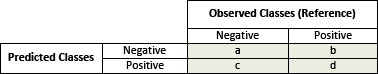
- True positives (d): these are cases in which we predicted the individuals would be diabetes-positive and they were.
- True negatives (a): We predicted diabetes-negative, and the individuals were diabetes-negative.
- False positives (b): We predicted diabetes-positive, but the individuals didn’t actually have diabetes. (Also known as a Type I error.)
- False negatives (c): We predicted diabetes-negative, but they did have diabetes. (Also known as a Type II error.)
Technically the raw prediction accuracy of the model is defined as (TruePositives + TrueNegatives)/SampleSize.
Precision, Recall and Specificity
In addition to the raw classification accuracy, there are many other metrics that are widely used to examine the performance of a classification model, including:
Precision, which is the proportion of true positives among all the individuals that have been predicted to be diabetes-positive by the model. This represents the accuracy of a predicted positive outcome. Precision = TruePositives/(TruePositives + FalsePositives).
Sensitivity (or Recall), which is the True Positive Rate (TPR) or the proportion of identified positives among the diabetes-positive population (class = 1). Sensitivity = TruePositives/(TruePositives + FalseNegatives).
Specificity, which measures the True Negative Rate (TNR), that is the proportion of identified negatives among the diabetes-negative population (class = 0). Specificity = TrueNegatives/(TrueNegatives + FalseNegatives).
False Positive Rate (FPR), which represents the proportion of identified positives among the healthy individuals (i.e. diabetes-negative). This can be seen as a false alarm. The FPR can be also calculated as 1-specificity. When positives are rare, the FPR can be high, leading to the situation where a predicted positive is most likely a negative.
Sensitivy and Specificity are commonly used to measure the performance of a predictive model.
These above mentioned metrics can be easily computed using the function confusionMatrix() [caret package].
In two-class setting, you might need to specify the optional argument positive, which is a character string for the factor level that corresponds to a “positive” result (if that makes sense for your data). If there are only two factor levels, the default is to use the first level as the “positive” result.
confusionMatrix(predicted.classes, observed.classes,
                positive = "pos")
## Confusion Matrix and Statistics
##
## Reference
## Prediction neg pos
## neg 48 11
## pos 4 15
##
## Accuracy : 0.808
## 95% CI : (0.703, 0.888)
## No Information Rate : 0.667
## P-Value [Acc > NIR] : 0.00439
##
## Kappa : 0.536
## Mcnemar's Test P-Value : 0.12134
##
## Sensitivity : 0.577
## Specificity : 0.923
## Pos Pred Value : 0.789
## Neg Pred Value : 0.814
## Prevalence : 0.333
## Detection Rate : 0.192
## Detection Prevalence : 0.244
## Balanced Accuracy : 0.750
##
## 'Positive' Class : pos
## The above results show different statistical metrics among which the most important include:
- the cross-tabulation between prediction and reference known outcome
- the model accuracy, 81%
- the kappa (54%), which is the accuracy corrected for chance.
In our example, the sensitivity is ~58%, that is the proportion of diabetes-positive individuals that were correctly identified by the model as diabetes-positive.
The specificity of the model is ~92%, that is the proportion of diabetes-negative individuals that were correctly identified by the model as diabetes-negative.
The model precision or the proportion of positive predicted value is 79%.
In medical science, sensitivity and specificity are two important metrics that characterize the performance of classifier or screening test. The importance between sensitivity and specificity depends on the context. Generally, we are concerned with one of these metrics.
In medical diagnostic, such as in our example, we are likely to be more concerned with minimal wrong positive diagnosis. So, we are more concerned about high Specificity. Here, the model specificity is 92%, which is very good.
In some situations, we may be more concerned with tuning a model so that the sensitivity/precision is improved. To this end, you can test different probability cutoff to decide which individuals are positive and which are negative.
Note that, here we have used p > 0.5 as the probability threshold above which, we declare the concerned individuals as diabetes positive. However, if we are concerned about incorrectly predicting the diabetes-positive status for individuals who are truly positive, then we can consider lowering this threshold: p > 0.2.
ROC curve
Introduction
The ROC curve (or receiver operating characteristics curve ) is a popular graphical measure for assessing the performance or the accuracy of a classifier, which corresponds to the total proportion of correctly classified observations.
For example, the accuracy of a medical diagnostic test can be assessed by considering the two possible types of errors: false positives, and false negatives. In classification point of view, the test will be declared positive when the corresponding predicted probability, returned by the classifier algorithm, is above a fixed threshold. This threshold is generally set to 0.5 (i.e., 50%), which corresponds to the random guessing probability.
So, in reference to our diabetes data example, for a given fixed probability cutoff:
- the true positive rate (or fraction) is the proportion of identified positives among the diabetes-positive population. Recall that, this is also known as the sensitivity of the predictive classifier model.
- and the false positive rate is the proportion of identified positives among the healthy (i.e. diabetes-negative) individuals. This is also defined as
1-specificity, where specificity measures the true negative rate, that is the proportion of identified negatives among the diabetes-negative population.
Since we don’t usually know the probability cutoff in advance, the ROC curve is typically used to plot the true positive rate (or sensitivity on y-axis) against the false positive rate (or “1-specificity” on x-axis) at all possible probability cutoffs. This shows the trade off between the rate at which you can correctly predict something with the rate of incorrectly predicting something. Another visual representation of the ROC plot is to simply display the sensitive against the specificity.
The Area Under the Curve (AUC) summarizes the overall performance of the classifier, over all possible probability cutoffs. It represents the ability of a classification algorithm to distinguish 1s from 0s (i.e, events from non-events or positives from negatives).
For a good model, the ROC curve should rise steeply, indicating that the true positive rate (y-axis) increases faster than the false positive rate (x-axis) as the probability threshold decreases.
So, the “ideal point” is the top left corner of the graph, that is a false positive rate of zero, and a true positive rate of one. This is not very realistic, but it does mean that the larger the AUC the better the classifier.
The AUC metric varies between 0.50 (random classifier) and 1.00. Values above 0.80 is an indication of a good classifier.
In this section, we’ll show you how to compute and plot ROC curve in R for two-class and multiclass classification tasks. We’ll use the linear discriminant analysis to classify individuals into groups.
Computing and plotting ROC curve
The ROC analysis can be easily performed using the R package pROC.
library(pROC)
# Compute roc
res.roc <- roc(observed.classes, prediction.probabilities)
plot.roc(res.roc, print.auc = TRUE)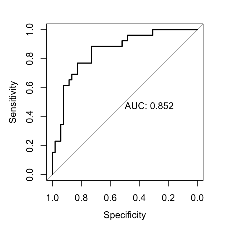
The gray diagonal line represents a classifier no better than random chance.
A highly performant classifier will have an ROC that rises steeply to the top-left corner, that is it will correctly identify lots of positives without misclassifying lots of negatives as positives.
In our example, the AUC is 0.85, which is close to the maximum ( max = 1). So, our classifier can be considered as very good. A classifier that performs no better than chance is expected to have an AUC of 0.5 when evaluated on an independent test set not used to train the model.
If we want a classifier model with a specificity of at least 60%, then the sensitivity is about 0.88%. The corresponding probability threshold can be extract as follow:
# Extract some interesting results
roc.data <- data_frame(
  thresholds = res.roc$thresholds,
  sensitivity = res.roc$sensitivities,
  specificity = res.roc$specificities
)
# Get the probality threshold for specificity = 0.6
roc.data %>% filter(specificity >= 0.6)
## # A tibble: 44 x 3
## thresholds sensitivity specificity
##
## 1 0.111 0.885 0.615
## 2 0.114 0.885 0.635
## 3 0.114 0.885 0.654
## 4 0.115 0.885 0.673
## 5 0.119 0.885 0.692
## 6 0.131 0.885 0.712
## # ... with 38 more rows The best threshold with the highest sum sensitivity + specificity can be printed as follow. There might be more than one threshold.
plot.roc(res.roc, print.auc = TRUE, print.thres = "best")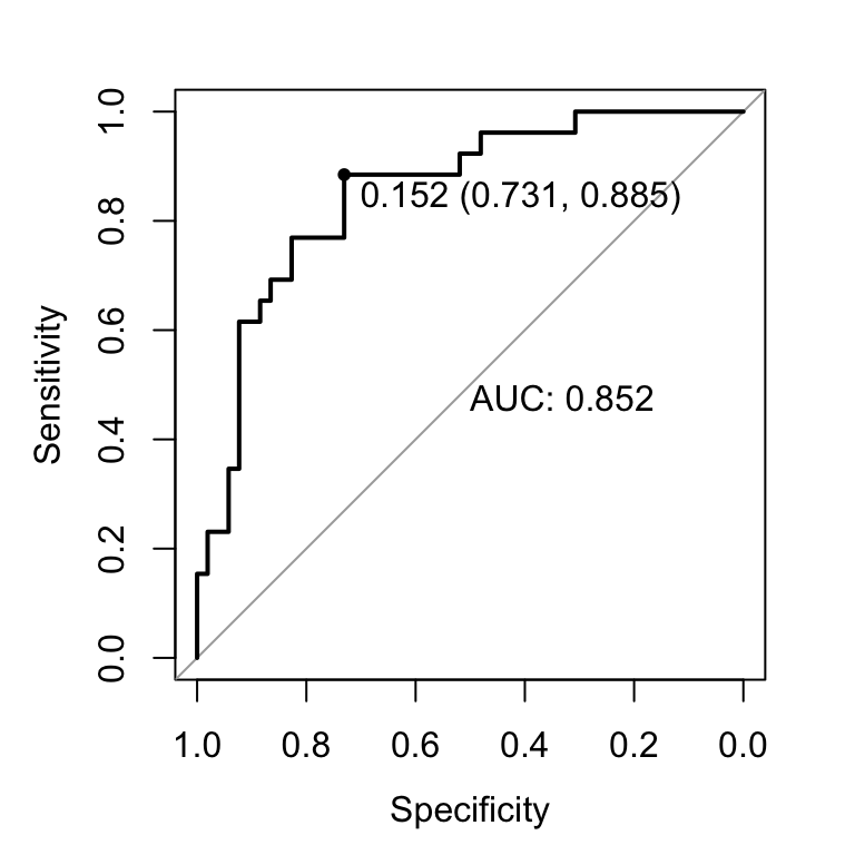
Here, the best probability cutoff is 0.335 resulting to a predictive classifier with a specificity of 0.84 and a sensitivity of 0.660.
Note that, print.thres can be also a numeric vector containing a direct definition of the thresholds to display:
plot.roc(res.roc, print.thres = c(0.3, 0.5, 0.7))Multiple ROC curves
If you have grouping variables in your data, you might wish to create multiple ROC curves on the same plot. This can be done using ggplot2.
# Create some grouping variable
glucose <- ifelse(test.data$glucose < 127.5, "glu.low", "glu.high")
age <- ifelse(test.data$age < 28.5, "young", "old")
roc.data <- roc.data %>%
  filter(thresholds !=-Inf) %>%
  mutate(glucose = glucose, age =  age)
# Create ROC curve
ggplot(roc.data, aes(specificity, sensitivity)) +
  geom_path(aes(color = age))+
  scale_x_reverse(expand = c(0,0))+
  scale_y_continuous(expand = c(0,0))+
  geom_abline(intercept = 1, slope = 1, linetype = "dashed")+
  theme_bw()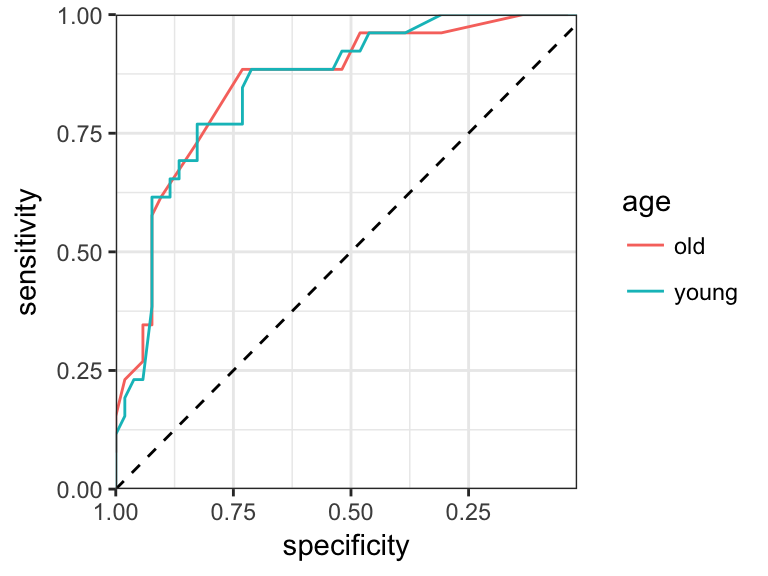
Multiclass settings
We start by building a linear discriminant model using the iris data set, which contains the length and width of sepals and petals for three iris species. We want to predict the species based on the sepal and petal parameters using LDA.
# Load the data
data("iris")
# Split the data into training (80%) and test set (20%)
set.seed(123)
training.samples <- iris$Species %>%
  createDataPartition(p = 0.8, list = FALSE)
train.data <- iris[training.samples, ]
test.data <- iris[-training.samples, ]
# Build the model on the train set
library(MASS)
model <- lda(Species ~., data = train.data)
Performance metrics (sensitivity, specificity, …) of the predictive model can be calculated, separately for each class, comparing each factor level to the remaining levels (i.e. a “one versus all” approach).
# Make predictions on the test data
predictions <- model %>% predict(test.data)
# Model accuracy
confusionMatrix(predictions$class, test.data$Species)
## Confusion Matrix and Statistics
##
## Reference
## Prediction setosa versicolor virginica
## setosa 10 0 0
## versicolor 0 10 0
## virginica 0 0 10
##
## Overall Statistics
##
## Accuracy : 1
## 95% CI : (0.884, 1)
## No Information Rate : 0.333
## P-Value [Acc > NIR] : 4.86e-15
##
## Kappa : 1
## Mcnemar's Test P-Value : NA
##
## Statistics by Class:
##
## Class: setosa Class: versicolor Class: virginica
## Sensitivity 1.000 1.000 1.000
## Specificity 1.000 1.000 1.000
## Pos Pred Value 1.000 1.000 1.000
## Neg Pred Value 1.000 1.000 1.000
## Prevalence 0.333 0.333 0.333
## Detection Rate 0.333 0.333 0.333
## Detection Prevalence 0.333 0.333 0.333
## Balanced Accuracy 1.000 1.000 1.000Note that, the ROC curves are typically used in binary classification but not for multiclass classification problems.
Discussion
This chapter described different metrics for evaluating the performance of classification models. These metrics include:
- classification accuracy,
- confusion matrix,
- Precision, Recall and Specificity,
- and ROC curve
To evaluate the performance of regression models, read the Chapter @ref(regression-model-accuracy-metrics).