Network Visualization Essentials in R
Network Analysis is used to investigate and visualize the inter-relationship between entities (individuals, things).
Examples of network structures, include: social media networks, friendship networks, collaboration networks and disease transmission.
Network and graph theory are extensively used across different fields, such as in biology (pathway analysis and protein-protein interaction visualization), finance, social sciences, economics, communication, history, computer science, etc.
In this chapter, you’ll learn:
- the basic terms of network analysis and visualization.
- how to create static networks using igraph (R base plot) and ggraph (ggplot2 system) R packages.
- how to create arc diagram, treemap and dendrogram layouts.
Contents:
Graph theory: Basics and key terms
Network graphs are characterized by two key terms: nodes and edges
nodes: The entities (individual actors, people, or things) to be connected in the network. Synonyms: vertices of a graph.
edges: The connections (interactions or relationships) between the entities. Synonyms: links, ties.
adjacency matrix: a square matrix in which the column and row names are the nodes of the network. This is a standard data format accepted by many network analysis packages in R. Synonyms: sociomatrices. Within the matrix a 1 specifies that there is a link between the nodes, and a 0 indicates no link.
edge list: a data frame containing at least two columns: one column of nodes corresponding to the source of a connection and another column of nodes that contains the target of the connection. The nodes in the data are identified by unique IDs.
Node list: a data frame with a single column listing the node IDs found in the edge list. You can also add attribute columns to the data frame such as the names of the nodes or grouping variables.
Weighted network graph: An edge list can also contain additional columns describing attributes of the edges such as a magnitude aspect for an edge. If the edges have a magnitude attribute the graph is considered weighted.
Directed and undirected network graph:
If the distinction between source and target is meaningful, the network is directed. Directed edges represent an ordering of nodes, like a relationship extending from one nodes to another, where switching the direction would change the structure of the network. The World Wide Web is an example of a directed network because hyperlinks connect one Web page to another, but not necessarily the other way around (Tyner, Briatte, and Hofmann 2017).
If the distinction is not meaningful, the network is undirected. Undirected edges are simply links between nodes where order does not matter. Co-authorship networks represent examples of undirected networks, where nodes are authors and they are connected by an edge if they have written a publication together (Tyner, Briatte, and Hofmann 2017).
Another example: When people send e-mail to each other, the distinction between the sender (source) and the recipient (target) is clearly meaningful, therefore the network is directed.
Install required packages
navdata: contains data sets required for this booktidyverse: for general data manipulationigraph,tidygraphandggraph: for network visualization
- Install the
navdataR package:
if(!require(devtools)) install.packages("devtools")
devtools::install_github("kassambara/navdata")- Install the remaining packages:
install.packages(
  c("tidyverse", "igraph", "tidygraph", "ggraph")
)
Data structure
Demo data set
We’ll use a fake demo data set containing the number of phone calls between the president of some EU countries.
library("navdata")
data("phone.call")
head(phone.call, 3)
## # A tibble: 3 x 3
## source destination n.call
##
## 1 France Germany 9
## 2 Belgium France 4
## 3 France Spain 3
Nodes are countries in the source and destination columns. The values, in the column n.call, will be used as edges weight.
To visualize the network graph, we need to create two data frames from the demo data sets:
- nodes list: containing nodes labels and other nodes attributes
- edges list: containing the relationship between the nodes. It consists of the edge list and any additional edge attributes.
In the following sections, we start by creating nodes and edges lists. Next, we’ll use the different packages to create network graphs.
Create nodes list
First, load the tidyverse R package for data manipulation:
library(tidyverse)Then, compute the following key steps to create nodes list:
- Take the distinct countries from both the “source” and “destination” columns
- Change the column name to
label - Join the information from the two columns together.
#  Get distinct source names
sources <- phone.call %>%
  distinct(source) %>%
  rename(label = source)
# Get distinct destination names
destinations <- phone.call %>%
  distinct(destination) %>%
  rename(label = destination)
# Join the two data to create node
# Add unique ID for each country
nodes <- full_join(sources, destinations, by = "label")
nodes <- nodes %>%
  mutate(id = 1:nrow(nodes)) %>%
  select(id, everything())
head(nodes, 3)
## # A tibble: 3 x 2
## id label
##
## 1 1 France
## 2 2 Belgium
## 3 3 Germany Create edges list
Key steps:
- Take the phone.call data, which are already in edges list format, showing the connection between nodes. Rename the column “n.call” to “weight”.
- Join the node IDs to the edges list data
- Do this for the “source” column and rename the id column that are brought over from nodes. New name: “from”.
- Do this for the “destination” column and rename the id column. New name: “to”
- Select only the columns “from” and “to” in the edge data. We don’t need to keep the column “source” and “destination” containing the names of countries. These information are already present in the node data.
# Rename the n.call column to weight
phone.call <- phone.call %>%
  rename(weight = n.call)
# (a) Join nodes id for source column
edges <- phone.call %>%
  left_join(nodes, by = c("source" = "label")) %>%
  rename(from = id)
# (b) Join nodes id for destination column
edges <- edges %>%
  left_join(nodes, by = c("destination" = "label")) %>%
  rename(to = id)
# (c) Select/keep only the columns from and to
edges <- select(edges, from, to, weight)
head(edges, 3)
## # A tibble: 3 x 3
## from to weight
##
## 1 1 3 9
## 2 2 1 4
## 3 1 8 3 Tools and visualization
There are many tools and software to analyse and visualize network graphs. However, for a reproducible and automatized research you need a programming environment such as in R software.
In this section, we review major R packages for reproducible network analysis and visualization.
We’ll introduce how to create static network graphs using igraph (file. 2017) and tidygraph(Pedersen 2017b) + ggraph (Pedersen 2017a) packages.
Note that, igraph packages uses the R base plotting system. The ggraph package is based on ggplot2 plotting system, which is highly flexible.
If you are new to network analysis in R, we highly recommend to learn the tidygraph and the ggraph package for the analysis and the visualization, respectively.
Note that, each time that you create a network graph, you need to set the random generator to always have the same layout. For example, you can type type this: set.seed(123)
igraph
- Create an igraph network object:
Key R function:
graph_from_data_frame().- Key arguments:
d: edge listvertices: node listdirected: can be either TRUE or FALSE depending on whether the data is directed or undirected.
library(igraph)
net.igraph <- graph_from_data_frame(
  d = edges, vertices = nodes,
  directed = TRUE
)- Create a network graph with igraph
set.seed(123)
plot(net.igraph, edge.arrow.size = 0.2,
     layout = layout_with_graphopt)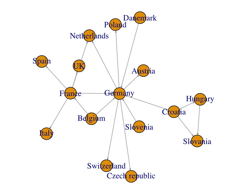
See the documentation by typing ?plot.igraph, for more options to customize the plot.
tidygraph and ggraph
tidygraph and ggraph are modern R packages for network data manipulation (tidygraph) and visualization (ggraph). They leverage the power of igraph.
- Create a network object using tidygraph:
- Key function:
tbl_graph(). - key arguments:
nodes,edgesanddirected.
library(tidygraph)
net.tidy <- tbl_graph(
  nodes = nodes, edges = edges, directed = TRUE
)- Visualize network using ggraph
Key functions:
geom_node_point(): Draws node points.geom_edge_link(): Draws edge links. To control the width of edge line according to the weight variable, specify the optionaes(width = weight), where, the weight specify the number of phone.call sent along each route. In this case, you can control the maximum and minimum width of the edges, by using the functionscale_edge_width()to set the range (minimum and maximum width value). For example: scale_edge_width(range = c(0.2, 2)).geom_node_text(): Adds text labels for nodes, by specifying the argumentaes(label = label). To avoid text overlapping, indicate the optionrepel = TRUE.labs(): Change main titles, axis labels and legend titles.
Create a classic node-edge diagrams. Possible values for the argument layout include: 'star', 'circle', 'gem', 'dh', 'graphopt', 'grid', 'mds', 'randomly', 'fr', 'kk', 'drl', 'lgl'.
library(ggraph)
ggraph(net.tidy, layout = "graphopt") +
  geom_node_point() +
  geom_edge_link(aes(width = weight), alpha = 0.8) +
  scale_edge_width(range = c(0.2, 2)) +
  geom_node_text(aes(label = label), repel = TRUE) +
  labs(edge_width = "phone.call") +
  theme_graph()
Graph layout
Layout defines the placement of nodes and edges in a given graph structure. There are different types of possible layouts (https://www.data-imaginist.com/2017/ggraph-introduction-layouts/). You should use the layout that suit the best your graph data structure.
In this section, we’ll describe some of the layouts, including:
linear: Arranges the nodes linearly or circularly in order to make an arc diagram.treemap: Creates a treemap from the graph, that is, a space-filing subdivision of rectangles showing a weighted hierarchy.
Arc diagram layout
In the following example, we’ll:
- Layout the nodes linearly (horizontal line) using
layout = "linear". - Create an arc diagram by drawing the edges as arcs
- Add only the label names, instead of including node points.
In the following arc diagram, the edges above the horizontal line move from left to right, while the edges below the line move from right to left.
# Arc diagram
ggraph(net.tidy, layout = "linear") +
  geom_edge_arc(aes(width = weight), alpha = 0.8) +
  scale_edge_width(range = c(0.2, 2)) +
  geom_node_text(aes(label = label), repel = TRUE) +
  labs(edge_width = "Number of calls") +
  theme_graph()+
theme(legend.position = "top") 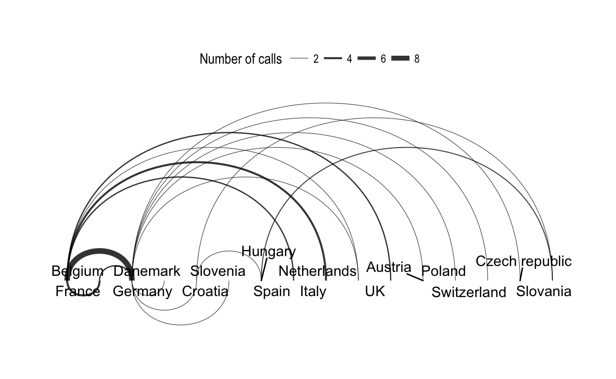
# Coord diagram, circular
ggraph(net.tidy, layout = "linear", circular = TRUE) +
  geom_edge_arc(aes(width = weight), alpha = 0.8) +
  scale_edge_width(range = c(0.2, 2)) +
  geom_node_text(aes(label = label), repel = TRUE) +
  labs(edge_width = "Number of calls") +
  theme_graph()+
  theme(legend.position = "top")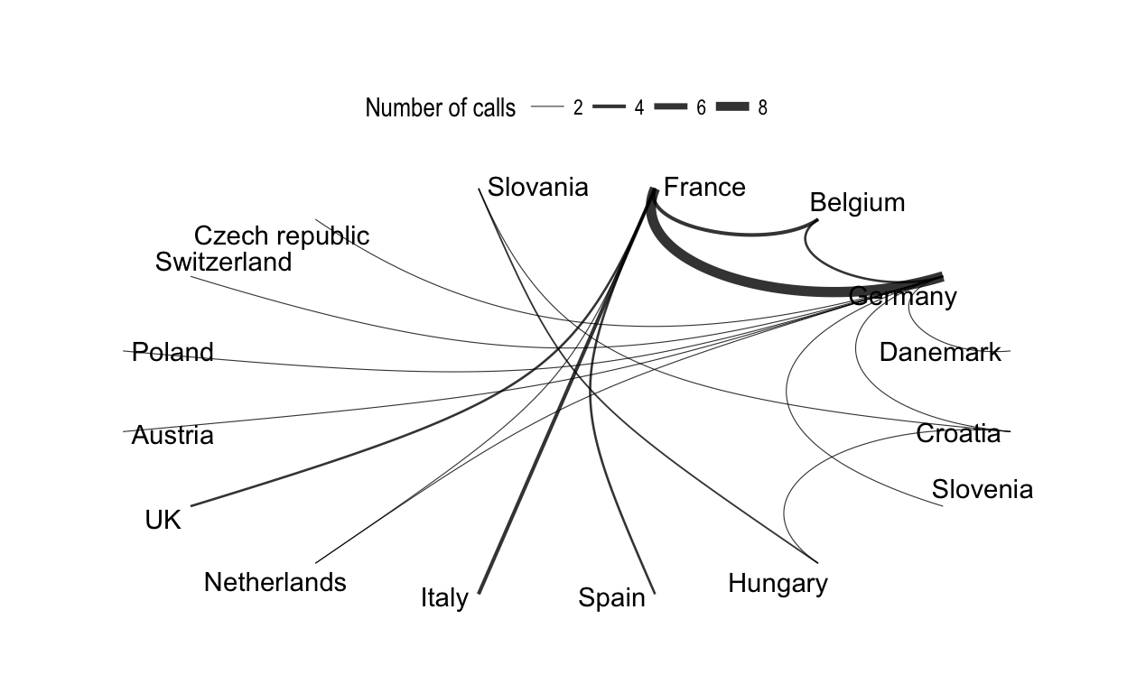
Treemap layout
A treemap is a visual method for displaying hierarchical data that uses nested rectangles to represent the branches of a tree diagram. Each rectangles has an area proportional to the amount of data it represents.
To illustrate this layout, we’ll use the france.trade demo data set [ in navdata package]. It contains the trading percentage between France and different countries.
Demo data sets
data("france.trade")
france.trade
## # A tibble: 251 x 3
## source destination trade.percentage
##
## 1 France Aruba 0.035
## 2 France Afghanistan 0.035
## 3 France Angola 0.035
## 4 France Anguilla 0.035
## 5 France Albania 0.035
## 6 France Finland 0.035
## # ... with 245 more rows Nodes list
Nodes are the distinct countries in the source and the destination columns.
- Take the distinct countries and create the nodes list:
# Distinct countries
countries <- c(
  france.trade$source, france.trade$destination
) %>%
  unique()
# Create nodes list
nodes <- data_frame(
  id = 1:length(countries),
  label = countries
)- Bind the trade percentage and turn the NAs into 0:
nodes <- nodes %>%
  left_join(
    france.trade[, c("destination", "trade.percentage")],
    by = c("label" = "destination" )
    ) %>%
  mutate(
    trade.percentage = ifelse(
      is.na(trade.percentage), 0, trade.percentage
      )
  )
head(nodes, 3)
## # A tibble: 3 x 3
## id label trade.percentage
##
## 1 1 France 0.000
## 2 2 Aruba 0.035
## 3 3 Afghanistan 0.035 Edges list
per_route <- france.trade %>%
  select(source, destination)
# (a) Join nodes id for source column
edges <- per_route %>%
  left_join(nodes, by = c("source" = "label")) %>%
  rename(from = id)
# (b) Join nodes id for destination column
edges <- edges %>%
  left_join(nodes, by = c("destination" = "label")) %>%
  rename(to = id)
# (c) Select/keep only the columns from and to
edges <- select(edges, from, to)
head(edges, 3)
## # A tibble: 3 x 2
## from to
##
## 1 1 2
## 2 1 3
## 3 1 4 Create the treemap
- Create network object and visualize:
- Network object:
trade.graph <- tbl_graph(
  nodes = nodes, edges = edges, directed = TRUE
)- Visualize. The ggpubr package is required to generate color palette:
# Generate colors for each country
require(ggpubr)
cols <- get_palette("Dark2", nrow(france.trade)+1)
# Visualize
set.seed(123)
ggraph(trade.graph, 'treemap', weight = "trade.percentage") +
    geom_node_tile(aes(fill = label), size = 0.25, color = "white")+
  geom_node_text(
    aes(label = paste(label, trade.percentage, sep = "\n"),
        size = trade.percentage), color = "white"
    )+
  scale_fill_manual(values = cols)+
  scale_size(range = c(0, 6) )+
  theme_void()+
  theme(legend.position = "none")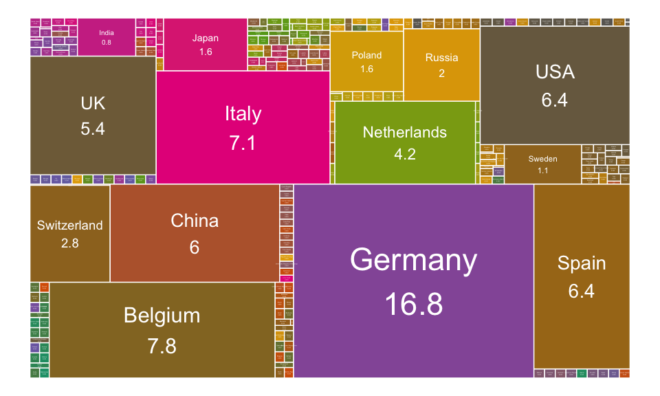
Create a choropleth map
- Take the world map and Color each country according to the trading percentage with France.
- Draw the map and color France in red
require("map")
# (1)
world_map <- map_data("world")
france.trade <- france.trade %>%
  left_join(world_map, by = c("destination" = "region"))
# (2)
ggplot(france.trade, aes(long, lat, group = group))+
  geom_polygon(aes(fill = trade.percentage ), color = "white")+
  geom_polygon(data = subset(world_map, region == "France"),
               fill = "red")+ # draw france in red
  scale_fill_gradientn(colours =c("lightgray", "yellow", "green"))+
  theme_void()
Dendrogram layout
Dendrogram layout are suited for hierarchical graph visualization, that is graph structures including trees and hierarchies.
In this section, we’ll compute hierarchical clustering using the USArrests data set. The output is visualized as a dendrogram tree.
- compute hierarchical clustering using the
USArrestsdata set; - then convert the result into a tbl_graph.
res.hclust <- scale(USArrests) %>%
  dist() %>% hclust()
res.tree <- as.dendrogram(res.hclust)- Visualize the dendrogram tree. Key function:
geom_edge_diagonal()andgeom_edge_elbow()
# Diagonal layout
ggraph(res.tree, layout = "dendrogram") +
  geom_edge_diagonal() +
  geom_node_text(
    aes(label = label), angle = 90, hjust = 1,
    size = 3
    )+
  ylim(-1.5, NA)+
  theme_minimal()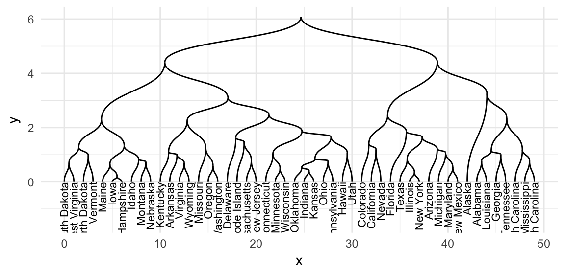
# Elbow layout
ggraph(res.tree, layout = "dendrogram") +
  geom_edge_elbow() +
  geom_node_text(
    aes(label = label), angle = 90, hjust = 1,
    size = 3
    )+
  ylim(-1.5, NA)+theme_minimal()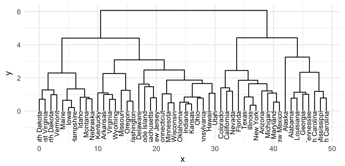
Read more
- Introduction to ggraph: Edges, Nodes and layouts
- Network Visualization with ggplot2
References
file., See AUTHORS. 2017. Igraph: Network Analysis and Visualization. https://CRAN.R-project.org/package=igraph.
Pedersen, Thomas Lin. 2017a. Ggraph: An Implementation of Grammar of Graphics for Graphs and Networks. https://CRAN.R-project.org/package=ggraph.
———. 2017b. Tidygraph: A Tidy Api for Graph Manipulation. https://CRAN.R-project.org/package=tidygraph.
Tyner, Sam, François Briatte, and Heike Hofmann. 2017. “Network Visualization with ggplot2.” The R Journal 9 (1): 27–59. https://journal.r-project.org/archive/2017/RJ-2017-023/index.html.


