


Visualizing Multivariate Categorical Data
To visualize a small data set containing multiple categorical (or qualitative) variables, you can create either a bar plot, a balloon plot or a mosaic plot.
For a large multivariate categorical data, you need specialized statistical techniques dedicated to categorical data analysis, such as simple and multiple correspondence analysis. These methods make it possible to analyze and visualize the association (i.e. correlation) between a large number of qualitative variables.
Here, you’ll learn some examples of graphs, in R programming language, for visualizing the frequency distribution of categorical variables contained in small contingency tables. We provide also the R code for computing the simple correspondence analysis.
Contents:

Prerequisites
Load required R packages and set the default theme:
library(ggplot2)
library(ggpubr)
theme_set(theme_pubr())
Bar plots of contingency tables
Demo data set: HairEyeColor (distribution of hair and eye color and sex in 592 statistics students)
- Prepare and inspect the data:
data("HairEyeColor")
df <- as.data.frame(HairEyeColor)
head(df)
## Hair Eye Sex Freq
## 1 Black Brown Male 32
## 2 Brown Brown Male 53
## 3 Red Brown Male 10
## 4 Blond Brown Male 3
## 5 Black Blue Male 11
## 6 Brown Blue Male 50- Create the bar graph:
- Hair color on x-axis
- Change bar fill by Eye color
- Split the graph into multiple panel by Sex
ggplot(df, aes(x = Hair, y = Freq))+
  geom_bar(
    aes(fill = Eye), stat = "identity", color = "white",
    position = position_dodge(0.9)
    )+
  facet_wrap(~Sex) +
  fill_palette("jco")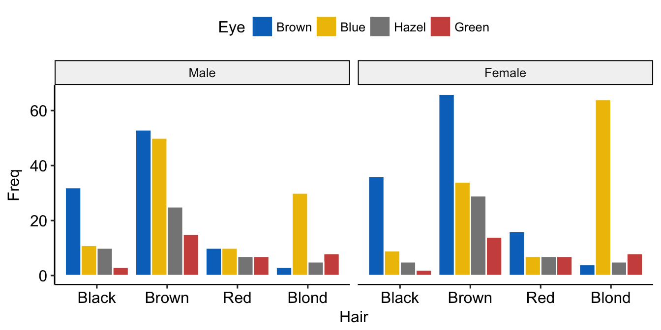
Balloon plot
Balloon plot is an alternative to bar plot for visualizing a large categorical data. We’ll use the function ggballoonplot() [in ggpubr], which draws a graphical matrix of a contingency table, where each cell contains a dot whose size reflects the relative magnitude of the corresponding component.
Demo data sets: Housetasks (a contingency table containing the frequency of execution of 13 house tasks in the couple.)
housetasks <- read.delim(
  system.file("demo-data/housetasks.txt", package = "ggpubr"),
  row.names = 1
  )
head(housetasks, 4)
## Wife Alternating Husband Jointly
## Laundry 156 14 2 4
## Main_meal 124 20 5 4
## Dinner 77 11 7 13
## Breakfeast 82 36 15 7- Create a simple balloon plot of a contingency table. Change the fill color by the values in the cells.
ggballoonplot(housetasks, fill = "value")+
  scale_fill_viridis_c(option = "C")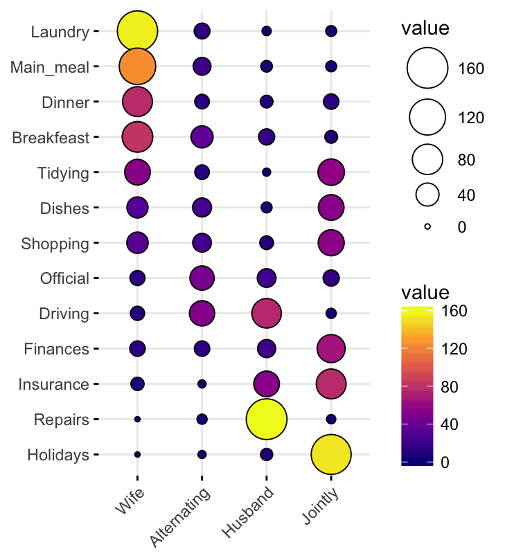
- Visualize a grouped frequency table. Demo data set:
HairEyeColor. Create a multi-panel plot by Sex
df <- as.data.frame(HairEyeColor)
ggballoonplot(df, x = "Hair", y = "Eye", size = "Freq",
              fill = "Freq", facet.by = "Sex",
              ggtheme = theme_bw()) +
  scale_fill_viridis_c(option = "C")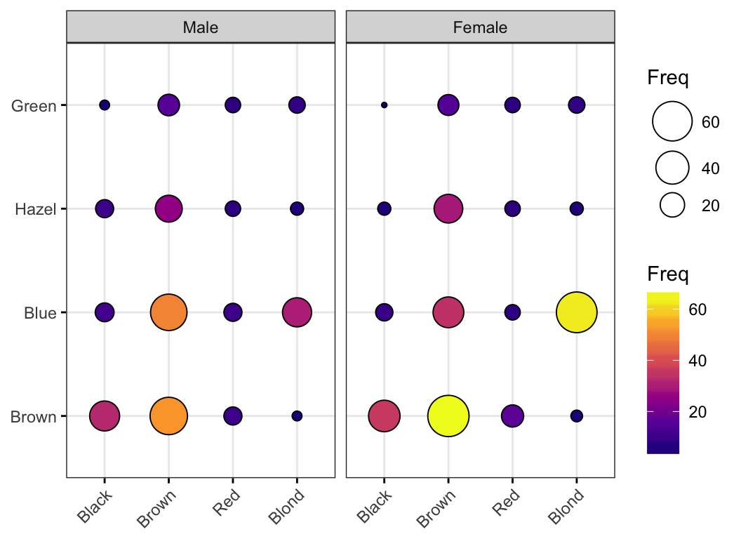
Mosaic plot
A mosaic plot is basically an area-proportional visualization of observed frequencies, composed of tiles (corresponding to the cells) created by recursive vertical and horizontal splits of a rectangle. The area of each tile is proportional to the corresponding cell entry, given the dimensions of previous splits.
Mosaic graph can be created using either the function mosaicplot() [in graphics] or the function mosaic() [in vcd package]. Read more at: Visualizing Multi-way Contingency Tables with vcd.
Example of mosaic plot:
library(vcd)
mosaic(HairEyeColor, shade = TRUE, legend = TRUE) 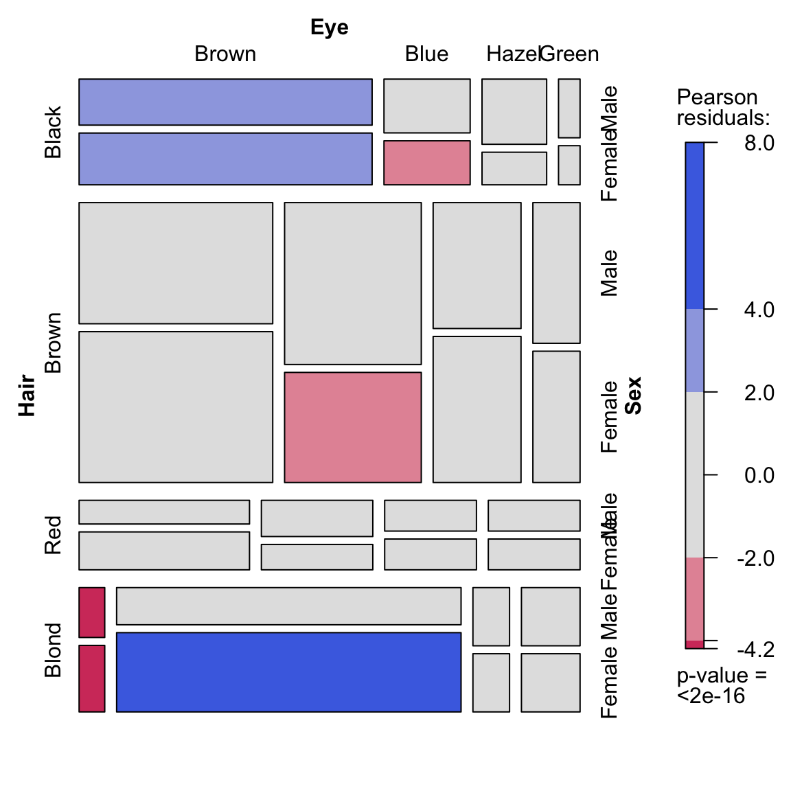
Correspondence analysis
Correspondence analysis can be used to summarize and visualize the information contained in a large contingency table formed by two categorical variables.
Required package: FactoMineR for the analysis and factoextra for the visualization
library(FactoMineR)
library(factoextra)
res.ca <- CA(housetasks, graph = FALSE)
fviz_ca_biplot(res.ca, repel = TRUE)
From the graphic above, it’s clear that:
- Housetasks such as dinner, breakfeast, laundry are done more often by the wife
- Driving and repairs are done more frequently by the husband
Read more at: Correspondence analysis in R