GGPlot Cheat Sheet for Great Customization
This chapter provides a cheat sheet to change the global appearance of a ggplot.
You will learn how to:
- Add title, subtitle, caption and change axis labels
- Change the appearance - color, size and face - of titles
- Set the axis limits
- Set a logarithmic axis scale
- Rotate axis text labels
- Change the legend title and position, as well, as the color and the size
- Change a ggplot theme and modify the background color
- Add a background image to a ggplot
- Use different color palettes: custom color palettess, color-blind friendly palettes, RColorBrewer palettes, viridis color palettes and scientific journal color palettes.
- Change point shapes (plotting symbols) and line types
- Rotate a ggplot
- Annotate a ggplot by adding straight lines, arrows, rectangles and text.
Contents:

Prerequisites
- Load packages and set the default theme:
library(ggplot2)
library(ggpubr)
theme_set(
  theme_pubr() +
    theme(legend.position = "right")
)- Create a box plot (bxp) and a scatter plot (sp) that we’ll customize in the next section:
- Box plot using the
ToothGrowthdataset:
# Convert the variable dose from numeric to factor variable
ToothGrowth$dose <- as.factor(ToothGrowth$dose)
bxp <- ggplot(ToothGrowth, aes(x=dose, y=len)) +
  geom_boxplot(aes(color = dose)) +
scale_color_manual(values = c("#00AFBB", "#E7B800", "#FC4E07"))- Scatter plot using the
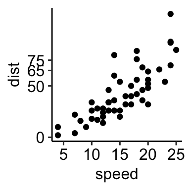
carsdataset
sp <- ggplot(cars, aes(x = speed, y = dist)) +
  geom_point()
Titles and axis labels
Key function: labs(). Used to change the main title, the subtitle, the axis labels and captions.
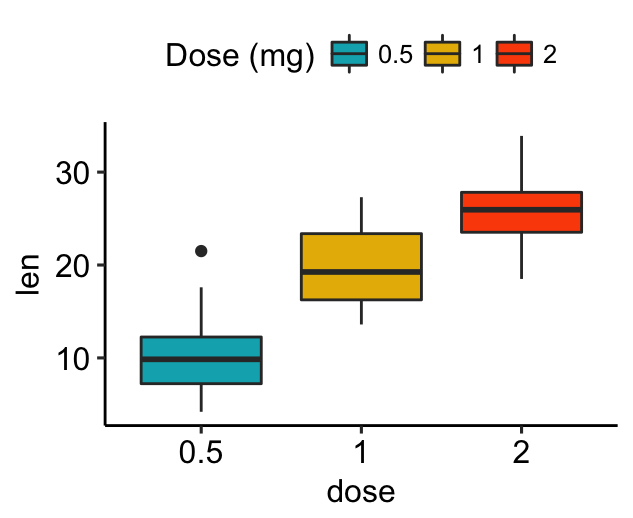
- Add a title, subtitle, caption and change axis labels
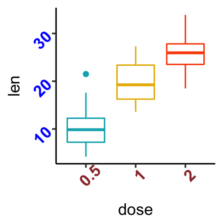
bxp <- bxp + labs(title = "Effect of Vitamin C on Tooth Growth",
              subtitle = "Plot of length by dose",
              caption = "Data source: ToothGrowth",
              x = "Dose (mg)", y = "Teeth length")
bxp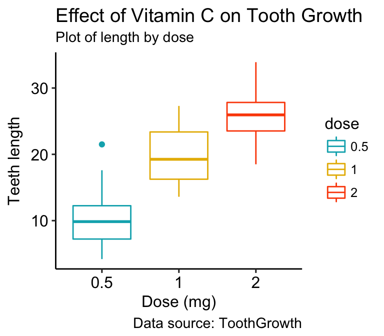
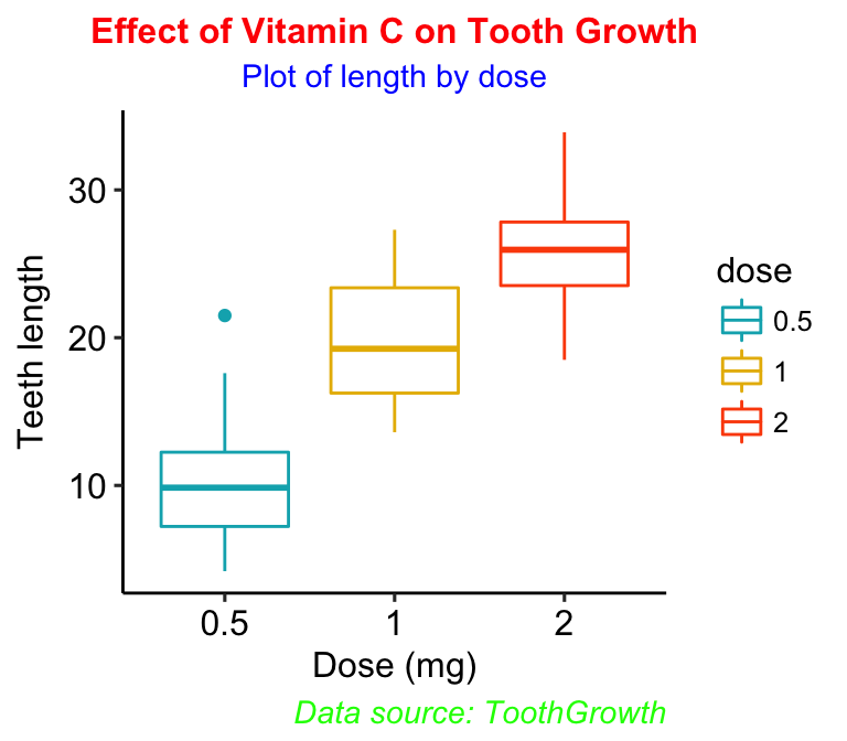
- Change the appearance of titles
- Key functions:
theme()andelement_text():
theme(
  plot.title = element_text(),
  plot.subtitle.title = element_text(),
  plot.caption = element_text()
)- Arguments of the function
element_text()include:color,size,face,family: to change the text font color, size, face (“plain”, “italic”, “bold”, “bold.italic”) and family.lineheight: change space between two lines of text elements. Number between 0 and 1. Useful for multi-line plot titles.hjustandvjust: number in [0, 1], for horizontal and vertical adjustment of titles, respectively.hjust = 0.5: Center the plot titles.hjust = 1: Place the plot title on the righthjust = 0: Place the plot title on the left
- Examples of R code:
- Center main title and subtitle (
hjust = 0.5) - Change color, size and face
- Center main title and subtitle (
bxp + theme(
  plot.title = element_text(color = "red", size = 12,
                            face = "bold", hjust = 0.5),
  plot.subtitle = element_text(color = "blue", hjust = 0.5),
  plot.caption = element_text(color = "green", face = "italic")
)
- Case of long titles. If the title is too long, you can split it into multiple lines using \n. In this case you can adjust the space between text lines by specifying the argument
lineheightin the theme functionelement_text():
bxp + labs(title = "Effect of Vitamin C on Tooth Growth \n in Guinea Pigs")+
  theme(plot.title = element_text(lineheight = 0.9))
Axes: Limits, Ticks and Log
Axis limits and scales
3 Key functions to set the axis limits and scales:
- Without clipping (preferred). Cartesian coordinates. The Cartesian coordinate system is the most common type of coordinate system. It will zoom the plot, without clipping the data.
sp + coord_cartesian(xlim = c(5, 20), ylim = (0, 50))- With clipping the data (removes unseen data points). Observations not in this range will be dropped completely and not passed to any other layers.
# Use this
sp + scale_x_continuous(limits = c(5, 20)) +
  scale_y_continuous(limits = c(0, 50))
# Or this shothand functions
sp + xlim(5, 20) + ylim(0, 50)
Note that, scale_x_continuous() and scale_y_continuous() remove all data points outside the given range and, the coord_cartesian() function only adjusts the visible area.
In most cases you would not see the difference, but if you fit anything to the data the functions scale_x_continuous() / scale_y_continuous() would probably change the fitted values.
- Expand the plot limits to ensure that a given value is included in all panels or all plots.
# set the intercept of x and y axes at (0,0)
sp + expand_limits(x = 0, y = 0)
# Expand plot limits
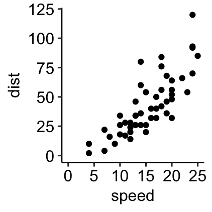
sp + expand_limits(x = c(5, 50), y = c(0, 150))Examples of R code:
# Default plot
print(sp)
# Change axis limits using coord_cartesian()
sp + coord_cartesian(xlim =c(5, 20), ylim = c(0, 50))
# set the intercept of x and y axis at (0,0)
sp + expand_limits(x = 0, y = 0)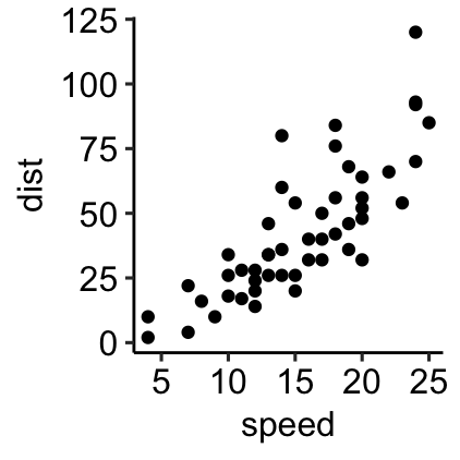
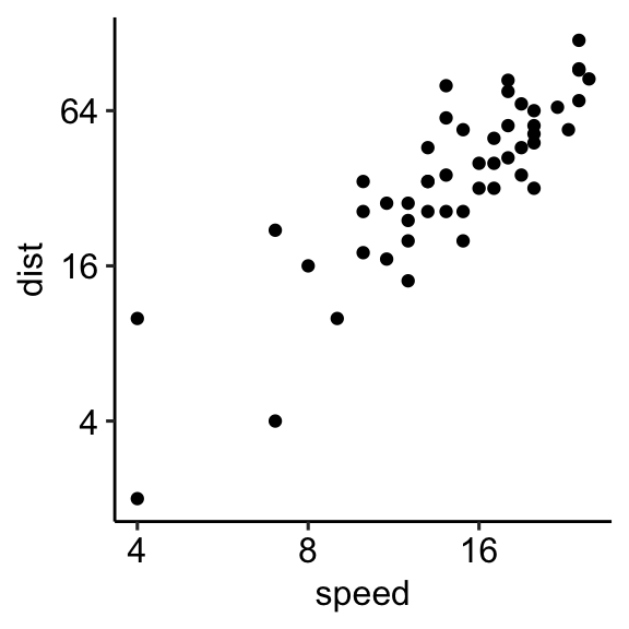
Log scale
Key functions to set a logarithmic axis scale:
- Scale functions. Allowed value for the argument trans:
log2andlog10.
sp + scale_x_continuous(trans = "log2")
sp + scale_y_continuous(trans = "log2")- Transformed Cartesian coordinate system. Possible values for x and y are “log2”, “log10”, “sqrt”, …
sp + coord_trans(x = "log2", y = "log2")- Display log scale ticks. Make sens only for log10 scale:
sp + scale_y_log10() + annotation_logticks()Note that, the scale functions transform the data. If you fit anything to the data it would probably change the fitted values.
An alternative is to use the function coord_trans(), which occurs after statistical transformation and will affect only the visual appearance of geoms.
Example of R code
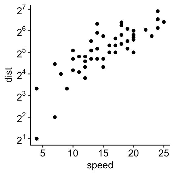
# Set axis into log2 scale
# Possible values for trans : 'log2', 'log10','sqrt'
sp + scale_x_continuous(trans = 'log2') +
  scale_y_continuous(trans = 'log2')
# Format y axis tick mark labels to show exponents
require(scales)
sp + scale_y_continuous(
  trans = log2_trans(),
  breaks = trans_breaks("log2", function(x) 2^x),
  labels = trans_format("log2", math_format(2^.x))
  )
Axis Ticks: Set and Rotate Text Labels
Start by creating a box plot:
bxp <- ggplot(ToothGrowth, aes(x=dose, y=len)) +
  geom_boxplot(aes(color = dose)) +
  scale_color_manual(values = c("#00AFBB", "#E7B800", "#FC4E07"))+
theme(legend.position = "none")- Change the style and the orientation angle of axis tick labels. For a vertical rotation of x axis labels use
angle = 90.
# Rotate x and y axis text by 45 degree
# face can be "plain", "italic", "bold" or "bold.italic"
bxp + theme(axis.text.x = element_text(face = "bold", color = "#993333",
                           size = 12, angle = 45),
          axis.text.y = element_text(face = "bold", color = "blue",
                           size = 12, angle = 45))
# Remove axis ticks and tick mark labels
bxp + theme(
  axis.text.x = element_blank(), # Remove x axis tick labels
  axis.text.y = element_blank(), # Remove y axis tick labels
  axis.ticks = element_blank()   # Remove ticks
) 
To adjust the position of the axis text, you can specify the argument hjust and vjust, which values should be comprised between 0 and 1.
- Change axis lines:
- Remove the y-axis line
- Change the color, the size and the line type of the x-axis line:
bxp + theme(
  axis.line.y = element_blank(),
  axis.line = element_line(
    color = "gray", size = 1, linetype = "solid"
    )
  )
- Customize discrete axis. Use the function
scale_x_discrete()orscale_y_discrete()depending on the axis you want to change.
Here, we’ll customize the x-axis of the box plot:
# Change x axis label and the order of items
bxp + scale_x_discrete(name ="Dose (mg)",
limits = c("2","1","0.5"))
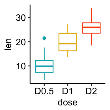
# Rename / Change tick mark labels
bxp + scale_x_discrete(breaks = c("0.5","1","2"),
labels = c("D0.5", "D1", "D2"))
# Choose which items to display
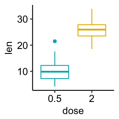
bxp + scale_x_discrete(limits = c("0.5", "2"))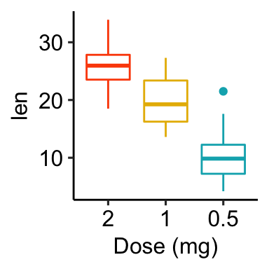
- Customize continuous axis. Change axis ticks interval.
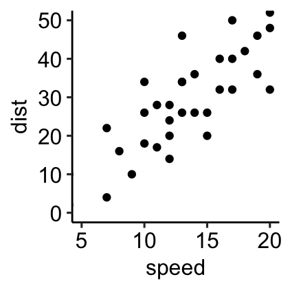
# Default scatter plot
sp <- ggplot(cars, aes(x = speed, y = dist)) +
geom_point()
sp
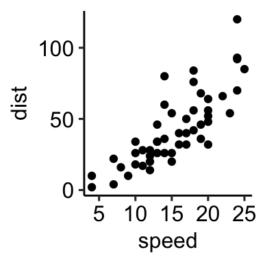
# Break y axis by a specified value
# a tick mark is shown on every 50
sp + scale_y_continuous(breaks=seq(0, 150, 50))
# Tick marks can be spaced randomly
sp + scale_y_continuous(breaks=c(0, 50, 65, 75, 150))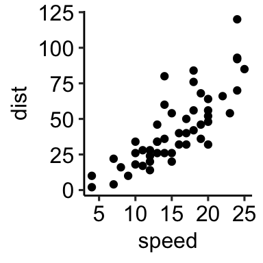
Legends: Title, Position and Appearance
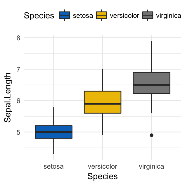
Start by creating a box plot using the ToothGrowth data set. Change the box plot fill color according to the grouping variable dose.
library(ggplot2)
ToothGrowth$dose <- as.factor(ToothGrowth$dose)
bxp <- ggplot(ToothGrowth, aes(x = dose, y = len))+
geom_boxplot(aes(fill = dose)) +
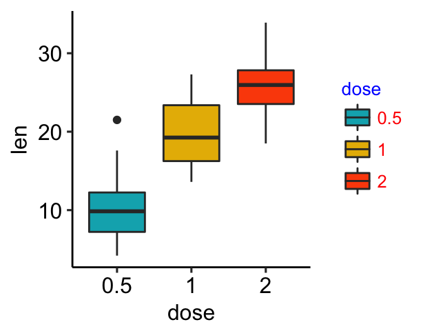
scale_fill_manual(values = c("#00AFBB", "#E7B800", "#FC4E07"))Change legend title and position
- Legend title. Use
labs()to changes the legend title for a given aesthetics (fill, color, size, shape, . . . ). For example:
- Use
p + labs(fill = "dose")for geom_boxplot(aes(fill = dose)) - Use
p + labs(color = "dose")for geom_boxplot(aes(color = dose)) - and so on for linetype, shape, etc
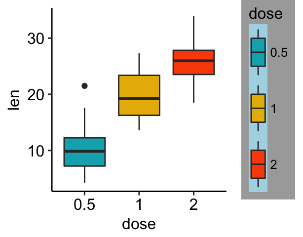
- Legend position. The default legend position is “right”. Use the function
theme()with the argumentlegend.positionto specify the legend position.
Allowed values for the legend position include: “left”, “top”, “right”, “bottom”, “none”.
Legend location can be also a numeric vector c(x,y), where x and y are the coordinates of the legend box. Their values should be between 0 and 1. c(0,0) corresponds to the “bottom left” and c(1,1) corresponds to the “top right” position. This makes it possible to place the legend inside the plot.
Examples:
# Default plot
bxp
# Change legend title and position
bxp +
  labs(fill = "Dose (mg)") +
  theme(legend.position = "top")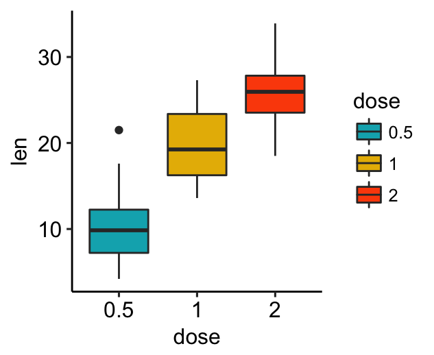
To remove legend, use p + theme(legend.position = “none”).
Change the appearance of legends
- Change legend text color and size
- Change the legend box background color
# Change the appearance of legend title and text labels
bxp + theme(
  legend.title = element_text(color = "blue", size = 10),
  legend.text = element_text(color = "red")
  )
# Change legend background color, key size and width
bxp + theme(
  # Change legend background color
  legend.background = element_rect(fill = "darkgray"),
  legend.key = element_rect(fill = "lightblue", color = NA),
  # Change legend key size and key width
  legend.key.size = unit(1.5, "cm"),
  legend.key.width = unit(0.5,"cm")
  )
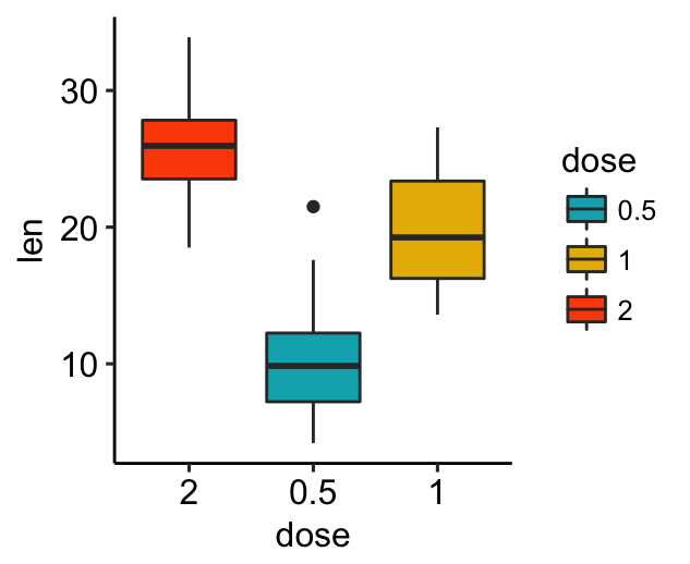
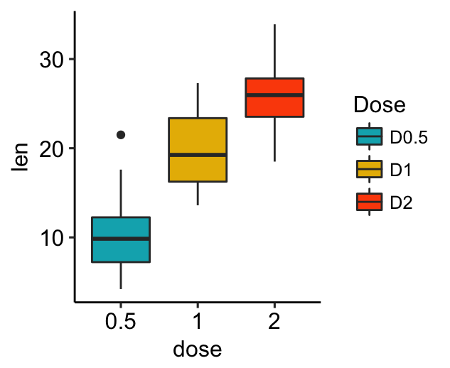
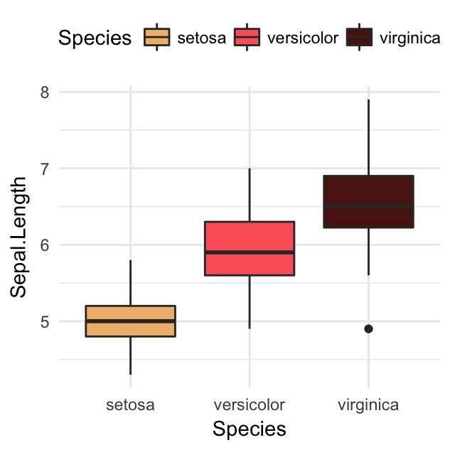
Rename legend labels and change the order of items
# Change the order of legend items
bxp + scale_x_discrete(limits=c("2", "0.5", "1"))
# Edit legend title and labels for the fill aesthetics
bxp + scale_fill_manual(
  values = c("#00AFBB", "#E7B800", "#FC4E07"),
  name = "Dose",
  breaks = c("0.5", "1", "2"),
  labels = c("D0.5", "D1", "D2")
  )
Other manual scales to set legends for a given aesthetic:
# Color of lines and points
scale_color_manual(name, labels, limits, breaks)
# For linetypes
scale_linetype_manual(name, labels, limits, breaks)
# For point shapes
scale_shape_manual(name, labels, limits, breaks)
# For point size
scale_size_manual(name, labels, limits, breaks)
# Opacity/transparency
scale_alpha_manual(name, labels, limits, breaks)
Themes gallery
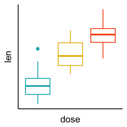
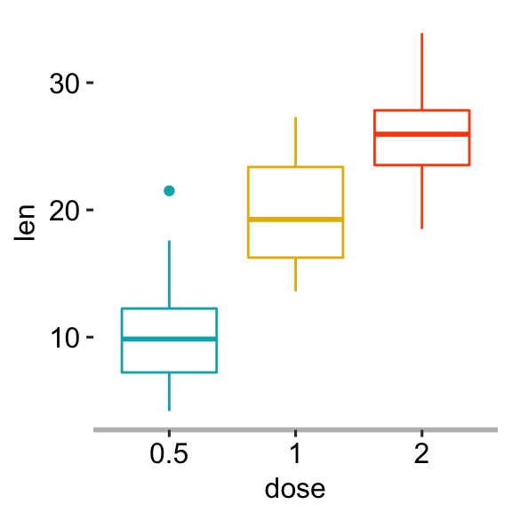
Start by creating a simple box plot:
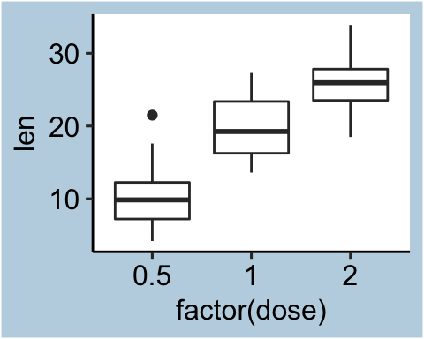
bxp <- ggplot(ToothGrowth, aes(x = factor(dose), y = len)) +
  geom_boxplot()
Use themes in ggplot2 package
Several simple functions are available in ggplot2 package to set easily a ggplot theme. These include:
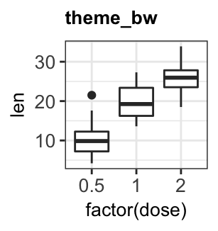
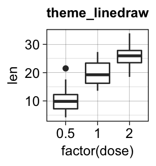
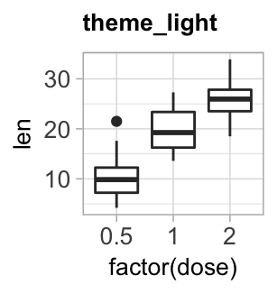
theme_gray(): Gray background color and white grid lines. Put the data forward to make comparisons easy.theme_bw(): White background and gray grid lines. May work better for presentations displayed with a projector.theme_linedraw(): A theme with black lines of various widths on white backgrounds, reminiscent of a line drawings.theme_light(): A theme similar totheme_linedraw()but with light grey lines and axes, to direct more attention towards the data.
bxp + theme_gray(base_size = 14)
bxp + theme_bw()
bxp + theme_linedraw()
bxp + theme_light()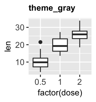
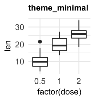
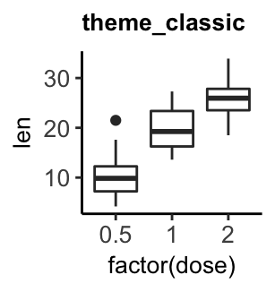
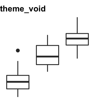
theme_dark(): Same as theme_light but with a dark background. Useful to make thin colored lines pop out.theme_minimal(): A minimal theme with no background annotationstheme_classic(): A classic theme, with x and y axis lines and no grid lines.theme_void(): a completely empty theme, useful for plots with non-standard coordinates or for drawings.
bxp + theme_dark()
bxp + theme_minimal()
bxp + theme_classic()
bxp + theme_void()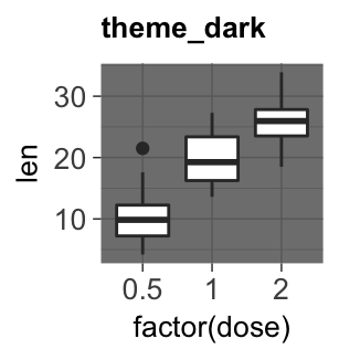
Note that, additional themes are available in the ggthemes R package.
Background color and grid lines
- Create a simple box plot:
p <- ggplot(ToothGrowth, aes(factor(dose), len)) +
geom_boxplot()- Change the panel background (1) and the plot background (2) colors:
# 1. Change plot panel background color to lightblue
# and the color of major/grid lines to white
p + theme(
  panel.background = element_rect(fill = "#BFD5E3", colour = "#6D9EC1",
                                size = 2, linetype = "solid"),
  panel.grid.major = element_line(size = 0.5, linetype = 'solid',
                                colour = "white"),
  panel.grid.minor = element_line(size = 0.25, linetype = 'solid',
                                colour = "white")
  )
# 2. Change the plot background color (not the panel)
p + theme(plot.background = element_rect(fill = "#BFD5E3"))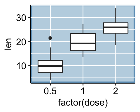
Add background image to ggplot2 graphs
Import the background image. Use either the function
readJPEG()[in jpeg package] or the function `readPNG()[in png package] depending on the format of the background image.Combine a ggplot with the background image. R function:
background_image()[in ggpubr].
# Import the image
img.file <- system.file("https://www.sthda.com/english/sthda-upload/images/r-graphics-essentials/background-image.png",
                        package = "ggpubr")
img.file <- "https://www.sthda.com/english/sthda-upload/images/r-graphics-essentials/background-image.png"
# Combine with ggplot
library(ggpubr)
ggplot(iris, aes(Species, Sepal.Length))+
  background_image(img)+
  geom_boxplot(aes(fill = Species), color = "white", alpha = 0.5)+
  fill_palette("jco")
Colors
A color can be specified either by name (e.g.: “red”) or by hexadecimal code (e.g. : “#FF1234”). In this section, you will learn how to change ggplot colors by groups and how to set gradient colors.
- Set ggplot theme to
theme_minimal():
theme_set(
  theme_minimal() +
    theme(legend.position = "top")
)- Initialize ggplots using the
irisdata set:
# Box plot
bp <- ggplot(iris, aes(Species, Sepal.Length))
# Scatter plot
sp <- ggplot(iris, aes(Sepal.Length, Sepal.Width))- Specify a single color. Change the fill color (in box plots) and points color (in scatter plots).
# Box plot
bp + geom_boxplot(fill = "#FFDB6D", color = "#C4961A")
# Scatter plot
sp + geom_point(color = "#00AFBB")
- Change colors by groups.
You can change colors according to a grouping variable by:
- Mapping the argument
colorto the variable of interest. This will be applied to points, lines and texts - Mapping the argument
fillto the variable of interest. This will change the fill color of areas, such as in box plot, bar plot, histogram, density plots, etc.
It’s possible to specify manually the color palettes by using the functions:
scale_fill_manual()for box plot, bar plot, violin plot, dot plot, etcscale_color_manual()orscale_colour_manual()for lines and points
# Box plot
bp <- bp + geom_boxplot(aes(fill = Species))
bp + scale_fill_manual(values = c("#00AFBB", "#E7B800", "#FC4E07"))
# Scatter plot
sp <- sp + geom_point(aes(color = Species))
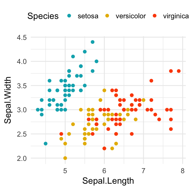
sp + scale_color_manual(values = c("#00AFBB", "#E7B800", "#FC4E07"))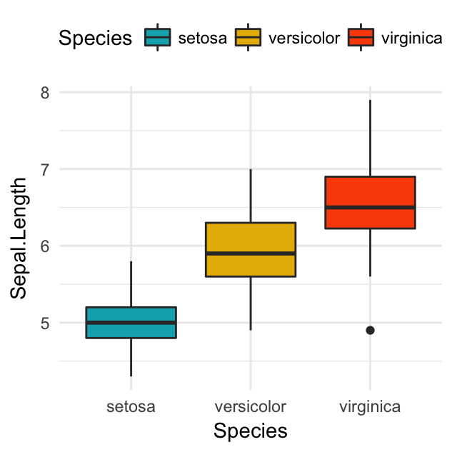
Find below, two color-blind-friendly palettes, one with gray, and one with black (source: http://jfly.iam.u-tokyo.ac.jp/color/).
# The palette with grey:
cbp1 <- c("#999999", "#E69F00", "#56B4E9", "#009E73",
          "#F0E442", "#0072B2", "#D55E00", "#CC79A7")
# The palette with black:
cbp2 <- c("#000000", "#E69F00", "#56B4E9", "#009E73",
          "#F0E442", "#0072B2", "#D55E00", "#CC79A7")

- Use viridis color palettes. The
viridisR package provides color palettes to make beautiful plots that are: printer-friendly, perceptually uniform and easy to read by those with colorblindness. Key functionsscale_color_viridis()andscale_fill_viridis()
library(viridis)
# Gradient color
ggplot(iris, aes(Sepal.Length, Sepal.Width))+
geom_point(aes(color = Sepal.Length)) +
scale_color_viridis(option = "D")
# Discrete color. use the argument discrete = TRUE
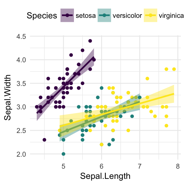
ggplot(iris, aes(Sepal.Length, Sepal.Width))+
geom_point(aes(color = Species)) +
geom_smooth(aes(color = Species, fill = Species), method = "lm") +
scale_color_viridis(discrete = TRUE, option = "D")+
scale_fill_viridis(discrete = TRUE) 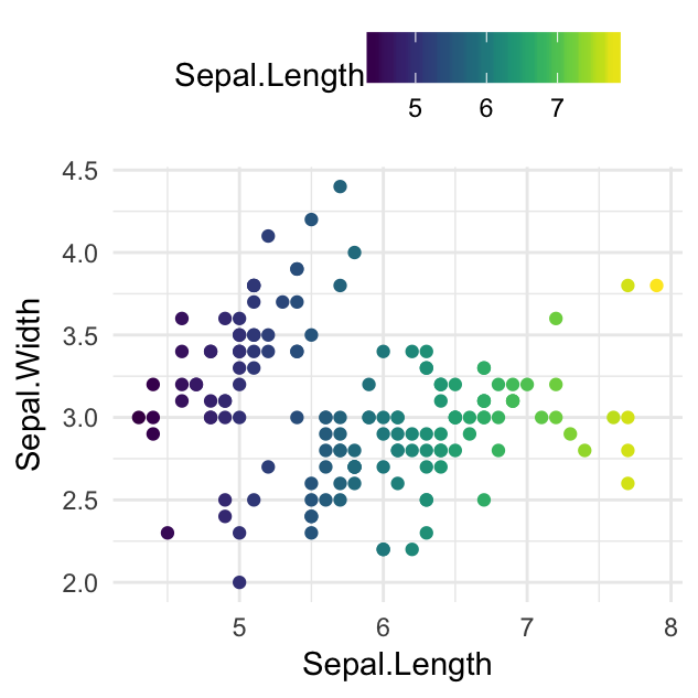
- Use RColorBrewer palettes. Two color scale functions are available in ggplot2 for using the colorbrewer palettes:
scale_fill_brewer()for box plot, bar plot, violin plot, dot plot, etcscale_color_brewer()for lines and points
For example:
# Box plot
bp + scale_fill_brewer(palette = "Dark2")
# Scatter plot
sp + scale_color_brewer(palette = "Dark2")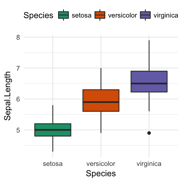
To display colorblind-friendly brewer palettes, use this R code:
library(RColorBrewer)
display.brewer.all(colorblindFriendly = TRUE)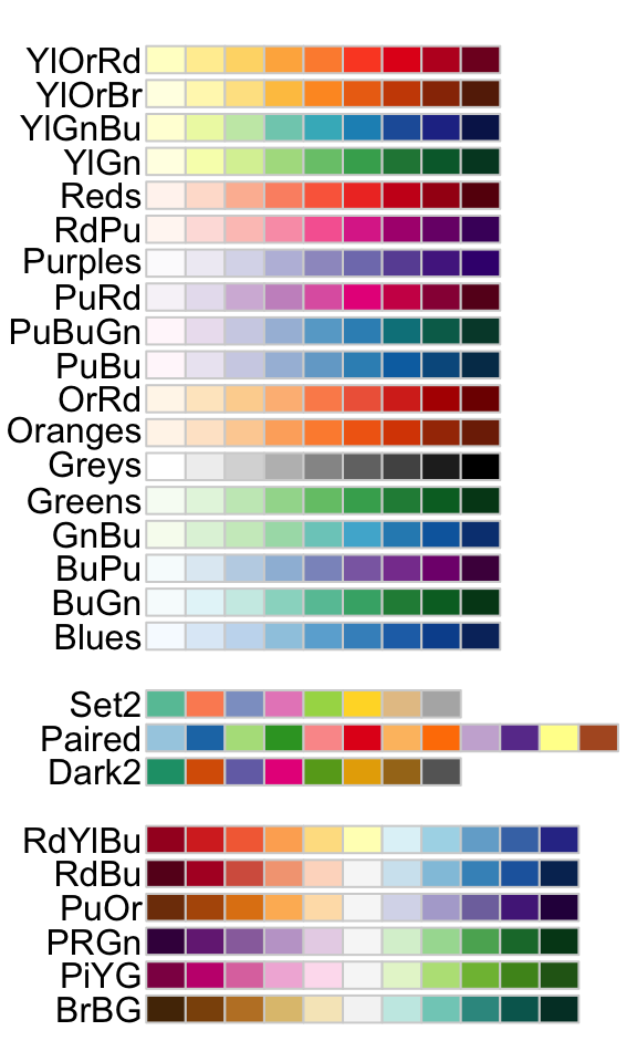
- Other discrete color palettes:
- Scientific journal color palettes in the ggsci R package. Contains a collection of high-quality color palettes inspired by colors used in scientific journals, data visualization libraries, and more. For example:
scale_color_npg()andscale_fill_npg(): Nature Publishing Groupscale_color_aaas()andscale_fill_aaas(): American Association for the Advancement of Sciencescale_color_lancet()andscale_fill_lancet(): Lancet journalscale_color_jco()andscale_fill_jco(): Journal of Clinical Oncology
- Wes Anderson color palettes in the wesanderson R package. Contains 16 color palettes from Wes Anderson movies.
- Scientific journal color palettes in the ggsci R package. Contains a collection of high-quality color palettes inspired by colors used in scientific journals, data visualization libraries, and more. For example:
For example:
# jco color palette from the ggsci package
bp + ggsci::scale_fill_jco()
# Discrete color from wesanderson package
library(wesanderson)
bp + scale_fill_manual(
  values = wes_palette("GrandBudapest1", n = 3)
  )
You can find more examples at ggsci package vignettes and at wesanderson github page
- Set gradient colors. For gradient colors, you should map the map the argument
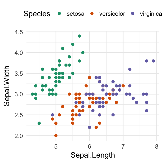
colorand/orfillto a continuous variable. In the following example, we color points according to the variable:Sepal.Length.
ggplot(iris, aes(Sepal.Length, Sepal.Width))+
  geom_point(aes(color = Sepal.Length)) +
  scale_color_gradientn(colours = c("blue", "yellow", "red"))+
  theme(legend.position = "right")
- Design and use the power of color palette at https://goo.gl/F5g3Lb
Points shape, color and size
- Common point shapes available in R:
ggpubr::show_point_shapes()+
  theme_void()
Note that, the point shape options from pch 21 to 25 are open symbols that can be filled by a color. Therefore, you can use the fill argument in geom_point() for these symbols.
- Change ggplot point shapes. The argument
shapeis used, in the functiongeom_point()[ggplot2], for specifying point shapes.
It’s also possible to change point shapes and colors by groups. In this case, ggplot2 will use automatically a default color palette and point shapes. You can change manually the appearance of points using the following functions:
scale_shape_manual(): to change manually point shapesscale_color_manual(): to change manually point colorsscale_size_manual(): to change manually the size of points
Create a scatter plot and change points shape, color and size:
# Create a simple scatter plot
ggplot(iris, aes(Sepal.Length, Sepal.Width)) +
geom_point(shape = 18, color = "#FC4E07", size = 3)+
theme_minimal()
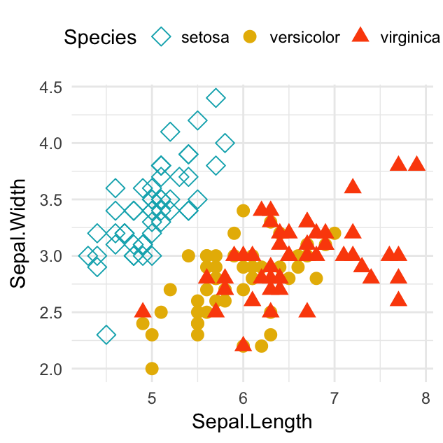
# Change point shapes and colors by groups
ggplot(iris, aes(Sepal.Length, Sepal.Width)) +
geom_point(aes(shape = Species, color = Species), size = 3) +
scale_shape_manual(values = c(5, 16, 17)) +
scale_color_manual(values = c("#00AFBB", "#E7B800", "#FC4E07"))+
theme_minimal() +
theme(legend.position = "top")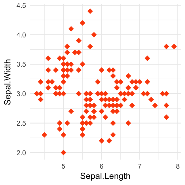
Line types
- Common line types available in R:
ggpubr::show_line_types()+
  theme_gray()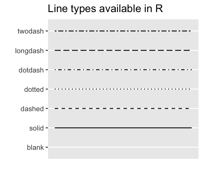
- Change line types. To change a single line, use for example
linetype = "dashed".
In the following R code, we’ll change line types and colors by groups. To modify the default colors and line types, the function scale_color_manual() and scale_linetype_manual() can be used.
# Create some data.
# # Compute the mean of `len` grouped by dose and supp
library(dplyr)
df2 <- ToothGrowth %>%
  group_by(dose, supp) %>%
  summarise(len.mean = mean(len))
df2
## # A tibble: 6 x 3
## # Groups: dose [?]
## dose supp len.mean
##
## 1 0.5 OJ 13.23
## 2 0.5 VC 7.98
## 3 1 OJ 22.70
## 4 1 VC 16.77
## 5 2 OJ 26.06
## 6 2 VC 26.14 # Change manually line type and color manually
ggplot(df2, aes(x = dose, y = len.mean, group = supp)) +
geom_line(aes(linetype = supp, color = supp))+
geom_point(aes(color = supp))+
scale_linetype_manual(values=c("solid", "dashed"))+
scale_color_manual(values=c("#00AFBB","#FC4E07"))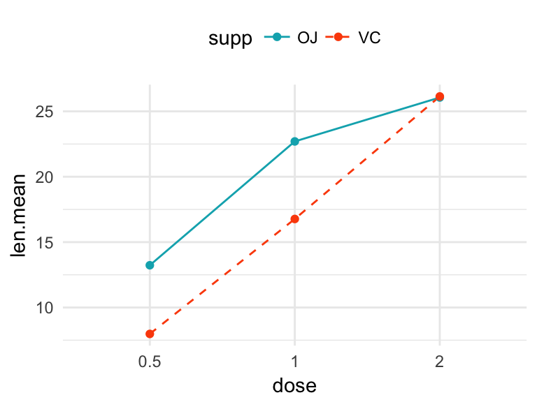
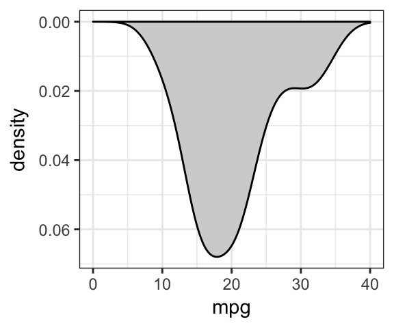
Rotate a ggplot
Key functions:
coord_flip(): creates horizontal plotsscale_x_reverse()andscale_y_reverse(): reverse the axis
# Horizontal box plot
ggplot(ToothGrowth, aes(factor(dose), len)) +
  geom_boxplot(fill = "lightgray") +
  theme_bw() +
  coord_flip()
# Reverse y axis
ggplot(mtcars, aes(mpg))+
  geom_density(fill = "lightgray") +
  xlim(0, 40) +
  theme_bw()+
  scale_y_reverse()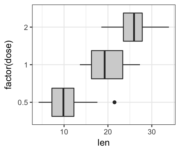
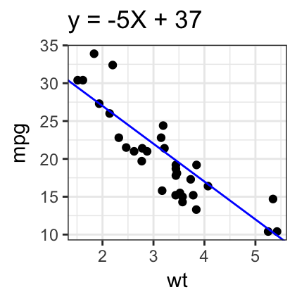
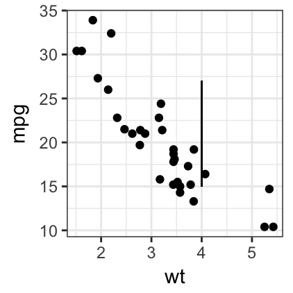
Plot annotation
Add straight lines
Key R functions:
- geom_hline(yintercept, linetype, color, size): add horizontal lines
- geom_vline(xintercept, linetype, color, size): add vertical lines
- geom_abline(intercept, slope, linetype, color, size): add regression lines
- geom_segment(): add segments
Create a simple scatter plot:
- Creating a simple scatter plot
sp <- ggplot(data = mtcars, aes(x = wt, y = mpg)) +
geom_point()+theme_bw()- Add straight lines and segments
# Add horizontal line at y = 2O; and vertical line at x = 3
sp + geom_hline(yintercept = 20, linetype = "dashed", color = "red") +
  geom_vline(xintercept = 3, color = "blue", size = 1)
# Add regression line
sp + geom_abline(intercept = 37, slope = -5, color="blue")+
  labs(title = "y = -5X + 37")
# Add a vertical line segment from
# point A(4, 15) to point B(4, 27)
sp + geom_segment(x = 4, y = 15, xend = 4, yend = 27)
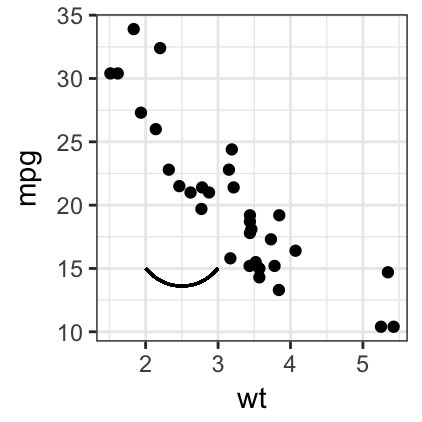
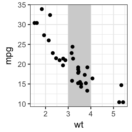
- Add arrows, curves and rectangles:
# Add arrow at the end of the segment
require(grid)
sp + geom_segment(x = 5, y = 30, xend = 3.5, yend = 25,
                 arrow = arrow(length = unit(0.5, "cm")))
# Add curves
sp + geom_curve(aes(x = 2, y = 15, xend = 3, yend = 15))
# Add rectangles
ggplot(data = mtcars, aes(x = wt, y = mpg)) +
  geom_rect(xmin = 3, ymin = -Inf, xmax = 4, ymax = Inf,
            fill = "lightgray") +
  geom_point() + theme_bw()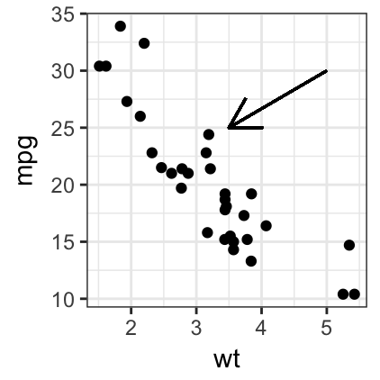
Text annotation
Key ggplot2 function:
- geom_text(): adds text directly to the plot
- geom_label(): draws a rectangle underneath the text, making it easier to read.
- annotate(): useful for adding small text annotations at a particular location on the plot
- annotation_custom(): Adds static annotations that are the same in every panel
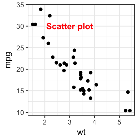
# Add text at a particular coordinate
sp + annotate("text", x = 3, y = 30,
              label = "Scatter plot",
              color = "red", fontface = 2)