


MFA - Multiple Factor Analysis in R: Essentials
Multiple factor analysis (MFA) (J. Pagès 2002) is a multivariate data analysis method for summarizing and visualizing a complex data table in which individuals are described by several sets of variables (quantitative and /or qualitative) structured into groups. It takes into account the contribution of all active groups of variables to define the distance between individuals. The number of variables in each group may differ and the nature of the variables (qualitative or quantitative) can vary from one group to the other but the variables should be of the same nature in a given group (Abdi and Williams 2010).
MFA may be considered as a general factor analysis. Roughly, the core of MFA is based on:
- Principal component analysis (PCA) (Chapter @ref(principal-component-analysis)) when variables are quantitative,
- Multiple correspondence analysis (MCA) (Chapter @ref(multiple-correspondence-analysis)) when variables are qualitative.
This global analysis, where multiple sets of variables are simultaneously considered, requires to balance the influences of each set of variables. Therefore, in MFA, the variables are weighted during the analysis. Variables in the same group are normalized using the same weighting value, which can vary from one group to another. Technically, MFA assigns to each variable of group j, a weight equal to the inverse of the first eigenvalue of the analysis (PCA or MCA according to the type of variable) of the group j.
Multiple factor analysis can be used in a variety of fields (J. Pagès 2002), where the variables are organized into groups:
Survey analysis, where an individual is a person; a variable is a question. Questions are organized by themes (groups of questions).
Sensory analysis, where an individual is a food product. A first set of variables includes sensory variables (sweetness, bitterness, etc.); a second one includes chemical variables (pH, glucose rate, etc.).
Ecology, where an individual is an observation place. A first set of variables describes soil characteristics ; a second one describes flora.
- Times series, where several individuals are observed at different dates. In this situation, there is commonly two ways of defining groups of variables:
- generally, variables observed at the same time (date) are gathered together.
- When variables are the same from one date to the others, each set can gather the different dates for one variable.
In the current chapter, we show how to compute and visualize multiple factor analysis in R software using FactoMineR (for the analysis) and factoextra (for data visualization). Additional, we’ll show how to reveal the most important variables that contribute the most in explaining the variations in the data set.
Contents:
Computation
R packages
Install FactoMineR and factoextra as follow:
install.packages(c("FactoMineR", "factoextra"))Load the packages:
library("FactoMineR")
library("factoextra")
Data format
We’ll use the demo data sets wine available in FactoMineR package. This data set is about a sensory evaluation of wines by different judges.
library("FactoMineR")
data(wine)
colnames(wine)
## [1] "Label" "Soil"
## [3] "Odor.Intensity.before.shaking" "Aroma.quality.before.shaking"
## [5] "Fruity.before.shaking" "Flower.before.shaking"
## [7] "Spice.before.shaking" "Visual.intensity"
## [9] "Nuance" "Surface.feeling"
## [11] "Odor.Intensity" "Quality.of.odour"
## [13] "Fruity" "Flower"
## [15] "Spice" "Plante"
## [17] "Phenolic" "Aroma.intensity"
## [19] "Aroma.persistency" "Aroma.quality"
## [21] "Attack.intensity" "Acidity"
## [23] "Astringency" "Alcohol"
## [25] "Balance" "Smooth"
## [27] "Bitterness" "Intensity"
## [29] "Harmony" "Overall.quality"
## [31] "Typical"An image of the data is shown below:
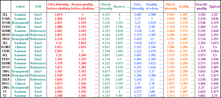
(Image source, FactoMineR, http://factominer.free.fr)
The data contains 21 rows (wines, individuals) and 31 columns (variables):
- The first two columns are categorical variables:
label(Saumur, Bourgueil or Chinon) andsoil(Reference, Env1, Env2 or Env4). - The 29 next columns are continuous sensory variables. For each wine, the value is the mean score for all the judges.
The goal of this study is to analyze the characteristics of the wines.
The variables are organized in groups as follow:
First group - A group of categorical variables specifying the
origin of the wines, including the variableslabelandsoilcorresponding to thefirst 2 columnsin the data table. In FactoMineR terminology, the argumentsgroup = 2is used to define the first 2 columns as a group.Second group - A group of continuous variables, describing the
odor of the wines before shaking, including the variables: Odor.Intensity.before.shaking, Aroma.quality.before.shaking, Fruity.before.shaking, Flower.before.shaking and Spice.before.shaking. These variables corresponds to thenext 5 columnsafter the first group. FactoMineR terminology:group = 5.Third group - A group of continuous variables quantifying the
visual inspection of the wines, including the variables: Visual.intensity, Nuance and Surface.feeling. These variables corresponds to thenext 3 columnsafter the second group. FactoMineR terminology:group = 3.Fourth group - A group of continuous variables concerning the
odor of the wines after shaking, including the variables: Odor.Intensity, Quality.of.odour, Fruity, Flower, Spice, Plante, Phenolic, Aroma.intensity, Aroma.persistency and Aroma.quality. These variables corresponds to thenext 10 columnsafter the third group. FactoMineR terminology:group = 10.Fith group - A group of continuous variables evaluating the
taste of the wines, including the variables Attack.intensity, Acidity, Astringency, Alcohol, Balance, Smooth, Bitterness, Intensity and Harmony. These variables corresponds to thenext 9 columnsafter the fourth group. FactoMineR terminology:group = 9.Sixth group - A group of continuous variables concerning the
overall judgement of the wines, including the variables Overall.quality and Typical. These variables corresponds to thenext 2 columnsafter the fith group. FactoMineR terminology:group = 2.
In summary:
-
We have 6 groups of variables, which can be specified to the FactoMineR as follow: group = c(2, 5, 3, 10, 9, 2).
-
These groups can be named as follow: name.group = c(“origin”, “odor”, “visual”, “odor.after.shaking”, “taste”, “overall”).
-
Among the 6 groups of variables, one is categorical and five groups contain continuous variables. It’s recommended, to standardize the continuous variables during the analysis. Standardization makes variables comparable, in the situation where the variables are measured in different units. In FactoMineR, the argument
type = “s”specifies that a given group of variables should be standardized. If you don’t want standardization, usetype = “c”. To specify categorical variables,type = “n”is used. In our example, we’ll usetype = c(“n”, “s”, “s”, “s”, “s”, “s”).
R code
The function MFA()[FactoMiner package] can be used. A simplified format is :
MFA (base, group, type = rep("s",length(group)), ind.sup = NULL,
name.group = NULL, num.group.sup = NULL, graph = TRUE)base: a data frame with n rows (individuals) and p columns (variables)group: a vector with the number of variables in each group.type: the type of variables in each group. By default, all variables are quantitative and scaled to unit variance. Allowed values include:- “c” or “s” for quantitative variables. If “s”, the variables are scaled to unit variance.
- “n” for categorical variables.
- “f” for frequencies (from a contingency tables).
ind.sup: a vector indicating the indexes of the supplementary individuals.name.group: a vector containing the name of the groups (by default, NULL and the group are named group.1, group.2 and so on).num.group.sup: the indexes of the illustrative groups (by default, NULL and no group are illustrative).graph: a logical value. If TRUE a graph is displayed.
The R code below performs the MFA on the wines data using the groups: odor, visual, odor after shaking and taste. These groups are named active groups. The remaining group of variables - origin (the first group) and overall judgement (the sixth group) - are named supplementary groups; num.group.sup = c(1, 6):
library(FactoMineR)
data(wine)
res.mfa <- MFA(wine,
               group = c(2, 5, 3, 10, 9, 2),
               type = c("n", "s", "s", "s", "s", "s"),
               name.group = c("origin","odor","visual",
                              "odor.after.shaking", "taste","overall"),
               num.group.sup = c(1, 6),
               graph = FALSE)
The output of the MFA() function is a list including :
print(res.mfa)## **Results of the Multiple Factor Analysis (MFA)**
## The analysis was performed on 21 individuals, described by 31 variables
## *Results are available in the following objects :
##
## name
## 1 "$eig"
## 2 "$separate.analyses"
## 3 "$group"
## 4 "$partial.axes"
## 5 "$inertia.ratio"
## 6 "$ind"
## 7 "$quanti.var"
## 8 "$quanti.var.sup"
## 9 "$quali.var.sup"
## 10 "$summary.quanti"
## 11 "$summary.quali"
## 12 "$global.pca"
## description
## 1 "eigenvalues"
## 2 "separate analyses for each group of variables"
## 3 "results for all the groups"
## 4 "results for the partial axes"
## 5 "inertia ratio"
## 6 "results for the individuals"
## 7 "results for the quantitative variables"
## 8 "results for the quantitative supplementary variables"
## 9 "results for the categorical supplementary variables"
## 10 "summary for the quantitative variables"
## 11 "summary for the categorical variables"
## 12 "results for the global PCA"Visualization and interpretation
We’ll use the factoextra R package to help in the interpretation and the visualization of the multiple factor analysis.
The functions below [in factoextra package] will be used:
get_eigenvalue(res.mfa): Extract the eigenvalues/variances retained by each dimension (axis).fviz_eig(res.mfa): Visualize the eigenvalues/variances.get_mfa_ind(res.mfa): Extract the results for individuals.get_mfa_var(res.mfa): Extract the results for quantitative and qualitative variables, as well as, for groups of variables.fviz_mfa_ind(res.mfa),fviz_mfa_var(res.mfa): Visualize the results for individuals and variables, respectively.
In the next sections, we’ll illustrate each of these functions.
To help in the interpretation of MFA, we highly recommend to read the interpretation of principal component analysis (Chapter (???)(principal-component-analysis)), simple (Chapter (???)(correspondence-analysis)) and multiple correspondence analysis (Chapter (???)(multiple-correspondence-analysis)). Many of the graphs presented here have been already described in previous chapter.
Eigenvalues / Variances
The proportion of variances retained by the different dimensions (axes) can be extracted using the function get_eigenvalue() [factoextra package] as follow:
library("factoextra")
eig.val <- get_eigenvalue(res.mfa)
head(eig.val)
## eigenvalue variance.percent cumulative.variance.percent
## Dim.1 3.462 49.38 49.4
## Dim.2 1.367 19.49 68.9
## Dim.3 0.615 8.78 77.7
## Dim.4 0.372 5.31 83.0
## Dim.5 0.270 3.86 86.8
## Dim.6 0.202 2.89 89.7The function fviz_eig() or fviz_screeplot() [factoextra package] can be used to draw the scree plot:
fviz_screeplot(res.mfa)
Graph of variables
Groups of variables
The function get_mfa_var() [in factoextra] is used to extract the results for groups of variables. This function returns a list containing the coordinates, the cos2 and the contribution of groups, as well as, the
group <- get_mfa_var(res.mfa, "group")
group
## Multiple Factor Analysis results for variable groups
## ===================================================
## Name Description
## 1 "$coord" "Coordinates"
## 2 "$cos2" "Cos2, quality of representation"
## 3 "$contrib" "Contributions"
## 4 "$correlation" "Correlation between groups and principal dimensions"The different components can be accessed as follow:
# Coordinates of groups
head(group$coord)
# Cos2: quality of representation on the factore map
head(group$cos2)
# Contributions to the  dimensions
head(group$contrib)
To plot the groups of variables, type this:
fviz_mfa_var(res.mfa, "group")
- red color = active groups of variables
- green color = supplementary groups of variables
The plot above illustrates the correlation between groups and dimensions. The coordinates of the four active groups on the first dimension are almost identical. This means that they contribute similarly to the first dimension. Concerning the second dimension, the two groups - odor and odor.after.shake - have the highest coordinates indicating a highest contribution to the second dimension.
To draw a bar plot of groups contribution to the dimensions, use the function fviz_contrib():
# Contribution to the first dimension
fviz_contrib(res.mfa, "group", axes = 1)
# Contribution to the second dimension
fviz_contrib(res.mfa, "group", axes = 2)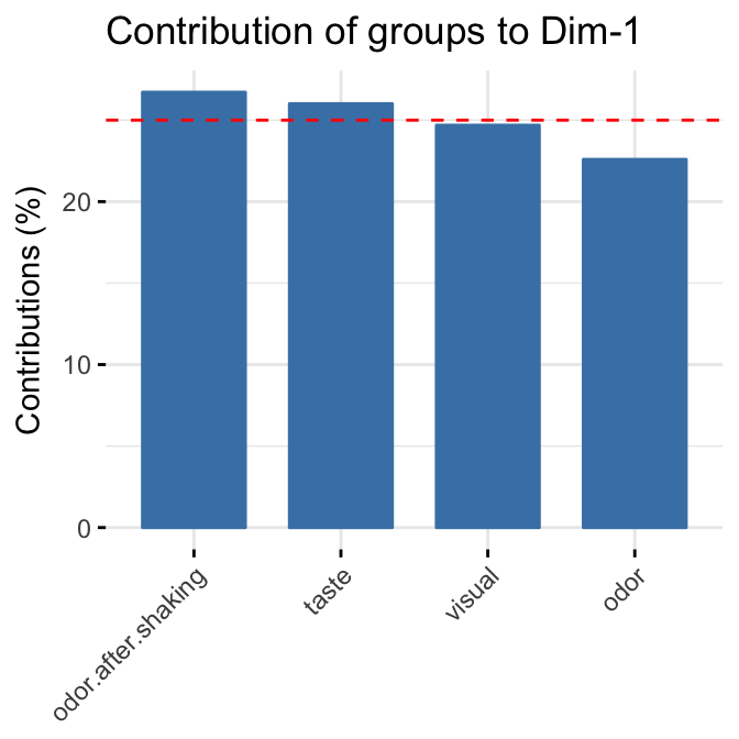

Quantitative variables
The function get_mfa_var() [in factoextra] is used to extract the results for quantitative variables. This function returns a list containing the coordinates, the cos2 and the contribution of variables:
quanti.var <- get_mfa_var(res.mfa, "quanti.var")
quanti.var
## Multiple Factor Analysis results for quantitative variables
## ===================================================
## Name Description
## 1 "$coord" "Coordinates"
## 2 "$cos2" "Cos2, quality of representation"
## 3 "$contrib" "Contributions"The different components can be accessed as follow:
# Coordinates
head(quanti.var$coord)
# Cos2: quality on the factore map
head(quanti.var$cos2)
# Contributions to the dimensions
head(quanti.var$contrib)
In this section, we’ll describe how to visualize quantitative variables colored by groups. Next, we’ll highlight variables according to either i) their quality of representation on the factor map or ii) their contributions to the dimensions.
To interpret the graphs presented here, read the chapter on PCA (Chapter (???)(principal-component-analysis)) and MCA (Chapter (???)(multiple-correspondence-analysis)).
Correlation between quantitative variables and dimensions. The R code below plots quantitative variables colored by groups. The argument palette is used to change group colors (see ?ggpubr::ggpar for more information about palette). Supplementary quantitative variables are in dashed arrow and violet color. We use repel = TRUE, to avoid text overlapping.
fviz_mfa_var(res.mfa, "quanti.var", palette = "jco",
             col.var.sup = "violet", repel = TRUE)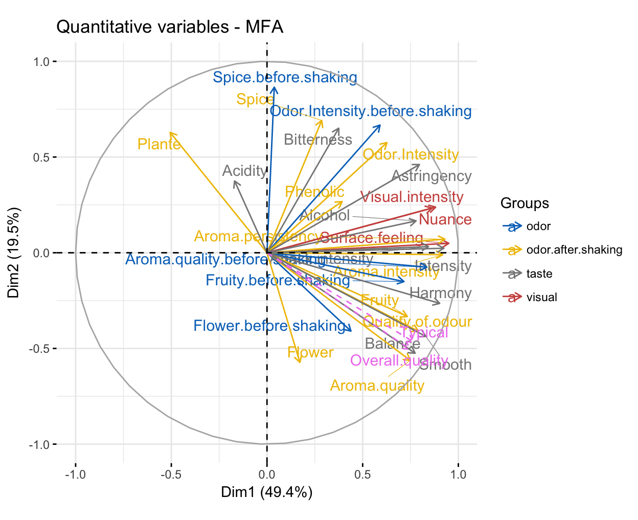
To make the plot more readable, we can use geom = c(“point”, “text”) instead of geom = c(“arrow”, “text”). We’ll change also the legend position from “right” to “bottom”, using the argument legend = “bottom”:
fviz_mfa_var(res.mfa, "quanti.var", palette = "jco",
             col.var.sup = "violet", repel = TRUE,
             geom = c("point", "text"), legend = "bottom")
Briefly, the graph of variables (correlation circle) shows the relationship between variables, the quality of the representation of variables, as well as, the correlation between variables and the dimensions:
Positive correlated variables are grouped together, whereas negative ones are positioned on opposite sides of the plot origin (opposed quadrants).
The distance between variable points and the origin measures the quality of the variable on the factor map. Variable points that are away from the origin are well represented on the factor map.
For a given dimension, the most correlated variables to the dimension are close to the dimension.
For example, the first dimension represents the positive sentiments about wines: “intensity” and “harmony”. The most correlated variables to the second dimension are: i) Spice before shaking and Odor intensity before shaking for the odor group; ii) Spice, Plant and Odor intensity for the odor after shaking group and iii) Bitterness for the taste group. This dimension represents essentially the “spicyness” and the vegetal characteristic due to olfaction.
The contribution of quantitative variables (in %) to the definition of the dimensions can be visualized using the function fviz_contrib() [factoextra package]. Variables are colored by groups. The R code below shows the top 20 variable categories contributing to the dimensions:
# Contributions to dimension 1
fviz_contrib(res.mfa, choice = "quanti.var", axes = 1, top = 20,
             palette = "jco")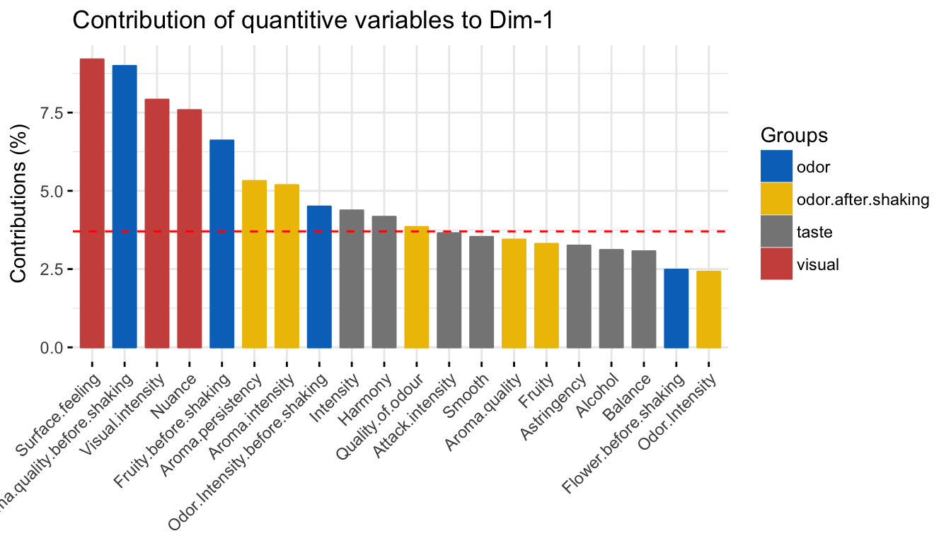
# Contributions to dimension 2
fviz_contrib(res.mfa, choice = "quanti.var", axes = 2, top = 20,
             palette = "jco")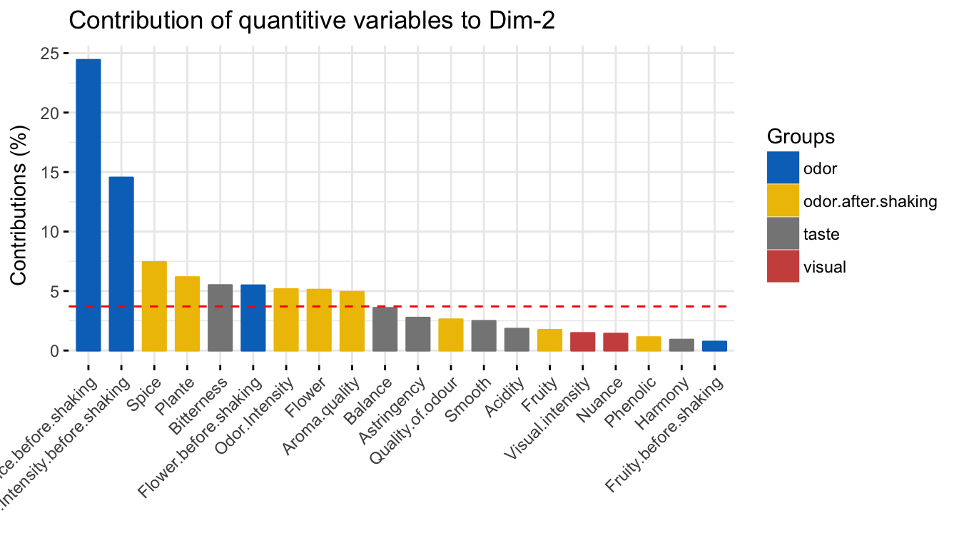
The red dashed line on the graph above indicates the expected average value, If the contributions were uniform. The calculation of the expected contribution value, under null hypothesis, has been detailed in the principal component analysis chapter (Chapter @ref(principal-component-analysis)).
The variables with the larger value, contribute the most to the definition of the dimensions. Variables that contribute the most to Dim.1 and Dim.2 are the most important in explaining the variability in the data set.
The most contributing quantitative variables can be highlighted on the scatter plot using the argument col.var = “contrib”. This produces a gradient colors, which can be customized using the argument gradient.cols.
fviz_mfa_var(res.mfa, "quanti.var", col.var = "contrib",
             gradient.cols = c("#00AFBB", "#E7B800", "#FC4E07"),
             col.var.sup = "violet", repel = TRUE,
             geom = c("point", "text"))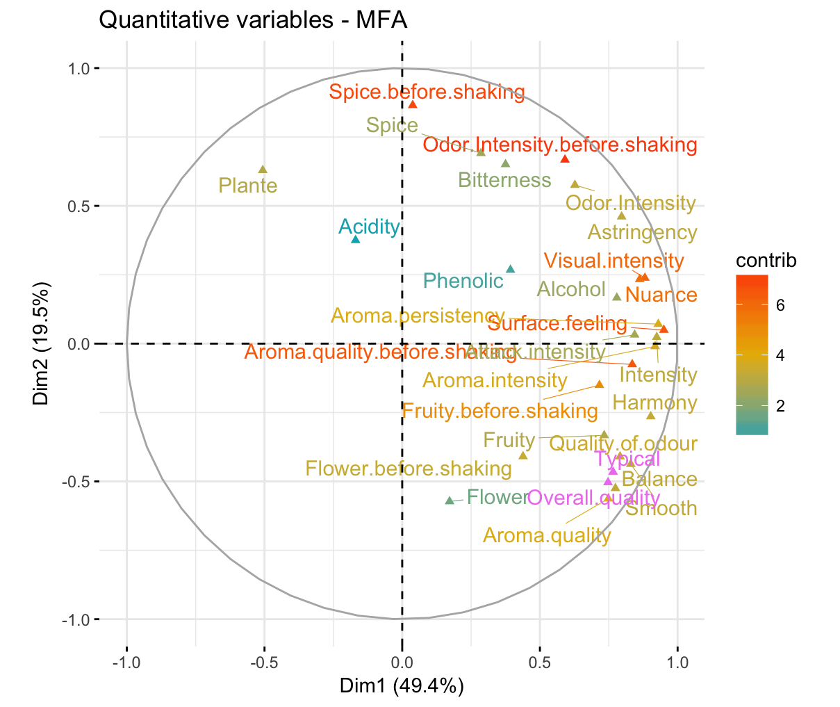
Similarly, you can highlight quantitative variables using their cos2 values representing the quality of representation on the factor map. If a variable is well represented by two dimensions, the sum of the cos2 is closed to one. For some of the row items, more than 2 dimensions might be required to perfectly represent the data.
# Color by cos2 values: quality on the factor map
fviz_mfa_var(res.mfa, col.var = "cos2",
             gradient.cols = c("#00AFBB", "#E7B800", "#FC4E07"),
             col.var.sup = "violet", repel = TRUE)
To create a bar plot of variables cos2, type this:
fviz_cos2(res.mfa, choice = "quanti.var", axes = 1)Graph of individuals
To get the results for individuals, type this:
ind <- get_mfa_ind(res.mfa)
ind
## Multiple Factor Analysis results for individuals
## ===================================================
## Name Description
## 1 "$coord" "Coordinates"
## 2 "$cos2" "Cos2, quality of representation"
## 3 "$contrib" "Contributions"
## 4 "$coord.partiel" "Partial coordinates"
## 5 "$within.inertia" "Within inertia"
## 6 "$within.partial.inertia" "Within partial inertia"To plot individuals, use the function fviz_mfa_ind() [in factoextra]. By default, individuals are colored in blue. However, like variables, it’s also possible to color individuals by their cos2 values:
fviz_mfa_ind(res.mfa, col.ind = "cos2",
             gradient.cols = c("#00AFBB", "#E7B800", "#FC4E07"),
             repel = TRUE)
In the plot above, the supplementary qualitative variable categories are shown in black. Env1, Env2, Env3 are the categories of the soil. Saumur, Bourgueuil and Chinon are the categories of the wine Label. If you don’t want to show them on the plot, use the argument invisible = “quali.var”.
Individuals with similar profiles are close to each other on the factor map. The first axis, mainly opposes the wine 1DAM and, the wines 1VAU and 2ING. As described in the previous section, the first dimension represents the harmony and the intensity of wines. Thus, the wine 1DAM (positive coordinates) was evaluated as the most “intense” and “harmonious” contrary to wines 1VAU and 2ING (negative coordinates) which are the least “intense” and “harmonious”. The second axis is essentially associated with the two wines T1 and T2 characterized by a strong value of the variables Spice.before.shaking and Odor.intensity.before.shaking.
Most of the supplementary qualitative variable categories are close to the origin of the map. This result indicates that the concerned categories are not related to the first axis (wine “intensity” & “harmony”) or the second axis (wine T1 and T2).
The category Env4 has high coordinates on the second axis related to T1 and T2.
The category “Reference” is known to be related to an excellent wine-producing soil. As expected, our analysis demonstrates that the category “Reference” has high coordinates on the first axis, which is positively correlated with wines “intensity” and “harmony”.
Note that, it’s possible to color the individuals using any of the qualitative variables in the initial data table. To do this, the argument habillage is used in the fviz_mfa_ind() function. For example, if you want to color the wines according to the supplementary qualitative variable “Label”, type this:
fviz_mfa_ind(res.mfa,
             habillage = "Label", # color by groups
             palette = c("#00AFBB", "#E7B800", "#FC4E07"),
             addEllipses = TRUE, ellipse.type = "confidence",
             repel = TRUE # Avoid text overlapping
) 
If you want to color individuals using multiple categorical variables at the same time, use the function fviz_ellipses() [in factoextra] as follow:
fviz_ellipses(res.mfa, c("Label", "Soil"), repel = TRUE)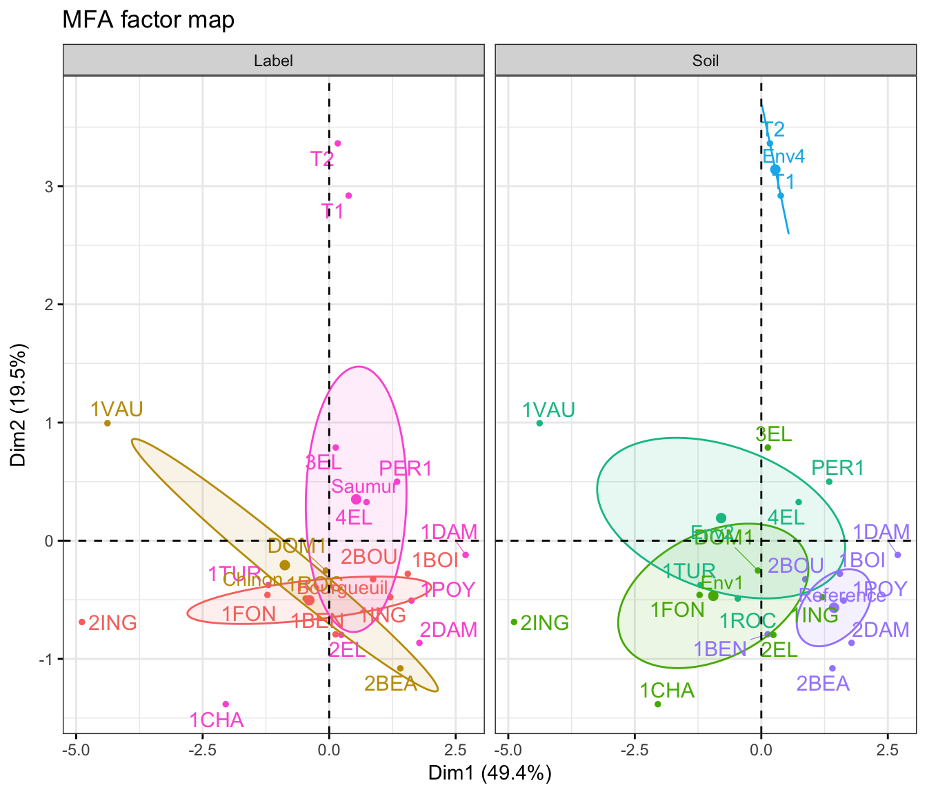
Alternatively, you can specify categorical variable indices:
fviz_ellipses(res.mca, 1:2, geom = "point")Graph of partial individuals
The results for individuals obtained from the analysis performed with a single group are named partial individuals. In other words, an individual considered from the point of view of a single group is called partial individual.
In the default fviz_mfa_ind() plot, for a given individual, the point corresponds to the mean individual or the center of gravity of the partial points of the individual. That is, the individual viewed by all groups of variables.
For a given individual, there are as many partial points as groups of variables.
The graph of partial individuals represents each wine viewed by each group and its barycenter. To plot the partial points of all individuals, type this:
fviz_mfa_ind(res.mfa, partial = "all") If you want to visualize partial points for wines of interest, let say c(“1DAM”, “1VAU”, “2ING”), use this:
fviz_mfa_ind(res.mfa, partial = c("1DAM", "1VAU", "2ING")) 
Red color represents the wines seen by only the odor variables; violet color represents the wines seen by only the visual variables, and so on.
The wine 1DAM has been described in the previous section as particularly “intense” and “harmonious”, particularly by the odor group: It has a high coordinate on the first axis from the point of view of the odor variables group compared to the point of view of the other groups.
From the odor group’s point of view, 2ING was more “intense” and “harmonious” than 1VAU but from the taste group’s point of view, 1VAU was more “intense” and “harmonious” than 2ING.
Graph of partial axes
The graph of partial axes shows the relationship between the principal axes of the MFA and the ones obtained from analyzing each group using either a PCA (for groups of continuous variables) or a MCA (for qualitative variables).
fviz_mfa_axes(res.mfa)
It can be seen that, he first dimension of each group is highly correlated to the MFA’s first one. The second dimension of the MFA is essentially correlated to the second dimension of the olfactory groups.
Summary
The multiple factor analysis (MFA) makes it possible to analyse individuals characterized by multiple sets of variables. In this article, we described how to perform and interpret MFA using FactoMineR and factoextra R packages.
Further reading
For the mathematical background behind MFA, refer to the following video courses, articles and books:
- Multiple Factor Analysis Course Using FactoMineR (Video courses). https://goo.gl/WcmHHt.
- Exploratory Multivariate Analysis by Example Using R (book) (F. Husson, Le, and Pagès 2017).
- Principal component analysis (article) (Abdi and Williams 2010). https://goo.gl/1Vtwq1.
- Simultaneous analysis of distinct Omics data sets with integration of biological knowledge: Multiple Factor Analysis approach (Tayrac et al. 2009).
References
Abdi, Hervé, and Lynne J. Williams. 2010. “Principal Component Analysis.” John Wiley and Sons, Inc. WIREs Comp Stat 2: 433–59. http://staff.ustc.edu.cn/~zwp/teach/MVA/abdi-awPCA2010.pdf.
Husson, Francois, Sebastien Le, and Jérôme Pagès. 2017. Exploratory Multivariate Analysis by Example Using R. 2nd ed. Boca Raton, Florida: Chapman; Hall/CRC. http://factominer.free.fr/bookV2/index.html.
Pagès, J. 2002. “Analyse Factorielle Multiple Appliquée Aux Variables Qualitatives et Aux Données Mixtes.” Revue Statistique Appliquee 4: 5–37.
Tayrac, Marie de, Sébastien Lê, Marc Aubry, Jean Mosser, and François Husson. 2009. “Simultaneous Analysis of Distinct Omics Data Sets with Integration of Biological Knowledge: Multiple Factor Analysis Approach.” BMC Genomics 10 (1): 32. https://doi.org/10.1186/1471-2164-10-32.