


FAMD in R Using FactoMineR: Quick Scripts and Videos
Factor analysis of mixed data (FAMD) is dedicated to analyze a data set containing both categorical and continuous variables.
This article provides a quick start R code and video showing a practical example with interpretation FAMD in R using the FactoMineR package.
Rougthly, FAMD can be seen as a mixed between principal component analysis (PCA) and multiple correspondence analysis (MCA). It acts as PCA for quantitative variables and as MCA for qualitative variables.
FAMD allows one to study the similarities between individuals taking into account mixed variables and to study the relationships between all the variables (both qualitative and quantitative variables).
It also creates the graph of individuals, the correlation circle for the continuous variables and the plot of categories for categorical variables. Additionally, it produces specific graphs to visualize the relationship between both quantitative and qualitative variables.
Contents:
Quick start R code
- Install FactoMineR package:
install.packages("FactoMineR")- Compute FAMD using the demo data set
wine[in FactoMineR]. This data set refers to 21 wine characteristics. We’ll compute FAMD with a subset of the data. Categorical and continuous variables are detected automatically.
library(FactoMineR)
data("wine")
df <- wine[, c(1, 2, 16, 22, 29, 28, 30,31)]
res.famd <- FAMD(df, graph = FALSE)- Visualize eigenvalues (scree plot). Show the percentage of variances explained by each principal component.
eig.val <- res.famd$eig
barplot(eig.val[, 2],
        names.arg = 1:nrow(eig.val),
        main = "Variances Explained by Dimensions (%)",
        xlab = "Principal Dimensions",
        ylab = "Percentage of variances",
        col ="steelblue")
# Add connected line segments to the plot
lines(x = 1:nrow(eig.val), eig.val[, 2],
      type = "b", pch = 19, col = "red")
- Graph of individuals. Qualitative variable categories are shown in bold.
plot(res.famd, choix = "ind")
- Correlation between variables (qualitative and quantitative) with principal dimensions:
plot(res.famd, choix = "var")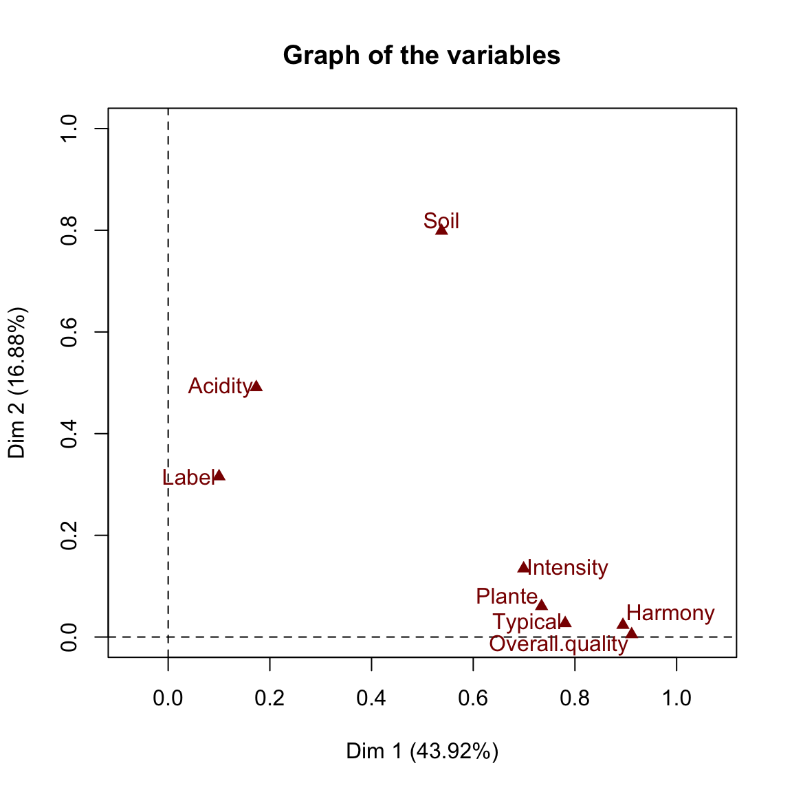
- Correlation circle of quantitative variables:
plot(res.famd, choix = "quanti")


