Add P-values and Significance Levels to ggplots
In this article, we’ll describe how to easily i) compare means of two or multiple groups; ii) and to automatically add p-values and significance levels to a ggplot (such as box plots, dot plots, bar plots and line plots …).
Contents
Prerequisites
Install and load required R packages
Required R package: ggpubr (version >= 0.1.3), for ggplot2-based publication ready plots.
- Install from CRAN as follow:
install.packages("ggpubr")- Or, install the latest developmental version from GitHub as follow:
if(!require(devtools)) install.packages("devtools")
devtools::install_github("kassambara/ggpubr")- Load ggpubr:
library(ggpubr)Official documentation of ggpubr is available at: https://www.sthda.com/english/rpkgs/ggpubr
Demo data sets
Data: ToothGrowth data sets.
data("ToothGrowth")
head(ToothGrowth)
## len supp dose
## 1 4.2 VC 0.5
## 2 11.5 VC 0.5
## 3 7.3 VC 0.5
## 4 5.8 VC 0.5
## 5 6.4 VC 0.5
## 6 10.0 VC 0.5Methods for comparing means
The standard methods to compare the means of two or more groups in R, have been largely described at: comparing means in R.
The most common methods for comparing means include:
| Methods | R function | Description |
|---|---|---|
| T-test | t.test() | Compare two groups (parametric) |
| Wilcoxon test | wilcox.test() | Compare two groups (non-parametric) |
| ANOVA | aov() or anova() | Compare multiple groups (parametric) |
| Kruskal-Wallis | kruskal.test() | Compare multiple groups (non-parametric) |
A practical guide to compute and interpret the results of each of these methods are provided at the following links:
- Comparing one-sample mean to a standard known mean:
- Comparing the means of two independent groups:
- Comparing the means of paired samples:
-
Comparing the means of more than two groups
- Analysis of variance (ANOVA, parametric):
- Kruskal-Wallis Test in R (non parametric alternative to one-way ANOVA)
R functions to add p-values
Here we present two new R functions in the ggpubr package:
- compare_means(): easy to use solution to performs one and multiple mean comparisons.
- stat_compare_means(): easy to use solution to automatically add p-values and significance levels to a ggplot.
compare_means()
As we’ll show in the next sections, it has multiple useful options compared to the standard R functions.
The simplified format is as follow:
compare_means(formula, data, method = "wilcox.test", paired = FALSE,
group.by = NULL, ref.group = NULL, ...)- formula: a formula of the form x ~ group, where x is a numeric variable and group is a factor with one or multiple levels. For example, formula = TP53 ~ cancer_group. It’s also possible to perform the test for multiple response variables at the same time. For example, formula = c(TP53, PTEN) ~ cancer_group.
-
data: a data.frame containing the variables in the formula.
-
method: the type of test. Default is “wilcox.test”. Allowed values include:
- “t.test” (parametric) and “wilcox.test”" (non-parametric). Perform comparison between two groups of samples. If the grouping variable contains more than two levels, then a pairwise comparison is performed.
- “anova” (parametric) and “kruskal.test” (non-parametric). Perform one-way ANOVA test comparing multiple groups.
-
paired: a logical indicating whether you want a paired test. Used only in t.test and in wilcox.test.
-
group.by: variables used to group the data set before applying the test. When specified the mean comparisons will be performed in each subset of the data formed by the different levels of the group.by variables.
-
ref.group: a character string specifying the reference group. If specified, for a given grouping variable, each of the group levels will be compared to the reference group (i.e. control group). ref.group can be also “.all.”. In this case, each of the grouping variable levels is compared to all (i.e. base-mean).
stat_compare_means()
This function extends ggplot2 for adding mean comparison p-values to a ggplot, such as box blots, dot plots, bar plots and line plots.
The simplified format is as follow:
stat_compare_means(mapping = NULL, comparisons = NULL hide.ns = FALSE,
label = NULL, label.x = NULL, label.y = NULL, ...)-
mapping: Set of aesthetic mappings created by aes().
-
comparisons: A list of length-2 vectors. The entries in the vector are either the names of 2 values on the x-axis or the 2 integers that correspond to the index of the groups of interest, to be compared.
-
hide.ns: logical value. If TRUE, hide ns symbol when displaying significance levels.
-
label: character string specifying label type. Allowed values include “p.signif” (shows the significance levels), “p.format” (shows the formatted p value).
-
label.x,label.y: numeric values. coordinates (in data units) to be used for absolute positioning of the label. If too short they will be recycled.
-
…: other arguments passed to the function compare_means() such as method, paired, ref.group.
Compare two independent groups
Perform the test:
compare_means(len ~ supp, data = ToothGrowth)## # A tibble: 1 x 8
## .y. group1 group2 p p.adj p.format p.signif method
##
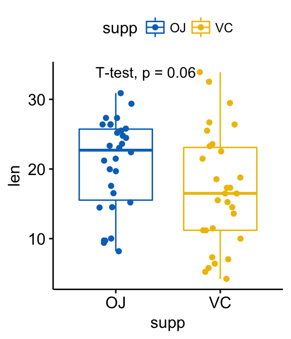
## 1 len OJ VC 0.0645 0.0645 0.064 ns Wilcoxon By default method = “wilcox.test” (non-parametric test). You can also specify method = “t.test” for a parametric t-test.
Returned value is a data frame with the following columns:
- .y.: the y variable used in the test.
- p: the p-value
- p.adj: the adjusted p-value. Default value for p.adjust.method = “holm”
- p.format: the formatted p-value
- p.signif: the significance level.
- method: the statistical test used to compare groups.
Create a box plot with p-values:
p <- ggboxplot(ToothGrowth, x = "supp", y = "len",
          color = "supp", palette = "jco",
          add = "jitter")
#  Add p-value
p + stat_compare_means()
# Change method
p + stat_compare_means(method = "t.test")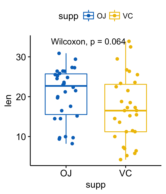
Note that, the p-value label position can be adjusted using the arguments: label.x, label.y, hjust and vjust.
The default p-value label displayed is obtained by concatenating the method and the p columns of the returned data frame by the function compare_means(). You can specify other combinations using the aes() function.
For example,
- aes(label = ..p.format..) or aes(label = paste0(“p =”, ..p.format..)): display only the formatted p-value (without the method name)
- aes(label = ..p.signif..): display only the significance level.
- aes(label = paste0(..method.., “\n”, “p =”, ..p.format..)): Use line break (“\n”) between the method name and the p-value.
As an illustration, type this:
p + stat_compare_means( aes(label = ..p.signif..),
                        label.x = 1.5, label.y = 40)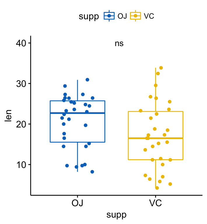
If you prefer, it’s also possible to specify the argument label as a character vector:
p + stat_compare_means( label = "p.signif", label.x = 1.5, label.y = 40)Compare two paired samples
Perform the test:
compare_means(len ~ supp, data = ToothGrowth, paired = TRUE)## # A tibble: 1 x 8
## .y. group1 group2 p p.adj p.format p.signif method
##
## 1 len OJ VC 0.00431 0.00431 0.0043 ** Wilcoxon Visualize paired data using the ggpaired() function:
ggpaired(ToothGrowth, x = "supp", y = "len",
         color = "supp", line.color = "gray", line.size = 0.4,
         palette = "jco")+
  stat_compare_means(paired = TRUE)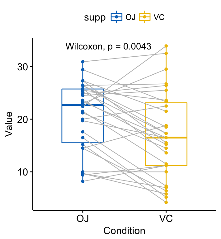
Compare more than two groups
- Global test:
# Global test
compare_means(len ~ dose,  data = ToothGrowth, method = "anova")
## # A tibble: 1 x 6
## .y. p p.adj p.format p.signif method
##
## 1 len 9.53e-16 9.53e-16 9.5e-16 **** Anova Plot with global p-value:
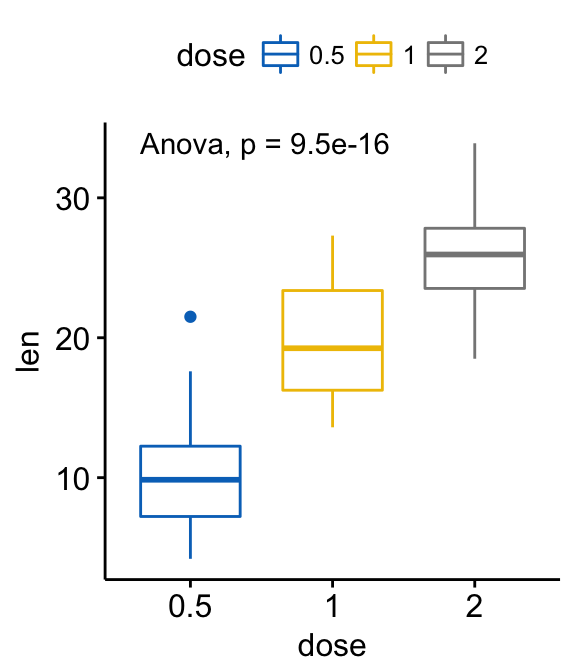
# Default method = "kruskal.test" for multiple groups
ggboxplot(ToothGrowth, x = "dose", y = "len",
          color = "dose", palette = "jco")+
  stat_compare_means()
# Change method to anova
ggboxplot(ToothGrowth, x = "dose", y = "len",
          color = "dose", palette = "jco")+
  stat_compare_means(method = "anova")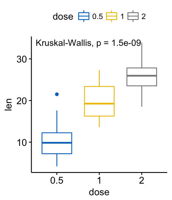
- Pairwise comparisons. If the grouping variable contains more than two levels, then pairwise tests will be performed automatically. The default method is “wilcox.test”. You can change this to “t.test”.
# Perorm pairwise comparisons
compare_means(len ~ dose,  data = ToothGrowth)
## # A tibble: 3 x 8
## .y. group1 group2 p p.adj p.format p.signif method
##
## 1 len 0.5 1 7.02e-06 1.40e-05 7.0e-06 **** Wilcoxon
## 2 len 0.5 2 8.41e-08 2.52e-07 8.4e-08 **** Wilcoxon
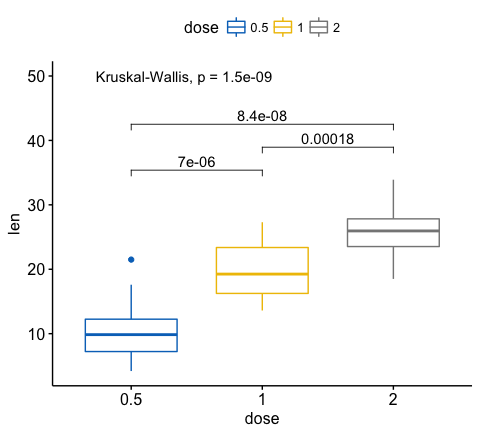
## 3 len 1 2 1.77e-04 1.77e-04 0.00018 *** Wilcoxon # Visualize: Specify the comparisons you want
my_comparisons <- list( c("0.5", "1"), c("1", "2"), c("0.5", "2") )
ggboxplot(ToothGrowth, x = "dose", y = "len",
color = "dose", palette = "jco")+
stat_compare_means(comparisons = my_comparisons)+ # Add pairwise comparisons p-value
stat_compare_means(label.y = 50) # Add global p-value
If you want to specify the precise y location of bars, use the argument label.y:
ggboxplot(ToothGrowth, x = "dose", y = "len",
          color = "dose", palette = "jco")+
  stat_compare_means(comparisons = my_comparisons, label.y = c(29, 35, 40))+
  stat_compare_means(label.y = 45)
(Adding bars, connecting compared groups, has been facilitated by the ggsignif R package )
- Multiple pairwise tests against a reference group:
# Pairwise comparison against reference
compare_means(len ~ dose,  data = ToothGrowth, ref.group = "0.5",
              method = "t.test")
## # A tibble: 2 x 8
## .y. group1 group2 p p.adj p.format p.signif method
##
## 1 len 0.5 1 6.70e-09 6.70e-09 6.7e-09 **** T-test
## 2 len 0.5 2 1.47e-16 2.94e-16 < 2e-16 **** T-test # Visualize
ggboxplot(ToothGrowth, x = "dose", y = "len",
color = "dose", palette = "jco")+
stat_compare_means(method = "anova", label.y = 40)+ # Add global p-value
stat_compare_means(label = "p.signif", method = "t.test",
ref.group = "0.5") # Pairwise comparison against reference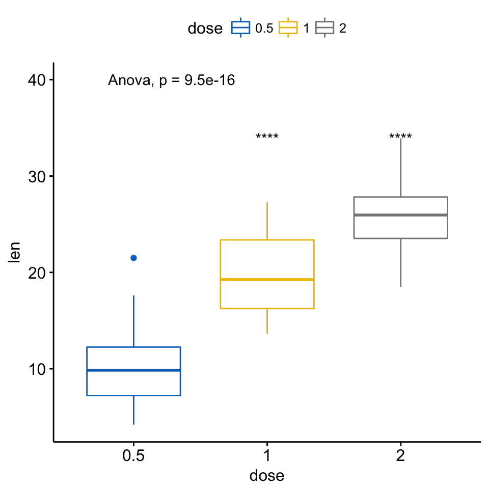
- Multiple pairwise tests against all (base-mean):
# Comparison of each group against base-mean
compare_means(len ~ dose,  data = ToothGrowth, ref.group = ".all.",
              method = "t.test")
## # A tibble: 3 x 8
## .y. group1 group2 p p.adj p.format p.signif method
##
## 1 len .all. 0.5 1.24e-06 3.73e-06 1.2e-06 **** T-test
## 2 len .all. 1 5.67e-01 5.67e-01 0.57 ns T-test
## 3 len .all. 2 1.37e-05 2.74e-05 1.4e-05 **** T-test # Visualize
ggboxplot(ToothGrowth, x = "dose", y = "len",
color = "dose", palette = "jco")+
stat_compare_means(method = "anova", label.y = 40)+ # Add global p-value
stat_compare_means(label = "p.signif", method = "t.test",
ref.group = ".all.") # Pairwise comparison against all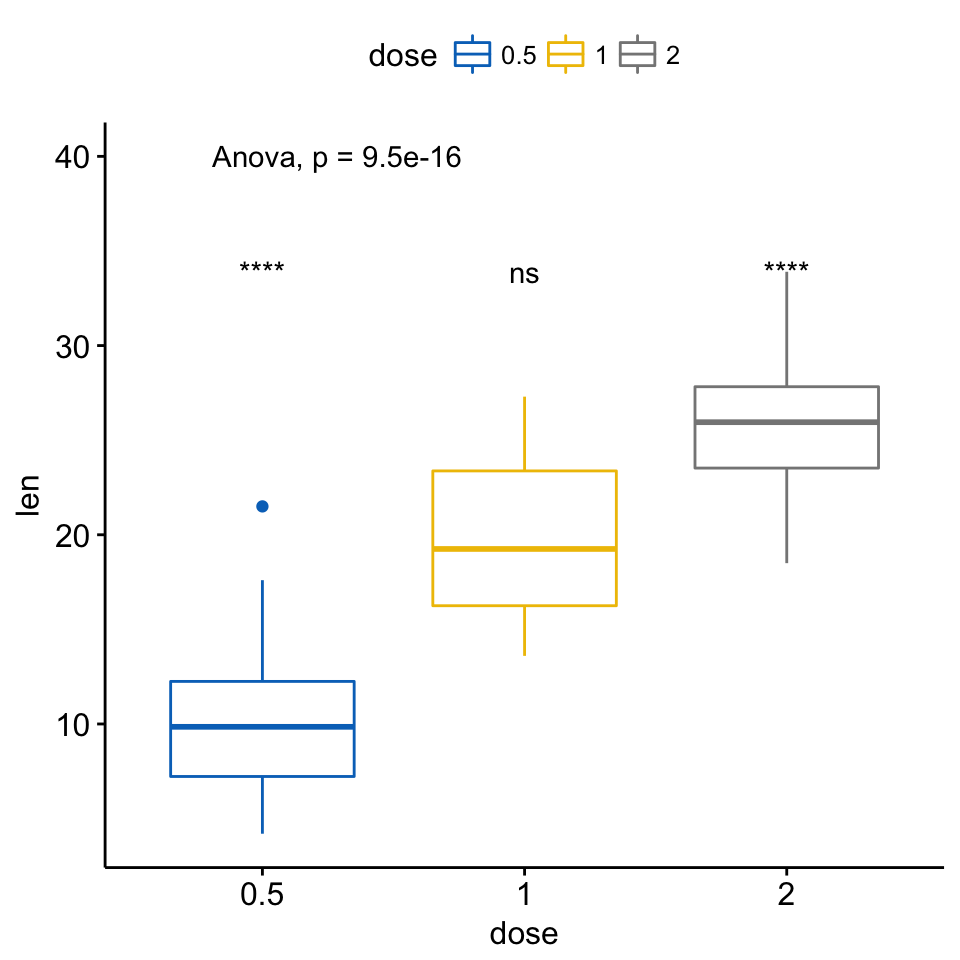
A typical situation, where pairwise comparisons against “all” can be useful, is illustrated here using the myeloma data set available on Github.
We’ll plot the expression profile of the DEPDC1 gene according to the patients’ molecular groups. We want to know if there is any difference between groups. If yes, where the difference is?
To answer to this question, you can perform a pairwise comparison between all the 7 groups. This will lead to a lot of comparisons between all possible combinations. If you have many groups, as here, it might be difficult to interpret.
Another easy solution is to compare each of the seven groups against “all” (i.e. base-mean). When the test is significant, then you can conclude that DEPDC1 is significantly overexpressed or downexpressed in a group xxx compared to all.
# Load myeloma data from GitHub
myeloma <- read.delim("https://raw.githubusercontent.com/kassambara/data/master/myeloma.txt")
# Perform the test
compare_means(DEPDC1 ~ molecular_group,  data = myeloma,
              ref.group = ".all.", method = "t.test")
## # A tibble: 7 x 8
## .y. group1 group2 p p.adj p.format p.signif method
##
## 1 DEPDC1 .all. Cyclin D-1 0.149690 0.44907 0.14969 ns T-test
## 2 DEPDC1 .all. Cyclin D-2 0.523143 1.00000 0.52314 ns T-test
## 3 DEPDC1 .all. Hyperdiploid 0.000282 0.00169 0.00028 *** T-test
## 4 DEPDC1 .all. Low bone disease 0.005084 0.02542 0.00508 ** T-test
## 5 DEPDC1 .all. MAF 0.086107 0.34443 0.08611 ns T-test
## 6 DEPDC1 .all. MMSET 0.576291 1.00000 0.57629 ns T-test
## # ... with 1 more rows # Visualize the expression profile
ggboxplot(myeloma, x = "molecular_group", y = "DEPDC1", color = "molecular_group",
add = "jitter", legend = "none") +
rotate_x_text(angle = 45)+
geom_hline(yintercept = mean(myeloma$DEPDC1), linetype = 2)+ # Add horizontal line at base mean
stat_compare_means(method = "anova", label.y = 1600)+ # Add global annova p-value
stat_compare_means(label = "p.signif", method = "t.test",
ref.group = ".all.") # Pairwise comparison against all
From the plot above, we can conclude that DEPDC1 is significantly overexpressed in proliferation group and, it’s significantly downexpressed in Hyperdiploid and Low bone disease compared to all.
Note that, if you want to hide the ns symbol, specify the argument hide.ns = TRUE.
# Visualize the expression profile
ggboxplot(myeloma, x = "molecular_group", y = "DEPDC1", color = "molecular_group",
          add = "jitter", legend = "none") +
  rotate_x_text(angle = 45)+
  geom_hline(yintercept = mean(myeloma$DEPDC1), linetype = 2)+ # Add horizontal line at base mean
  stat_compare_means(method = "anova", label.y = 1600)+        # Add global annova p-value
  stat_compare_means(label = "p.signif", method = "t.test",
                     ref.group = ".all.", hide.ns = TRUE)      # Pairwise comparison against all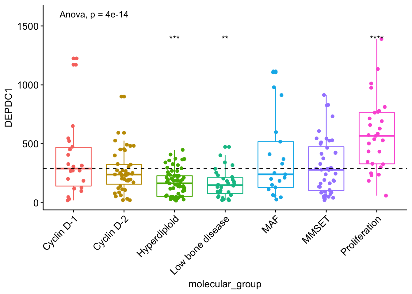
Multiple grouping variables
- Two independent sample comparisons after grouping the data by another variable:
Perform the test:
compare_means(len ~ supp, data = ToothGrowth,
              group.by = "dose")
## # A tibble: 3 x 9
## dose .y. group1 group2 p p.adj p.format p.signif method
##
## 1 0.5 len OJ VC 0.02319 0.0464 0.023 * Wilcoxon
## 2 1.0 len OJ VC 0.00403 0.0121 0.004 ** Wilcoxon
## 3 2.0 len OJ VC 1.00000 1.0000 1.000 ns Wilcoxon In the example above, for each level of the variable “dose”, we compare the means of the variable “len” in the different groups formed by the grouping variable “supp”.
Visualize (1/2). Create a multi-panel box plots facetted by group (here, “dose”):
# Box plot facetted by "dose"
p <- ggboxplot(ToothGrowth, x = "supp", y = "len",
          color = "supp", palette = "jco",
          add = "jitter",
          facet.by = "dose", short.panel.labs = FALSE)
# Use only p.format as label. Remove method name.
p + stat_compare_means(label = "p.format")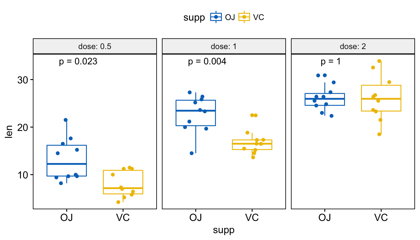
# Or use significance symbol as label
p + stat_compare_means(label =  "p.signif", label.x = 1.5)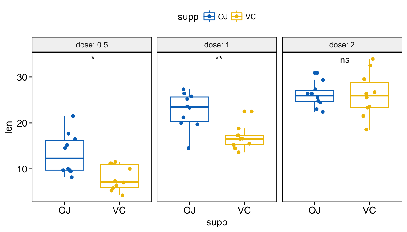
To hide the ‘ns’ symbol, use the argument hide.ns = TRUE.
Visualize (2/2). Create one single panel with all box plots. Plot y = “len” by x = “dose” and color by “supp”:
p <- ggboxplot(ToothGrowth, x = "dose", y = "len",
          color = "supp", palette = "jco",
          add = "jitter")
p + stat_compare_means(aes(group = supp))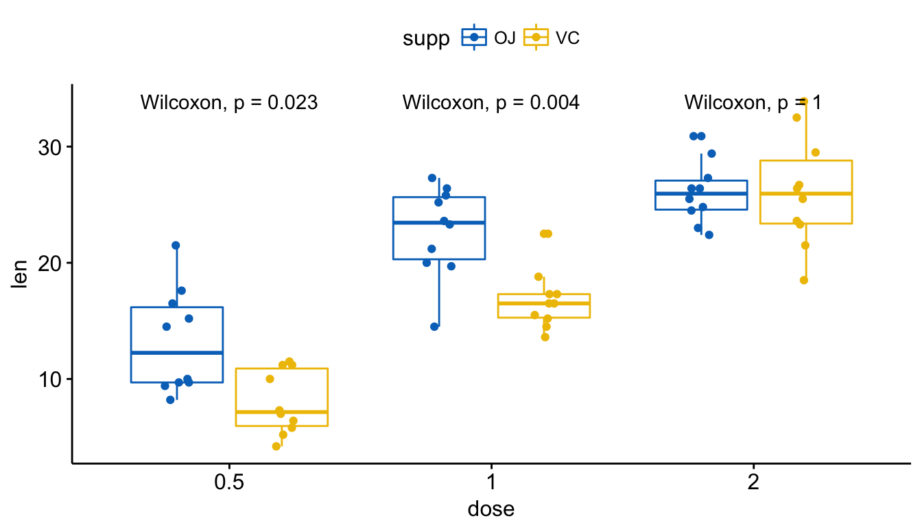
# Show only p-value
p + stat_compare_means(aes(group = supp), label = "p.format")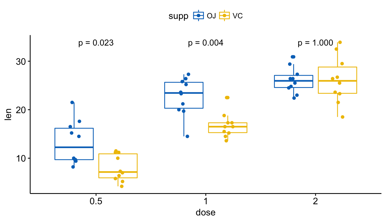
# Use significance symbol as label
p + stat_compare_means(aes(group = supp), label = "p.signif")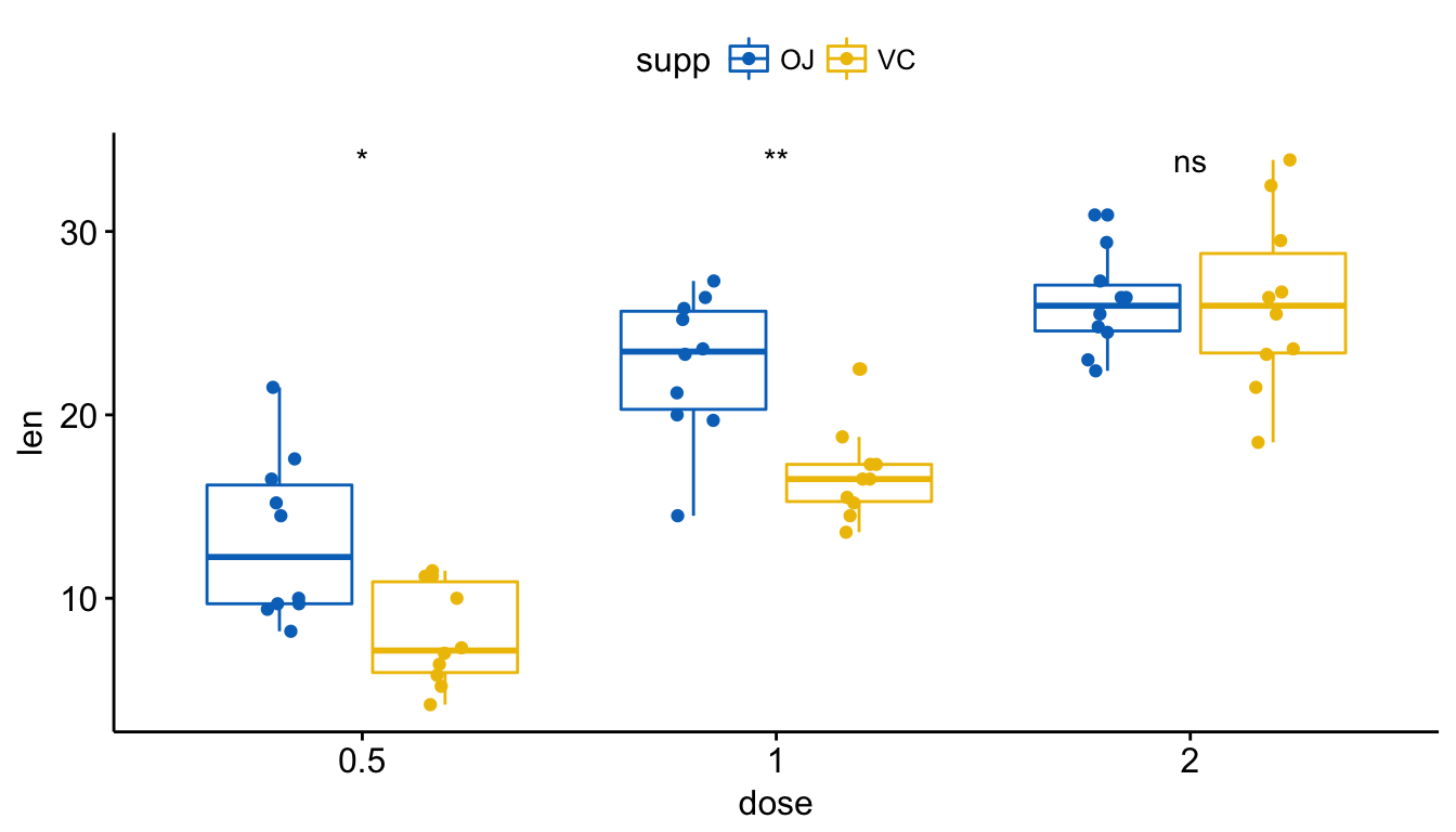
- Paired sample comparisons after grouping the data by another variable:
Perform the test:
compare_means(len ~ supp, data = ToothGrowth,
              group.by = "dose", paired = TRUE)
## # A tibble: 3 x 9
## dose .y. group1 group2 p p.adj p.format p.signif method
##
## 1 0.5 len OJ VC 0.0330 0.0659 0.033 * Wilcoxon
## 2 1.0 len OJ VC 0.0191 0.0572 0.019 * Wilcoxon
## 3 2.0 len OJ VC 1.0000 1.0000 1.000 ns Wilcoxon Visualize. Create a multi-panel box plots facetted by group (here, “dose”):
# Box plot facetted by "dose"
p <- ggpaired(ToothGrowth, x = "supp", y = "len",
          color = "supp", palette = "jco",
          line.color = "gray", line.size = 0.4,
          facet.by = "dose", short.panel.labs = FALSE)
# Use only p.format as label. Remove method name.
p + stat_compare_means(label = "p.format", paired = TRUE)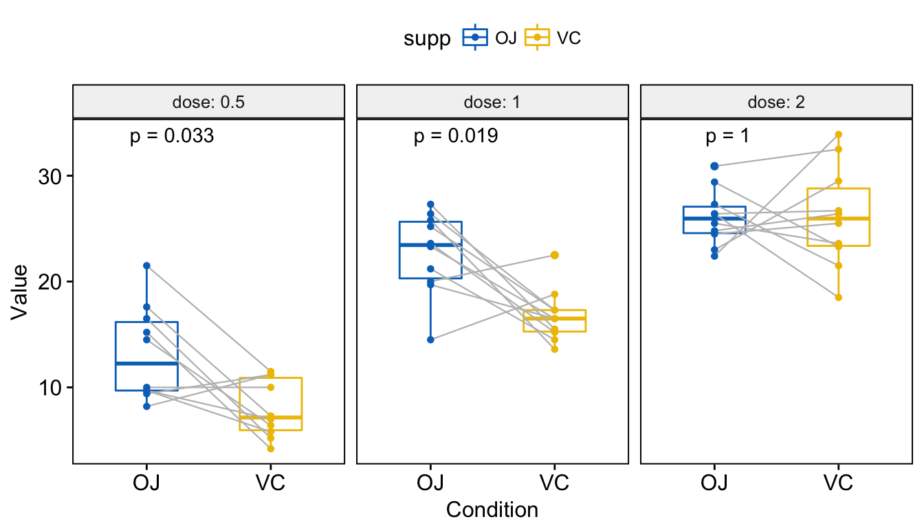
Other plot types
- Bar and line plots (one grouping variable):
# Bar plot of mean +/-se
ggbarplot(ToothGrowth, x = "dose", y = "len", add = "mean_se")+
  stat_compare_means() +                                         # Global p-value
  stat_compare_means(ref.group = "0.5", label = "p.signif",
                     label.y = c(22, 29))                   # compare to ref.group
# Line plot of mean +/-se
ggline(ToothGrowth, x = "dose", y = "len", add = "mean_se")+
  stat_compare_means() +                                         # Global p-value
  stat_compare_means(ref.group = "0.5", label = "p.signif",
label.y = c(22, 29)) 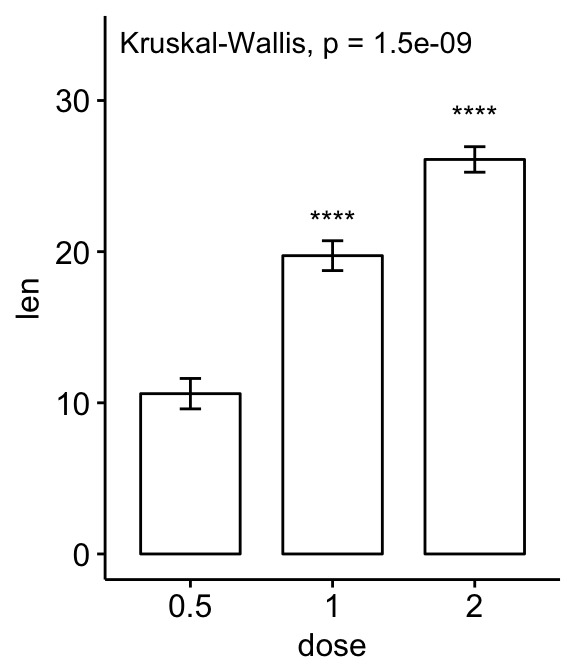

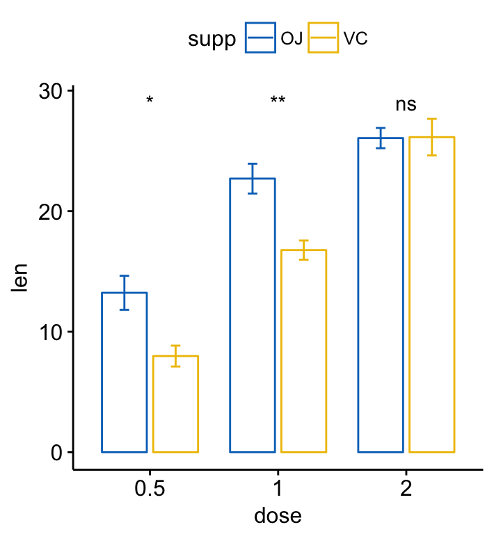
- Bar and line plots (two grouping variables):
ggbarplot(ToothGrowth, x = "dose", y = "len", add = "mean_se",
color = "supp", palette = "jco",
position = position_dodge(0.8))+
stat_compare_means(aes(group = supp), label = "p.signif", label.y = 29)
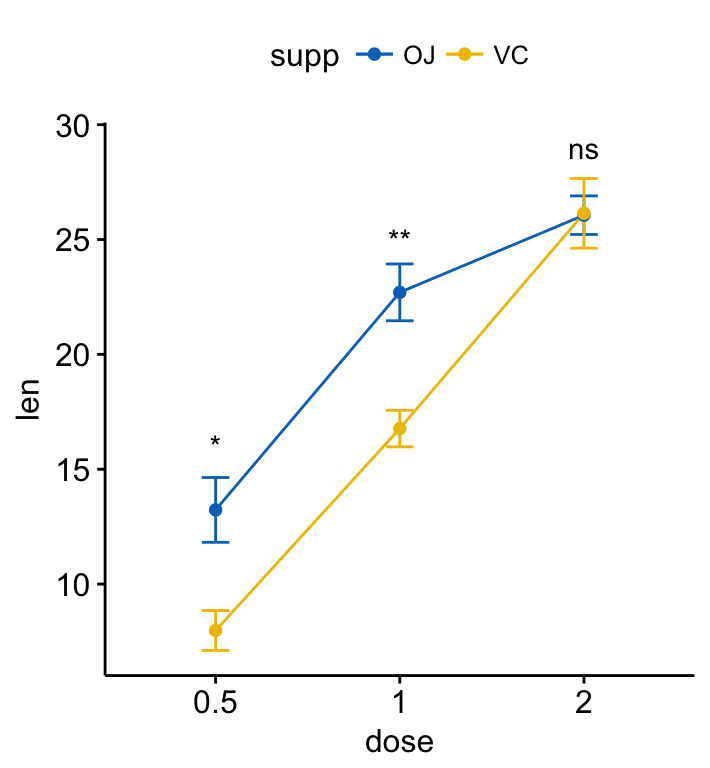
ggline(ToothGrowth, x = "dose", y = "len", add = "mean_se",
color = "supp", palette = "jco")+
stat_compare_means(aes(group = supp), label = "p.signif",
label.y = c(16, 25, 29))