


Amazing interactive 3D scatter plots - R software and data visualization
I recently posted an article describing how to make easily a 3D scatter plot in R using the package scatterplot3d.
This R tutorial describes how to perform an interactive 3d graphics using R software and the function scatter3d from the package car.
The function scatter3d() uses the rgl package to draw and animate 3D scatter plots.
Install and load required packages
The packages rgl and car are required for this tutorial:
install.packages(c("rgl", "car"))Note that, on Linux operating system, the rgl package can be installed as follow:
sudo apt-get install r-cran-rgl
Load the packages:
library("car")Prepare the data
We’ll use the iris data set in the following examples :
data(iris)
head(iris)
Sepal.Length Sepal.Width Petal.Length Petal.Width Species
1 5.1 3.5 1.4 0.2 setosa
2 4.9 3.0 1.4 0.2 setosa
3 4.7 3.2 1.3 0.2 setosa
4 4.6 3.1 1.5 0.2 setosa
5 5.0 3.6 1.4 0.2 setosa
6 5.4 3.9 1.7 0.4 setosasep.l <- iris$Sepal.Length
sep.w <- iris$Sepal.Width
pet.l <- iris$Petal.Lengthiris data set gives the measurements of the variables sepal length and width, petal length and width, respectively, for 50 flowers from each of 3 species of iris. The species are Iris setosa, versicolor, and virginica.
The function scatter3d
The simplified formats are:
scatter3d(formula, data)
scatter3d(x, y, z)- x, y, z are respectively the coordinates of points to be plotted. The arguments y and z can be optional depending on the structure of x.
- formula: a model formula of form y ~ x + z. If you want to plot the points by groups, you can use y ~ x + z | g where g is a factor dividing the data into groups
- data: data frame within which to evaluate the formula
Basic 3D scatter plots
library(car)
# 3D plot with the regression plane
scatter3d(x = sep.l, y = pet.l, z = sep.w)
Note that, the plot can be manually rotated by holding down on the mouse or touchpad. It can be also zoomed using the scroll wheel on a mouse or pressing ctrl + using the touchpad on a PC or two fingers (up or down) on a mac.
Change point colors and remove the regression surface:
scatter3d(x = sep.l, y = pet.l, z = sep.w,
        point.col = "blue", surface=FALSE)
Plot the points by groups
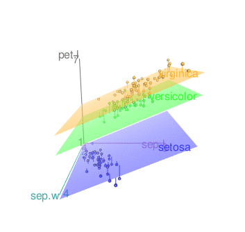
Default plot
scatter3d(x = sep.l, y = pet.l, z = sep.w, groups = iris$Species)
Remove the surfaces
- To remove the grids only, the argument grid = FALSE can be used as follow:
scatter3d(x = sep.l, y = pet.l, z = sep.w, groups = iris$Species,
          grid = FALSE)
Note that, the display of the surface(s) can be changed using the argument fit. Possible values for fit are “linear”, “quadratic”, “smooth” and “additive”
scatter3d(x = sep.l, y = pet.l, z = sep.w, groups = iris$Species,
          grid = FALSE, fit = "smooth")
- Remove surfaces. The argument surface = FALSE is used.
scatter3d(x = sep.l, y = pet.l, z = sep.w, groups = iris$Species,
          grid = FALSE, surface = FALSE)
Add concentration ellipsoids
scatter3d(x = sep.l, y = pet.l, z = sep.w, groups = iris$Species,
          surface=FALSE, ellipsoid = TRUE)
Remove the grids from the ellipsoids:
scatter3d(x = sep.l, y = pet.l, z = sep.w, groups = iris$Species,
          surface=FALSE, grid = FALSE, ellipsoid = TRUE)
Change point colors by groups
The argument surface.col is used. surface.col is a vector of colors for the regression planes.
For multi-group plots, the colors are used for the regression surfaces and for the points in the several groups.
scatter3d(x = sep.l, y = pet.l, z = sep.w, groups = iris$Species,
          surface=FALSE, grid = FALSE, ellipsoid = TRUE,
          surface.col = c("#999999", "#E69F00", "#56B4E9"))
Read more about colors in R: colors in R
It’s also possible to use color palettes from the RColorBrewer package:
library("RColorBrewer")
colors <- brewer.pal(n=3, name="Dark2")
scatter3d(x = sep.l, y = pet.l, z = sep.w, groups = iris$Species,
          surface=FALSE, grid = FALSE, ellipsoid = TRUE,
          surface.col = colors)
Axes
Change axis labels:
The arguments xlab, ylab and zlab are used:
scatter3d(x = sep.l, y = pet.l, z = sep.w,
        point.col = "blue", surface=FALSE,
        xlab = "Sepal Length (cm)", ylab = "Petal Length (cm)",
        zlab = "Sepal Width (cm)")
Remove axis scales
axis.scales = FALSE
scatter3d(x = sep.l, y = pet.l, z = sep.w,
        point.col = "blue", surface=FALSE,
        axis.scales = FALSE)
Change axis colors
By default, different colors are used for the 3 axes. The argument axis.col is used to specify colors for the 3 axes:
scatter3d(x = sep.l, y = pet.l, z = sep.w, groups = iris$Species,
          surface=FALSE, grid = FALSE, ellipsoid = TRUE,
          axis.col = c("black", "black", "black"))
Add text labels for the points
The arguments below are used:
- labels: text labels for the points, one for each point
- id.n: Number of relatively extreme points to identify automatically
scatter3d(x = sep.l, y = pet.l, z = sep.w,
          surface=FALSE, labels = rownames(iris), id.n=nrow(iris))
Export images
The plot can be saved as png or pdf.
- The function rgl.snapshot() is used to save the screenshot as png file:
rgl.snapshot(filename = "plot.png")- The function rgl.postscript() is used to saves the screenshot to a file in ps, eps, tex, pdf, svg or pgf format:
rgl.postscript("plot.pdf",fmt="pdf")See also
The function Identify3d()[ car package] allows to label points interactively with the mouse.
Infos
This analysis has been performed using R software (ver. 3.1.2) and car (ver. 2.0-25)
Show me some love with the like buttons below... Thank you and please don't forget to share and comment below!!
Montrez-moi un peu d'amour avec les like ci-dessous ... Merci et n'oubliez pas, s'il vous plaît, de partager et de commenter ci-dessous!
Recommended for You!


Recommended for you
This section contains the best data science and self-development resources to help you on your path.
Books - Data Science
Our Books
- Practical Guide to Cluster Analysis in R by A. Kassambara (Datanovia)
- Practical Guide To Principal Component Methods in R by A. Kassambara (Datanovia)
- Machine Learning Essentials: Practical Guide in R by A. Kassambara (Datanovia)
- R Graphics Essentials for Great Data Visualization by A. Kassambara (Datanovia)
- GGPlot2 Essentials for Great Data Visualization in R by A. Kassambara (Datanovia)
- Network Analysis and Visualization in R by A. Kassambara (Datanovia)
- Practical Statistics in R for Comparing Groups: Numerical Variables by A. Kassambara (Datanovia)
- Inter-Rater Reliability Essentials: Practical Guide in R by A. Kassambara (Datanovia)
Others
- R for Data Science: Import, Tidy, Transform, Visualize, and Model Data by Hadley Wickham & Garrett Grolemund
- Hands-On Machine Learning with Scikit-Learn, Keras, and TensorFlow: Concepts, Tools, and Techniques to Build Intelligent Systems by Aurelien Géron
- Practical Statistics for Data Scientists: 50 Essential Concepts by Peter Bruce & Andrew Bruce
- Hands-On Programming with R: Write Your Own Functions And Simulations by Garrett Grolemund & Hadley Wickham
- An Introduction to Statistical Learning: with Applications in R by Gareth James et al.
- Deep Learning with R by François Chollet & J.J. Allaire
- Deep Learning with Python by François Chollet
Click to follow us on Facebook :
Comment this article by clicking on "Discussion" button (top-right position of this page)