ggplot2.customize : How to personalize easily ggplot2 graphs in R statistical software
- Introduction
- Install and load easyGgplot2 package
- Data format
- Basic box plot
- Customize your box plot
- Facet : split a plot into a matrix of panels
- ggplot2.customize function
- Easy ggplot2 ebook
- Infos
Introduction
ggplot2.customize is an easy to use function, to customize plots (e.g : box and whisker plot, histogram, density plot, dotplot, scatter plot, line plot, …) generated with R ggplot2 package. ggplot2.customize function is from easyGgplot2 R package and it can be used to personalize graphical parameters including axis, title, background, color, legend and more. To be able to run the R script of this tutorial, you have to install easyGgplot2. This is explained in the next section.
The aim of this tutorial is to show you step by step, how to plot and customize a box plot using ggplot2.customize function.
Note that all the R scripts used in this tutorial to customize ggplot2 boxplot can also be applied to personalize the others graphics (including boxplot, histogram, density plot, dotplot, etc, …) generated by either ggplot2 or easyGgplot2 R packages.
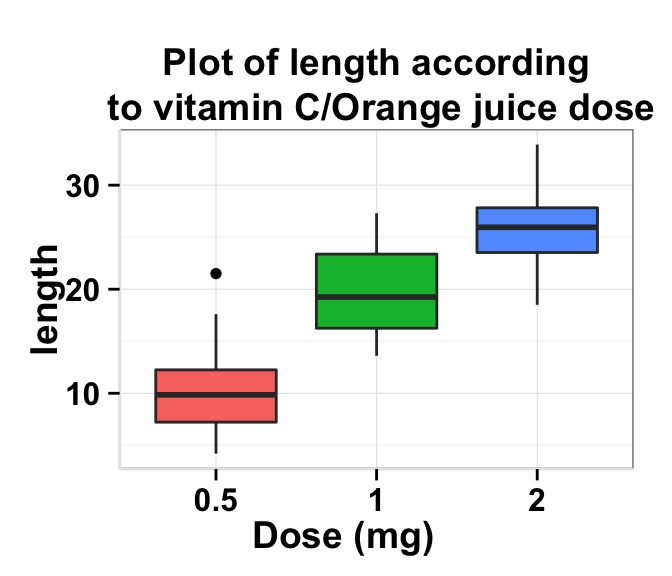
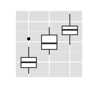
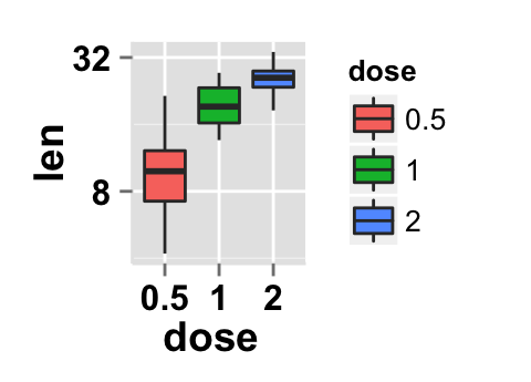
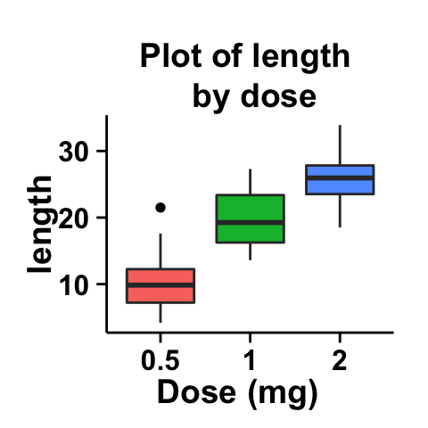
At the end of this tutorial you will be able to draw, with few R code, the following plots :
The prototype of ggplot2.customize function is described at the end of this document.
Install and load easyGgplot2 package
easyGgplot2 R package can be installed as follow :
install.packages("devtools")
library(devtools)
install_github("easyGgplot2", "kassambara")
Load the package using this R code :
library(easyGgplot2)Data format
The data must be a numeric vector or a data.frame (columns are variables and rows are observations).
ToothGrowth data is used in the following examples.
# data.frame
df <- ToothGrowth
head(df)
## len supp dose
## 1 4.2 VC 0.5
## 2 11.5 VC 0.5
## 3 7.3 VC 0.5
## 4 5.8 VC 0.5
## 5 6.4 VC 0.5
## 6 10.0 VC 0.5ToothGrowth describes the effect of Vitamin C on Tooth growth in Guinea pigs. The response is the length (len) of teeth in each of 10 guinea pigs at each of three dose levels of Vitamin C (0.5, 1, and 2 mg) with each of two delivery methods (orange juice or ascorbic acid).
The data is a data frame with 60 observations on 3 variables. * [,1] len numeric Tooth length. * [,2] supp factor Supplement type (VC or OJ). * [,3] dose numeric Dose in milligrams.Basic box plot
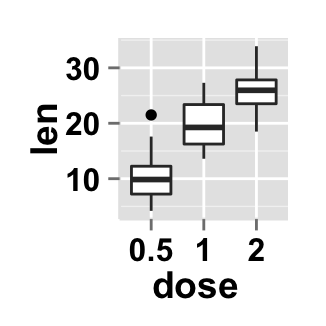
You can generate basic box plot using either ggplot2.boxplot [easyGgplot2 package] or geom_boxplot [ggplot2 package].
# Boxplot using ggplot2 package
p <- ggplot(ToothGrowth, aes(factor(dose), len))+geom_boxplot()
p
# Boxplot using easyGgplot2 package
p<-ggplot2.boxplot(data = ToothGrowth, xName = 'dose',yName = 'len')
p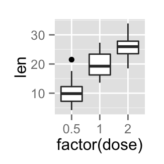
Customize your box plot
Parameters
The arguments that can be used to customize x and y axis are listed below :
| Parameters | Description |
|---|---|
| xShowTitle, yShowTitle | if TRUE, x and y axis titles will be shown. Set the value to FALSE to hide axis labels. Default values are TRUE. |
| xtitle, ytitle | x and y axis labels. Default values are NULL. |
| xtitleFont, ytitleFont | a vector of length 3 indicating respectively the size, the style and the color of x and y axis titles. Possible values for the style:“plain”, “italic”, “bold”, “bold.italic”. Color can be specified as an hexadecimal code (e.g: “#FFCC00”) or by the name (e.g : “red”, “green”). Default values are xtitleFont = c(14,"bold", "black"), ytitleFont = c(14,"bold", "black"). |
| xlim, ylim | limit for the x and y axis. Default values are NULL. |
| xScale, yScale | x and y axis scales. Possible values : c(“none”, “log2”, “log10”). e.g: yScale = “log2”. Default values are NULL. |
| xShowTickLabel, yShowTickLabel | if TRUE, x and y axis tick mark labels will be shown. Default values are TRUE. |
| xTickLabelFont, yTickLabelFont | a vector of length 3 indicating respectively the size, the style and the color of x and y axis tick label fonts. Default value are xTickLabelFont = c(12, "bold", "black"), yTickLabelFont = c(12, "bold", "black"). |
| xtickLabelRotation, ytickLabelRotation | Rotation angle of x and y axis tick labels. Default value are 0. |
| hideAxisTicks | if TRUE, x and y axis ticks are hidden. Default value is FALSE. |
| axisLine | a vector of length 3 indicating respectively the size, the line type and the color of axis lines. Default value is c(0.5, "solid", "#E5E5E5"). |
Main title and axis labels
# Change main title and axis titles
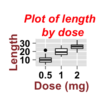
ggplot2.customize(p,
                mainTitle = "Plot of length \n by dose",
                xtitle = "Dose (mg)", ytitle = "Length")
# Customize title styles. Possible values for the font style :
  # 'plain', 'italic', 'bold', 'bold.italic'.
ggplot2.customize(p,
                xtitle = "Dose (mg)", ytitle = "Length",
                mainTitle = "Plot of length \n by dose",
                mainTitleFont = c(14,"bold.italic", "red"),
                xtitleFont = c(14,"bold", "#993333"), ytitleFont = c(14,"bold", "#993333"))
# Hide x an y axis titles
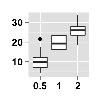
ggplot2.customize(p, xShowTitle = FALSE, yShowTitle = FALSE)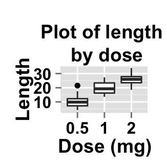
Axis ticks
# Axis ticks labels and orientaion
ggplot2.customize(p,
                xShowTitle = FALSE, yShowTitle = FALSE,
                xTickLabelFont = c(14,"bold", "#993333"),
                yTickLabelFont = c(14,"bold", "#993333"),
                xtickLabelRotation = 45, ytickLabelRotation = 45)
# Hide axis tick labels
ggplot2.customize(p,
                xShowTitle = FALSE, yShowTitle = FALSE,
                xShowTickLabel = FALSE, yShowTickLabel = FALSE)
# Hide axis ticks
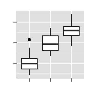
ggplot2.customize(p,
                xShowTitle = FALSE, yShowTitle = FALSE,
                xShowTickLabel = FALSE, yShowTickLabel = FALSE,
                hideAxisTicks = TRUE)
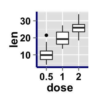
# AxisLine : a vector of length 3 indicating the size,
  #the line type and the color of axis lines
ggplot2.customize(p, axisLine = c(1, "solid", "darkblue"))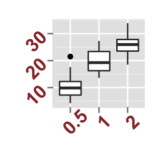
Background and colors
Change box plot background and fill colors
# change background color to "white". Default is "gray"
ggplot2.customize(p,backgroundColor = "white")
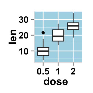
# change background color to "lightblue" and grid color to "white"
ggplot2.customize(p, backgroundColor = "lightblue",
                  gridColor = "white")

# remove grid; remove top and right borders around the plot;
# change  axis lines
ggplot2.customize(p,
                backgroundColor = "white",
                removePanelGrid = TRUE,removePanelBorder = TRUE,
                axisLine = c(0.5, "solid", "black"))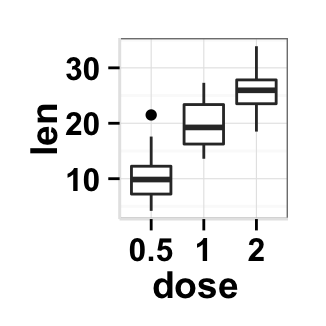
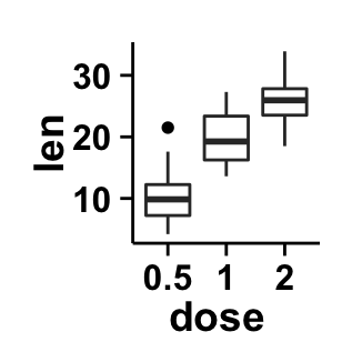
Colors can be specified as a hexadecimal RGB triplet, such as "#FFCC00" or by names (e.g : "red" ). You can also use other color scales, such as ones taken from the RColorBrewer package. The different color systems available in R have been described in detail here.
Legend
Legend position
# Color the box plot accoording to the groupName "dose"
# Create legend
p1<- ggplot2.boxplot(data = ToothGrowth,
          xName = "dose", yName = "len", groupName = "dose")
p1
# Change the legend position to "top"
  # Possible values: "left","top", "right", "bottom"
ggplot2.customize(p1, legendPosition = "top")

# legendPosition can be also a numeric vector c(x, y)
ggplot2.customize(p1, legendPosition = c(0.8,0.2)) 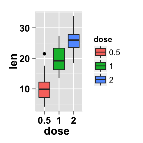
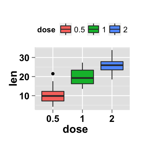
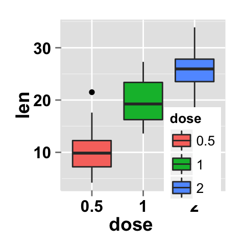
It is also possible to position the legend inside the plotting area. You have to indicate the x, y coordinates of legend box. x and y values must be between 0 and 1. c(0,0) corresponds to “bottom left” and c(1,1) corresponds to “top right” position.
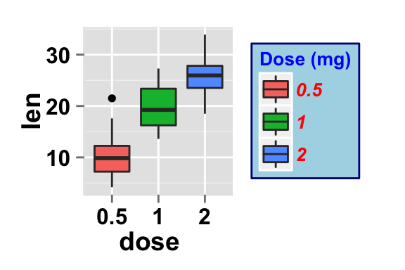
Legend background color, title and text font styles
# Change legend background color, title and text font styles
ggplot2.customize(p1,
        #legendTitleFont = c(size, style, color)
        legendTitle = "Dose (mg)",
        legendTitleFont = c(10, "bold", "blue"),
        #legendTextFont = c(size, style, color)
        legendTextFont = c(10, "bold.italic", "red"),
        #legendBackground: c(fill, lineSize, lineType, lineColor)
        legendBackground = c("lightblue", 0.5, "solid", "darkblue" )
        )
Change the order of items in the legend, remove plot legend
# Change the order of items in the legend
 # legendItemOrder : character vector indicating
# the order of items in the legends.
ggplot2.customize(p1, legendItemOrder = c("2", "1", "0.5"))
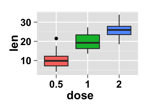
# Remove plot legend
ggplot2.customize(p1, showLegend = FALSE) 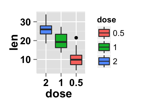
Axis scales
Possible values for y axis scale are “none”, “log2” and log10. Default value is “none”.
# Change y axis limit
ggplot2.customize(p1, ylim = c(0,50))

# y Log scale. yScale = "log2".
  # Possible value = "none", "log2" and "log10"
ggplot2.customize(p1, yScale = "log2") 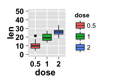
Create a customized plots with few R code
# Customized box plot with centered dot plot
ggplot2.customize(p1, showLegend = FALSE,
        backgroundColor = "white",
        xtitle = "Dose (mg)", ytitle = "length",
        mainTitle = "Plot of length \n by dose")
# Remove grid; Remove Top and right border around the plot
ggplot2.customize(p1, showLegend = FALSE,
        backgroundColor = "white",
        xtitle = "Dose (mg)", ytitle = "length",
        mainTitle = "Plot of length \n by dose",
        removePanelGrid = TRUE,removePanelBorder = TRUE,
        axisLine = c(0.5, "solid", "black"))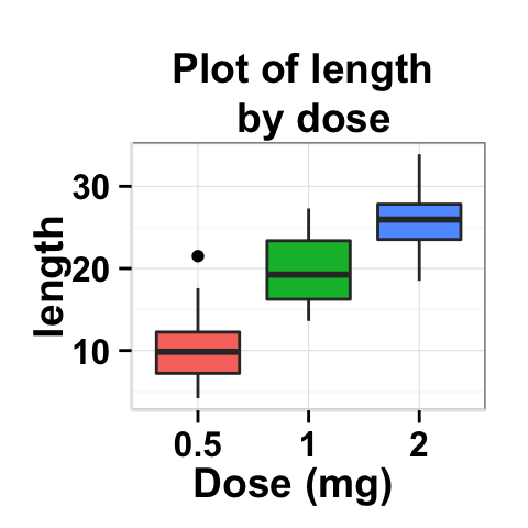
Facet : split a plot into a matrix of panels
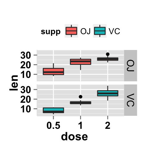
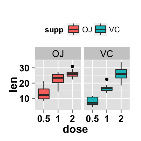
The approach of facet splits a plot into a matrix of panels. Each panel displays a different subset of the data.
Facet with one variable
# Box plot with multiples groups
p2<- ggplot2.boxplot(data = ToothGrowth,
          xName = "dose", yName = "len", groupName = "supp")
p2
# Facet according to the supp variable
ggplot2.customize(p2, legendPosition = "top",
        faceting = TRUE, facetingVarNames = "supp")
# Change the direction. Possible values are
  # "vertical", horizontal". default is vertical.
ggplot2.customize(p2, legendPosition = "top",
        faceting = TRUE, facetingVarNames = "supp",
facetingDirection = "horizontal") 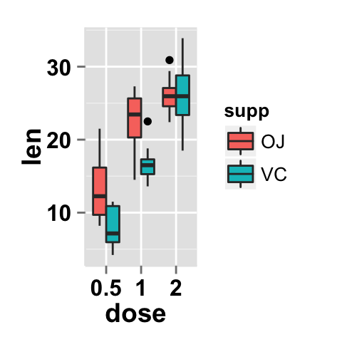
Facet with two variables
# Facet by two variables: dose and supp.
# Rows are dose and columns are supp
ggplot2.customize(p2, legendPosition = "top",
        faceting = TRUE, facetingVarNames = c("dose","supp"))
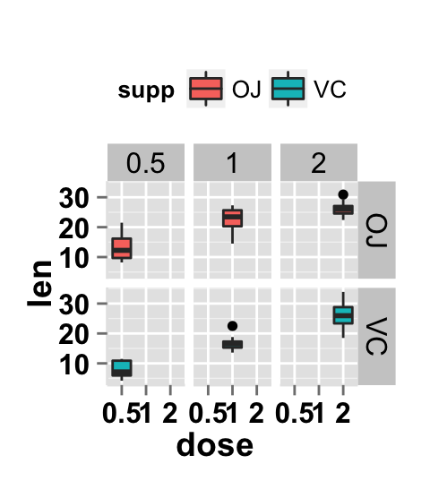
#Facet by two variables: reverse the order of the 2 variables
#Rows are supp and columns are dose
ggplot2.customize(p2, legendPosition = "top",
        faceting = TRUE, facetingVarNames = c("supp", "dose"))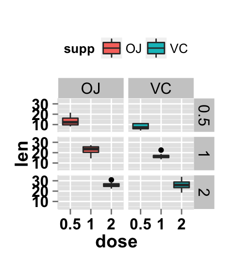
Facet scales
By default, all the panels have the same scale (facetingScales="fixed"). They can be made independent, by setting scales to free, free_x, or free_y.
# Facet with free scales
ggplot2.customize(p2, legendPosition = "top",
        faceting = TRUE, facetingVarNames = c("dose", "supp"),
        facetingScales = "free")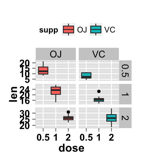
y axis have different scales now in the different panels.
Facet label apperance
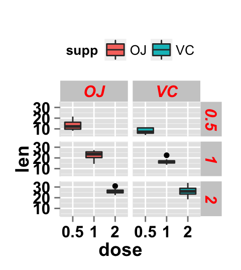
# Change facet text font. Possible values for the font style:
  #'plain', 'italic', 'bold', 'bold.italic'.
ggplot2.customize(p2, legendPosition = "top",
          faceting = TRUE, facetingVarNames = c("dose","supp"),
          facetingFont = c(12, 'bold.italic', "red"))
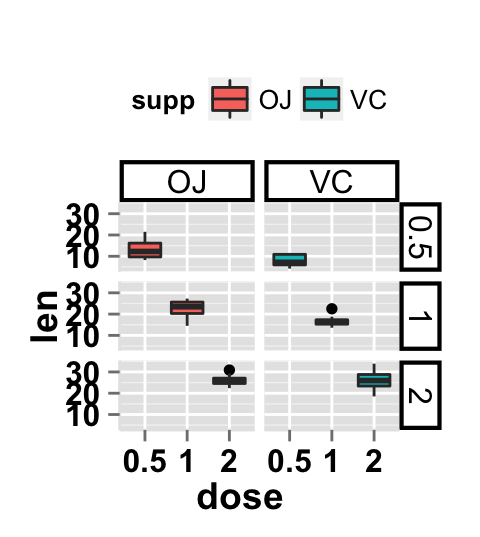
#Change the apperance of the rectangle around facet label
ggplot2.customize(p2, legendPosition = "top",
      faceting = TRUE, facetingVarNames = c("dose","supp"),
      facetingRect = list(background = "white", lineType = "solid",
                        lineColor = "black", lineSize = 1.5)
        )
ggplot2.customize function
Description
Customize easily a plot generated with either easyGgplot2 or ggplot2 R packages.
usage
ggplot2.boxplot(plot,...)Arguments
plot : A plot object generated with ggplot2 or easyGgplot2 package (boxplot, density plot, histogram, dotplot, etc ….)
… : Any argument from the list of the arguments indicated below.
The other arguments which can be used are shown in the table below. They are used to customize the plot (axis, title,** background, color, legend**, ….) generated by easyGgplot2 and ggplot2.
| Arguments | Descriptions |
|---|---|
| Customize plot title | |
| mainTitle | Title of the plot. |
| mainTitleFont | A vector of length 3 indicating respectively the size, the style and the color of main title. Possible values for font style are “plain”, “italic”, “bold”, “bold.italic”. Color can be specified as an hexadecimal code (e.g: “#FFCC00”) or by the name (e.g : “red”, “green”). Default value is: mainTitleFont=c(14, “bold”, “black”). |
| Customize x and y axis | |
| xShowTitle, yShowTitle | if TRUE, x axis and y axis titles will be shown. Default values are TRUE. |
| xtitle, ytitle | x and y axis labels. |
| xtitleFont, ytitleFont | A vector of length 3 indicating respectively the size, the style and the color of x and y axis titles. Default values are c(14,“bold”, “black”). |
| xlim, ylim | Limit for the x and y axis. Default values are NULL. |
| xScale, yScale | x and y axis scales. Possible values are c(“none”, “log2”, “log10”). Example: yScale = “log2”. Default values are “none”. |
| xShowTickLabel, yShowTickLabel | if TRUE, x and y axis tick mark labels will be shown. Default values are TRUE. |
| xTickLabelFont, yTickLabelFont | A vector of length 3 indicating respectively the size, the style and the color of x and y axis tick label fonts. Default values are c(12, “bold”, “black”). |
| xtickLabelRotation, ytickLabelRotation | Rotation angle of x and y axis tick labels. Default values are 0. |
| hideAxisTicks | if TRUE, x and y axis ticks are removed. Default value is FALSE. |
| axisLine | A vector of length 3 indicating respectively the size, the line type and the color of axis lines. Default value is c(0.5, “solid”, “#E5E5E5”). |
| Customize plot background | |
| removePanelBorder | if TRUE, the top-right border of the plot are removed. Default value is FALSE. |
| removePanelGrid | if TRUE, panel grids are removed. Default value is FALSE. |
| backgroundColor | background color of plot panel. Default value is “gray”. |
| gridColor | Color of plot panel grids. Default value is “white”. |
| Customize plot legend | |
| showLegend | if TRUE, plot legend will be shown. Default value is TRUE. |
| legendPosition | Position of legend box. Default value is “right”. Possible values for legend position are “right”, “left”,“top”, “bottom”. LegendPosition can be also a numeric vector c(x, y) indicating the coordinate of legend box. x and y values must be between 0 and 1. c(0,0) corresponds to the “bottom left” and c(1,1) corresponds to the “top right” position. |
| legendBackground | A vector of length 4 indicating boxFill, boxLineSize, boxLineType, boxLineColor. Default value is legendBackground = c(“#FFFFFF”, 0.5, “blank”, “black” ). |
| legendTextFont | A vector of length 3 indicating respectively the size, the style and the color of legend text. Default value is c(10, “plain”, “black”). Possible values for font style are “plain”, “italic”, “bold”, “bold.italic”. |
| legendTitleFont | A vector of length 3 indicating respectively the size, the style and the color of legend title. Default value is c(10, “plain”, “black”) |
| legendItemOrder | Character vector indicating the order of items in the legends. Example: c(“2”, “1”, “0.5”) |
| Faceting : split a plot into a matrix of panels | |
| faceting | if TRUE, the data are split up by one or two variables and graphs are displayed in different panels. In this case, you have to indicate the facetingVarNames. Default value is FALSE. |
| facetingVarNames | the names of the columns containing variables to use for faceting. Default value is NULL. |
| facetingDirection | possibles values are “vertical” and “horizontal”. Default value is vertical. Default value is “vertical”. |
| facetingScales |
By default, all the panels have the same scale (facetingScales = "fixed"). They can be made independent, by setting scales to “free”, “free_x”, or “free_y”. Default value is “fixed”.
|
| facetingFont | Change facet label appearance. A vector of length 3 indicating respectively the size, the font style and the color of the text. Default value is facetingFont = c(size = 12, font = “plain”, color = “black”). |
| facetingRect | Modify the appearance of the rectangle around the facet label.Default value is list(background = NULL, lineType = NULL, lineColor = NULL, lineSize = NULL). |
| facetingTextAngles | Modify the facet label text orientation. It indicates the angles of the x and y texts (in [0, 360]). Default value is c(NULL, NULL). |
| Others | |
| orientation | Change the orientation of the plot. Possible values are c(“standard”, “horizontal”, “yAxisReversed”). Default value is “standard”. |
Possible values for font style are “plain”, “italic”, “bold”, “bold.italic”.
Examples
plot<-ggplot2.boxplot(data = ToothGrowth,
              xName = 'dose', yName = 'len')
plot<-ggplot2.customize(plot, mainTitle = "Plot of length \n by dose",
            xtitle = "Dose (mg)", ytitle = "Length")
print(plot)
Easy ggplot2 ebook
Note that an eBook is available on easyGgplot2 package here.
By Alboukadel Kassambara
Copyright 2014 Alboukadel Kassambara. All rights reserved.
Published by STHDA (https://www.sthda.com/english).
September 2014 : First edition.
Licence : This document is under creative commons licence (http://creativecommons.org/licenses/by-nc-sa/3.0/).
Contact : Alboukadel Kassambara alboukadel.kassambara@gmail.com
Infos
This analysis was performed using R (ver. 3.1.0), easyGgplot2 (ver 1.0.0) and ggplot2 (ver 1.0.0).
Show me some love with the like buttons below... Thank you and please don't forget to share and comment below!!
Montrez-moi un peu d'amour avec les like ci-dessous ... Merci et n'oubliez pas, s'il vous plaît, de partager et de commenter ci-dessous!
Recommended for You!
Recommended for you
This section contains the best data science and self-development resources to help you on your path.
Books - Data Science
Our Books
- Practical Guide to Cluster Analysis in R by A. Kassambara (Datanovia)
- Practical Guide To Principal Component Methods in R by A. Kassambara (Datanovia)
- Machine Learning Essentials: Practical Guide in R by A. Kassambara (Datanovia)
- R Graphics Essentials for Great Data Visualization by A. Kassambara (Datanovia)
- GGPlot2 Essentials for Great Data Visualization in R by A. Kassambara (Datanovia)
- Network Analysis and Visualization in R by A. Kassambara (Datanovia)
- Practical Statistics in R for Comparing Groups: Numerical Variables by A. Kassambara (Datanovia)
- Inter-Rater Reliability Essentials: Practical Guide in R by A. Kassambara (Datanovia)
Others
- R for Data Science: Import, Tidy, Transform, Visualize, and Model Data by Hadley Wickham & Garrett Grolemund
- Hands-On Machine Learning with Scikit-Learn, Keras, and TensorFlow: Concepts, Tools, and Techniques to Build Intelligent Systems by Aurelien Géron
- Practical Statistics for Data Scientists: 50 Essential Concepts by Peter Bruce & Andrew Bruce
- Hands-On Programming with R: Write Your Own Functions And Simulations by Garrett Grolemund & Hadley Wickham
- An Introduction to Statistical Learning: with Applications in R by Gareth James et al.
- Deep Learning with R by François Chollet & J.J. Allaire
- Deep Learning with Python by François Chollet
Click to follow us on Facebook :
Comment this article by clicking on "Discussion" button (top-right position of this page)


