ggplot2 : Quick correlation matrix heatmap - R software and data visualization
This R tutorial describes how to compute and visualize a correlation matrix using R software and ggplot2 package.
Prepare the data
mtcars data are used :
mydata <- mtcars[, c(1,3,4,5,6,7)]
head(mydata)
## mpg disp hp drat wt qsec
## Mazda RX4 21.0 160 110 3.90 2.620 16.46
## Mazda RX4 Wag 21.0 160 110 3.90 2.875 17.02
## Datsun 710 22.8 108 93 3.85 2.320 18.61
## Hornet 4 Drive 21.4 258 110 3.08 3.215 19.44
## Hornet Sportabout 18.7 360 175 3.15 3.440 17.02
## Valiant 18.1 225 105 2.76 3.460 20.22Compute the correlation matrix
Correlation matrix can be created using the R function cor() :
cormat <- round(cor(mydata),2)
head(cormat)
## mpg disp hp drat wt qsec
## mpg 1.00 -0.85 -0.78 0.68 -0.87 0.42
## disp -0.85 1.00 0.79 -0.71 0.89 -0.43
## hp -0.78 0.79 1.00 -0.45 0.66 -0.71
## drat 0.68 -0.71 -0.45 1.00 -0.71 0.09
## wt -0.87 0.89 0.66 -0.71 1.00 -0.17
## qsec 0.42 -0.43 -0.71 0.09 -0.17 1.00Read more about correlation matrix data visualization : correlation data visualization in R
Create the correlation heatmap with ggplot2
The package reshape is required to melt the correlation matrix :
library(reshape2)
melted_cormat <- melt(cormat)
head(melted_cormat)
## Var1 Var2 value
## 1 mpg mpg 1.00
## 2 disp mpg -0.85
## 3 hp mpg -0.78
## 4 drat mpg 0.68
## 5 wt mpg -0.87
## 6 qsec mpg 0.42The function geom_tile()[ggplot2 package] is used to visualize the correlation matrix :
library(ggplot2)
ggplot(data = melted_cormat, aes(x=Var1, y=Var2, fill=value)) +
  geom_tile()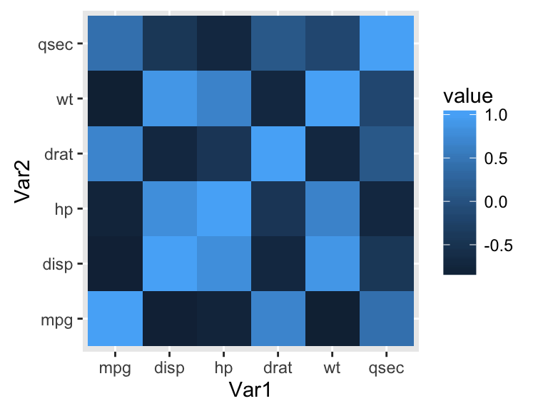
The default plot is very ugly. We’ll see in the next sections, how to change the appearance of the heatmap.
Note that, if you have lot of data, it’s preferred to use the function geom_raster() which can be much faster.
Get the lower and upper triangles of the correlation matrix
Note that, a correlation matrix has redundant information. We’ll use the functions below to set half of it to NA.
Helper functions :
# Get lower triangle of the correlation matrix
  get_lower_tri<-function(cormat){
    cormat[upper.tri(cormat)] <- NA
    return(cormat)
  }
  # Get upper triangle of the correlation matrix
  get_upper_tri <- function(cormat){
    cormat[lower.tri(cormat)]<- NA
    return(cormat)
  }
Usage :
upper_tri <- get_upper_tri(cormat)
upper_tri
## mpg disp hp drat wt qsec
## mpg 1 -0.85 -0.78 0.68 -0.87 0.42
## disp NA 1.00 0.79 -0.71 0.89 -0.43
## hp NA NA 1.00 -0.45 0.66 -0.71
## drat NA NA NA 1.00 -0.71 0.09
## wt NA NA NA NA 1.00 -0.17
## qsec NA NA NA NA NA 1.00Finished correlation matrix heatmap
Melt the correlation data and drop the rows with NA values :
# Melt the correlation matrix
library(reshape2)
melted_cormat <- melt(upper_tri, na.rm = TRUE)
# Heatmap
library(ggplot2)
ggplot(data = melted_cormat, aes(Var2, Var1, fill = value))+
 geom_tile(color = "white")+
 scale_fill_gradient2(low = "blue", high = "red", mid = "white",
   midpoint = 0, limit = c(-1,1), space = "Lab",
   name="Pearson\nCorrelation") +
  theme_minimal()+
 theme(axis.text.x = element_text(angle = 45, vjust = 1,
    size = 12, hjust = 1))+
 coord_fixed()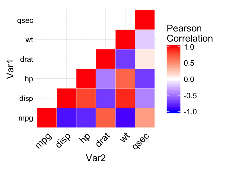
In the figure above :
- negative correlations are in blue color and positive correlations in red. The function scale_fill_gradient2 is used with the argument limit = c(-1,1) as correlation coefficients range from -1 to 1.
- coord_fixed() : this function ensures that one unit on the x-axis is the same length as one unit on the y-axis.
Reorder the correlation matrix
This section describes how to reorder the correlation matrix according to the correlation coefficient. This is useful to identify the hidden pattern in the matrix. hclust for hierarchical clustering order is used in the example below.
Helper function to reorder the correlation matrix :
reorder_cormat <- function(cormat){
# Use correlation between variables as distance
dd <- as.dist((1-cormat)/2)
hc <- hclust(dd)
cormat <-cormat[hc$order, hc$order]
}
Reordered correlation data visualization :
# Reorder the correlation matrix
cormat <- reorder_cormat(cormat)
upper_tri <- get_upper_tri(cormat)
# Melt the correlation matrix
melted_cormat <- melt(upper_tri, na.rm = TRUE)
# Create a ggheatmap
ggheatmap <- ggplot(melted_cormat, aes(Var2, Var1, fill = value))+
 geom_tile(color = "white")+
 scale_fill_gradient2(low = "blue", high = "red", mid = "white",
   midpoint = 0, limit = c(-1,1), space = "Lab",
    name="Pearson\nCorrelation") +
  theme_minimal()+ # minimal theme
 theme(axis.text.x = element_text(angle = 45, vjust = 1,
    size = 12, hjust = 1))+
 coord_fixed()
# Print the heatmap
print(ggheatmap)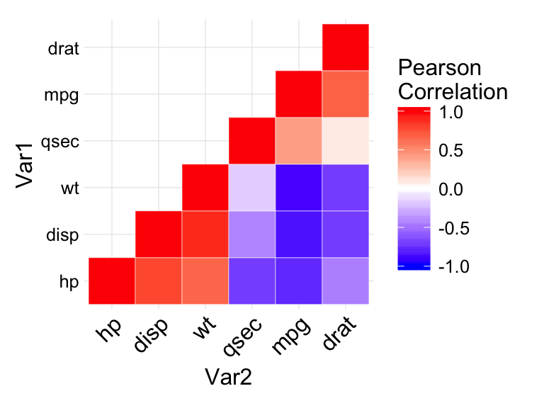
Add correlation coefficients on the heatmap
- Use geom_text() to add the correlation coefficients on the graph
- Use a blank theme (remove axis labels, panel grids and background, and axis ticks)
- Use guides() to change the position of the legend title
ggheatmap +
geom_text(aes(Var2, Var1, label = value), color = "black", size = 4) +
theme(
  axis.title.x = element_blank(),
  axis.title.y = element_blank(),
  panel.grid.major = element_blank(),
  panel.border = element_blank(),
  panel.background = element_blank(),
  axis.ticks = element_blank(),
  legend.justification = c(1, 0),
  legend.position = c(0.6, 0.7),
  legend.direction = "horizontal")+
  guides(fill = guide_colorbar(barwidth = 7, barheight = 1,
                title.position = "top", title.hjust = 0.5))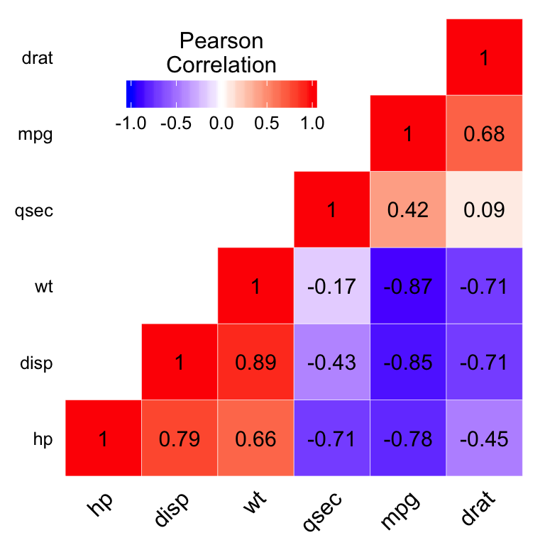
Read more about correlation matrix data visualization : correlation data visualization in R
Infos
This analysis has been performed using R software (ver. 3.2.1) and ggplot2 (ver. 1.0.1)
Show me some love with the like buttons below... Thank you and please don't forget to share and comment below!!
Montrez-moi un peu d'amour avec les like ci-dessous ... Merci et n'oubliez pas, s'il vous plaît, de partager et de commenter ci-dessous!
Recommended for You!
Recommended for you
This section contains the best data science and self-development resources to help you on your path.
Books - Data Science
Our Books
- Practical Guide to Cluster Analysis in R by A. Kassambara (Datanovia)
- Practical Guide To Principal Component Methods in R by A. Kassambara (Datanovia)
- Machine Learning Essentials: Practical Guide in R by A. Kassambara (Datanovia)
- R Graphics Essentials for Great Data Visualization by A. Kassambara (Datanovia)
- GGPlot2 Essentials for Great Data Visualization in R by A. Kassambara (Datanovia)
- Network Analysis and Visualization in R by A. Kassambara (Datanovia)
- Practical Statistics in R for Comparing Groups: Numerical Variables by A. Kassambara (Datanovia)
- Inter-Rater Reliability Essentials: Practical Guide in R by A. Kassambara (Datanovia)
Others
- R for Data Science: Import, Tidy, Transform, Visualize, and Model Data by Hadley Wickham & Garrett Grolemund
- Hands-On Machine Learning with Scikit-Learn, Keras, and TensorFlow: Concepts, Tools, and Techniques to Build Intelligent Systems by Aurelien Géron
- Practical Statistics for Data Scientists: 50 Essential Concepts by Peter Bruce & Andrew Bruce
- Hands-On Programming with R: Write Your Own Functions And Simulations by Garrett Grolemund & Hadley Wickham
- An Introduction to Statistical Learning: with Applications in R by Gareth James et al.
- Deep Learning with R by François Chollet & J.J. Allaire
- Deep Learning with Python by François Chollet
Click to follow us on Facebook :
Comment this article by clicking on "Discussion" button (top-right position of this page)


