Correlation matrix : Formatting and visualization
The computing of correlation matrix is described in detail here. The goal of this document is twofold. On one hand, we will use the Hmisc R package to produce a table of correlation coefficients and the corresponding p-values. On the other hand, we will see how to format the correlation matrix into a table of 4 columns containing row/column names, the correlation coefficients and the p-values of these correlations.
Data
The mtcars data is used in the following examples :
mydata <- mtcars[, c(1,3,4,5,6,7)]
head(mydata)
mpg disp hp drat wt qsec
Mazda RX4 21.0 160 110 3.90 2.620 16.46
Mazda RX4 Wag 21.0 160 110 3.90 2.875 17.02
Datsun 710 22.8 108 93 3.85 2.320 18.61
Hornet 4 Drive 21.4 258 110 3.08 3.215 19.44
Hornet Sportabout 18.7 360 175 3.15 3.440 17.02
Valiant 18.1 225 105 2.76 3.460 20.22Computing of the correlation matrix
The rcorr() function from Hmisc package can be used to perform Pearson or Spearman correlation test.
library(Hmisc)
res<-rcorr(as.matrix(mydata))
As an output, the rcorr() function returns a list including the following elements : - r : the correlation matrix. - P : the p-values corresponding to the significance levels of the correlations.
# Printing the correlation matrix
signif(res$r, 2)
mpg disp hp drat wt qsec
mpg 1.00 -0.85 -0.78 0.680 -0.87 0.420
disp -0.85 1.00 0.79 -0.710 0.89 -0.430
hp -0.78 0.79 1.00 -0.450 0.66 -0.710
drat 0.68 -0.71 -0.45 1.000 -0.71 0.091
wt -0.87 0.89 0.66 -0.710 1.00 -0.170
qsec 0.42 -0.43 -0.71 0.091 -0.17 1.000# Printing the p-values of the correlations
signif(res$P,2) mpg disp hp drat wt qsec
mpg NA 9.4e-10 1.8e-07 1.8e-05 1.3e-10 1.7e-02
disp 9.4e-10 NA 7.1e-08 5.3e-06 1.2e-11 1.3e-02
hp 1.8e-07 7.1e-08 NA 1.0e-02 4.1e-05 5.8e-06
drat 1.8e-05 5.3e-06 1.0e-02 NA 4.8e-06 6.2e-01
wt 1.3e-10 1.2e-11 4.1e-05 4.8e-06 NA 3.4e-01
qsec 1.7e-02 1.3e-02 5.8e-06 6.2e-01 3.4e-01 NAFormatting the correlation matrix in 4 column tables
The following custom function is used:
# ++++++++++++++++++++++++++++
# flattenCorrMatrix
# ++++++++++++++++++++++++++++
# cormat : matrix of the correlation coefficients
# pmat : matrix of the correlation p-values
flattenCorrMatrix <- function(cormat, pmat) {
  ut <- upper.tri(cormat)
  data.frame(
    row = rownames(cormat)[row(cormat)[ut]],
    column = rownames(cormat)[col(cormat)[ut]],
    cor  =(cormat)[ut],
    p = pmat[ut]
    )
}
The flattenCorrMatrix function will format the correlation matrix into a table of 4 columns: row names, column names, the correlation coefficient between each variable and the others, and the p-values.
flattenCorrMatrix(res$r, res$P) row column cor p
1 mpg disp -0.8476 9.380e-10
2 mpg hp -0.7762 1.788e-07
3 disp hp 0.7909 7.143e-08
4 mpg drat 0.6812 1.776e-05
5 disp drat -0.7102 5.282e-06
6 hp drat -0.4488 9.989e-03
7 mpg wt -0.8677 1.294e-10
8 disp wt 0.8880 1.222e-11
9 hp wt 0.6587 4.146e-05
10 drat wt -0.7124 4.784e-06
11 mpg qsec 0.4187 1.708e-02
12 disp qsec -0.4337 1.314e-02
13 hp qsec -0.7082 5.766e-06
14 drat qsec 0.0912 6.196e-01
15 wt qsec -0.1747 3.389e-01Visualization of the correlation matrix
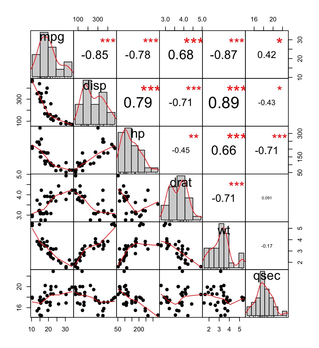
You can use the chart.Correlation() function from PerformanceAnalytics package to display a chart of the correlation matrix.
The histograms of the variables are shown on the diagonal. The asterisks indicate the significance levels of the correlations. Each significance level is associated to a symbol :
p-values(0, 0.001, 0.01, 0.05, 0.1, 1) <=> symbols(“***”, “**”, “*”, “.”, " “)
library(PerformanceAnalytics)
chart.Correlation(mydata, histogram=TRUE, pch=19)
Infos
This analysis has been performed with R (ver. 3.1.0).
Show me some love with the like buttons below... Thank you and please don't forget to share and comment below!!
Montrez-moi un peu d'amour avec les like ci-dessous ... Merci et n'oubliez pas, s'il vous plaît, de partager et de commenter ci-dessous!
Recommended for You!
Recommended for you
This section contains the best data science and self-development resources to help you on your path.
Books - Data Science
Our Books
- Practical Guide to Cluster Analysis in R by A. Kassambara (Datanovia)
- Practical Guide To Principal Component Methods in R by A. Kassambara (Datanovia)
- Machine Learning Essentials: Practical Guide in R by A. Kassambara (Datanovia)
- R Graphics Essentials for Great Data Visualization by A. Kassambara (Datanovia)
- GGPlot2 Essentials for Great Data Visualization in R by A. Kassambara (Datanovia)
- Network Analysis and Visualization in R by A. Kassambara (Datanovia)
- Practical Statistics in R for Comparing Groups: Numerical Variables by A. Kassambara (Datanovia)
- Inter-Rater Reliability Essentials: Practical Guide in R by A. Kassambara (Datanovia)
Others
- R for Data Science: Import, Tidy, Transform, Visualize, and Model Data by Hadley Wickham & Garrett Grolemund
- Hands-On Machine Learning with Scikit-Learn, Keras, and TensorFlow: Concepts, Tools, and Techniques to Build Intelligent Systems by Aurelien Géron
- Practical Statistics for Data Scientists: 50 Essential Concepts by Peter Bruce & Andrew Bruce
- Hands-On Programming with R: Write Your Own Functions And Simulations by Garrett Grolemund & Hadley Wickham
- An Introduction to Statistical Learning: with Applications in R by Gareth James et al.
- Deep Learning with R by François Chollet & J.J. Allaire
- Deep Learning with Python by François Chollet
Click to follow us on Facebook :
Comment this article by clicking on "Discussion" button (top-right position of this page)


