ggplot2 line types : How to change line types of a graph in R software?
This R tutorial describes how to change line types of a graph generated using ggplot2 package.
Related Book:
GGPlot2 Essentials for Great Data Visualization in R
Line types in R
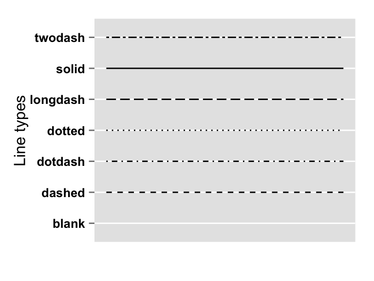
The different line types available in R software are : “blank”, “solid”, “dashed”, “dotted”, “dotdash”, “longdash”, “twodash”.
Note that, line types can be also specified using numbers : 0, 1, 2, 3, 4, 5, 6. 0 is for “blank”, 1 is for “solid”, 2 is for “dashed”, ….
A graph of the different line types is shown below :
Basic line plots
Generate some data
df <- data.frame(time=c("breakfeast", "Lunch", "Dinner"),
                bill=c(10, 30, 15))
head(df)
## time bill
## 1 breakfeast 10
## 2 Lunch 30
## 3 Dinner 15Create line plots and change line types
The argument linetype is used to change the line type :
library(ggplot2)
# Basic line plot with points
ggplot(data=df, aes(x=time, y=bill, group=1)) +
  geom_line()+
  geom_point()
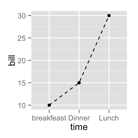
# Change the line type
ggplot(data=df, aes(x=time, y=bill, group=1)) +
  geom_line(linetype = "dashed")+
  geom_point()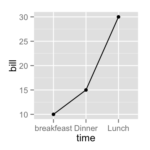
Line plot with multiple groups
Create some data
df2 <- data.frame(sex = rep(c("Female", "Male"), each=3),
                  time=c("breakfeast", "Lunch", "Dinner"),
                  bill=c(10, 30, 15, 13, 40, 17) )
head(df2)
## sex time bill
## 1 Female breakfeast 10
## 2 Female Lunch 30
## 3 Female Dinner 15
## 4 Male breakfeast 13
## 5 Male Lunch 40
## 6 Male Dinner 17Change globally the appearance of lines
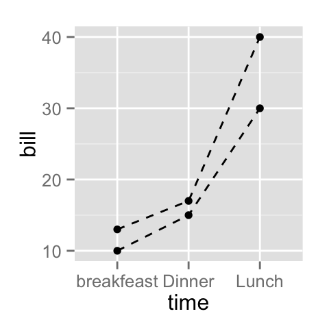
In the graphs below, line types, colors and sizes are the same for the two groups :
library(ggplot2)
# Line plot with multiple groups
ggplot(data=df2, aes(x=time, y=bill, group=sex)) +
  geom_line()+
  geom_point()
# Change line types
ggplot(data=df2, aes(x=time, y=bill, group=sex)) +
  geom_line(linetype="dashed")+
  geom_point()
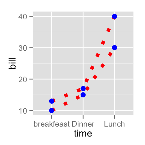
# Change line colors and sizes
ggplot(data=df2, aes(x=time, y=bill, group=sex)) +
  geom_line(linetype="dotted", color="red", size=2)+
  geom_point(color="blue", size=3)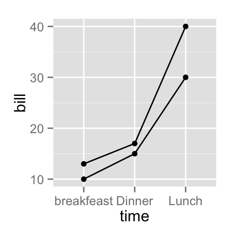
Change automatically the line types by groups
In the graphs below, line types, colors and sizes are changed automatically by the levels of the variable sex :
# Change line types by groups (sex)
ggplot(df2, aes(x=time, y=bill, group=sex)) +
  geom_line(aes(linetype=sex))+
  geom_point()+
  theme(legend.position="top")
# Change line types + colors
ggplot(df2, aes(x=time, y=bill, group=sex)) +
  geom_line(aes(linetype=sex, color=sex))+
  geom_point(aes(color=sex))+
  theme(legend.position="top")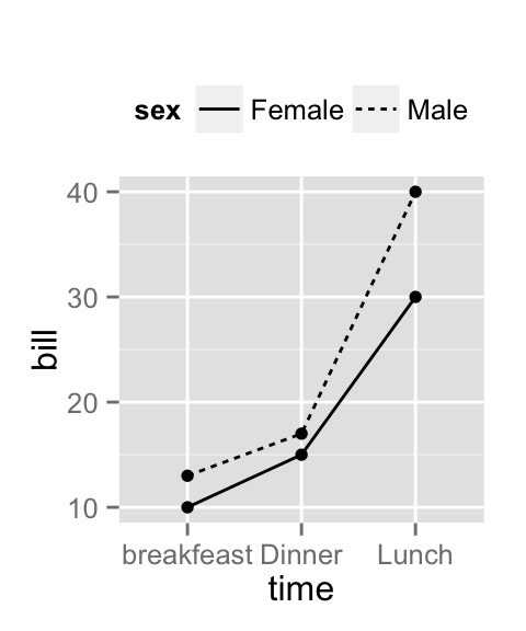

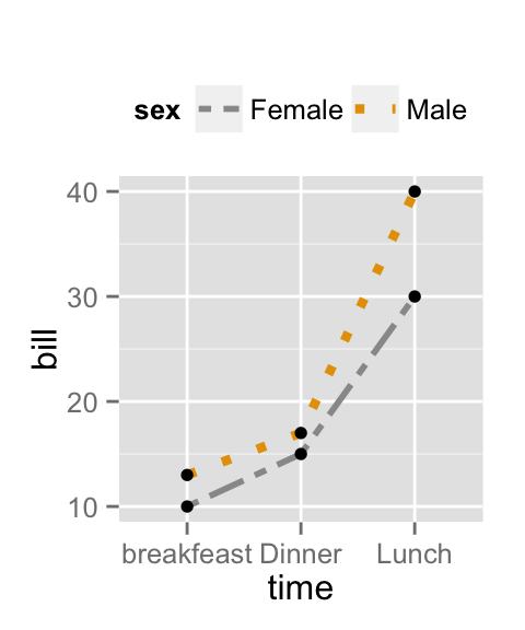
Change manually the appearance of lines
The functions below can be used :
- scale_linetype_manual() : to change line types
- scale_color_manual() : to change line colors
- scale_size_manual() : to change the size of lines
# Set line types manually
ggplot(df2, aes(x=time, y=bill, group=sex)) +
  geom_line(aes(linetype=sex))+
  geom_point()+
  scale_linetype_manual(values=c("twodash", "dotted"))+
  theme(legend.position="top")
# Change line colors and sizes
ggplot(df2, aes(x=time, y=bill, group=sex)) +
  geom_line(aes(linetype=sex, color=sex, size=sex))+
  geom_point()+
  scale_linetype_manual(values=c("twodash", "dotted"))+
  scale_color_manual(values=c('#999999','#E69F00'))+
  scale_size_manual(values=c(1, 1.5))+
  theme(legend.position="top")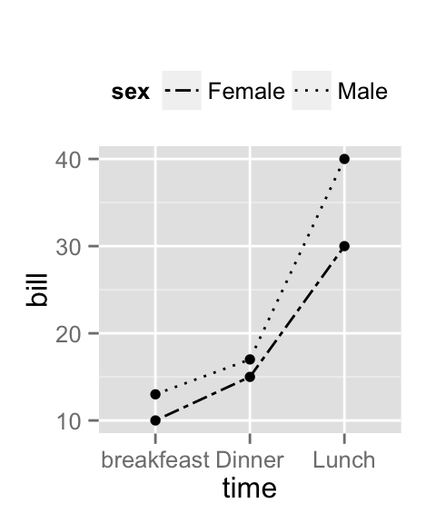
Infos
This analysis has been performed using R software (ver. 3.1.2) and ggplot2 (ver. 1.0.0)
Show me some love with the like buttons below... Thank you and please don't forget to share and comment below!!
Montrez-moi un peu d'amour avec les like ci-dessous ... Merci et n'oubliez pas, s'il vous plaît, de partager et de commenter ci-dessous!
Recommended for You!
Recommended for you
This section contains the best data science and self-development resources to help you on your path.
Books - Data Science
Our Books
- Practical Guide to Cluster Analysis in R by A. Kassambara (Datanovia)
- Practical Guide To Principal Component Methods in R by A. Kassambara (Datanovia)
- Machine Learning Essentials: Practical Guide in R by A. Kassambara (Datanovia)
- R Graphics Essentials for Great Data Visualization by A. Kassambara (Datanovia)
- GGPlot2 Essentials for Great Data Visualization in R by A. Kassambara (Datanovia)
- Network Analysis and Visualization in R by A. Kassambara (Datanovia)
- Practical Statistics in R for Comparing Groups: Numerical Variables by A. Kassambara (Datanovia)
- Inter-Rater Reliability Essentials: Practical Guide in R by A. Kassambara (Datanovia)
Others
- R for Data Science: Import, Tidy, Transform, Visualize, and Model Data by Hadley Wickham & Garrett Grolemund
- Hands-On Machine Learning with Scikit-Learn, Keras, and TensorFlow: Concepts, Tools, and Techniques to Build Intelligent Systems by Aurelien Géron
- Practical Statistics for Data Scientists: 50 Essential Concepts by Peter Bruce & Andrew Bruce
- Hands-On Programming with R: Write Your Own Functions And Simulations by Garrett Grolemund & Hadley Wickham
- An Introduction to Statistical Learning: with Applications in R by Gareth James et al.
- Deep Learning with R by François Chollet & J.J. Allaire
- Deep Learning with Python by François Chollet
Click to follow us on Facebook :
Comment this article by clicking on "Discussion" button (top-right position of this page)


