ggplot2 legend : Easy steps to change the position and the appearance of a graph legend in R software
- Data
- Example of plot
- Change the legend position
- Change the legend title and text font styles
- Change the background color of the legend box
- Change the order of legend items
- Remove the plot legend
- Remove slashes in the legend of a bar plot
- guides() : set or remove the legend for a specific aesthetic
- Infos
The goal of this R tutorial is to describe how to change the legend of a graph generated using ggplot2 package.
Related Book:
GGPlot2 Essentials for Great Data Visualization in R
Data
ToothGrowth data is used in the examples below :
# Convert the variable dose from numeric to factor variable
ToothGrowth$dose <- as.factor(ToothGrowth$dose)
head(ToothGrowth)
## len supp dose
## 1 4.2 VC 0.5
## 2 11.5 VC 0.5
## 3 7.3 VC 0.5
## 4 5.8 VC 0.5
## 5 6.4 VC 0.5
## 6 10.0 VC 0.5Make sure that the variable dose is converted as a factor variable using the above R script.
Example of plot
library(ggplot2)
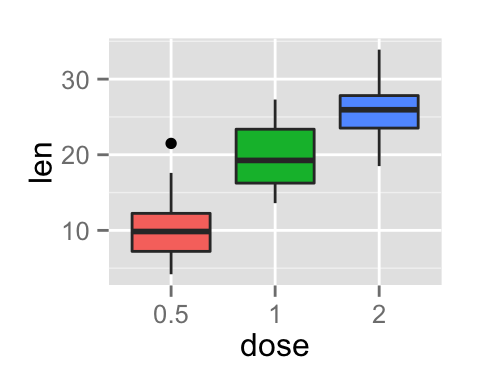
p <- ggplot(ToothGrowth, aes(x=dose, y=len, fill=dose)) +
  geom_boxplot()
p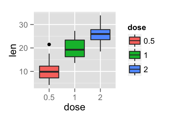
Change the legend position
The position of the legend can be changed using the function theme() as follow :
p + theme(legend.position="top")
p + theme(legend.position="bottom")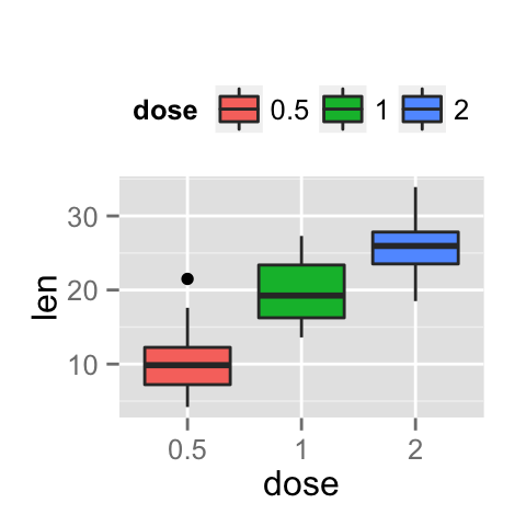
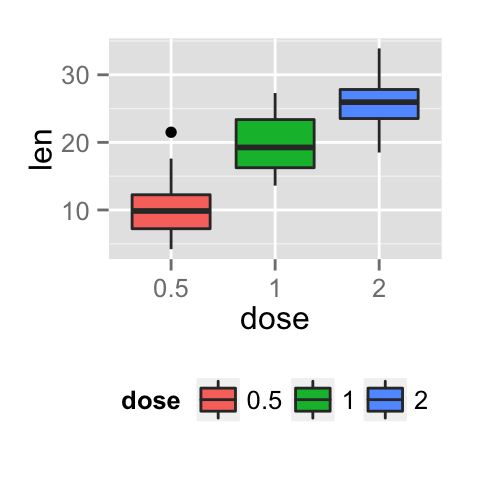
The allowed values for the arguments legend.position are : “left”,“top”, “right”, “bottom”.
Note that, the argument legend.position can be also a numeric vector c(x,y). In this case it is possible to position the legend inside the plotting area. x and y are the coordinates of the legend box. Their values should be between 0 and 1. c(0,0) corresponds to the “bottom left” and c(1,1) corresponds to the “top right” position.
p + theme(legend.position = c(0.8, 0.2))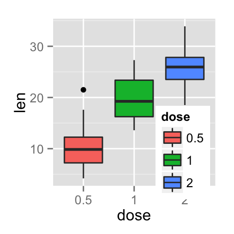
Change the legend title and text font styles
# legend title
p + theme(legend.title = element_text(colour="blue", size=10,
                                      face="bold"))
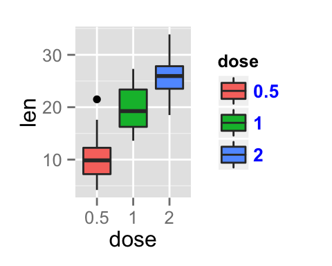
# legend labels
p + theme(legend.text = element_text(colour="blue", size=10,
                                     face="bold"))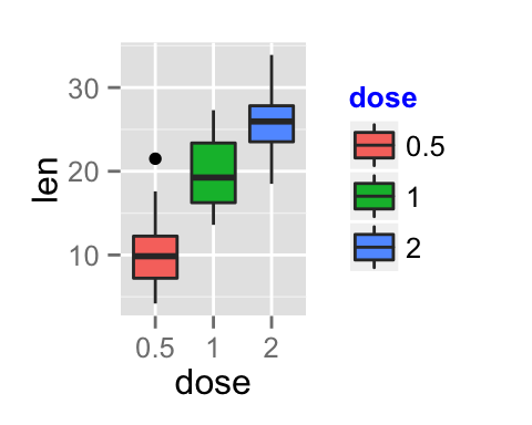
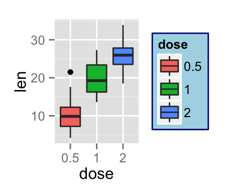
Change the background color of the legend box
# legend box background color
p + theme(legend.background = element_rect(fill="lightblue",
                                  size=0.5, linetype="solid"))
p + theme(legend.background = element_rect(fill="lightblue",
                                  size=0.5, linetype="solid",
                                  colour ="darkblue"))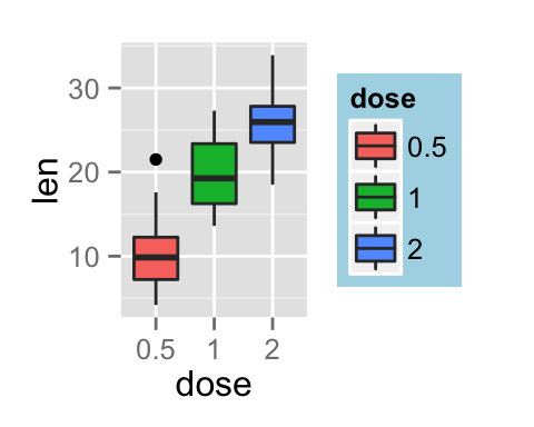
Change the order of legend items
To change the order of items to “2”, “0.5”, “1” :
p + scale_x_discrete(limits=c("2", "0.5", "1"))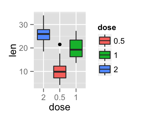
Remove the plot legend
# Remove only the legend title
p + theme(legend.title = element_blank())
# Remove the plot legend
p + theme(legend.position='none')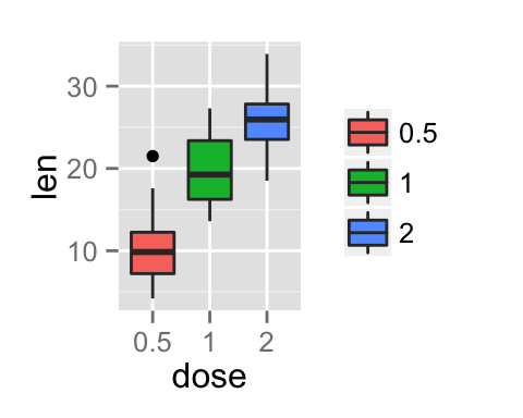
Remove slashes in the legend of a bar plot
# Default plot
ggplot(data=ToothGrowth, aes(x=dose, fill=dose)) + geom_bar()
# Change bar plot border color,
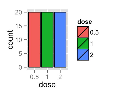
# but slashes are added in the legend
ggplot(data=ToothGrowth, aes(x=dose, fill=dose)) +
  geom_bar(colour="black")
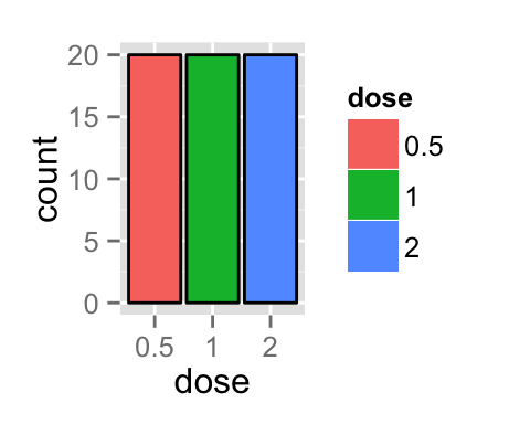
# Hide the slashes:
  #1. plot the bars with no border color,
  #2. plot the bars again with border color, but with a blank legend.
ggplot(data=ToothGrowth, aes(x=dose, fill=dose))+
  geom_bar() +
  geom_bar(colour="black", show_guide=FALSE)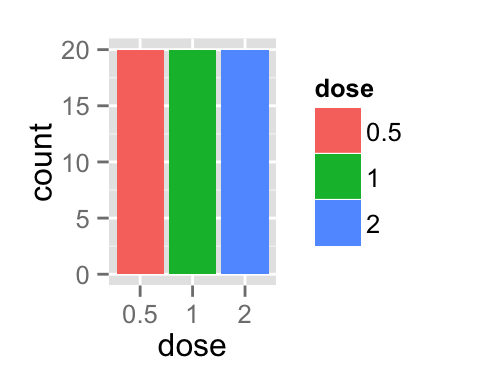
guides() : set or remove the legend for a specific aesthetic
It’s possible to use the function guides() to set or remove the legend of a particular aesthetic(fill, color, size, shape, etc).
mtcars data sets are used :
# Prepare the data : convert cyl and gear to factor variables
mtcars$cyl<-as.factor(mtcars$cyl)
mtcars$gear <- as.factor(mtcars$gear)
head(mtcars)
## mpg cyl disp hp drat wt qsec vs am gear carb
## Mazda RX4 21.0 6 160 110 3.90 2.620 16.46 0 1 4 4
## Mazda RX4 Wag 21.0 6 160 110 3.90 2.875 17.02 0 1 4 4
## Datsun 710 22.8 4 108 93 3.85 2.320 18.61 1 1 4 1
## Hornet 4 Drive 21.4 6 258 110 3.08 3.215 19.44 1 0 3 1
## Hornet Sportabout 18.7 8 360 175 3.15 3.440 17.02 0 0 3 2
## Valiant 18.1 6 225 105 2.76 3.460 20.22 1 0 3 1Default plot without guide specification
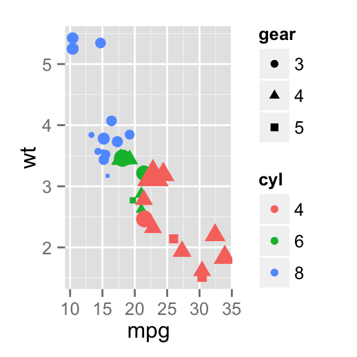
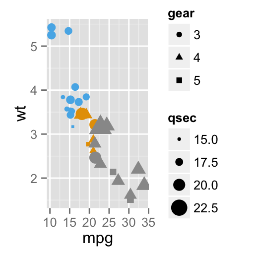
The R code below creates a scatter plot. The color and the shape of the points are determined by the factor variables cyl and gear, respectively. The size of the points are controlled by the variable qsec.
p <- ggplot(data = mtcars,
    aes(x=mpg, y=wt, color=cyl, size=qsec, shape=gear))+
    geom_point()
# Print the plot without guide specification
p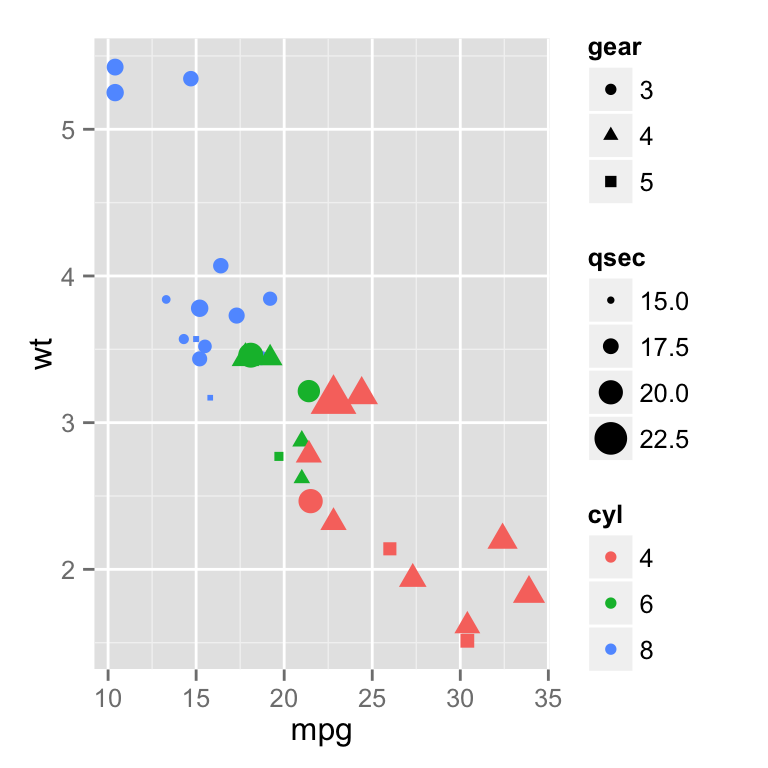
Change the legend position for multiple guides
# Change the legend position
p +theme(legend.position="bottom")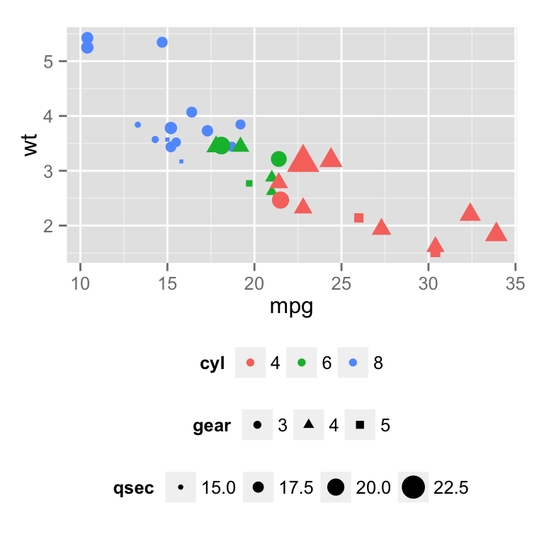
# Horizontal legend box
p +theme(legend.position="bottom", legend.box = "horizontal")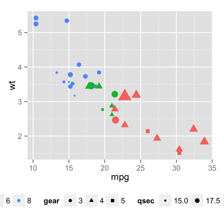
Change the order for multiple guides
The function guide_legend() is used :
p+guides(color = guide_legend(order=1),
         size = guide_legend(order=2),
         shape = guide_legend(order=3))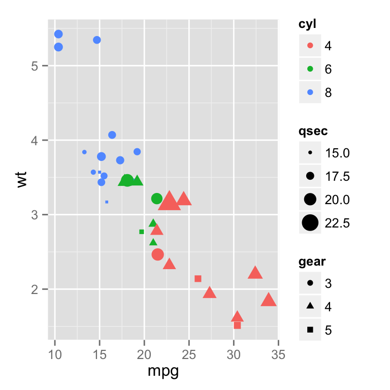
If a continuous color is used, the order of the color guide can be changed using the function guide_colourbar() :
qplot(data = mpg, x = displ, y = cty, size = hwy,
      colour = cyl, shape = drv) +
  guides(colour = guide_colourbar(order = 1),
         alpha = guide_legend(order = 2),
         size = guide_legend(order = 3))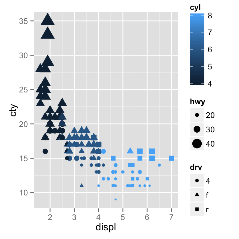
Remove a legend for a particular aesthetic
The R code below removes the legend for the aesthetics color and size :
p+guides(color = FALSE, size = FALSE)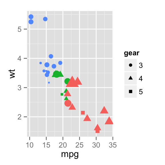
Removing a particular legend can be done also when using the functions scale_xx. In this case the argument guide is used as follow :
# Remove legend for the point shape
p+scale_shape(guide=FALSE)
# Remove legend for size
p +scale_size(guide=FALSE)
# Remove legend for color
p + scale_color_manual(values=c('#999999','#E69F00','#56B4E9'),
                       guide=FALSE)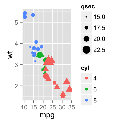
Infos
This analysis has been performed using R software (ver. 3.1.0) and ggplot2 (ver. 1.0.0)
Show me some love with the like buttons below... Thank you and please don't forget to share and comment below!!
Montrez-moi un peu d'amour avec les like ci-dessous ... Merci et n'oubliez pas, s'il vous plaît, de partager et de commenter ci-dessous!
Recommended for You!
Recommended for you
This section contains the best data science and self-development resources to help you on your path.
Books - Data Science
Our Books
- Practical Guide to Cluster Analysis in R by A. Kassambara (Datanovia)
- Practical Guide To Principal Component Methods in R by A. Kassambara (Datanovia)
- Machine Learning Essentials: Practical Guide in R by A. Kassambara (Datanovia)
- R Graphics Essentials for Great Data Visualization by A. Kassambara (Datanovia)
- GGPlot2 Essentials for Great Data Visualization in R by A. Kassambara (Datanovia)
- Network Analysis and Visualization in R by A. Kassambara (Datanovia)
- Practical Statistics in R for Comparing Groups: Numerical Variables by A. Kassambara (Datanovia)
- Inter-Rater Reliability Essentials: Practical Guide in R by A. Kassambara (Datanovia)
Others
- R for Data Science: Import, Tidy, Transform, Visualize, and Model Data by Hadley Wickham & Garrett Grolemund
- Hands-On Machine Learning with Scikit-Learn, Keras, and TensorFlow: Concepts, Tools, and Techniques to Build Intelligent Systems by Aurelien Géron
- Practical Statistics for Data Scientists: 50 Essential Concepts by Peter Bruce & Andrew Bruce
- Hands-On Programming with R: Write Your Own Functions And Simulations by Garrett Grolemund & Hadley Wickham
- An Introduction to Statistical Learning: with Applications in R by Gareth James et al.
- Deep Learning with R by François Chollet & J.J. Allaire
- Deep Learning with Python by François Chollet
Click to follow us on Facebook :
Comment this article by clicking on "Discussion" button (top-right position of this page)


