ggbio - Visualize genomic data
This analysis was performed using R (ver. 3.1.0).ggbio is a package build on top of ggplot2() to visualize easily genomic data.
Building your first track
In this chapter, you will learn : ˆ1.How to add ideogram track. ˆ2. How to add gene model track. 4. How to add reference track 3. How to add track from bam files to visualize coverage and mismatch summary. 4. How to add track for vcf file to visualize variants
Add ideogram track : Plot single chromosome with cytoband
hg19, hg18, mm10, mm9 as been built inside, so you don't have download it on the fly.library(ggbio)
#chr 1 is automatically drawn by default (subchr="chr1")
p.ideo <- Ideogram(genome = "hg19")
p.ideo
#Highlights a region on "chr2"
library(GenomicRanges)
p.ideo + xlim(GRanges("chr2", IRanges(1e8, 1e8+10000000)))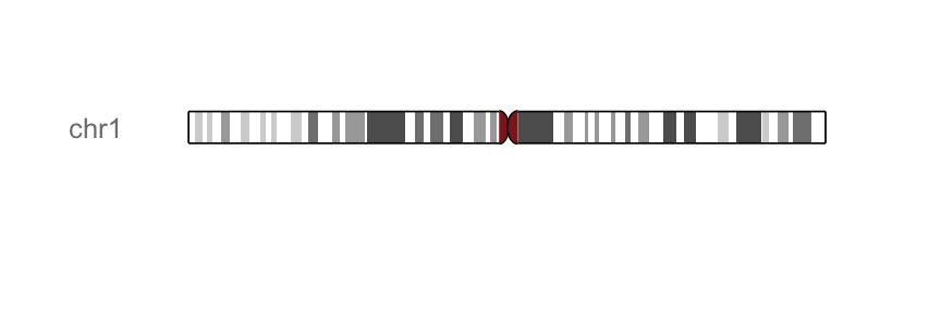
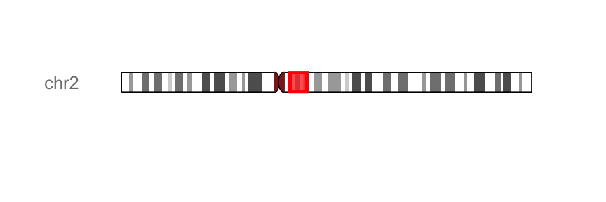
color and fill arguments can be used to change the color and the fill color of highlight region
Add gene model track
Gene model is composed of genetic features CDS, UTR, introns, exons and non-genetic region. ggbio supports three methods to make gene model track:
OrganismDb object: recommended, support gene symbols and other combination of columns as label. TranscriptDb object: don’t support gene symbol labeling. GRangesList object: flexible, if you don’t have annotation package available for the first two methods, you could prepare a data set parsed from gtf file, you can simply use it and plot it as gene model track.
In this section, we’ll show, how to make gene model from OrganismDb and from TranscriptDb objects. To make a gene model from GRangesList object, see the vignette of ggbio package.
Gene model from OrganismDb object
OrganismDb object has a simpler API to retrieve data from different annotation resources, so we could label our transcripts in different ways.
library(ggbio)
library(Homo.sapiens)
#load gene symbol : GRanges, one gene/row
data(genesymbol, package = "biovizBase")
#retrieve information of the gene of interest
wh <- genesymbol[c("BRCA1", "NBR1")]
wh <- range(wh, ignore.strand = TRUE)
#Plot the different transcripts  for our gene of interest
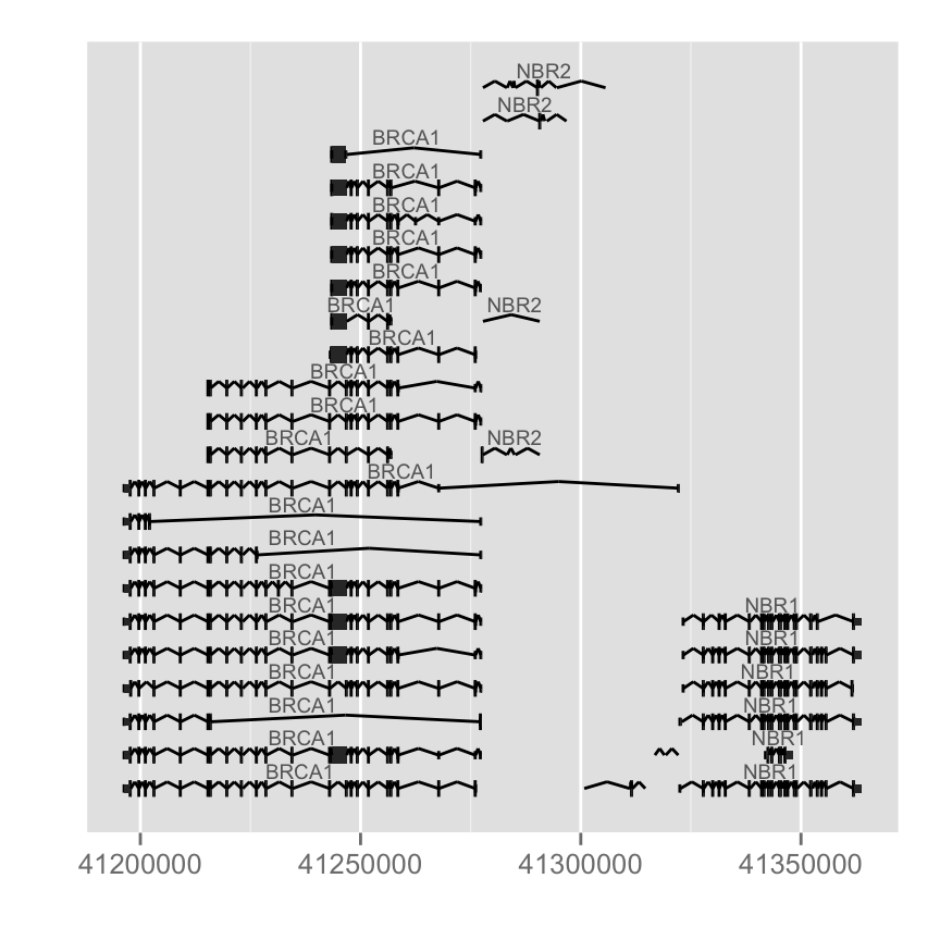
p.txdb <- autoplot(Homo.sapiens, which = wh)
p.txdb
#Change inton geometry, use gap.geom
autoplot(Homo.sapiens, which = wh, gap.geom = "chevron")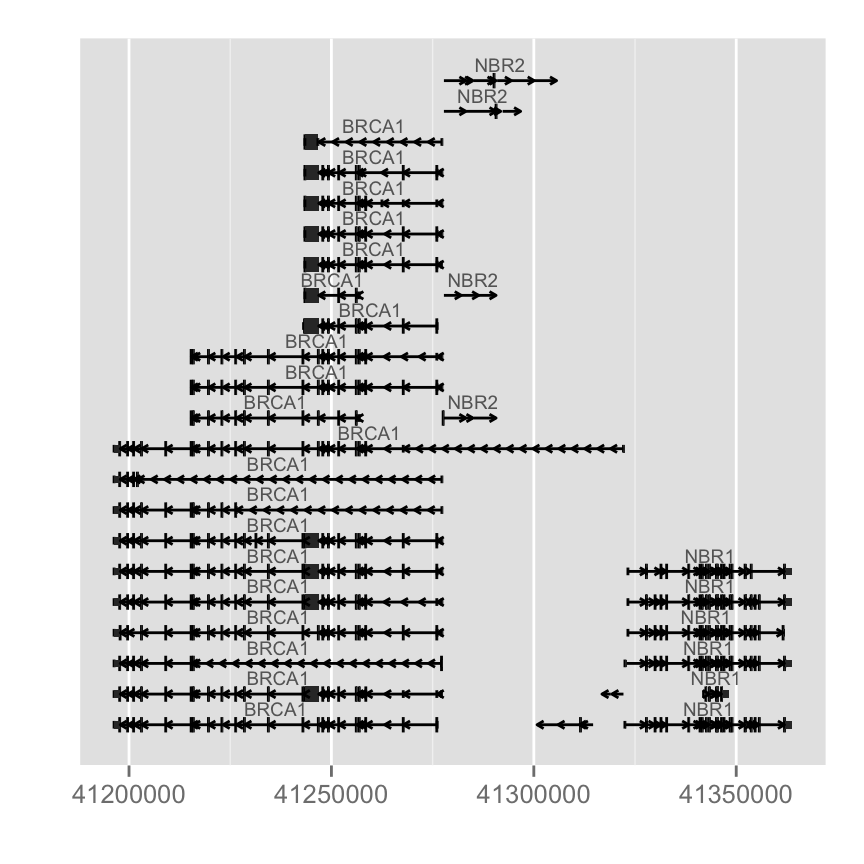
Different arguments to change colors : label.color (color of the label), color(line color) and fill (fill color of exons):
autoplot(Homo.sapiens, which = wh, label.color = "black", color = "brown",
fill = "brown")
Label could be turned off by setting it to FALSE, you could also use expression to make a flexible label combination from column names.columns(Homo.sapiens)## [1] "GOID" "TERM" "ONTOLOGY" "DEFINITION"
## [5] "ENTREZID" "PFAM" "IPI" "PROSITE"
## [9] "ACCNUM" "ALIAS" "CHR" "CHRLOC"
## [13] "CHRLOCEND" "ENZYME" "MAP" "PATH"
## [17] "PMID" "REFSEQ" "SYMBOL" "UNIGENE"
## [21] "ENSEMBL" "ENSEMBLPROT" "ENSEMBLTRANS" "GENENAME"
## [25] "UNIPROT" "GO" "EVIDENCE" "GOALL"
## [29] "EVIDENCEALL" "ONTOLOGYALL" "OMIM" "UCSCKG"
## [33] "CDSID" "CDSNAME" "CDSCHROM" "CDSSTRAND"
## [37] "CDSSTART" "CDSEND" "EXONID" "EXONNAME"
## [41] "EXONCHROM" "EXONSTRAND" "EXONSTART" "EXONEND"
## [45] "GENEID" "TXID" "EXONRANK" "TXNAME"
## [49] "TXCHROM" "TXSTRAND" "TXSTART" "TXEND"#Flexible label
autoplot(Homo.sapiens, which = wh, columns = c("GENENAME", "GO"), names.expr = "GENENAME::GO")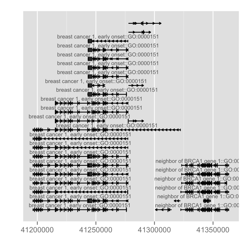
Gene model from TranscriptDb object
TranscriptDb doesn't contain any gene symbol information, so we use tx id as default for label.library(TxDb.Hsapiens.UCSC.hg19.knownGene)
txdb <- TxDb.Hsapiens.UCSC.hg19.knownGene
autoplot(txdb, which = wh)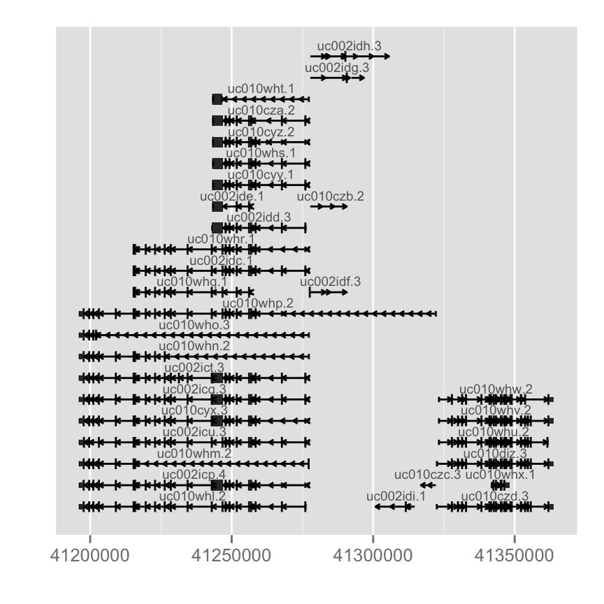
Add a reference track
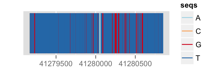
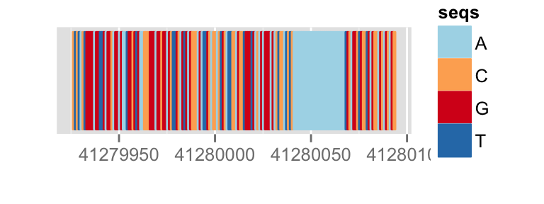
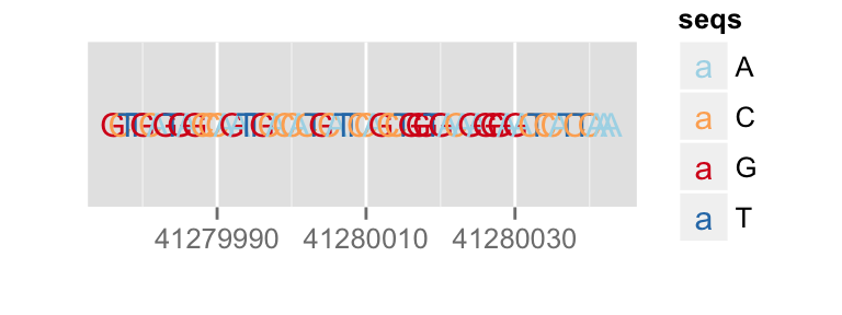
To add a reference track, we need to load a BSgenome object from the annotation package. You can choose to plot the sequence as text, rect, segment.
You can pass a zoom in factor into zoom function, if it's over 1 it's zooming out, if it's smaller than 1 it's zooming in.library(BSgenome.Hsapiens.UCSC.hg19)
bg <- BSgenome.Hsapiens.UCSC.hg19
p.bg <- autoplot(bg, which = wh)
## no geom
p.bg
## segment
p.bg + zoom(1/100)
## rectangle
p.bg + zoom(1/1000)
## text
p.bg + zoom(1/2500)
To override a zemantic zoom threshold, you simply provide a geom explicitly.
library(BSgenome.Hsapiens.UCSC.hg19)
bg <- BSgenome.Hsapiens.UCSC.hg19
## force to use geom 'segment' at this level
autoplot(bg, which = resize(wh, width = width(wh)/2000), geom = "segment")
Add an alignement track
Create a bam object
RSamtools package is required. The following code is just an example to create a bam object. This bam object can be used in autoplot function
bam<-BamFile(file="file.bam", index="file.bai")
#use it for autoplot
autoplot(bam, which = wh)
Visualize bam file
ggbio supports visualization of alignments file stored in bam, autoplot method accepts :
- bam file path (indexed)
- BamFile object
It's simple to just pass a file path to autoplot function, you can stream a chunk of region by providing 'which' parameter. Otherwise please use method 'estiamte' to show overall estiamted coverage.fl.bam <- system.file("extdata", "wg-brca1.sorted.bam", package = "biovizBase")
#keeps only the seqlevels in value and removes all others
wh <- keepSeqlevels(wh, "chr17")
autoplot(fl.bam, which = wh)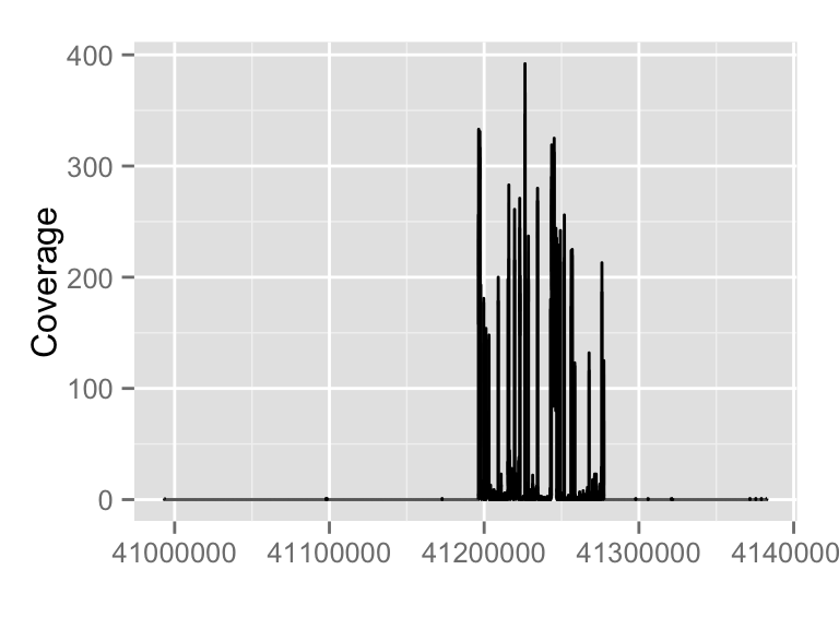
Mismatch proportion
To show mismatch proportion, you have to provide reference sequence, the mismatched proportion is color coded in the bar chart.
library(BSgenome.Hsapiens.UCSC.hg19)
bg <- BSgenome.Hsapiens.UCSC.hg19
p.mis <- autoplot(fl.bam, bsgenome = bg, which = wh, stat = "mismatch")
p.mis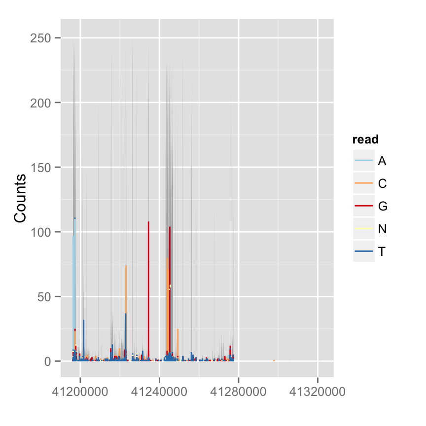
View all coverage distribution
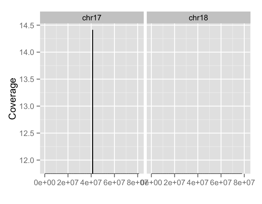
To view overall estimated coverage distribution, please use method ‘estiamte’. ‘which’ parameter also accept characters. And there is a hidden value called ‘..coverage..’ to let you do simple transformation in aes().
#View all coverage distribution
autoplot(fl.bam, method = "estimate")
#Select chromosomes of interest
#Log transformation of coverage
autoplot(fl.bam, method = "estimate",
         which = paste0("chr", 17:18),
         aes(y = log(..coverage..)))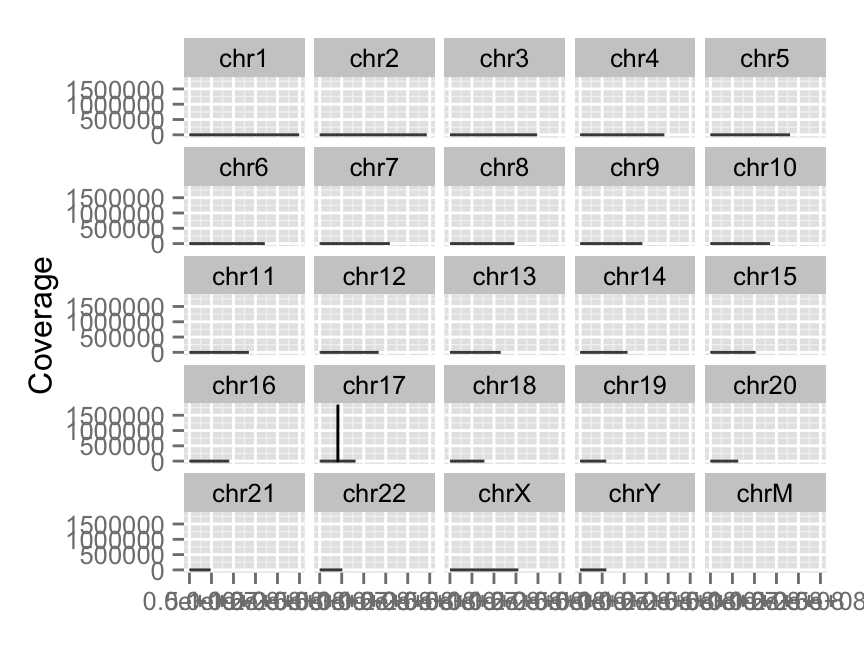
Add a variants track : vizualize vcf file
This track is supported by semantic zoom.To view your variants file, you could : - Import it using package** VariantAnntoation as VCF object, then use autoplot - Convert it in VRanges** object and use autoplot - Simply provide vcf file path in autoplot()
library(VariantAnnotation)
fl.vcf <- system.file("extdata", "17-1409-CEU-brca1.vcf.bgz", package="biovizBase")
vcf <- readVcf(fl.vcf, "hg19")
vr <- as(vcf[, 1:3], "VRanges")
vr <- renameSeqlevels(vr, value = c("17" = "chr17"))
## small region contains data
gr17 <- GRanges("chr17", IRanges(41234400, 41234530))
p.vr <- autoplot(vr, which = wh)
## none geom
p.vr
## rect geom
p.vr + xlim(gr17)
## text geom
p.vr + xlim(gr17) + zoom()
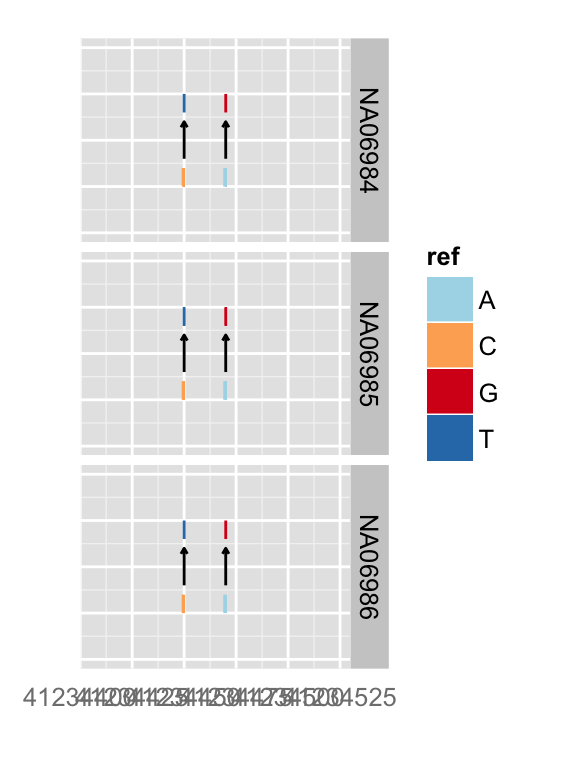
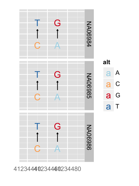
You can simply override geom
autoplot(vr, which = wh, geom = "rect", arrow = FALSE)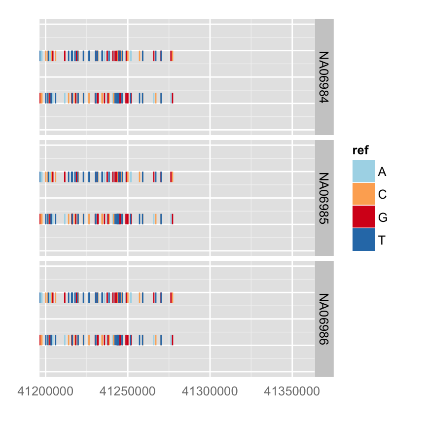
Building your tracks
gr17 <- GRanges("chr17", IRanges(41234415, 41234569))
tks <- tracks(p.ideo, mismatch = p.mis, dbSNP = p.vr, ref = p.bg, gene = p.txdb,
heights = c(2, 3, 3, 1, 4)) + xlim(gr17) + theme_tracks_sunset()
tks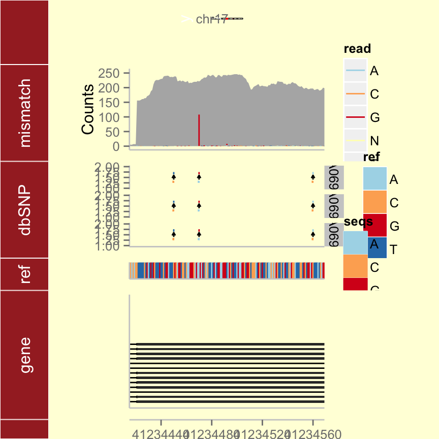
Overview plots
Overview is a good way to show all events at the same time, give overall summary statistics for the whole genome. In this chapter, we will introduce three different layouts that are used a lots in genomic data visualization.
Circular plots
We are going to visualize somatic mutation as segment.
- rule of thumb seqlengths, seqlevels and chromosomes names should be exactly the same. - to use circle, you have to use ggbio constructor at the beginning instead of ggplot.
All the raw data processed and stored in GRanges ready for use, you can simply load the sample data from biovizBase
Load data
#Load the data
data("CRC", package = "biovizBase")
head(hg19sub)
## GRanges with 6 ranges and 0 metadata columns:
## seqnames ranges strand
##
## [1] 1 [1, 249250621] *
## [2] 2 [1, 243199373] *
## [3] 3 [1, 198022430] *
## [4] 4 [1, 191154276] *
## [5] 5 [1, 180915260] *
## [6] 6 [1, 171115067] *
## ---
## seqlengths:
## 1 2 3 ... 20 21 22
## 249250621 243199373 198022430 ... 63025520 48129895 51304566 Create ideogram, label and scale track
The function layouts the circle by the order you created from inside to outside.
p <- ggbio() + circle(hg19sub, geom = "ideo", fill = "gray70") + #Ideogram
circle(hg19sub, geom = "scale", size = 2) + #Scale
circle(hg19sub, geom = "text", aes(label = seqnames), vjust = 0, size = 3) # label
p #print plot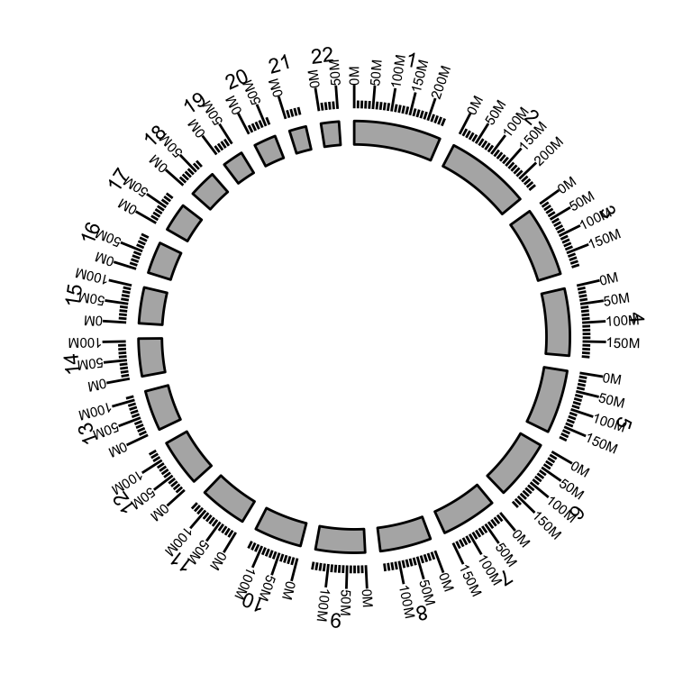
Show somatic mutation
We add a “rectangle” track to show somatic mutation.
head(mut.gr)## GRanges with 6 ranges and 10 metadata columns:
## seqnames ranges strand | Hugo_Symbol Entrez_Gene_Id
## |
## [1] 1 [ 11003085, 11003085] + | TARDBP 23435
## [2] 1 [ 62352395, 62352395] + | INADL 10207
## [3] 1 [194960885, 194960885] + | CFH 3075
## [4] 2 [ 10116508, 10116508] - | CYS1 192668
## [5] 2 [ 33617747, 33617747] + | RASGRP3 25780
## [6] 2 [ 73894280, 73894280] + | C2orf78 388960
## Center NCBI_Build Strand Variant_Classification Variant_Type
##
## [1] Broad 36 + Missense SNP
## [2] Broad 36 + Missense SNP
## [3] Broad 36 + Missense SNP
## [4] Broad 36 - Missense SNP
## [5] Broad 36 + Missense SNP
## [6] Broad 36 + Missense SNP
## Reference_Allele Tumor_Seq_Allele1 Tumor_Seq_Allele2
##
## [1] G G A
## [2] T T G
## [3] G G A
## [4] C C T
## [5] C C T
## [6] T T C
## ---
## seqlengths:
## 1 2 3 ... 20 21 22
## 249250621 243199373 198022430 ... 63025520 48129895 51304566 p <- ggbio() + circle(mut.gr, geom = "rect", color = "steelblue") + #somatic mutation
circle(hg19sub, geom = "ideo", fill = "gray70") +#Ideogram
circle(hg19sub, geom = "scale", size = 2) +#Scale
circle(hg19sub, geom = "text", aes(label = seqnames), vjust = 0, size = 3)#label
p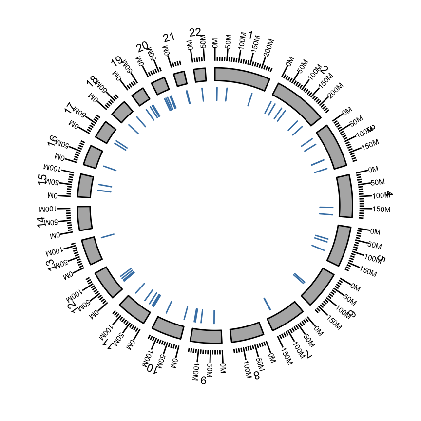
Many other examples are available in the ggbio package vignette
Licence
Show me some love with the like buttons below... Thank you and please don't forget to share and comment below!!
Montrez-moi un peu d'amour avec les like ci-dessous ... Merci et n'oubliez pas, s'il vous plaît, de partager et de commenter ci-dessous!
Recommended for You!
Recommended for you
This section contains the best data science and self-development resources to help you on your path.
Books - Data Science
Our Books
- Practical Guide to Cluster Analysis in R by A. Kassambara (Datanovia)
- Practical Guide To Principal Component Methods in R by A. Kassambara (Datanovia)
- Machine Learning Essentials: Practical Guide in R by A. Kassambara (Datanovia)
- R Graphics Essentials for Great Data Visualization by A. Kassambara (Datanovia)
- GGPlot2 Essentials for Great Data Visualization in R by A. Kassambara (Datanovia)
- Network Analysis and Visualization in R by A. Kassambara (Datanovia)
- Practical Statistics in R for Comparing Groups: Numerical Variables by A. Kassambara (Datanovia)
- Inter-Rater Reliability Essentials: Practical Guide in R by A. Kassambara (Datanovia)
Others
- R for Data Science: Import, Tidy, Transform, Visualize, and Model Data by Hadley Wickham & Garrett Grolemund
- Hands-On Machine Learning with Scikit-Learn, Keras, and TensorFlow: Concepts, Tools, and Techniques to Build Intelligent Systems by Aurelien Géron
- Practical Statistics for Data Scientists: 50 Essential Concepts by Peter Bruce & Andrew Bruce
- Hands-On Programming with R: Write Your Own Functions And Simulations by Garrett Grolemund & Hadley Wickham
- An Introduction to Statistical Learning: with Applications in R by Gareth James et al.
- Deep Learning with R by François Chollet & J.J. Allaire
- Deep Learning with Python by François Chollet
Click to follow us on Facebook :
Comment this article by clicking on "Discussion" button (top-right position of this page)


