fviz_mca: Quick Multiple Correspondence Analysis data visualization - R software and data mining
Description
Draw the graph of individuals/variables from the output of Multiple Correspondence Analysis (MCA).
The following functions, from factoextra package are use:
- fviz_mca_ind(): Graph of individuals
- fviz_mca_var(): Graph of variable categories
- fviz_mca_biplot() (or fviz_mca()): Biplot of individuals and variable categories
Install and load factoextra
The package devtools is required for the installation as factoextra is hosted on github.
# install.packages("devtools")
library("devtools")
install_github("kassambara/factoextra")
Load factoextra :
library("factoextra")Usage
# Graph of individuals
fviz_mca_ind(X, axes = c(1, 2),
  geom = c("point", "text"), label = "all", invisible = "none",
  labelsize = 4, pointsize = 2, habillage = "none",
  addEllipses = FALSE, ellipse.level = 0.95, col.ind = "blue",
  col.ind.sup = "darkblue", alpha.ind = 1, shape.ind = 19,
  select.ind = list(name = NULL, cos2 = NULL, contrib = NULL),
  map = "symmetric",
  jitter = list(what = "label", width = NULL, height = NULL), ...)
# Graph of variables
fviz_mca_var(X, axes = c(1, 2),
  geom = c("point", "text"), label = "all",
  invisible = "none", labelsize = 4, pointsize = 2, col.var = "red",
  alpha.var = 1, shape.var = 17, col.quanti.sup = "blue",
  col.quali.sup = "darkgreen", col.circle = "grey70",
  select.var = list(name = NULL, cos2 = NULL, contrib = NULL),
  map = "symmetric",
  jitter = list(what = "label", width = NULL, height = NULL))
# Biplot of individuals and variables
fviz_mca_biplot(X, axes = c(1, 2), geom = c("point", "text"),
  label = "all", invisible = "none", labelsize = 4, pointsize = 2,
  habillage = "none", addEllipses = FALSE, ellipse.level = 0.95,
  col.ind = "blue", col.ind.sup = "darkblue", alpha.ind = 1,
  col.var = "red", alpha.var = 1, col.quanti.sup = "blue",
  col.quali.sup = "darkgreen", shape.ind = 19, shape.var = 17,
  select.var = list(name = NULL, cos2 = NULL, contrib = NULL),
  select.ind = list(name = NULL, cos2 = NULL, contrib = NULL),
  map = "symmetric", arrows = c(FALSE, FALSE),
  jitter = list(what = "label", width = NULL, height = NULL), ...)
# An alias of fviz_mca_biplot()
fviz_mca(X, ...)
Arguments
| Argument | Description |
|---|---|
| X | an object of class MCA [FactoMineR]; mca [ade4]. |
| axes | a numeric vector of length 2 specifying the dimensions to be plotted. |
| geom | a text specifying the geometry to be used for the graph. Allowed values are the combination of c(“point”, “arrow”, “text”). Use “point” (to show only points); “text” to show only labels; c(“point”, “text”) or c(“arrow”, “text”) to show both types. |
| label | a text specifying the elements to be labelled. Default value is “all”. Allowed values are “none” or the combination of c(“ind”, “ind.sup”,“var”, “quali.sup”, “quanti.sup”). “ind” can be used to label only active individuals. “ind.sup” is for supplementary individuals. “var” is for active variable categories. “quali.sup” is for supplementary qualitative variable categories. “quanti.sup” is for quantitative supplementary variables. |
| invisible | a text specifying the elements to be hidden on the plot. Default value is “none”. Allowed values are the combination of c(“ind”, “ind.sup”,“var”, “quali.sup”, “quanti.sup”). |
| labelsize | font size for the labels. |
| pointsize | the size of points. |
| habillage | an optional factor variable for coloring the observations by groups. Default value is “none”. If X is a MCA object from FactoMineR package, habillage can also specify the supplementary qualitative variable (by its index or name) to be used for coloring individuals by groups (see ?MCA in FactoMineR). |
| addEllipses | logical value. If TRUE, draws ellipses around the individuals when habillage != “none”. |
| ellipse.level | the size of the concentration ellipse in normal probability. |
| col.ind,col.var | colors for individuals and variables, respectively. Possible values include also : “cos2”, “contrib”, “coord”, “x” or “y”. In this case, the colors for individuals/variables are automatically controlled by their qualities of representation (“cos2”), contributions (“contrib”), coordinates (x^2 + y^2 , “coord”), x values (“x”) or y values (“y”). To use automatic coloring (by cos2, contrib, ….), make sure that habillage =“none”. |
| col.ind.sup | color for supplementary individuals. |
| alpha.ind,alpha.var | controls the transparency of individual and variable colors, respectively. The value can variate from 0 (total transparency) to 1 (no transparency). Default value is 1. Possible values include also : “cos2”, “contrib”, “coord”, “x” or “y”. In this case, the transparency for the individual/variable colors are automatically controlled by their qualities (“cos2”), contributions (“contrib”), coordinates (x2+y2 , “coord”), x values(“x”) or y values(“y”). To use this, make sure that habillage =“none”. |
| select.ind,select.var |
a selection of individuals/variables to be drawn. Allowed values are NULL or a list containing the arguments name, cos2 or contrib:
|
| map | character string specifying the map type. Allowed options include: "symmetric", "rowprincipal", "colprincipal", "symbiplot", "rowgab", "colgab", "rowgreen" and "colgreen". See details |
| jitter | a parameter used to jitter the points in order to reduce overplotting. It’s a list containing the objects what, width and height (Ex.; jitter = list(what, width, height)). what: the element to be jittered. Possible values are “point” or “p”; “label” or “l”; “both” or “b”. width: degree of jitter in x direction (ex: 0.2). height: degree of jitter in y direction (ex: 0.2). |
| col.quanti.sup, col.quali.sup | a color for the quantitative/qualitative supplementary variables. |
| arrows | Vector of two logicals specifying if the plot should contain points (FALSE, default) or arrows (TRUE). First value sets the rows and the second value sets the columns. |
| … | Arguments to be passed to the function fviz_mca_biplot(). |
Details
The default plot of MCA is a “symmetric” plot in which both rows and columns are in principal coordinates. In this situation, it’s not possible to interpret the distance between row points and column points. To overcome this problem, the simplest way is to make an asymmetric plot. This means that, the column profiles must be presented in row space or vice-versa. The allowed options for the argument map are:
“rowprincipal” or “colprincipal”: asymmetric plots with either rows in principal coordinates and columns in standard coordinates, or vice versa. These plots preserve row metric or column metric respectively.
“symbiplot”: Both rows and columns are scaled to have variances equal to the singular values (square roots of eigenvalues), which gives a symmetric biplot but does not preserve row or column metrics.
“rowgab” or “colgab”: Asymmetric maps, proposed by Gabriel & Odoroff (1990), with rows (respectively, columns) in principal coordinates and columns (respectively, rows) in standard coordinates multiplied by the mass of the corresponding point.
“rowgreen” or “colgreen”: The so-called contribution biplots showing visually the most contributing points (Greenacre 2006b). These are similar to “rowgab” and “colgab” except that the points in standard coordinates are multiplied by the square root of the corresponding masses, giving reconstructions of the standardized residuals.
Value
A ggplot2 plot
Examples
Multiple Correspondence Analysis
A Multiple Correspondence Analysis (MCA) is performed using the function MCA() [in FactoMineR] and poison data [in FactoMineR]:
# Install and load FactoMineR to compute MCA
# install.packages("FactoMineR")
library("FactoMineR")
data(poison)
poison.active <- poison[1:55, 5:15]
head(poison.active[, 1:6])
Nausea Vomiting Abdominals Fever Diarrhae Potato
1 Nausea_y Vomit_n Abdo_y Fever_y Diarrhea_y Potato_y
2 Nausea_n Vomit_n Abdo_n Fever_n Diarrhea_n Potato_y
3 Nausea_n Vomit_y Abdo_y Fever_y Diarrhea_y Potato_y
4 Nausea_n Vomit_n Abdo_n Fever_n Diarrhea_n Potato_y
5 Nausea_n Vomit_y Abdo_y Fever_y Diarrhea_y Potato_y
6 Nausea_n Vomit_n Abdo_y Fever_y Diarrhea_y Potato_yres.mca <- MCA(poison.active, graph=FALSE)fviz_mca_ind(): Graph of individuals
# Default plot
fviz_mca_ind(res.mca)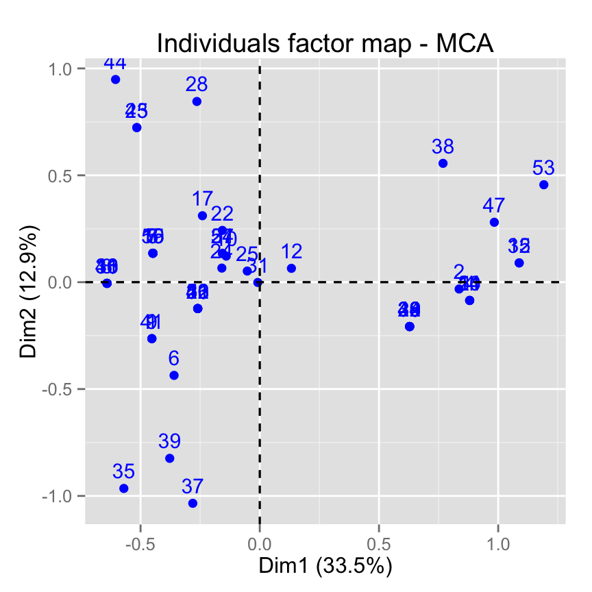
# Change title and axis labels
fviz_mca_ind(res.mca) +
 labs(title = "MCA", x = "Dim.1", y ="Dim.2" )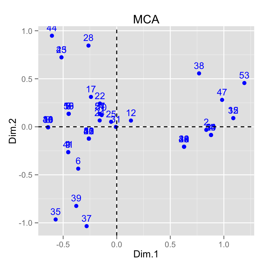
# Change axis limits by specifying the min and max
fviz_mca_ind(res.mca) +
   xlim(-0.8, 1.5) + ylim (-1.5, 1.5)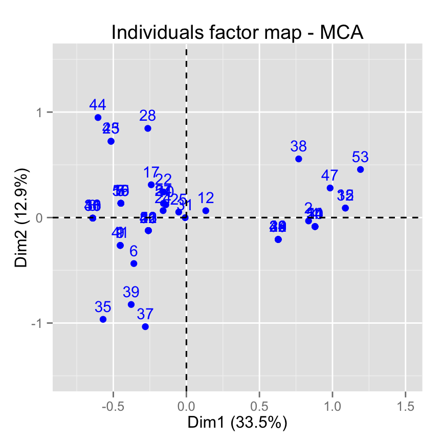
# Use text only
fviz_mca_ind(res.mca, geom = "text")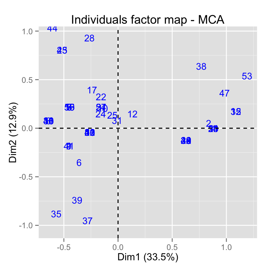
# Use points only
fviz_mca_ind(res.mca, geom="point")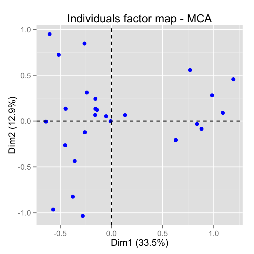
# Change the size of points
fviz_mca_ind(res.mca, geom="point", pointsize = 4)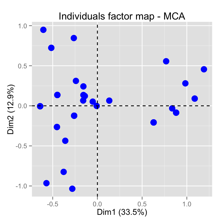
# Change point color and theme
fviz_mca_ind(res.mca, col.ind = "blue")+
   theme_minimal()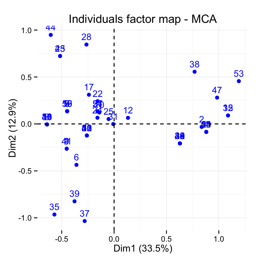
# Reduce overplotting
fviz_mca_ind(res.mca,
             jitter = list(width = 0.2, height = 0.2))
# Control automatically the color of individuals
# using the cos2 or the contributions
# cos2 = the quality of the individuals on the factor map
fviz_mca_ind(res.mca, col.ind="cos2")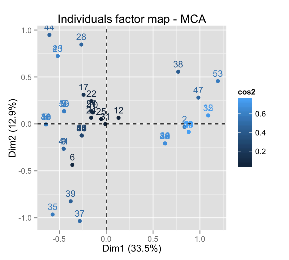
# Gradient color
fviz_mca_ind(res.mca, col.ind="cos2") +
      scale_color_gradient2(low="white", mid="blue",
      high="red", midpoint=0.4)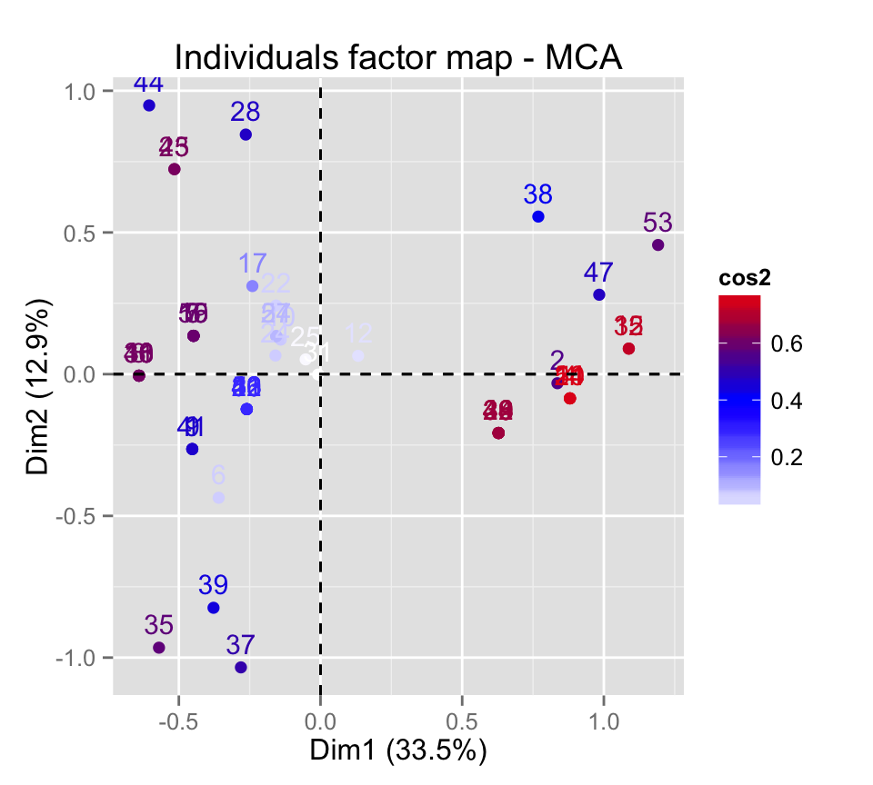
# Change the theme and use only points
fviz_mca_ind(res.mca, col.ind="cos2", geom = "point") +
      scale_color_gradient2(low="white", mid="blue",
      high="red", midpoint=0.4)+ theme_minimal()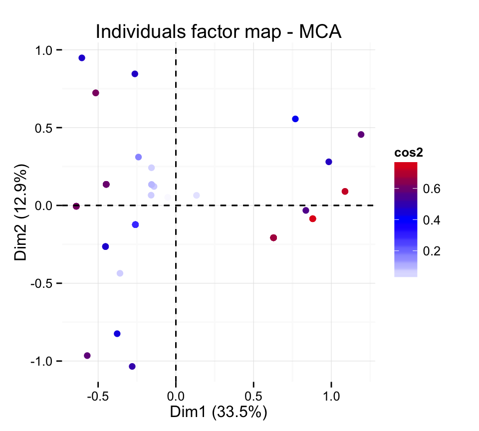
# Color by the contributions
fviz_mca_ind(res.mca, col.ind="contrib") +
      scale_color_gradient2(low="white", mid="blue",
      high="red", midpoint=1.5)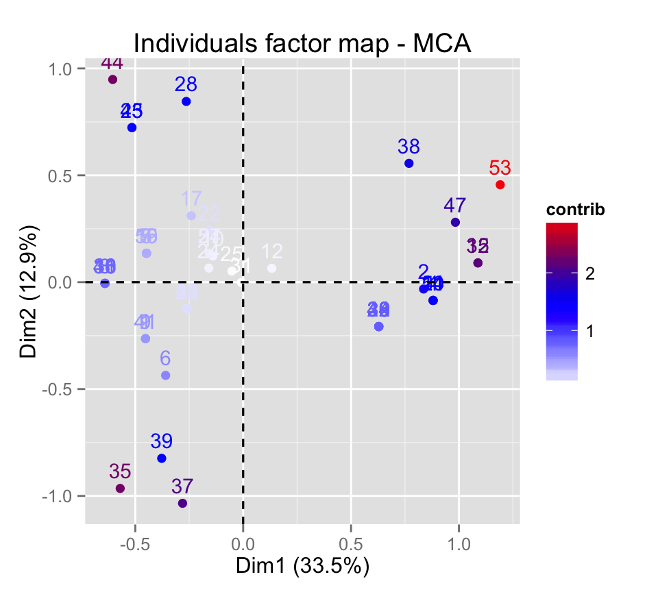
# Control the transparency of the color by the
# contributions
fviz_mca_ind(res.mca, alpha.ind="contrib") +
     theme_minimal()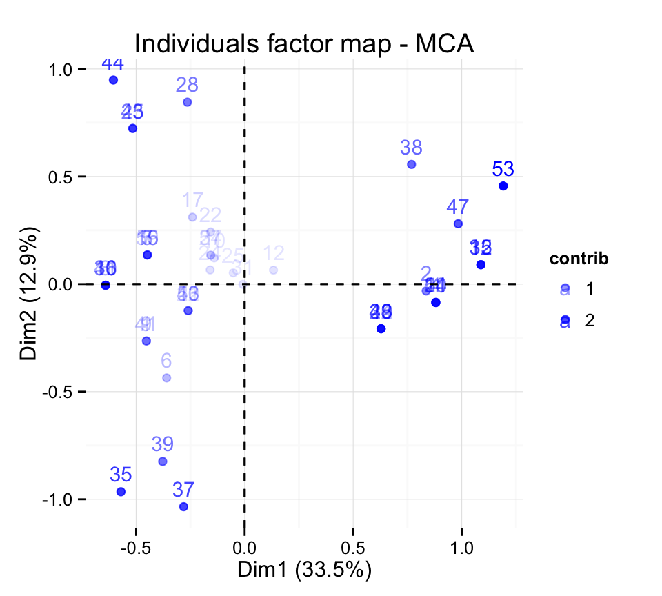
# Color individuals by groups
grp <- as.factor(poison.active[, "Vomiting"])
fviz_mca_ind(res.mca, label="none", habillage=grp)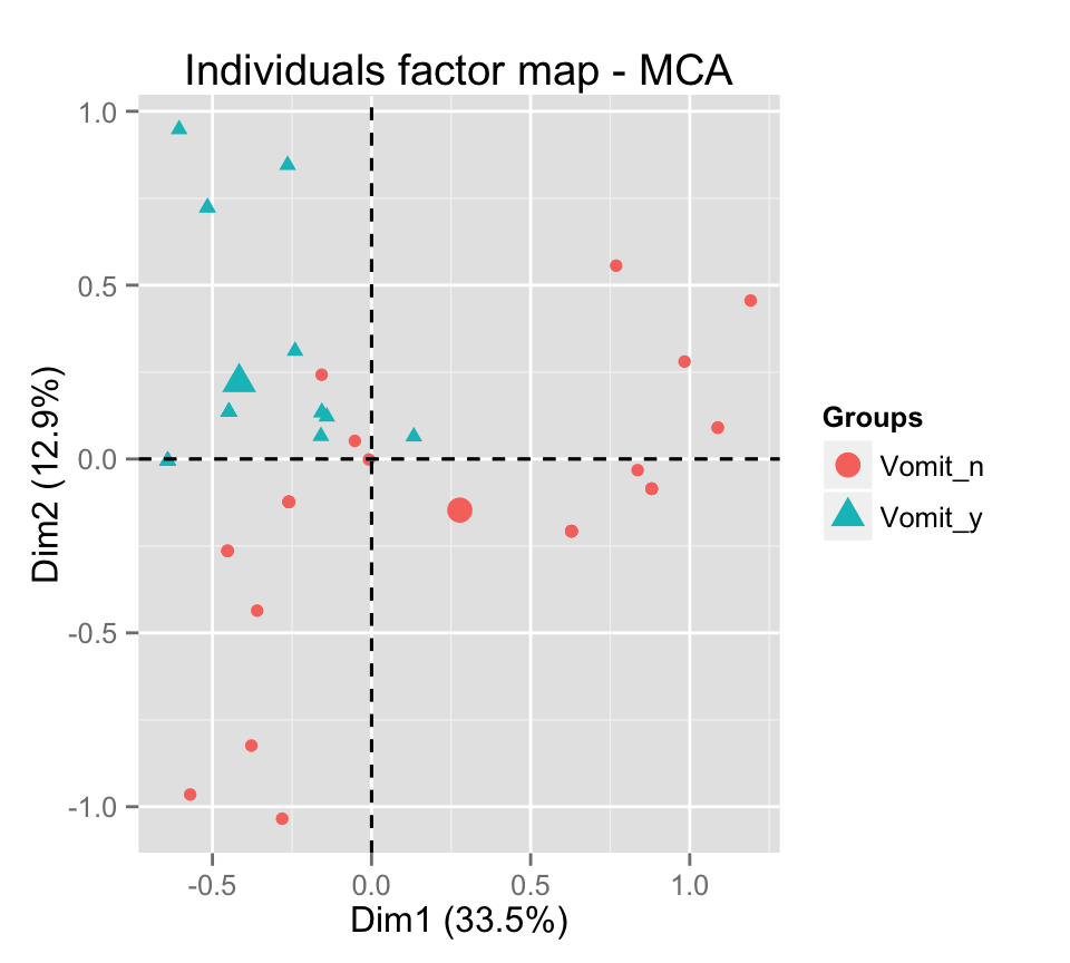
# Add ellipses
p <- fviz_mca_ind(res.mca, label="none", habillage=grp,
             addEllipses=TRUE, ellipse.level=0.95)
print(p)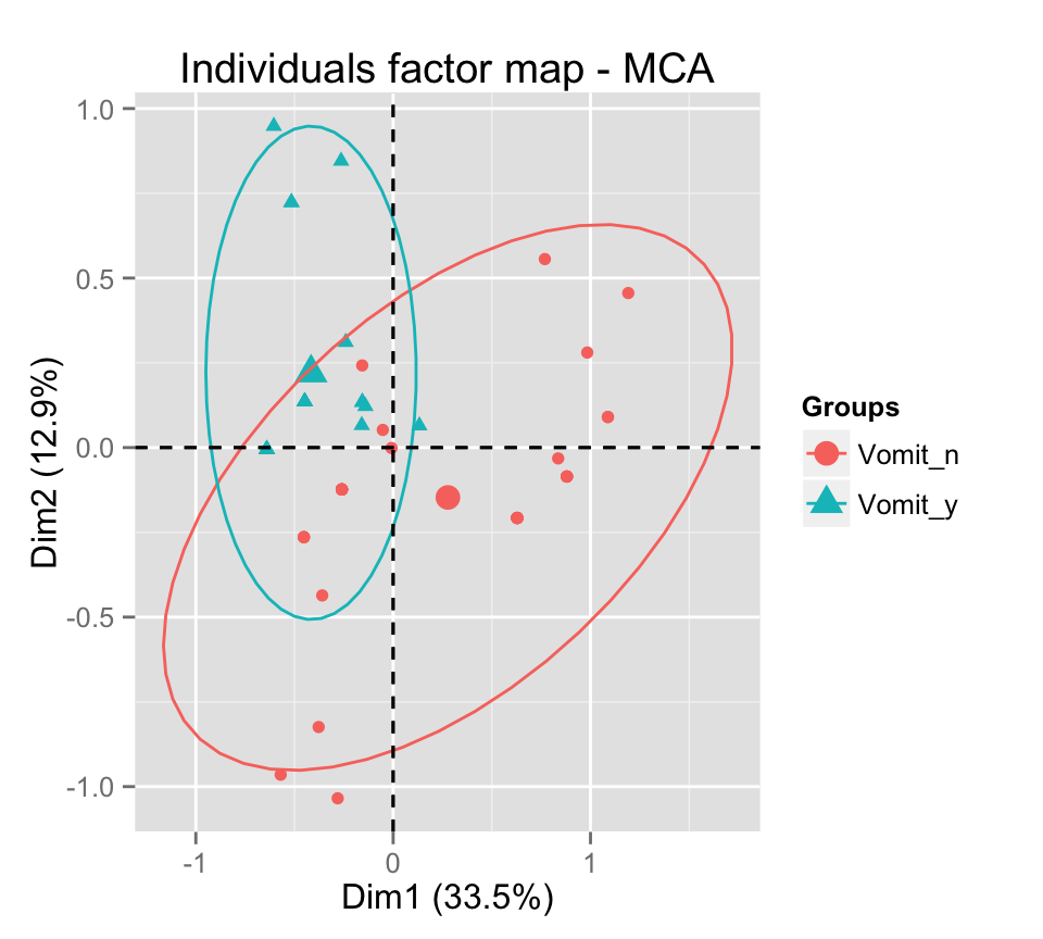
# Change group colors using RColorBrewer color palettes
p + scale_color_brewer(palette="Dark2") +
   theme_minimal()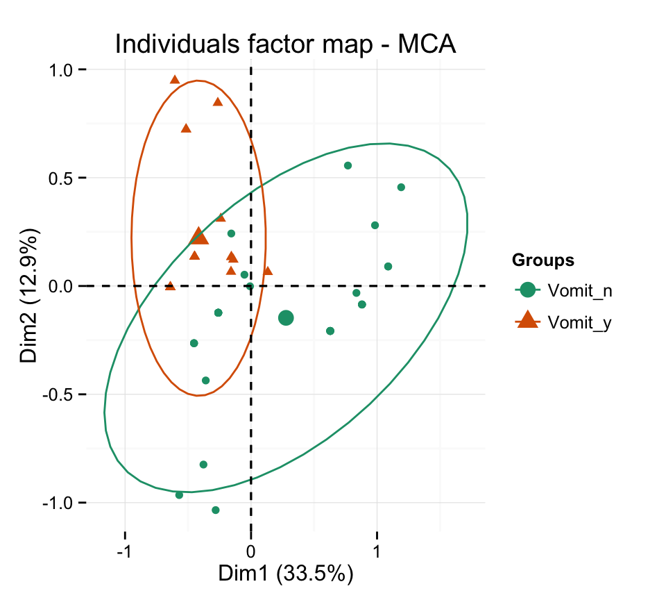
p + scale_color_brewer(palette="Paired") +
     theme_minimal()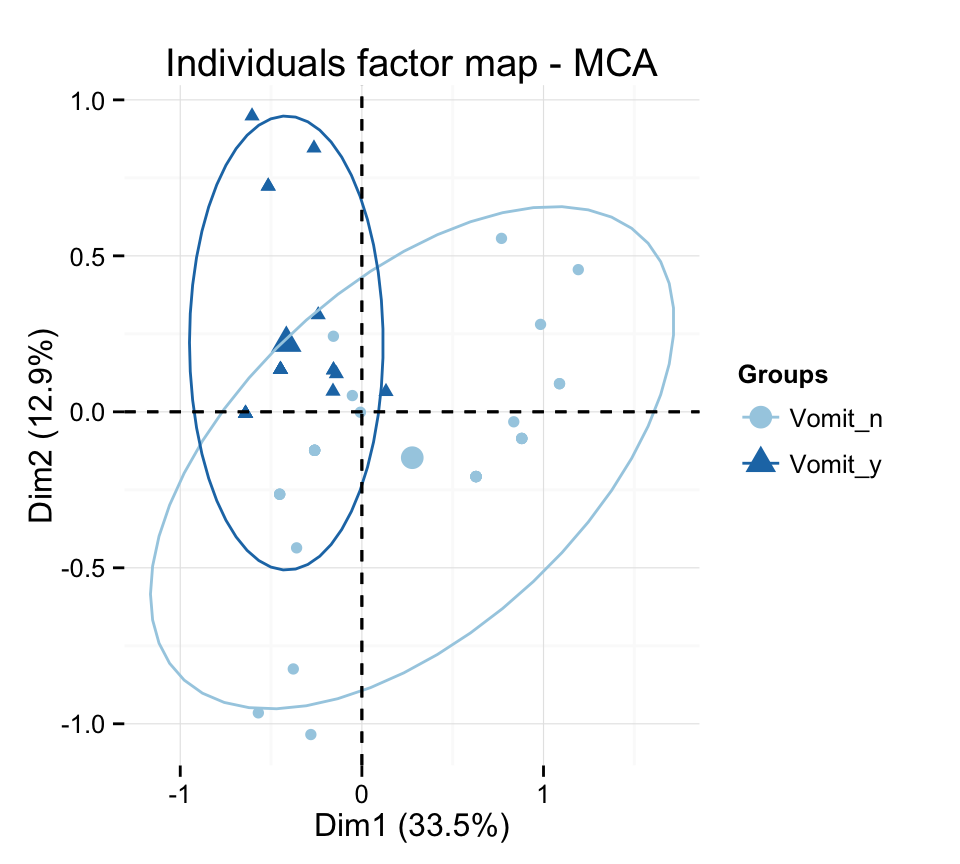
p + scale_color_brewer(palette="Set1") +
     theme_minimal()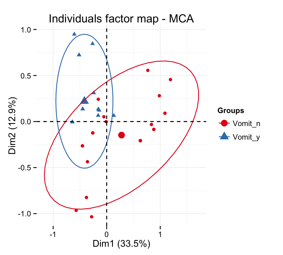
# Change color manually
p + scale_color_manual(values=c("#999999", "#E69F00", "#56B4E9"))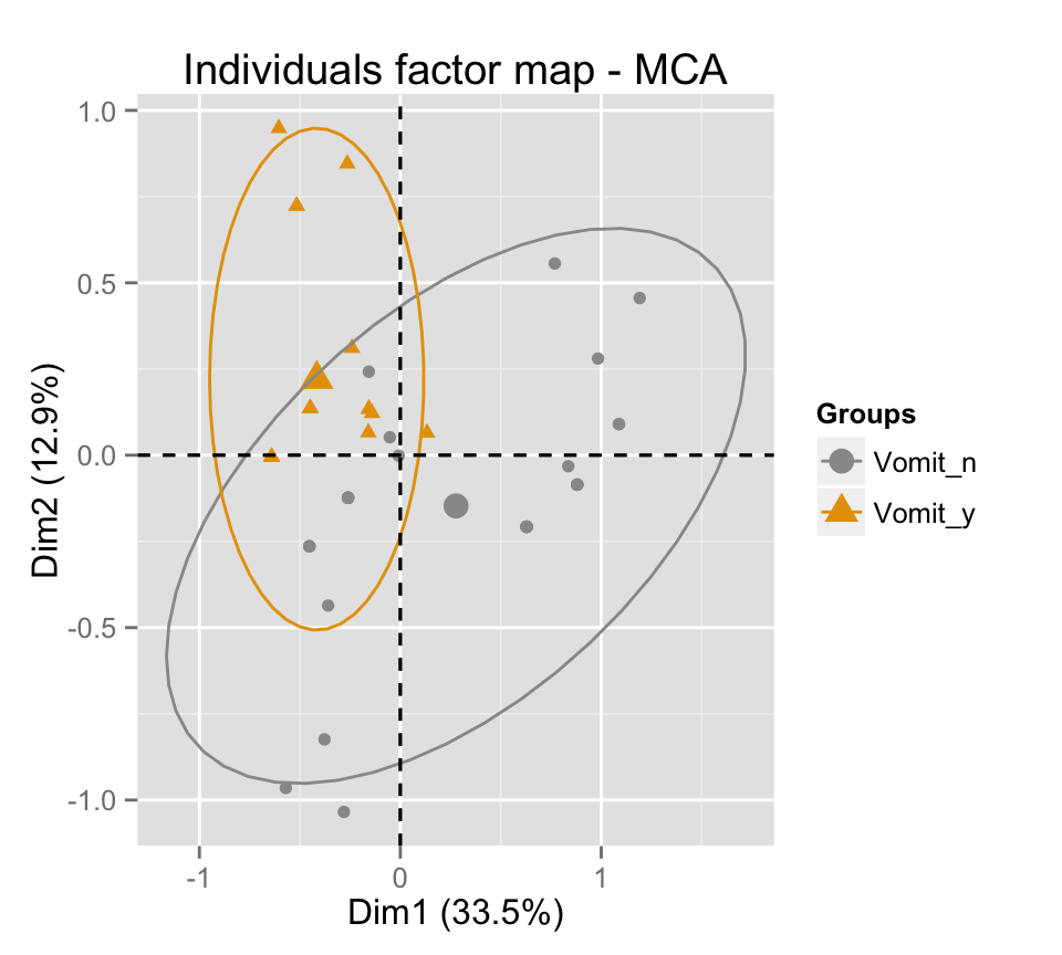
# Select and visualize individuals with cos2 >= 0.4
fviz_mca_ind(res.mca, select.ind = list(cos2 = 0.4))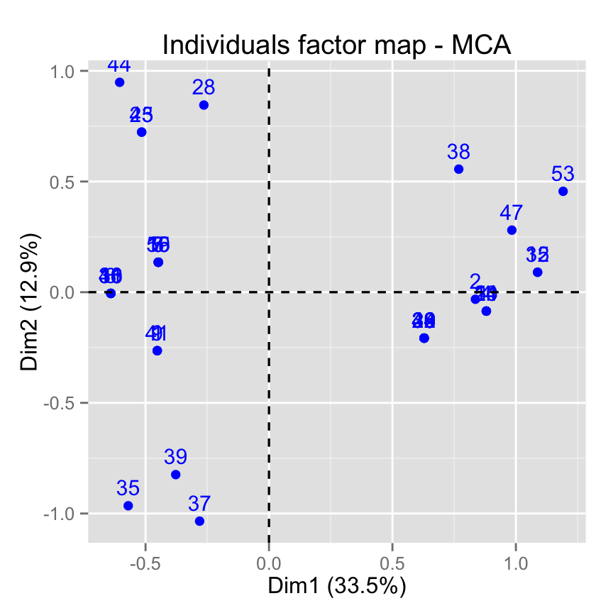
# Select the top 20 according to the cos2
fviz_mca_ind(res.mca, select.ind = list(cos2 = 20))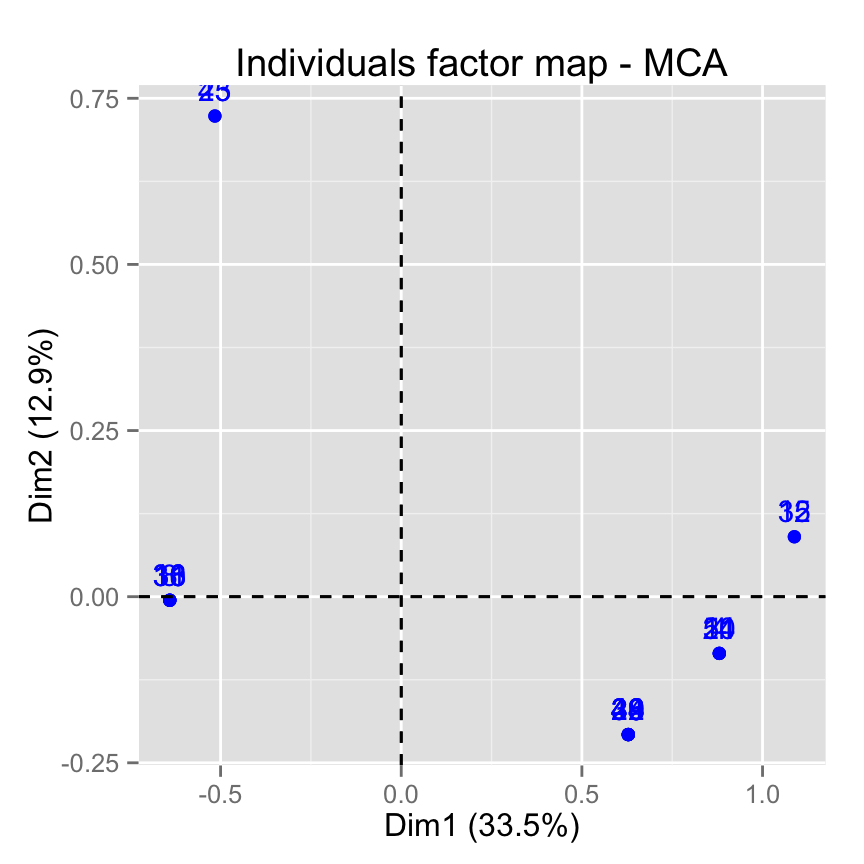
# Select the top 20 contributing individuals
fviz_mca_ind(res.mca, select.ind = list(contrib = 20))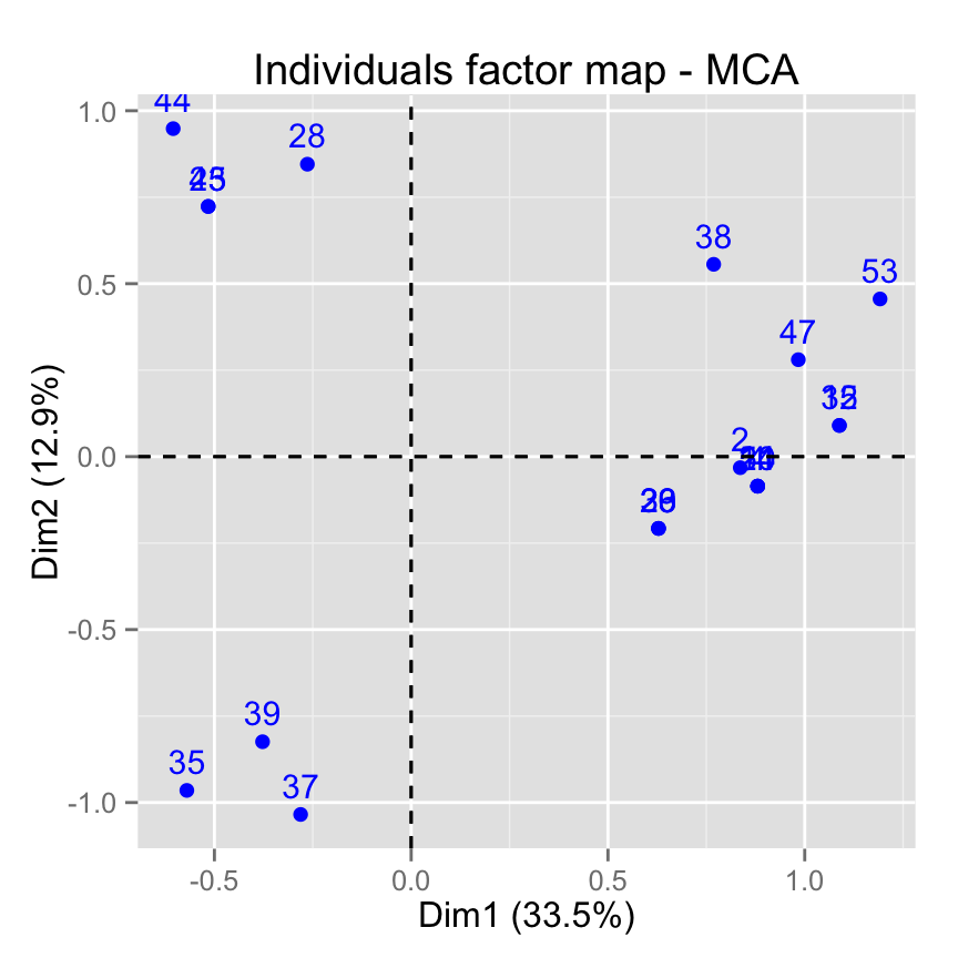
# Select by names
fviz_mca_ind(res.mca,
select.ind = list(name = c("44", "38", "53",  "39")))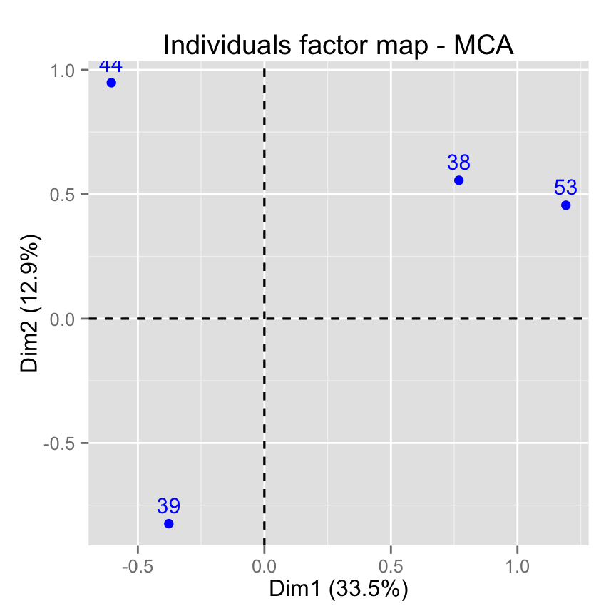
fviz_mca_var(): Graph of variable categories
# Default plot
fviz_mca_var(res.mca)
# Change color and theme
fviz_mca_var(res.mca, col.var="steelblue")+
 theme_minimal()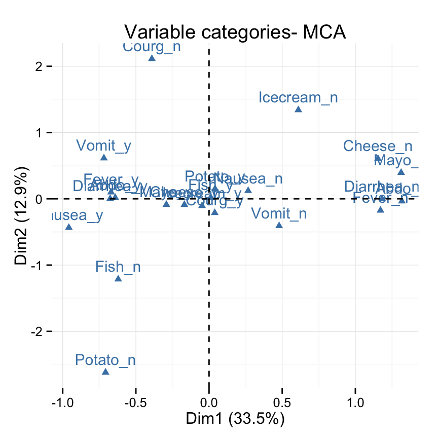
# Control variable colors using their contributions
fviz_mca_var(res.mca, col.var = "contrib")+
 scale_color_gradient2(low = "white", mid = "blue",
           high = "red", midpoint = 2) +
 theme_minimal()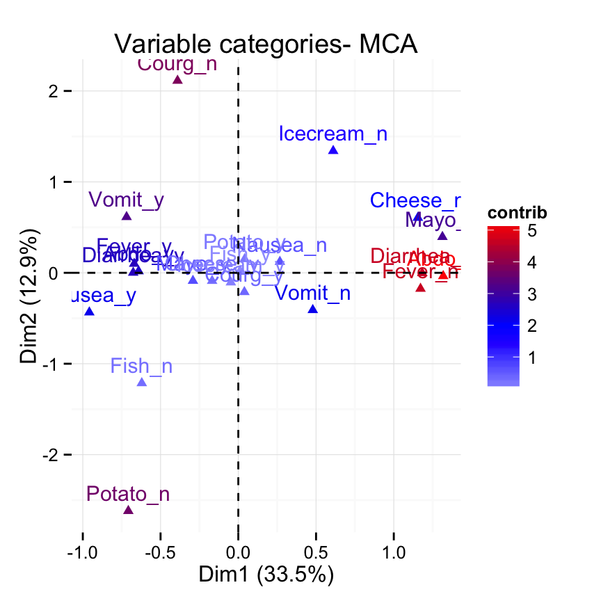
# Control the transparency of variables using their contributions
fviz_mca_var(res.mca, alpha.var = "contrib") +
   theme_minimal()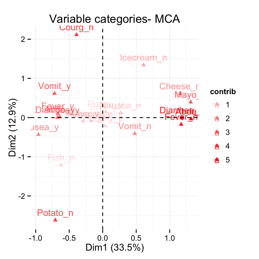
# Select and visualize categories with cos2 >= 0.4
fviz_mca_var(res.mca, select.var = list(cos2 = 0.4))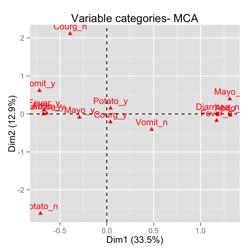
# Select the top 10 contributing variable categories
fviz_mca_var(res.mca, select.var = list(contrib = 10))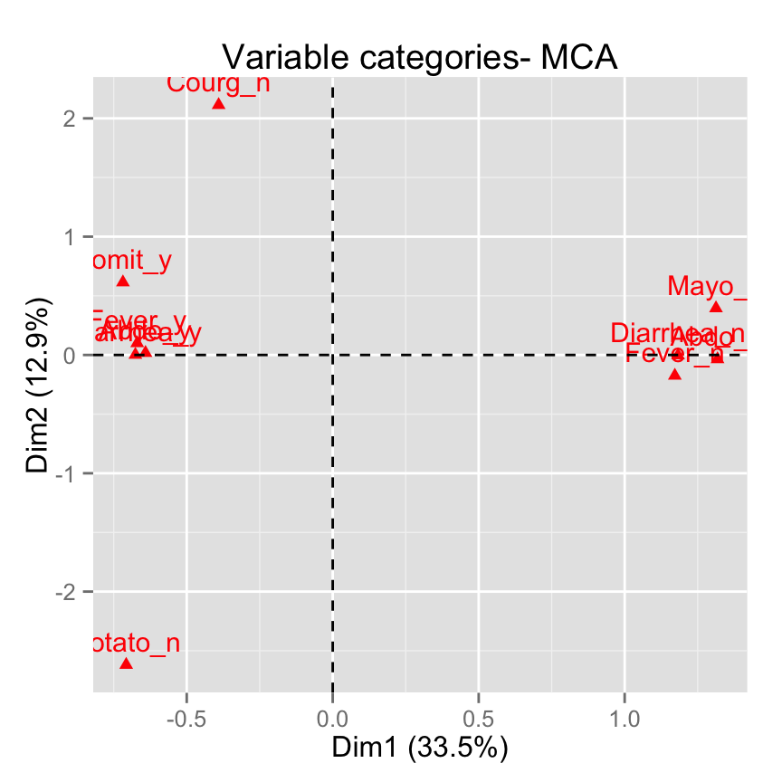
# Select by names
fviz_mca_var(res.mca,
 select.var= list(name = c("Courg_n", "Fever_y", "Fever_n")))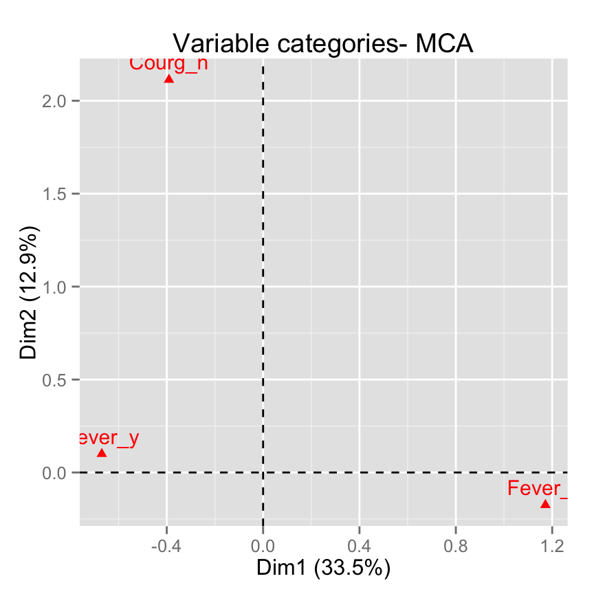
fviz_mca_biplot(): Biplot of individuals of variable categories
fviz_mca_biplot(res.mca)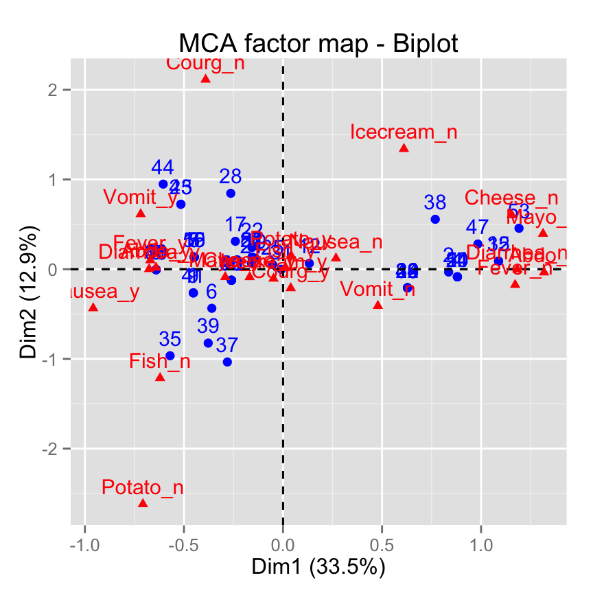
# Keep only the labels for variable categories
fviz_mca_biplot(res.mca, label ="var")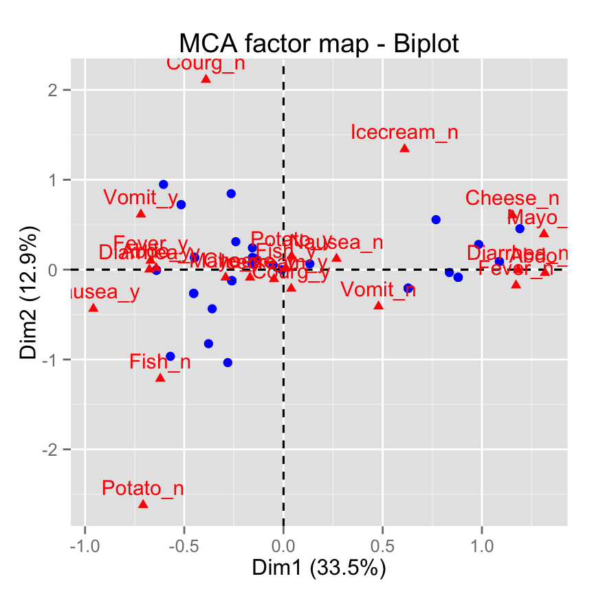
# Keep only labels for individuals
fviz_mca_biplot(res.mca, label ="ind")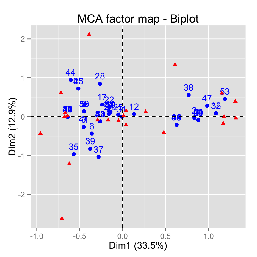
# Hide variable categories
fviz_mca_biplot(res.mca, invisible ="var")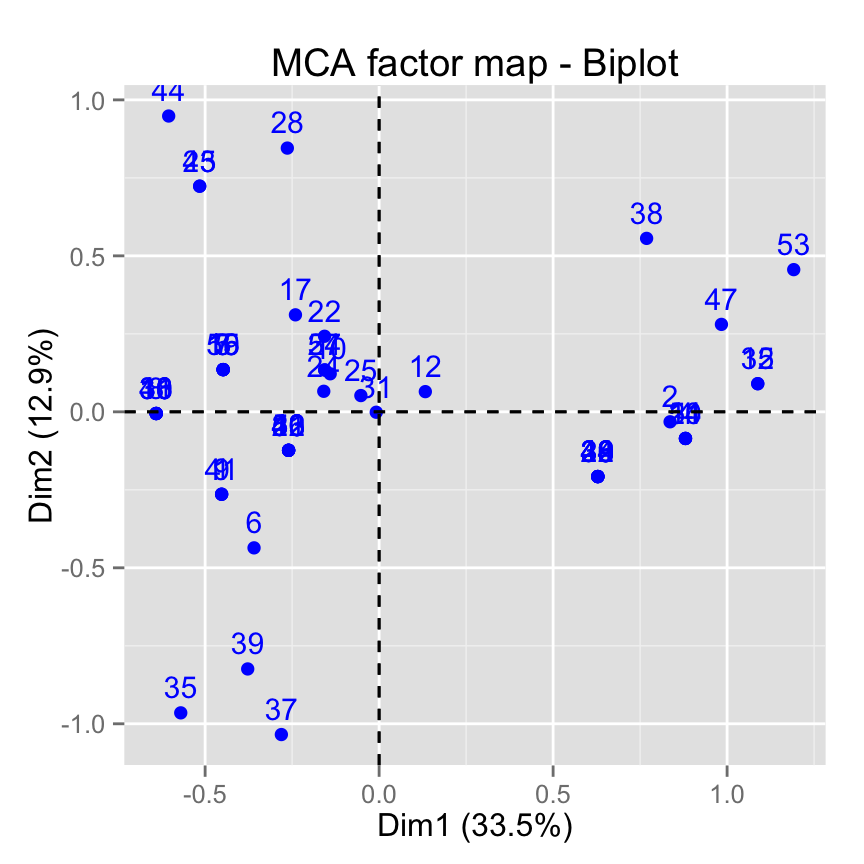
# Hide individuals
fviz_mca_biplot(res.mca, invisible ="ind")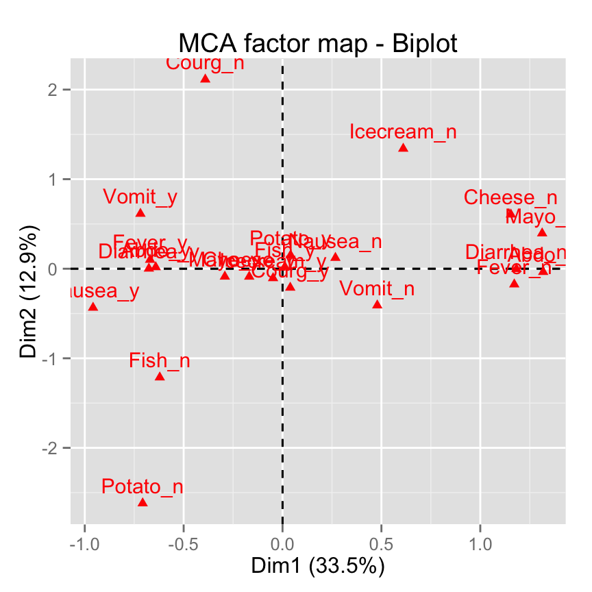
# Control automatically the color of individuals using the cos2
fviz_mca_biplot(res.mca, label ="var", col.ind="cos2") +
       theme_minimal()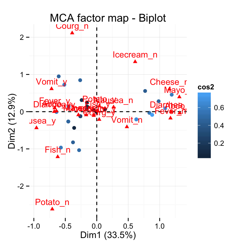
# Change the color by groups, add ellipses
fviz_mca_biplot(res.mca, label="var", col.var ="blue",
   habillage=grp, addEllipses=TRUE, ellipse.level=0.95) +
   theme_minimal()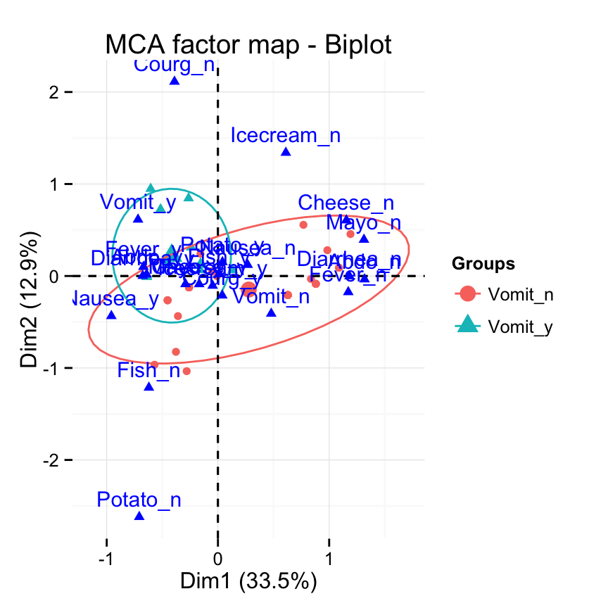
# Select the top 30 contributing individuals
# And the top 10 variables
fviz_mca_biplot(res.mca,
               select.ind = list(contrib = 30),
               select.var = list(contrib = 10))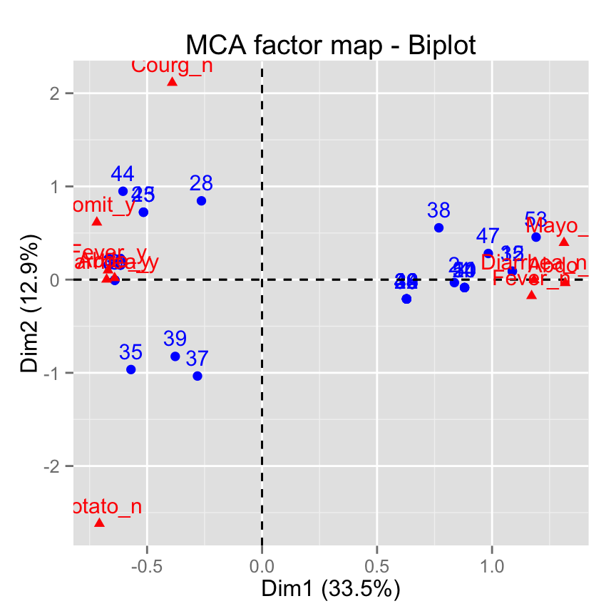
Infos
This analysis has been performed using R software (ver. 3.2.1) and factoextra (ver. 1.0.3)
Show me some love with the like buttons below... Thank you and please don't forget to share and comment below!!
Montrez-moi un peu d'amour avec les like ci-dessous ... Merci et n'oubliez pas, s'il vous plaît, de partager et de commenter ci-dessous!
Recommended for You!
Recommended for you
This section contains the best data science and self-development resources to help you on your path.
Books - Data Science
Our Books
- Practical Guide to Cluster Analysis in R by A. Kassambara (Datanovia)
- Practical Guide To Principal Component Methods in R by A. Kassambara (Datanovia)
- Machine Learning Essentials: Practical Guide in R by A. Kassambara (Datanovia)
- R Graphics Essentials for Great Data Visualization by A. Kassambara (Datanovia)
- GGPlot2 Essentials for Great Data Visualization in R by A. Kassambara (Datanovia)
- Network Analysis and Visualization in R by A. Kassambara (Datanovia)
- Practical Statistics in R for Comparing Groups: Numerical Variables by A. Kassambara (Datanovia)
- Inter-Rater Reliability Essentials: Practical Guide in R by A. Kassambara (Datanovia)
Others
- R for Data Science: Import, Tidy, Transform, Visualize, and Model Data by Hadley Wickham & Garrett Grolemund
- Hands-On Machine Learning with Scikit-Learn, Keras, and TensorFlow: Concepts, Tools, and Techniques to Build Intelligent Systems by Aurelien Géron
- Practical Statistics for Data Scientists: 50 Essential Concepts by Peter Bruce & Andrew Bruce
- Hands-On Programming with R: Write Your Own Functions And Simulations by Garrett Grolemund & Hadley Wickham
- An Introduction to Statistical Learning: with Applications in R by Gareth James et al.
- Deep Learning with R by François Chollet & J.J. Allaire
- Deep Learning with Python by François Chollet
Click to follow us on Facebook :
Comment this article by clicking on "Discussion" button (top-right position of this page)


