fviz_contrib - Quick visualization of row/column contributions - R software and data mining
Description
This function can be used to visualize the contributions of rows/columns from the results of Principal Component Analysis (PCA), Correspondence Analysis (CA) and Multiple Correspondence Analysis (MCA) functions.
The function fviz_contrib() [in factoextra package] is used.
Install and load factoextra
The package devtools is required for the installation as factoextra is hosted on github.
# install.packages("devtools")
devtools::install_github("kassambara/factoextra")
Load factoextra :
library("factoextra")Usage
fviz_contrib(X, choice = c("row", "col", "var", "ind"),
             axes = 1, fill = "steelblue", color = "steelblue",
             sort.val = c("desc", "asc", "none"), top = Inf)
Arguments
| Argument | Description |
|---|---|
| X | an object of class PCA, CA and MCA [FactoMineR]; prcomp and princomp [stats]; dudi, pca, coa and acm [ade4]; ca [ca package]. |
| choice | allowed values are “row” and “col” for CA; “var” and “ind” for PCA or MCA. |
| axes | a numeric vector specifying the dimension(s) of interest. |
| fill | a fill color for the bar plot. |
| color | an outline color for the bar plot. |
| sort.val | a string specifying whether the value should be sorted. Allowed values are “none” (no sorting), “asc” (for ascending) or “desc” (for descending). |
| top | a numeric value specifying the number of top elements to be shown. |
| … | not used. |
Details
The function fviz_contrib() creates a barplot of row/column contributions. A reference dashed line is also shown on the barplot. This reference line corresponds to the expected value if the contribution where uniform.
For a given dimension, any row/column with a contribution above the reference line could be considered as important in contributing to the dimension.
Value
A ggplot2 plot
Examples
Principal component analysis
A principal component analysis (PCA) is performed using the built-in R function prcomp() and the decathlon2 [in factoextra] data
data(decathlon2)
decathlon2.active <- decathlon2[1:23, 1:10]
res.pca <- prcomp(decathlon2.active,  scale = TRUE)
# variable contributions on axis 1
fviz_contrib(res.pca, choice="var", axes = 1 )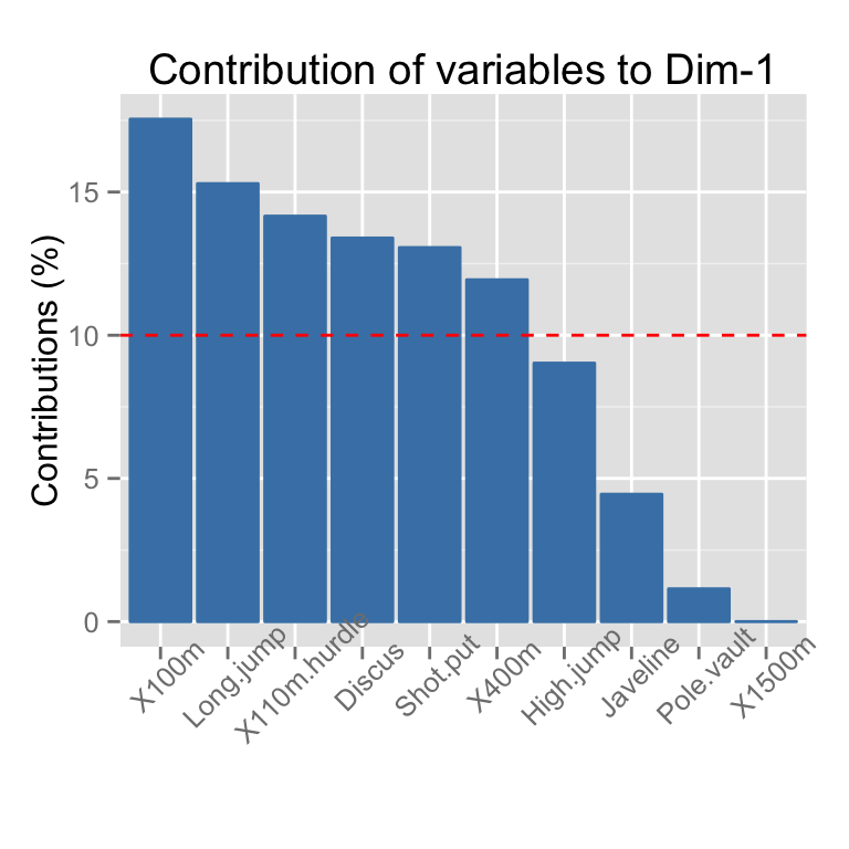
# sorting
fviz_contrib(res.pca, choice="var", axes = 1,
           sort.val ="asc")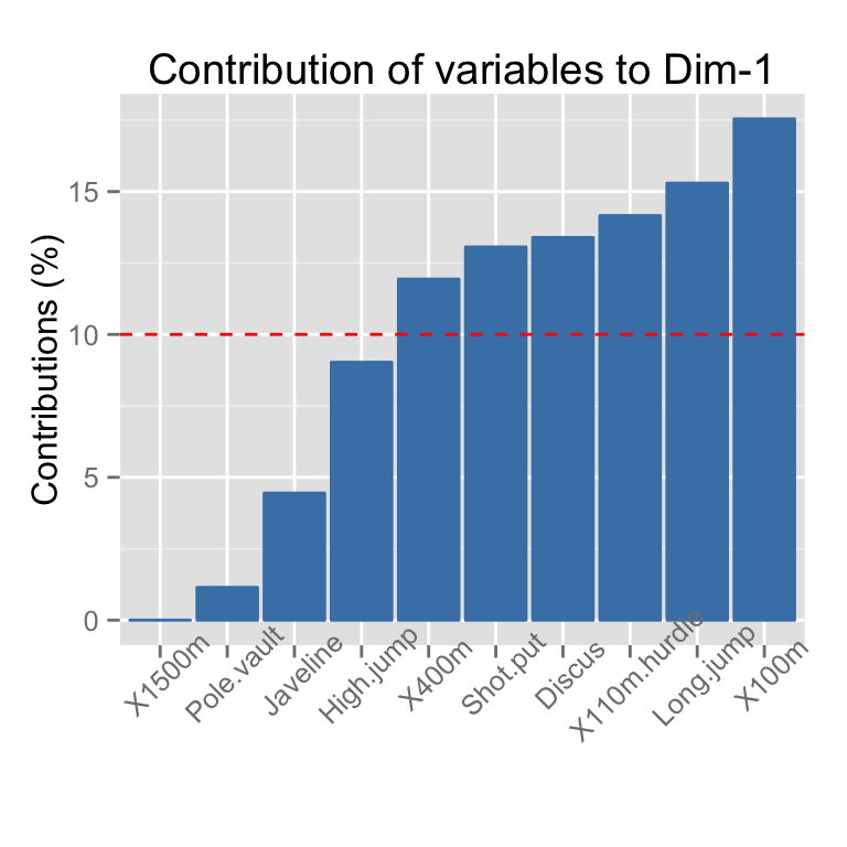
# select the top 7 contributing variables
fviz_contrib(res.pca, choice="var", axes = 1, top = 7 )
# Change theme and color
fviz_contrib(res.pca, choice="var", axes = 1,
         fill = "lightgray", color = "black") +
         theme_minimal() +
         theme(axis.text.x = element_text(angle=45))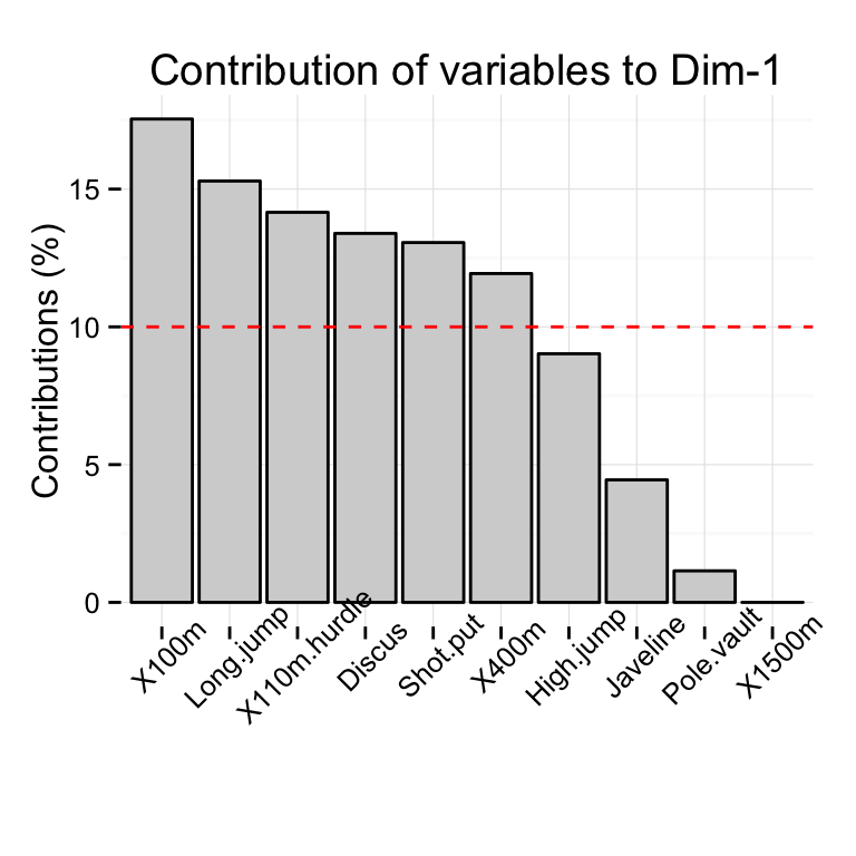
# Variable contributions on axis 2
fviz_contrib(res.pca, choice="var", axes = 2)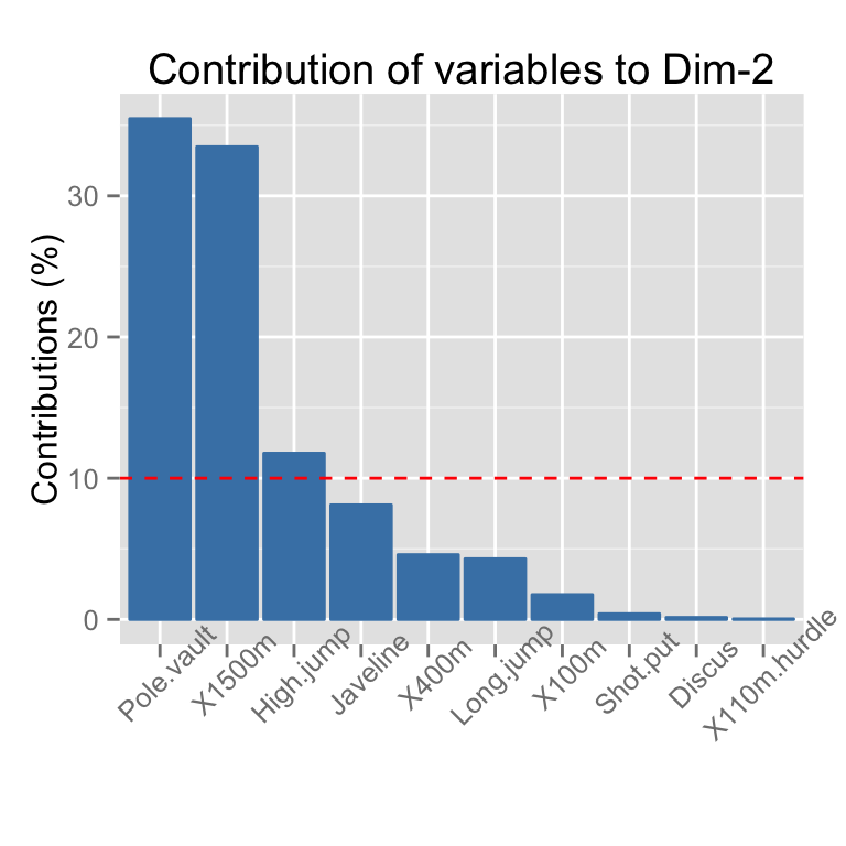
# Variable contributions on axes 1 + 2
fviz_contrib(res.pca, choice="var", axes = 1:2)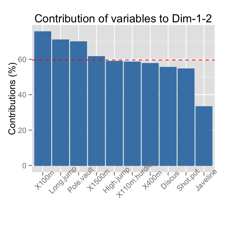
# Contributions of individuals on axis 1
fviz_contrib(res.pca, choice="ind", axes = 1)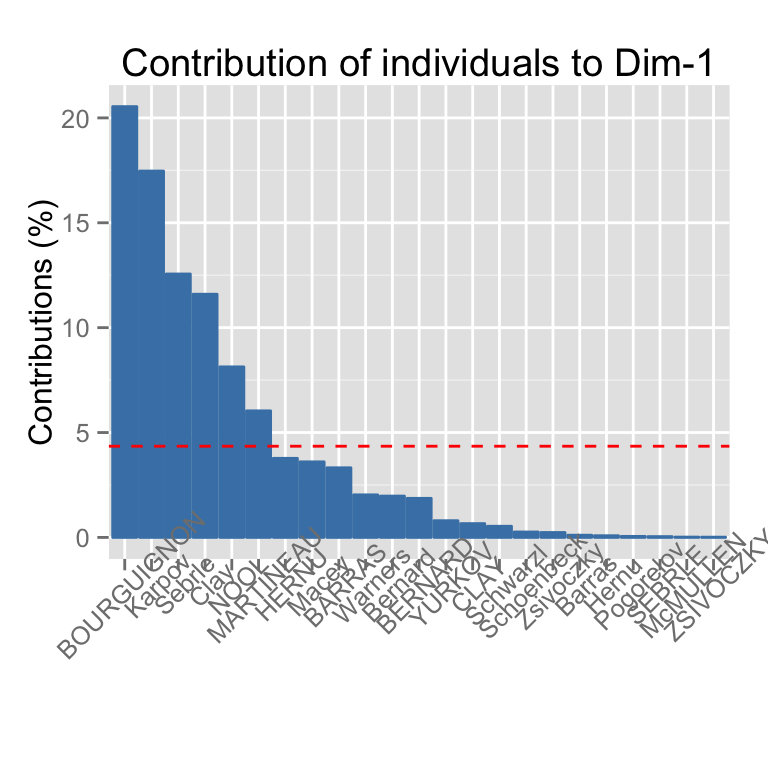
Correspondence Analysis
The function CA() in FactoMineR package is used:
# Install and load FactoMineR to compute CA
# install.packages("FactoMineR")
library("FactoMineR")
data("housetasks")
res.ca <- CA(housetasks, graph = FALSE)
# Visualize row contributions on axes 1
fviz_contrib(res.ca, choice ="row", axes = 1)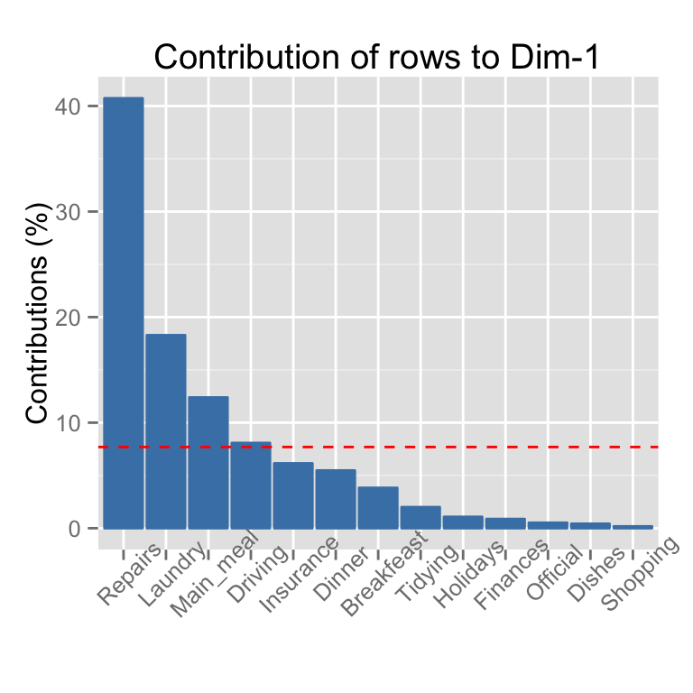
# Visualize row contributions on axes 1 + 2
fviz_contrib(res.ca, choice ="row", axes = 1:2)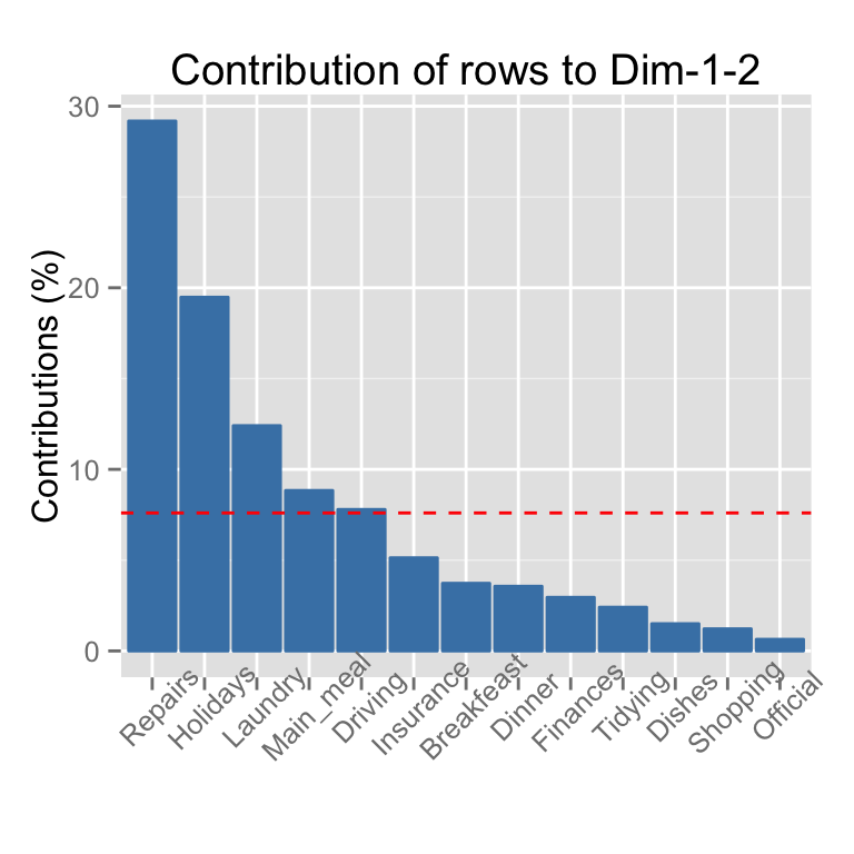
# Visualize column contributions on axes 1
fviz_contrib(res.ca, choice ="col", axes = 1)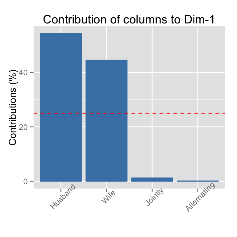
Multiple Correspondence Analysis
The function MCA() in FactoMineR package is used:
library(FactoMineR)
data(poison)
res.mca <- MCA(poison, quanti.sup = 1:2,
              quali.sup = 3:4, graph=FALSE)
# Visualize individual contributions on axes 1
fviz_contrib(res.mca, choice ="ind", axes = 1)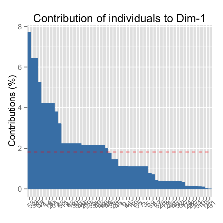
# Select the top 20
fviz_contrib(res.mca, choice ="ind", axes = 1, top = 20)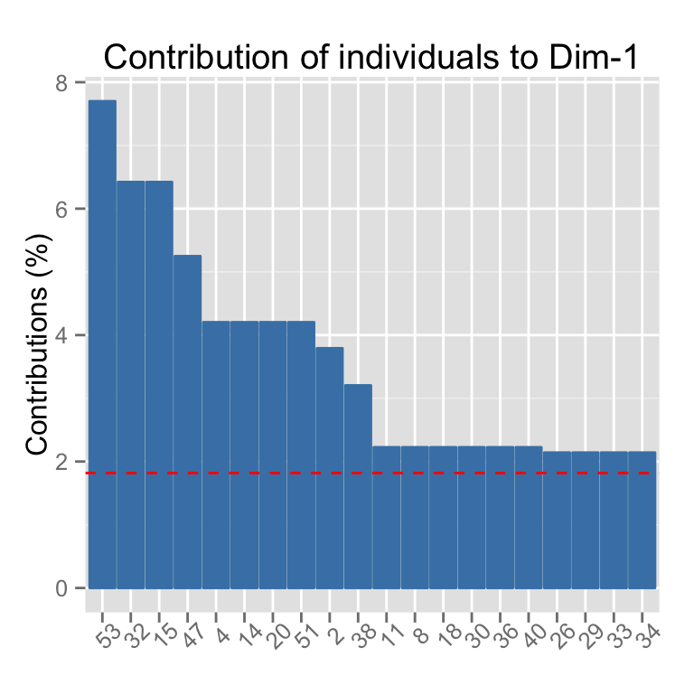
# Visualize variable categorie contributions on axes 1
fviz_contrib(res.mca, choice ="var", axes = 1)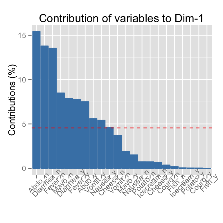
Infos
This analysis has been performed using R software (ver. 3.1.2) and factoextra (ver. 1.0.2)
Show me some love with the like buttons below... Thank you and please don't forget to share and comment below!!
Montrez-moi un peu d'amour avec les like ci-dessous ... Merci et n'oubliez pas, s'il vous plaît, de partager et de commenter ci-dessous!
Recommended for You!
Recommended for you
This section contains the best data science and self-development resources to help you on your path.
Books - Data Science
Our Books
- Practical Guide to Cluster Analysis in R by A. Kassambara (Datanovia)
- Practical Guide To Principal Component Methods in R by A. Kassambara (Datanovia)
- Machine Learning Essentials: Practical Guide in R by A. Kassambara (Datanovia)
- R Graphics Essentials for Great Data Visualization by A. Kassambara (Datanovia)
- GGPlot2 Essentials for Great Data Visualization in R by A. Kassambara (Datanovia)
- Network Analysis and Visualization in R by A. Kassambara (Datanovia)
- Practical Statistics in R for Comparing Groups: Numerical Variables by A. Kassambara (Datanovia)
- Inter-Rater Reliability Essentials: Practical Guide in R by A. Kassambara (Datanovia)
Others
- R for Data Science: Import, Tidy, Transform, Visualize, and Model Data by Hadley Wickham & Garrett Grolemund
- Hands-On Machine Learning with Scikit-Learn, Keras, and TensorFlow: Concepts, Tools, and Techniques to Build Intelligent Systems by Aurelien Géron
- Practical Statistics for Data Scientists: 50 Essential Concepts by Peter Bruce & Andrew Bruce
- Hands-On Programming with R: Write Your Own Functions And Simulations by Garrett Grolemund & Hadley Wickham
- An Introduction to Statistical Learning: with Applications in R by Gareth James et al.
- Deep Learning with R by François Chollet & J.J. Allaire
- Deep Learning with Python by François Chollet
Click to follow us on Facebook :
Comment this article by clicking on "Discussion" button (top-right position of this page)


