Plotly: Create Interactive Plots in R
Plotly R package makes interactive , publication-quality graphs online. Examples of how to make line plots, scatter plots, area charts, bar charts, error bars, box plots, histograms, heatmaps, subplots, multiple-axes, and 3D (WebGL based) charts.
You can read more at: Plotly R Library .
In this document, we’ll show how to create an interactive ggplot2 -based graphics using plotly.
Install required packages
install.packages("ggplot2")
install.packages("plotly")
Usage
library(ggplot2)
library(plotly)
set.seed(100)
d <- diamonds[sample(nrow(diamonds), 1000), ]
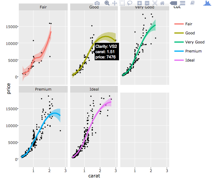
p <- ggplot(data = d, aes(x = carat, y = price)) +
  geom_point(aes(text = paste("Clarity:", clarity)), size = .5) +
  geom_smooth(aes(colour = cut, fill = cut)) + facet_wrap(~ cut)
ggplotly(p)
The plots look like this:
Last update : 08/08/2017
Enjoyed this article? Give us 5 stars
Avez vous aimé cet article? Donnez nous 5 étoiles
Recommended for You!
Recommended for you
This section contains the best data science and self-development resources to help you on your path.
Books - Data Science
Our Books
Others


