This article describes k-means clustering example and provide a step-by-step guide summarizing the different steps to follow for conducting a cluster analysis on a real data set using R software.
We’ll use mainly two R packages:
- cluster: for cluster analyses and
- factoextra: for the visualization of the analysis results.
Install these packages, as follow:
install.packages(c("cluster", "factoextra"))A rigorous cluster analysis can be conducted in 3 steps mentioned below:
Here, we provide quick R scripts to perform all these steps.
Contents:
Related Book
Practical Guide to Cluster Analysis in RData preparation
We’ll use the demo data set USArrests. We start by standardizing the data using the scale() function:
# Load the data set
data(USArrests)
# Standardize
df <- scale(USArrests)
Assessing the clusterability
The function get_clust_tendency() [factoextra package] can be used. It computes the Hopkins statistic and provides a visual approach.
library("factoextra")
res <- get_clust_tendency(df, 40, graph = TRUE)
# Hopskin statistic
res$hopkins_stat
## [1] 0.656# Visualize the dissimilarity matrix
print(res$plot)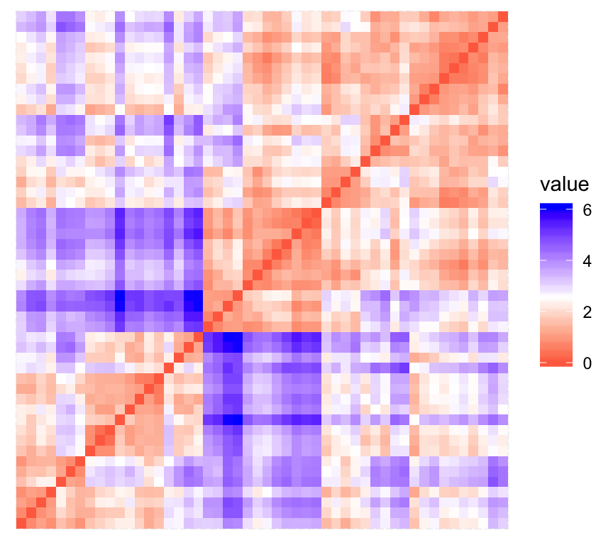
The value of the Hopkins statistic is significantly < 0.5, indicating that the data is highly clusterable. Additionally, It can be seen that the ordered dissimilarity image contains patterns (i.e., clusters).
Estimate the number of clusters in the data
As k-means clustering requires to specify the number of clusters to generate, we’ll use the function clusGap() [cluster package] to compute gap statistics for estimating the optimal number of clusters . The function fviz_gap_stat() [factoextra] is used to visualize the gap statistic plot.
library("cluster")
set.seed(123)
# Compute the gap statistic
gap_stat <- clusGap(df, FUN = kmeans, nstart = 25,
                    K.max = 10, B = 100)
# Plot the result
library(factoextra)
fviz_gap_stat(gap_stat)
The gap statistic suggests a 4 cluster solutions.
It’s also possible to use the function NbClust() [in NbClust] package.
Compute k-means clustering
K-means clustering with k = 4:
# Compute k-means
set.seed(123)
km.res <- kmeans(df, 4, nstart = 25)
head(km.res$cluster, 20)
## Alabama Alaska Arizona Arkansas California Colorado
## 4 3 3 4 3 3
## Connecticut Delaware Florida Georgia Hawaii Idaho
## 2 2 3 4 2 1
## Illinois Indiana Iowa Kansas Kentucky Louisiana
## 3 2 1 2 1 4
## Maine Maryland
## 1 3# Visualize clusters using factoextra
fviz_cluster(km.res, USArrests)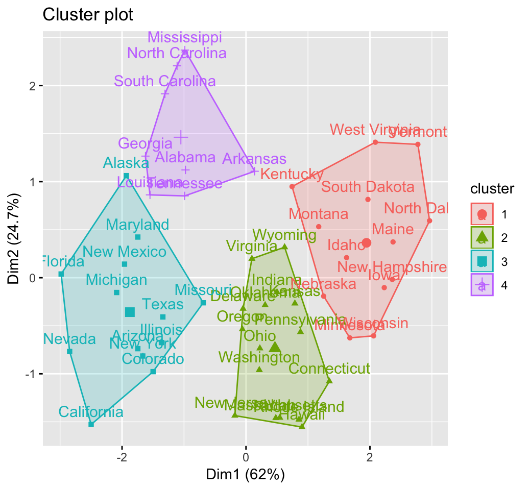
Cluster validation statistics: Inspect cluster silhouette plot
Recall that the silhouette measures (\(S_i\)) how similar an object \(i\) is to the the other objects in its own cluster versus those in the neighbor cluster. \(S_i\) values range from 1 to - 1:
- A value of \(S_i\) close to 1 indicates that the object is well clustered. In the other words, the object \(i\) is similar to the other objects in its group.
- A value of \(S_i\) close to -1 indicates that the object is poorly clustered, and that assignment to some other cluster would probably improve the overall results.
sil <- silhouette(km.res$cluster, dist(df))
rownames(sil) <- rownames(USArrests)
head(sil[, 1:3])
## cluster neighbor sil_width
## Alabama 4 3 0.4858
## Alaska 3 4 0.0583
## Arizona 3 2 0.4155
## Arkansas 4 2 0.1187
## California 3 2 0.4356
## Colorado 3 2 0.3265fviz_silhouette(sil)## cluster size ave.sil.width
## 1 1 13 0.37
## 2 2 16 0.34
## 3 3 13 0.27
## 4 4 8 0.39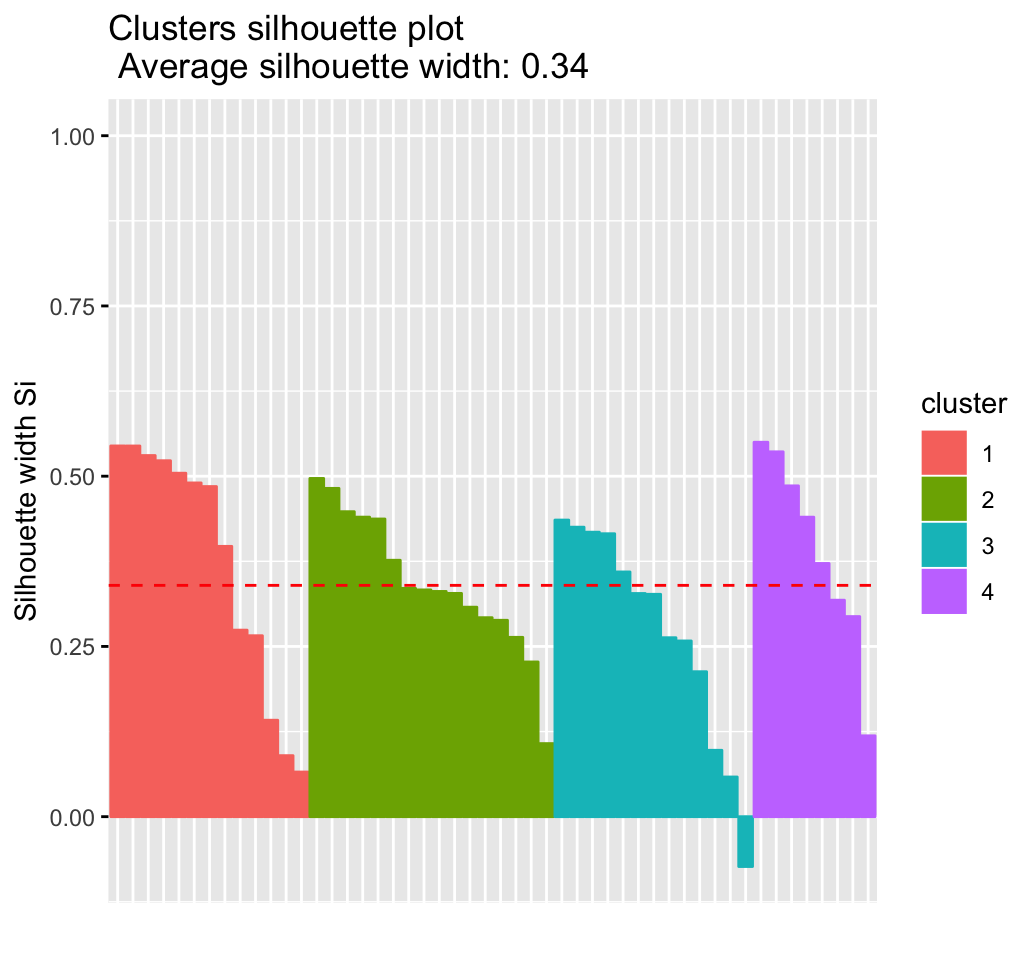
It can be seen that there are some samples which have negative silhouette values. Some natural questions are :
Which samples are these? To what cluster are they closer?
This can be determined from the output of the function silhouette() as follow:
neg_sil_index <- which(sil[, "sil_width"] < 0)
sil[neg_sil_index, , drop = FALSE]
## cluster neighbor sil_width
## Missouri 3 2 -0.0732eclust(): Enhanced clustering analysis
The function eclust()[factoextra package] provides several advantages compared to the standard packages used for clustering analysis:
- It simplifies the workflow of clustering analysis
- It can be used to compute hierarchical clustering and partitioning clustering in a single line function call
- The function eclust() computes automatically the gap statistic for estimating the right number of clusters.
- It automatically provides silhouette information
- It draws beautiful graphs using ggplot2
K-means clustering using eclust()
# Compute k-means
res.km <- eclust(df, "kmeans", nstart = 25)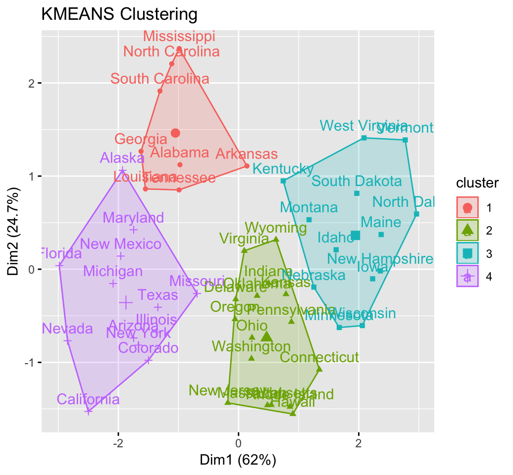
# Gap statistic plot
fviz_gap_stat(res.km$gap_stat)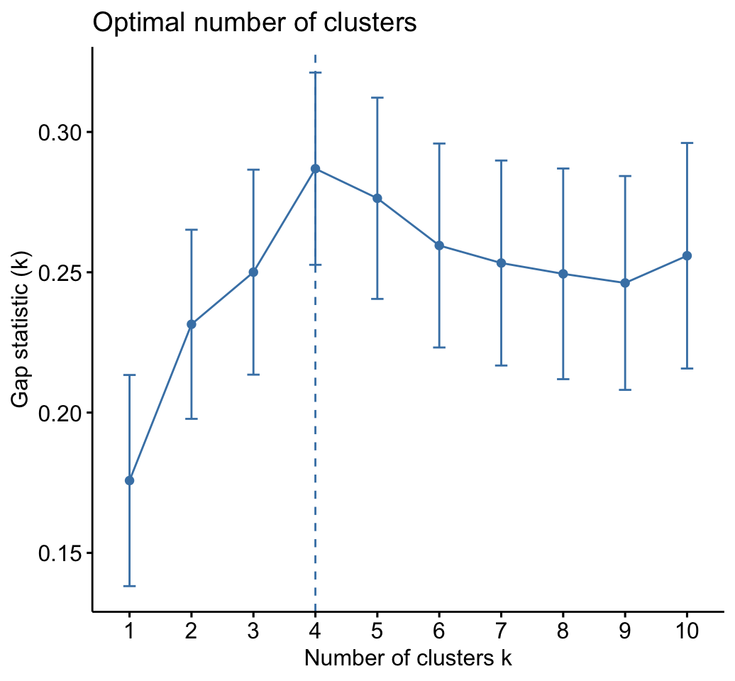
# Silhouette plot
fviz_silhouette(res.km)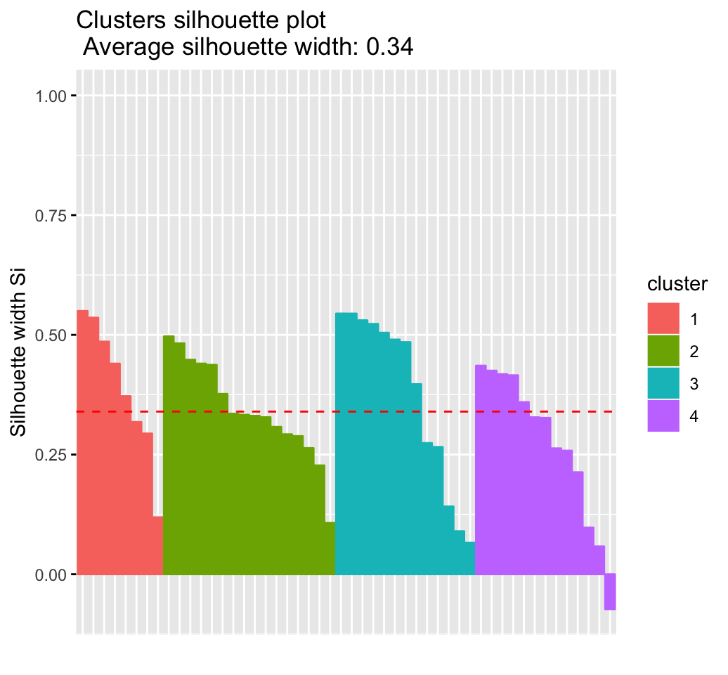
Hierachical clustering using eclust()
 # Enhanced hierarchical clustering
res.hc <- eclust(df, "hclust") # compute hclust
## Clustering k = 1,2,..., K.max (= 10): .. done
## Bootstrapping, b = 1,2,..., B (= 100) [one "." per sample]:
## .................................................. 50
## .................................................. 100fviz_dend(res.hc, rect = TRUE) # dendrogam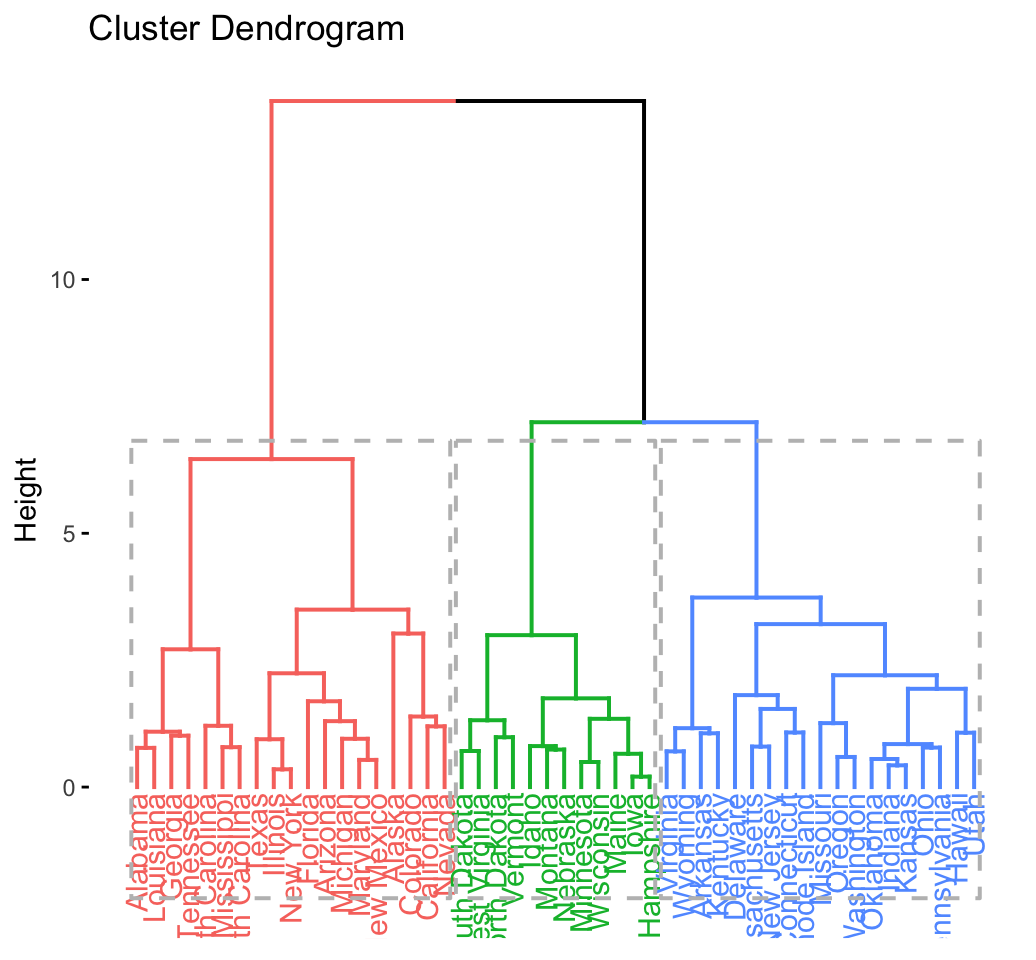
The R code below generates the silhouette plot and the scatter plot for hierarchical clustering.
fviz_silhouette(res.hc) # silhouette plot
fviz_cluster(res.hc) # scatter plot
Recommended for you
This section contains best data science and self-development resources to help you on your path.
Coursera - Online Courses and Specialization
Data science
- Course: Machine Learning: Master the Fundamentals by Stanford
- Specialization: Data Science by Johns Hopkins University
- Specialization: Python for Everybody by University of Michigan
- Courses: Build Skills for a Top Job in any Industry by Coursera
- Specialization: Master Machine Learning Fundamentals by University of Washington
- Specialization: Statistics with R by Duke University
- Specialization: Software Development in R by Johns Hopkins University
- Specialization: Genomic Data Science by Johns Hopkins University
Popular Courses Launched in 2020
- Google IT Automation with Python by Google
- AI for Medicine by deeplearning.ai
- Epidemiology in Public Health Practice by Johns Hopkins University
- AWS Fundamentals by Amazon Web Services
Trending Courses
- The Science of Well-Being by Yale University
- Google IT Support Professional by Google
- Python for Everybody by University of Michigan
- IBM Data Science Professional Certificate by IBM
- Business Foundations by University of Pennsylvania
- Introduction to Psychology by Yale University
- Excel Skills for Business by Macquarie University
- Psychological First Aid by Johns Hopkins University
- Graphic Design by Cal Arts
Amazon FBA
Amazing Selling Machine
Books - Data Science
Our Books
- Practical Guide to Cluster Analysis in R by A. Kassambara (Datanovia)
- Practical Guide To Principal Component Methods in R by A. Kassambara (Datanovia)
- Machine Learning Essentials: Practical Guide in R by A. Kassambara (Datanovia)
- R Graphics Essentials for Great Data Visualization by A. Kassambara (Datanovia)
- GGPlot2 Essentials for Great Data Visualization in R by A. Kassambara (Datanovia)
- Network Analysis and Visualization in R by A. Kassambara (Datanovia)
- Practical Statistics in R for Comparing Groups: Numerical Variables by A. Kassambara (Datanovia)
- Inter-Rater Reliability Essentials: Practical Guide in R by A. Kassambara (Datanovia)
Others
- R for Data Science: Import, Tidy, Transform, Visualize, and Model Data by Hadley Wickham & Garrett Grolemund
- Hands-On Machine Learning with Scikit-Learn, Keras, and TensorFlow: Concepts, Tools, and Techniques to Build Intelligent Systems by Aurelien Géron
- Practical Statistics for Data Scientists: 50 Essential Concepts by Peter Bruce & Andrew Bruce
- Hands-On Programming with R: Write Your Own Functions And Simulations by Garrett Grolemund & Hadley Wickham
- An Introduction to Statistical Learning: with Applications in R by Gareth James et al.
- Deep Learning with R by François Chollet & J.J. Allaire
- Deep Learning with Python by François Chollet


Hi,
Great website, excellent content. But why do you have a huge banner at the top that comes almost a third of the way down the page when you scroll down? Particularly as this banner has so much wasted white space in it. Please change it, it’s driving me mad!
Thanks
Thank you Gary for your suggestion. I’ll work in improving the appearance of the website as soon as possible.
I see that it takes you time to work on removing the barner because it has been a year, and it keeps appearing and it does not allow you to read the page well, do not be lazy and do it.
Hi, would you please send to me a screenshot. I’m not sure to understand the bug. I’m using the Chrome and things seem to be fine.
Best regards,
Alboukadel
hi,is this a typo?
res$hopkins_stat
## [1] 0.656
the hopkins stat value equals 0.656… but your comments is “The value of the Hopkins statistic is significantly 0.5” ?